Advertising Art Director: Herbert Bayer

Herbert Bayer’s experimental typeface, Universal (Sturm Blond), notable for its bold, geometric form and lack of capital letters.

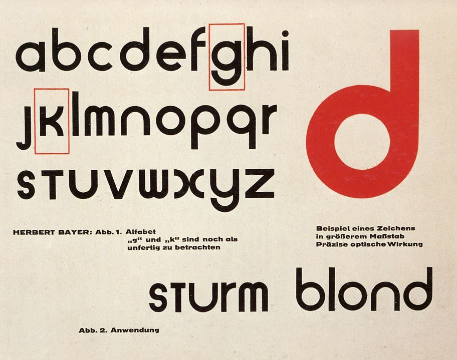
An artistic polymath best known for his creative contributions while studying and teaching at the Bauhaus school, Herbert Bayer is one of the most important names to know in terms of graphic design history. Bayer is credited with designing the experimental sans serif typeface Universal (Sturm Blond) that consisted of only lowercase letters. The differences between this and the germanic blackletter typefaces he grew up seeing were drastic.

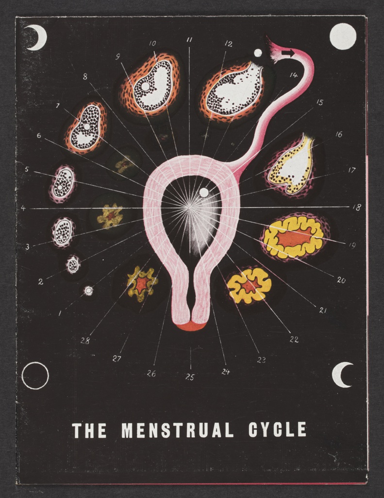
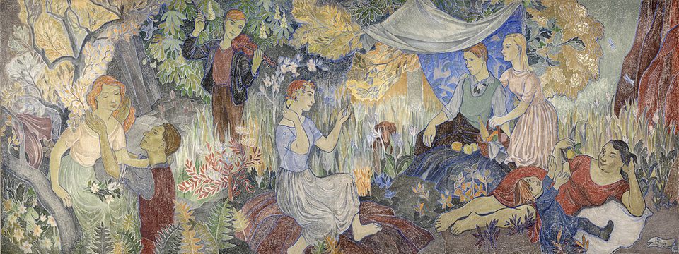
Bayer’s biology-based illustrations, as well as his architectural plans, are my personal favourites from the prolific artist. Pharma companies had started hiring artists to promote medicinal information and medications shortly after Bayer moved to the United States. The Menstrual Cycle brochure both informed readers of female* reproductive organs, the ovulation cycle, and a new hormone-based drug the commissioning company was selling. This illustration is unique compared to his usual advertising work, that of which was reminiscent of neoplasticism; primary colours, geometric shapes, and abstract while maintaining legibility.

*female in this context is referring to those who were assigned female at birth, but does reflect the thousands of transgender men and non-binary individuals who also have this anatomy

Information citations:
https://en.wikipedia.org/wiki/Herbert_Bayer
https://www.cooperhewitt.org/2019/11/25/herbert-bayer-master-of-the-universe/

Image Citations:
https://blogs.stthomas.edu/arthistory/files/2015/04/IMG_0779-300×221.jpg
https://i.pinimg.com/originals/d2/3b/57/d23b57326e99e791902436c08c6d6188.jpg
https://images.collection.cooperhewitt.org/348630_d89848f2b7aa39ea_b.jpg
http://socks-studio.com/2017/05/08/herbert-bayers-small-architectural-projects-1924/

Historical Artifact: Gogh-ing All In!


Dutch Post-Impressionist artist Vincent Van Gogh painted “Bedroom in Arles” in 1888, when he was renting a room in Arles, France, at a home dubbed the Yellow House. Van Gogh explained:

“Colour must be abundant in this part, its simplification adding a rank of grandee to the style…suggest[ing] a certain rest or dream.”

He deliberately skewed the perspective and flattened the interior, hoping to resemble a Japanese print. He believed colours expressed something beyond the description.

Tobin Eckstein


Miniature dioramas have always been a point of child-like fascination and respect for me. The ability to compose a location or moment in time within a ~1:24 scale is highly commendable. When I lived in Victoria, I unfortunately never got the chance to visit Miniature World, but one day I will get there! When reading the Historical Artifact brief I thought it would be a great chance to explore my love for tiny architecture. After weighing my options, I decided to recreate “Bedroom in Arles” by Vincent Van Gogh.

I was lucky enough to come across a couple of miniatures other people had made, which gave me a nice point of reference in regards to ratio and materials. Minus the clay, popsicle sticks, sponge, and Weldbond glue, I already owned all of the items I needed, so the project was inexpensive and accessible to create. The materials I used are listed here: scissors, hobby knife, cutting mat, cardboard, popsicle sticks, Weldbond glue, rubber cement glue, twine, acrylic paint, toilet paper, cardstock, pencil crayons, clay, a sponge, and fine liner. Cardboard is a pretty obvious choice for the framework; it’s flexible, yet structurally sound with some light reinforcement. Cardstock paper was able to handle a light coat of paint without warping for the walls and floor, and when crinkled it worked perfectly as fabric. I wanted to use popsicle sticks for the furniture because, for one, the furniture portrayed in the painting is wood, and secondly, it is lightweight and easy to glue. I used a sponge for the mattress, to give some height and a surface to place the pillows and blankets on. The pillows are made of toilet paper, as it was the plushiest material I could think to use that easily rolled up. The clay items on the table give some nice texture and dimension, as well as provide me with a chance to try a new medium! Everything else, such as the paintings and doors, were mainly a stylistic choice.

I would give myself full marks for this project. I am incredibly proud of both my effort and the final product. Moving forward, I would like to explore this art form further, and maybe I’ll even get a comission at some point!

Survey 9: The Revolutionary Posters of Soviet Brothers Georgii and Vladimir Stenberg

Vladimir and Georgii Stenberg working in their shared studio

Vladimir Stenberg (1899-1982) and Georgii Stenberg (1900-1933-he died in a motorcycle accident) were born in Soviet Russia to a Swedish father, who worked as a painter, and a Latvian mother. The Stenberg Brothers were initially active as sculptors, theatre designers, architects, and draftsmen; even designing women’s shoes and rail carriages. They made their biggest mark as radical poster designers during the Constructivist graphic design movement, specifically in propaganda and film posters.

According to communist Russia, fine art was useless. Many artists worked around this by creating avant-garde posters. Posters and film became important tools for the state because they were able to convert illiterate citizens through government-sanctioned imagery. The Stenberg Brothers started studying at the State Free Art Workshops (SVOMAS) at the beginning of the civil war (1917), which highly informed their visuals. They founded the Society of Young Artists (OBMOKhU) with some of their comrades in 1919, which aimed to design compelling posters for the Bolshevik cause. In fact, the distribution of propaganda was considered a desirable and honourable practice in Russia at the time, and the Stenbergs excelled at this.

Our primary device is montage…[but] we do not neglect Construction. Ours are eye-catching posters which, one might say, are designed to shock. We deal with the material in a free manner…disregarding actual proportions…turning figures upside-down; in short, we employ everything that can make a busy passerby stop in their tracks.

Vladimir Stenberg (1928)

A BROTHERLY BOND
In the book “Stenberg Brothers: Constructing A Revolution in Soviet Design” written by gallery curator and Professor of Design History and Theory, Christopher Mount, it is stated that Georgii and Vladimir Stenberg “shared from an early age an unusually strong fraternal bond.” They would work on their posters simultaneously, rushedly alternating positions around the piece until it was completed. All of their joint works featured the signature 2 Stenberg 2, supporting the idea of the collective rather than the individual, as proposed by the Bolsheviks.

The Stenberg Brother’s posters are defined by an exaggerated use of scale, a sense of movement, and dynamic use of colour and typography. They would often base the visuals on stills from the films. Many of their peers and other artists in the field ended up imitating them due to the effectiveness of their designs. When Josef Stalin declared socialist realism as the official artistic medium, the brothers became little known and almost lost to history.

Information Citations:
https://thecharnelhouse.org/2015/08/05/the-stenberg-brothers-and-the-art-of-soviet-movie-posters/
https://www.moma.org/interactives/exhibitions/1997/sternbergbrothers/
https://en.wikipedia.org/wiki/Constructivism_(art)#Constructivist_graphic_design
https://en.wikipedia.org/wiki/Stenberg_brothers
https://tumblr.austinkleon.com/post/134238069611
https://www.moma.org/documents/moma_catalogue_250_300063174.pdf

Tove Jansson: Impressionist Portraits, Wartime Cartoons and Moomins

One might say that Swedish-speaking Finland native Tove Jansson (1914-2001) was born to be an artist, with her family consisting of a graphic designer mother, sculptor father, and photographer and cartoonist brothers. Tove herself would take on the labels of author, novelist, painter, illustrator, and comic-strip artist. The impassioned bohemian atmosphere of her home would fuel Jansson’s creative expression as the years went on. Before reaching ten years old, she would already be selling multiple illustrations to magazines to be published. Tove’s paintings fall under the Impressionism movement for featuring visible brushstrokes, a depiction of shifting light and movement, and ordinary subject matter. Her honest and frequent self-portraits and still lifes used the same techniques as great Impressionists like Van Gogh and Monet. Public murals, often done as frescos, were also important marks of her painting career.

A fresco by Tove Jansson, now housed in the Helinski Art Museum, titled Party in the Countryside, 1947
One of Tove Jansson’s murals in Hamina, Finland, titled A Story From the Bottom of the Sea, 1952

Tove Jansson had guts. She wasn’t afraid to sign her name on her work as a young queer woman ridiculing Hitler and Stalin in political cartoons for Finnish satire magazine Garm. Controversial matters were of no concern. She was belittled by male painting teachers, dared to openly love women in a greatly homophobic era and lived through the horrors of second world war; all of these events, as well as many more, impacted how Jansson thought and created throughout her adult years.

She would publish her first Moomin book titled The Moomins and the Great Flood in 1945. Tove never claimed that Moomin’s were solely for children, and the subjects of natural disaster, displacement, and death came up a few times, yet always in a charming, easy to process way. Society fell in love with Moominvalley and its inhabitants quickly. As expressed in her short story “The Cartoonist”, Tove grew to be terrified that she was “…one of those people who are prevented from doing Great Art because they draw comic strips”. She found great success and happiness in her time of developing the world of Moomins but turned all creative direction to her brother Lars Jansson in 1970. Although best known for creating Moomins, Tove Jansson’s oil paintings and novels have come into popularity recently with exhibitions taking attendees through all eighty-six of her wonderful years as a creator. She spent the majority of her life with her partner Tuulikki Pietilä, a prominent Finnish graphic artist and professor, often creating art in their summer cabin on the remote island of Klovharun, Finland.

Adventures from Moominvalley Season 1 Episode 1: Spring in Moomin Valley
Tove Jansson’s Moomin’s had been depicted twice in animation before, but this was the first time she felt her characters were really brought to life!

Information Citations:
https://www.nybooks.com/daily/2017/11/14/tove-jansson-beyond-the-moomins/
https://theculturetrip.com/europe/finland/articles/finnish-artist-tove-jansson-was-more-than-just-the-creator-of-the-moomins/
https://www.dulwichpicturegallery.org.uk/whats-on/exhibitions/2017/october/tove-jansson/
https://upload.wikimedia.org/wikipedia/en/c/c6/Tove_Jansson_cover_of_Garm_magazine_October_1944.jpg
https://d2mpxrrcad19ou.cloudfront.net/item_images/512655/9027957_bukobject.jpg
https://i1.wp.com/www.brainpickings.org/wp-content/uploads/2014/12/moomindeluxe258.jpg?w=680&ssl=1
https://helsinkiheroes.com/tove-jansson-at-ateneum/

Media Citations:
https://dam-13749.kxcdn.com/wp-content/uploads/2017/09/Tove-Jansson_Ennen-naamiaisia_1943_pieni.jpg
https://cdn.nybooks.com/wp-content/uploads/2017/11/jansson-smoking-girl.jpg
https://www.youtube.com/watch?v=za5qalOgt00&feature=emb_rel_pause