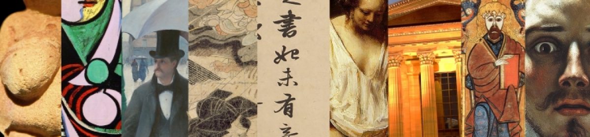
I love taking the opportunity to delve further into my German heritage and so this project was more than just an assignment; it was a personal passion project. Germany has been the centre for many turning points in both the design and engineering world-think Bauhaus and the Gutenberg press-and their innovations with typography marry both of those elements together. I had many ways I could approach this infographic, but I decided to take the most important document from each pivotal typeface and stick them together as one. For Textura, we have the Gutenberg Bible, Schwabacher is a page from the Nuremberg Chronicle, Fraktur from Durer’s Triumphal Arch, and Antiqua from a German newspaper in 1941. The Eszett is just a bonus! I tried my best to match the style of each document, even bringing a lighter to my page (scary!), and I think it turned out pretty good. If I had created it over a longer period of time rather than in two sittings, I may have come out with something even better though. I definitely had to cover a couple of ink smears with white acrylic…That being said, I am still proud of the project and would give it a solid 9/10.
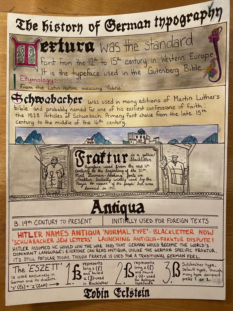
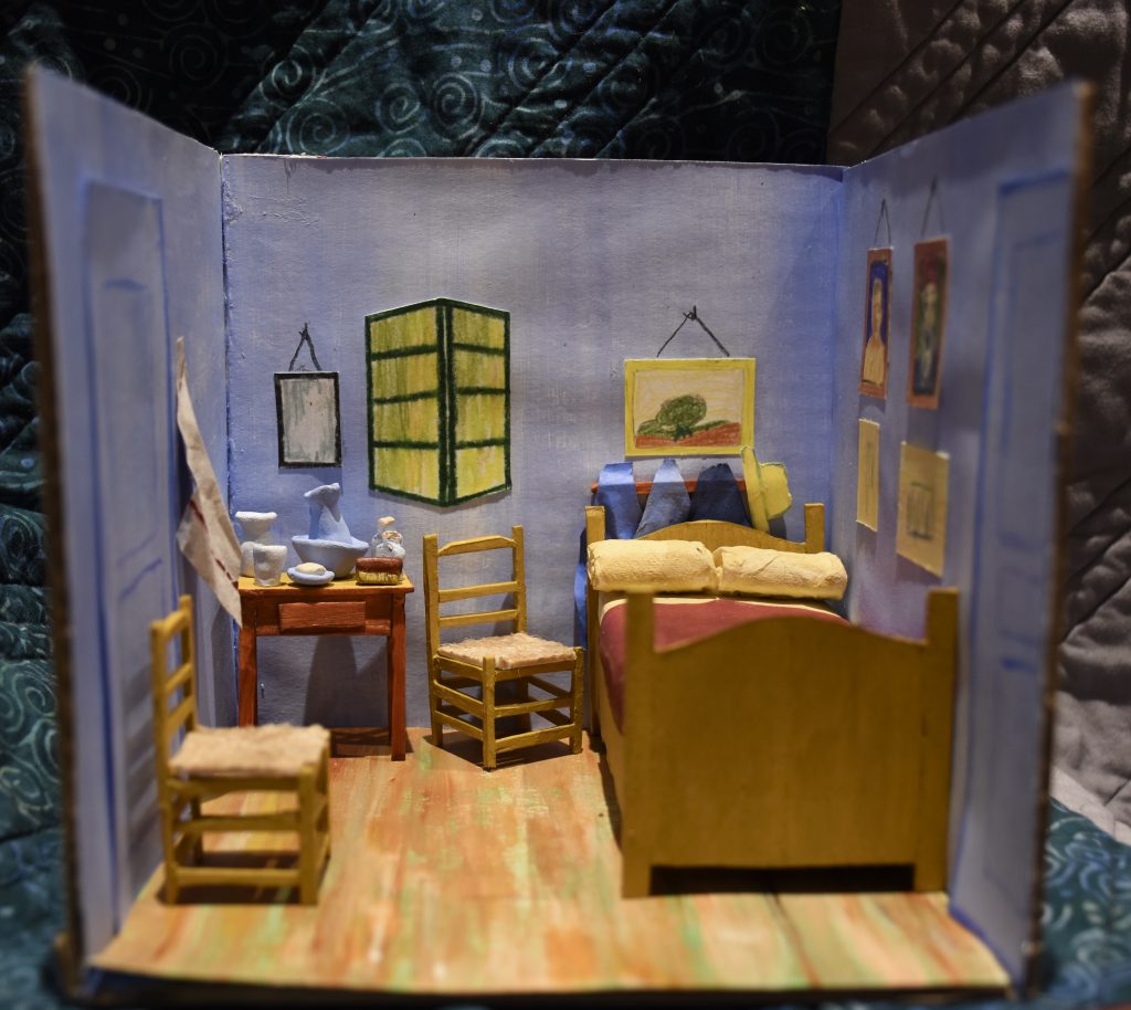
Dutch Post-Impressionist artist Vincent Van Gogh painted “Bedroom in Arles” in 1888, when he was renting a room in Arles, France, at a home dubbed the Yellow House. Van Gogh explained:
“Colour must be abundant in this part, its simplification adding a rank of grandee to the style…suggest[ing] a certain rest or dream.”
He deliberately skewed the perspective and flattened the interior, hoping to resemble a Japanese print. He believed colours expressed something beyond the description.
Tobin Eckstein
Miniature dioramas have always been a point of child-like fascination and respect for me. The ability to compose a location or moment in time within a ~1:24 scale is highly commendable. When I lived in Victoria, I unfortunately never got the chance to visit Miniature World, but one day I will get there! When reading the Historical Artifact brief I thought it would be a great chance to explore my love for tiny architecture. After weighing my options, I decided to recreate “Bedroom in Arles” by Vincent Van Gogh.
I was lucky enough to come across a couple of miniatures other people had made, which gave me a nice point of reference in regards to ratio and materials. Minus the clay, popsicle sticks, sponge, and Weldbond glue, I already owned all of the items I needed, so the project was inexpensive and accessible to create. The materials I used are listed here: scissors, hobby knife, cutting mat, cardboard, popsicle sticks, Weldbond glue, rubber cement glue, twine, acrylic paint, toilet paper, cardstock, pencil crayons, clay, a sponge, and fine liner. Cardboard is a pretty obvious choice for the framework; it’s flexible, yet structurally sound with some light reinforcement. Cardstock paper was able to handle a light coat of paint without warping for the walls and floor, and when crinkled it worked perfectly as fabric. I wanted to use popsicle sticks for the furniture because, for one, the furniture portrayed in the painting is wood, and secondly, it is lightweight and easy to glue. I used a sponge for the mattress, to give some height and a surface to place the pillows and blankets on. The pillows are made of toilet paper, as it was the plushiest material I could think to use that easily rolled up. The clay items on the table give some nice texture and dimension, as well as provide me with a chance to try a new medium! Everything else, such as the paintings and doors, were mainly a stylistic choice.
I would give myself full marks for this project. I am incredibly proud of both my effort and the final product. Moving forward, I would like to explore this art form further, and maybe I’ll even get a comission at some point!
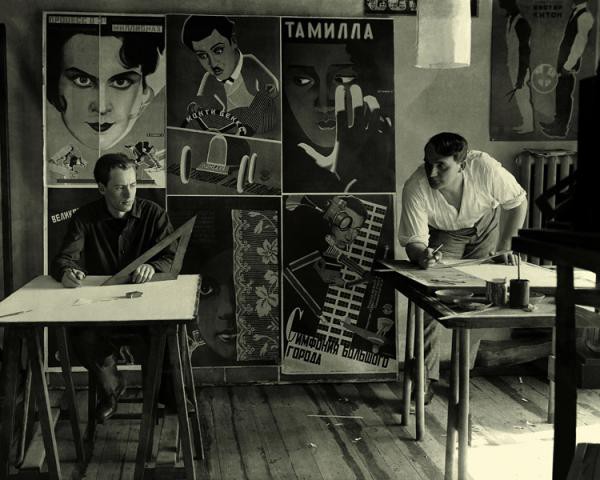
Vladimir and Georgii Stenberg working in their shared studio
Vladimir Stenberg (1899-1982) and Georgii Stenberg (1900-1933-he died in a motorcycle accident) were born in Soviet Russia to a Swedish father, who worked as a painter, and a Latvian mother. The Stenberg Brothers were initially active as sculptors, theatre designers, architects, and draftsmen; even designing women’s shoes and rail carriages. They made their biggest mark as radical poster designers during the Constructivist graphic design movement, specifically in propaganda and film posters.
(left to right) Assemblage Polytechnique (1920) by Vladimir Stenberg, costume design from Night and Day (1926) by Vladimir Stenberg, Idol of the Public (1925) by the Stenberg Brothers.
According to communist Russia, fine art was useless. Many artists worked around this by creating avant-garde posters. Posters and film became important tools for the state because they were able to convert illiterate citizens through government-sanctioned imagery. The Stenberg Brothers started studying at the State Free Art Workshops (SVOMAS) at the beginning of the civil war (1917), which highly informed their visuals. They founded the Society of Young Artists (OBMOKhU) with some of their comrades in 1919, which aimed to design compelling posters for the Bolshevik cause. In fact, the distribution of propaganda was considered a desirable and honourable practice in Russia at the time, and the Stenbergs excelled at this.
Our primary device is montage…[but] we do not neglect Construction. Ours are eye-catching posters which, one might say, are designed to shock. We deal with the material in a free manner…disregarding actual proportions…turning figures upside-down; in short, we employ everything that can make a busy passerby stop in their tracks.
Vladimir Stenberg (1928)
The Stenberg Brother’s first film poster, for a film called The Eyes of Love (1923)
A BROTHERLY BOND In the book “Stenberg Brothers: Constructing A Revolution in Soviet Design” written by gallery curator and Professor of Design History and Theory, Christopher Mount, it is stated that Georgii and Vladimir Stenberg “shared from an early age an unusually strong fraternal bond.” They would work on their posters simultaneously, rushedly alternating positions around the piece until it was completed. All of their joint works featured the signature 2 Stenberg 2, supporting the idea of the collective rather than the individual, as proposed by the Bolsheviks.
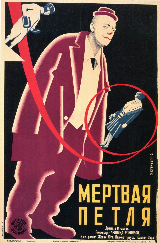
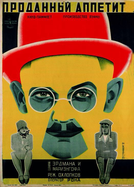
(Left to right) The Death Loop (1929), The Last Flight (1929) and The Sold Appetite (1928) film posters by the Stenberg Brothers
The Stenberg Brother’s posters are defined by an exaggerated use of scale, a sense of movement, and dynamic use of colour and typography. They would often base the visuals on stills from the films. Many of their peers and other artists in the field ended up imitating them due to the effectiveness of their designs. When Josef Stalin declared socialist realism as the official artistic medium, the brothers became little known and almost lost to history.
Information Citations: https://thecharnelhouse.org/2015/08/05/the-stenberg-brothers-and-the-art-of-soviet-movie-posters/ https://www.moma.org/interactives/exhibitions/1997/sternbergbrothers/ https://en.wikipedia.org/wiki/Constructivism_(art)#Constructivist_graphic_design https://en.wikipedia.org/wiki/Stenberg_brothers https://tumblr.austinkleon.com/post/134238069611 https://www.moma.org/documents/moma_catalogue_250_300063174.pdf
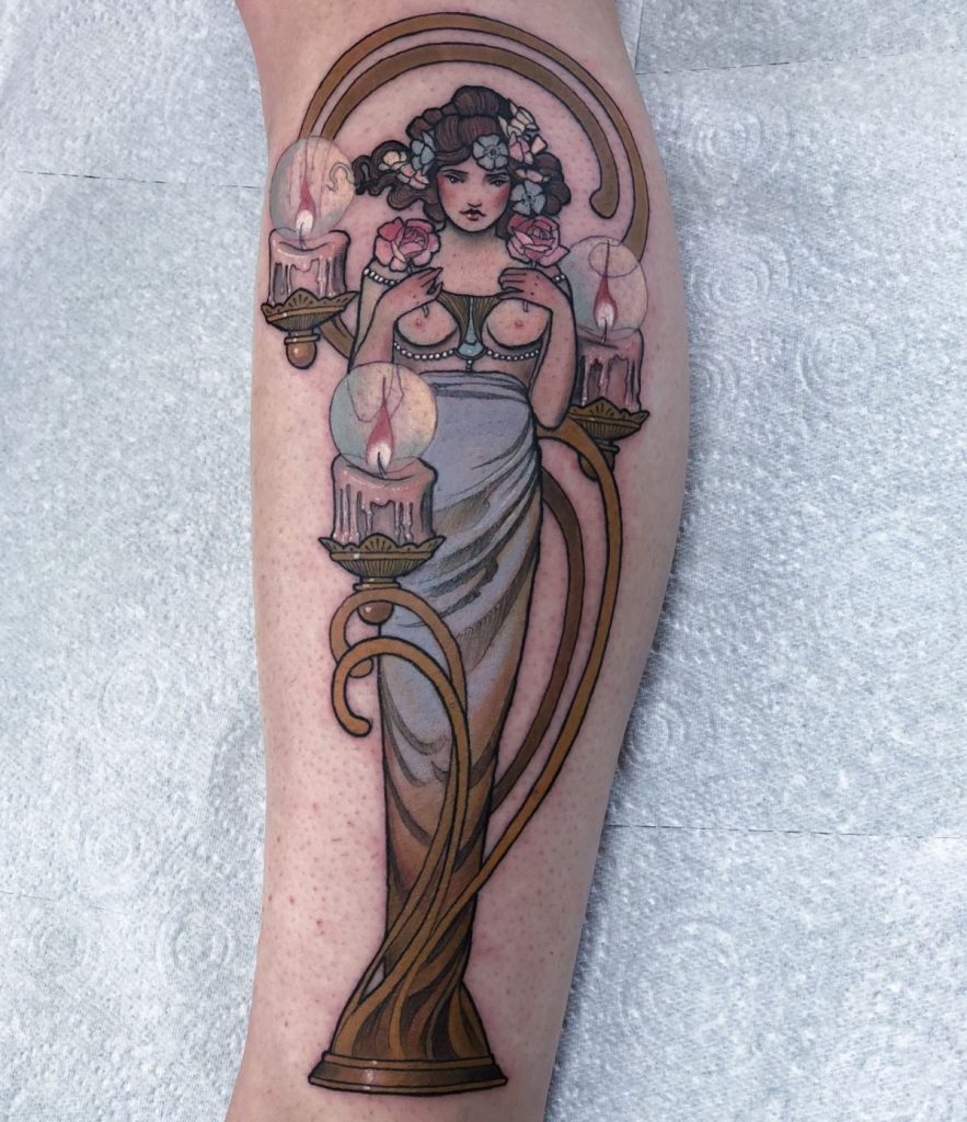
(left) ‘The Kiss’ carved by Peter Behrens (right) ‘Mucha inspired candelabra for Rebecca’ tattoo by Hannah Flowers
With the recent development of reliable and accessible transportation, the Art Nouveau period was one of the more interconnected movements. While artists from earlier periods, like Da Vinci and Michaelangelo in the Renaissance, met frequently, it was because they had been born in the same country. Henri de Toulouse-Lautrec and Vincent Van Gogh were born over 1000km apart, and yet they ended up taking art lessons together in France. Ukiyo-e prints from Japan, and the resulting fetishization of their culture referred to as Japanism, was a crucial influence on the Art Nouveau movement, as well as movements that followed, such as Impressionism, Cubism, and Neo-Traditionalism.
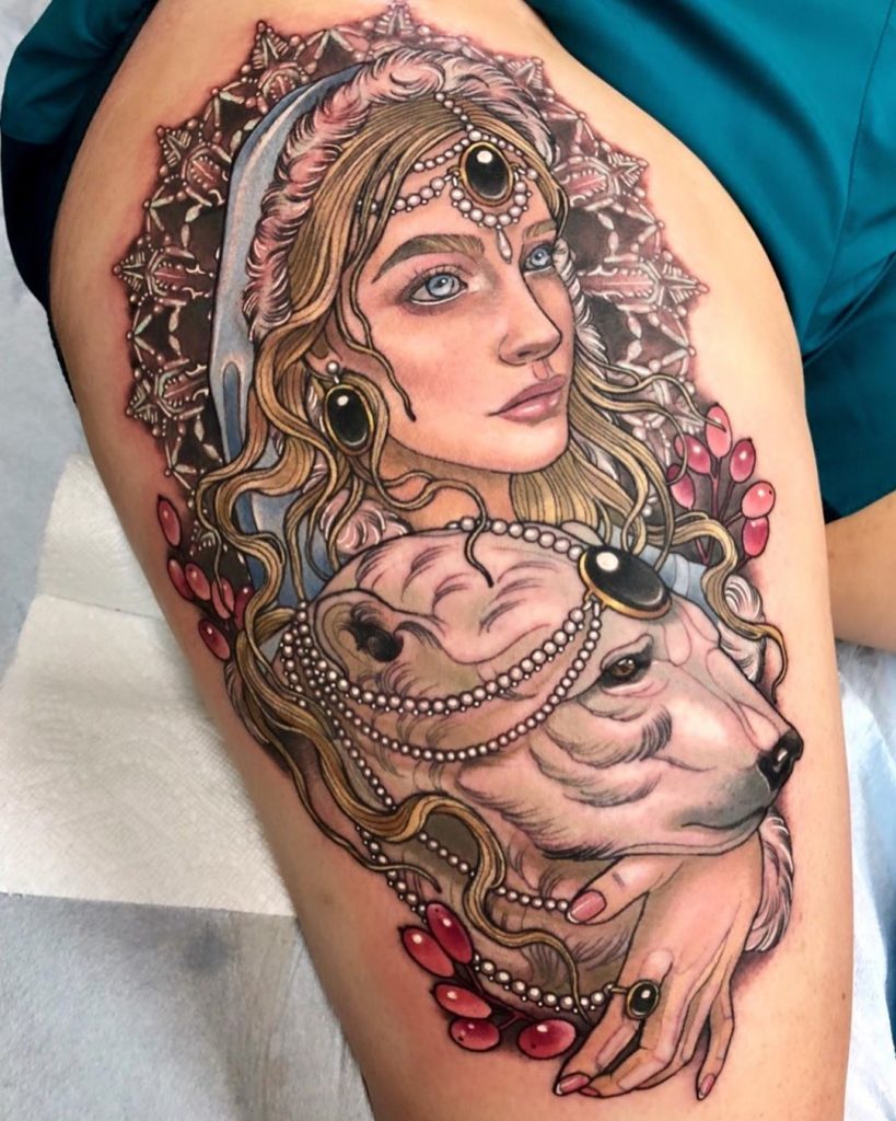
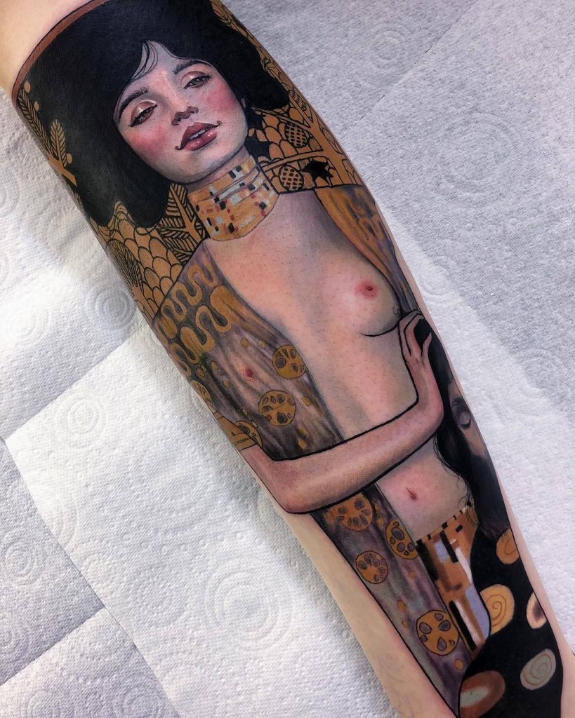
My last lecture from Capilano University professor, Judy Snaydon, focused on the years 1895 to 1905. If I took anything away from that class, it was that everything is more intertwined than we realize. As a tattoo art enthusiast, I immediately recognized the similarities between Art Nouveau and Neo-Traditional designs. The gallery at the top of this post features Peter Behrens ‘The Kiss” (1898) and a tattoo design “Mucha inspired candelabra for Rebecca” (2018) by Neo-Traditional artist Hannah Flowers. One hundred and twenty years between these artworks, and yet the whiplash curves and muted palette makes it look like they could be from the same artist. Below is the hand-rolled cigarette ‘Job’ poster (1898) that gave Alphonse Mucha his first taste of fame. Beside Mucha’s piece is one by Arielle Gagnon portraying a woman adorned in black glass jewels, pearls, and a pink feathery hood that frames her stoic face (2019). This blonde woman gently caresses the neck of a polar bear wearing matching ornaments. Although Neo-Traditional designs often have more developed shading and elaborate outlines, the likeness to its influencer is undeniable.
(left) Tattoo of a woman with a polar bear by Arielle Gagnon (right) ‘Job’ poster by Alphonse Mucha
Art Nouveau and Neo-Traditionalism celebrate the empowerment of women and their bodies through sultry yet normalized portrayals, often framed by flowing locks, sumptuous jewellery, and botanical decoration. When women aren’t the main subject, animals and flowers are their replacements. Cool pale blues and greens with adornments of gold, purple, and red are what I’ve personally noticed as the most common palette for both of these styles. Another teacher of mine, Jeff Burgess, told my class that “You stand on the shoulders of giants” and “Art is your heritage-own it and be proud of it”. Movements such as Neo-Traditionalism shed light onto Jeff’s words, and display how they reign true. Each creative movement throughout time has been intrinsically intertwined, with the movement before disapproving of the next. The beauty and individuality that flowers with each new artistic development proves to be worth the effort, and we are left with another powerful genre to add to the list and learn from.
Definition of Art Nouveau
A style of decorative art, architecture, and design prominent in western Europe and the US from about 1890 until World War I and characterized by intricate linear designs and flowing curves based on natural forms.
Summary of Neo-Traditional
Although very different, visually, from American Traditional, Neo-Traditional still uses the same base of techniques to complete the tattoos such as outlining in dark black ink. Ukiyo-e Japanese prints, Art Nouveau, and Art Deco are all art movements that influence Neo-Traditional tattoos. Neo-Traditional tattoos are known for their dense and richly sumptuous aesthetic that often depict flowers, portraits of women, animals, and more.
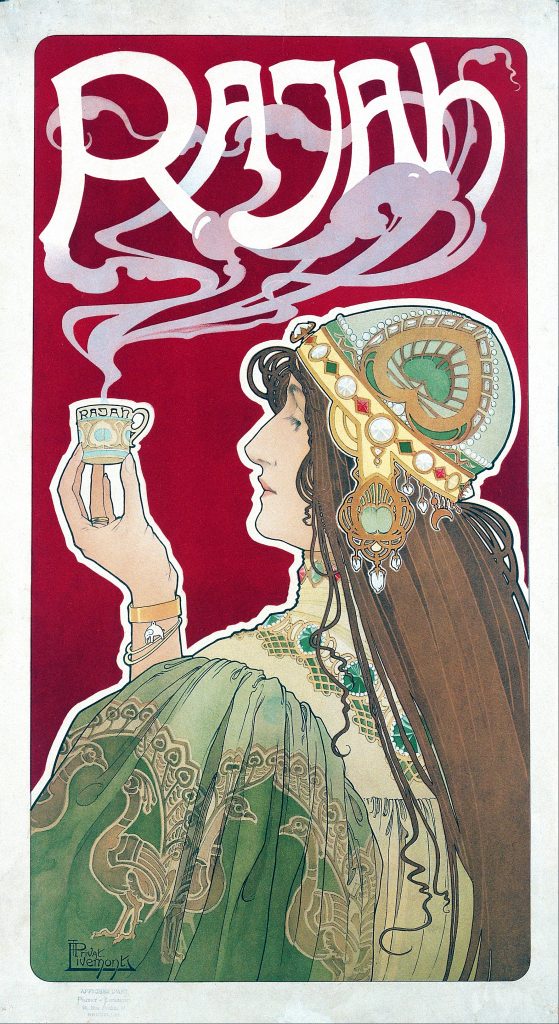
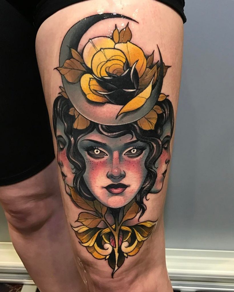
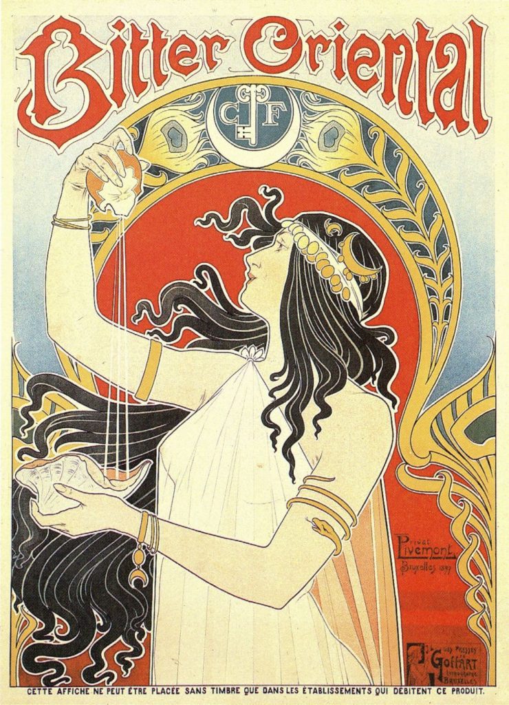
(from left to right) ‘Rajah Coffee’ by Henri Privat-Livemont, tattoo of woman with rose done by Debora Cherrys, ‘Bitter Oriental’ by Henri Privat-Livemont, Klimt inspired tattoo by Hannah Flowers
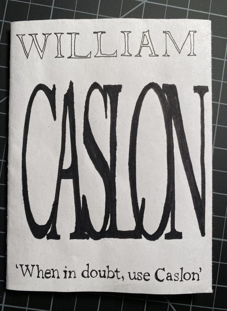
Front and back cover for “William Caslon: When In Doubt” zine
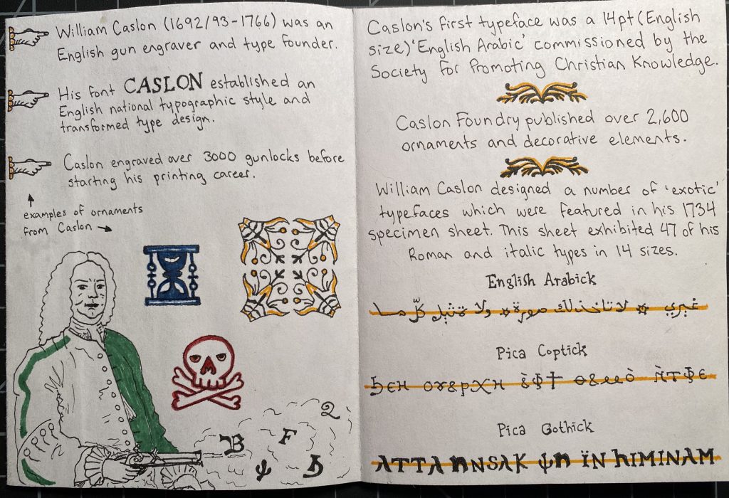
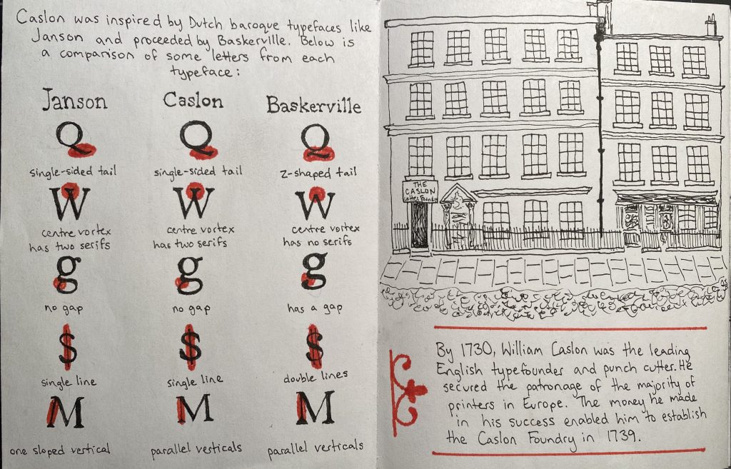
I chose to create a zine about William Caslon and his still successful serif typeface: Caslon. Serifs and ‘exotic’ (Gothic, Coptic, etc.) fonts are favourites of mine, and Caslon employed both of these elements in his typographic designs. I’m consistently searching for new information in my daily life, and this made the process of researching for this project enjoyable. I learned a lot about British and American history, as well as typography. William Caslon was born in 1692, which means not a lot of colours made it to the shelves. I decided to follow a limited colour palette for my composition, and instead focus on the geometric and informative aspects of the typeface itself. The colours I did use are reminiscent of traditional printmaking colours. Using a micron pen, I was able to give a similar feel to printing press pages. This assignment took me a lot longer than I anticipated, but I am satisfied with the result. I would give myself a 9.5/10, losing marks for the messier areas of colouring, although this is mostly due to marker colour bleeds and smooth paper not taking pencil crayon well. The formatting of my pages is engaging and full of information. Almost every illustration is accurate to historical documents.
My first two pages focus on William Caslon’s background and the beginning of his typeface career.These two are my favourites; a comparison of Janson, Caslon, and Baskerville typefaces, and my rendering of a print of the original Caslon Foundry building.The last couple pages show the original and modern uses of the Caslon typeface.
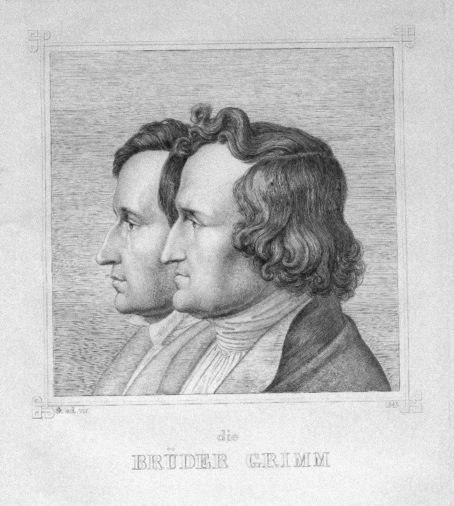
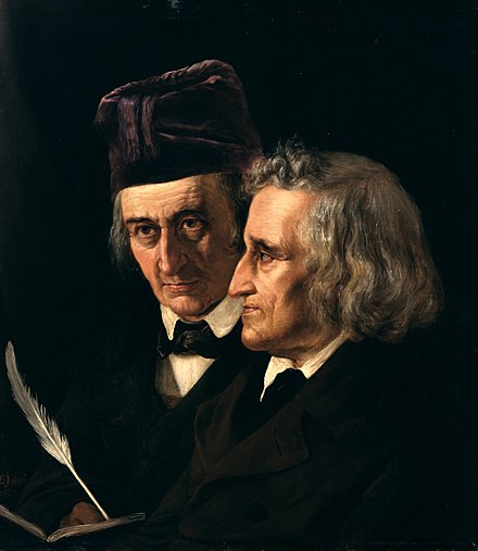
(left image) “Die Brüder Grimm“, drawing by their younger brother Ludwig Emil Grimm, (right image) Jacob (left) and Wilhelm Grimm in an oil portrait by Elisabeth Jerichau Baumann.
Jacob Ludwig Karl Grimm (1785-1863) and Wilhelm Carl Grimm (1786-1859), better known as Brothers Grimm, were born in Hanau, Germany to stay at home mother, Dorothea Grimm nee Zimmer, and lawyer and jurist father, Philipp Wilhelm Grimm. Philipp’s death in 1796 plummeted the family into poverty, and, being the eldest surviving siblings-3 Grimm children had passed away as infants-the brothers assumed responsibility for the household. Favouritism towards higher born students was evident throughout the boys’ childhood education, and yet each graduated head of his class due to unwavering academic dedication. University was no different; they had to request to study law, were excluded from applying for financial aid, and couldn’t afford to participate in student activities. After a lifetime of study, Jacob Grimm and Wilhelm Grimm became two of the most important German scholars of their time. Collectively, they held the titles of author, editor, librarian, German studies professor, philologist, folklorist, and lexicographer.
German studies: The field of humanities that researches, documents, and disseminates German language and literature in both its historic and present forms. (1) Philology: The study of literary texts as well as oral and written records, the establishment of their authenticity and their original form, and the determination of their meaning. (2) Lexicography: The art or craft of compiling, writing and editing dictionaries.(3)
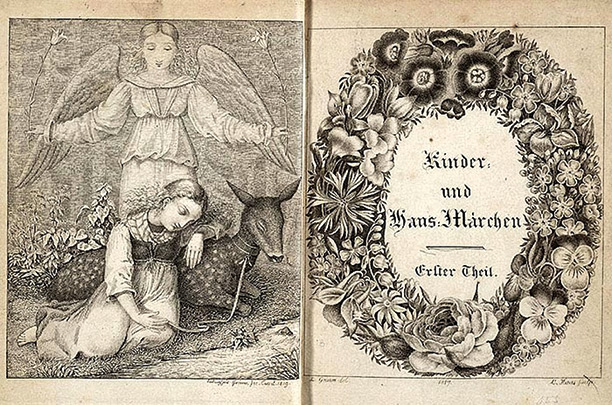
Title page and illustration from the first volume of Grimms’ Kinder-und Hausmärchen v.1, 2nd edition. (1819)
As librarians, the Brothers Grimm had low income but were content with the amount of time they had for research in the position. They had basically dropped their pursuit at becoming lawyers, like their late father was, and instead dedicated themselves to literature. They didn’t write any of the tales, as people often believe, but collected the mostly orally sourced tales into two volumes, the first editions being published in 1812, as Kinder- und Hausmärchen–Children and household tales, or more commonly known as Grimms’ Fairy Tale. Public school had recently been made compulsory in Europe, so there were more literate middle-class people reading, and their books spread like wildfire. The books were commercially successful, but the violence and sexual content made them less well-received than they would have been sans explicit material. Families were interested in having a more child-friendly version of Grimms’ Fairy Tale, so they started sending in their versions of the published tales. This gave the brothers plenty of material for the revised second edition, published in 1819. The 7th edition of Grimms’ Fairy Tale, published in 1857, is the one most people refer to for retelling and translating. You can read the original 200 tales and ten legends, as translated by Margaret Hunt in 1884, at the website World of Tales, through this link: https://www.worldoftales.com/fairy_tales/Grimm_fairy_tales_Margaret_Hunt.html#gsc.tab=0. A prime example that displays the violent stories that were cut is How Some Children Played At Slaughtering, and you can read it below. This story has been collected from two sources, and each was copied from the website for Children and Youth in History.
How Some Children Played At Slaughtering
I In a city named Franecker, located in West Friesland, some young boys and girls between the ages of five and six happened to be playing with one another. They chose one boy to play a butcher, another boy to play was to be a cook, and a third boy was to be a pig. Then they chose one girl to be a cook and another girl her assistant. The assistant was to catch the blood of the pig in a little bowl so they could make sausages. As agreed, the butcher now fell upon the little boy playing the pig, threw him to the ground, and slit his throat open with a knife, while the assistant cook caught the blood in her little bowl. A councilman was walking nearby and saw this wretched act. He immediately took the butcher with him and led him into the house of the mayor, who instantly summoned the entire council. They deliberated about this incident and did not know what they should do to the boy, for they realized it had all been part of a children’s game. One of the councilmen, an old wise man, advised the chief judge to take a beautiful red apple in one hand and a Rhenish gulden in the other. Then he was to call the boy and stretch out his hands to him. If the boy took the apple, he was to be set free. If he took the gulden, he was to be killed. The judge took the wise man’s advice, and the boy grabbed the apple with a laugh. Thus he was set free without any punishment.
II There once was a father who slaughtered a pig, and his children saw that. In the afternoon, when they began playing, one child said to the other, “you be the little pig, and I’ll be the butcher.” He then took a shiny knife and slit his little brother’s throat. Their mother was upstairs in a room bathing another child, and when she heard the cries of her son, she immediately ran downstairs. Upon seeing what had happened, she took the knife out of her son’s throat and was so enraged that she stabbed the heart of the other boy, who had been playing the butcher. Then she quickly ran back to the room to tend to her child in the bathtub, but while she was gone, he had drowned in the tub. Now the woman became so frightened and desperate that she did not allow the neighbors to comfort her and finally hung herself. When her husband came back from the fields and saw everything, he became so despondent that he died soon after.
Fairy tales evolve over time to represent the current culture. Both a form of education and entertainment, they’re often used to teach children moral lessons. The oldest known tale is ~6000 years old. Verbal and pictorial depictions of Grimms’ collected tales have evolved drastically throughout the centuries, and different renditions can be viewed below. The Grimm Brothers made a significant impact in the world of German literature and linguistics and triggered the professional study of folklore. A large number of our favourite Disney movies and shorts, including, but not limited to, Sleeping Beauty (originally Briar Rose), Cinderella, Snow White, Rapunzel, and The Frog Princess (originally The Frog Prince), are based on Grimm’s tales.
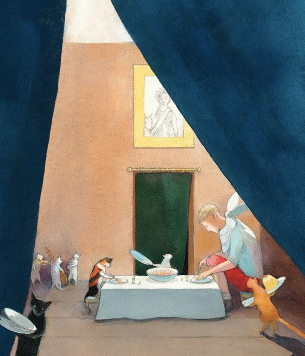
(From left to right) The Wild Man by Andrea Dezsö (2014), The Poor Miller’s Boy and the Little Cat by Lisbeth Zwerger (2012), The Goblins by Maurice Sendak (1973).
(Left to right) Hansel and Gretel by Wanda Gág (1936) and The Boy Hidden in the Fish (The Sea Hare) by David Hockney (1970)
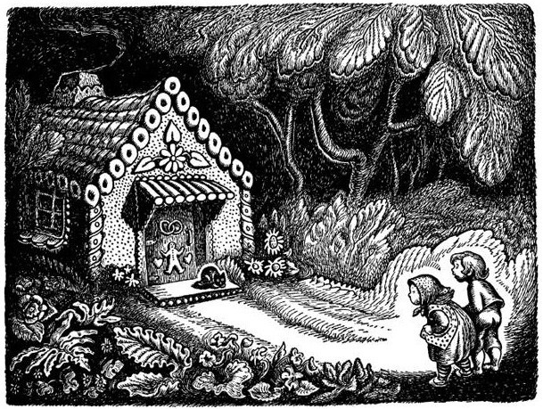
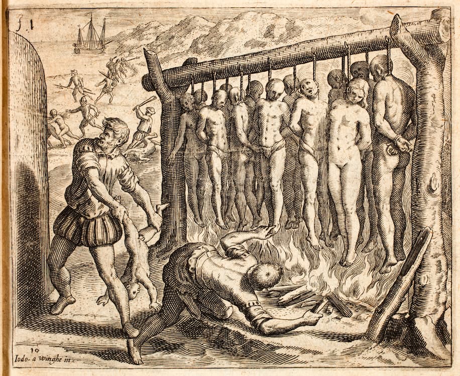
This engraving was created by Flemish painter, Joos Van Winghe, and Belgian engraver, Theodor de Bry. It gives a visual to the horrific acts committed by Spanish explorers to the indigenous people of Guanahani, as described by Bartolomé de las Casas.
On October 12, 1492, Christopher Columbus landed on the shores of Guanahani (what is now known as the Bahamas), and ultimately delivered a death sentence to the indigenous people, the Taíno (tie-ee-no), which also encompasses the Lucayan (loo-kai-en) people, both of which are part of the Arawak (air-uh-walk) language group, who inhabited the island. The Spanish explorer immediately noted “…They should be good servants.” New World diseases, forced slave labour, and brutal murders, all brought on by Christopher Columbus and his crew, led to somewhere between 80% and 90% of the Taíno population dying within 30 years. Bartolome de las Casas was one of these Spanish explorers for decades, but he renounced the actions of Columbus and his fellow crewmates in his book A Short Account of the Destruction of the Indies (1992). The following is a graphic excerpt from this text:
“They [Spanish explorers] forced their way into native settlements, slaughtering everyone they found there, including small children, old men, pregnant women, and even women who had just given birth. They hacked them to pieces, slicing open their bellies with their swords as though they were so many sheep herded into a pen. They even laid wagers on whether they could slice a man in two at a stroke, or cut an individual’s head from his body, or disembowel him with a single blow of their axes. They grabbed suckling infants by the feet and, ripping them from their mothers’ breasts, dashed them headlong against the rocks. Others, laughing and joking all the while, threw them over their shoulders, shouting, ‘Wriggle, you little perisher.’
Christopher Columbus is still a widely celebrated man in America, but Indigenous Day has now been introduced to our calendars, and it is slowly, but surely, taking over Columbus Day. That man took hand in horrific acts against the indigenous people of Guanahani and sparked a continuing trend of violence against indigenous people that still ails the world now.
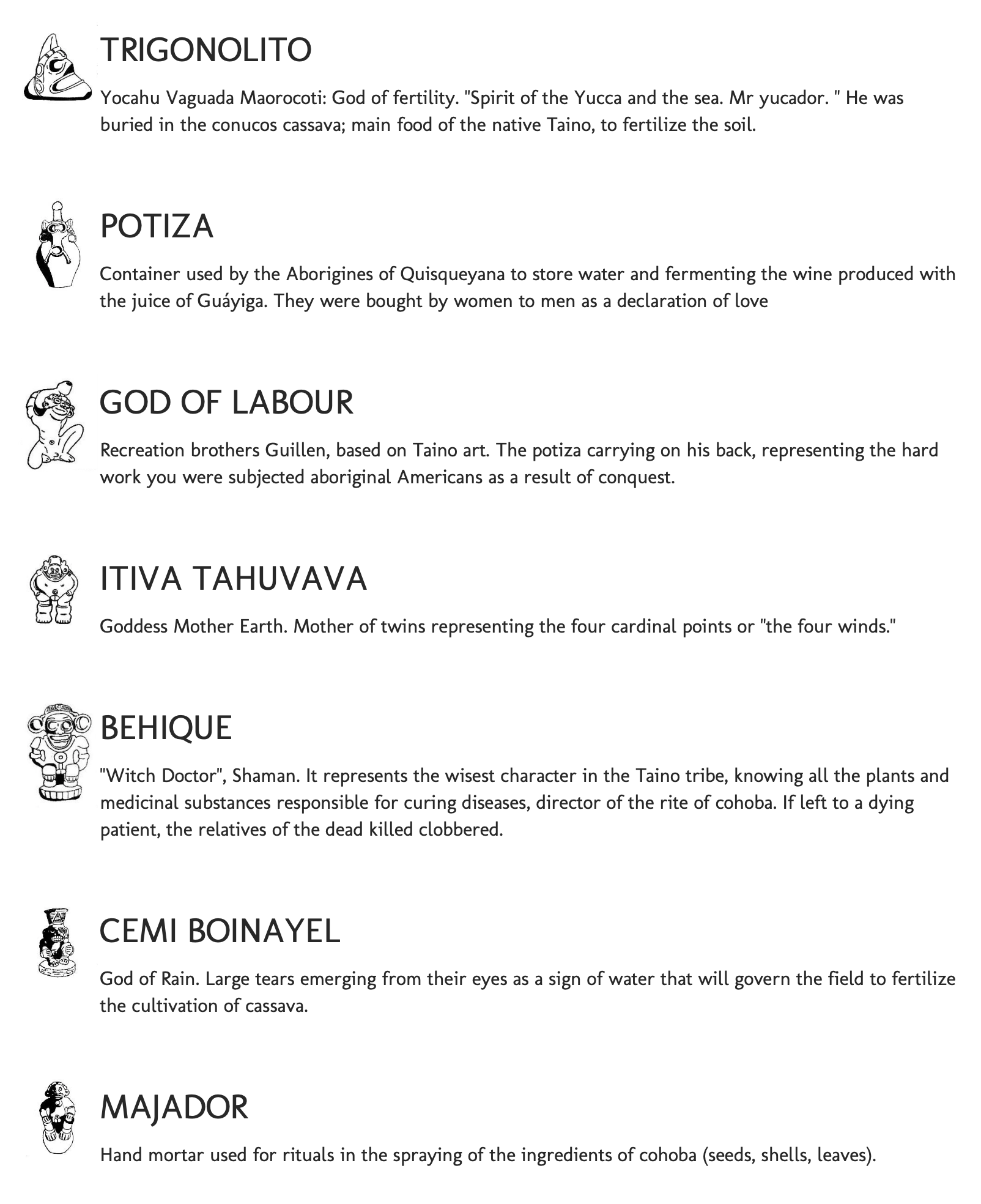
Symbols and their meanings from the Taino Museum website.
A pictograph from the Pomier Caves that depict a story about the missionaries coming to Hispaniola.
The Taíno people deserve to have their history told. They were a culturally advanced nation that had an efficient agricultural production system, a matrilineal based lineage system that led to independent women with full reign over their bodies, and even village plazas for ceremonial events and social activities. Symbols were important and prevalent in Taíno culture, and a large number of petroglyphs and pictographs can be found all over the Bahamas, Puetro Rico, and other islands of the area. The largest collection of rock art in the Carribean can be found in the Pomier Caves, which is a series of 55 caves containing approximately 6,000 drawings, carvings, and pictographs.
Recreation of a Taíno village in Cuba
Information Citations: https://en.wikipedia.org/wiki/Christopher_Columbus https://www.washingtonpost.com/history/2019/10/14/here-are-indigenous-people-christopher-columbus-his-men-could-not-annihilate/ https://en.wikipedia.org/wiki/Ta%C3%ADno https://en.wikipedia.org/wiki/Pomier_Caves
Screenshot of my Invision mood board for the Gold Rush (1858), CP Railway construction (1881-1885) Chinese Head Tax (1885-1923), and Art Nouveau (1891)
I’ll admit, this mood board was a test of my patience. Invision’s layout system is hardly organized (don’t those two usually go hand-in-hand?), my peers consistently reported that their board hadn’t saved, and the need for keywords on each photo felt like unnecessary pressure. That all being said, I am very proud of my work and recognize that even if I struggled with the platform, it is of value to explore. History is a subject that I (try to) approach without bias and I pack an immense passion for uncovering the voices and stories of-often purposely-forgotten minorities. My format is aesthetically pleasing, each source is cited, and new knowledge is jam-packed for readers to discover. I would confidently give myself a 10/10 for this assignment.
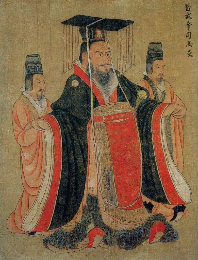
a) Spring Morning in the Han Palace by Qiu Ying depicts activities regularly done in the Han Dynasty
b) Emperor Wu is depicted here in traditional Mianfu robes
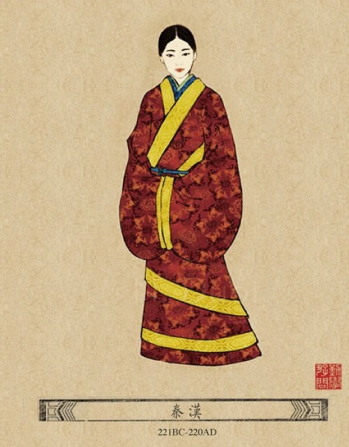
The Han Dynasty (206 BCE to 220 CE) brought forth some of the most crucial technology and fashion statements in early Chinese culture.
The term ‘hanfu’ was devised recently, and refers to a wide range of traditional, or traditionally inspired, Chinese clothing. There were four main styles worn during this time period: mianfu robes, shenyi hanfu, ruqun hanfu, and duanda hanfu.(1) ‘Dark Style’ was the top colour trend in clothing and predominantly exhibited in mianfu robes, which were exclusively worn by princes and nobles.
c) An illustration of a Chinese woman wearing curved front shenyi hanfu
Hues such as black, brown, and red would be integrated into this “coronation costume” (direct English translation of mianfu). The general public had less access to Dark Style, and so their clothing was generally dyed with pigments such as khaki or green. Everyone was able to express their culture with prints that featured important creatures like tigers, dragons, phoenixes, and astrological symbols, such as stars, the moon and auspicious clouds.
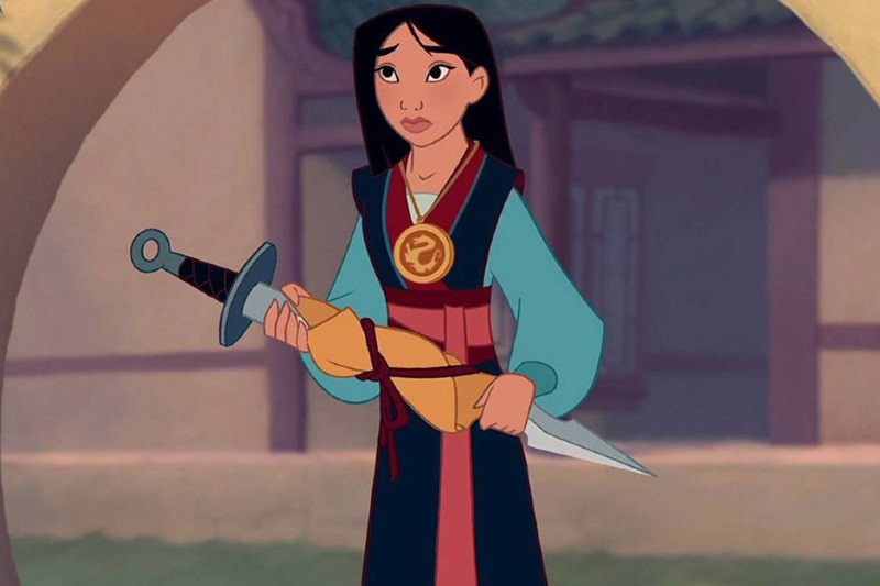
d) Mulan wears ruqun hanfu in her self titled movie by Disney
Shenyi hanfu means “wrapping the body deep within the clothes,“(2) and it was a primary article for both men and women. There were two styles of shenyi: curving and straight front. You are most likely unknowingly familiar with the next form of hanfu, ruqun, through watching Disney’s ‘Mulan’. It is one of the earliest and most basic designs of hanfu.
e) A replication of the average peasants duanda hanfu
Composed of a shirt and skirt combo, females generally had highly decorated pieces, whereas males wore simpler versions. The final clothing style of the Han period was duanda hanfu. This was composed of a shirt and pair of trousers. It was daily clothing for common people, made of cheap cloth for farmwork.
As stated earlier in the post, the Han Dynasty brought incredible inventions that changed the course of life in China. Agriculture, cartography, medicine, and many other areas of practice and industry were improved. Some notable inventions were waterwheel powered bellows, the mechanical chain pump, a pendulum seismometer, new herbal remedies, and much more. Even with all of this new technology at play, the Han Dynasty is most arguably known for discovering the paramount process of papermaking. An excerpt from Wikipedia explains how the Han would make their paper: “…mulberry tree bark, hemp, old linens, and fishnets were boiled together to make a pulp that was pounded, stirred in water, and then dunked with a wooden sieve containing a reed mat that was shaken, dried, and bleached into sheets of paper.” (3) Li Ziqi is a Chinese blogger who creates content that conveys intimacy and tranquillity and connects viewers to ancient traditional processes on serene countryside property. Watch the video embedded below to understand more about the ancient Han papermaking process.
f) Li Ziqi demonstrates the traditional Han paper making process in this YouTube video
References for information: (1)https://www.newhanfu.com/what-is-the-han-dynasty-clothing.html (2)https://medium.com/@learnchinese/chinese-shenyi-clothing-8b27655af393 (3)https://en.wikipedia.org/wiki/Science_and_technology_of_the_Han_dynast
Media Citations: a)https://www.laviezine.com/1860/top-10-most-famous-chinese-paintings/ b)https://i.pinimg.com/originals/43/6b/eb/436bebb6a79a1c2a54910357bd879ce3.jpg c)https://en.wikipedia.org/wiki/File:Shenyi.svg d)https://i.pinimg.com/originals/f7/c7/94/f7c7942555b2809a2dc71d05eba04d76.jpg e)https://www.newhanfu.com/wp-content/uploads/2020/04/What-did-ancient-Chinese-peasants-wear-3.jpg f)https://www.thisiscolossal.com/2018/01/a-relaxing-video-demonstrates-the-detailed-steps-of-making-paper-by-hand/
A view of my yearbook spread with the flaps at their starting positionView of my yearbook spread with the flaps flipped
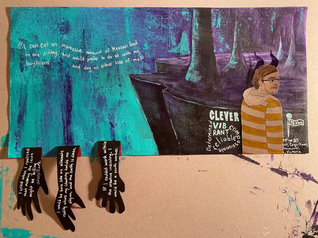
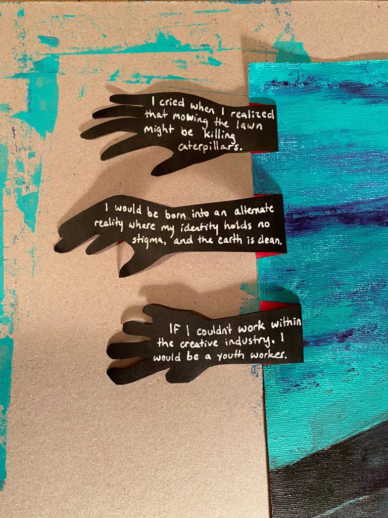
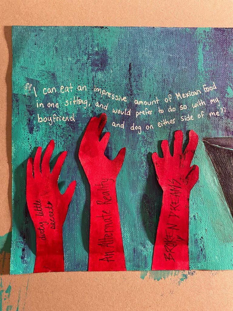
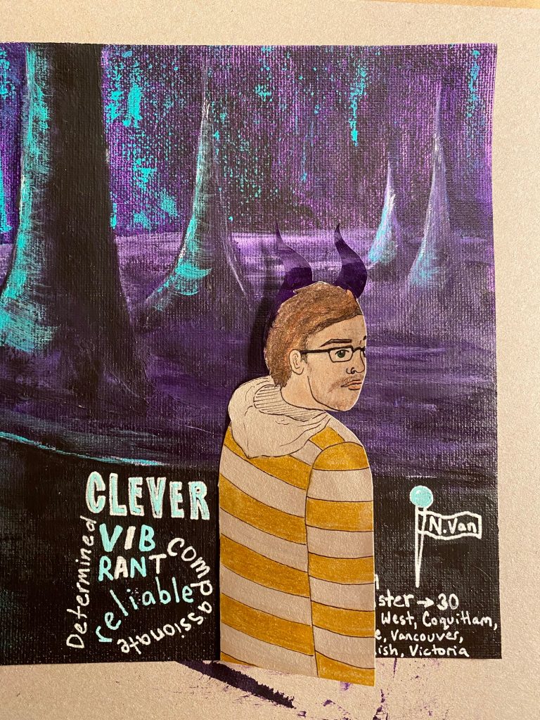
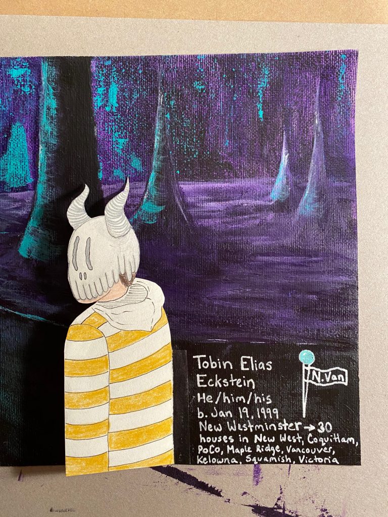
As you likely know by now, I’m Tobin, and this is my yearbook spread! Any project that requires me to talk about myself is a difficult one. As much as I’m an open book, I still like to keep a lot to myself. When we were given this assignment, I immediately thought “okay, what would make a good design?” I had plans to create a poster that would put text in paint labels and my name across a paintbrush. A beautiful design in my head, but not truly personal to me. After seeing a couple of my peers’ progress, I decided to switch my thought process to “what design would I love?” I took some inspiration from graphic novels, tv shows, and video games that I love, and came up with this. The hands are a direct copy of a previous art piece that I did; one of my favourite works. The representation of myself with the mask shows the face that I have needed to put on for survival throughout my life. Luckily, I don’t need that mask much these days. I would give myself a 10/10 for my spread because I’m proud of myself for being vulnerable and expressing the style that I want to be known for. Take a look below for close-ups of each section.


