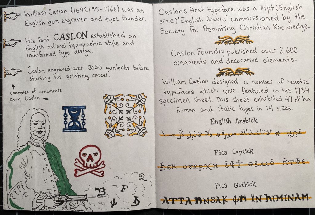
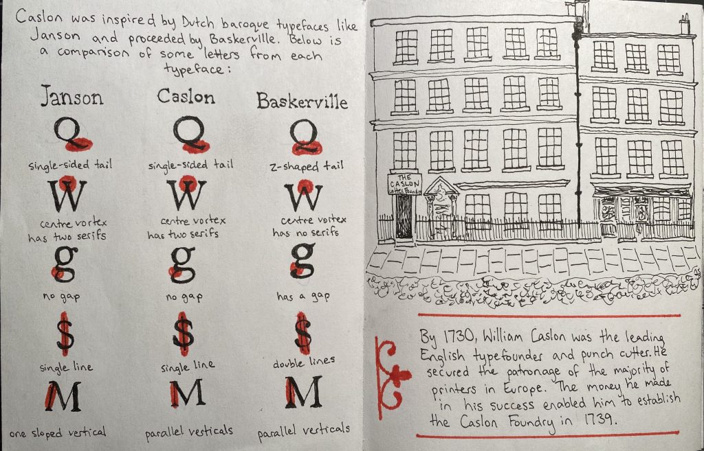
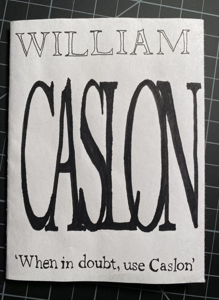
I chose to create a zine about William Caslon and his still successful serif typeface: Caslon. Serifs and ‘exotic’ (Gothic, Coptic, etc.) fonts are favourites of mine, and Caslon employed both of these elements in his typographic designs. I’m consistently searching for new information in my daily life, and this made the process of researching for this project enjoyable. I learned a lot about British and American history, as well as typography. William Caslon was born in 1692, which means not a lot of colours made it to the shelves. I decided to follow a limited colour palette for my composition, and instead focus on the geometric and informative aspects of the typeface itself. The colours I did use are reminiscent of traditional printmaking colours. Using a micron pen, I was able to give a similar feel to printing press pages. This assignment took me a lot longer than I anticipated, but I am satisfied with the result. I would give myself a 9.5/10, losing marks for the messier areas of colouring, although this is mostly due to marker colour bleeds and smooth paper not taking pencil crayon well. The formatting of my pages is engaging and full of information. Almost every illustration is accurate to historical documents.


