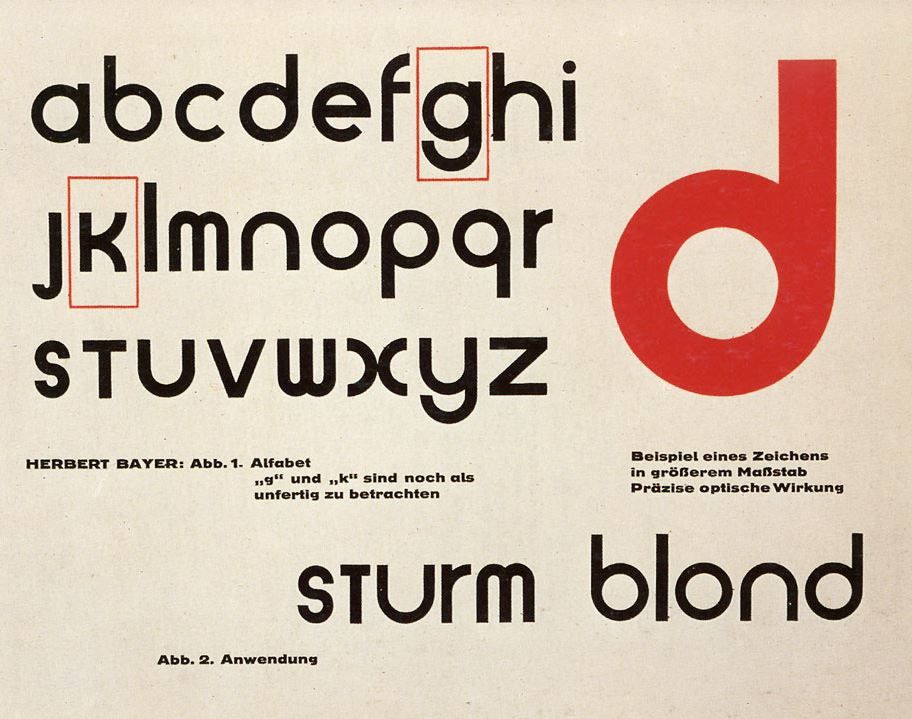

An artistic polymath best known for his creative contributions while studying and teaching at the Bauhaus school, Herbert Bayer is one of the most important names to know in terms of graphic design history. Bayer is credited with designing the experimental sans serif typeface Universal (Sturm Blond) that consisted of only lowercase letters. The differences between this and the germanic blackletter typefaces he grew up seeing were drastic.
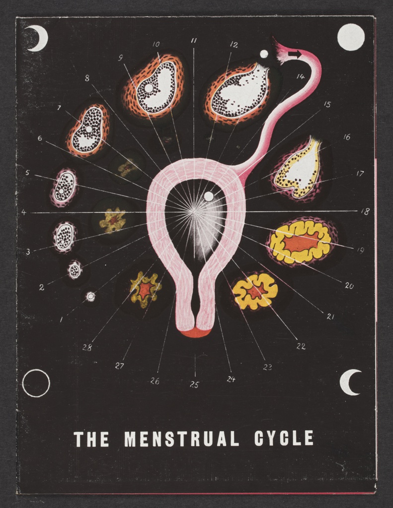
Bayer’s biology-based illustrations, as well as his architectural plans, are my personal favourites from the prolific artist. Pharma companies had started hiring artists to promote medicinal information and medications shortly after Bayer moved to the United States. The Menstrual Cycle brochure both informed readers of female* reproductive organs, the ovulation cycle, and a new hormone-based drug the commissioning company was selling. This illustration is unique compared to his usual advertising work, that of which was reminiscent of neoplasticism; primary colours, geometric shapes, and abstract while maintaining legibility.
*female in this context is referring to those who were assigned female at birth, but does reflect the thousands of transgender men and non-binary individuals who also have this anatomy
Information citations:
https://en.wikipedia.org/wiki/Herbert_Bayer
https://www.cooperhewitt.org/2019/11/25/herbert-bayer-master-of-the-universe/
Image Citations:
https://blogs.stthomas.edu/arthistory/files/2015/04/IMG_0779-300×221.jpg
https://i.pinimg.com/originals/d2/3b/57/d23b57326e99e791902436c08c6d6188.jpg
https://images.collection.cooperhewitt.org/348630_d89848f2b7aa39ea_b.jpg
http://socks-studio.com/2017/05/08/herbert-bayers-small-architectural-projects-1924/


