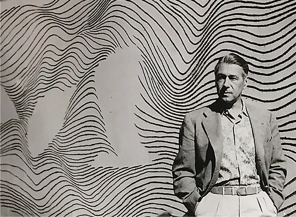
Canadian graphic artist and keyboardist Hugh Syme is known for his artwork and cover concepts for rock and metal bands
There may not be a person alive on this earth who hasn’t seen at least one of Hugh Syme’s 325 album cover designs. The Toronto-born graphic artist has designed for a wide range of musicians, from Canadian Pop Queen Celine Dion to American thrash metal forerunner Megadeth. Syme has been responsible for all of Rush’s album art since 1975’s Caress of Steel, as well as their famous Starman logo. Being a keyboardist, Hugh Syme has also played with Rush, Alice in Chains, Ian Thomas Band, Tiles, and Jim McCarthy.
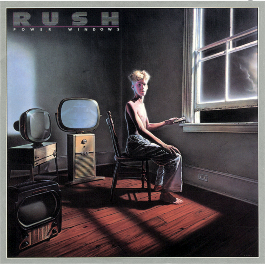
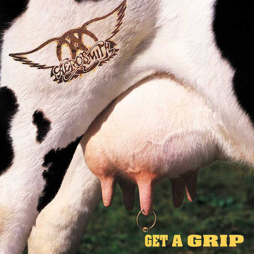
(left) Power Windows by Rush, 1985, designed by Hugh Syme (right) Get A Grip by Aerosmith, 1993, designed by Hugh Syme
“A lot of people don’t know that’s a painting-[Rush’s] Power Windows-because I worked from several images. I found the room, found the guy, and found TV, then painted the final as acrylic on canvas.”
Hugh Syme
Syme was a big fan of Salvador Dali growing up. One of his friends was fortunate enough to meet Dali at his Port Lligat studio and came back with descriptions “about Dali’s floor being strewn with reference photos,” which is when Hugh realized there was no shame in utilizing photo reference.
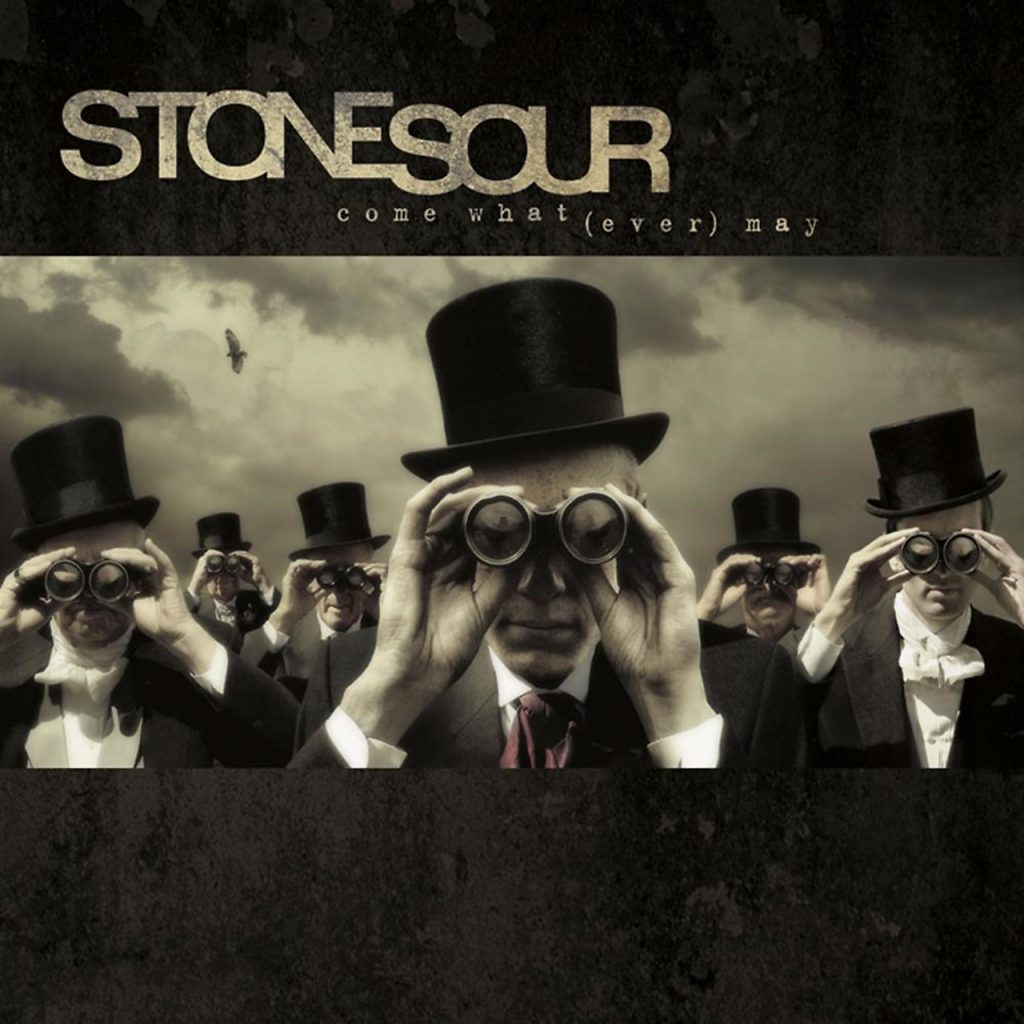
(left) The X Factor by Iron Maiden, 1995, designed by Hugh Syme (right) Come What(ever) May by Stone Sour, 2006, designed by Hugh Syme
Implementing what he calls ‘improbable reality’, as well as ‘breaking the frame’ (ie. extending past the canvas limits) has led Hugh Syme to win 5 Juno Awards, as well as being nominated 18 times.
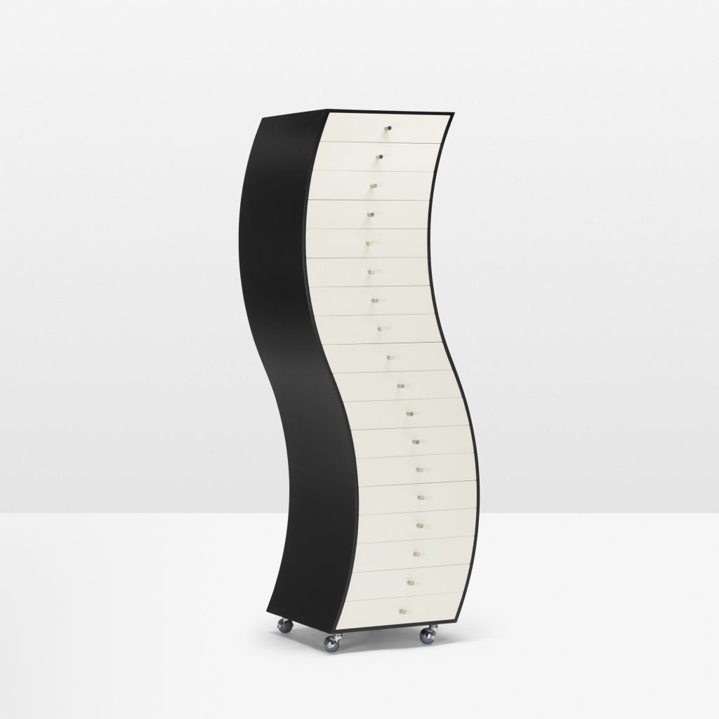
A collection of objects designed by The Memphis Group displayed in a living room setting
The Memphis Group (est. in 1980 by Ettore Sottsass) was an Italian design and architecture collective that aimed to evolve the future of design through eccentric pieces that have been described as “a shotgun wedding between Bauhaus and Fisher-Price”. Colourful and asymmetrical pieces of plastic laminate and terrazzo were often fit together for an abstract object meant to be used as decoration or furniture. Although very cheap to construct, The Memphis Group slapped hefty price tags on their works, designing them to sell to a luxury market.
Shiro Kuramata is considered one of Japan’s most important designers of the 20th century. He was born just before the start of WW2, one artist amongst a generation of creatives who changed the way Japan was viewed by the world. Towards the end of the ’80s, Kuramata was invited by Sottsass to join The Memphis Group; unfortunately, the collective was disbanded shortly after.
How High the Moon by Shiro Kuramata, wire steel mesh and nickel chrome finish, 1986
“My strongest desire is to be free of gravity, free of bondage. I want to float”
Shiro Kuramata
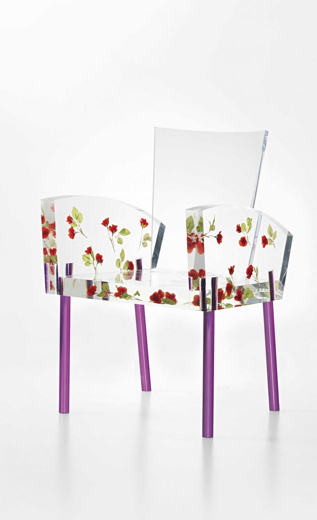
(left) Furniture in Irregular Forms by Shiro Kuramata, laminated plywood base and melamine board with steel-ball casters, 1970 (right) Miss Blanche by Shiro Kuramata, acrylic and artificial roses body with aluminum pipe legs, 1988
Shiro was often known for his usage of industrial materials, such as plexiglass and wire steel mesh, as well as the way he merged popular culture, Japanese aesthetic and the Western avant-garde.
Supergraphics in the ’70s referred to large scale geometric graphics on a wall or building, bringing movement and vibrancy to an otherwise minimalist space. Imagine the iconic Polaroid rainbow curving around one of your walls; that was the general concept of these 1970s murals.
Supergraphics at The Sea Ranch featured in Life Magazine, Barbara Stauffacher Solomon, 1966
Barbara ‘Bobbie’ Stauffacher Solomon was a front runner in supergraphics. Bobbie is a powerhouse of a woman who holds multiple degrees from some of the world’s top universities. At 23 years old, her husband, filmmaker Frank Stauffacher, died of a brain tumour, leaving her with their disabled 3-year-old child and no money. Young, beautiful and single, she reportedly fled San Francisco as all of her friend’s husbands were pining after her! Solomon took this opportunity to study at the Basel Art Institute. Being back in America with prestigious Swiss training and friends in high places, Barbara was immediately given an office and job after job. Her most famous job was actually her first: the multitude of supergraphics and painted signs featured at The Sea Ranch in California. Barbara is still living her best life in San Francisco at 93 years old.
“If Steve Jobs had known me back then, he probably would have hired me”
The 1960’s counterculture movement is known for its anti-establishment ideology, human rights advocacy, and psychoactive drug experimentation. The introduction and usage of mind-altering drugs, most commonly LSD, produced some of the most popular psychedelic artists of the ’60s, such as Wes Wilson, Victor Moscoso, and Rick Griffin.
(left to right) New Year Bash by Wes Wilson, 1966-67, Peacock Ball by Victor Moscoso, 1967, Hawaiian Aoxomoxoa by Rick Griffin, 1969
A wave of technological advances in the 1990s gave birth to the Digital Age, which allowed an even broader scope of artistic expression, thanks to computer programs. These new tools gave way to a psychedelic revival, as well as a boom in graffiti art, raves, and the production of a new drug: MDMA (Ecstacy). Here’s where Alex Grey comes in. Although he wasn’t active until the ’70s, he’s listed second on the recommended list when looking up ‘psychedelic artists’, even before Wes Wilson!
(top, left, right) Net of Being by Alex Grey, oil on linen, 2002-2007, Kissing by Alex Grey, oil on linen, 1983, Over Soul by Alex Grey, oil on linen, 1998-1997
Alex Grey was introduced to LSD by his professor at a party. Since that night, he has dedicated his life to studying and depicting every layer of the human experience: metaphysical, tangible, emotional, and spiritual. His studying went as far as preparing cadavers for dissection at Harvard Medical School’s anatomy department. Although much of his early art was created while on psychedelic influence, he and his wife rarely partake nowadays.
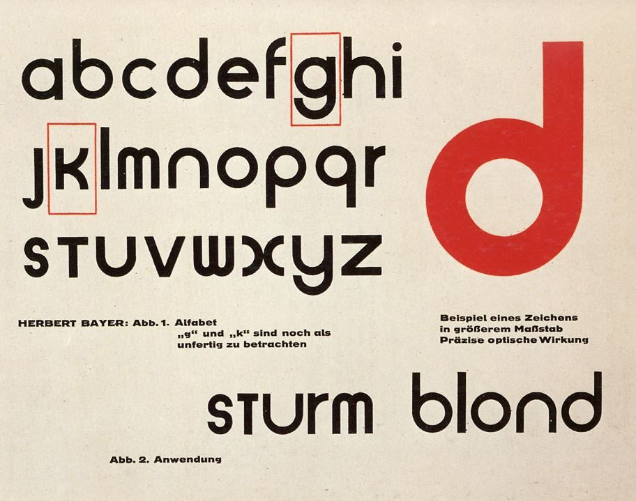
Herbert Bayer’s experimental typeface, Universal (Sturm Blond), notable for its bold, geometric form and lack of capital letters.
An artistic polymath best known for his creative contributions while studying and teaching at the Bauhaus school, Herbert Bayer is one of the most important names to know in terms of graphic design history. Bayer is credited with designing the experimental sans serif typeface Universal (Sturm Blond) that consisted of only lowercase letters. The differences between this and the germanic blackletter typefaces he grew up seeing were drastic.
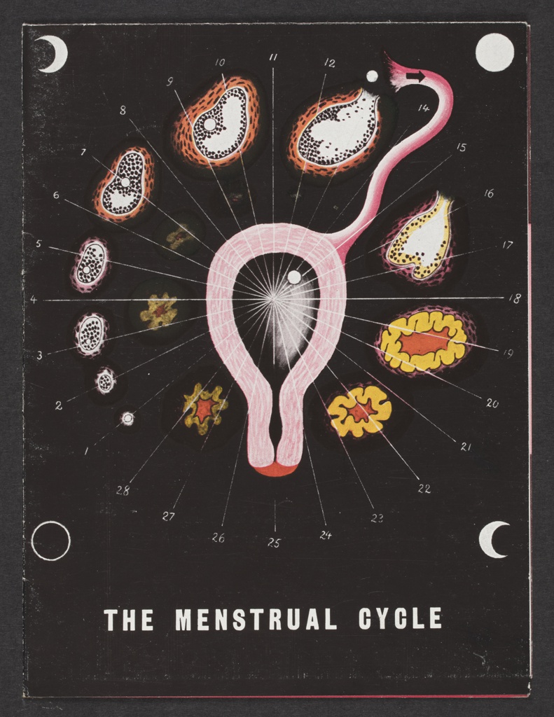
The Menstrual Cycle brochure, 1939, commissioned by Schering Corporation, to promote a hormone-based drug that helped ease period discomfort, such as cramping and irregularlity in bleeding
Bayer’s biology-based illustrations, as well as his architectural plans, are my personal favourites from the prolific artist. Pharma companies had started hiring artists to promote medicinal information and medications shortly after Bayer moved to the United States. The Menstrual Cycle brochure both informed readers of female* reproductive organs, the ovulation cycle, and a new hormone-based drug the commissioning company was selling. This illustration is unique compared to his usual advertising work, that of which was reminiscent of neoplasticism; primary colours, geometric shapes, and abstract while maintaining legibility.
*female in this context is referring to those who were assigned female at birth, but does reflect the thousands of transgender men and non-binary individuals who also have this anatomy
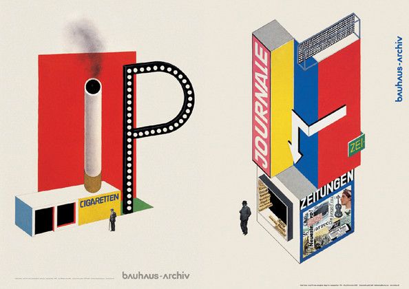
(left) Design for a Cigarette Kiosk, 1924 (right) Design for a Newspaper Stand, 1924
Information citations: https://en.wikipedia.org/wiki/Herbert_Bayer https://www.cooperhewitt.org/2019/11/25/herbert-bayer-master-of-the-universe/
I love taking the opportunity to delve further into my German heritage and so this project was more than just an assignment; it was a personal passion project. Germany has been the centre for many turning points in both the design and engineering world-think Bauhaus and the Gutenberg press-and their innovations with typography marry both of those elements together. I had many ways I could approach this infographic, but I decided to take the most important document from each pivotal typeface and stick them together as one. For Textura, we have the Gutenberg Bible, Schwabacher is a page from the Nuremberg Chronicle, Fraktur from Durer’s Triumphal Arch, and Antiqua from a German newspaper in 1941. The Eszett is just a bonus! I tried my best to match the style of each document, even bringing a lighter to my page (scary!), and I think it turned out pretty good. If I had created it over a longer period of time rather than in two sittings, I may have come out with something even better though. I definitely had to cover a couple of ink smears with white acrylic…That being said, I am still proud of the project and would give it a solid 9/10.
Death on the Boards (1992) by Robert Williams. Influences from hot rod culture, erotic novels, and underground comix are apparent in this piece.
The underground visual art movement Lowbrow or Lowbrow Art developed in 1960s Los Angeles, CA. when authorized art institutions wouldn’t recognize the work of cartoonists like Robert Williams and Gary Panter. Williams took credit for creating the term “lowbrow art” in 1979 when he “decided to give [his] book the self-deprecating title The Lowbrow Art of Robt. Williams” in direct opposition of “highbrow” culture. Other terms to describe the movement include Cartoon-Tainted Abstract Realism and Pop Surrealism. The cultural influences of the lowbrow art movement are broad, and the table below only scratches the surface.
Surrealism
Japanese Anime
Soft porn
Pop Art
Tiki and surf cultures
Hot rod culture
Underground comix
Graffiti
Pulp art
Punk music
Classic cartoons
“B” horror movies
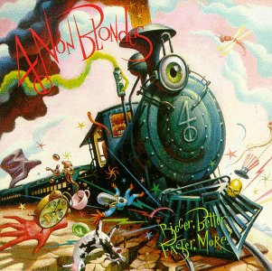
(left to right) Aerosmith’s “Love in an Elevator” (1989), Michael Jackson’s “Dangerous” (1991), and 4 Non Blondes “Bigger, Better, Faster, More!” (1992), all designed by Mark Ryden.
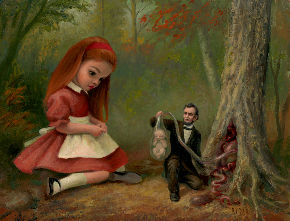
One of the biggest names to emerge from the Lowbrow movement is Mark Ryden. Although he’s influenced by the things mentioned above, he also looks to French Neoclassicist painters, Little Golden Books, and any items that evoke mystery. Ryden worked as a commercial artist from 1988 to 1998 and designed album covers for a lengthy list of prominent artists, including Red Hot Chili Peppers, Michael Jackson, 4 Non Blondes, and Aerosmith, as well as two book covers for horror novelist Stephen King.
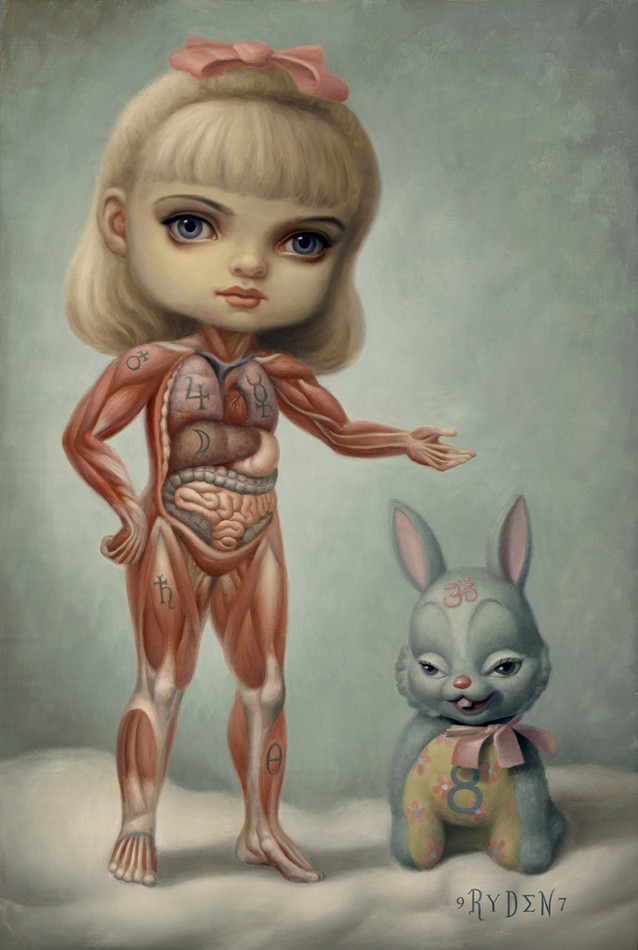
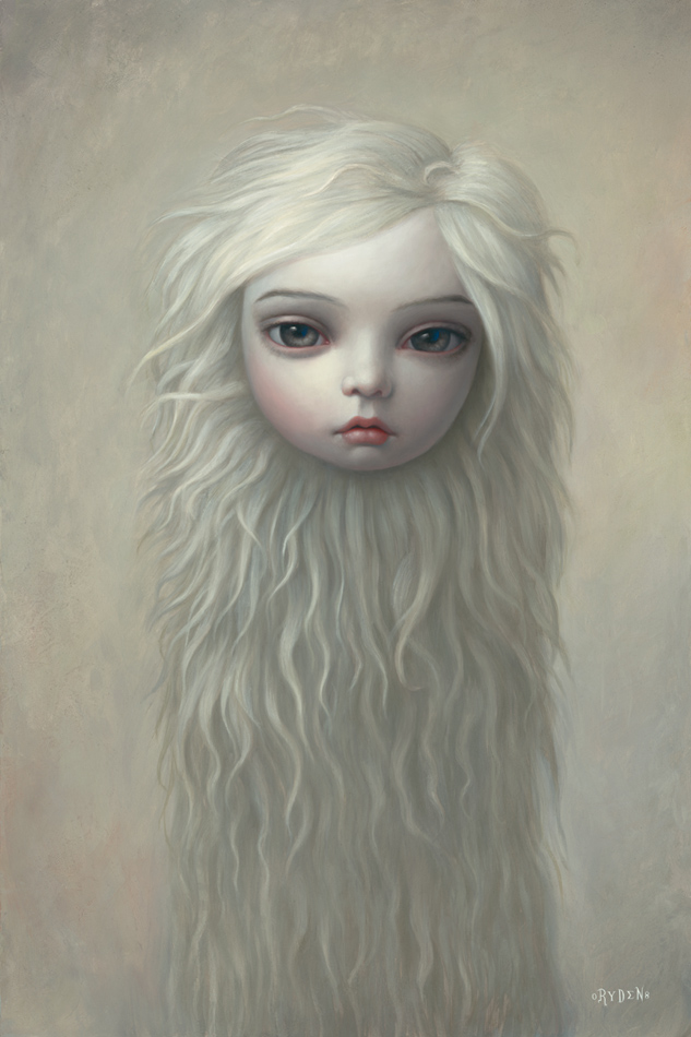
(left to right) Inside Sue (1997), Puella Animo Aureo (2001) and Fur Girl (2008) by Mark Ryden
(left to right) 61 Fetal Trapping in Northern California (2006) and Princess Praline’s Procession (for whipped cream) (2016) by Mark Ryden
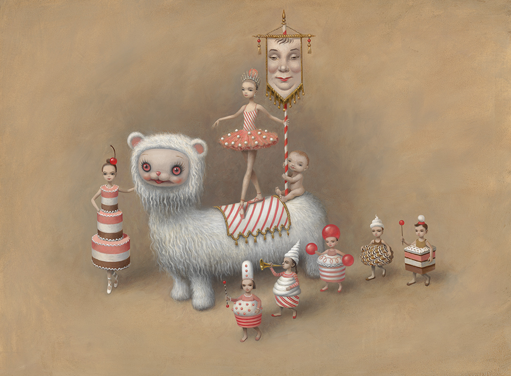
Since leaving commercial art, Ryden has built his career on exhibitions and major projects. His 1998 solo debut show was titled The Meat Show and featured pieces that commented on the disconnect between our meat in the delis to the living creatures we carve it from. Some of Ryden’s other exhibitions include Wondertoonel (2004), The Tree Show (2007), The Snow Yak Show (2009), and The Gay 90’s: Old Tyme Art Show (2010). His most recent project (2017) came in the form of a two-act ballet titled Whipped Cream; a story about a young boy who overindulges at a Vienna pastry shop and falls into a surreal delirium. His pieces generally focus in on youthful, grotesquely proportioned girls with cryptic undertones, blurring the line between nostalgic and disturbing. Mark Ryden married fellow lowbrow artist Marion Peck in 2009, and they have consequently been lovingly named “King and Queen of Pop Surrealism” and one of the ten most important couples in Los Angeles.
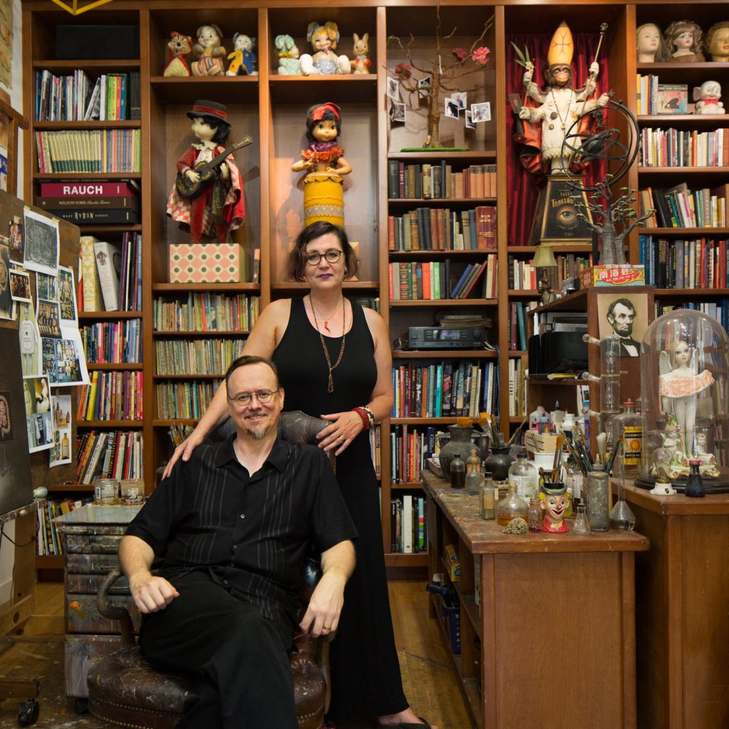
Mark Ryden and his wife Marion Peck in their home, surrounded by various influences to their work, as well as some of their own works.
In 2014, Mark Ryden released an album called “The Gay Nineties Old Tyme Music: Daisy Bell” which features popular contemporary artists singing personal renditions of Daisy Bell (Bicycle Built for Two). The proceeds went to the nonprofit organization, Little Kids Rock, that supports musical education in disadvantaged elementary schools.
“Memory Lane” is an automaton diorama by Mark Ryden, presented as part of the “The Gay Nineties West” exhibition, held on May 3, 2014 to June 28, 2014 at Kohn Gallery in LA.
Information Citations: https://en.wikipedia.org/wiki/Lowbrow_(art_movement) https://en.wikipedia.org/wiki/Mark_Ryden
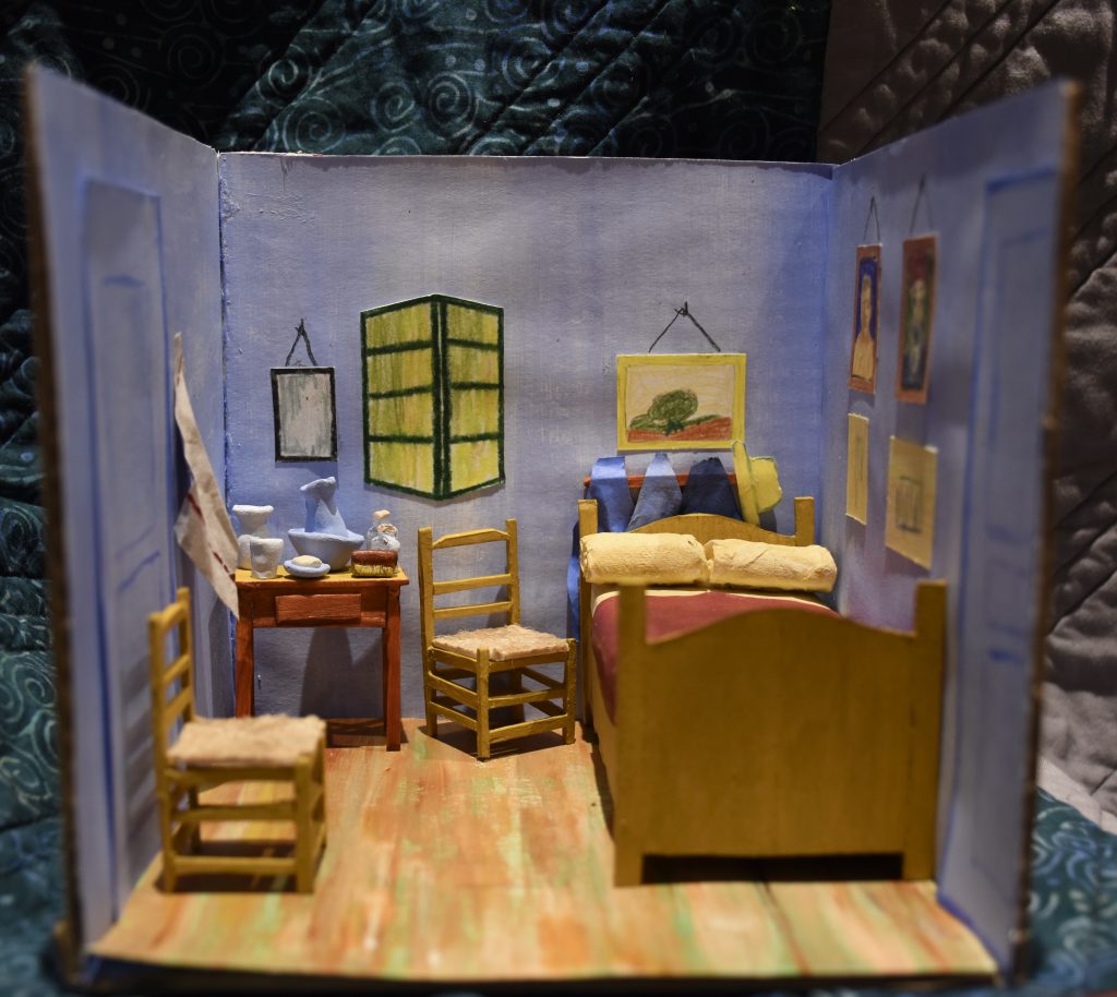
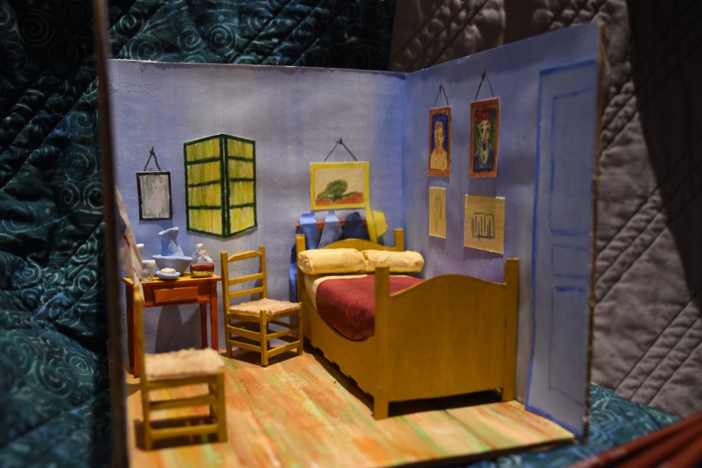
Dutch Post-Impressionist artist Vincent Van Gogh painted “Bedroom in Arles” in 1888, when he was renting a room in Arles, France, at a home dubbed the Yellow House. Van Gogh explained:
“Colour must be abundant in this part, its simplification adding a rank of grandee to the style…suggest[ing] a certain rest or dream.”
He deliberately skewed the perspective and flattened the interior, hoping to resemble a Japanese print. He believed colours expressed something beyond the description.
Tobin Eckstein
Miniature dioramas have always been a point of child-like fascination and respect for me. The ability to compose a location or moment in time within a ~1:24 scale is highly commendable. When I lived in Victoria, I unfortunately never got the chance to visit Miniature World, but one day I will get there! When reading the Historical Artifact brief I thought it would be a great chance to explore my love for tiny architecture. After weighing my options, I decided to recreate “Bedroom in Arles” by Vincent Van Gogh.
I was lucky enough to come across a couple of miniatures other people had made, which gave me a nice point of reference in regards to ratio and materials. Minus the clay, popsicle sticks, sponge, and Weldbond glue, I already owned all of the items I needed, so the project was inexpensive and accessible to create. The materials I used are listed here: scissors, hobby knife, cutting mat, cardboard, popsicle sticks, Weldbond glue, rubber cement glue, twine, acrylic paint, toilet paper, cardstock, pencil crayons, clay, a sponge, and fine liner. Cardboard is a pretty obvious choice for the framework; it’s flexible, yet structurally sound with some light reinforcement. Cardstock paper was able to handle a light coat of paint without warping for the walls and floor, and when crinkled it worked perfectly as fabric. I wanted to use popsicle sticks for the furniture because, for one, the furniture portrayed in the painting is wood, and secondly, it is lightweight and easy to glue. I used a sponge for the mattress, to give some height and a surface to place the pillows and blankets on. The pillows are made of toilet paper, as it was the plushiest material I could think to use that easily rolled up. The clay items on the table give some nice texture and dimension, as well as provide me with a chance to try a new medium! Everything else, such as the paintings and doors, were mainly a stylistic choice.
I would give myself full marks for this project. I am incredibly proud of both my effort and the final product. Moving forward, I would like to explore this art form further, and maybe I’ll even get a comission at some point!
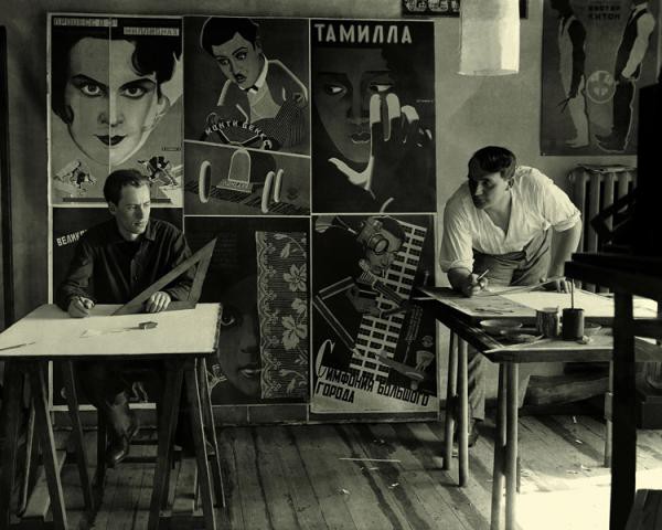
Vladimir and Georgii Stenberg working in their shared studio
Vladimir Stenberg (1899-1982) and Georgii Stenberg (1900-1933-he died in a motorcycle accident) were born in Soviet Russia to a Swedish father, who worked as a painter, and a Latvian mother. The Stenberg Brothers were initially active as sculptors, theatre designers, architects, and draftsmen; even designing women’s shoes and rail carriages. They made their biggest mark as radical poster designers during the Constructivist graphic design movement, specifically in propaganda and film posters.
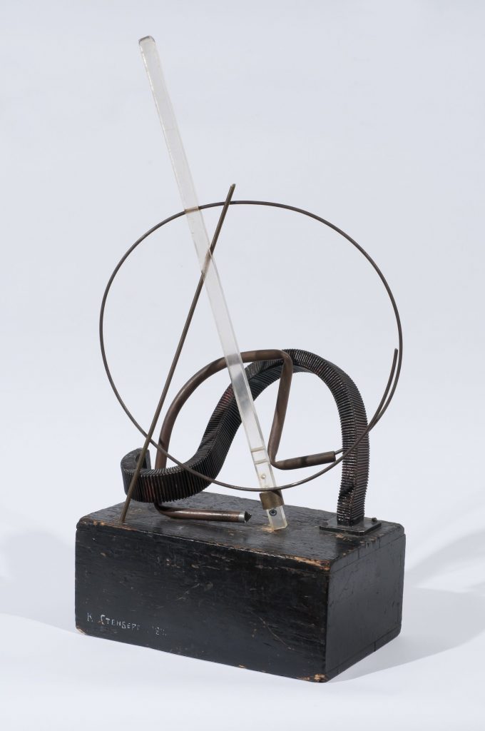
(left to right) Assemblage Polytechnique (1920) by Vladimir Stenberg, costume design from Night and Day (1926) by Vladimir Stenberg, Idol of the Public (1925) by the Stenberg Brothers.
According to communist Russia, fine art was useless. Many artists worked around this by creating avant-garde posters. Posters and film became important tools for the state because they were able to convert illiterate citizens through government-sanctioned imagery. The Stenberg Brothers started studying at the State Free Art Workshops (SVOMAS) at the beginning of the civil war (1917), which highly informed their visuals. They founded the Society of Young Artists (OBMOKhU) with some of their comrades in 1919, which aimed to design compelling posters for the Bolshevik cause. In fact, the distribution of propaganda was considered a desirable and honourable practice in Russia at the time, and the Stenbergs excelled at this.
Our primary device is montage…[but] we do not neglect Construction. Ours are eye-catching posters which, one might say, are designed to shock. We deal with the material in a free manner…disregarding actual proportions…turning figures upside-down; in short, we employ everything that can make a busy passerby stop in their tracks.
Vladimir Stenberg (1928)
The Stenberg Brother’s first film poster, for a film called The Eyes of Love (1923)
A BROTHERLY BOND In the book “Stenberg Brothers: Constructing A Revolution in Soviet Design” written by gallery curator and Professor of Design History and Theory, Christopher Mount, it is stated that Georgii and Vladimir Stenberg “shared from an early age an unusually strong fraternal bond.” They would work on their posters simultaneously, rushedly alternating positions around the piece until it was completed. All of their joint works featured the signature 2 Stenberg 2, supporting the idea of the collective rather than the individual, as proposed by the Bolsheviks.
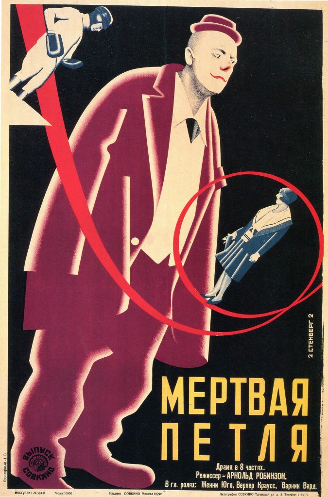
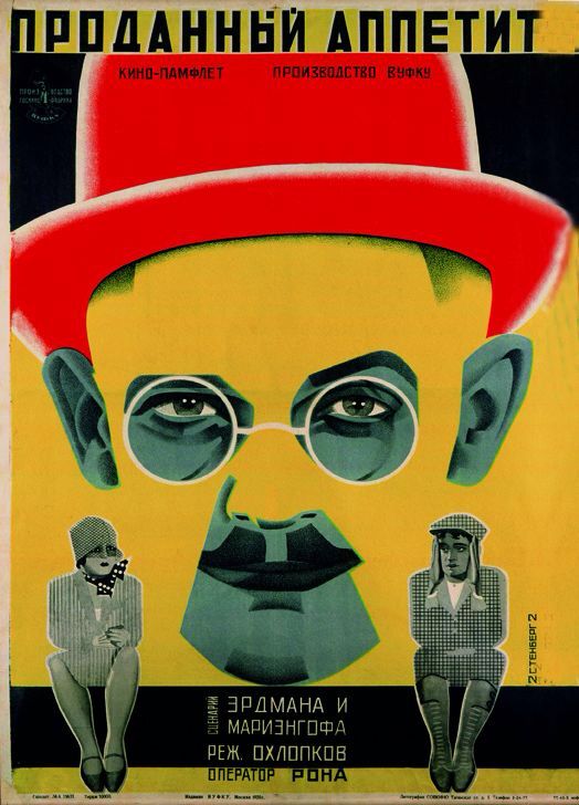
(Left to right) The Death Loop (1929), The Last Flight (1929) and The Sold Appetite (1928) film posters by the Stenberg Brothers
The Stenberg Brother’s posters are defined by an exaggerated use of scale, a sense of movement, and dynamic use of colour and typography. They would often base the visuals on stills from the films. Many of their peers and other artists in the field ended up imitating them due to the effectiveness of their designs. When Josef Stalin declared socialist realism as the official artistic medium, the brothers became little known and almost lost to history.
Information Citations: https://thecharnelhouse.org/2015/08/05/the-stenberg-brothers-and-the-art-of-soviet-movie-posters/ https://www.moma.org/interactives/exhibitions/1997/sternbergbrothers/ https://en.wikipedia.org/wiki/Constructivism_(art)#Constructivist_graphic_design https://en.wikipedia.org/wiki/Stenberg_brothers https://tumblr.austinkleon.com/post/134238069611 https://www.moma.org/documents/moma_catalogue_250_300063174.pdf
Surrealism (b. 1920) was a cultural movement that sought to unleash the potential of the unconscious mind and unite it with the conscious creative, often resulting in juxtaposed, bizarre images. The leaders of this movement were Salvador Dali and Rene Magritte. You’ve likely heard of Frida Khalo, as well, but do you know any other female names from the surrealist movement? How about in art history; can you list more female artists than you can count on one hand? Let’s change that.
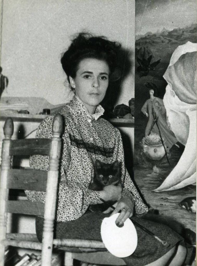
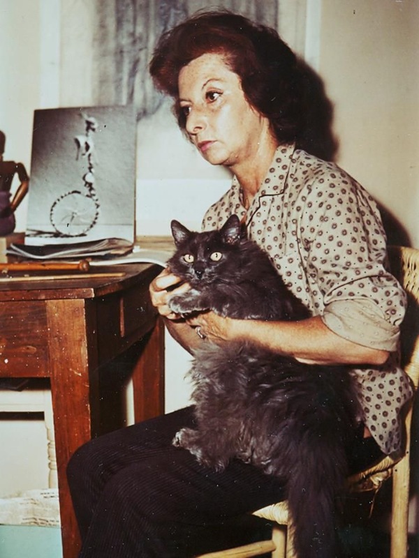
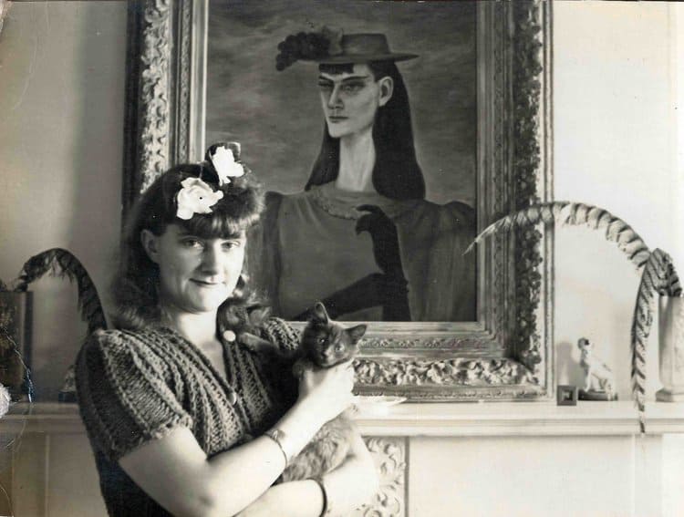
All three artists seemed to have close relationships with their cats and had portraits taken with them (Left to right) Leonora Carrington, Remedios Varo, and Gertrude Abercrombie
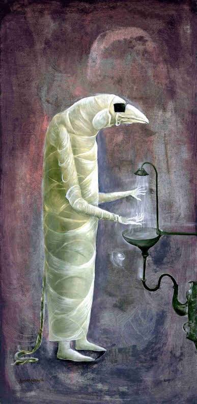
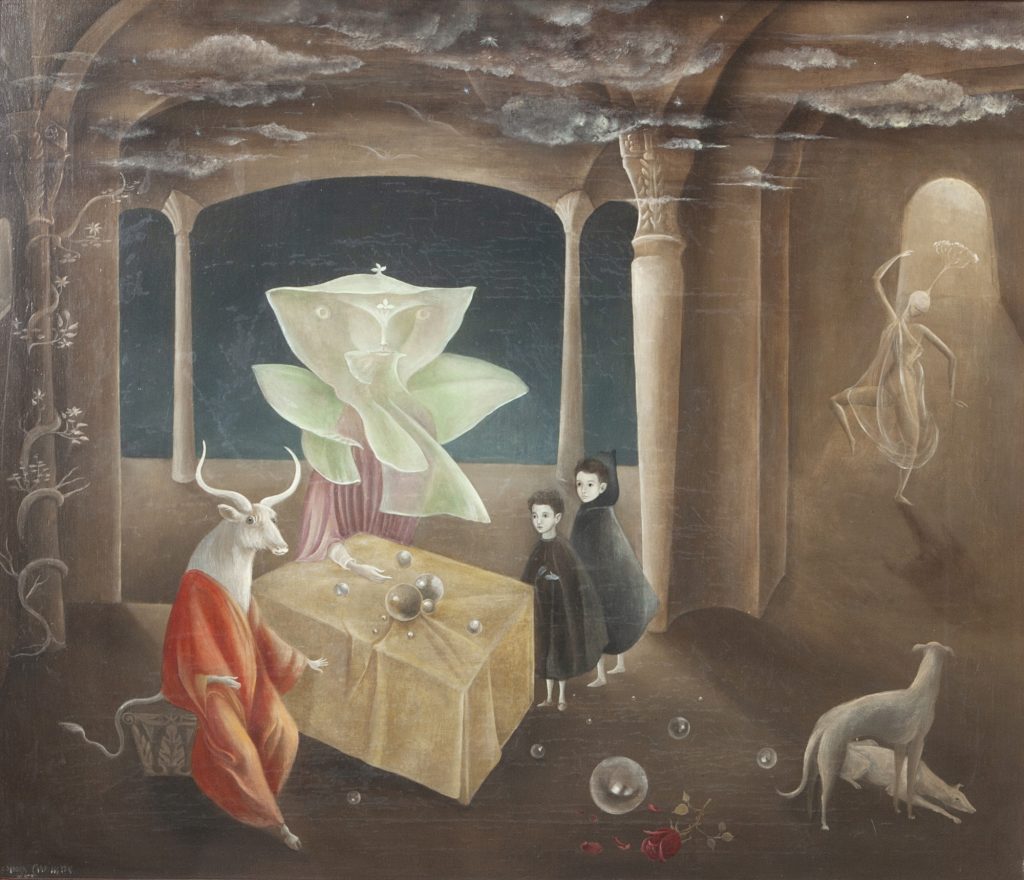
Leonora Carrington (April 6, 1917 – May 25, 2011) was a British-born Mexican artist, and one of the last survivors of the Surrealist movement. At 19 years old, she was introduced to leading surrealist Max Ernst, who was 27 years her senior and married, at a dinner party. They ran away to Paris, but that was short-lived and Leonora ended up in a psychiatric ward with an eating disorder and paralyzing anxiety. These were very dark times but she was eventually rescued by her nanny in a submarine (and this is not the craziest story from Leonora’s life). In her memoir, Down Below, Carrington recounts the horrific experiences she faced in the ward: “ruthless institutional therapies, sexual assault, hallucinatory drugs, and unsanitary conditions“. Shortly after this, she became an outspoken socio-political activist and was creating her best art. Carrington stated that: “I painted for myself…I never believed anyone would exhibit or buy my work.” She would build up small brushstrokes into stunning imagery that focused in on alchemy, magical realism, symbolism, and her personal experiences of female sexuality.
(top left to bottom right) Leonora Carrington is known for her “dreamlike weirdness” in paintings such as Portrait of Max Ernst (1939), The Giantess (1947), The Surgeon (1978), And Then We Saw the Daughter of the Minotaur (1953) and The Lovers (1987)
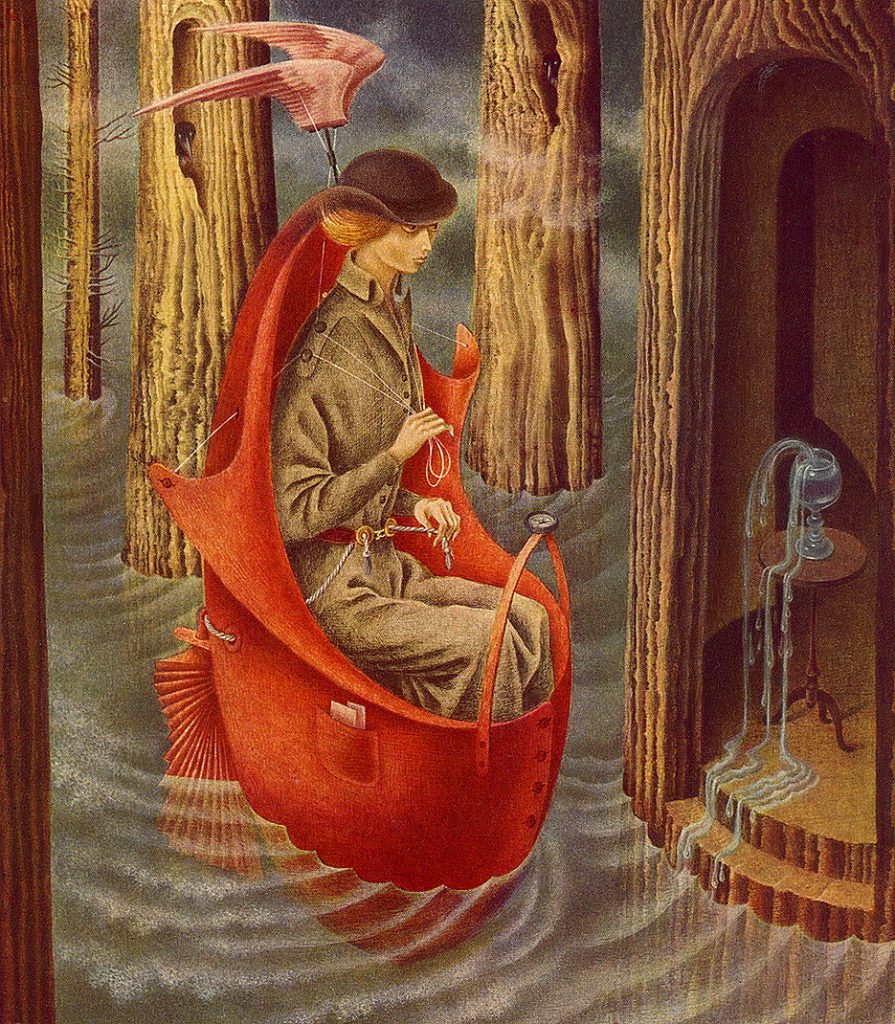
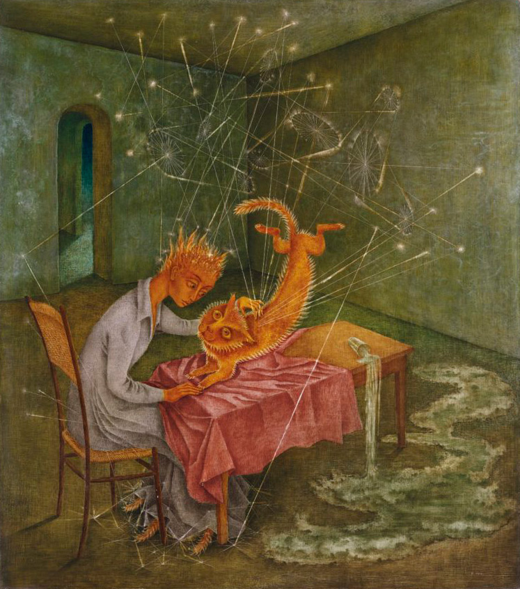
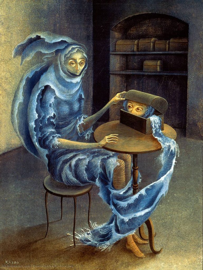
Remedios Varo (Dec 16, 1908 – Oct 8, 1963) was a Spanish-Mexican surrealist painter who had imagery like no other. She showed promise as an artist early on, and so her father, a hydraulic engineer, would have her copy the technical drawings of his works to improve her understanding and execution of straight lines, radii, and perspective. Unlike most women of her time, Varo was encouraged to be individual and expressive, and her father gifted her with science and adventure books to broaden her education. Her works often featured androgynous figures in tight spaces, which led to a feminist interpretation of her work, although she didn’t necessarily define them as such. The main influences on her work include religion, nature, magic, and her fascination with science. Varo was friends with Leonora Carrington, and they had a tight bond that served as another influence for both of them. When Varo passed away from a heart attack, she was referred to as “the sorceress who left too soon“.
(top left to bottom right) Exploring River of the Source Orinonoco (1959), Creation of the Birds (1957), Sympathy (1955), Abut (1959) and Papilla Estelar (1958) by Remedios Varo, who believed that “The dream world and the real world are the same.”
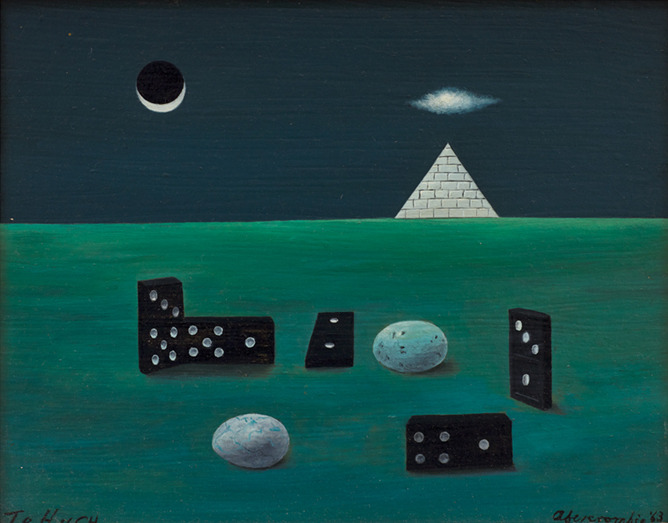
Gertrude Abercrombie (Feb 17, 1909 – July 3, 1977) was known as “the queen of the bohemian artists” due to her presence in the Chicago jazz scene, an aspect that highly influenced her work. She was close friends with musicians such as Dizzy Gillespie, Charlie Parker, and Sarah Vaughan, and was an improvisational pianist herself. After attending an art fair, selling some works, and being told by Gertrude Stein she needed to “draw better”, Abercrombie started to take her art more seriously. She had a loose, painterly style that depicted barren landscapes, sparsely furnished interiors, and women with connections to sorcery, all of which were self-portraits. Gertrude stated, “I am not interested in complicated things nor in the commonplace, I like to paint simple things that are a little strange.” Her health declined in the late 50s due to financial losses, alcoholism, and arthritis, which led to her reclusive lifestyle towards the end. In a retrospective exhibition held just before her death, she said: “I will go out either in a blizzard or in a blaze of glory.” A poetic and humorous statement, just like many of her pieces.
(top left to bottom right) Birds, Eggs and Dominoes with Pyramid (1963), The Courtship (1949), Split Personality (1954), and Design for Death (Charlie Parker’s Favourite Painting) (1946) by “Queen of the Bohemian Artists” Gertrude Abercrombie


:format(webp):no_upscale()/cdn.vox-cdn.com/uploads/chorus_asset/file/9965699/Screen_Shot_2018_01_02_at_1.55.35_PM.png)