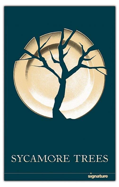
The poster for Ricky Ian Gordon and Nina Mankin’s play, Sycamore Trees, portrays the Gestalt Theory element of figure/ground beautifully. Human minds can process multistability: the perception of two images alternating between foreground and background due to the presence of multiple equilibrium points. Deliberate spacing between the shards of a broken plate creates the illusion of a sycamore tree standing strong.
The icon for Google Images is built from four components that are linked only through shape and size. The reason our brain reads these semi-circles as a unified icon is due to the element of similarity, which comes from the Gestalt Theory. If any of these shapes were replaced with an animal of the corresponding colour, the icon would not be as pleasing and seamless as it is now.
The element of closure from Gestalt Theory refers to a lack of outline around a shape, which forces our minds to fill in the gaps to make it readable. Long revered video game brand, PlayStation, clearly demonstrates closure in their logo. The letter P is stood upright, and the letter S is laying flat behind it, like a shadow. Effectively broken into three pieces, the PS is read as such, regardless of its breaks.
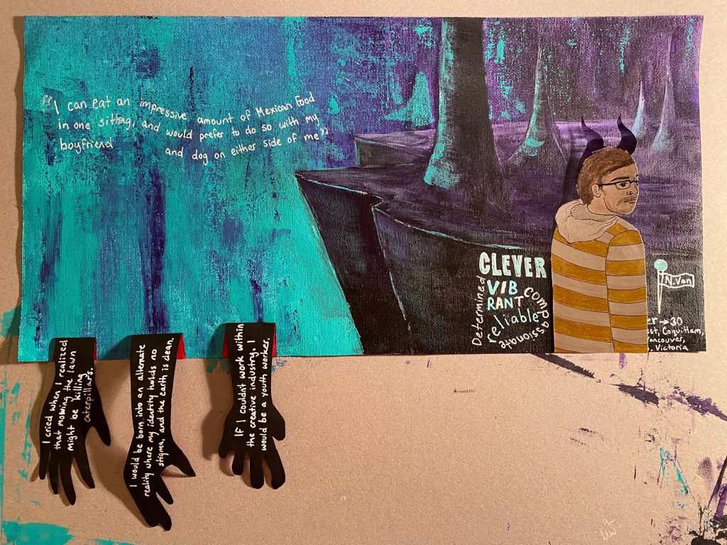
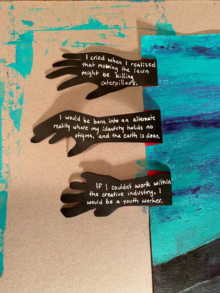
A view of my yearbook spread with the flaps at their starting positionView of my yearbook spread with the flaps flipped
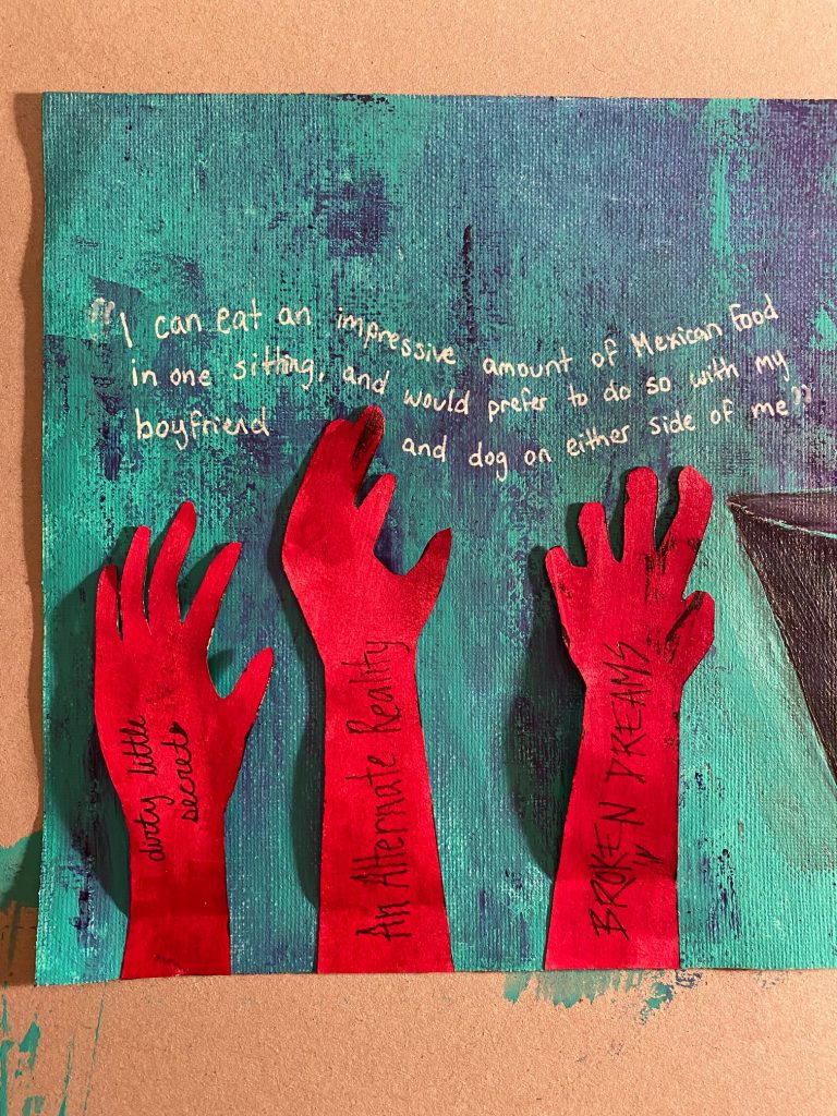
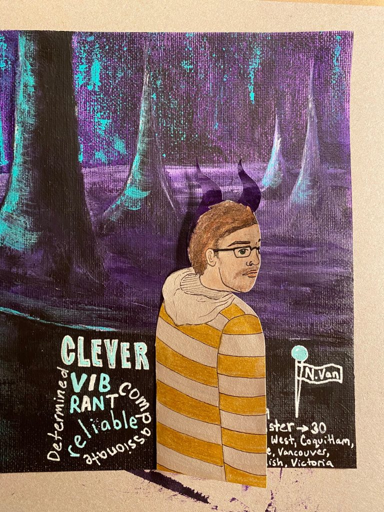
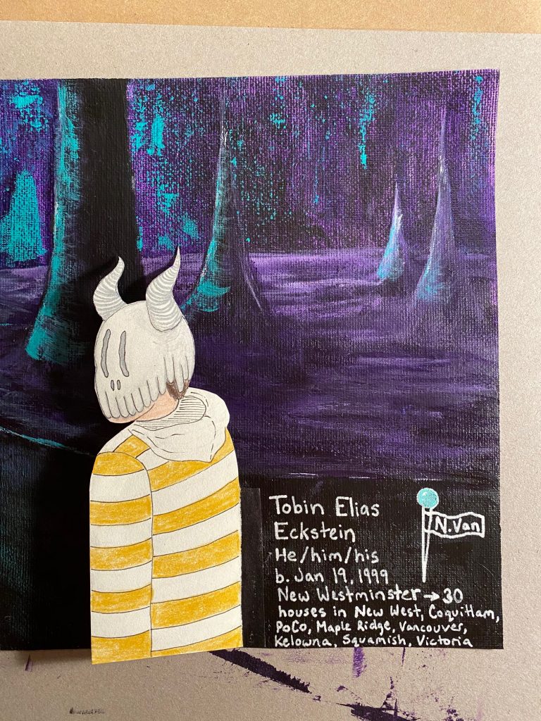
As you likely know by now, I’m Tobin, and this is my yearbook spread! Any project that requires me to talk about myself is a difficult one. As much as I’m an open book, I still like to keep a lot to myself. When we were given this assignment, I immediately thought “okay, what would make a good design?” I had plans to create a poster that would put text in paint labels and my name across a paintbrush. A beautiful design in my head, but not truly personal to me. After seeing a couple of my peers’ progress, I decided to switch my thought process to “what design would I love?” I took some inspiration from graphic novels, tv shows, and video games that I love, and came up with this. The hands are a direct copy of a previous art piece that I did; one of my favourite works. The representation of myself with the mask shows the face that I have needed to put on for survival throughout my life. Luckily, I don’t need that mask much these days. I would give myself a 10/10 for my spread because I’m proud of myself for being vulnerable and expressing the style that I want to be known for. Take a look below for close-ups of each section.
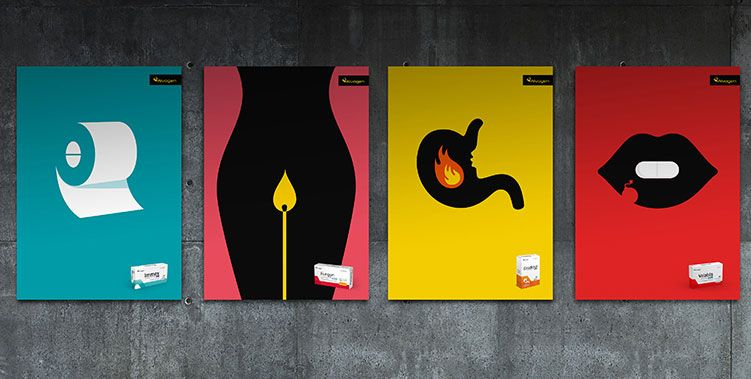
Alvogen, a global, privately owned pharmaceutical company, partnered with the Icelandic advertising agency, Kontor Reykjavík, and Israeli artist, Noma Bar, to create eye-catching posters for their over-the-counter medications. Due to strict advertising regulations, the ads were unable to state details of medications through text, so the designers focused on imagery. The expression of ailment, and subsequent relief, is flawlessly communicated on each poster through the use of recognizable shapes.
Godsend is the unconventional coming of age story that follows 18-year-old Californian, Aden Sawyer, as she takes her teenage rebellion to another level with a plan of studying Islam at a madrassa in Peshawar, Pakistan, disguised as a young man. John Wray explores how far Aden will take her religious dedication-and submission-as her journey for personal fulfillment takes her from Islam student to Islamist militant. The use of space on the cover of this novel expresses the way Aden can peer out of her disguise without allowing others to see what she is hiding. The black surrounding all but her eyes may also signify the side of her faith that she chooses to ignore; the practice of veiling women from the public eye. When equipped with the plot of the story, Godsend’s cover creates an impactful statement that is easily translated through the element of space.
In the memoir titled Educated, Tara Westover recounts leaving her survivalist Mormon family in order to gain opportunities and broaden her understanding of the world through a college education. The novel cover’s graphic employs a clever use of size to portray a small figure, assumed to be Westover, hiking a mountain range within the shape of a pencil. What makes this image so effective is the idea that her freedom to explore and create would never have been possible without her schooling.
This striking use of black and white lines comes from the movie poster for Spike Lee’s BlacKkKlansman (2018). The film follows the story of Ron Stallworth (John David Washington), the first African-American to be hired in the Colorado Springs Police Department, and his infiltration of the local Klu Klux Klan chapter. The central theme of racism is evident. White lines of the American flag, a flag that supposedly represents freedom and opportunity, is holding the lead actor back from the forefront. Due to the nature of his career, the lines can be read both as a representation of race, as well as the unjust treatment of the black community from law enforcement.