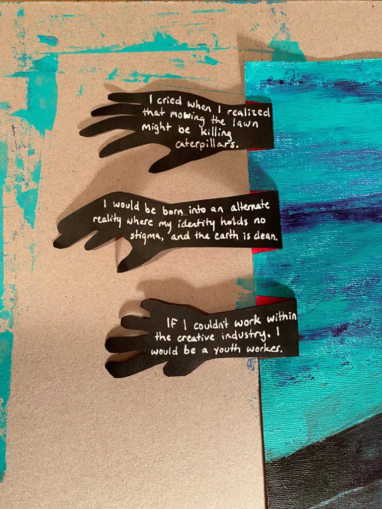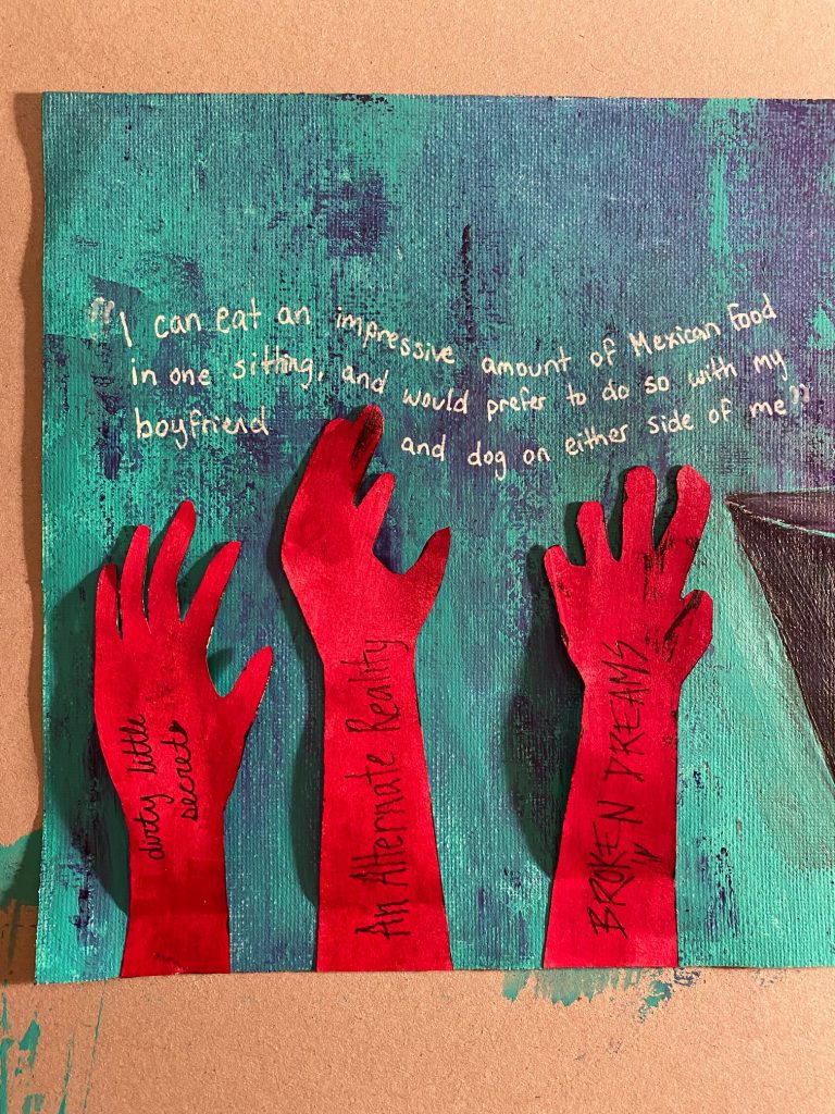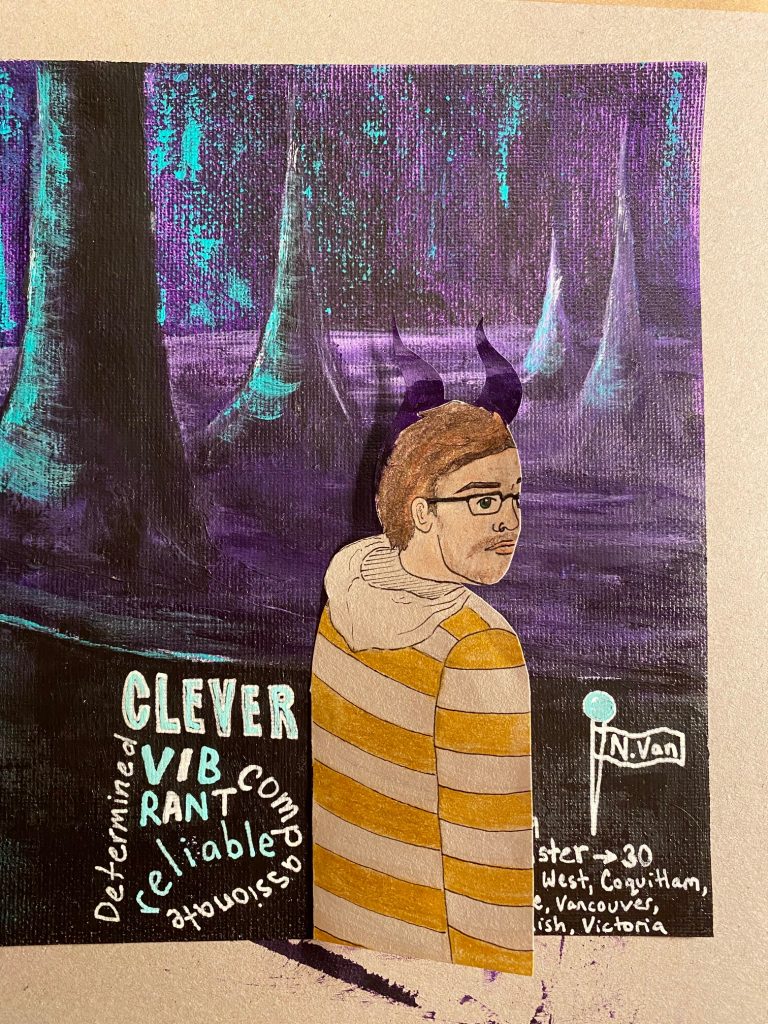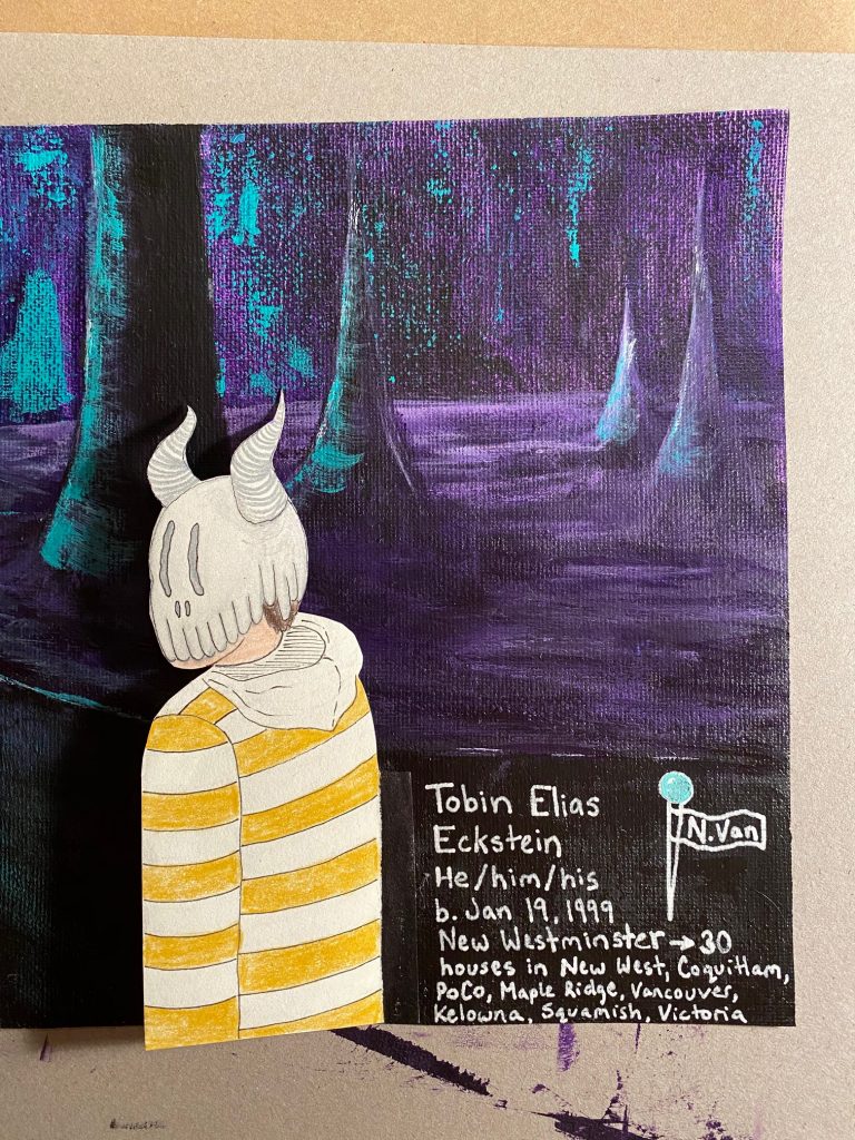
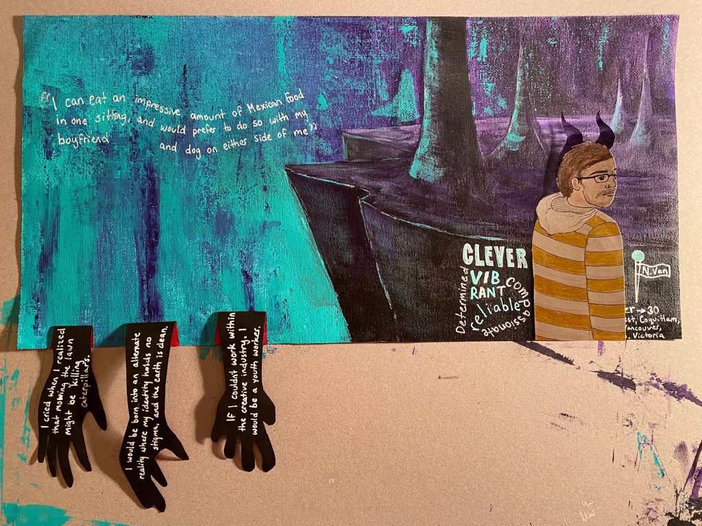
As you likely know by now, I’m Tobin, and this is my yearbook spread! Any project that requires me to talk about myself is a difficult one. As much as I’m an open book, I still like to keep a lot to myself. When we were given this assignment, I immediately thought “okay, what would make a good design?” I had plans to create a poster that would put text in paint labels and my name across a paintbrush. A beautiful design in my head, but not truly personal to me. After seeing a couple of my peers’ progress, I decided to switch my thought process to “what design would I love?” I took some inspiration from graphic novels, tv shows, and video games that I love, and came up with this. The hands are a direct copy of a previous art piece that I did; one of my favourite works. The representation of myself with the mask shows the face that I have needed to put on for survival throughout my life. Luckily, I don’t need that mask much these days. I would give myself a 10/10 for my spread because I’m proud of myself for being vulnerable and expressing the style that I want to be known for. Take a look below for close-ups of each section.
