TOBIN ELIAS ECKSTEIN
3RD YEAR CAPILANO UNIVERSITY (IDEA) STUDENT
DESIGN | ILLUSTRATION | INTERACTIVE
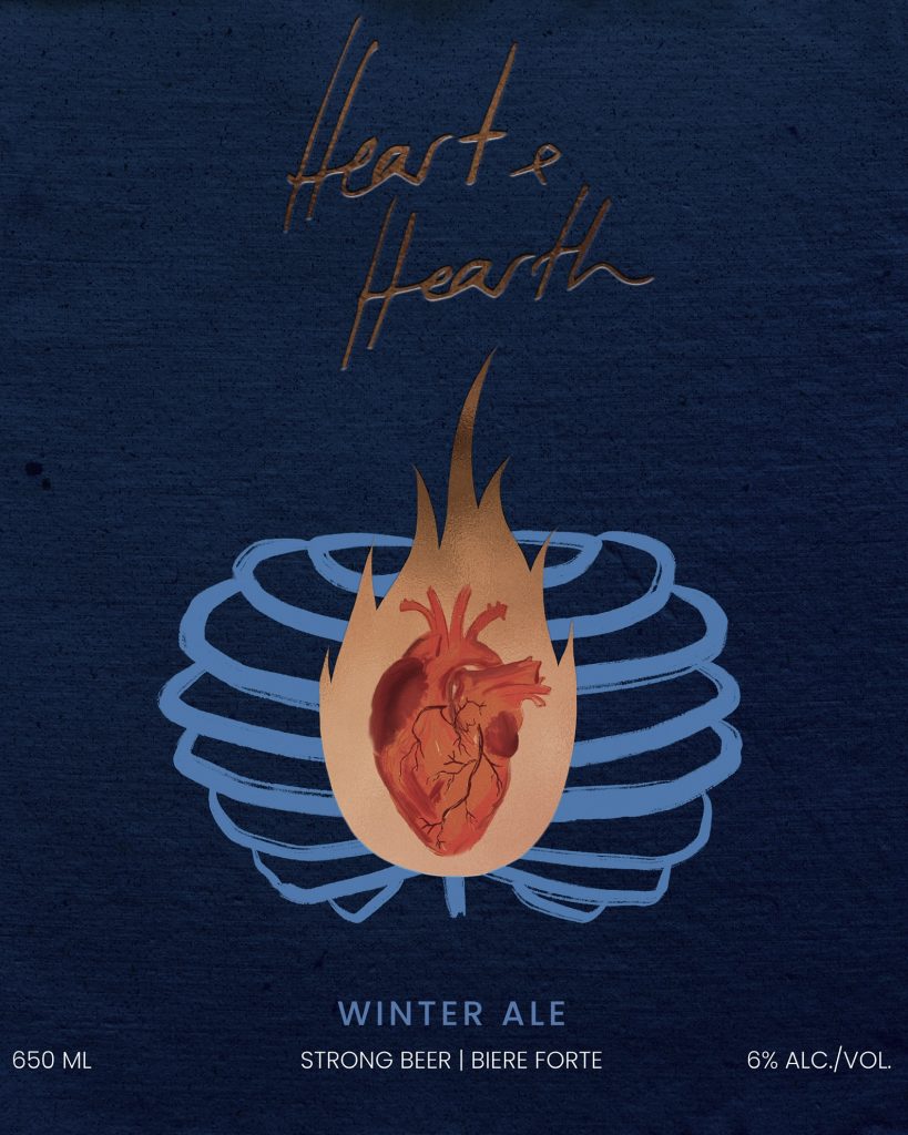
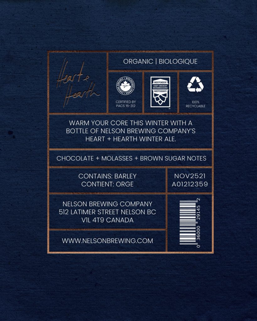
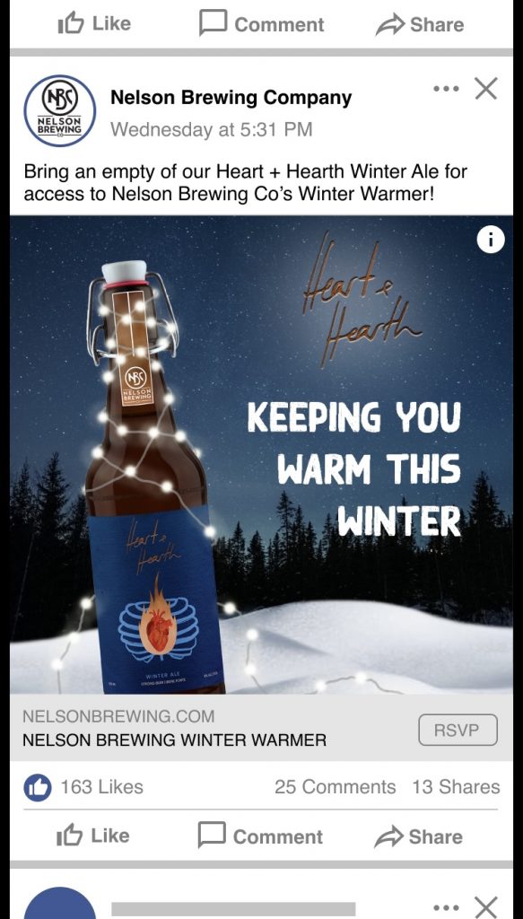
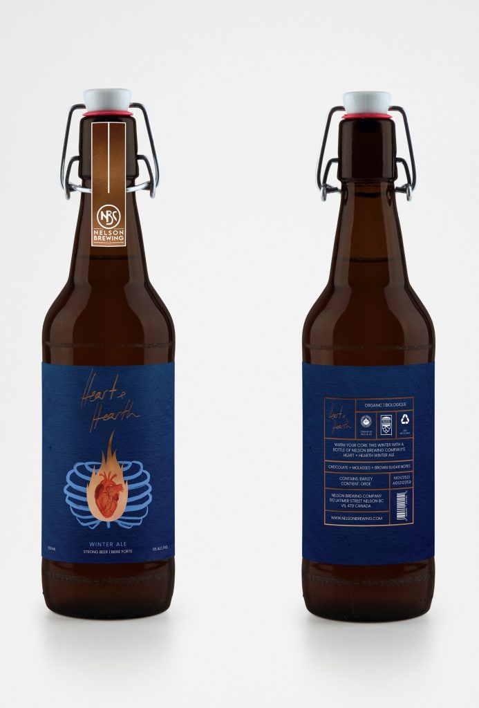
Heart & Hearth
100 Project
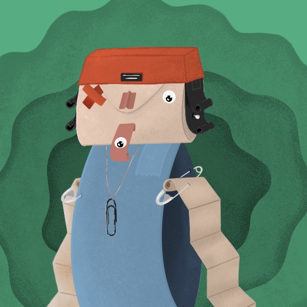
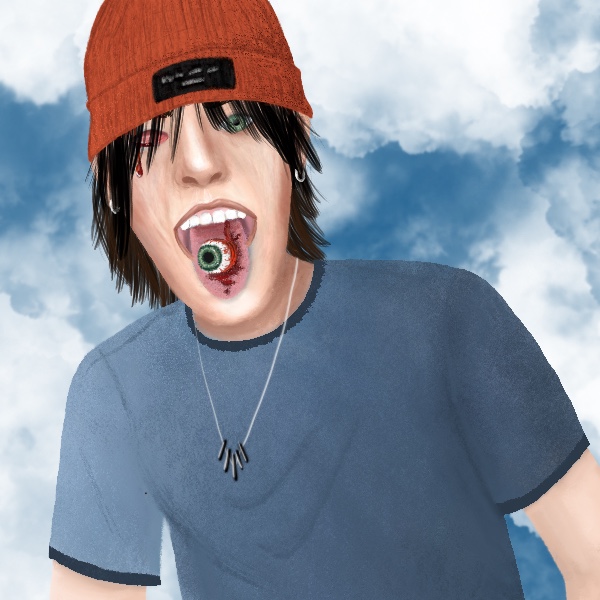
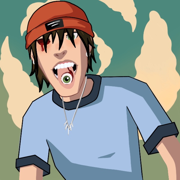
My theme for this project was 100 Renditions of the Same Drawing. I wanted to explore different techniques of digital illustration to broaden my own style, as well as improve my efficiency in the iPad program Procreate. Featured below are just a handful of the squares that I illustrated.






Service Dog Fabric Design
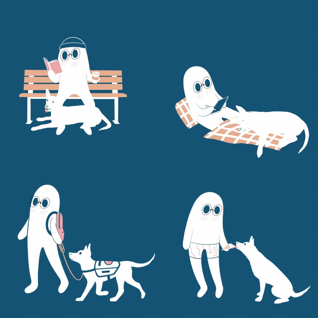
My dog, Salix, is a psychiatric service dog in-training (sdit) and it is very helpful for him to wear something plainly stating this in order to mitigate the number of people distracting him. Below is an in-progress fabric pattern that will be used for Salix’s vest, which will feature patches such as “service dog in-training” and “do not pet”. Although the characters are generic, they are representations of me and Salix enjoying our days together as a team!
Book Cover Design
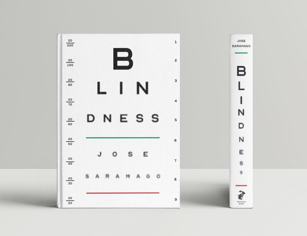
The purpose of this assignment was to design a book cover and spine that uses typographic expressionism as its main point of communication. With my chosen title being ‘Blindness’, using an eye chart was an obvious thumbnail sketch, and yet one of my least favourites to start with! My instructor pushed me to explore this idea further, and I’m very glad that I did! I’m very proud of my execution with this design and it’s given me a lot more confidence in my conceptual ideas and design ability moving forward.
Documentary Premiere Poster
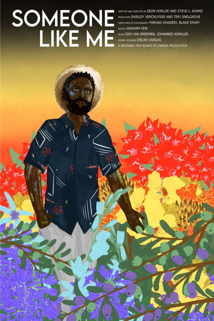
I was commissioned by Sean + Steve to design an alternative poster for their documentary, Someone Like Me, a film that follows a group of queer strangers who are tasked with supporting the resettlement of Drake, a gay Ugandan man seeking asylum in Vancouver, Canada. I didn’t want any aspect of Drake’s identity to be placed as more crucial than the other, and so I featured a sort of rainbow flag through South African foliage to help to soften the hyper-masculine image that all men, but especially black men, are expected to maintain. The gradient in the background goes from black, yellow to red; the colours of the Ugandan flag.
Psychedelic Album Cover
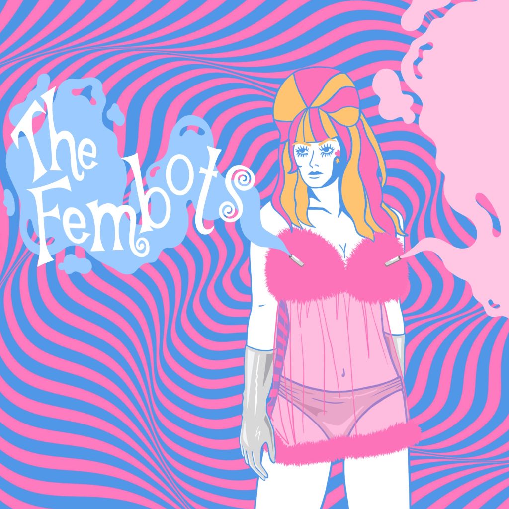
I’m not especially knowledgeable on the ’60s…my parents were teens in the grunge era. I had Beastie Boys and Tool, not The Beatles or The Doors. So, all of the 1960’s education I received was from the grooviest man himself: Austin Powers. My vinyl cover imagines ‘The Fembots’ from the films as a chart-topping girl group, spreading radical love through song and their aphrodisiac spraying nipple barrels.
Swissted Style Band Gig Poster
Our brief for this project was to design a band poster in the Swiss Style AKA National Typographic Style. I chose to represent Beck, for his convenient bright colour usage, and Tool, simply because they are a favourite band of mine. Swiss style features minimalist geometry, sans serif typefaces and asymmetrical layouts, all to support the key purpose of simplicity, objectivity and readability.


Grunge Album Cover
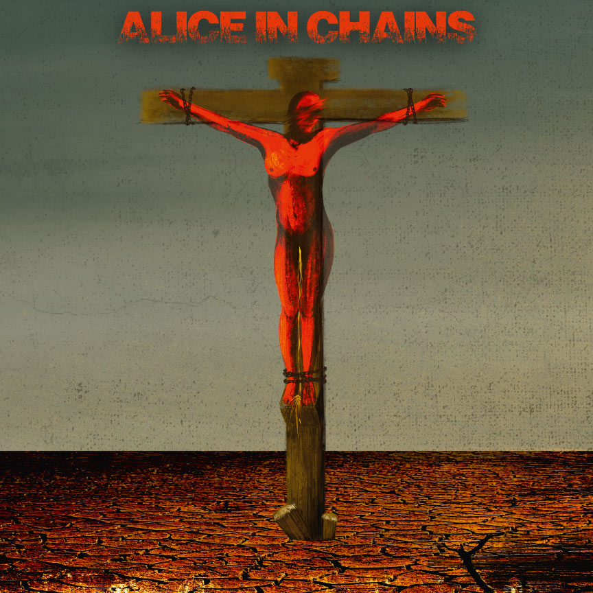
The classic grunge-era band, Alice in Chains, was a major influence in all heavy metal that came after it. Their highest-selling album to date, Dirt, received critical acclaim, but I’ve personally never LOVED the design. I decided to help out with that by redoing the album in a way that, I believe, the late Layne Staley would approve of. The model in the original cover had to hold her bladder for six hours while she was buried in clay and dirt then photographed. As soon as the camera was put down, she further crumbled the environment around her and ran to the bathroom. My design imagines a more blasphemous situation, in which she did not make it in time.
International Shopping Bag Design
I’ve always held immense respect and interest in Polynesian culture, so I decided to expand my knowledge of their customs by designing a shopping bag for Hawaii. I wanted the focus to be on Kākau, the ancient art of tattooing, as well as fire dancing. All of the tattoos featured on this figure are real designs from native Hawaiians. He is also wearing a malo and grass adornments at the knees.

Conceptual Movie/Show Poster
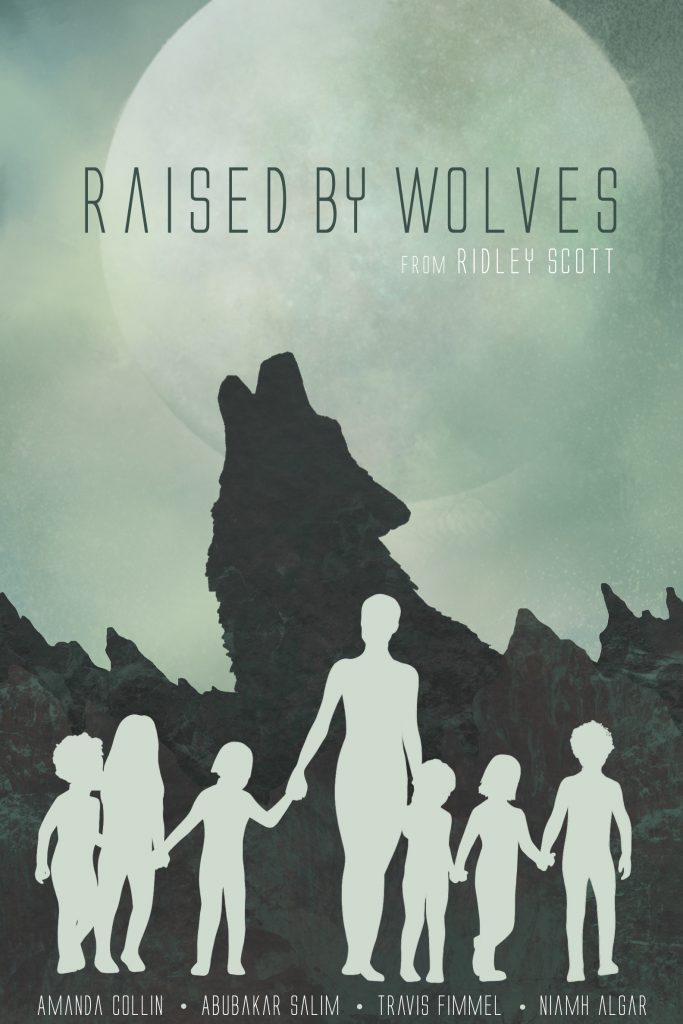
Using a metaphor, analogy or pun, we were to encompass the essence of a show’s plot through a poster design. I chose to represent Ridley Scott’s HBO Max sci-fi drama, Raised by Wolves, which follows two androids raising human children on Kepler-22b after Earth was destroyed by a war between the Mithraic and Atheists. The visual metaphor of the mountain range morphing into a wolf behind mother expresses not only the title but the emotional and physical changes she goes through.
Improved App Prototype
I was tasked with improving Pinterest’s current app design. The frustrating aspects of the existing app included a busy/clunky feed, unreliable sources, and ads that looked like regular posts. These are the main changes I implemented in my prototype:
- Feed grid went from masonry to fixed aspect
- Red highlights added to activated buttons/pages
- General category list available under search
- Personalized profile page with a header image and bio
- Collage preview for All Pins board instead of stacked
- Improved readability through style and positioning of elements
Explore the prototype yourself here: https://www.figma.com/proto/Z0jWQBLo5zy9Vru9n1dPOM/151-Workshops-Group-One?node-id=1109%3A1009&scaling=scale-down&page-id=1109%3A1008

Unacknowledged Love Editorial Illustration
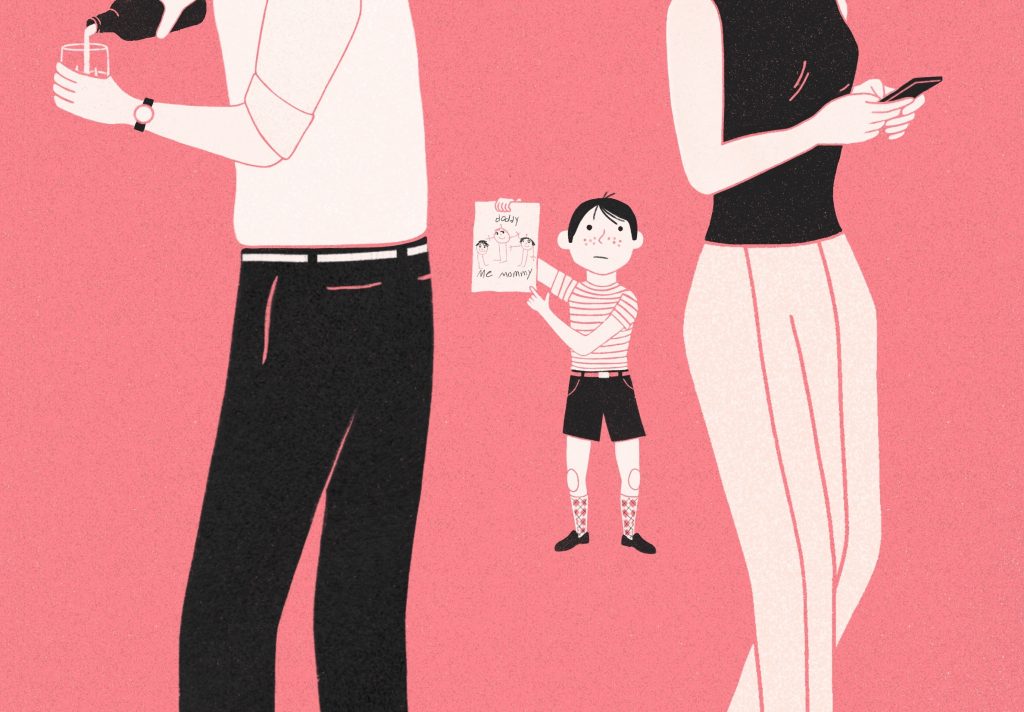
We were to combine conceptual and technical skills in rendering a mock editorial illustration for a Modern Love article, based on the style of a classic illustrator and a given adjective. I was given “Unacknowledged Love” and I chose to draw in the style of Lorraine Fox.
Sea Turtle Painting
I bought an iPad in order to prepare some digital pieces for my application to Capilano University. This was the first piece I created with Procreate. The purpose of painting this sea turtle was to explore the features of the program, which I certainly did.

