By creating the mood boards, I was able to visually see where my interests lie. I like places where there are lots of greenery- I think this has to do with living in one of the greenest cities in the world. From what I’ve gained from my mood boards is that I enjoy emerging myself in nature. From what I like to eat, to where I like to spend time aside from work, if I want to destress, I can always rely on Mother Nature to bring me to my zen. My adventurous side has been reflected in the sorts of typefaces and designs I’ve added to my mood boards. For my design mood board, I included plenty of images with lots of personality and intricacy. From what I can see, I am a very detail-oriented person so being able to see a piece of work to that level of craftsmanship draws my attention. When it came to compiling images for my mood board, I did not find the process challenging at all. I realized that finding images to showcase who I am as a person is a lot easier than having to write out a biography. I think the reason is that I have always been such a visual person, I am so used to making decisions based on aesthetics.
IDES 320- Personal Brand
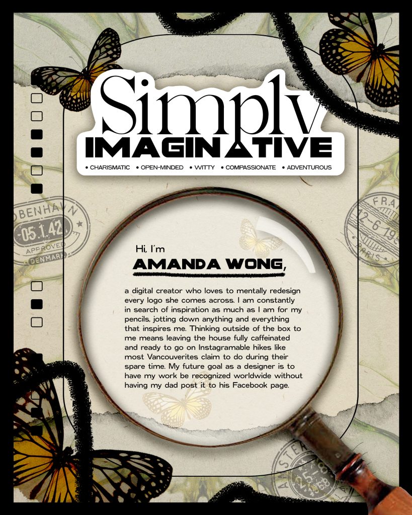
I found that this process took a lot longer than expected, the main reason being that the entire poster advertisement was solely based on who you are and where you see yourself in the future. It took me a while to bring myself together to start ideating because I felt the pressure of needing to know the outcome of something I haven’t stepped foot in. When I gave up on ideating the aesthetics of my poster, that was when my creative juices started to flow. Once I opened Adobe Photoshop on my laptop, it was non-stop experimenting. I eventually ended up with a very nostalgic-looking design. As a kid, I remember reading these books called “ISpy” right before bed. This series of picture riddle books had the best images. All sorts of random toys, scattered on each page. That was when I soon saw the resemblance between my document and those books I loved so much in my youth. It brought me back to the time when I felt the most creative, as a kid.
This project took me over six hours to complete, most of the time trying to generate an idea, which is why I give myself a 9/10. Designing the poster, I felt quite proud of because I didn’t follow an aesthetic that I would see trending on Behance or Pinterest. My brand essence was derived from experimenting, that is why I thought “simply imaginative” would be a good title to label myself. When I don’t overcomplicate a situation or scenario I am given, I find myself the most creative.
NVFD City Studio Campaign
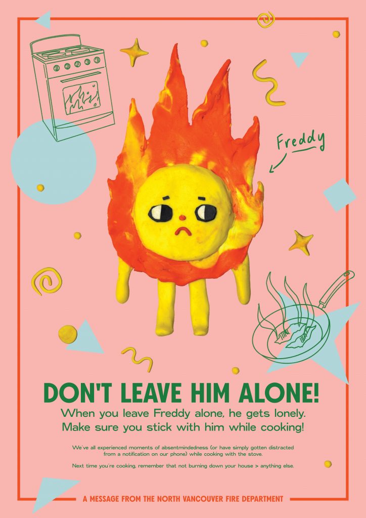
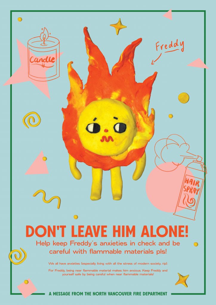
Our group (MAKe Studios) created a fire prevention campaign on behalf of the NVFD (North Vancouver Fire Department). We did this by focusing on key problems that seem to occur a lot in our targetted age group, high school and post-secondary students who have moved out for the first time and are living on their own. The main causes of fires were ones created in the kitchen, by setting off fireworks, and by using flammable materials. Being a part of the targetted audience, my group members and I felt that the best solution we could come up with would be to personify the fire itself. This idea came from the nostalgia of our childhood, watching cartoons every morning. Cartoons are still very prevalent in our lives now as there are adult cartoons such as Rick and Morty that have skyrocketed in popularity in the past couple of years. We paired this concept with a bright and playful colour palette to captivate the eyes of the demographic as we are all about visual aesthetics nowadays.
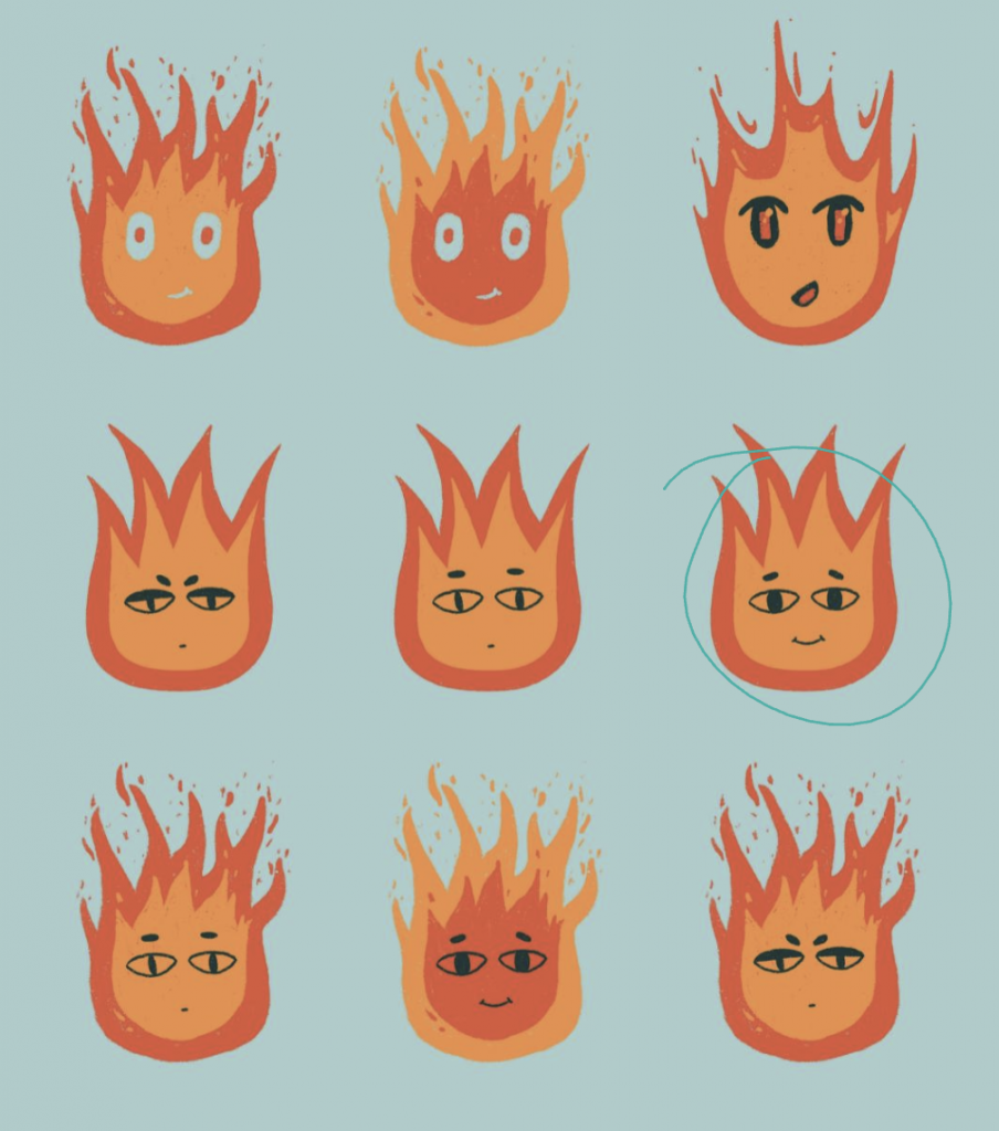
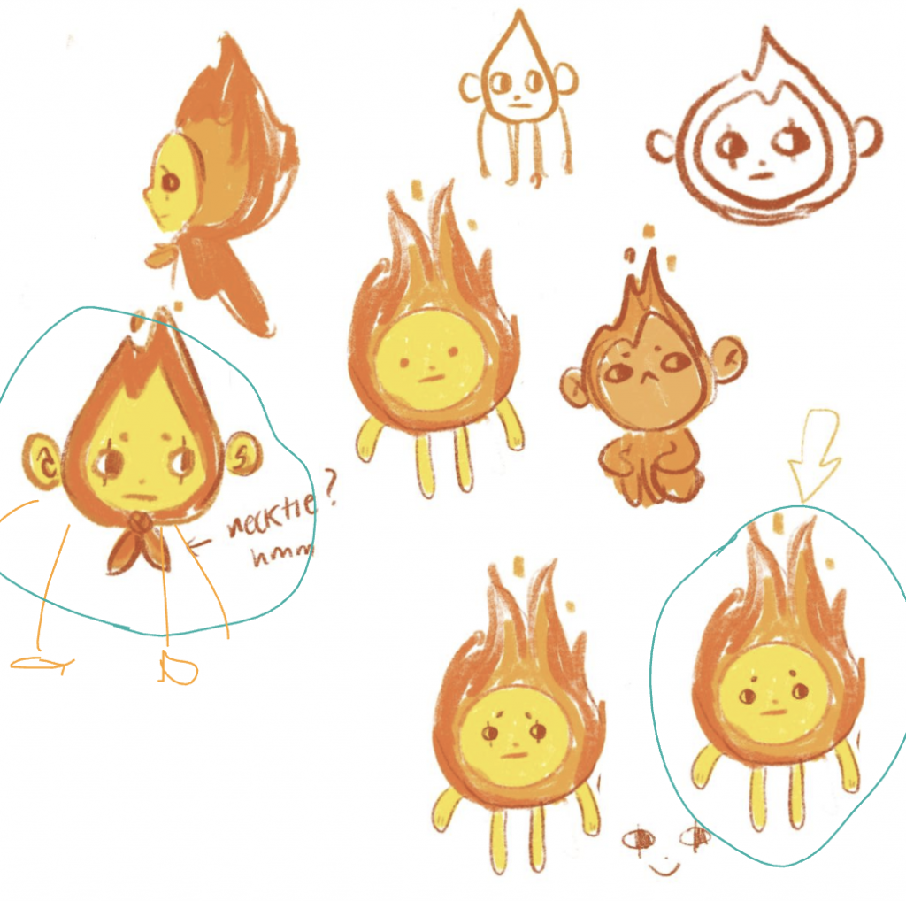
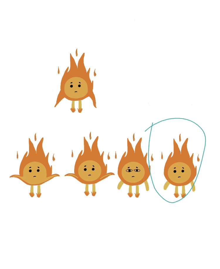
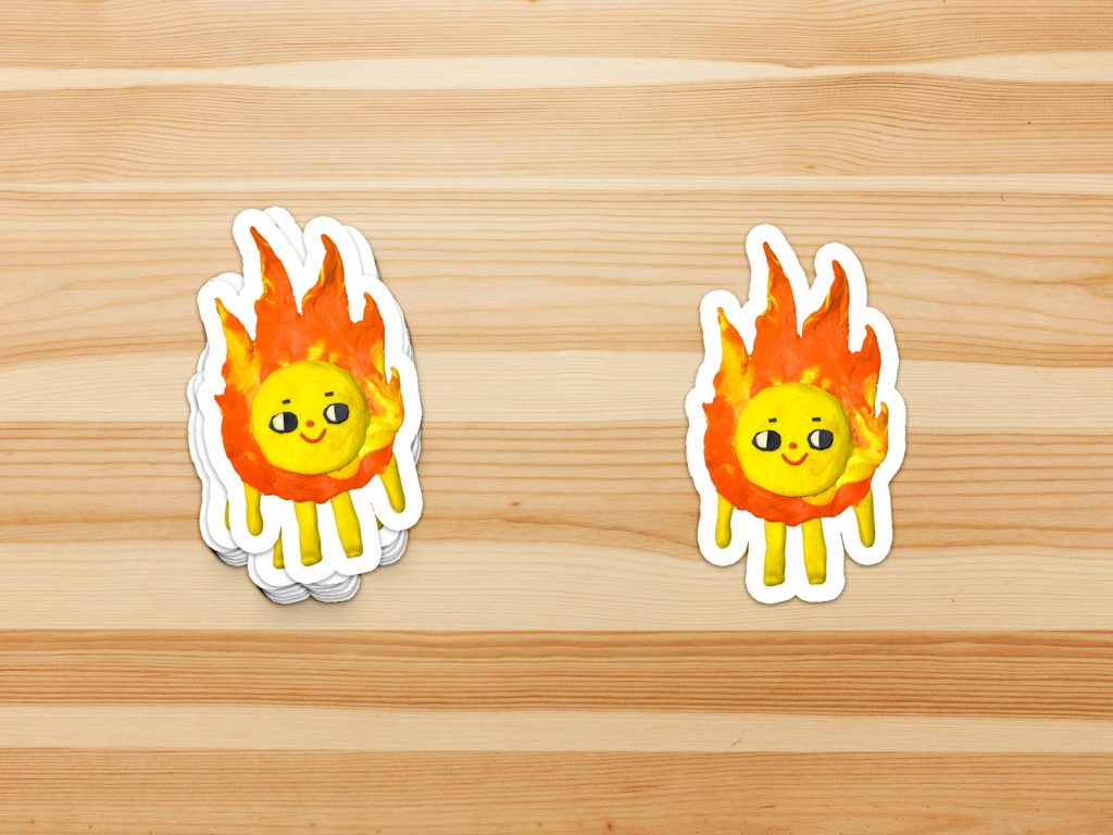
The character we had come up with is named “Freddy the Fire.” The idea with Freddy is to put viewers in the perspective of seeing Freddy as a friend or someone they would want to protect. The header is set as “Don’t leave him alone”, followed by a line mentioning what bothers Freddy. The language that we used such as r.i.p and pls are little things that we wanted to incorporate since it is how most teenagers and young adults talk. It is a way of seeing this campaign as more relatable because we put the viewers in a familiar setting.
Initially, we had the name “Sparky.” However, we soon found out that the NVFD’s mascot for their fire prevention program in elementary schools was also named Sparky the Dalmation dog. From that, we knew that the name had to have some sort of complexity, to represent a higher age category. The idea of playing with the french word for fire “feu” was interesting, yet not a lot of English names contained those three letters. Although our french attempt failed, we came up with the name Freddy because the sound of “feu” and “Fred” felt similar to a degree but for that, we just thought that it was a memorable name.
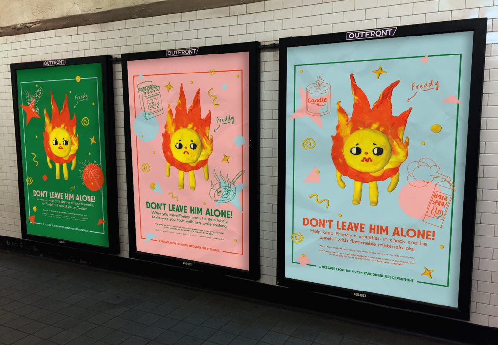
It is known that this specific demographic is heavily dependent on our use of our phones. Most of us, including myself use social media as a source for news and updates. Aside from creating three poster advertisements, we saw greater benefits in moving our campaign onto social media. On a platform like Instagram, awareness can be brought up in communities such as North Vancouver but extend to students all over the world. My main task in our team was to create three animation GIFS to use on the NVFD Instagram. We chose to create three Instagram Stories because it is a quick yet effective solution in getting our message across, plus there is a feature where it can constantly show on someone’s Instagram if marked as an advertisement. Working on this project for weeks, I can look back and say that the experience was a big learning journey for me. This was my first time creating a small animation and before this, I had little video editing experience. However, working in a group with Kat and Michelle was a big help. It was nice working with them because we were able to nail down the idea and bring it to life pretty early on and keep the focus on meeting our checkpoint goals. Overall I would rate my performance for this project an 8/10.
Below is my group and I’s final outcome for NVFD’s fire prevention awareness campaign.
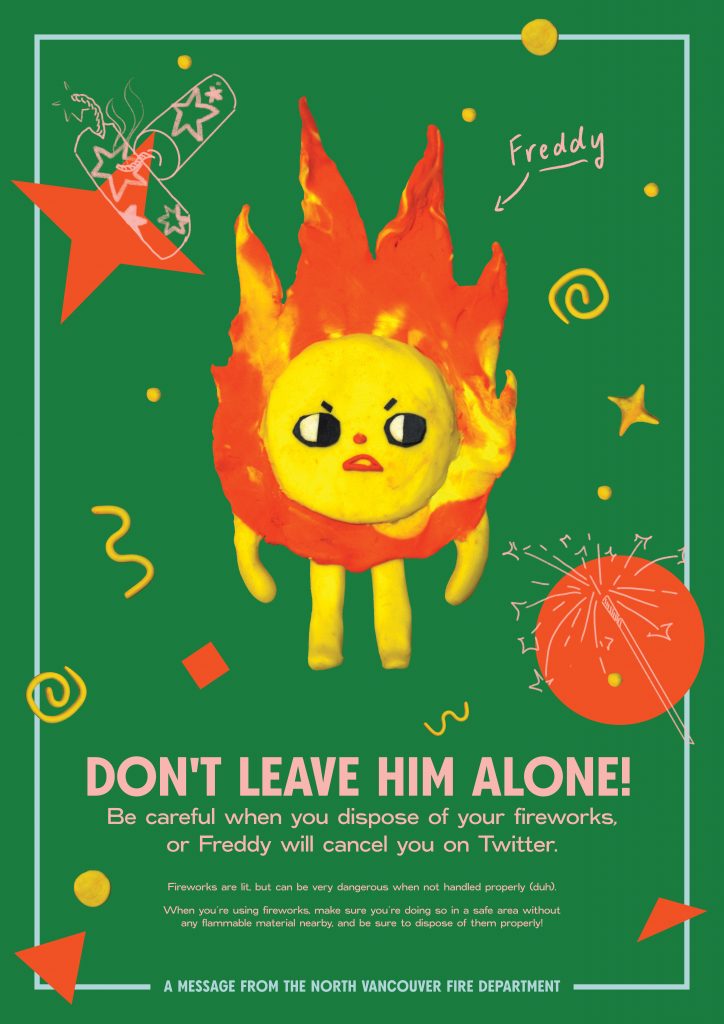
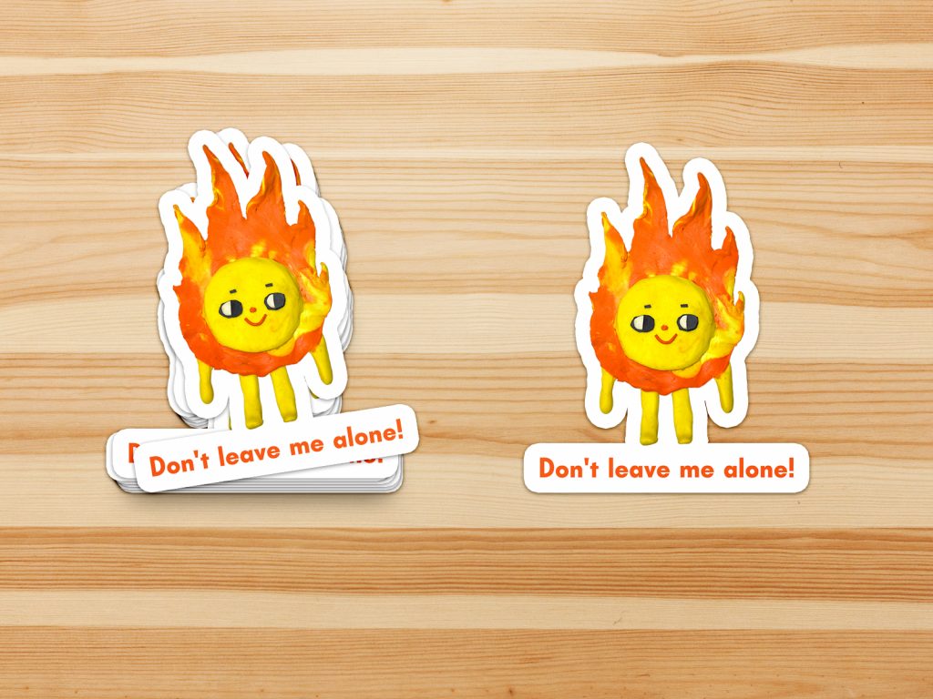
I just want to acknowledge that there was a lot more behind the scenes that we put into this project such as brainstorming type copy on the poster, the clay makes of “Freddy”, putting together presentations, and creative briefs.
Reconciliation Project
Michelle and I were very keen on taking on the topic of land acknowledgments because of the amount of talk we saw on forums and social media. There was a Facebook post in particular that changed both my and Michelle’s views on land acknowledgments and made us curious if the actions we are doing are good enough in this day in age?
To us, land acknowledgments have always been something we’ve listened to in school assemblies without ever really thinking about the consequences that had happened and continue to happen to indigenous people. From this, we discovered that neither of us knew a whole lot about indigenous land and the harm colonization has done to its culture. Talking to others about this topic, we saw that it was common that people our age (students) didn’t know either, but were eager to make a change. Thus, from the list of 94 Calls to Action, we chose Call to Action #62; to develop and fund aboriginal content in education.
To what degree do land acknowledgments serve a purpose? Land acknowledgments had first come about to recognize the land of the people, a step to acknowledging the horrid actions of Canada’s history, yet the trauma remains for many Indigenous people as they are denied easy access to living essentials on their land. The goal for this project was to imitate these same emotions of the frustration of indigenous people and implement them in a way where others can see from their own point of view.
Michelle and I chose to do three guerilla advertisements; those that can be easily placed in locations highly visited by students. This would be accompanied by an interactive element to bring further attention to other ways we can do to support our indigenous communities.
The idea for our guerilla campaign was to focus on the idea that acknowledging something that was once present does not bring back what has been lost. This goes with the idea that acknowledging the territories of indigenous groups we live on does not mean that indigenous people will get entirely of their land back. To demonstrate this idea, we chose to use commonly found objects to show a new perspective on the situation.
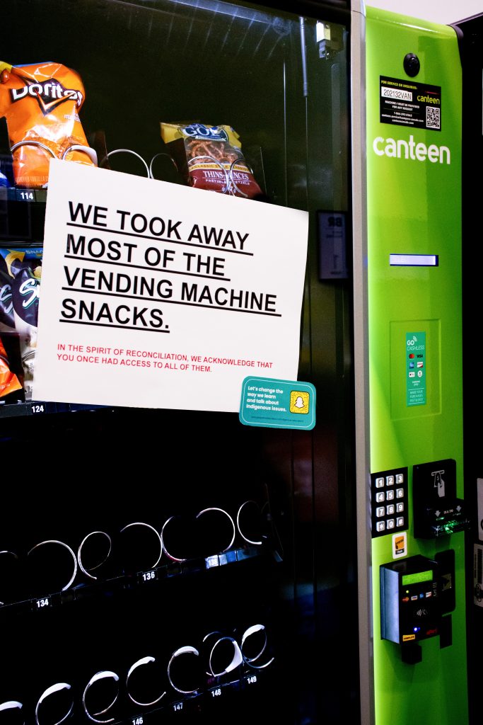
Michelle was in charge of designing the signs while I went to the school campus to take and edit photos of the mockup guerilla campaigns. Not being the most profound photographer, I had ran into issues with lighting, and other unexpected issues that eventually lead me to spend a great amount of time during the editing phase of the project. We also played around with different variations of one idea that we ended up cutting it out entirely.
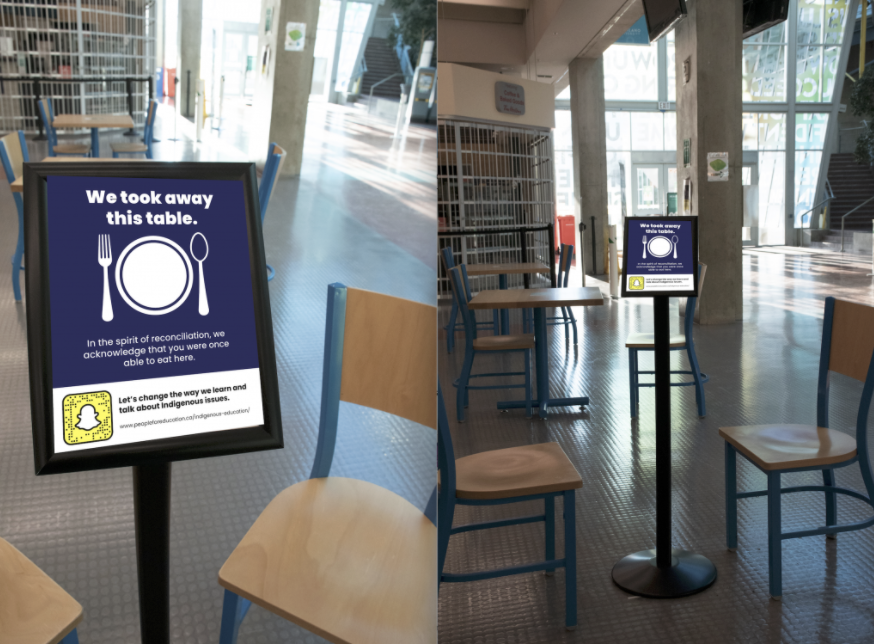
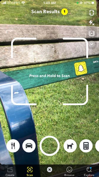
Based on the appealed demographic, we realized that using a preexisting app such as Snapchat would help bring students to take further action to the cause. On each guerilla ad, we placed a Snapcode that opens up a quick blurb about the land you are located on and the history you never knew about.
Sure this project had its struggles but I think the way Michelle and I were able to adapt to situations and still be able to convey our main message is not a doubt something to be pleased about.
IDES 244: Education on Land Acknowledgements
Our main focus for this project is to bring light to land acknowledgements and how it is not as effective as people make it out to seem. In “Land Acknowledgements Accomplish Little”, Alex Small talks about how land acknowledgements are mostly all talk but no action. What this article states is that it is easy to acknowledge past mistakes but to take action of the situation is what is needed. Performative Activism has been a big topic this past year especially with the Black Lives Matter Movement, but in actual fact, performative activism has been around for a long time and with First Nations as well.
What my partner Michelle and I want to do is to help regain the purpose of the land acknowledgments and to show that there is much more for the public to do to fully educate themselves on this matter, and that starts with classroom education. This project would be directed towards students from kindergarten to high school. Looking back on last year and the number of social issues that had resurfaced, this younger generation had an overall good response to taking the next step to change. By educating the young, we hope to start discussions in households and to carry on to educating the next generation and so on.
Research Links:
https://www.insidehighered.com/views/2020/01/09/why-land-acknowledgments-arent-worth-much-opinion
https://etfofnmi.ca/wp-content/uploads/2019/10/Going-Beyond-A-Land-Acknowledgement-FINAL-VERSION.pdf
UX Storyboard
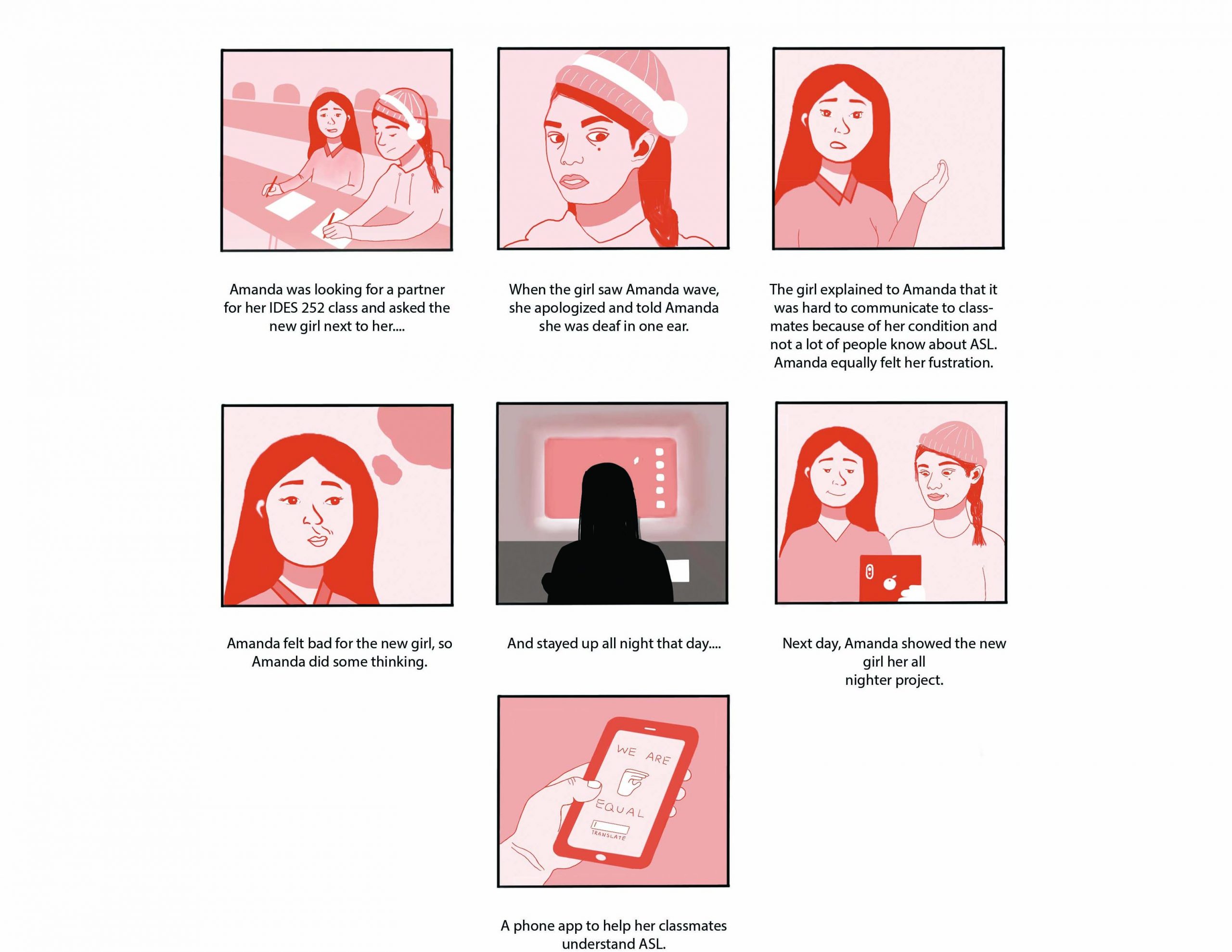
Background on Amanda Chu:
This storyboard is based on Amanda Chu who is an “avid Discord User and gamer”. She studies industrial design which involves her being creative with technology.
Brainstorming:
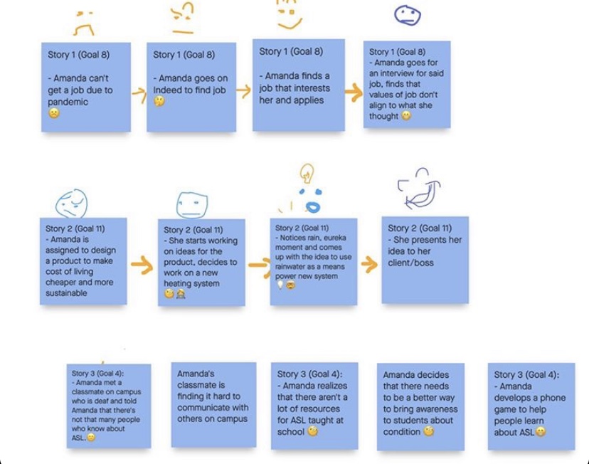
Story one was based on Goal 8 which was “Decent work & Economic Growth”. Our group thought this was well suited for Amanda because she had a hard time finding a career to pursue that fit her parents’ expectation and her interests. This story was based on the hardships of job finding during a Global Pandemic.
Story two was based on goal 11 (Sustainable Cities & Communities). Taking from the fact that she “excelled in mathematics and sciences” we thought this could be a convincing story if Amanda were to develop a sustainable heating system right from her office.
Story three was based on goal 4 (Quality Education). We picked this goal for Amanda because hearing her needs verses her parents needs, we felt that Amanda would be a good role model in a school setting. We wanted to use Amanda as someone who can help others with bettering their education. This story would take place in class at university.
Final Decision:
We collectively chose story three, as it was a story of her developing a hearing app for a classmate. The story felt like the most heartfelt and impactful. It also had a good integration of Amanda’s tech background.
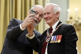
Blog 5: Douglas Coupland
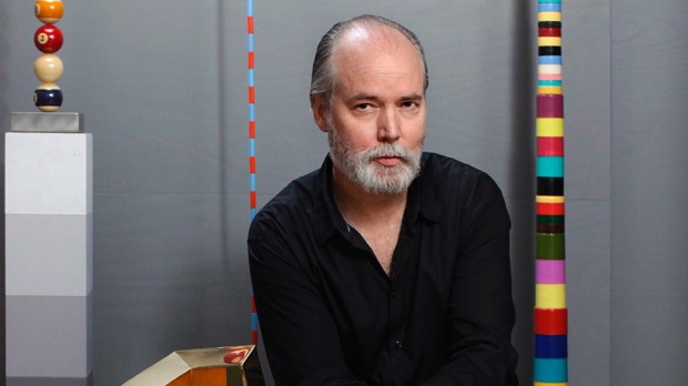
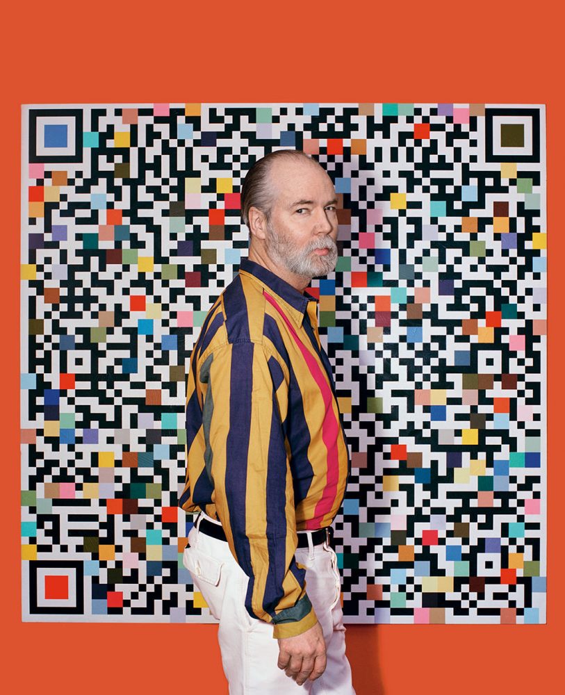
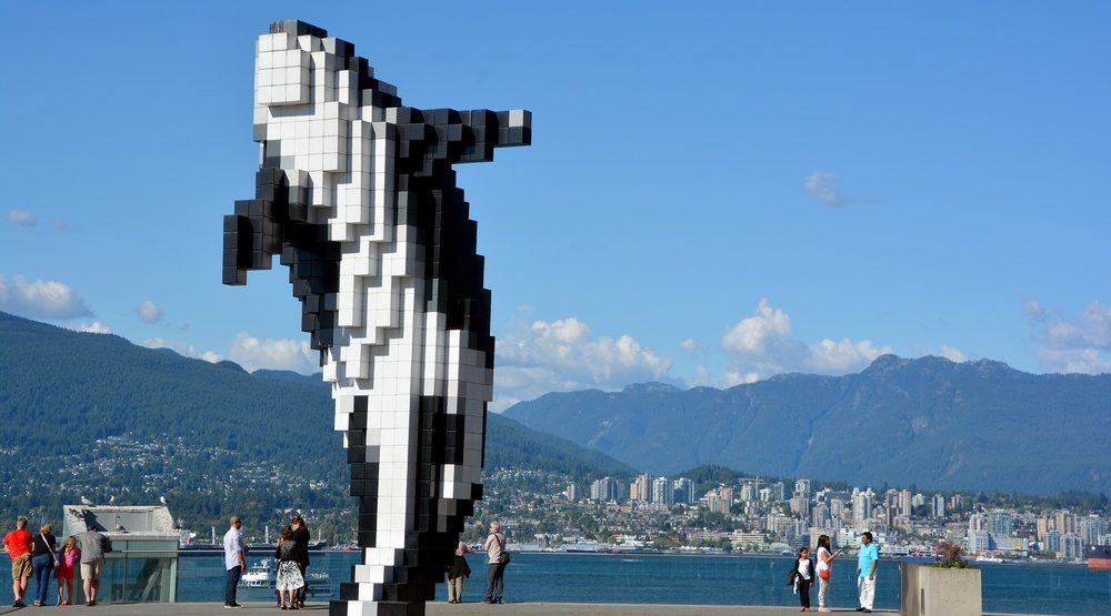
Born in Germany, but grew up in Vancouver, BC, Douglas Coupland has established himself as a Canadian author and artist. In 1984, Douglas attended Emily Carr University of Art and Design as a sculptor but then moved to Hawaii to study Japanese Business Science. In 2013, Douglas was given Officer of the Order Of Canada for his great accomplishments.
Some of Douglas’ greatest works include 2018 Vortex, an installation at the Vancouver Aquarium to bring awareness to plastic pollution in our oceans and his first solo exhibition 2014 “Everywhere is anywhere is anything is everything”. You can see from his great body of work that he is heavily influenced by the pop art era, artists such as Andy Warhol. The difference between pop art and Douglas Coupland’s art is that Douglas Coupland makes pop art that reflects the digital age that we are living in. For example, the “Digital Orca” is a sculpture he produced that showcases Vancouver’s past of harbour life with the future of the digital era.
Sources:
https://www.britannica.com/biography/Douglas-Coupland
https://www.thecanadianencyclopedia.ca/en/article/douglas-coupland
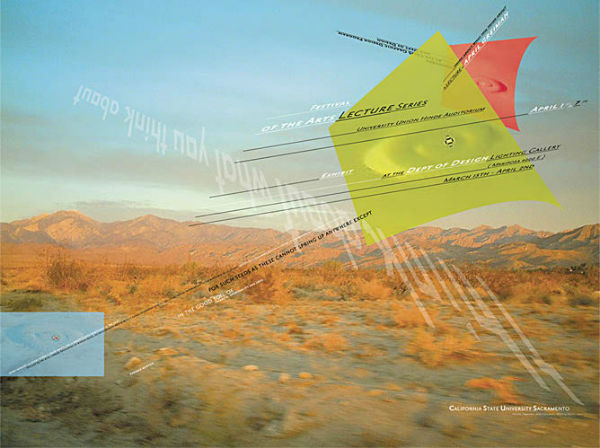
Blog 4: April Greiman
April Greiman was one of the first graphic designers to push the limitations of the computer in the late 1970s.
Graduating with an undergraduate degree from Kansas City Art Institute, April found herself moving to Switzerland for additional learning, attending Basel School of Design, where she was mentored by Armin Hofmann and Wolfgang Weingart. Armin and Wolfgang exposed April to the International Style movement and later the “New Wave” which she associates her art style as. Things that seemed like a disadvantage such as pixelation and other digitization “errors”, April was able to integrate them as part of the design in her work.
A few key elements you can commonly find in most of April’s works is that she tends to make her subjects floating in mid air on different angles, while accompanied by different typefaces.
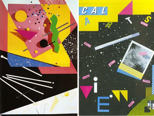
April’s body of work is overall enjoyable to look at. The use of colour, photography, font variation and perspective puts viewers through a new experience every time it is encountered with. What I have pulled out from April’s work is that putting thought and intention into your work does not have to be boring, thus why she is a quintessential member of the “New Wave” movement.
Sources:
https://www.aiga.org/medalist-aprilgreiman
Blog 3: Paula Scher
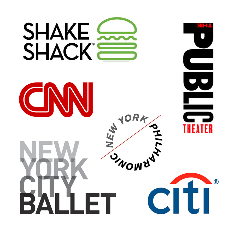
Paula Scher reconfigured the design world with only knowing the essentials, knowing how to illustrate her concepts using typography. She is known to have given corporate identities to many big companies such as CNN, Citi Bank, and Tiffany & Co. Paula now sits as the first female Principal of Pentagram, since 1991.
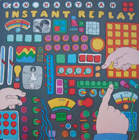
Paula’s portfolio stretches into different design genres, from corporate logo design, packaging, and her album covers, which used to produce on average 150 album covers a year. Paula married her design “crush” Seymour Chwast who also is a partner at Pentagram. But their work history dates back to when Paula was first working at CBS and Atlantic Records, collaborating on Dan Hartman’s 1978 Instant Replay album cover.
Although she said that she is not the best illustrator out there, it is not a doubt that Paula Scher’s 40-year career has been anything but mediocre.
Sources:
http://paulastribute.weebly.com/1974-1983-cbsatlantic-records.html
Blog 2: Stanley Mouse
Stanley Mouse is an American artist who is renowned for his psychedelic posters and album covers. Some of Stanley’s most credible pieces include his works done for the Grateful Dead and Journey which he and fellow artist Alton Kelley collaborated on together. Stanley grew up in an artistic household in Detroit, Michigan, where his father was one of the animators for Walt Disney’s Snow White. Living in the main hub of automotive manufacturing, Stanley found himself obsessing over motor cars. Combining his great talent with the airbrush, it is said that Stanley painted almost every hot rod in the city and participated in every car show painting custom t-shirts. Aside from his love of cars, Stanley saw art nouveau and other periods like art deco to be influential periods that shaped his art style to fit the aesthetic of commercial art.
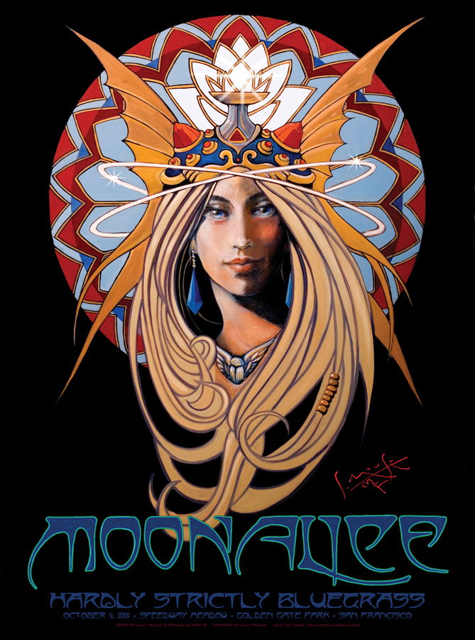
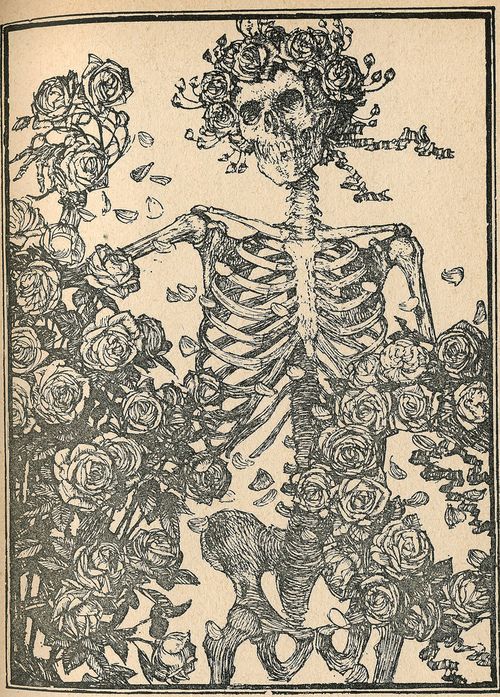
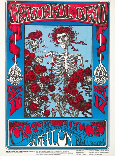
What I admire most about Stanley is his collaborative efforts with other artists. By taking advantage of the sources he had around him, and learning new styles, Stanley’s experimentation with rock posters and album covers rewarded him as being one of the most iconic psychedelic artists of this era.
Sources:
https://en.wikipedia.org/wiki/Stanley_Mouse
http://www.mousestudios.com/section/biography