Takashi Murakami

Takashi Murakami is a Japanese modern artist who was born on February 1, 1962. He works with both painting and sculpture and commercial mediums and is noted for blurring the barrier between high and low arts. He popularized the phrase “superflat,” which defines both the aesthetic aspects of Japanese creative heritage and the nature of postwar Japanese culture and society and is also used to characterise Murakami’s artistic style and other Japanese artists influenced by him.
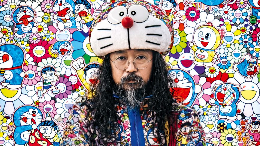
Portrait of Murakami

Murakami was born and raised in Tokyo. He had always been a lover of anime and manga (Japanese cartoons and comics), and he aspired to work in the animation industry. He studied drawing at Tokyo University of the Arts to become an animator, but he finally concentrated in Nihonga, the ‘traditional’ form of Japanese painting that integrates ancient Japanese aesthetic traditions, methods, and topics.

Below is one of the first characters he created. I love the colours, simplicity of the shapes and the silly yet eerie effect this piece has on its viewers.
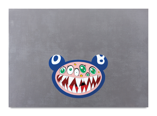
“DOB’s March”-1995

Personally, ever since I went to Japan to pursue my Japanese language studies, I have always admired his work. I want to study at Tokyo university of art in the future and have always looked up to Takashi Murakami’s work. Like him, I have also grown up watching anime and reading manga since my parents are both animators and were big fans of the Japanese animation films. This was what drove me to admire Murakami’s work.
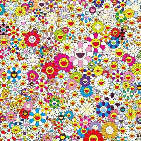
“flowers in heaven” -2010

This one of his trademark artworks, that is recognized globally. I love how simplistic yet captivating this piece is. The name of the piece also makes me wonder what the artist thought before naming the piece.

Even though at first, I did not understand the impact of his work, after listening to my peers talk about his journey in class, I realized what an impact he has created.

These are some of his other artworks that really resinated with me:

This artwork of his named “727” really stood out to me. I admired how he merged the tradidtioal Japanese style painting along with his personal character style. 
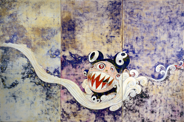
“727” – 1996

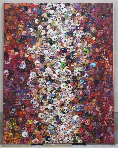
“I Know Not. I Know.” -2010

Works cites:

https://www.wikiart.org/en/takashi-murakami/all-works#!#filterName:all-paintings-chronologically,resultType:masonry

https://gagosian.com/artists/takashi-murakami/

Bourdieu – Habitus and field

One of the most successful forms of adaptation to the social space is achieved by people who take to this space like ducks to water and who therefore do not need a pocket calculator to find their way. ” -Pierre Bourdieu

This was part of one of the first readings I did in this class. When I was just getting settled into my new university life, I was scared and nervous because it was my first time away from home. This quotation above truly struck a chord with me.

This quote did not make sense to me at first. But as I began to socialise and comprehend my surroundings, I recognised that this was an excellent example of one of the most successful kinds of adaptation. Personally, I haven’t had the finest social experiences, but I now do my best to adapt to my surroundings.

A.M Cassandre

Adolphe Jean-Marie Mouron, aka A.M Cassandre, was born on the 24th of January 1901, in Kharkov, Ukraine.

I chose to write about Cassandre because during the survey presentations in class I enjoyed looking at his posters and artwork. They stood out to me and I would like to put them together and adore his complex yet simplistic style.

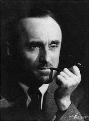
A.M Cassandre portrait

To sustain himself, he found and capitalized on the popularity of advertising posters, which were all the rage in Paris in the late 1910s. He was allowed to work at a printing firm in Paris, where he began signing his artworks, mainly posters, signed as “Cassandre.”
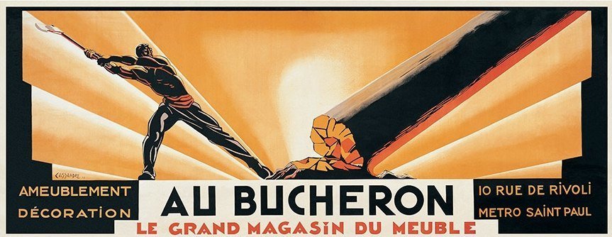
By 1922, he was able to open his art studio and create even more posters in his distinct style, which was influenced by cubism and surrealism. One of his most well-known works “Au Bucheron,” was a poster designed for a cabinet builder. It was then printed in a huge size in many “Compagnie Internationale des Wagons-Lits” copies and distributed across Paris.

Au Bucheron (1923)

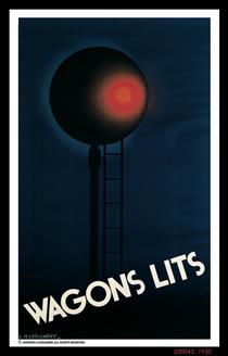
Compagnie Internationale des Wagons-Lits (1930)

His early style combined stylized curves and geometric motifs from Art Nouveau with a hint of sleekness and elegance.

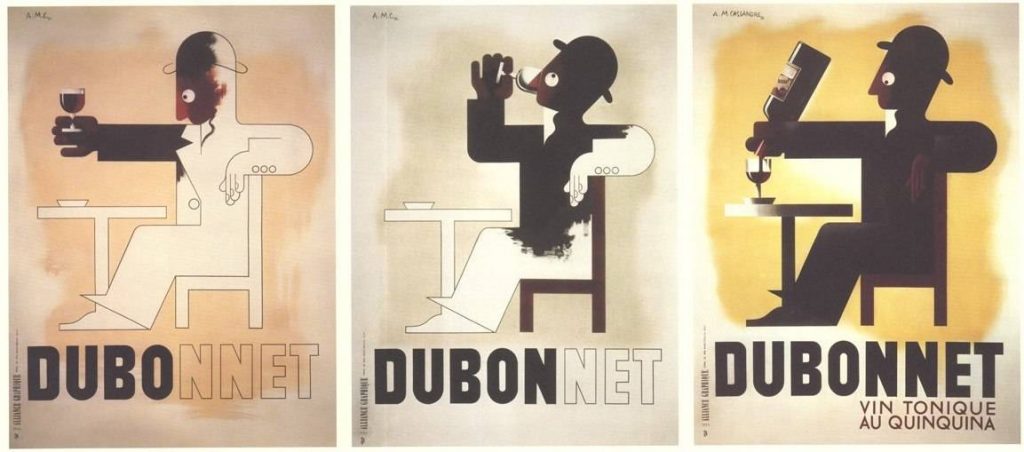
His outstanding works for the “Compagnie Internationale des Wagons-Lits” and “Dubonnet” wine companies were among the first posters designed to be seen and understood from moving vehicles. He was the one who came up with the notion of the Serial Poster, which is a series of posters that delivers an entire engaging topic in fast succession.

Dubonnet (1932)

A.M Cassandre was a highly inventive painter. I admired how he was able to demonstrate sleek, classical, and attractive art deco posters.
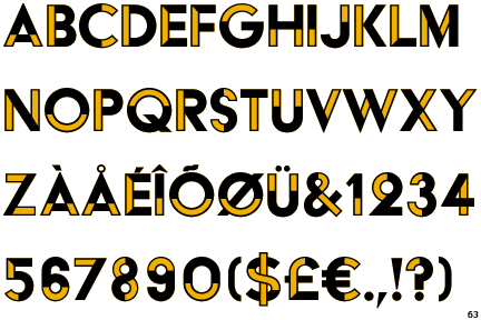
A.M Cassandre’s designs did not only affect Art Deco but also commercial art. He created memorable travel posters for the well-known travel firms, he also focused on exploring new styles and methods outside of poster arts Like typography. He designed various typeface types through his firm like the one below.

Acier Display Noir typeface

Works cited:

Factual information:

https://www.wikiart.org/en/cassandre/all-works#!#filterName:all-paintings-chronologically,resultType:masonry

Historical type identification poster

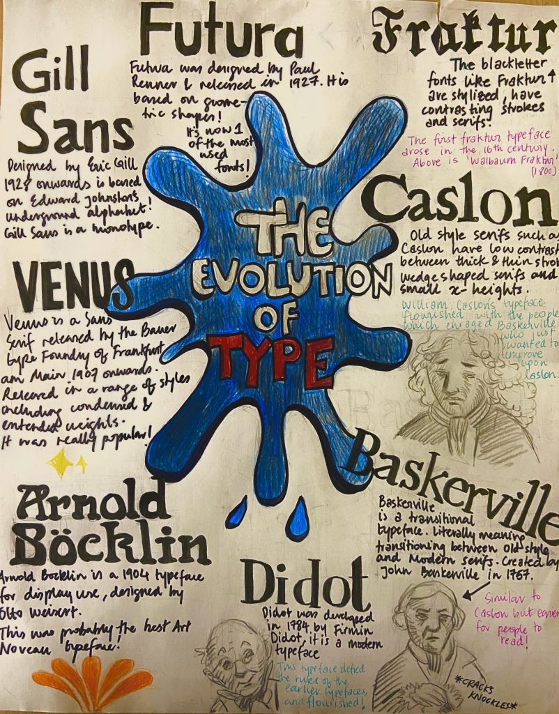
For this assignment, we had to make an entirely hand-drawn poster that featured a brief description of these eight typographic categories before 1945 as well as their distinguishing features. It appeared to be a straightforward exercise at first, but I soon realized that developing a poster with extensive information and making it engage was a difficult process. I had a concept and drew some initial designs for this task, however, I struggled with font layout and rendering.

Even though it took around 4 hours to correctly execute the final poster, the process works, and research required approximately two days to produce and obtain a final design idea. I’d give myself a 7/10 since I believe I could have done a much better job regarding neatness and layout.

My idea of creating a storytelling poster was solid, however, the execution and effectively getting the idea onto paper could have been better. I also feel that I should have spent more time on the project, but I misjudged the amount of effort that was necessary for this assignment to be completed successfully.

This is my result of the Type identification poster!