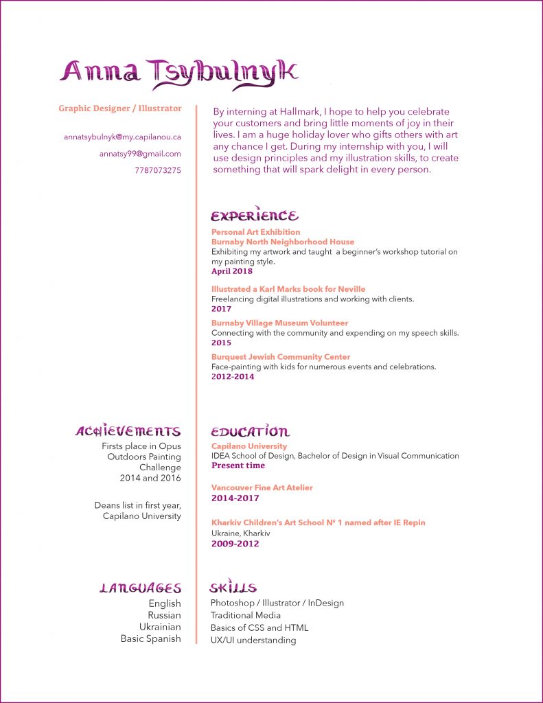
This resume has been designed specifically for Hallmark summer internship. Hallmark creates lots of beautiful cards for different celebratory occasions. They appreciate handwritten fonts and so for my resume I have decided to handwrite the titles on my resume. It still looks clean and the handwritten font reflects on my design personality. I have also made sure to include the celebratory events where I connected with the community and other illustrative related jobs. The colour purple highlights the main headings of the sections and the soft orange highlights the experiences in those sections. I have tried to align the text boxes parallel to each other for a better organization and left some breathing space not over-cluttering my paper. I have put a lot of time researching what the core message of the company I want to apply is and wrote my short statement paragraph according to that. Based on my rationale, my self-evaluation rating would be 8/10 for this project.

Leave a Reply