Concept 1: Colour
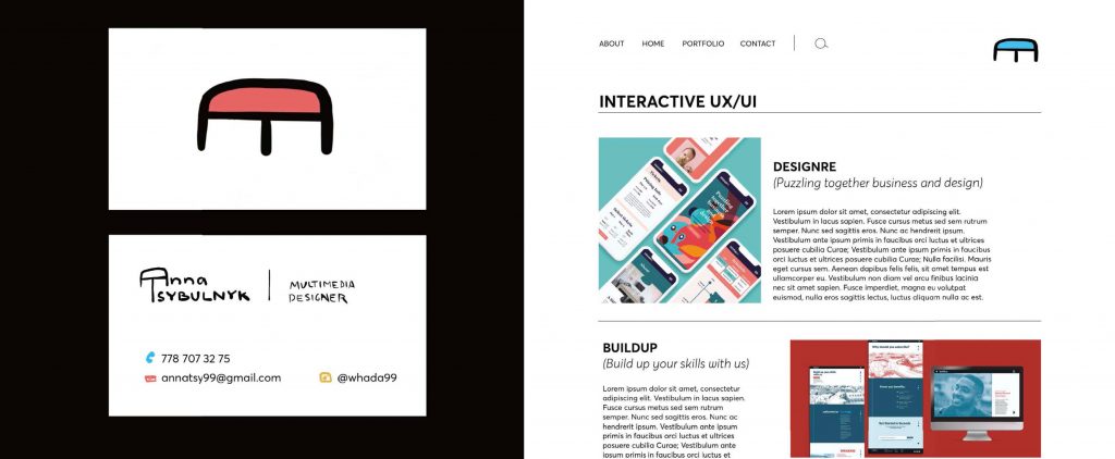
The logo includes primary colour variations. Since I love adding colours to my art, I always think about traditional painting techniques. Most colours can be mixed just using the primaries that’s why they were chosen.
Business cards can be printed in 3 smaller portions, each group with its own colour (blue, yellow, or red). The website logo can be an animation of colours just changing.
Concept 2: Culture
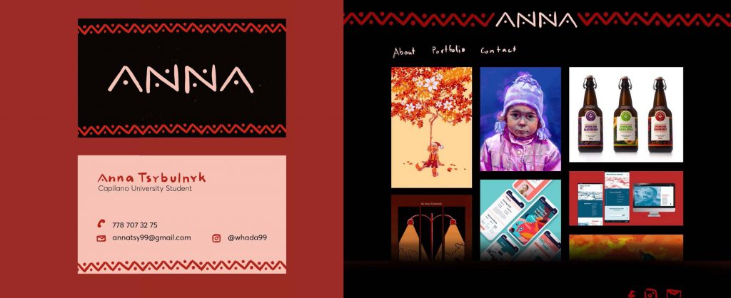
This logo hints at one of the Ukrainian culture’s simple patterns. This pattern consisting of the colour red, black and cream that can be typically seen on some Ukrainian easter eggs, wooden cutting boards, and wooden spoons.
Besides cream, the logo can appear as a red version on the light background if needed.
Printing of the business cards would be less costly and the pattern can also be incorporated in my potential portfolio website.
Concept 3: Pattern
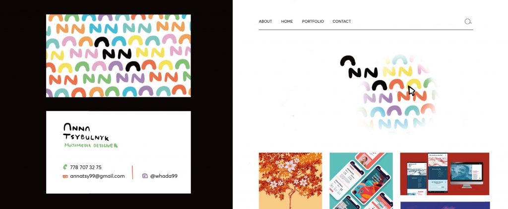
This logo will have really round “A”s and more angular “N”s. I wanted to reflect on the fact that I am a style chameleon. This logo symbolizes two sides of my passion for interactive and illustrative designs.
I used this logo to create a colourful pattern showing all of “my true colours”
The home website page would appear as just the black logo on a white background, but once the mouse moves across the screen the colourful pattern would be revealed.
Leave a Reply