by Trula Fountaine | Dec 15, 2017 | Blog, News and Updates
Due to scheduled system maintenance, ePortfolios.capilanou.ca will not be available between 5 a.m. on Dec. 19 and 8 a.m. on Dec. 20.
Thank you for your understanding.
by Aurelea Mahood | Sep 21, 2017 | Blog, News and Updates

The Fall term is now in full swing. Line ups at Good Earth. A busy Library courtyard on these sunny crisp autumn days. And increasing traffic in the Writing Centre (Fir 402).
This term, there new faces in the Writing Centre. The Writing Centre instructors and peer mentors have been joined by the Portfolio Project Peer Mentors. The mentors are there to assist students and faculty alike with building out digital portfolios. This year, we have a growing mix of course- and program-based ePortfolio initiatives with participation from faculty and students in North Vancouver and the Sunshine Coast.
Drop-In Hours
Monday 11 am – 2 pm
Tuesday 11 am – 2 pm
Wednesday 11 am – 2 pm
Thursday 11:30 am – 2:30 pm
Friday 11 am – 2 pm
by Trula Fountaine | Jul 12, 2017 | Blog, User Experience
This is the most important tip, which makes it number 1 on our list.
People should just “get” how to use your website. Fear, doubt, and uncertainty creeps in when they have to think about how to use your website.
If they get frustrated with your website, they’ll leave and find another.
Example thoughts that cause fear, doubt, and uncertainty:
- “What does this link do?”
- “Hmm. Pretty busy. Where should I start?”
- “Is this clickable?”
- “What does that title mean?”
- “There’s too much information to process”
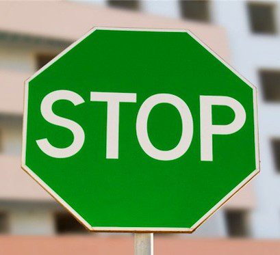
by Trula Fountaine | Jul 12, 2017 | Blog, User Experience
Imagine yourself driving and coming across a green stop sign. Do you stop or keep going?
Whatever you chose to do, you probably had to think about it. And that usually spells fear, doubt, and uncertainty.
Don’t try to reinvent the wheel. Most websites that try to do something new often come across gimmicky and hard to use.
Keep things simple and use the current website conventions. For example, if most websites have their navigation on the left or top, you might consider doing the same also.
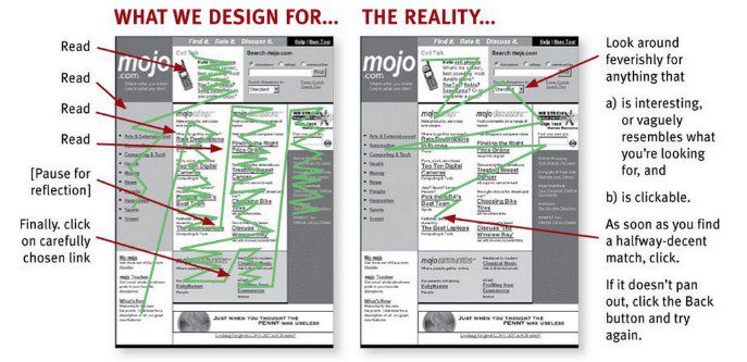
by Trula Fountaine | Jul 12, 2017 | Blog, User Experience
Most people don’t read web content word for word.
That’s why it’s important to structure your content for scanning.
Headings, bold fonts, descriptive links, and white space are a few of the things to consider when designing and writing your content.
by Trula Fountaine | Jul 12, 2017 | Blog, User Experience
Long lines of text tend to make it difficult for eyes to track back to the beginning of the next line.
To make it easier for people to read or scan the page, keep content blocks narrow by limiting the characters to approximately 65 per line.
Narrow block example:
Capilano University is a teaching-focused university offering a wide range of programs and services that enable students to succeed in their current studies, in their ongoing education, in their chosen careers, in their lifelong pursuit of knowledge and in their contribution as responsible citizens in a rapidly changing and diverse global community.
Wide block example:
Capilano University is a teaching-focused university offering a wide range of programs and services that enable students to succeed in their current studies, in their ongoing education, in their chosen careers, in their lifelong pursuit of knowledge and in their contribution as responsible citizens in a rapidly changing and diverse global community.