Amplification through Simplification
The idea that simplification of an image makes its representation stronger. It is important to remember that this concept isn’t just about taking away detail. One must figure out which are the most important details that anchor an idea and keep it recognisable and cut out the other details which don’t.
This concept is actually pretty important in cartoons, as it aids in self-identification. The idea being that the more detailed and developed a character is, the more we think of them as separate from us. While a more stylised and simplified character allows the reader to project onto them.
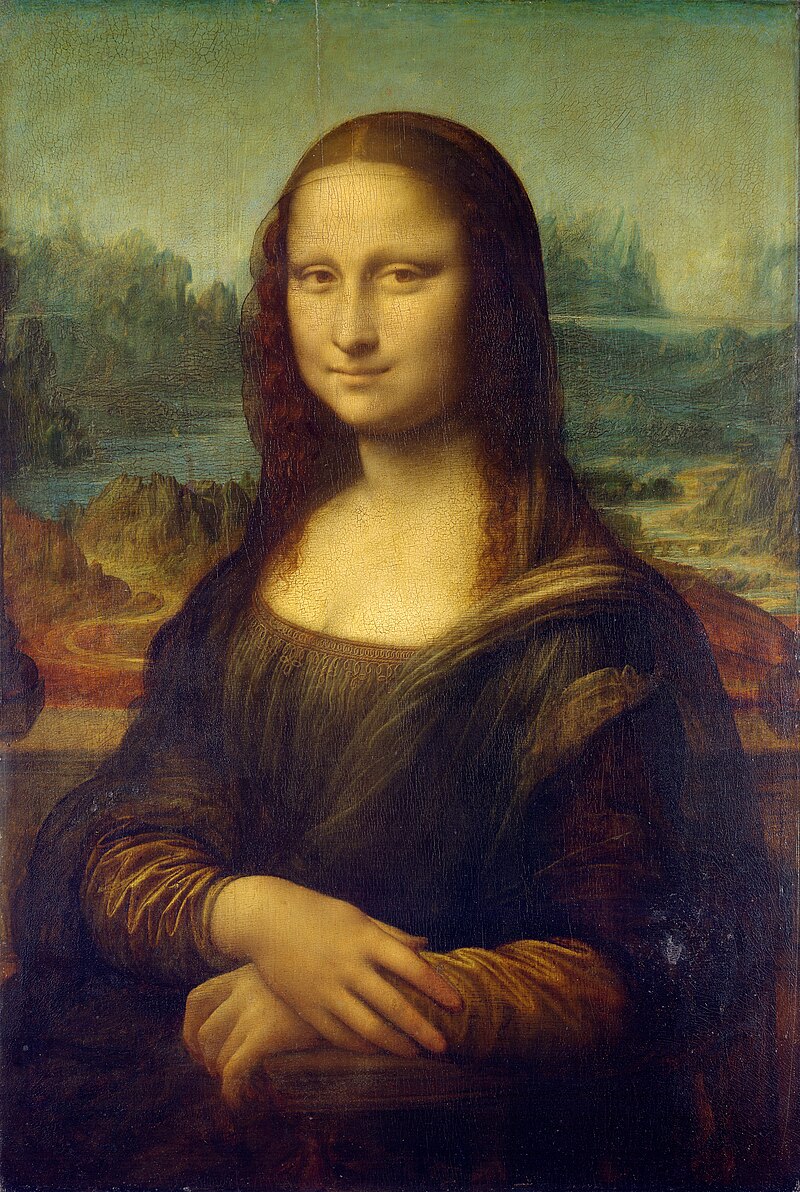
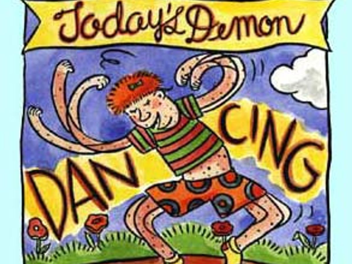
For example, which one of this do pictures can you more easily see as representing you as an individual?

Or perhaps

Closure
Scott McCloud defines closure “phenomenon of observing the parts but perceiving the whole.” In other words, it is when readers imply what happens between the gutters of the panels. We can think of closure as the reader filling in the blanks. The example which McCloud utilises is one panel showing an axe being raised and the following panel showing a scream.
Gutter
The space that separates panels from each other. It might be helpful to think gutters akin to a cut when watching a film. Their size and placement are up to the artist. They are integral to the pacing of comics, as they can be used to slow down time by spacing it out. Likewise, events can also occur between a comics gutter’s without ever being drawn out explicitly (this is when closure comes in!)
Panels
A picture contained within some kind of border. Similarly to gutters they also contribute to the pacing of a comic, for example, the repetition of very similar panels can be used to slow down a story and focus on a specific moment. Panels come in a large variety of different shapes and are these can be use for different effects. For example, irregularly shaped panels are used to convey different states of being (for example, a dream state or a flashback) and add dynamism to action scenes or imply conflict.
Bleed
What one could be considered a panel except that the image is not contained within a border. They often have the effect of slowing down time in comics, as they give a substantial amount of space and time to one moment.
Icons
A visual representation of a person, place, thing, or idea. These are everywhere and there are too many to name them all, but we can use a smiley face as an example. I know what a smiley face is meant to represent, and almost everyone does, even though it bears very little resemblance to the face of an actual smiling face. Icons are often not not direct representations of what they are meant to invoke.
Synaesthetics
The idea that visual elements such as lines, shapes, colours, patterns, etc. all hold a potential to express and link to senses. A lot of good examples of this being shown is in the expressive lettering of comics. Specifically, sound effects are usually lettered in a way that links them to a sense.
Motion/Action Lines
A stylised element made up of lines meant to communicate speed and or movement. Sometimes they’ll include streaking, which is the trail which an object leaves when moving quickly.

Mono Sensory Medium
A medium which only engages a single sense. Comics for example, are an example of this as they engage their audience solely through visuals. Another example could be radio, which only engages through audio. A film would not fit into this category because it is a medium which combines audio and visuals.
Speech Bubbles
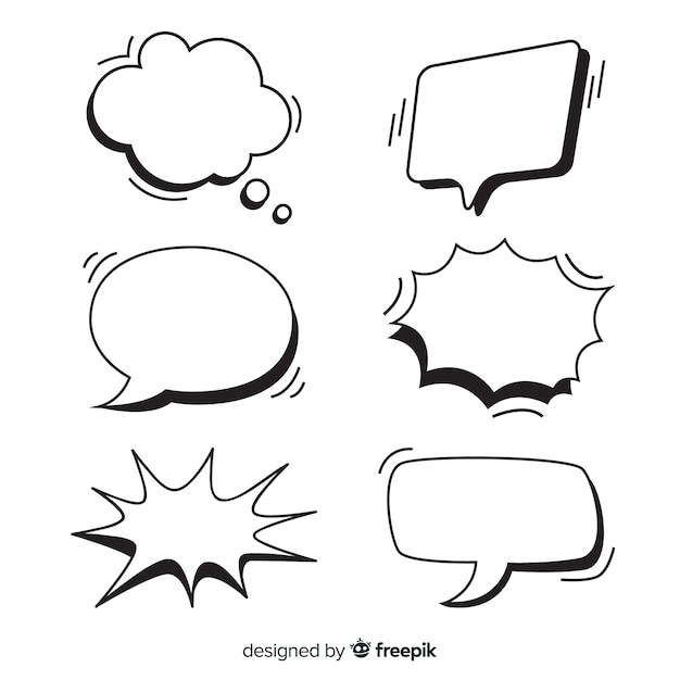
Speech bubbles Contain the speech of a cartoon. The most recognisable version is an oval with a tail that points towards the speaking character. However, they have as much potential to be expressive as any visual element of comics. The shape generally indicates the way something is spoken. For example, a broken up speech bubble often indicates a character is whispering, while a jagged speech bubble can indicate that a character is shouting.
