The first step I took towards making my personal ad was coming up with my brand essence and how it would inform the design/layout of my personal ad. I was was expecting this part to be the most arduous, but surprisingly I figured out the concept of my brand essence and thus designing the concept relatively quickly. The swot analysis in class was a wealth of ideas for my brand essence because it identified my strengths and helped me see myself outside of my own perspective. I found figuring out my brand essence first to be good decision for my workflow as it allow me to divert more time to the illustrations in the bottom of the ad.
Overall, I found the design aspects easier than the writing, although, there were still plenty of design details that I should have paid more attention to. It was very difficult to get out of my mind and describe myself from an outside perspective, and it was also the part I completed last. It was even more difficult to inject any sense of fun or charm into it, to the point where I don’t think I was successful at this part.
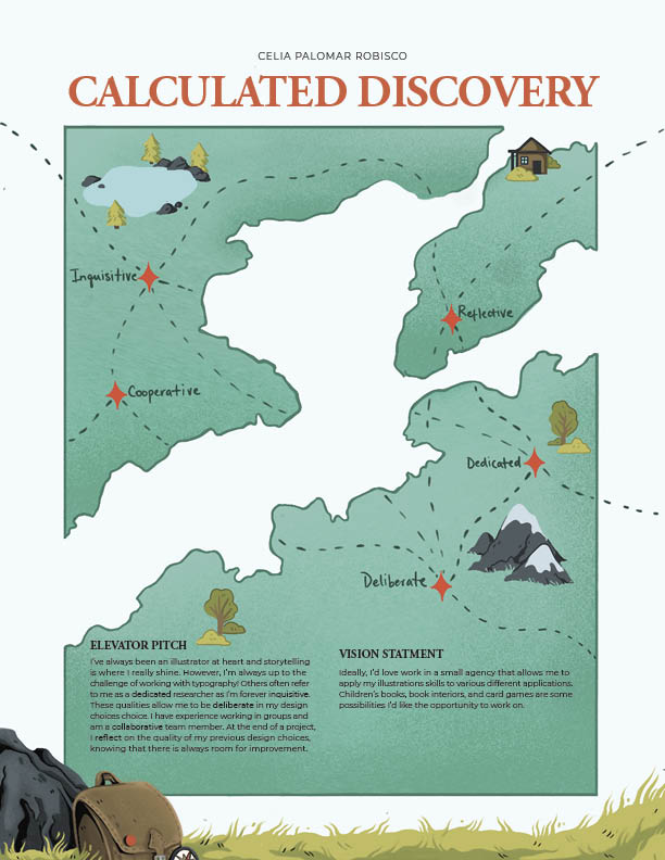
In all, although this project was very simple, I found it difficult but also rewarding. I definitely left with much more of a sense of my personal brand than when I went into the project. Design-wise, I think this exercise mostly reinforced what I already knew. Namely that I really need to pay more attention to the type in general, and once again, the importance of proofreading.
———————————————————————————————–
As for the mood boards, I would give myself a 7.5 or an 8 out of ten. I believe that I have accomplished the goal of the exercise, even though there is definite room for improvement. I definitely feel that the page of brand we wanted to emulate was the weakest. Perhaps this is in part because I feel unsure in how in/formally I’d like to present myself and my work to future clients.
Another issue I ran into was drawing the line between what I like and admire and what work I actually produce. For example, I found I was often drawn to desaturated images with lots of neutrals, which doesn’t actually reflect my illustration style. If anything, I need to use more neutrals. In the end, I had to go back and swap out some images for ones that would be more reflective of my work.