For my Mentorship, I was paired with Jouchelle Miranda, a storyboard artist working at Atomic Cartoons. I knew from the start that I wanted to do concept art/character design for my mentorship project, and upon seeing her work, I knew it would be a great opportunity to hone my skills and flesh out some characters.
We met for a beer and I presented some ideas to her that I thought I could flesh out for the project, two of which were based on existing illustrations of mine and one was an idea for a Webcomic that I’ve been thinking about for a while. I expressed what my desires were out of the project, as well as my weaknesses and what I wanted to improve on out of this, along with developing a great portfolio piece. As dynamic expressions and characters were something that I struggle with, we decided to focus on that and take the path of the Webtoon in order to have a fresh start.
An illustration that I did in Mark Pilon’s class and one I considered to expand on for the mentorshipLikewise, this was an illustration done for Zoe Evamy’s class and another that I was considering.
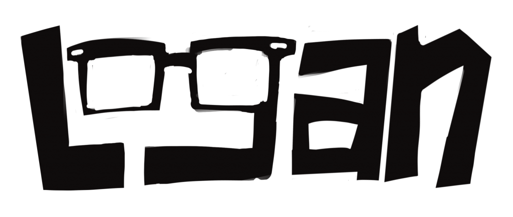
It’s done!! Well… mostly. Last week, we critiqued out logo ideas in small groups and it was decided that I should pursue the wordmark (namemark?) logo as my final. Admittedly, I was apprehensive. Like I said before, hand drawn type has never been a strength of mine, so I wasn’t sure if I could pull it off well enough. It was a struggle, but luckily I was able to ask the help of a freelancer friend of mine, and he helped me to incorporate the glasses without over thinking the shape. It’s not perfect (yet), but I think I’ve gotten it to a point where I’m starting to be happy with it! Hurray!
In terms of application, I’d love to animate the eyes so they appear to be blinking, winking, “smiling”, etc. I feel confident that I can give this logo even MORE personality!
I put a lot of work into revamping this dang logo, and after being fully prepared to give up and move on to a different one, I somehow managed to make something of it. It’s on it’s way, for sure! I’d give myself an 8.5/10!
After some peer review, we narrowed down our logo sketches to our three favourites, thanks to Judy! Overall, I agreed with the comments that were made and I was happy with the ones that Judy helped me to decide on, because I feel like they resonated well with the brand. Next, I brought the sketches into procreate and drew some slightly more refined versions. From those, we will pick one to carry on with and fully refine into the final version.
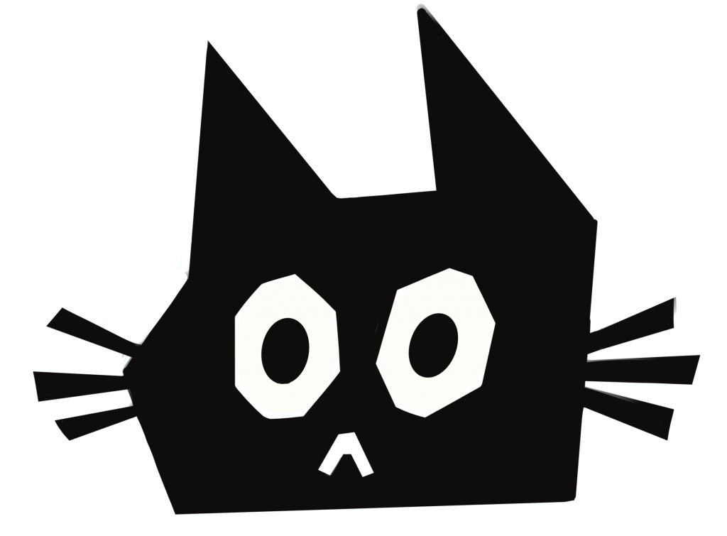
Now, I know we said that we’d only decided on three logos, but I couldn’t help including one more. There was a cat icon that I had drawn up, and for some reason I wasn’t able to part with it, so it made it’s way into the fray. Good luck, cat logo!
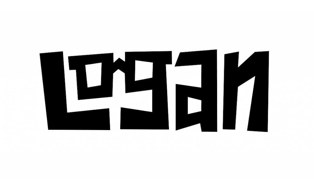
First, I refined one of my word-mark logos. Overall, I’m not super excited about this one and I think I’d much rather prefer an icon based logo. Typography has never been my strength, so I always feel awkward hand lettering things and I’m never entirely happy with how they look. Anyways, this one was inspired by my love of chunky sans serif typefaces, but with an added flair of “Logan” in the glasses.
Second was the coffee mug icon, which is more in line with my tastes and personality. It’s simple, and I feel like I could have some fun playing with facial expressions!
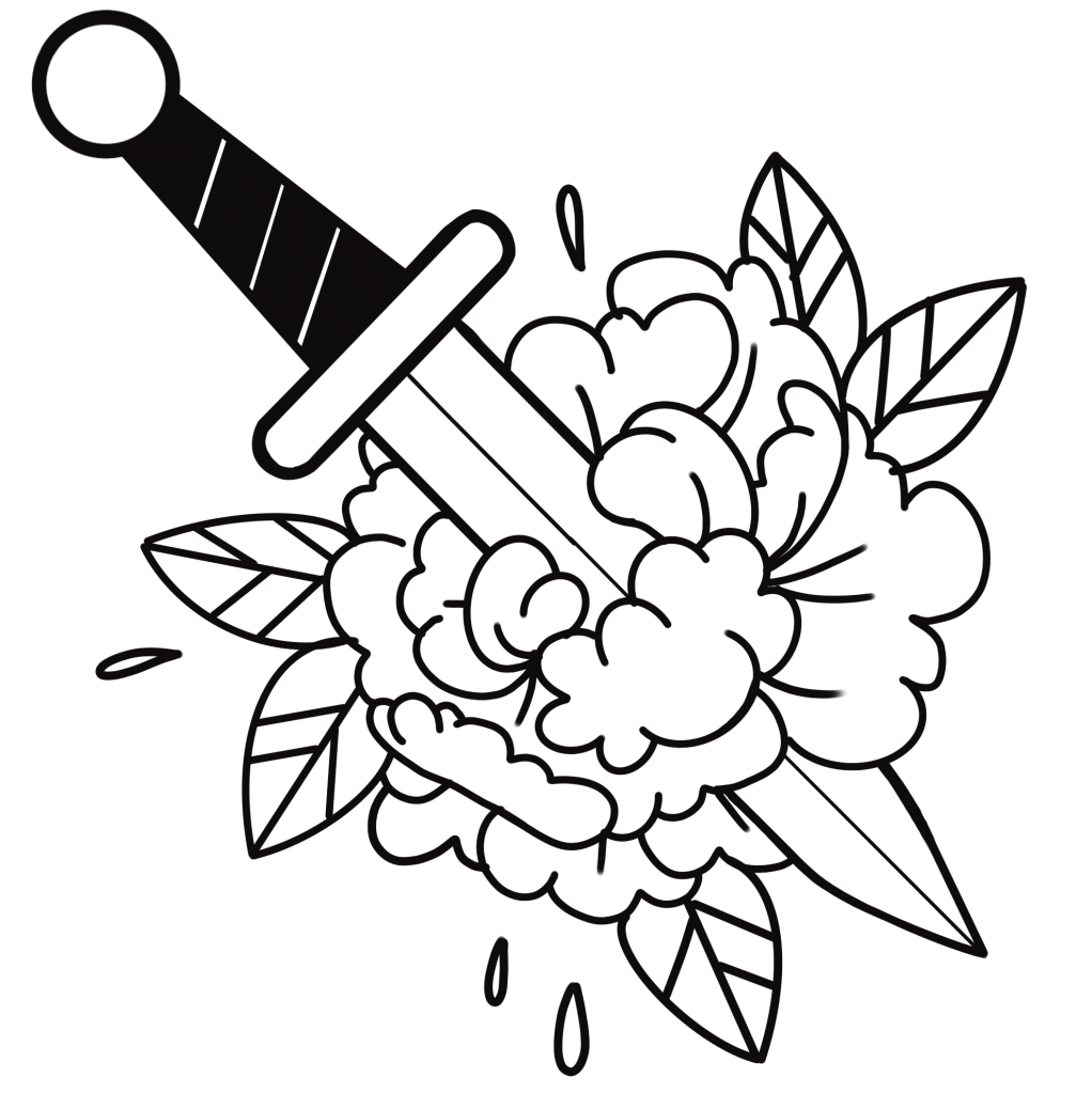
Next up is an illustrative logo inspired by my tattoos and love of tattoo culture. It’s something that I’m easily recognized by and known for, so it seemed like an obvious logo solution. As well, I can incorporate my line art quality that is very recognizable in my art style.
And finally, my cat logo that I couldn’t resist exploring! It’s a simple, cartoony depiction of a black cat, which is a symbol that has kind of become synonymous with myself. I like taking a typically dark, “taboo” figure and turning it into something approachable and cute.
Overall, I think I did some diverse exploration and I’m happy with my mix of concepts! I’d give myself an 8/10!
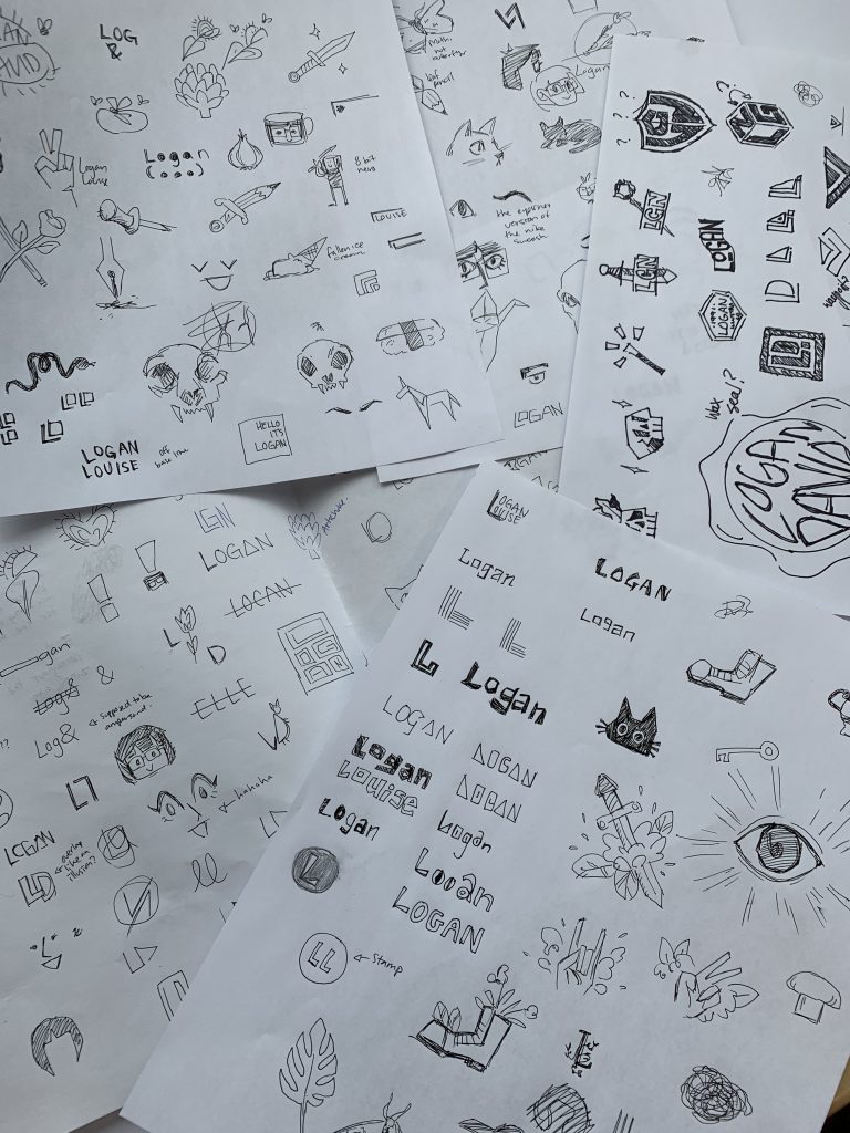
For the next part of our Personal Branding process, we’ve started developing and exploring pieces for our logos. The first week of logo development, we were tasked with generating 100 ideas. For the first round, I focused on the “low hanging fruit” of logo design, like my name in various forms and relevant iconography. For the second round, I tried to push the icons further by making them more experimental and obscure, but it was hard to toe the line between relevant and… just weird. I wanted to make something unique without losing the sense of my identity in the process. I haven’t yet settled on some favourites, because I’m trying to not sway myself before I think more about furthering my ideas.
LinkedIn was easy to do, because I had already made a portfolio in the past and I just needed to revamp it. It’s hard trying to blend my personality while also trying to maintain a sense of professionalism. It was fun making connections with current and former graduates in IDEA though!
For the first part of our personal branding assignment, we had to create several mood boards that reflected our aesthetics and tastes. As someone who LOVED making mood boards, this was a treat. I tried to focus on elements that resonated with me and that I could potentially carry on into my own brand, rather than just looking for the best aesthetics. For the most part, it was an easy process and I know enough about myself and my style that I could fill them out with ease. Some of the more abstract topics, like sounds and smells, were a bit trickier because I was torn between being accurate and making the mood boards aesthetically pleasing, but I think I found a good compromise. I’m curious to see how these elements will inspire me as I progress further!
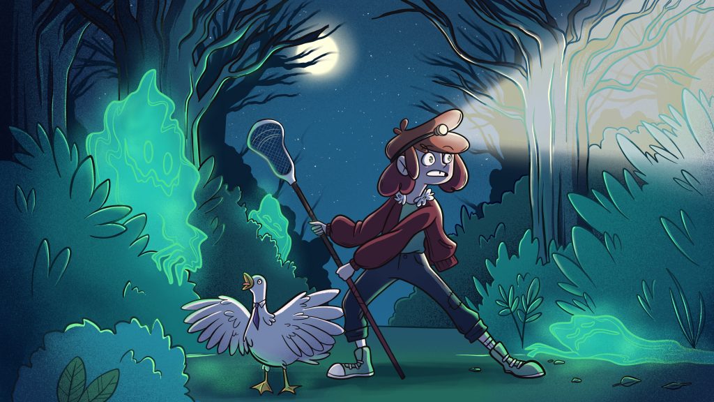
I was very excited to take this class because character development is something that I enjoy doing and would love to someday do as a profession, whether that be with an animation studio or through my own independent endeavours. My goal for this class was to push my character to look unique and compelling while also taking the opportunity to strengthen my illustration and colouring skills.
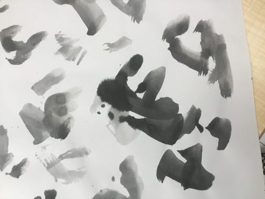
In our first class, we did a fun exercise where we used diluted ink to create tons of blobs on sheets of Newsprint. We worked quickly and loose and didn’t think too hard about what we were creating.
Next, we looked through our ink blots and tried to find “characters” within the shapes. I had a difficult time with this, because I tend to start my drawings with more structure, but this challenged me to explore new ideas and push my skills and style. If we found a character within a shape that we liked, we had the option to pursue it further with our final illustration. Unfortunately, a lot of mine ended up looking like grouchy old men or downright ugly characters, so I chose to take another approach.
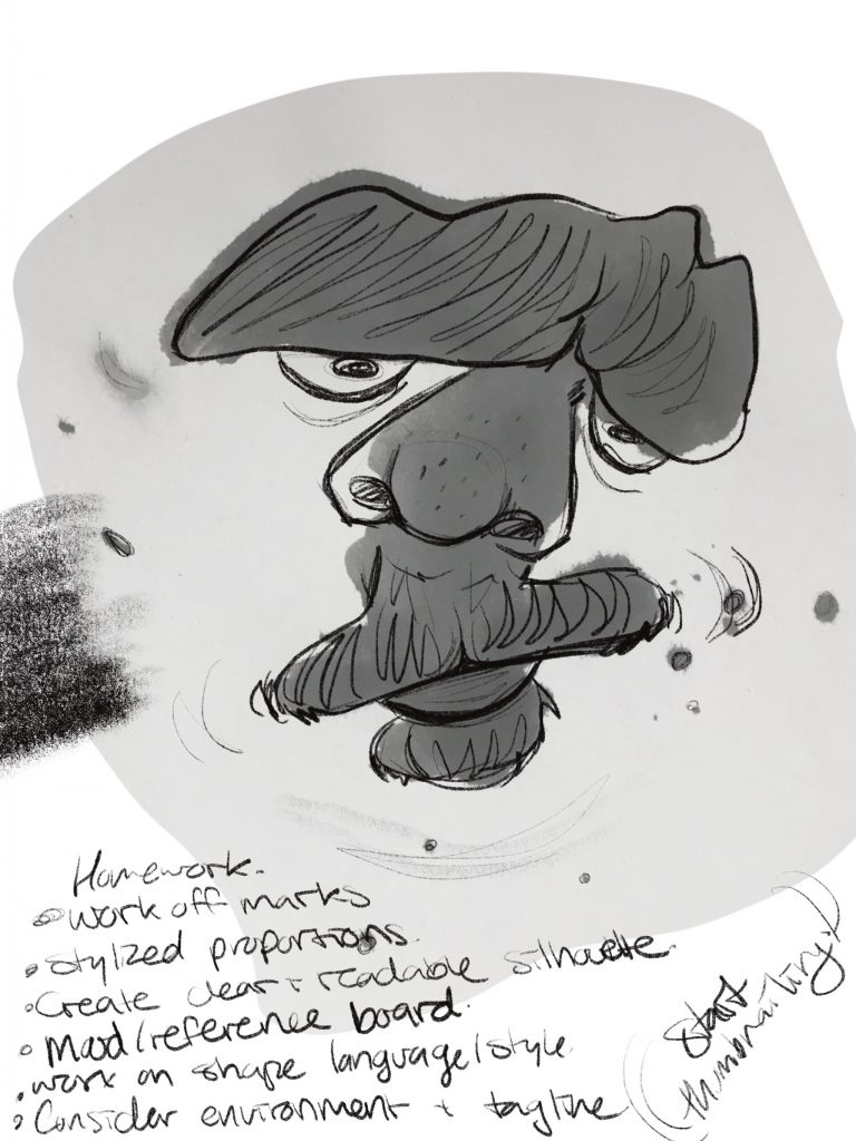
One of my Grumpy Old Men
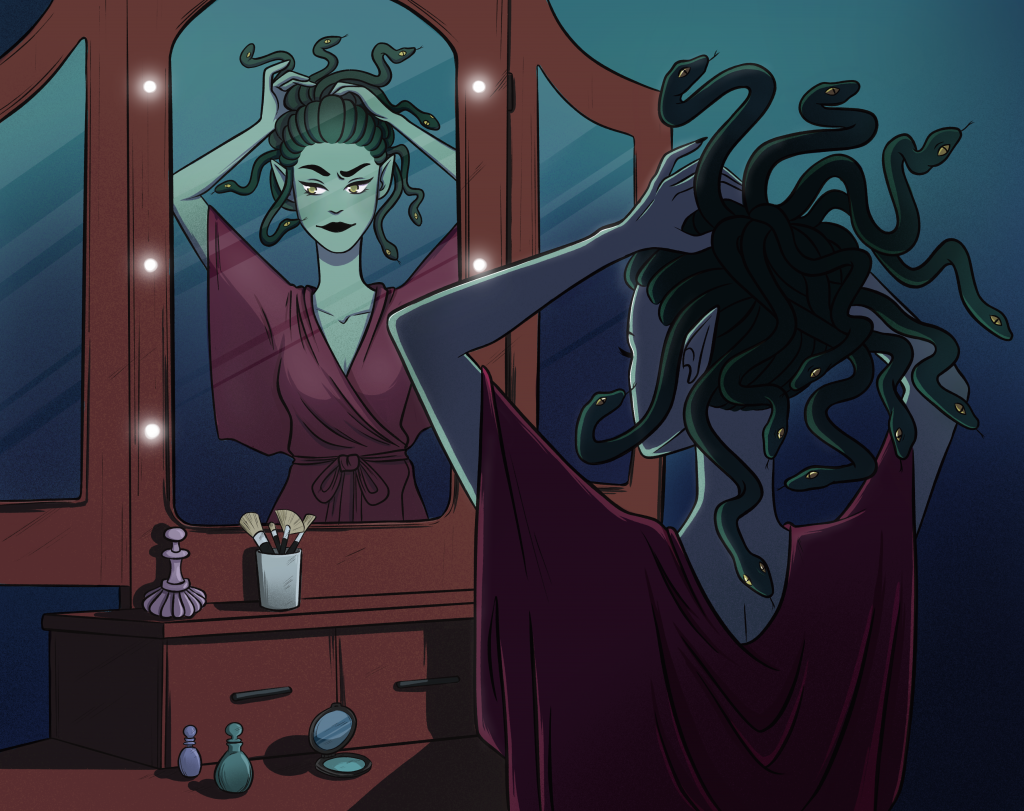
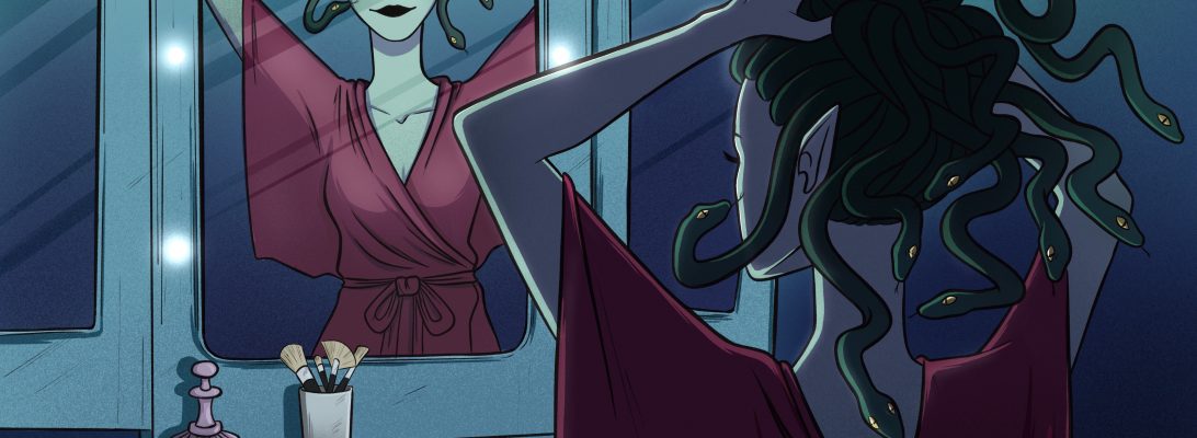
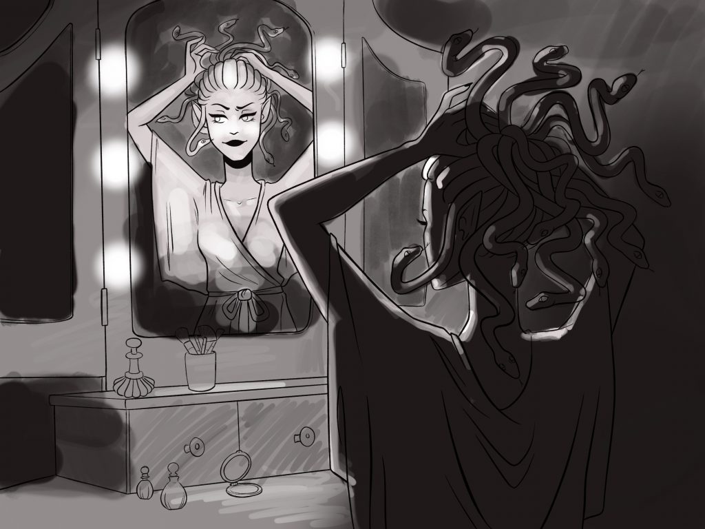
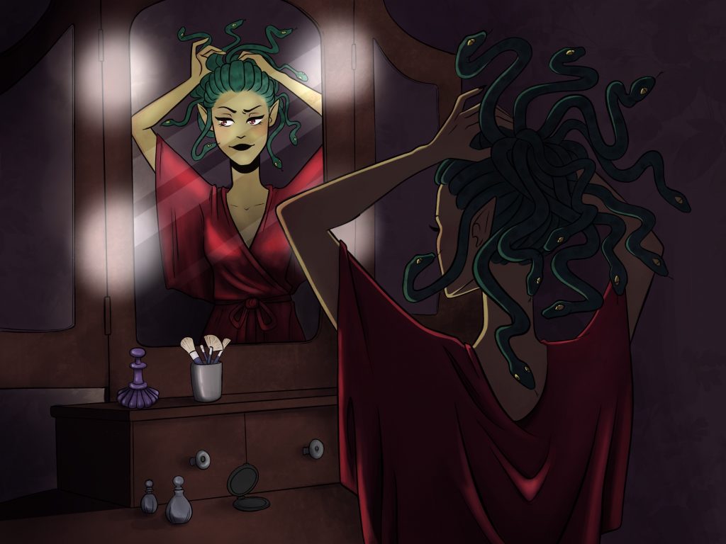
Instead of working with the ink blots, I chose to base my character off a set of shapes to give her a strong and unique silhouette, which was the intended goal. In my exploration, I landed on a silhouette that reminded me of a character that I had worked on for a previous assignment in Jeff’s class; She was a Gorgon lady, like Medusa, who collected the statues of the people she had turned to stone. While I overall enjoyed that past assignment, looking back on it now, the illustration seems very stiff and generic compared to what I’m capable of now (it’s crazy how much you can improve in only a year). So I decided to take the opportunity to tackle a similar character, but put her in a more unique setting. Enter: Gorgon Business Mogul. She’s strong, contemporary and unafraid.
I sketched some thumbnails of her in various settings, like in a boardroom, walking down a hall with an intern trailing behind, and other work-based settings that suited her intimidating aura. But then I sketched a scene of her at home, sitting at a vanity, and was attracted to the intimate setting of a character who wouldn’t often reveal her private life to others. I settled on this concept, especially because the lighting would be far more dynamic than some of the other concepts.
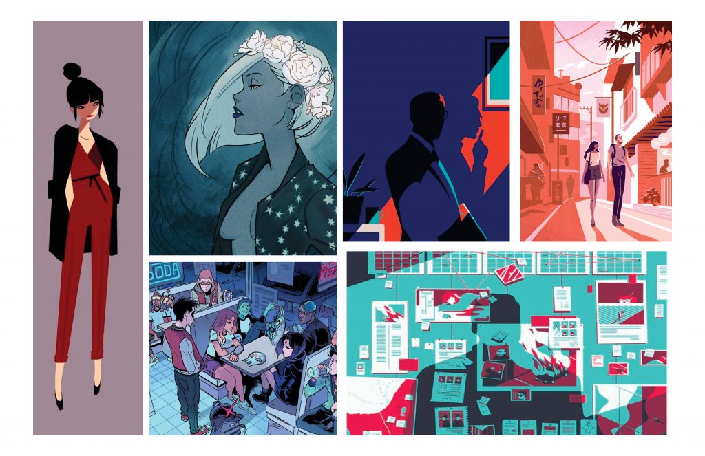
Style/Inspiration BoardGreyscale shadow/lighting study. Unfortunately, I somehow managed to delete my other sketches in the development process.
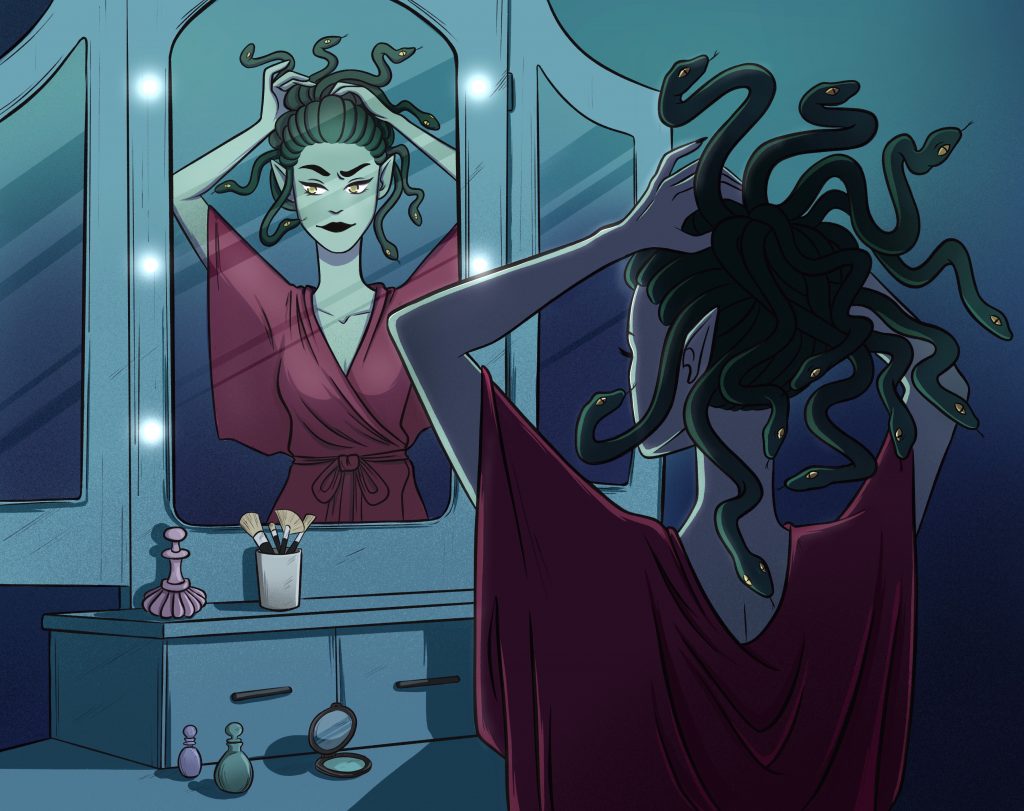
My first attempt at colouring her… failed miserably. I was sick for that week and when I looked back on the work I had done, it was a mess of different colouring styles and a not-so-cohesive colour pallette.
Yeah, I wasn’t feeling too hot.
SO… I decided to redo the colouring entirely and sharpen the lines as well, and I was much happier with the result. I chose a more uniform colour palette and decided to go for a more graphic colouring style rather than… whatever the hell I was doing before.
I’m… much happier with this version. There’s still room for improvement, but I hope to explore more with this character in the future.