Mentorship – Ideation

For my Mentorship, I was paired with Jouchelle Miranda, a storyboard artist working at Atomic Cartoons. I knew from the start that I wanted to do concept art/character design for my mentorship project, and upon seeing her work, I knew it would be a great opportunity to hone my skills and flesh out some characters.

We met for a beer and I presented some ideas to her that I thought I could flesh out for the project, two of which were based on existing illustrations of mine and one was an idea for a Webcomic that I’ve been thinking about for a while. I expressed what my desires were out of the project, as well as my weaknesses and what I wanted to improve on out of this, along with developing a great portfolio piece. As dynamic expressions and characters were something that I struggle with, we decided to focus on that and take the path of the Webtoon in order to have a fresh start.

An illustration that I did in Mark Pilon’s class and one I considered to expand on for the mentorship
Likewise, this was an illustration done for Zoe Evamy’s class and another that I was considering.

Personal Branding – Final Logo

It’s done!! Well… mostly. Last week, we critiqued out logo ideas in small groups and it was decided that I should pursue the wordmark (namemark?) logo as my final. Admittedly, I was apprehensive. Like I said before, hand drawn type has never been a strength of mine, so I wasn’t sure if I could pull it off well enough. It was a struggle, but luckily I was able to ask the help of a freelancer friend of mine, and he helped me to incorporate the glasses without over thinking the shape. It’s not perfect (yet), but I think I’ve gotten it to a point where I’m starting to be happy with it! Hurray!

In terms of application, I’d love to animate the eyes so they appear to be blinking, winking, “smiling”, etc. I feel confident that I can give this logo even MORE personality!

I put a lot of work into revamping this dang logo, and after being fully prepared to give up and move on to a different one, I somehow managed to make something of it. It’s on it’s way, for sure! I’d give myself an 8.5/10!

Personal Branding – Logo Concepts

After some peer review, we narrowed down our logo sketches to our three favourites, thanks to Judy! Overall, I agreed with the comments that were made and I was happy with the ones that Judy helped me to decide on, because I feel like they resonated well with the brand. Next, I brought the sketches into procreate and drew some slightly more refined versions. From those, we will pick one to carry on with and fully refine into the final version.

Now, I know we said that we’d only decided on three logos, but I couldn’t help including one more. There was a cat icon that I had drawn up, and for some reason I wasn’t able to part with it, so it made it’s way into the fray. Good luck, cat logo!

First, I refined one of my word-mark logos. Overall, I’m not super excited about this one and I think I’d much rather prefer an icon based logo. Typography has never been my strength, so I always feel awkward hand lettering things and I’m never entirely happy with how they look. Anyways, this one was inspired by my love of chunky sans serif typefaces, but with an added flair of “Logan” in the glasses.

Second was the coffee mug icon, which is more in line with my tastes and personality. It’s simple, and I feel like I could have some fun playing with facial expressions! 

Next up is an illustrative logo inspired by my tattoos and love of tattoo culture. It’s something that I’m easily recognized by and known for, so it seemed like an obvious logo solution. As well, I can incorporate my line art quality that is very recognizable in my art style.

And finally, my cat logo that I couldn’t resist exploring! It’s a simple, cartoony depiction of a black cat, which is a symbol that has kind of become synonymous with myself. I like taking a typically dark, “taboo” figure and turning it into something approachable and cute.

Overall, I think I did some diverse exploration and I’m happy with my mix of concepts! I’d give myself an 8/10!

Personal Branding – Logo Ideation and LinkedIn Profile

For the next part of our Personal Branding process, we’ve started developing and exploring pieces for our logos. The first week of logo development, we were tasked with generating 100 ideas. For the first round, I focused on the “low hanging fruit” of logo design, like my name in various forms and relevant iconography. For the second round, I tried to push the icons further by making them more experimental and obscure, but it was hard to toe the line between relevant and… just weird. I wanted to make something unique without losing the sense of my identity in the process. I haven’t yet settled on some favourites, because I’m trying to not sway myself before I think more about furthering my ideas.

LinkedIn was easy to do, because I had already made a portfolio in the past and I just needed to revamp it. It’s hard trying to blend my personality while also trying to maintain a sense of professionalism. It was fun making connections with current and former graduates in IDEA though!

Personal Branding – Mood Boards

For the first part of our personal branding assignment, we had to create several mood boards that reflected our aesthetics and tastes. As someone who LOVED making mood boards, this was a treat. I tried to focus on elements that resonated with me and that I could potentially carry on into my own brand, rather than just looking for the best aesthetics. For the most part, it was an easy process and I know enough about myself and my style that I could fill them out with ease. Some of the more abstract topics, like sounds and smells, were a bit trickier because I was torn between being accurate and making the mood boards aesthetically pleasing, but I think I found a good compromise. I’m curious to see how these elements will inspire me as I progress further!

2D Character Development

I was very excited to take this class because character development is something that I enjoy doing and would love to someday do as a profession, whether that be with an animation studio or through my own independent endeavours. My goal for this class was to push my character to look unique and compelling while also taking the opportunity to strengthen my illustration and colouring skills.

In our first class, we did a fun exercise where we used diluted ink to create tons of blobs on sheets of Newsprint. We worked quickly and loose and didn’t think too hard about what we were creating.

Next, we looked through our ink blots and tried to find “characters” within the shapes. I had a difficult time with this, because I tend to start my drawings with more structure, but this challenged me to explore new ideas and push my skills and style. If we found a character within a shape that we liked, we had the option to pursue it further with our final illustration. Unfortunately, a lot of mine ended up looking like grouchy old men or downright ugly characters, so I chose to take another approach.

One of my Grumpy Old Men

Instead of working with the ink blots, I chose to base my character off a set of shapes to give her a strong and unique silhouette, which was the intended goal. In my exploration, I landed on a silhouette that reminded me of a character that I had worked on for a previous assignment in Jeff’s class; She was a Gorgon lady, like Medusa, who collected the statues of the people she had turned to stone. While I overall enjoyed that past assignment, looking back on it now, the illustration seems very stiff and generic compared to what I’m capable of now (it’s crazy how much you can improve in only a year). So I decided to take the opportunity to tackle a similar character, but put her in a more unique setting. Enter: Gorgon Business Mogul. She’s strong, contemporary and unafraid.

I sketched some thumbnails of her in various settings, like in a boardroom, walking down a hall with an intern trailing behind, and other work-based settings that suited her intimidating aura. But then I sketched a scene of her at home, sitting at a vanity, and was attracted to the intimate setting of a character who wouldn’t often reveal her private life to others. I settled on this concept, especially because the lighting would be far more dynamic than some of the other concepts.

Style/Inspiration Board
Greyscale shadow/lighting study. Unfortunately, I somehow managed to delete my other sketches in the development process.

My first attempt at colouring her… failed miserably. I was sick for that week and when I looked back on the work I had done, it was a mess of different colouring styles and a not-so-cohesive colour pallette.

Yeah, I wasn’t feeling too hot.

SO… I decided to redo the colouring entirely and sharpen the lines as well, and I was much happier with the result. I chose a more uniform colour palette and decided to go for a more graphic colouring style rather than… whatever the hell I was doing before.

I’m… much happier with this version. There’s still room for improvement, but I hope to explore more with this character in the future.

Thanks for the class, Zoe!

AHIS 430-01 Glossary Terms

Action to Action: The most common transition in comics. This is where the first panel is the beginning of an action and the second is the end. They’re often dynamic and show “movement”. In some cases, multiple panels might be used if the action is long or complicated.

Aspect to Aspect: This transition is often used to set the mood and subtly entice the reader. This is where each panel shows a different subject, often not a part of the sequence or story, but is instead meant to observe the surroundings. It is used to pace comics and create a certain mood—longing, discomfort, apprehension, etc.

Caption: A text box, separate from the speech/dialogue bubbles, used to give the narrator an inner voice. Can be used to further storytelling and get insight into the character’s thoughts. I’ve noticed a lot of western superhero comics use it at the beginning of each issue, almost to fill the reader in on what happened since last issue.

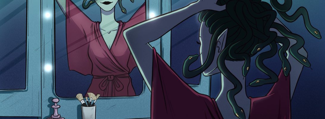
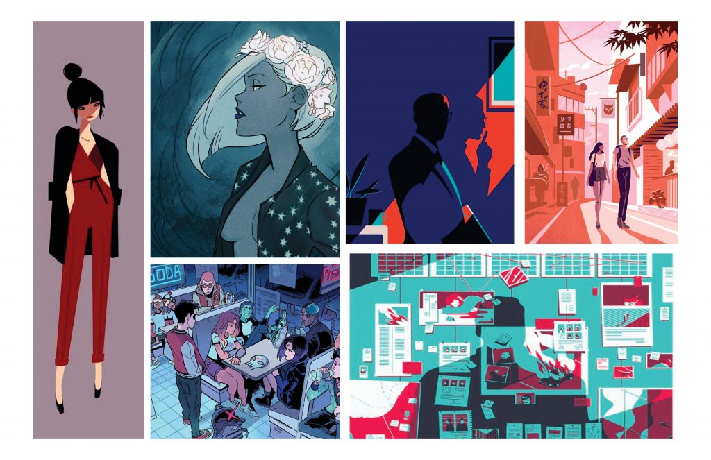
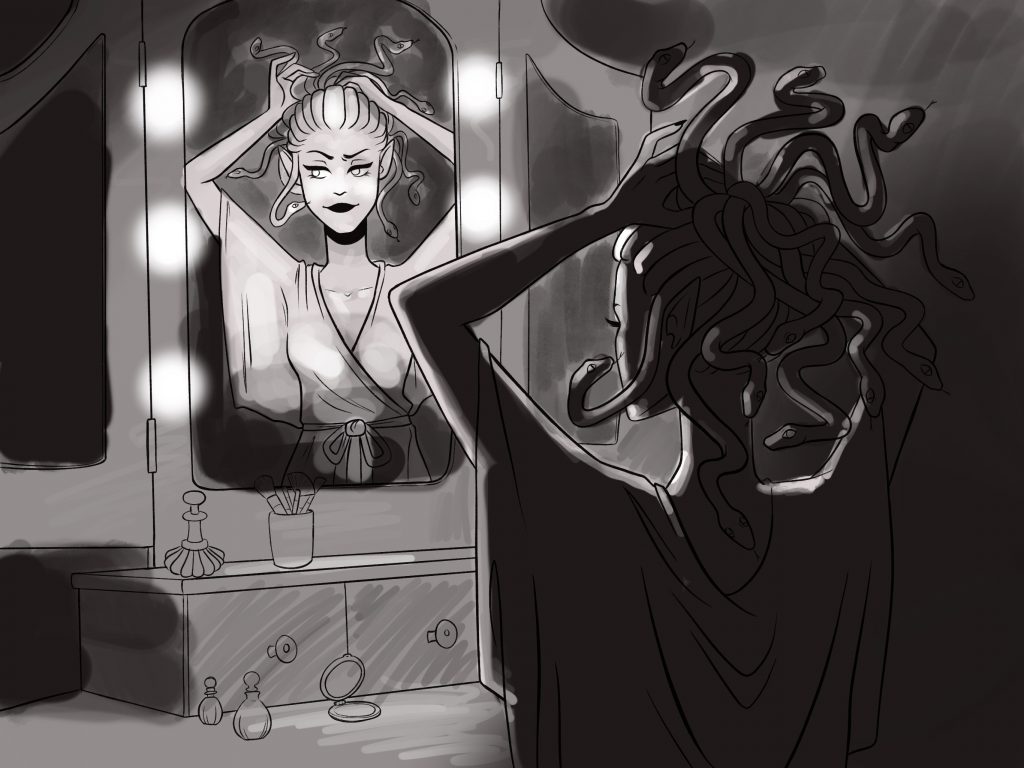
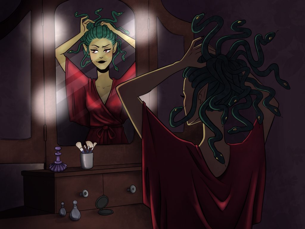
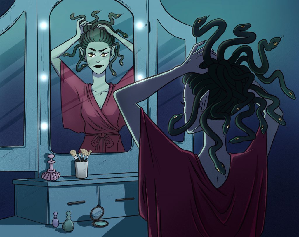
Cartoon: To put it simply, it’s a very simplified representation of something or someone. Cartoons can vary in detail and completion, but they’re often very distinguishable from realism in their style. Cartoons can have big eyes, simplified and blocky hair, basic lines for noses and mouths, etc. Cartoon styles are distinguishable among artists and add a lot of character to the medium in which they’re used!

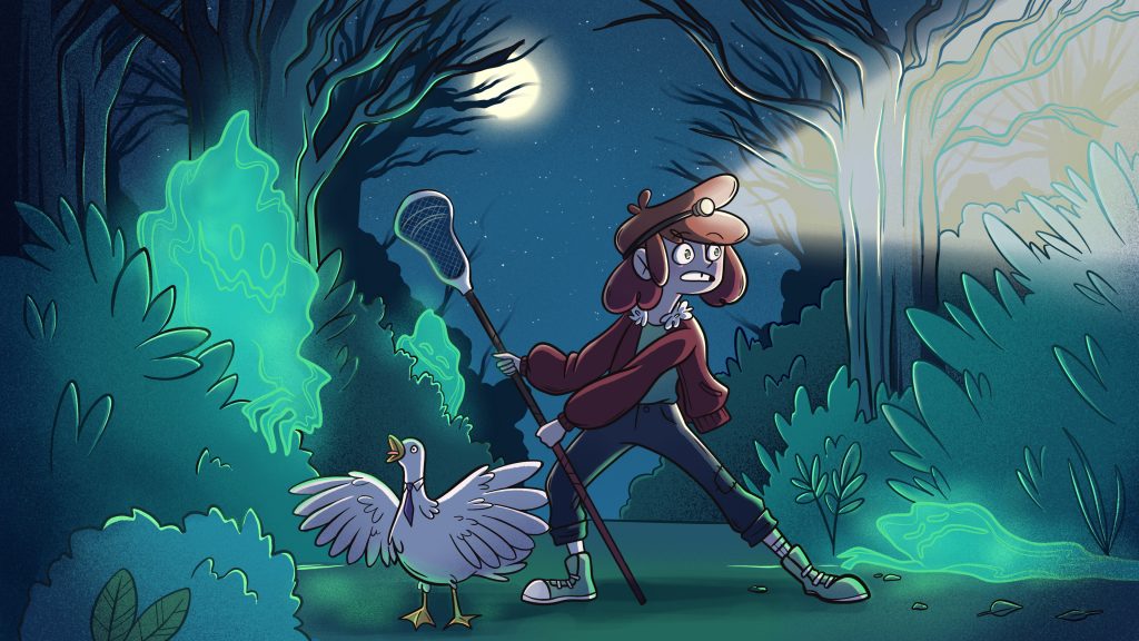
Comic: In Scott McCloud’s words, comics are “juxtaposed pictorial and other images in deliberate sequence, intended to convey information and/or to produce an aesthetic response in the viewer.” More or less, they’re sequential images that may or may not tell a story and are often illustrated. I think the definition can vary in many, many different ways and it’s hard to nail down a true meaning to the word. “Comic” could very much be subjective! To me, it’s storytelling in the form of sequential illustration (and sometimes with words).

Composition: In comics, composition is extremely important. It all comes down to what the reader can see, and the author/illustrator has the job of making the comic as legible and seamless as possible (if basic storytelling is their goal). Even the arrangement of panels comes into play and must follow the rules of how a person reads in their respective culture.

Graphic Novel: In my opinion, “graphic novel” is just the term for a comic when people think the word “comic” is too childish. Realistically, graphic novels are longer than your average serialized comic and usually are released in novel form, rather than in issues. Graphic novels are popular among short series that wouldn’t benefit from serialization.

Gutter: The space between comic panels/frames. These can be crucial in that they’re the space in which the reader is intended to piece together the two frames. They can vary in size and shape as well as time span and even location. The author has a great task of making gutters effective and compelling.

Icon: An icon is an image that is universally (in most cases) used to represent a person, place, thing or idea. The rendering and style should have no effect on the readability, and readers should be able to understand what the icon is regardless of art style. Icons can be anything from religious symbols to flags to widely used logos to signs.

Indie Comic: Indie Comics are also known as Alternative Comics. These are published by smaller companies, often written by lesser known authors/artists, and often are for more mature audiences. They aren’t your typical serialized superhero comics or manga. They originally stemmed from the “underground comix” of the mid 70s but have since become massively popular for their complex subject matter and compelling stories.

Issue: Particularly in Western Cultures, comics are often published as serialized issues. This practice goes back to the early days of Superhero comics and has since continued to today. Although graphic novels and manga have become massively popular over recent years, superhero comics and many others are still published as weekly, biweekly or monthly issues. This maintains the novelty while also continuing the tradition of “collecting” issues. Because of this, some issues gain value over time and can be sold for far more than their market price. (I once sold a copy of Detective comics for $150!)

Layout: The layout is simply how the panels, gutter, spreads, etc. are all… laid out on the page. This can vary based on art style and storytelling, causing drama, evoking an emotional response, depicting time and space, to just simply getting the story across.

Manga: Japanese comics! Manga has a drawing style that is native to Japanese artists, but has been reworked and adapted by many North American artists today. They’re often considered to be “low brow”, but I think some of the best storytelling comes from manga, despite how convoluted and outlandish they tend to be.

Moment to Moment: This transition is used in a short amount of time, making the scene last as long as possible. With this, the scene is able to appear tense, slow, or frustrating. By lingering on one scene (or an aspect of a scene) it gains significance in the story.

Non Sequitur: A transition between two panels that… have pretty much nothing to do with one another. In many cases, this can be used to advance time or to skip between scenes/characters. If used poorly, they can look chaotic and mismatched, but maybe that’s what the author was going for in the first place.

Omnibus: A large volume that contains a complete work or a series of works. In the case of comic books, many issues or short graphic novels are compiled into an omnibus for convenience, and as a collector’s item. Personally, I think they’re a bit inconvenient because they tend to be HUGE and I can’t see myself carrying around something twice the size of a biology textbook to read on the bus.

Panel: Simply, it’s the box (or contained area) that holds the image and text within a current scene. An individual frame. Sometimes it’s just a drawing, sometimes it’s just words, but it’s that single moment in time depicted in the comic. I don’t know how else to explain this.

Pause Panel: A “silent” panel in a comic, usually leading up to an action of a punchline. Much like the Moment to Moment transitions, these can be used to create tension and suspense in a story.

Point of View: Who’s telling the story? While the vast majority of comics are drawn in Third Person (are there any first person illustrated comics?), they’re often narrated in first person. Or Third person limited. Sometimes Omniscient. Anyways, the point of view can vary depending on series and country of origin. Many North American Superhero comics use first person storytelling in the point of view of whichever character is featured. Manga, on the other hand, typically have a more omniscient approach with less narration.

Scene to Scene: A transition that moves the reader through time and/or space. It’s often used in order to skip the boring, fluffy bits that would’ve taken place in between scenes. Nobody wants a boring comic, so scene to scene is the way to go.

Splash Page: A panel that takes up the entirety of a page. This is for scenes that need a lot of emphasis (“wow” factor). They’re also used as beginnings or endings, as they can act well as a title page or a cliffhanger/resolution in many cases.

Speech Bubble: When a character speaks in a comic, their dialogue is often within a speech bubble! These can have many different characteristics and can help set the mood. They can be jagged (angry), rounded (friendly), bubbly (thoughtful), or limp (weak/tired)—the options are endless. If the author is feeling meta, they can even acknowledge the existence of speech bubbles in their stories or have the characters interact with them (though it’s not very common).

Subject to Subject: This is a transition that depicts different elements of the same scene. It can be several different characters reacting to the same scene or a different perspective on the same scene. Like many of the other transitions, it’s typically used for dramatics.

Symbol: A recognizable icon that doesn’t need to be clarified. A popular example would be the emblems that superheroes wear on their chests—you don’t need an explanation, because you know the S stands for Superman. The people of Gotham City aren’t confused when the Bat symbol lights up the sky, they know exactly what it means.

Volume: Whereas an issue is a weekly/biweekly/monthly story, a volume is a collection of issues… but not quite as big as an omnibus. Usually they contain anywhere from 5-8 chapters/issues. Manga is almost exclusively published in volumes, because the serialized “issues” are typically released through magazines… at least, for the big name series.

Webcomic: An independently made, independently published comic, usually not-for-profit (though I’m happy to see many artists are getting the support they deserve now). There are many sites to read webcomics, and they vary in skill level, meaning anyone can make one! If you’re an aspiring comic book writer, this is the perfect place to start.

Zine: A self-published short magazine, usually in small circulation and made through collaboration. Zines can feature any kind of subject matter and are typically limited print. They can contain anything from short stories to comics to illustration and are a passion project among communities.

GDC Campaign

For this assignment, we were tasked with providing the GDC with a means of attracting more students to their organization. As it stands, the GDC has much to offer for students, but it seems that students and young adults aren’t aware of the GDC and their resources or they simply don’t care. Our group chose to solve this issue with a guerrilla campaign that would not only educate students about the GDC, but create a fun and memorable experience that could be looked forward to.

Our group proposed the idea of a GDC “spirit week” that could take place twice per semester as a means of informing students about recent GDC and design news. In order to make the experience more memorable, games would be played during breaks in between GDC lectures and talks. The games would be alternate versions of ones that already exist, but themed so that they can incorporate design themes and terms. Because the games are based on preexisting ones, they’re easily played without any complicated rules. Students can win prizes for winning and participating in these games, and the student ambassador could also collect the student’s names and enter them in a draw for a chance to win a grand prize.

Because this event celebrates design fundamentals, we decided to go with a “flashback” theme. Our moodboard was inspired by 80s and 90s retro design; the look of the event is fun, retro and energetic. Social media posts will be designed in this style to create a consistent feel leading up to the event. The games themselves will be appropriate for classroom participation and will be quick, easy and won’t interrupt class time. The GDC classroom ambassador would be responsible for gathering and distributing the appropriate materials (games are available as simple PDF print-outs).

We decided on games because they’re a fun, interactive and engaging way of making the GDC more memorable and present within classrooms. Rather than just having lectures and info sessions, games and a bigger social media presence would benefit the GDC and help them better connect with students. The aesthetic we chose is trendy and fun, but it doesn’t take itself too seriously, which makes the GDC seem more approachable to students.

Our group collaborated very well and we all had valuable input. We had regular check-ins and made sure to have everything done on time so that we weren’t holding each other back. Overall, I am pleased with the amount and quality of work that we were able to accomplish as a group and we had a lot of fun doing this project! In terms of group cooperation and distribution of work, I’d happily give our group a 10/10!

In terms of my own personal work on the assignment, I contributed to the ideation, game creation and copywriting for the project and final presentation. I feel like the work was evenly distributed and we all finished it in a timely manner with very few hiccups in between.

Reconciliation Social Campaign: Cultural Appropriation

For this assignment, we were tasked with making a self-directed design solution around the topic of reconciling with the First Nations peoples of Canada. It’s a topic that I’ve always held close to my heart, though have always been reluctant to approach out of fear of appropriation/offending others. It was important to me to handle this subject with care, and so I chose to focus on the topic of Cultural Appropriation so that I was less likely to misinterpret or misuse something from indigenous cultures. As a privileged white Canadian, I thought it best to educate other privileged white people on how they can be allies to indigenous groups.

In my research, I was startled to find that most attendees of festivals who wear appropriated clothing don’t actually realize what they’re doing, or they’re simply ignorant about the issues and do not care. A lack of education on appropriation as well as the normalization of appropriated “costumes” (through halloween, cultural events, etc.) have blurred the lines for festival goers. My goal was to challenge the decisions of these people and make them question why they chose to wear what they did in the first place. It’s intended to shame the wearer, and rightfully so because appropriation in itself is offensive and shameful towards the cultures that are being stolen from.

Because of this, my deliverables had to be easily accessed and forced onto the attendees. Social media is easily ignored, so if you deliver something along with the tickets, they’re forced to acknowledge it before the festival even starts. I chose to create a zine to be delivered with the tickets as well as a poster series that would be displayed at the festival itself. The tone and imagery are colourful and jarring, and intended to make the viewer uncomfortable with their decision-—much like how indigenous people and people of colour are faced with discomfort caused by appropriation.

The challenges that I faced, especially after meeting with the Indigenous studies class at Capilano University, were that I was afraid of crossing the line of appropriation myself. I had to choose my imagery very careful and I made sure to collect images of First Nations people that would’ve actually lived in the area that the festival takes place in—The Kutenai and Sinixt people. I was dissatisfied with my original design and restarted the posters from scratch after receiving helpful advice from the Indigenous studies class. Overall, I’m much happier with my designs now than I was at the beginning and I feel I’m successfully portrayed the tone and message while also maintaining respect for the First Nations referenced in my campaign.

Considering the amount of revisions I had to take in order to get to a place where I felt comfortable presenting, I feel very satisfied with my work. In the future, if I get the opportunity, I’d love to expand on my Zine concept and fill in the rest of the pages that I didn’t have time to create.

For this project, I’d give myself a solid 8.5/10.

Personal Resume

For my resume, I chose to cater it towards video game companies like EA. A goal of mine is to work in the gaming industry at some point in my life, so I thought it would be fun to base this resume on that! I chose a pixelated, retro aesthetic because I find it pairs well with the gaming industry, as well it captures my “geeky” personality.

Because I have a lot of work experience, I tried to be as succinct as possible so it wasn’t too text heavy. I thought I did a good job of balancing the space that I had available, while also adequately detailing my work experience.

Overall, I’m fairly happy with the result, but there is obviously some room for improvement. I would give myself a 7.5/10.