Hello, my name is Rachel and I am currently a first-year at Capilano University’s IDEA program. I’m eighteen years old and have spent my whole life to this point in North Vancouver. This is where I developed my passion for art, reading, and writing; but, I joined the program for my love of storytelling. Over the next four years of the program, I hope to improve my technical and creative skills so that through my work I can find unique ways to tell these stories. Outside of the program, I enjoy playing ice hockey, gardening (or attempting to), and listening to way too much music.
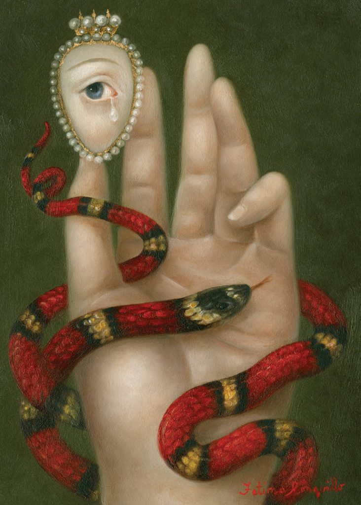
Painting by Fatima Ronquillo commissioned by Gucci for a painting of a Lover’s Eye.
For my Artifact Project, I decided upon a popular trend in the Victorian Era, that started with Queen Victoria herself, called the Lover’s Eye, or a painted miniature. Lover’s Eye’s were typically a painted watercolor eye of one person’s lover that they would wear on a piece of jewelry. The Lover’s Eye would most commonly be a broach in a simple frame that could be surrounded by jewls if you could afford it. The jewelry was used as a discrete way of showing who the person was either dating or courting and often sparked gossip over who was in the miniature. Yet, it was most commaly used as a way to show affection. I used the painting above as a reference for how I would take my photo later.
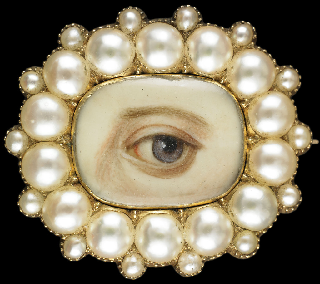
A simpler Lover’s Eye that I would reference for the design.
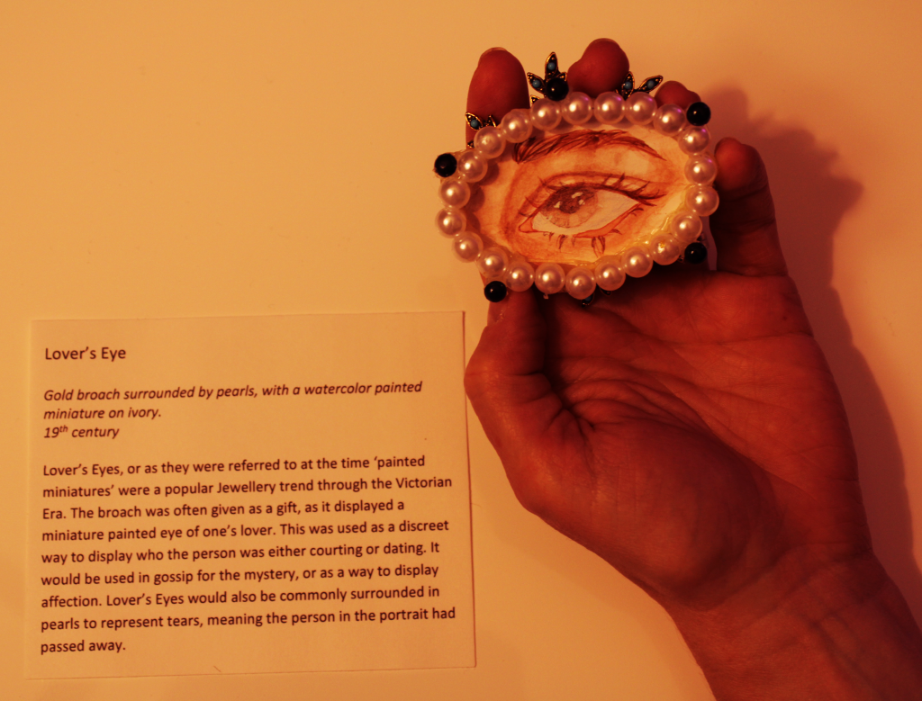
Originally I sketched out more intricate designs like the image below. Unfortunately, I have never made jewelry, so I needed to simplify the design so I could complete a broach with the limited materials and knowledge in jewelry making I had. I ended up basing the design off the Lovers Eye above. I knew I wanted to surround the eye in pearls as it was commonly used to symbolize tears, meaning the person whose eye in the portrait had passed away.
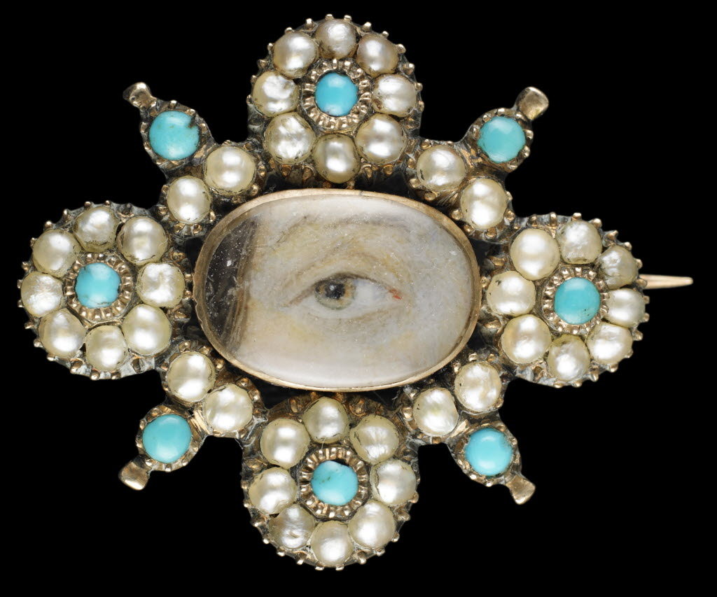
This is another example of a Lover’s Eye with a more intricate design surrounding the miniature.
I began by arranging and threading fake pearls on a thin metal wire to surround the eye. I cut out a piece of mixed-media paper and painted a left eye in watercolor. Lover’s eyes are typically paintings of the left eye as it’s said to be connected to the heart. I then hot glued the ring of pearls to the paper and then hot glued the miniature to a backing of an old broach. I thought it looked too simple so I evenly spaced out five fake black gems and created a platform in hot glue so that the gems would stand out from the pearls then glued them down. I went in after with a pencil crayon over the eye to fix some values and then set up the camera shoot to mimic the first Fatima Ronquillo painting of Gucci’s Lover’s Eye. Overall the process went smoothly and took me an estimated 4 hours in total with research to complete the assignment. Other than my failure to understand a hot glue gun at first I’d say the Artifact came out how I hoped it would. If I wanted to improve I might have done more research into jewelry to allow me to better understand how to make a more intricate design. I’d give myself a 9 out of 10.
Here’s the final outcome.
My version of the Artifact ‘Lover’s Eye’, photo based on the Gucci painting.
Citations:
Bewkes, Stacey, et al. “Lover’s Eyes: A History Lesson.” Katie Considers, 5 June 2018, https://katieconsiders.com/2018/06/05/miniature-lovers-eye-jewelry/.
ESMAN, ABIGAIL R. “Lover’s Eye Jewelry: This Romantic (Yet Eerie) Tradition Is Entrancing Artists Right Now.” The Study, 29 Oct. 2020, https://www.1stdibs.com/blogs/the-study/lovers-eye-jewelry/.
Gotthardt, Alexxa. “Why Lovers in 18th-Century England Exchanged Mysterious Painted Eyes.” Artsy, 4 Jan. 2019, https://www.artsy.net/article/artsy-editorial-mysterious-history-lovers-eye-jewelry.
All image Citations came from this site:
Bewkes, Stacey, et al. “Lover’s Eyes: A History Lesson.” Katie Considers, 5 June 2018, https://katieconsiders.com/2018/06/05/miniature-lovers-eye-jewelry/.
Carl Jung’s Psychology of the Unconscious published in 1913
Photo of famous Swiss Psychotherapist and Psychiatrist Carl Gustav Jung.
Carl Jung’s Many Intrests
Born in 1875, famous Swiss Psychotherapist and Psychiatrist Carl Gustav Jung would spend his early years developing an interest in religious history and medicine. He would go on to study at the University of Basel pursing and completing a medical degree. Yet, it would be the time spent after his degree where he would begin to create some of his most famous work. Jung joined the Burghoelzli Clinic in Zurich after graduation and would cultivate a keen interest into the complexities of the human unconscious mind.
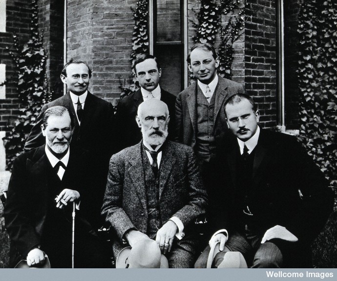
Image of Sigmund Freud, Stanley Hall, Carl Gustav Jung, Abraham Arden Brill, Ernest Jones and Sándor Ferenczi. All leading Psychotherapist and Psychiatrist of their time.
A Diffrence in Academic Opinion
Jung would go on to travel the world and write books on his new psychoanalytical theories. Along his journeys, Jung would send a copy of one of his books “Studies in World Association” to Sigmound Freud. Impressed with Jung’s work, the equally famous Austrian neurologist Freud would offer to have him visit. Togther they would discuss ideas of the human subconscious. Jung agreed with Freud’s theories but believed there was something more that Freud hadn’t tapped into yet. They would become good friends intill parting ways due to a difference in academic opinion, as Freud would openly criticize Jung’s idea of a collective consciousness and the idea Jung developed categorizing the unconscious into archetypes.
Though this lead to the end of their friendship, this theory on archytypes would be Jung’s most famous and long lasting idea. He would also explore the religious nature behind human psychology, going back to his childhood interest in the psyoclogical impact of religion. Jung founded analytical psychology and would popularized the idea of the two personality types of introversion and extroversion. He would even go on to write many more books like “Archtypes and the Collevtive Unconscious”, “Man and his Symbols”, and “The Relations Between the Ego and the Unconscious”. Carl Jung’s work is one of the most influential and well recognized. He alone would help revolutionize psychoanalytical theories and even influence modern pop-culturte.
Carl Jung’s Book “Psycology of the Unconscious”. This explores some of his most famous theories.
K-pop, Gaming, and Other Psychological Studies
Carl Jung would shape the future for studies done into Psychology. Psychotherapist and Psychiatrist would build off his work in Word Association and Divergent Veiws, Psyche and the Unconscious Mind, Archetypes, Introversion and Extroversion, and the Significance of Dreams. There would also be influence from Jung’s work that he couldn’t have forseen.
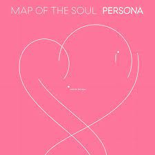
Jung would go on to also impact the Abstract and Expressionist Art movements. Painters like Jackson Pollock and Mark Rothko would use the idea on exploring the unconscious mind in their drawings and paintings. More recent pop culture references would be the international K-pop group BTS, as they would be inspired to create three albums further exploring Jung’s work into unconsciousness with their music. They would include albums tracks that are titled after Jung’s famous archtypes, “Map of the Soul: Persona”, “Map of the Soul: Ego”, and “Map of the Soul: Shadow”. Another famous reference to Jung’s work would be the video game titled Persona. Currently there are 5 very popular games in this series with characters and themes that also use the Archtypes from Jung’s work. Jung’s theories have spread to multiple platforms, mediums, and even have been explored in films. Whether it’s splatter paint art, K-pop songs, violent videogames, or Jung’s studies and books; there is a form of media accessible for all to learn from and enjoy.
K-pop group BTS’s album “Map of the soul: Persona” inspired by Jung’s Map of the Soul.
This is the Persona 5 video game inspires by Jung’s Archtypes.
Citations:
“Carl Jung’s 11 Best Books.” Exploring Your Mind, 25 Nov. 2017, https://exploringyourmind.com/carl-jungs-11-best-books/.
Erin, Adrinne. “Carl Jung’s Contributions To Psychology.” Carl Jung’s Contributions to Psychology, 10 Oct. 2019, http://www.dreampositive.info/carl-jungs-contributions-to-psychology/.
Ruiz, Susana L. “Analytical Psychology of C.g.jung L Psicoanalista Madrid.” Analytical Psychology of C.G.Jung l Psicoanalista Madrid, 14 Sept. 2019, https://bienestarpsicoanalisis.com/analytical-psychology/.
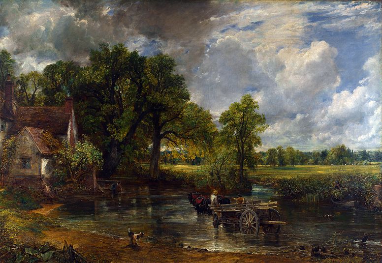
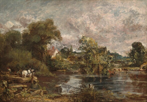
‘The Hay Wain’ Painted in oils on canvas, this painting is one of Constable’s more well-known pieces for its strong use of color and
Painter, John Constable revolutionized the genre of landscape paintings with his Romantic style that became popular in the late 18th century. Even though his paintings hang in the most prestigious of galleries, and sell for millions of dollars; within his own lifetime he didn’t garner much financial success. Yet, that doesn’t mean neither he nor his work wouldn’t have any impact. In fact, his work would help define future art movements and would elevate landscape painting to be taken seriously as an art form.
When Constable painted, he painted from life and not his imagination. “When I sit down to make a sketch from nature, the first thing I try to do is to forget that I have ever seen a picture.” He would make many sketches in the wilderness before even starting the painting process.
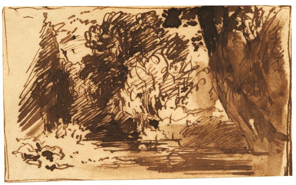
This is an example of compositional drawings by John Constable done in pen, ink, and wash. It’s one of his more messy sketches but was recently found and sold for 92 thousand dollars. It’s assumed to the painting ‘Jaques and the Wounded Stag from Shakespeare’s from at different angle at the same river.
This is the painting John Constable created from the aforementioned sketch named ‘Jaques and the Wounded Stag from Shakespeare’s’. I can’t be sure if it’s the same place myself but it’s interesting to look into.
J.M.W. is another famous Romantic landscape artist whose name is often brought up in conversation along with constable. His works and ideas were created too early in time to be fully appreciated by the public and I enjoyed viewing the evolution of his art. I admire the amount of movement he captures in colorful thin layers of oil that he uses to transform a landscape beyond what the ordinary eye can see. I wanted to look into both artists because of how closely ties together their work is. J.M.W. became more famous for his revolutionary art after his time for good reason. Yet, after completing the recent landscape assignment, I was drawn to John Constable’s work. While I do appreciate the painting style of J.M.W. Turner, I found that when painting my own landscapes I started with thin washes of paint but ended up blocking in shapes with much more opaque paint and sticking to using more opaque paint. Constable contrasted Turner in many ways, the most notable in their work would be how grounded and opaque Constable’s landscapes feel. I admire his brushwork and felt it would be more beneficial for me to study Constable’s work than another artist in hopes that I can learn to incorporate some of his techniques and ideas into my future landscapes.
‘The White Horse’ 1818-1819 This painting showcases the opaque dabs of oil paint that and would define his style and inspire the Impressionists movement.
Even though his landscapes are beautifully crafted, one of my favorite parts about researching John Constable ended up being his written work. I loved reading his work annotations and the letters he left behind. It gave an insight into his thought process and allowed me to further understand him and what he valued in art. For instance, Constable states “The sound of water escaping from the mill dams, etc., willows, rotten planks, slimy posts, and brickwork, I love such things.” He talks often about his love for the countryside and enjoying the small details that add to the atmosphere. His genuine love for nature shows in his Plein air paintings and is overall really inspiring. He loved and painted nature so much that a part of the English countryside in Suffolk was named ‘Constable Country. He used painting as a way to understand his surroundings. In his own words, Constable wrote to a friend “painting is but another word for feeling”, and I think that’s a really beautiful way to look at creating art.
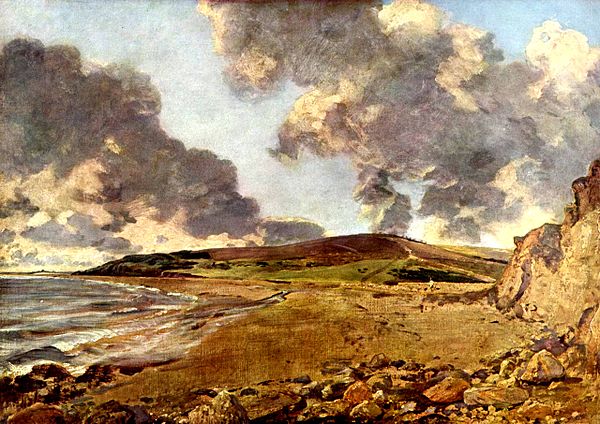
‘Weymouth Bay: Bowleaze Cove and Jorden Hill’ Oil painted on a beach. This painting hangs in the National Gallery in London and showcases a dynamic composition that’s more simple in nature.
Work Citations:
“The Hay Wain.” The National Gallery, 1 Jan. 1970, https://www.nationalgallery.org.uk/paintings/john-constable-the-hay-wain.
Lyles, Anne, and David B Brown. “’Salisbury Cathedral from the Meadows’, John Constable, Exhibited 1831.” Tate, Mar. 13AD, https://www.tate.org.uk/art/artworks/constable-salisbury-cathedral-from-the-meadows-t13896.
Riggs, Terry. “’Sketch for ‘Hadleigh Castle”, John Constable, C.1828–9.” Tate, Feb. 1998, https://www.tate.org.uk/art/artworks/constable-sketch-for-hadleigh-castle-n04810.
“Unearthed John Constable Drawings Sell for £92K.” BBC News, BBC, 6 Mar. 2019, https://www.bbc.com/news/uk-england-suffolk-47470069.
Image Citations:
“The Hay Wain.” The National Gallery, 1 Jan. 1970, https://www.nationalgallery.org.uk/paintings/john-constable-the-hay-wain.
Lyles, Anne, and David B Brown. “’Salisbury Cathedral from the Meadows’, John Constable, Exhibited 1831.” Tate, Mar. 13AD, https://www.tate.org.uk/art/artworks/constable-salisbury-cathedral-from-the-meadows-t13896.
Riggs, Terry. “’Sketch for ‘Hadleigh Castle”, John Constable, C.1828–9.” Tate, Feb. 1998, https://www.tate.org.uk/art/artworks/constable-sketch-for-hadleigh-castle-n04810.
Grimm’s Fairy Tales Published: – Survey 4: Steam and the speed of light (1750 – 1850) and Survey 5: Painters and posters (1850 – 1895)
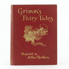
One of the original covers to the Grimm’s Fairy Tales collection.
Once Apon a Time
Grimm’s Fairy Tales is arguably the most influential collection of folklore to this day. There aren’t many people who can say they’ve never heard or seen any modernized iteration of the classic stories. Originally published in 1812 by the Brothers Grimm, Grimm’s Fairy Tales was a two-volume collection of 86 children’s stories. This is where iconic names such as Rapunzel, Snow White, as well as Hansel and Grettel came from. The stories were well received and over the coming years would expand from 86 stories to 210 with their rising popularity.
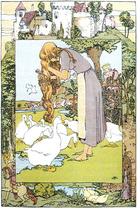
“The Goose Girl” Illustrated by Heinrich Vogeler and one of the original 86 stories in the Grimm’s Fairy Tales.
A Change in Violent Tendencies
As time passed more stories were added in, but there were also many that changed due to public opinion. See, even though the stories were marketed towards children, they aren’t the type of stories you’d think of telling a child nowadays. Especially as the original 86 stories were blunter, and more tragic with often brutal and graphic descriptions of violence. The Grimm brother even added some concepts that were too complex and scholarly for kids to understand. This lead to some revisions in the later editions of Grimm’s Fairy Tales.
One of the first changes that happened was the rise in evil stepmothers. Originally, many of the stories simply used a wicked mother as the villain. Though, this wasn’t received well so they later changed any evil mother to an evil stepmother for their lack of “motherhood sacredness”. There was another issue with violence and mature themes being unsuitable for children. In many respects, those aspects were changed, but the violence was never truly toned down. In fact, it seems as if instead of lessening the violence, that brutality became redirected towards punishing villains. Yet, this must have been seen as more respectable for readers as there were no complaints or changes till Disney came along to create their line of animated adaptations. This is also where fairy tales got pushed into mainstream pop culture. Disney was also the force that came along and created the idea of a ‘happily ever after’, as before this there was no guarantee that the protagonist would come out the other side of the story unharmed. Grimm’s Fary Tales pushed the idea of narrating a moral lesson over providing happy endings. Disney didn’t completely remove the idea of a moral lesson from their stories but did significantly childproof them for the silver screens.
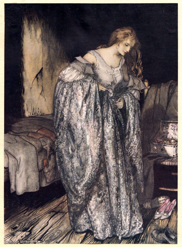
Illustrated by Arthur Rackham in the book the Grimm’s Fairytale 1917’s version of the story ‘The True Sweetheart’. One of my personal favorites from the collection of stories.
The Modern Influence and Legacy
Grimm’s Fairy Tales and most of their stories are talked about like common knowledge and referenced to likes of ancient Myths and Legends. Characters in the stories are considered iconic, they are referenced as notable archetypes and are the inspiration for many artists and storytellers to draw upon, sometimes without even knowing. Grimm’s Fairy Tales are deeply saturated in all forms of media and have a strong grip on pop culture. This is especially true, as recently Hollowood pushes the production of as many live-action re-makes of the Disney original cartoons as they can. No matter how good the movies are, or how closely they stick to the source material; they tend to do well as they feed on a strong sense of childhood nostalgia. This speaks volumes of how the stories are to this day able to be enjoyed by a wide audience of children and adults alike. There is a universal appeal to these stories like no other. They have the ability to adapt and evolve with time. They can change genre, and medium and still be well recognized by a wide audience. Whether it’s a painting, play, musical, dance number, movie, or even the one original Grimm’s story, they have and will continue to hold their place in history for people everywhere to enjoy.
Popova, Maria. “Arthur Rackham’s Rare and Revolutionary 1917 Illustrations for the Brothers Grimm Fairy Tales.” The Marginalian, 10 Oct. 2019, https://www.themarginalian.org/2016/02/29/arthur-rackham-brothers-grimm/.
Zipes, Jack, et al. “How the Grimm Brothers Saved the Fairy Tale.” The National Endowment for the Humanities, Apr. 2015, https://www.neh.gov/humanities/2015/marchapril/feature/how-the-grimm-brothers-saved-the-fairy-tale.
Image Citations:
Forgottenbeauty. “The True Sweetheart – Little Brother & Little Sister – Brothers Grimm – Arthur Rackham Art Board Print by Forgottenbeauty.” Redbubble, https://www.redbubble.com/i/art-board-print/The-True-Sweetheart-Little-Brother-and-Little-Sister-Brothers-Grimm-Arthur-Rackham-by-forgottenbeauty/33821322.TR477.
“Grimm’s Fairy Tales by Rackham, Arthur – Jonkers Rare Books.” Jonkers Rare Books – First Edition Books, Signed & Antique – Jonkers Rare Books, https://www.jonkers.co.uk/rare-book/9727/grimm-s-fairy-tales/arthur-rackham.
“The Goose Girl.” Wikipedia, Wikimedia Foundation, 30 Aug. 2021, https://en.wikipedia.org/wiki/The_Goose_Girl.
Typography Zine Project Rational on the Most Memorable Font from the Art Nouveau Era
In this assignment, I started off with a very strong idea of where I wanted to go with the project. I loved the research and aesthetic I built for the layouts. Unfortunately, I didn’t realize until much later that I picked a font that would not be subtle for the project. This was a major set back and in the future, I will be reading the briefs more carefully. For these setbacks, I will be giving myself a 7 for my personal score. The setback cause a time restriction and I feel I could have done more for this project. I did enjoy it when I eventually got to the font I’d end up using, Arnold Böcklin. The design choices came easy to me, as I love Art Nouveau and Alphonse Mucha, whose work help define the era. Art Nouveau was the theme for this zine so I used naturalistic shapes like arches in the patterns as many of the design choices done in Art Nouveau were inspired by nature. With that came a softer color pallet that I kept very minimal. I spent around 6 hours on the collective research and design portion of the assignment and have left with a better understanding of the intricacies of typography and the Art Nouveau.
Survey 2: Baroque, The Dutch Golden Age, Rococo, Neoclassicism, & Romanticism
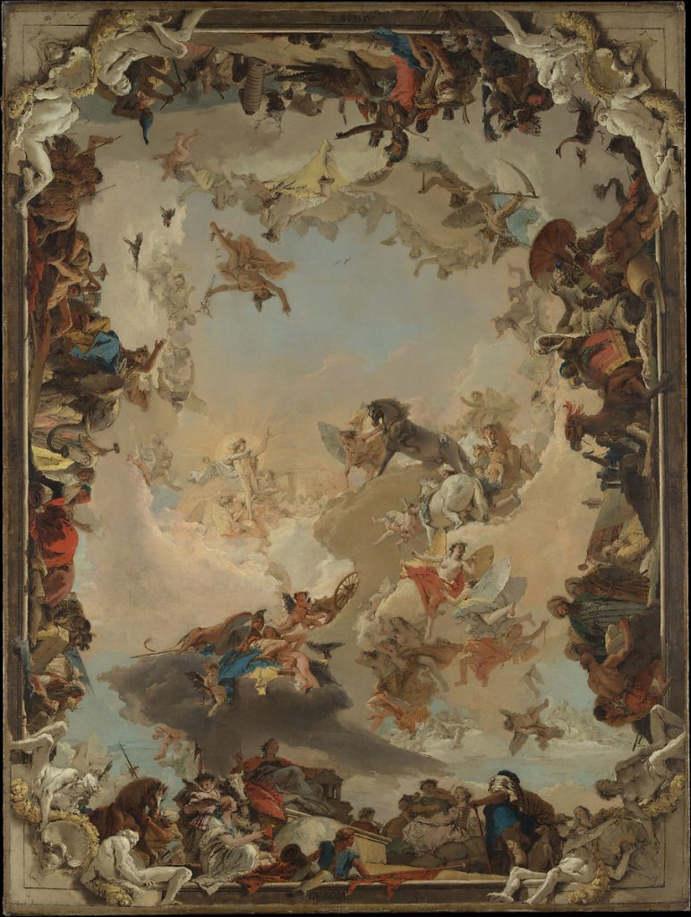
“Allegory of the Planets and Continents” is regeared as Tiepolo’s greatest artistic achievement. It is both complex with the multitude of figures in dynamic poses that lead the viewer’s eye smoothly around the composition. The painting is packed with detail to create an allegorical message behind the piece. The figures represent both the four continents and members of the Greco-Roman that were often connected to celestial bodies. The way different characters in the painting interact each tells smaller stories within the larger piece.
Giambattista Tiepolo is the first name you will find on the list of the Venetian painters’ guild in 1717. He is also known as Giovanni Battista Tiepolo and was a notable Italian painter and printmaker who was often commissioned to create art for Germany and Spain during the Rococo era. His work commonly showcases popular Rococo themes as he often painted allegorical pieces of classical myths or incorporated layers upon layers of symbolism to tell stories within his art.
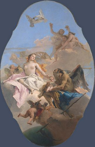
“An Allegory with Venus and Time” this oil painting represents the passage of time using Greek gods and their associations to illustrate the fable. This painting uses Rococo’s infamous softer pastel color pallet. Tiepolo also has a unique way he frames and crops his paintings. He often uses shapes, whether that’s blocks of flat color or detailed frames like the example above.
This is an example of some of the lesser-known works of his prints. Known as the “Half-dressed Nymph with two children, surrounded by four men”. I thought it would be interesting to dive into some of Tiepolo’s work in other mediums. I was looking to see the possible stylistic crossover between his printing and painting work. It’s possible that the sketches for his paintings could look similar in style to these prints as he uses etching techniques to create fine lines that imitate the look of pencils or ink on paper
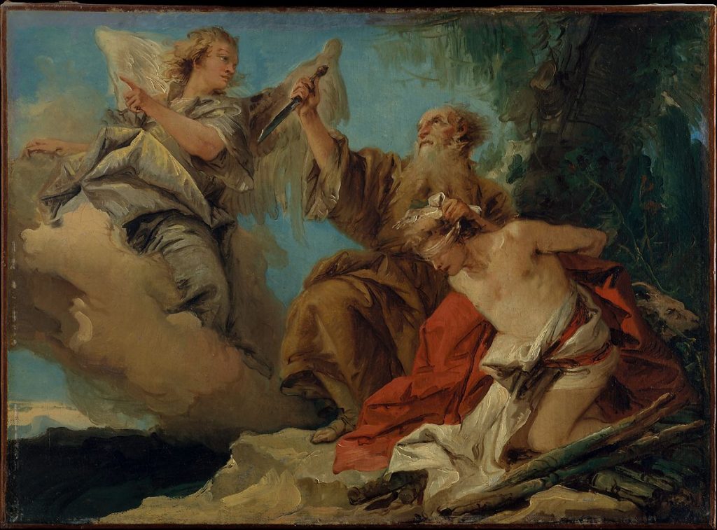
Tiepolo’s paintings carried all the whimsy and decor expected from the Rococo era, even though his style is defined and said to be influenced by the earlier Baroque period. Many of the characteristics in his work can be attributed to incorporating Baroque techniques. This is shown in the sense of drama and movement he brought to each painting. He was almost able to direct his figures among the canvas like actors on stage, conceiving large scenes with genuine emotions and dynamic compositions. All of his work was completed in his signature melancholic style that Tiepolo achieved through the use of strong ‘chiaroscuro’. This can be seen in famous works of his like “Madonna of Carmelo and the “Souls of Purgatory” and especially in “The Sacrifice of Isaac”.
“The Sacrifice of Isaac” is one of Tiepolo’s fewer allegories from the Christain Bible. It’s a story about an angel that keeps Abraham from sacrificing his son Issac in a test of faithfulness. This is a looser painting in terms of brushstrokes, especially in the background. Yet it still uses softer colors and dynamic poses to convey a father’s conviction and faith. This is also the strongest use of chiaroscuro in his work.
I’m an avid lover of storytelling regardless of mediums, so over the process of this blog post, I’ve become a big fan of Giambattista Tiepolo’s work. I love to study the different techniques people use to get these stories across. Tiepolo used symbols to craft his own unique way of illustrating these stories. I love mythology and breaking down symbolism, so I found his work especially interesting research. His style reflected this love for telling stories, as though it’s complex and detailed, he also integrates the use of looser brushstrokes in his works. It seems almost as if he knows the exact quantity of detail and precisely where to put it to get the story of his artwork across in the most succinct way possible. I would like to be able to integrate this quality into my own work to improve my visual compositions and storytelling.
“The Apotheosis of the Spanish Monarch”, was created in 1716 through the use of oil on canvas. This painting was commissioned to be representative of the Spanish Monarchy, attesting to it’s its antiquity, military power, and preeminence among European royal families. This painting is packed with iconography and symbolism, as each figure is either historical, mythological, or allegorical. This is piece is truly a mosaic of stories and symbolism that pushes a larger narrative. It’s a fascinating painting to break down and is probably my favorite as I spent way too much time invested in attempting to understand all the symbolism. If you’re interested the website link below takes you to the MUSEO DEL PRADO’s breakdown of some of the key features in the painting, which I recommend as it adds a level of understanding to help you appreciate the piece further. https://www.museodelprado.es/en/the-collection/art-work/vault-with-the-apotheosis-of-the-spanish-monarchy/6bd56ee8-029e-4534-ac84-c83292602d0b
Citations:
“The Banquet of Cleopatra – Giambattista Tiepolo – Google Arts & Culture.” Google, Google, https://artsandculture.google.com/asset/the-banquet-of-cleopatra-giambattista-tiepolo/wwFHnS1cmltkFw?hl=en.
Christiansen, Keith. “Giovanni Battista Tiepolo (1696–1770).” Metmuseum.org, Department of European Paintings, The Metropolitan Museum of Art, Oct. 2003, https://www.metmuseum.org/toah/hd/tiep/hd_tiep.htm.
“Vault with the Apotheosis of the Spanish Monarchy – the Collection.” The Collection – Museo Nacional Del Prado, https://www.museodelprado.es/en/the-collection/art-work/vault-with-the-apotheosis-of-the-spanish-monarchy/6bd56ee8-029e-4534-ac84-c83292602d0b.
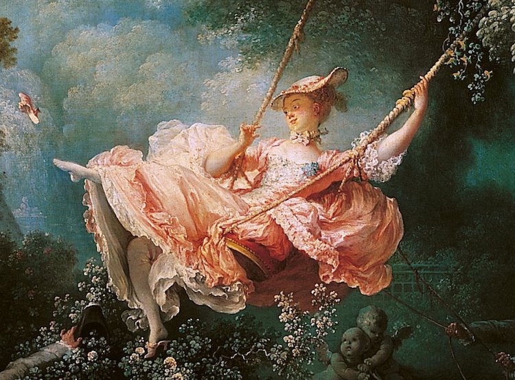
Arguably the most iconic and well-known art piece that came from the Rococo era. ‘The Swing’ is an 18th-century oil painting by Jean-Honoré Fragonard that perfectly encapsulated the Rococo ideals of light-hearted enjoyment, extravagant clothing, and the commonly used pastel colour pallets.
The Rococo period was defined by its extreme extravagance. The word ‘Rococo’ is derived from ‘rocaille,’ the french word that means a shell-covered rock decorating grottoes. Like many eras, the name was an insult or critique of the times’ main ideas and popular style. Rococo was seen as a movement with no substance. All elaborate ornamentation and no meaning or message. Critics of the movement look past all the glamour to see a plain grotto, except with no shells to decorate the cold exterior; leaving behind what is essentially just a dark and empty cave.
Oil painting portrait of King Louis XIV in Coronation Robes. His alternate title (The Sun King) had this painting commissioned to the French painter Hyacinthe Rigaud in 1701. Louis XIV was known for his love and endorsement of arts within the Rococo period.
Even though many people didn’t appreciate Rococo, it is still recognizable and has become iconic. The style is commonly used in fashion, art, and media as a reference point to build off or for its romanticized setting. At the time, Rococo’s fashion, art, and architecture was established by its lavish indulgence, yet modeled after popular ideas of love, youth, and playfulness. Subjects of paintings consisted commonly of innocent lovers in soft pastel colour pallets. Artists typically depicted old myths in naturalist settings. The architecture was centered around gold details and intricate embellishments. The building became more theatrical, with high ceilings, curving lines, and an emphasis on asymmetry. Rococo fashion is known for frills and ruffles. Lace and layers were found in both men’s and women’s fashion. Hair was piled higher, and silhouettes stretched larger and more exaggerated in form. In essence, everything became way more fashionable and much less functional.
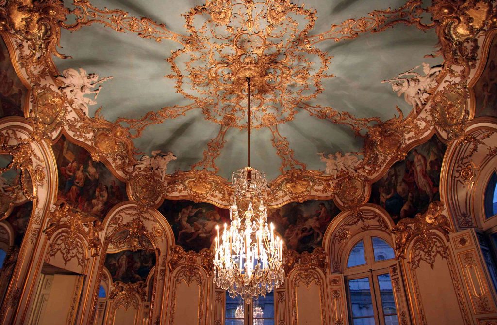
Extravagant Rococo architecture, at the Hotel de Soubise in Paris, France. A great example of the detailed gold embellishments that line the ceilings.
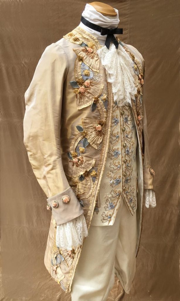
An example of the frilly and highly embellished male garment, popular in the Rococo period. The waistcoat and vest encapsulate the dreamy and decadent quality found in the lavish silhouettes and ornamentation.
Overall, it was a very lighthearted and playful period well reflected in its various arts. Jean-Antoine Watteau and Jean-Honore Fragonard capture this well in their artworks. There was an emphasis on fashion as the Rococo period was also the first era where magazines came out. Articles were being designed and published to spread the word of notable fashion designers and artists. Even though like many periods in history, it’s important to recognize this is an era defined, enjoyed, and documented by the wealthy who could afford the iconic extravagance and luxury. Rococo created a lasting impression on arts and culture that can still be admired and enjoyed to this day.
Painted by François Boucher, this work is inspired by the myth, The Birth of Venus. this painting shows the popular fascination with mythology and lighthearted romantic qualities that defined Rococo art.
Citations:
Boundless. “Boundless Art History.” Lumen, https://courses.lumenlearning.com/boundless-arthistory/chapter/rococo/#:~:text=Rococo%20style%20is%20characterized%20by,myths%2C%20youth%2C%20and%20playfulness.
Editorial, Artsy, and Rachel Lebowitz. “10 Rococo Artworks You Should Know.” Artsy, 29 May 2018, https://www.artsy.net/article/artsy-editorial-10-artworks-defined-rococo-style.
“Rococo.” History of Costume, https://historyofeuropeanfashion.wordpress.com/tag/rococo/.Trapasso, Erica. “A Brief History of Rococo Art.” Artnet News, Artnet News, 10 Mar. 2015, https://news.artnet.com/market/a-brief-history-of-rococo-art-32790.
Review on my Survey 3 Mood Board: Born from Criticism
I really enjoyed the research process within this project. I loved drawing historical connections between different major events. I thought it was fun to create interesting and (hopefully) witty titles, with equally interesting captions that attempt to tell a collective story. I went in with very clear mental depictions of each section on my Mood Board and their overall aesthetics. The most trouble I had on the project was probably the ideation portion of the assignment as I got lost in the research (mainly Rococo art and fashion), and wasted time researching information I knew I wouldn’t use. Aswell as I struggled to adapt to InVision at first, but got the hang of the software soon after. My projects focus was on survey 3, even though it might be the reason I dock myself half a point. I had more unique ideas and connections that I could have explored in other surveys; yet, out of the love for this time period I caved and choose to create my Mood Board on a more generic subject choice. The other half a point would be for the layout of my photos. The way each section is set up isn’t in perfect order to smoothly tell a readable story. My overall personal score is a 9/10. My overall time spent on the project is estimated to be around 6.5 hours.
Blog Post #1 – Late Gothic & Early Renaissance – High Renaissance & Mannerism.
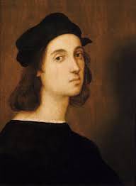
Raphael’s self-portrait, oil on board. In this, he attempts to capture his own artistic persona. It’s a soft painting that cast his eyes downward. This with deeper shadows perfectly portrays his thoughtful and more polite attitude.
The famous Italian painter Raphael started out working under the mentor Perugino; a master painter in the high Renaissance, known for primarily religious paintings in tempera and oils on altarpieces or wood panels. Through his mentorship, Raphael was also able to master techniques such as sfumato, perspective, anatomy, and capturing emotions; these were key qualities that defined the high renaissance art style. Raphael was particularly known for using richer colors in well-balanced compositions as seen in his works like ‘The triumph of Galetea’, ‘Disputation of the Most Holy Sacrament’, ‘Transfiguration, and my personal favorite ‘The School of Athens’.
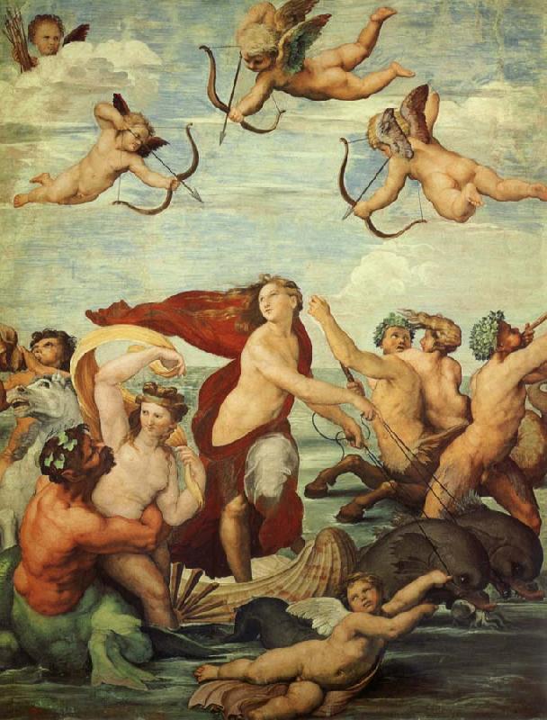
The fresco painting ‘The Triumph of Galatea’, is based on the Greek myth of Galatea and Pygmalion. A great example of Raphael’s capturing emotions and his use of brighter pigments. It helps portray the narrative and moral of idealized forms and love towards artistic creations in the original myth.
Though these works highlight his greatest technical skills they don’t portray the qualities Raphael possessed that set him apart from other painters in the high Renaissance. Raphael’s arguably greatest skill accounts for his even-temper and tenacious work ethic to improve. He was comparably easier to work with and more well-mannered than the other great artists of the time such as Michelangelo and Leonardo DaVinci. Though in comparison he started off at a disadvantage technically, his soft skills of being able to work well with patrons gave him a great advantage in his career. His work ethic to improve is both inspiring to myself and the reason I choose to do further research on this painter. His technical skill is equally amazing but his tenacity to improve is a quality that I value deeply. It greatly paid off for Raphael, as he is now one of the most influential figures that defined art in the High Renaissance.
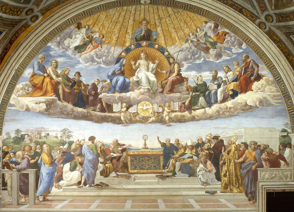
‘The School of Athens’ is a large fresco that adorns the walls of the Apostolic Palace in the Vatican. The painting contains some of the most influential thinkers and creators of the High Renaissance. This shows Raphael’s master over perspective in his almost effortless compositions.
Raphael’s, ‘Transfiguration’ uses dynamic forms and emotion help to narrate the biblical story. The figures have an almost sculpted quality through the use of sfumato. This piece also contains higher areas of contrast than his others. It was completed using Temura on wood in the Vatican city.
‘Disputation of the Most Holy Sacrament’ is another example of Raphael’s ambition with the number of figures he adds to his paintings. He also showcases once again his understanding of perspective and creating depth within beautifully composed compositions. This painting was completed using fresco in Vatican city.
Citations:
Carrigan, Margaret. “The 10 Best Artworks by Raphael, Seraphic Genius of the Renaissance-Ranked.” Artnet News, Artnet News, 10 Aug. 2017, https://news.artnet.com/art-world/10-greatest-artworks-raphael-seraphic-genius-renaissance-ranked-1047047.
Gombrich, E. H. The Story of Art. 16th ed., Phaidon Press, 2021.
“Raphael Paintings, Bio, Ideas.” The Art Story, https://www.theartstory.org/artist/raphael/#:~:text=Raphael%20not%20only%20mastered%20the,that%20was%20distinctly%20his%20own.