The Epic of Gilgamesh: Survey 1 Blog Post (35,000 BCE – 0 CE)
The First Story
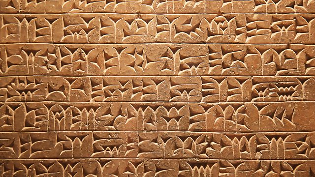
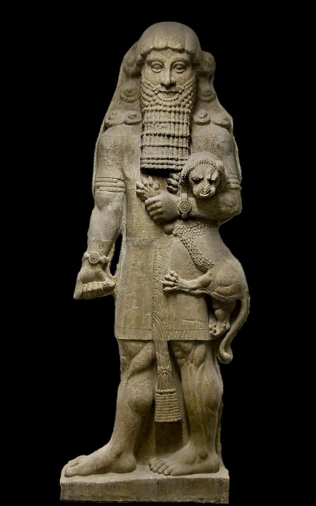
The Epic of Gilgamesh is, to this date, the earliest surviving written text. Created sometime around 2000 BCE in the Sumerian language of Cuneiform, engraved on clay tablets with a reed stylus. This Epic poem is the foundation for modern-day storytelling and some of the first-ever use of literary tropes. Yet, they aren’t the aspects that make this story so relevant to the modern-day. To understand why you need to understand Gilgamesh’s journey. So a brief spoiler alert for quite literally the oldest story in history.
A Pretty Epic Poem
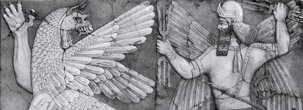
It’s hard to summarize this Epic into so few words, but it starts with the King of Uruk, Gilgamesh. Gilgamesh is a terrible person and even worse king. He’s three-fourths god (no, the math doesn’t add up) and cannot come to terms with his mortality. His people hate him and his tyranny, so they pray to the gods for help. In return, the gods crafted Gilgamesh an equal; his name was Enkidu. Enkidu challenged Gilgamesh to a fight. But, being equal in strength, the battle ceased into a stalemate. Gilgamesh was impressed, and with a newfound respect for Enkidu, they became fast friends. Enkidu taught Gilgamesh to be a better person, and eventually, the horrible ruler became a more beloved king. Together they decided to test their strength against the fearsome giant named Humbaba, and together the new friends slew the beast. Upon their return home, Gilgamesh and Enkidu were by with the goddess Ishtar, who proposes herself to Gilgamesh. He refuses her advances, and the infuriated Ishtar sends the Bull of Heaven to rampage the city and kill both the heroes. Once again, with the power of friendship, they both slay the bull. Unfortunately, the gods are outraged that the Bull of Heaven has been killed and decided someone must pay for this. Enkidu falls sick the next day and dies seven days later to repent for the massacre of the bull. Gilgamesh is stricken with grief that his best friend and equal have passed. He contemplates his mortality and, being unable to cope with being one-fourth human, Gilgamesh ventures out searching for a way to cure his mortality and live forever. He searches long and hard and works himself into sickness. When he finds something, it’s the immortal Utnapishtim; he offers Gilgamesh immortality if he can pass one of the trails. Unfortunately, due to his weariness from his desperate search, Gilgamesh isn’t able to complete the first task but eventually is able to obtain the fruit of immortality. On his journey back, Gilgamesh loses the fruit to a snake and gives up, returning to his kingdom empty-handed and mortal.
The Hero’s Journey
The Epic of Gilgamesh was the foundation for storytelling and modern literature. It created a variation of what would come to be known as the Hero’s Journey, a storytelling format, and many common story elements that would become modern tropes in entertainment. Yet, it’s still a debate if Gilgamesh was truly even a hero. Gilgamesh was generally disliked for very valid reasons. Throughout Gilgamesh’s story, he is a terrible person. He was a tyrant and committed multiple unforgivable crimes against his people and the gods. He never did anything to help anyone other than himself and got his only friend killed in the process. Not to mention he failed his most important task, the one thing he cared about, gaining immortality. Some might argue for these reasons he’s not a hero at all; and, they’re probably right. Yet, I don’t think that was the point of the story. It is generally known that Mesopotamians had a very negative view of the afterlife; this is reflected in Gilgamesh’s story. He wanted to escape his human faults and weakness; he wanted to escape death. Gilgamesh wants to be immortal, but once he returns to Uruk empty-handed, he is left with nothing but his human mortality. Gilgamesh may have fallen to his hubris and failed most of his tasks: but, in the process, he gained knowledge. He was undeniably very flawed but recognized his mistakes and grew past them to live a better life till his eventual death. He never conquered death, just the idea of it. He conquered the thought process that made death ruin his life. It was his limitations that made him a human, yet it was these same flaws that defined him as a hero. Which is an old lesson that many people could learn.
Citations:
Agrawal, Pulkit, and Yanping Zhang. “Harvard Wiki.” The Epic of Gilgamesh – Pulkit Agrawal – Literature 114 (Spring 2014-2015) – Harvard Wiki, The President, and Fellows of Harvard College, 10 May 2015, https://wiki.harvard.edu/confluence/display/k104639/The+Epic+of+Gilgamesh+-+Pulkit+Agrawal.
Bryant, Dewayne. “Epic of Gilgamesh.” World History: A Comprehensive Reference Set, edited by Facts on File, Facts On File, 1st edition, 2016. Credo Reference, https://ezproxy.capilanou.ca/login?url=https://search.credoreference.com/content/entry/fofworld/epic_of_gilgamesh/0?institutionId=6884. Accessed 30 Sep. 2021.
Dixon, Kevin H., and Kent H. Dixon . “The Epic of Gilgamesh.” Sevenstories.com, 5 June 2018, https://www.sevenstories.com/books/4052-the-epic-of-gilgamesh.
O’Neal, Michael J. ““EPIC OF GILGAMESH”: DOCUMENT ANALYSIS ca. 1300 BCE.” Milestone Documents of World Religions, edited by Grey House Publishing, Salem Press, 2nd edition, 2017. Credo Reference, https://ezproxy.capilanou.ca/login?url=https://search.credoreference.com/content/entry/greymdwr/epic_of_gilgamesh_document_analysis_ca_1300_bce/0?institutionId=6884. Accessed 01 Oct. 2021.
Images Citations:
“The Forum, Unlocking the Mysteries of Cuneiform Tablets.” BBC World Service, BBC, 30 Nov. 2020, https://www.bbc.co.uk/programmes/w3cszjwd.
Escabias, M. “‘The Epic of Gilgamesh’. an Epic Poem from 2.500 BC. Incredibly Current.” Actualidad Literatura, Actualidad Literatura, 25 Sept. 2018, https://www.actualidadliteratura.com/en/the-epic-of-gilgamesh-an-epic-poem-from-2-bc-incredibly-current/.
“Harvard Wiki.” The Epic of Gilgamesh – Pulkit Agrawal – Literature 114 (Spring 2014-2015) – Harvard Wiki, https://wiki.harvard.edu/confluence/display/k104639/The+Epic+of+Gilgamesh+-+Pulkit+Agrawal.