For my resume, I started by looking at references for layout and design. I also was working on pairing typefaces together. I ended up going with Futura and Century Schoolbook. I believe Futura shows confidence and a good work ethic. Century Schoolbook was chosen because I have a friendly softer side in my personality. I wanted my resume to have an interesting visual design if seen from further away and also have some colour pop to stand out.
I drew icons for the contact info to show my illustration and drawing style. I also added a small illustration of myself showing that I am fun and interested in the illustration field. Lastly, I chose my unusual title because I think the viewer would think twice or wonder what they will be reading. Overall, the way I wrote the introduction was to showcase that I am fun and approachable and would be an asset to the company. The playful writing also carries is shown throughout the resume design.
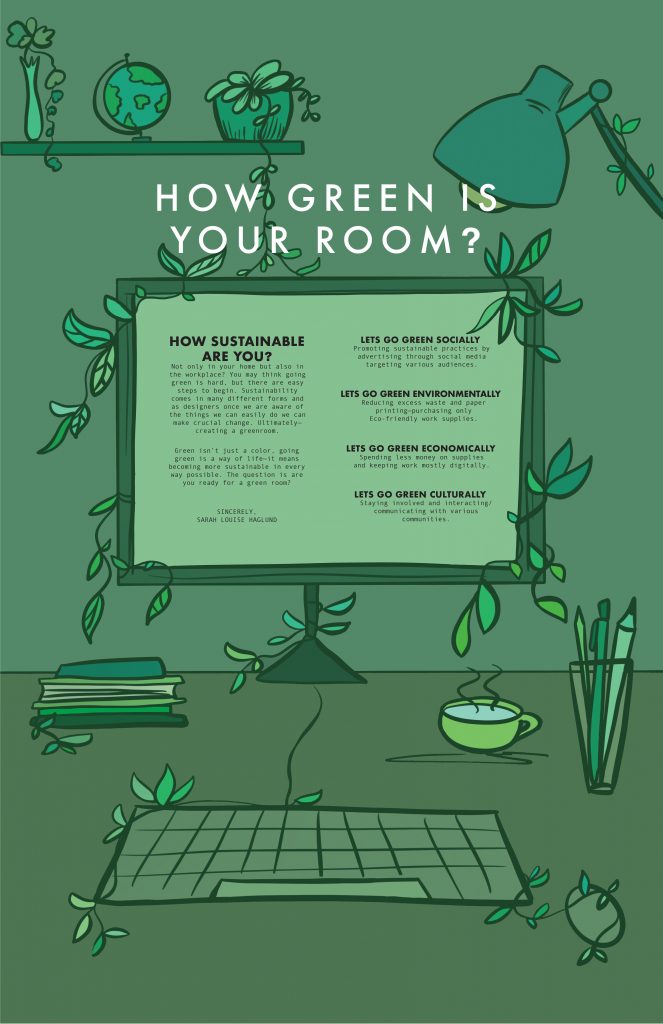
The poster is targeting future industry employers, therefore the design style was showing my personal style and approach for this project.
The typography used was Futura for headers/subheads paired with Andale Mono for the body copy. I believe these typefaces work well together because both are futurist and bold, having a slight personality—not overpowering one another. Andale Mono captured the keyboard computer written appearance, which made the typeface more believable and suit the design.
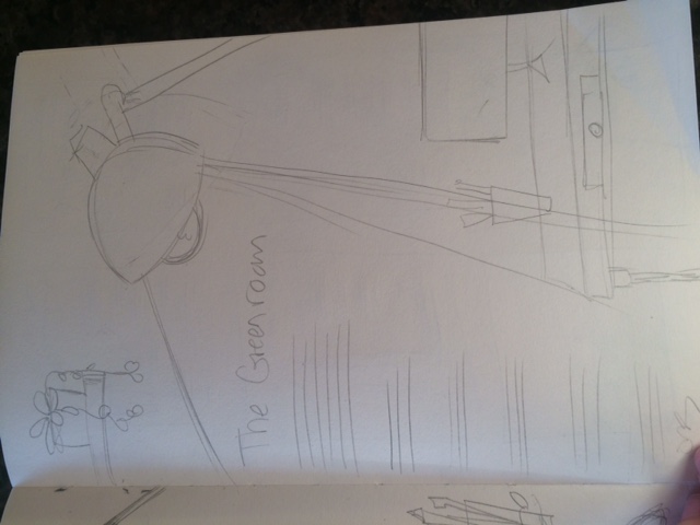
The manifesto is mentioning creating a green room (aka sustainable space) in the workplace and that is why the illustration is showing a designer’s work desk. There are small features such as the vines and decor that imply going green and that being sustainable can be in everything you do.
The various shades of green were chosen because the entire vibe of the manifesto and feel is about going green. The color green also represents energy, life, and growth which is why the color was used throughout the whole illustration.
Lastly, the manifesto was written towards all designers—challenging not only myself but anyone in the field to implement the 4 pillars of sustainability. The Manifesto was written this way because, in order to see change, it takes a team of people to make it happen and that is why I wanted to speak to a larger audience and challenge them to make change in their workplace.
I believe the Manifesto and the Design work well together and have a connection which was a goal I needed to achieve.
I am happy with the illustration style and the color palette is unusual but suits the sustainable green vibe.
I found the layout for the type the hardest and I believe the type may be too hard to read from far away as a poster.
I also think I could have done more research in various Manifestos and how they are written. However, this was personal and truly from my heart but I could have used more guidance.
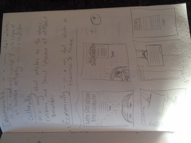
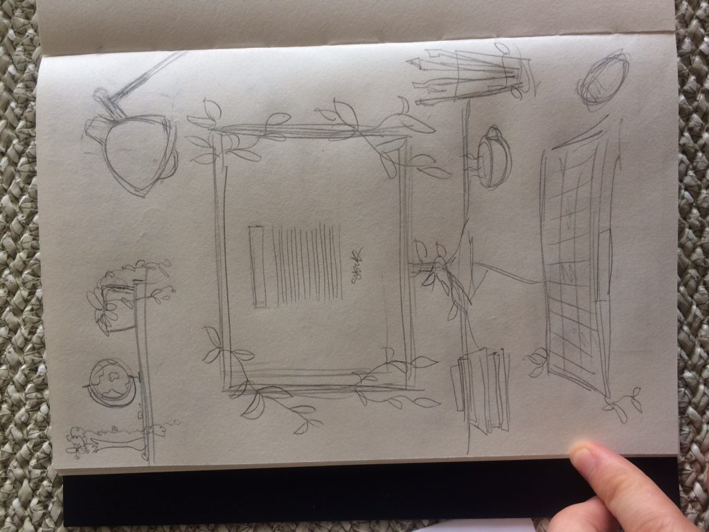
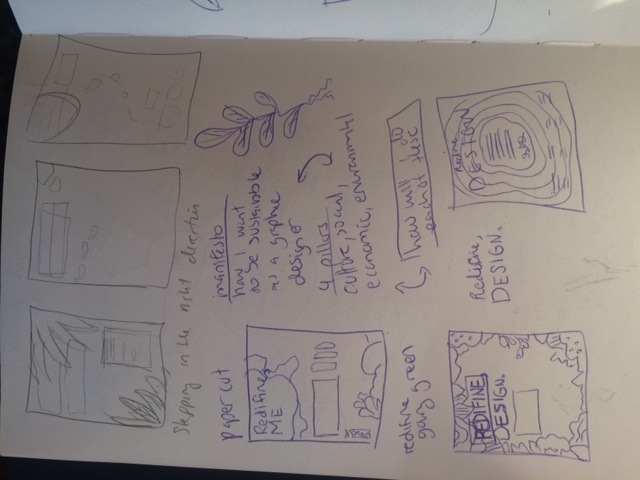
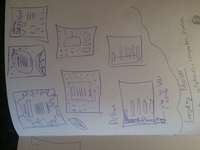
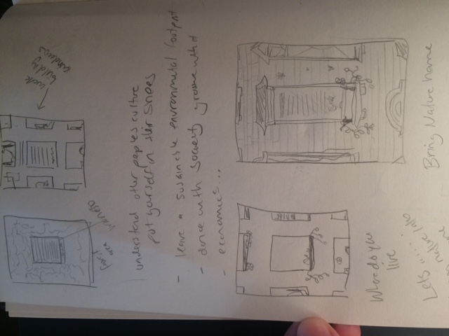
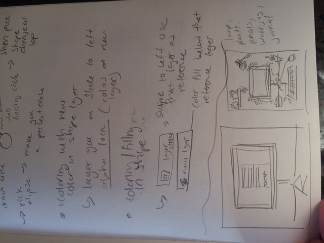
I worked a lot on the Manifesto to fit the design and did many sketches for the design/illustration.
The hardest part I think was the writing for me and what I wanted to say. Lastly, the layout was tricky for me. It would have been nice to have more time for a check-in again but I did learn a few things and overall this project was interesting and difficult.