My Mentorship Project Experience

Phase 1

The birth of my mentorship project begins. I knew I wanted to do a children’s book because I was always drawn to them as a kid and really appreciated good stories but the visuals are what I cared about. There was a topic that kept wandering in my brain and something that I faced as a child and still do today. Parents arguing in front of their children. This always tormented me and always made me very upset and would make me want to hide and run away. Now looking back it wasn’t so bad but I still will always avoid it if I can.

This is a problem that many children face after I researched it and it can cause a lot of stress on children while growing up. I wanted to bring this topic through a story that children could read and for parents to understand how a child must feel. My character will go on a quest to find out what love is and they will come to realize that love comes in many shapes and forms and can be experienced in different ways not just through loving someone or thing. The fact is love isn’t always and perfect and there will be ups and downs and sometimes it won’t work out but there are other ways to experience and find love.
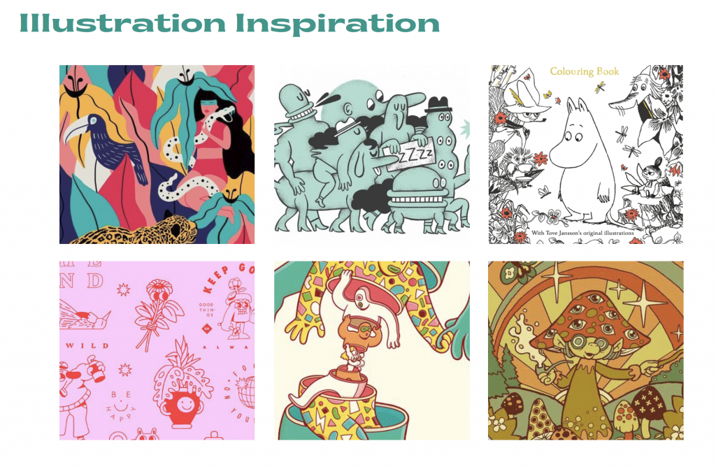
This first mood board is an example of how I want the illustration style to look and feel. I want it to be fun, playful, and cartoon-like.
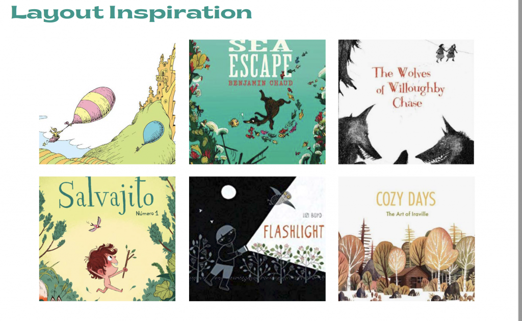
This next mood board example is some book covers I really like because there is some lovely white space.
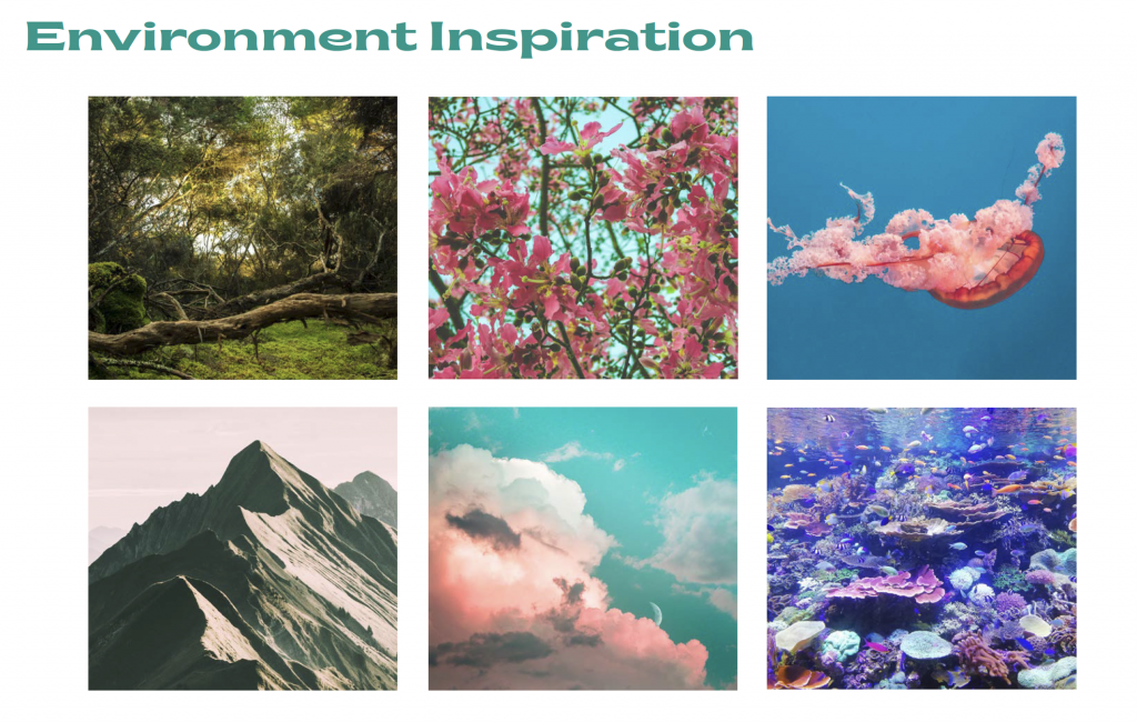
This mood board example shows how I want the environment to look and feel. I also am really drawn to the colors because they feel very fantasy-like. I knew I wanted to include mountains, forest, ocean, and sky.

self-assessment: 10/10 I had a clear vision and presented many mood boards to my mentor and he had a clear understanding of my direction.

Phase 2

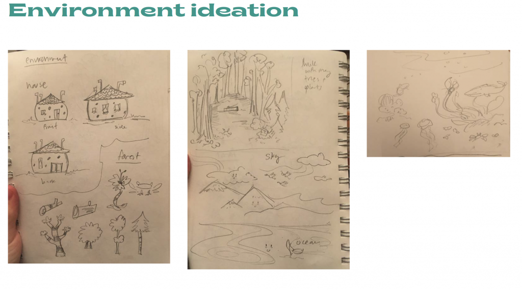
For this part, I was mainly working on the characters and rough storyboarding. My mentor told me that I did a good job by keeping them very loose and he still understood what was happening. I began thinking about the environment and what I wanted this fantasy world to look like. I knew the colors would be bright and the forest and creatures would all be very whimsical.
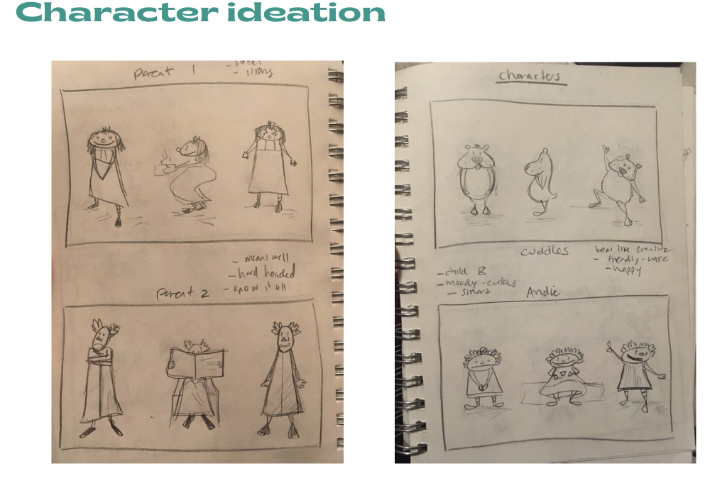
I numbered my storyboards to make it easier for my mentor to understand and I attached a description of what would happen in each frame. Next time I could do this differently and write little captions of each frame or write literally what the characters say. To make sure there isn’t any confusion from what you are seeing to that is being and said.
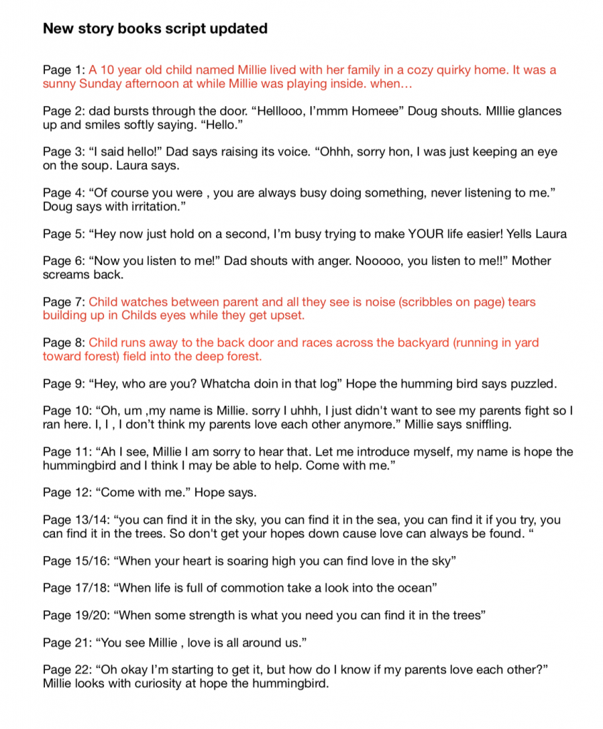
My next homework was working on the story and making that come to life more. I wanted the narrative to be like a sing-along in some parts. I was really working on the song part and the rhyming. Ideally, hopefully, I could make the whole story rhyme.
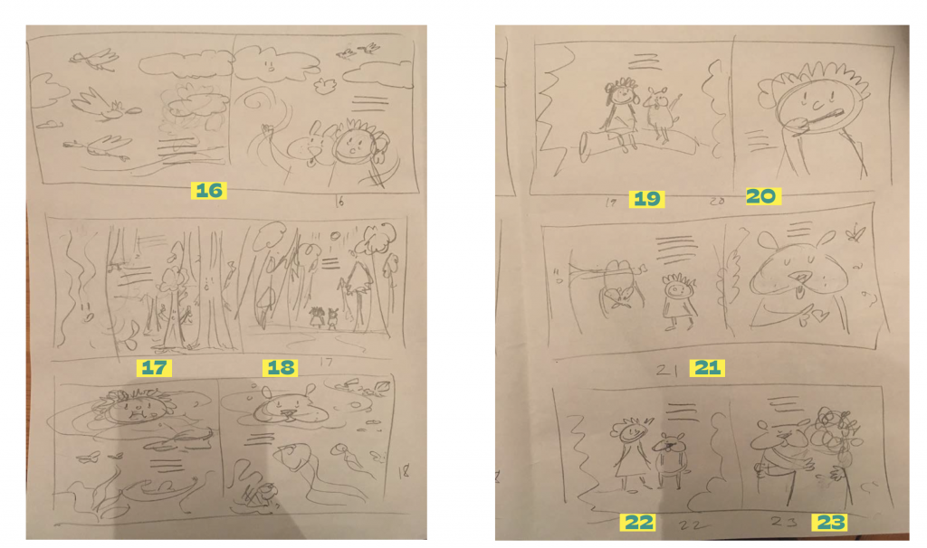
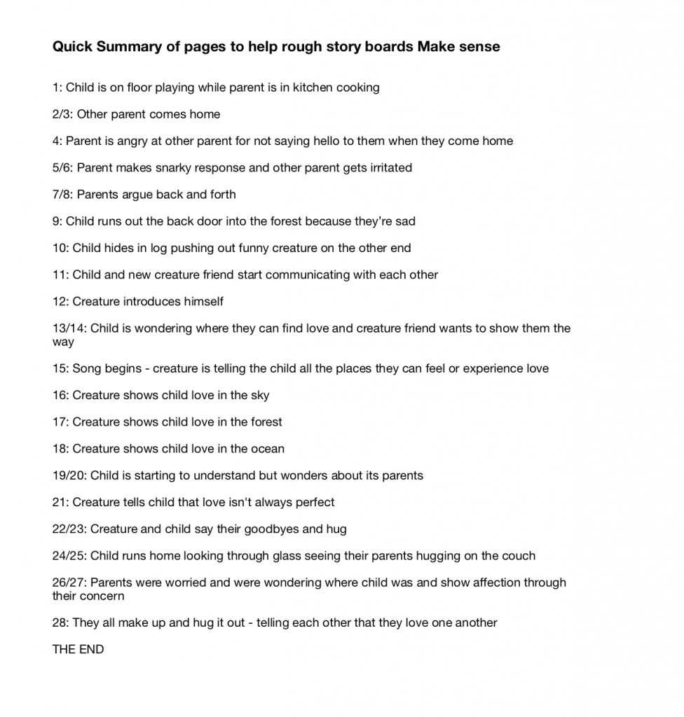
Self-assessment: 8/10 could have used further character exploration and storyboard clarity.

Phase 3

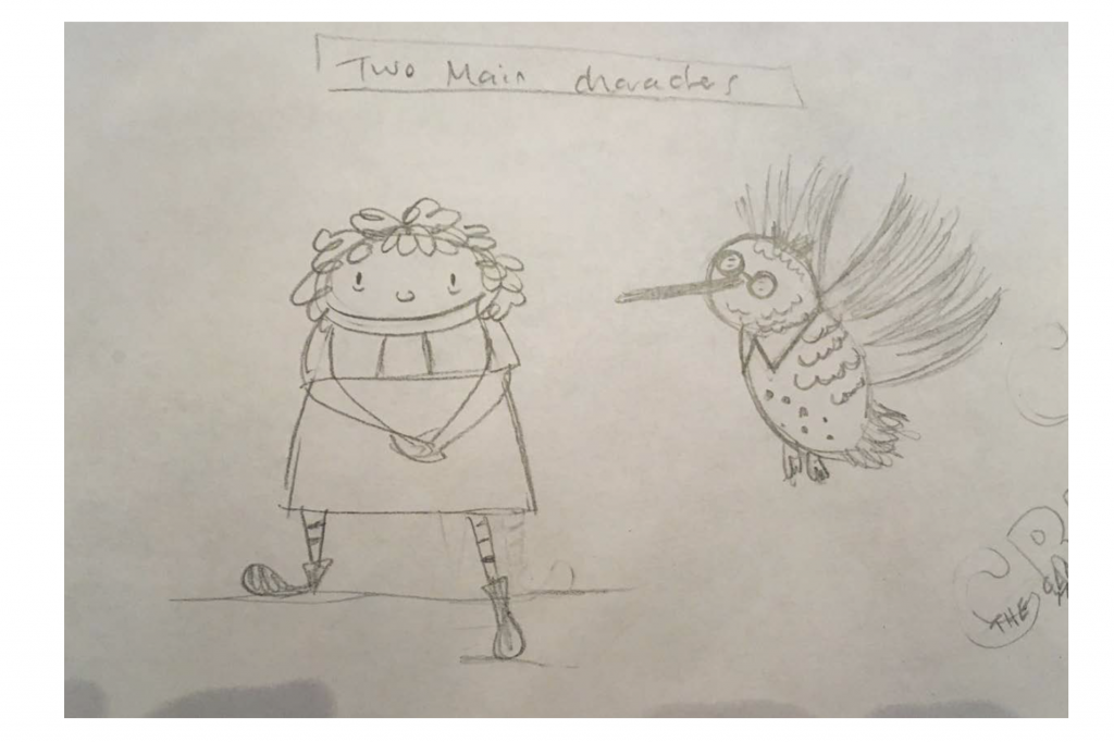
I am condensing two weeks together because we only have five posts when there were six in total. I began by working on fleshing out the story more and working with Patrick and refining the target audience. The story part is definitely the hardest part for me because writing isn’t my strong suit or putting thoughts down and visuals, of course, come easier. I refined the story more however still needs work and then I was working on character development. Figuring out the characters was a bit tricky because I wanted them to not have a gender and just be neutral and not necessarily have a specific race either. I tried creating the, into animals and they were looking pretty cute.
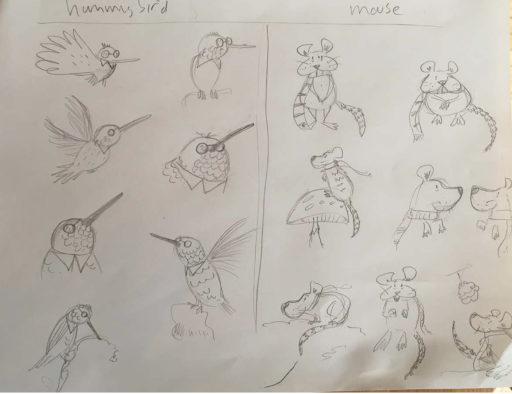
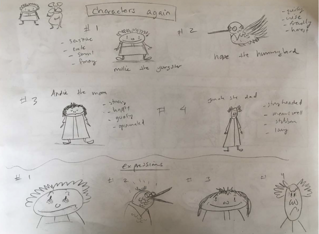
After talking to some different people I found out that children tend to associate themselves more with humans and connect more with the character than animals. After finding this out I decided to go back to the original plan and go with a human and a magical creature. I decided that it’s okay to pick a gender and race for this book and maybe mix it up the next time. So my main character is a little girl with red hair and a magical hummingbird.

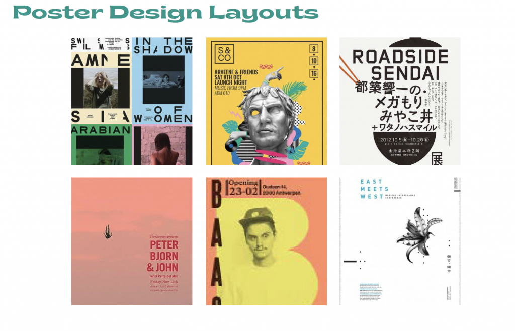
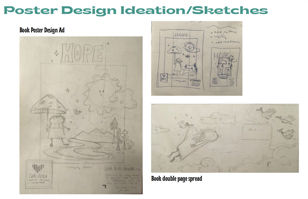
After I knew this is what I was going with I began brainstorming poster book ad designs in sketch form and have a design mood board.
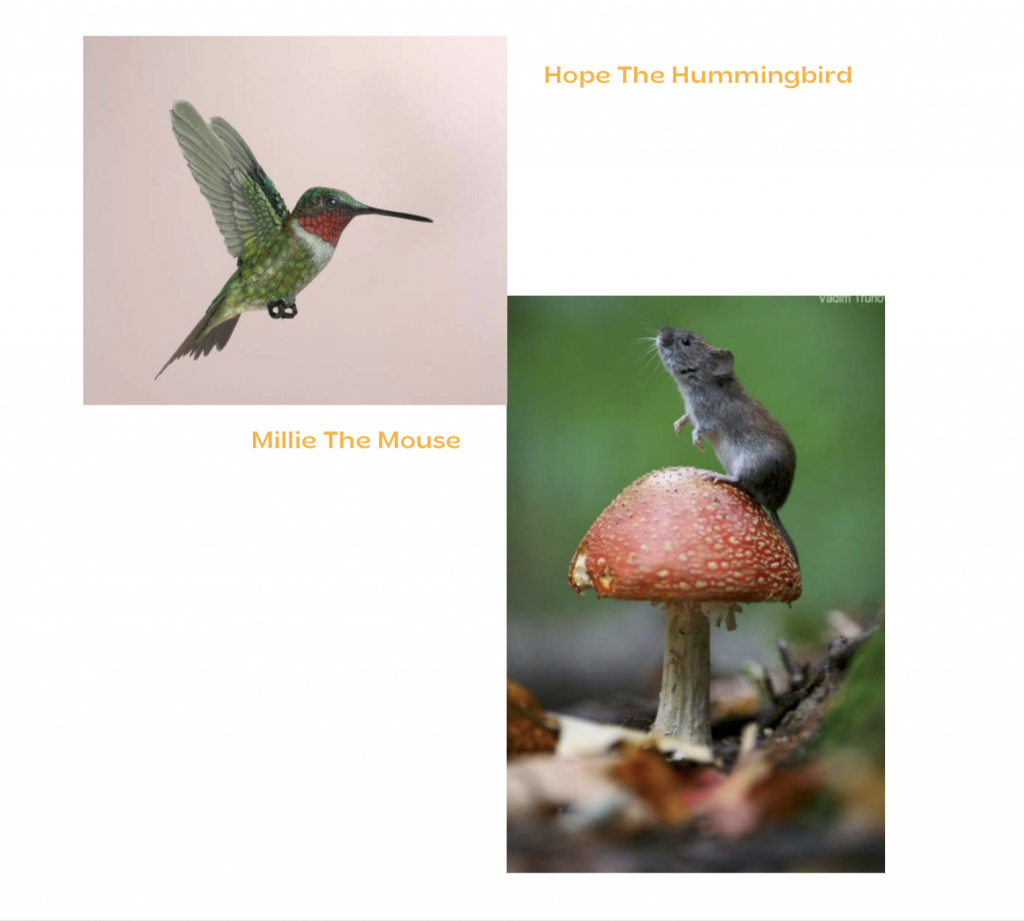
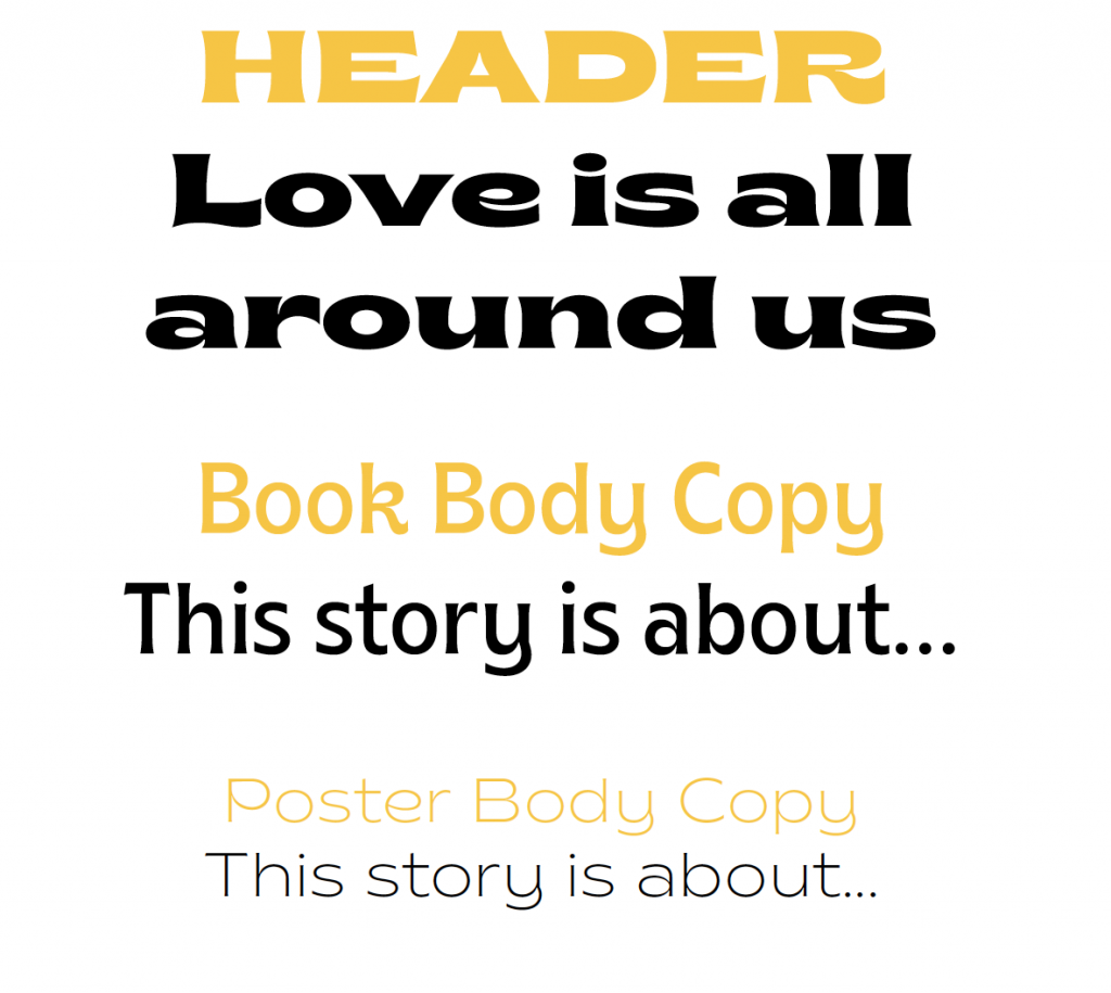
Self-Assessment: 10/10 I had a lot of process work and ideation that went into this phase. I developed the story several times and I went deeper into character exploration and developed several layout concepts.

Phase 4

This week I worked on creating designs for the poster book ad. I wanted to go with something that was modern and trendy with an unconventional typography layout. With the illustration inside of a colored square. I went through many variations, but I felt confident about this one. I sent the sketches and design/layout inspiration to my mentor, and he got back to me and said that I was maybe heading down the wrong path for the wrong target market. I was designing based on what is cool now and what I would think is cool when in fact, my target audience is for parents and young children. We discussed and deliberated on what designs might work better, and my mentor found a concept that I already made that he thought there was potential. 
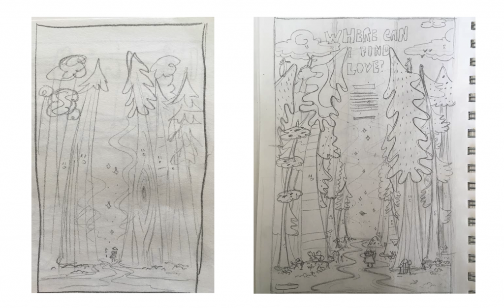
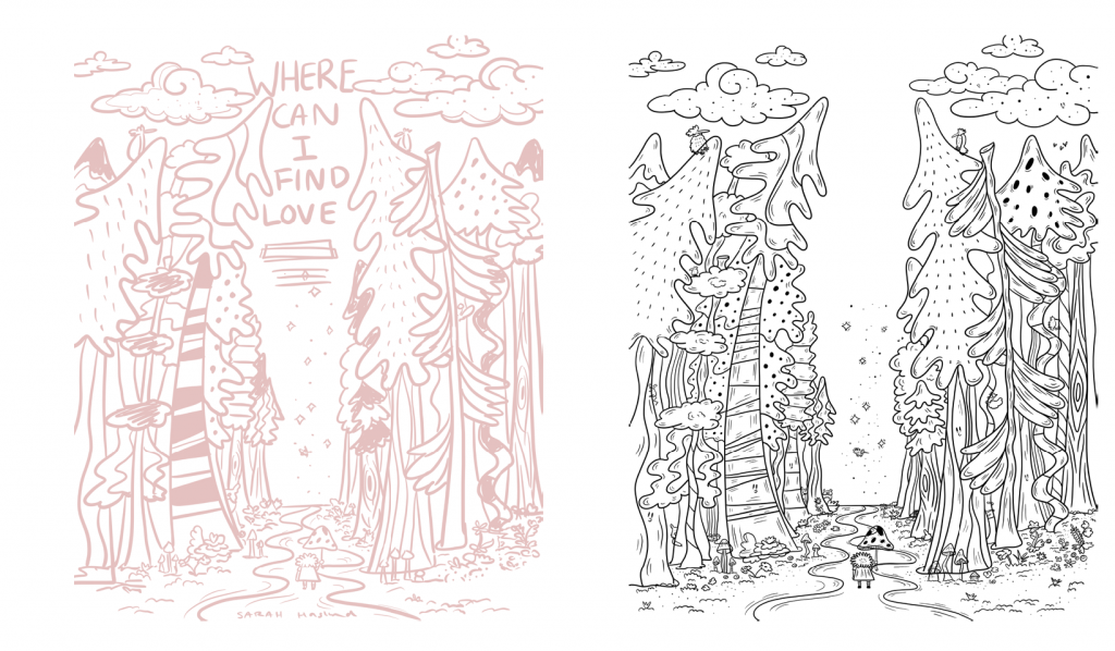
So I switched directions and I am glad he caught me and helped me go down a different path. So I decided to have my little characters very small walking on a trail and tall trees towering over them. Looking like an enchanted forest. This illustration now would show more depth and contrast in size. I also found what typography I wanted to use and I am going with a very playful retro happy typeface. I ended up making my poster design three columns with most of the text running down the middle. I also had to work on the color palette and develop that further to have lots of references. The color palette I am going with is a postal sci fie color palette because I find it very pleasing to the eye and most children do enjoy some bright color when reading storybooks. This book will be bursting in color. The only thing I’m missing is the sparkles. 
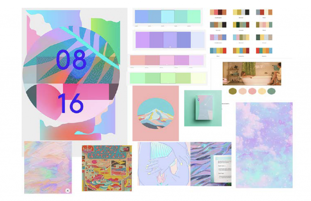
Self-Assessment: 7/10 I believe this was the hardest timeframe I set myself and I was not able to complete as much work as I hoped for my milestone. I was hoping to have both designs and final stages ready for revising but I only had one which is shown the beginning of phase 5.

Phase 5

This was the final stage for me to take my concepts and vision into the development stage. I had spoken to my mentor about deliverables and we confirmed that there would be a double-page spread and a book poster ad. Both the poster book ad will help advertise the book on social media and could be put up in public. As well the actual book dimensions are the correct size for Instagram, so I can post more images of the book. 
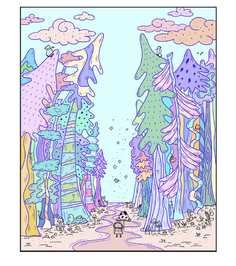
I think the week between final ideation to the finished pieces was a tight timeline I gave myself and I slightly adjusted timeline when I found out we had an additional week. It was really helpful having the milestones for myself though because it motivated and pushed me to complete the new task. 
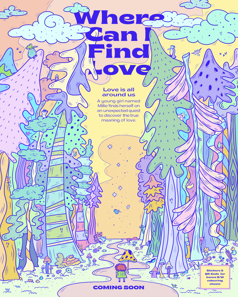
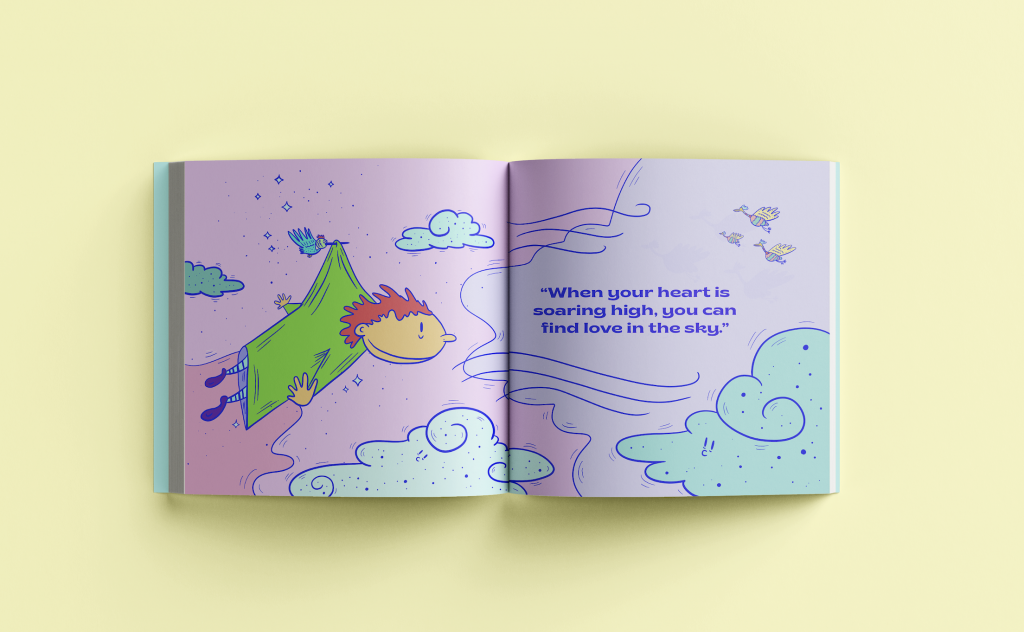
A lot of my work was ideation based and writing for the story. The story will continue to be modified and edited. I feel pretty happy with all the images I created for the spreads and I can visualize the end result, all I need to do is keep revising the writing.

The development of the poster book ad took the longest to ideate because I wasn’t sure how I wanted it to look. I decided I wanted the poster ad to be the same design as the cover for the book. However, I have to redraw the correct dimensions. 
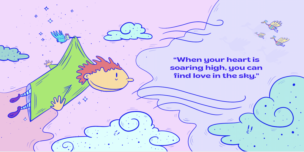
My mentor brought up some cool ideas I could incorporate into the book or have additional features. For example, I am including an online QR-Code that people can access b/w coloring sheets as well there will be a few pages that the child can color in the book itself. The book will also come with a page of stickers. 

I realized two things I need to make sure a fix and change are that when I was coloring my artwork in photoshop I was working in RGB which was fine for a digital PDF but when I take this to the final printing stages I need to work in CMYK so I must change that. I also need to check whether I can use the typeface I selected because I did buy it online but not to use on things that I am potentially selling so I need to make sure I buy the one I can use for selling. 

I plan on continuing to complete this children’s book this summer and finish the story, cover, and all the spreads. This story is dear to me and I would love for others to read it. I would like to print these books and sell them at markets, and small boutiques. I will keep in touch with my mentor through this process and keep in touch with Patrick for story revisions. This was a great experience and I am so glad I got to work with Carson Ting on this project that I have wanted to do for a while now. Overall, it was a great experience working with someone in the field to help direct and throw around ideas with. 
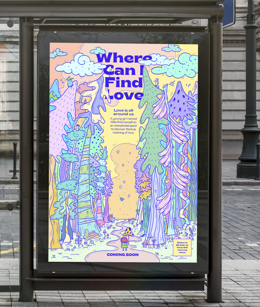
Self-Assessment: 10/10 I revised my work and asked my mentor and a few classmates for feedback on what I could improve on. I caught up where I wanted to be and my mentor was very happy with the final results and progress. I finished what I set out to do.
Rough Logo Concepts

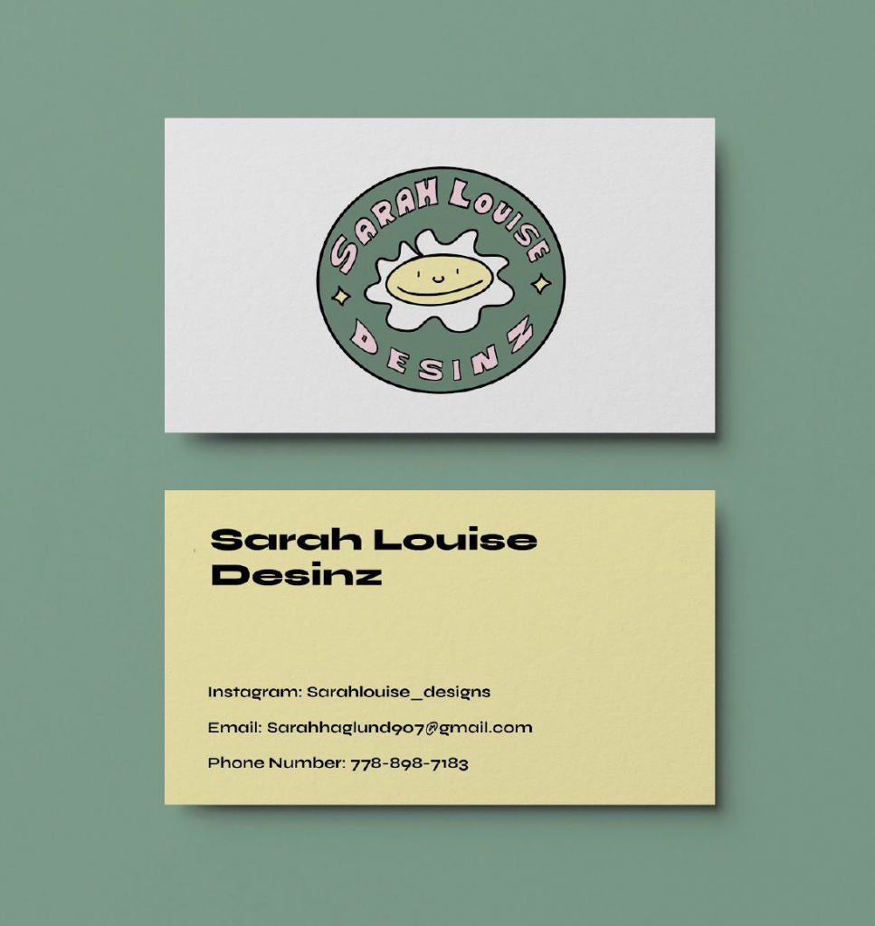
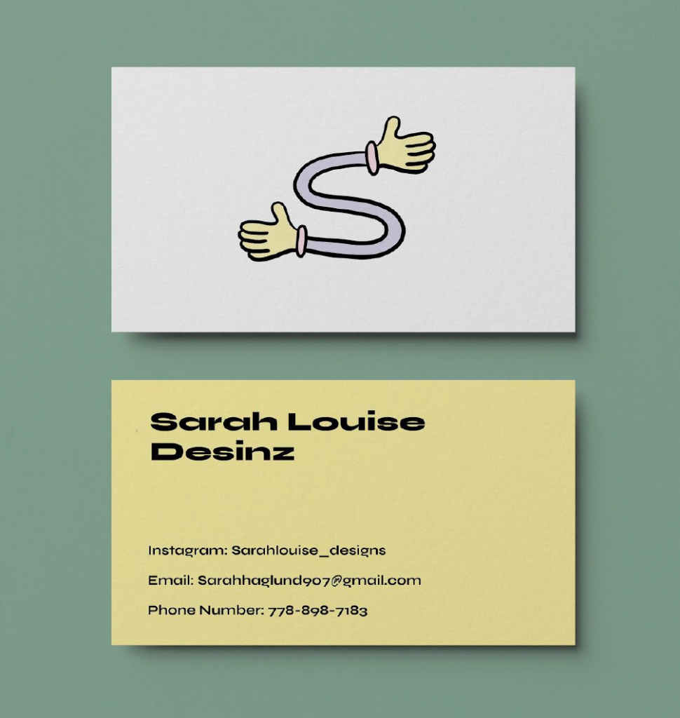
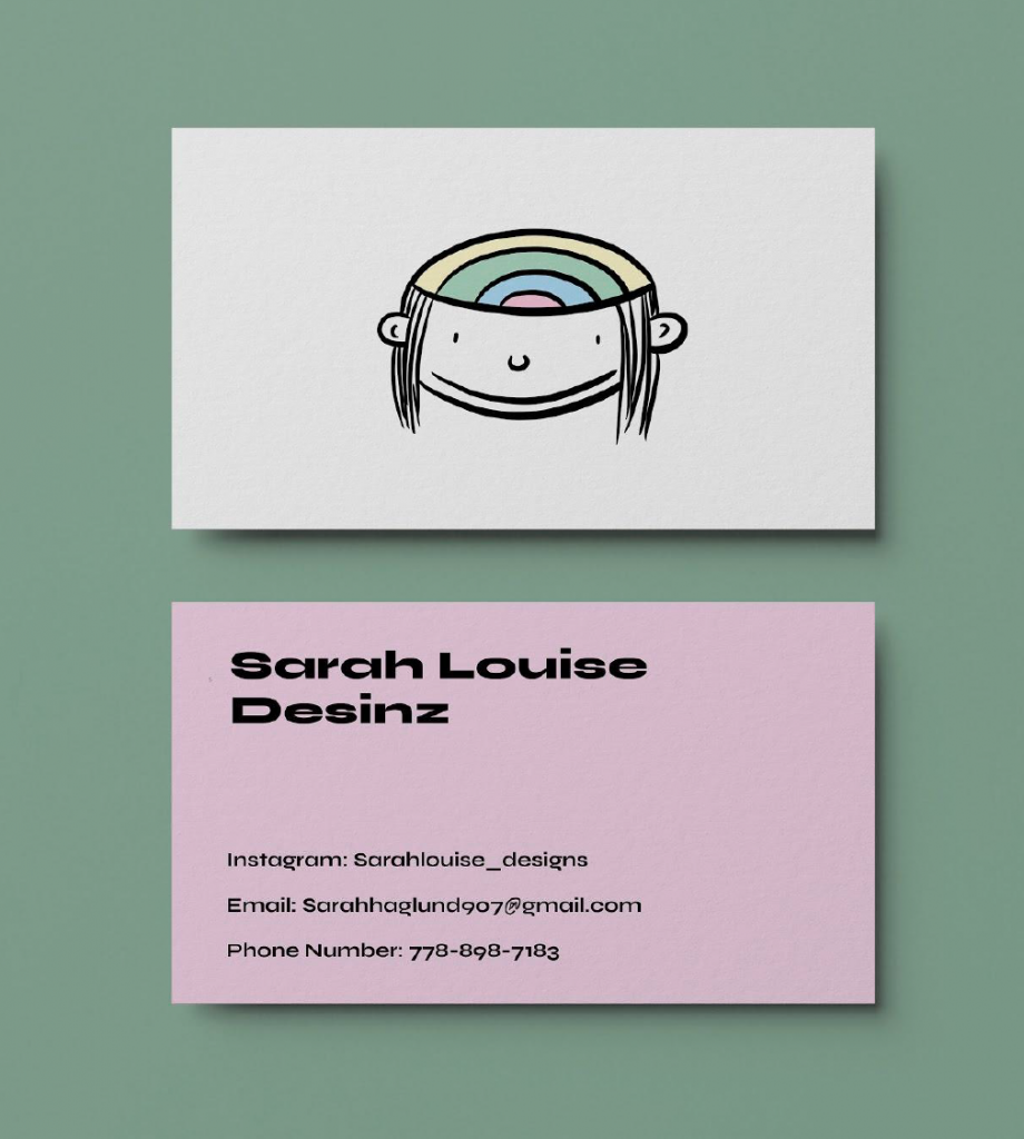
After we did the second round of 100 logo ideas we moved onto the next stage of choosing the top three best logos that have potential. I had 5 concepts that I could have gone with but narrowed it down to three. The first logo contains my name and character, which represents a typeface with personality and a playful nostalgic approach. In addition, my second concept was an “S” with two hands on either side which represents my welcoming and friendly side. Eager to meet people and can talk about business when need be. Lastly, the third concept is an illustration of my head and inside are my thoughts and ideas. This logo could be versatile with what elements can go inside my brain. All these logos have the potential for animation, the last maybe having the most. Now I am at the stage of deciding on the final. I really do like the sticker/label approach that the first one has. If I can somehow combine this feeling or theme with the second or third I think I would be satisfied with the result.

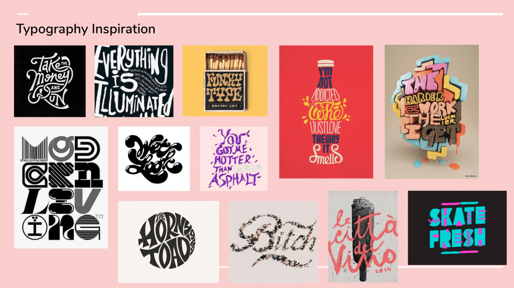
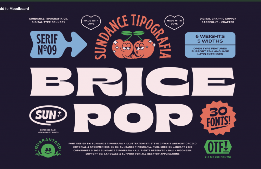
Below is the typeface I want to use for my logo.

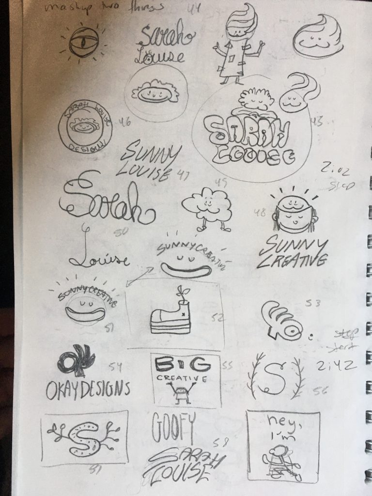
The second batch of logos (100 more)

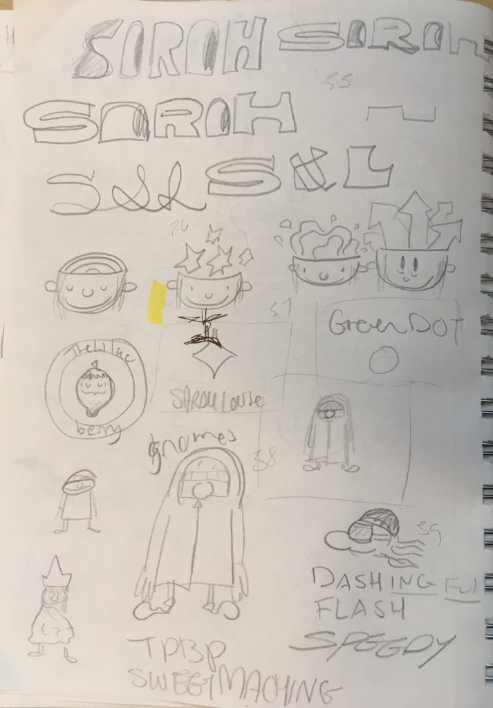
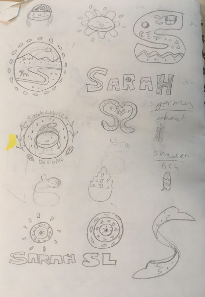
Creating the second batch of logos was harder than the first round. I also felt like I wasn’t the same creative workspace as I was before. In the first round I was moving around a lot in different spaces but this time I was mostly inside my home. I was still very fixated on coming up with a unique logo name but eventually decided to focus more on the logo itself and less about the name. I worked on looking more into my name and the wordmark it makes. As well I looked into my Swedish heritage and explored patterns and shapes that could be used for my logo. I knew I wanted to include a typeface with a lot of personalities and an icon that would look cartoonish. I believe this process was infinite for coming up with ideas, and I almost wished the process went on longer. Designing a logo for yourself is much harder than I thought because you almost have to look at yourself from above and ask yourself is this “Sarah” am I representing her to the best ability I can? I did enjoy the process even though it was difficult.

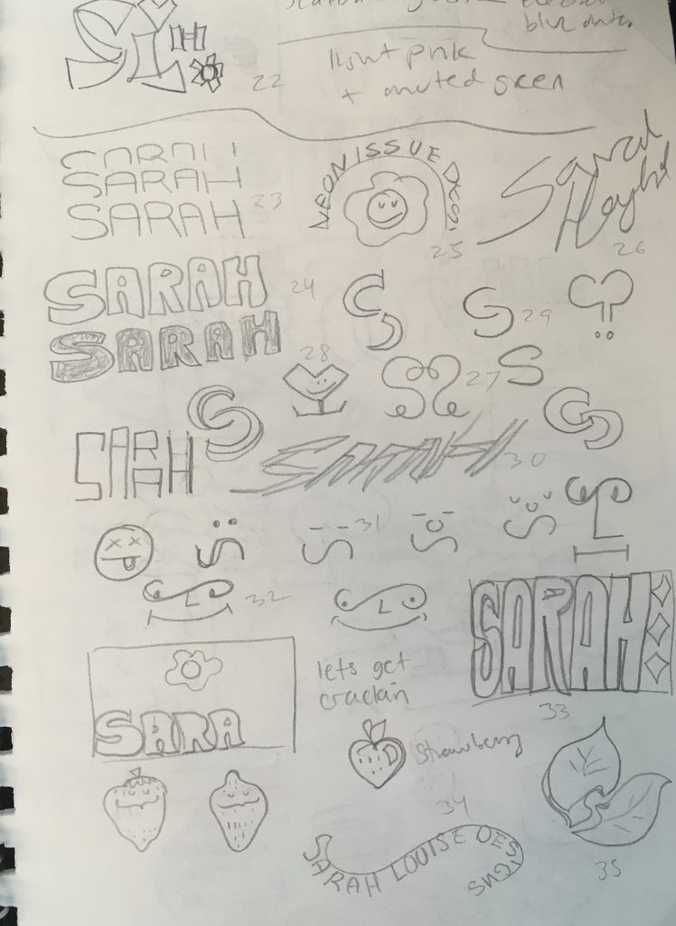
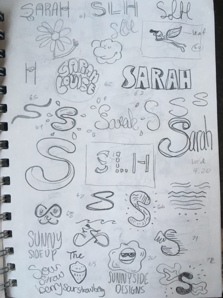
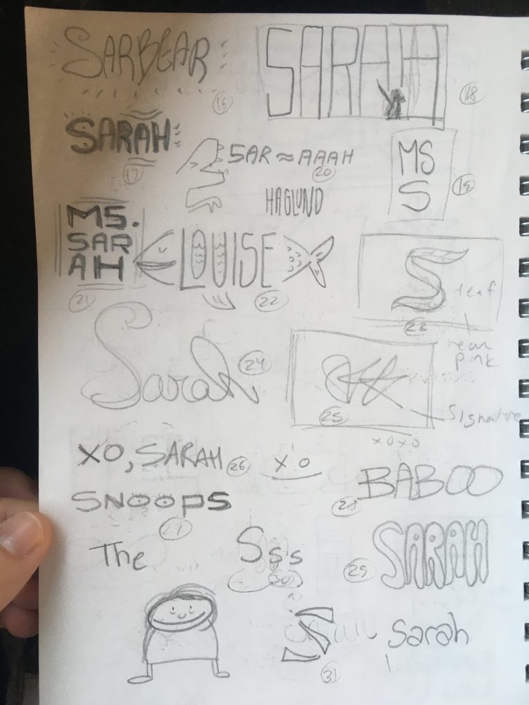
100 Logo Sketches (first go)

I found this process harder than I expected. I started with ideating not looking at any references from the internet. I also sketched in several different spots to hopefully get inspired. Such as outside in a park, indoors in a coffee shop and in my bedroom. I was determined to come up with my brand name for myself however I will keep ideating to do so, and explore more iconography and contrasting concepts. I would like to combine a gorgeous typeface full of personality with some illustration on my business card. Hopefully, communicating my passion for nature (keeping it organic) and love for glitter. (color and personality)

Mood Boards for Self-Branding Inspiration

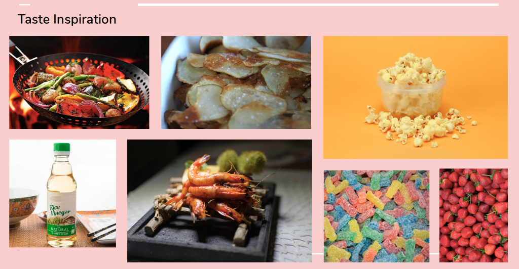
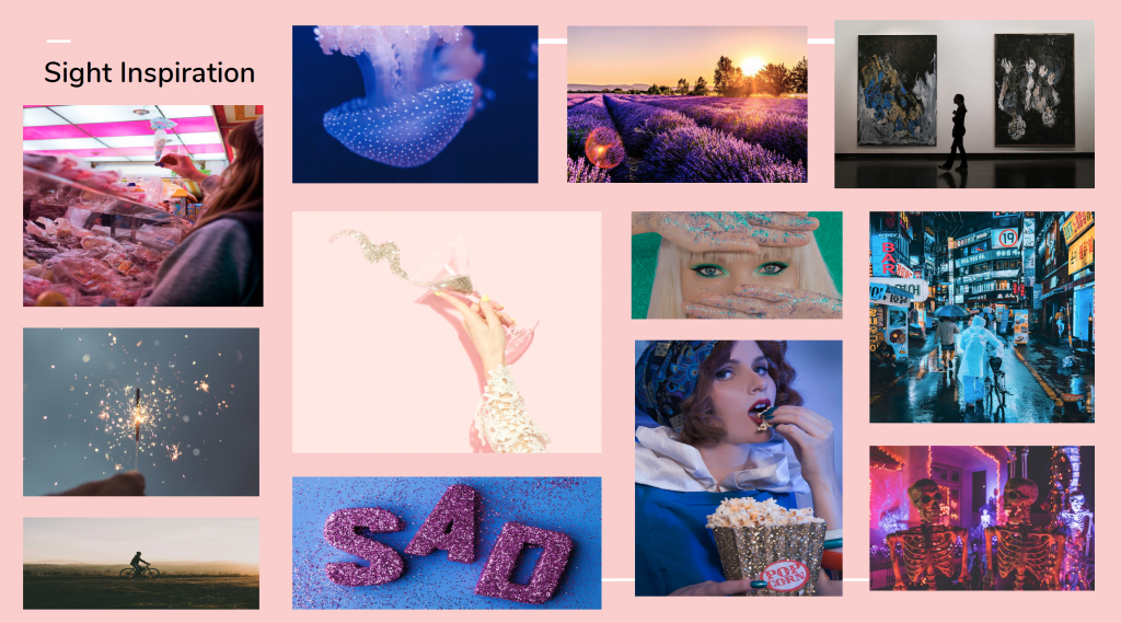
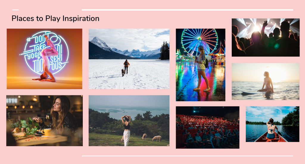
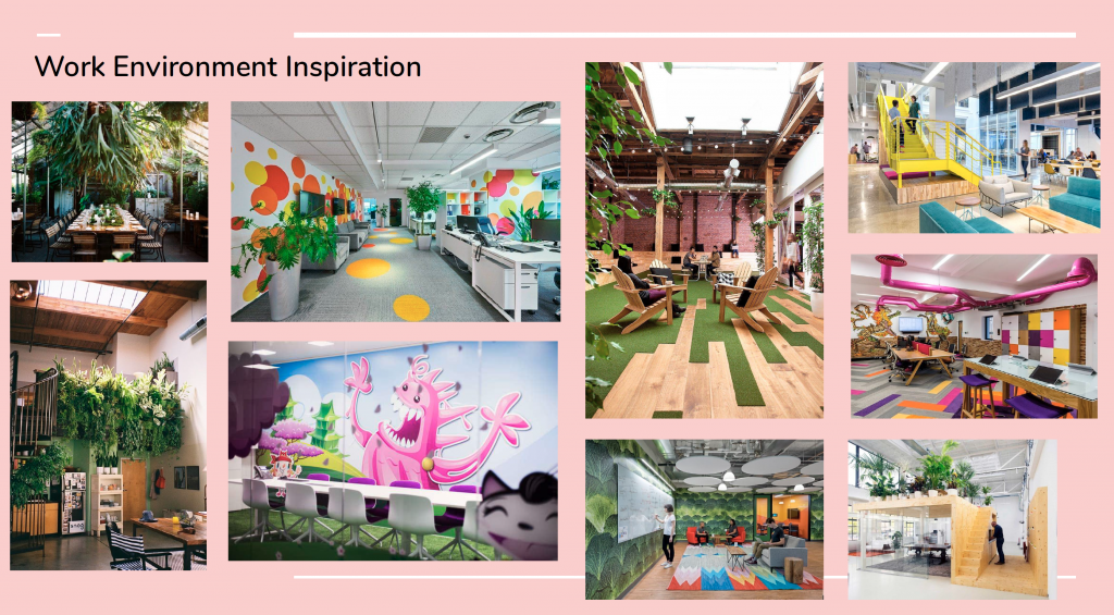
During the mood board process, I found it difficult to distill down what inspired me because there are so many infinite possibilities, specifically the sight, typography and illustration mood boards.

I found it interesting doing the five senses because I realized by understanding myself better I can reflect what I know about myself in my brand identity. It was a great exercise because now I feel more knowledgable about my interests and likes or dislikes. I will attempt to take certain elements from my mood boards and come up with different ideas to incorporate them into my logo to make it more successful.

I learned that I personality like being out in nature however I have a thing for colorful glittery things. I found that I would like to work in an environment that combines both of these things. I want to emphasize my personality through color and also show that I value the environment and am not afraid to play outside. 

GDC membership/ambassador project

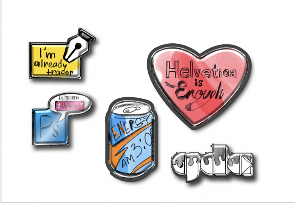
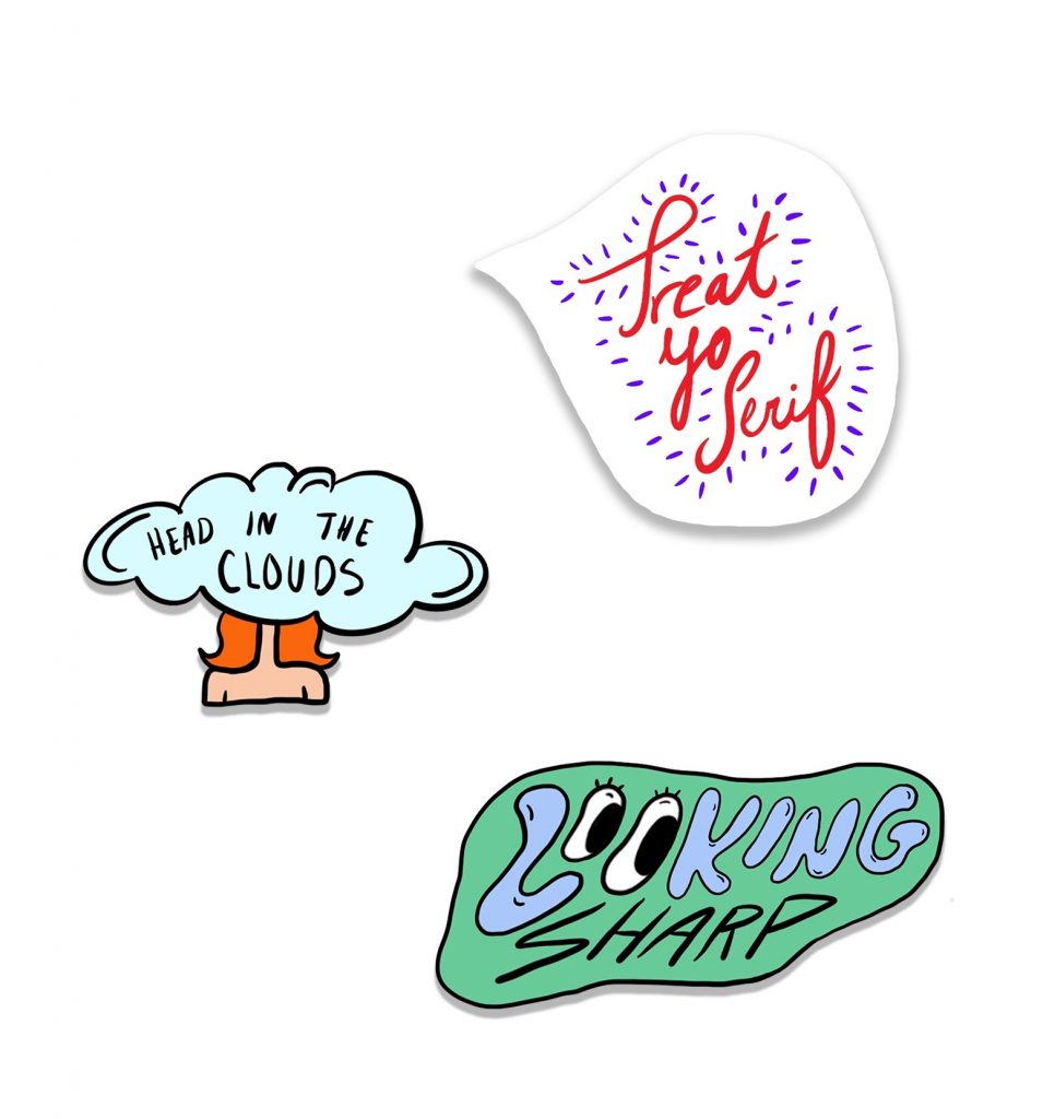
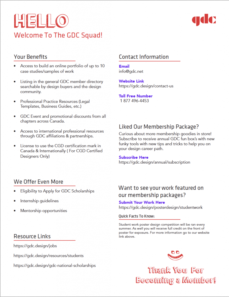
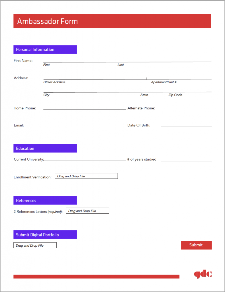
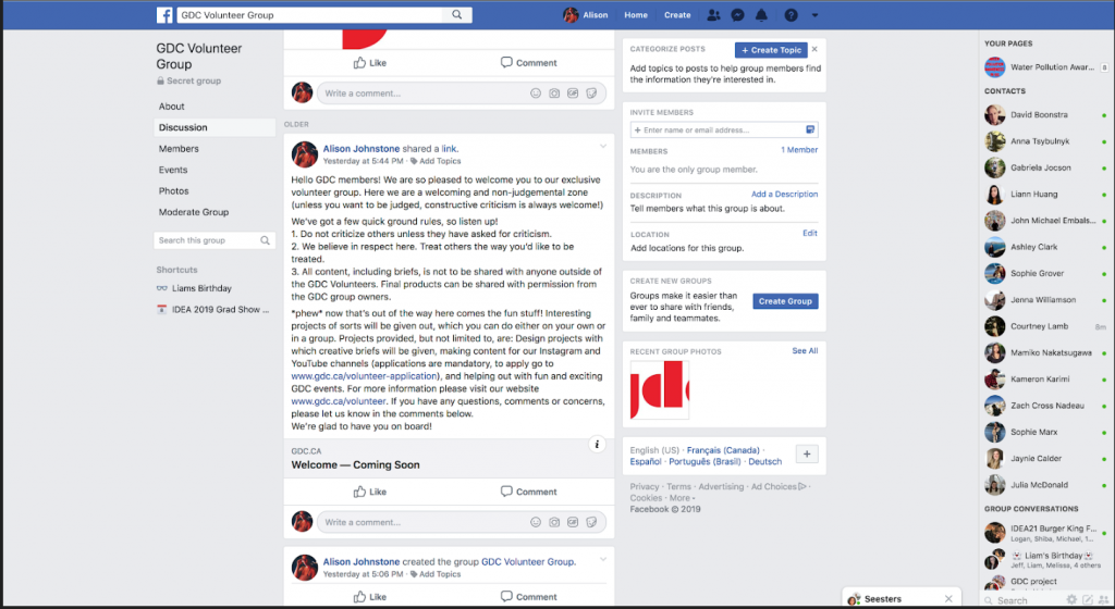
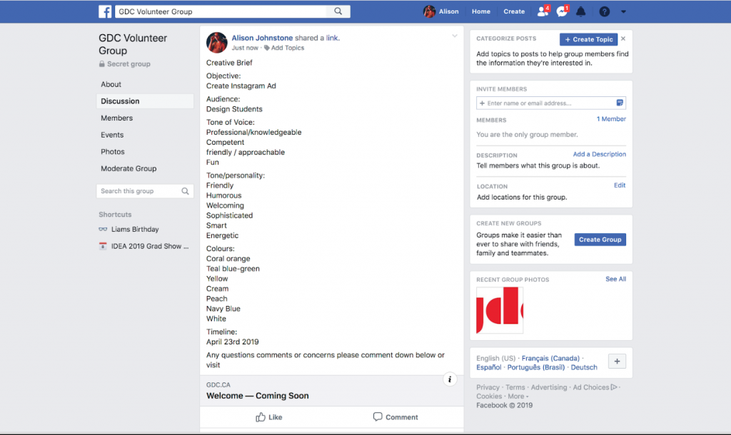
The area of focus that our group did was ambassador recruitment, volunteer opportunities, and a tangible unique membership package making the GDC more engaging and have stronger legitimacy.

Our mission goal was to increase student engagement and involvement with the GDC. Making them more aware of the benefits and current news such as upcoming scholarships etc. Our target audience is catered towards university students studying graphic design and illustration residing across Canada. Our membership package would be given initially to all new members, and members could subscribe to receive one annually, including, poster/info, stickers, pins, tips, tricks, and resource links. The volunteer engagement would continue over many years, with different activities. The ambassador recruitment would happen over a two-year term for the next nominated student ambassador. We believe the solutions we are proposing could work and could improve the disconnect between students and the GDC.

Our group consisted of 3 people. In the beginning, we were mostly focused on the membership package that you would receive once becoming a member. However, we moved further away from the tangible membership packaging box concept. Ultimately, going with a simple affordable envelope that would contain the poster/info and goodies. In the end, we ended up having the membership package, ambassador recruitment form, volunteer opportunities, and GDC/ambassador apparel.

Our process began with:

  • First doing mood board/direction research and rough sketches of design concepts.
  • With the design ideas gathered we worked as a team on identifying what was working what was not and design keepers. We continued to brainstorm and kept our ideas flexible. All of our work was unique to our own. However, we did try to bring the designs more together at the end to make them look more cohesive.

For the ideation process, we started by:

  • Brainstorming ideas for packaging, pins, and stickers, and design layouts.
  • We continued receiving helpful feedback from our instructor to make alterations and add ons/takeaways to our concepts.
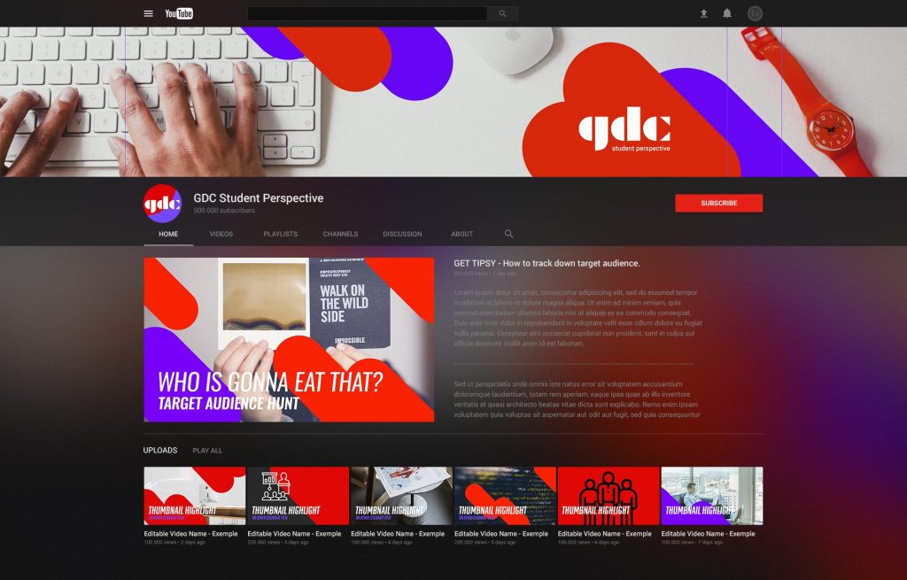
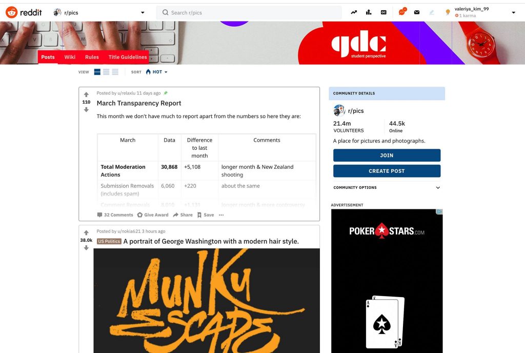
  • With additional refinements and guidance, we did not end up with what we started with but covered a lot more ground and touched on many platforms. Ultimately, reaching students as much as possible, through social media and interactive experiences.

Instructor/classmates recommended the following adjustments:

  • Add volunteer engagement
  • Change package idea to mail envelope
  • Alter recruitment ambassador process
  • Remove postcard system
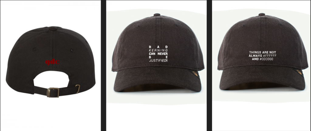
  • Remove certain apparel items, keep hats

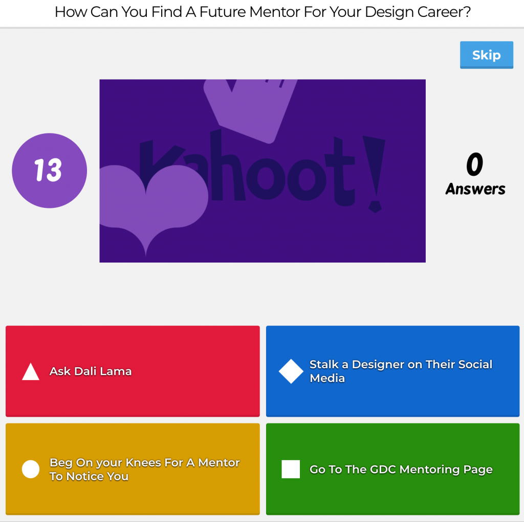
The various collateral I worked on in my team was the Kahoot game (which was passed onto another team) The brochure side of the poster, the 3 stickers, and the ambassador recruitment form. Each of my team members had an equal workload amount.

I believe I deserve an 8/10 because I contributed concepts/ideas and communicated well and was on time for meetups and due dates. I believe I could have done research to get a deeper understanding of how the GDC works. I believe as a team we deserve an 8.5/10. We worked good as a team, we communicated well and gave each other feedback as well as listened to instructors. The improvements we could have made would be to make all of our work look even more cohesive as a unit and done more mockup examples.

Land Of Bannock Food Truck Project

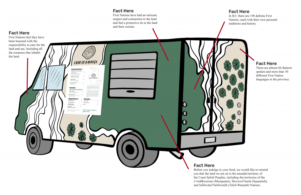
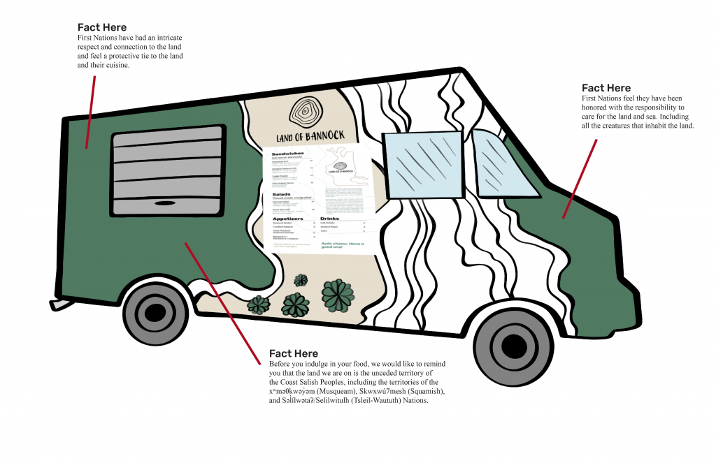
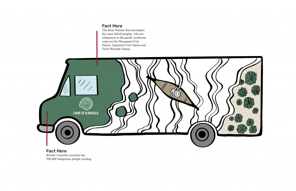
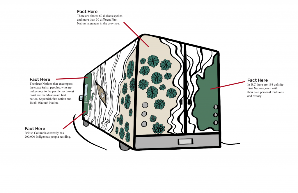
The area of focus we chose for our Decolonizing Idea Campaign was a food truck that would move to various locations in Vancouver. Hosted by the City of Vancouver’s Creative City Strategy Group. Their mission goal is to increase the Musqueam, Squamish and Tsleil-Waututh’s visibility of the land. Our target audience is catered towards non-aboriginal residing in Vancouver or visiting. The Land Of Bannock traveling food truck will be released on June 21 which is National Aboriginal Day. The length of time that the food truck travels in Vancouver is determined by the success of the solution. We would also have to make sure we consult with First Nations before the release of the food truck.

Our group consisted of four people. In the beginning, we had many directions that we could go with the project—we worked on narrowing down to a topic that would help give us flexible options, and be executed on time with a consistent design strategy.

Our process began with:

  • First doing research from the course website splitting up research material regarding the past, present land, and land rituals.
  • With the information gathered we decided we wanted to communicate about the First Nations spiritual connection with the land, traditions, and cuisine. Their connection with the land roots deep in their history because the land is so important to them both in reconciliation and in connection.

For the ideation process, we started by:

  • Brainstorming 100 different ideas individually—soon coming together as a collective we came up with 5 campaigns ideas.
  • When receiving feedback from our teacher The Pop-up Food Truck was the best choice for the following reasons: it was executable and was the most effective solution to answer our goal to increase visibility.
  • With additional refinements added to our Pop Up Food Truck idea such as adjusting our logo name from Breaking Bannock to Land of Bannock, we were heading on the right track. After having spoken to the MOPA students who gave us critical beneficial feedback and guidance.

The MOPA students recommended the following adjustments:

  • We were advised to emphasize the First Nations culture that surrounds their cuisine. Instead of the spiritual connection that is often a stigma about all First Nations Peoples.
  • Tell stories about local leaders, locations, and about food.
  • Adjust Menu to have all the translations beside the locations and food items.

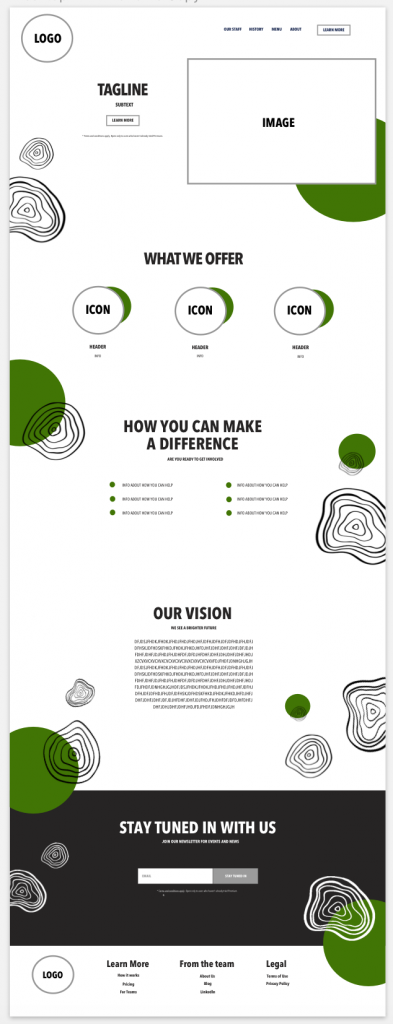
The various collateral I worked on in my team was the food truck design, Microsite template with circle line icons as well as in the logo. In addition, doing research earlier in the process which was divided up.

I believe I deserve an 8/10 because I contributed many ideas throughout the beginning of the project to the end. I executed the food truck to the best of my abilities and created the template for the microsite. As well I created a visual personality for the brand I feel with the design style. However, I believe I could have gathered more research or spoken to First Nations people around Capilano University for more insight regarding their thoughts and past experiences.

Resume Ideation

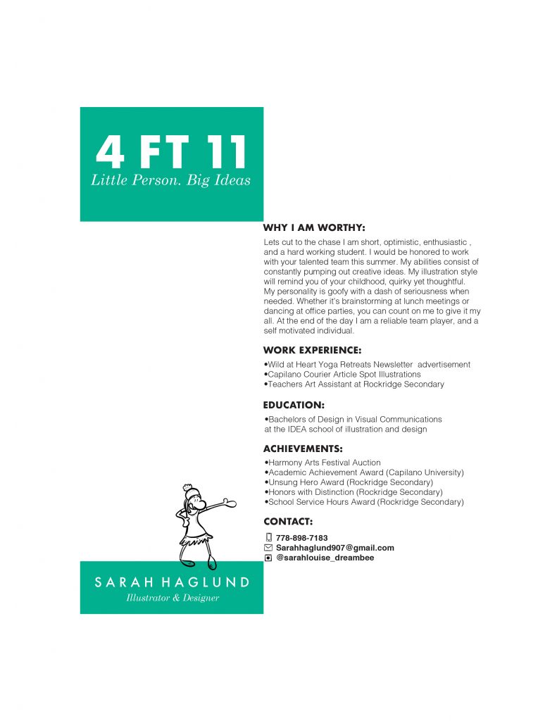
For my resume, I started by looking at references for layout and design. I also was working on pairing typefaces together. I ended up going with Futura and Century Schoolbook. I believe Futura shows confidence and a good work ethic. Century Schoolbook was chosen because I have a friendly softer side in my personality. I wanted my resume to have an interesting visual design if seen from further away and also have some colour pop to stand out.

I drew icons for the contact info to show my illustration and drawing style. I also added a small illustration of myself showing that I am fun and interested in the illustration field. Lastly, I chose my unusual title because I think the viewer would think twice or wonder what they will be reading. Overall, the way I wrote the introduction was to showcase that I am fun and approachable and would be an asset to the company. The playful writing also carries is shown throughout the resume design.

I believe I deserve an 8.5/10

Sustainability 101 Design Manifesto

Rationale

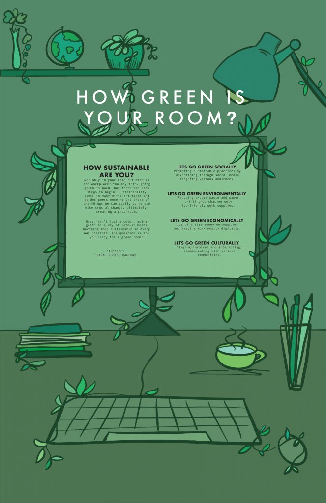
The poster is targeting future industry employers, therefore the design style was showing my personal style and approach for this project.

The typography used was Futura for headers/subheads paired with Andale Mono for the body copy. I believe these typefaces work well together because both are futurist and bold, having a slight personality—not overpowering one another. Andale Mono captured the keyboard computer written appearance, which made the typeface more believable and suit the design.

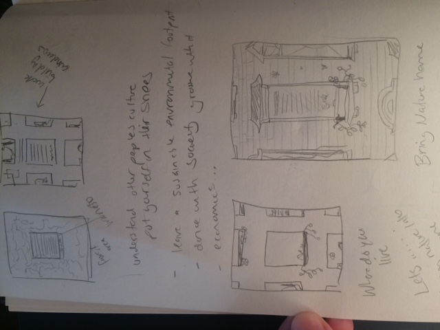
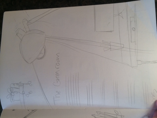
The manifesto is mentioning creating a green room (aka sustainable space) in the workplace and that is why the illustration is showing a designer’s work desk. There are small features such as the vines and decor that imply going green and that being sustainable can be in everything you do.
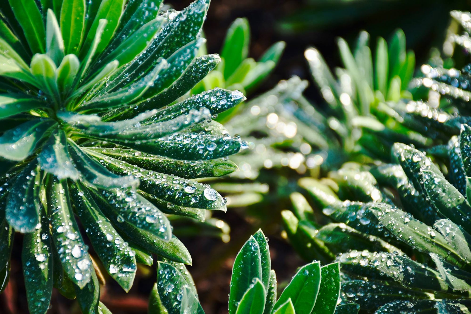
The various shades of green were chosen because the entire vibe of the manifesto and feel is about going green. The color green also represents energy, life, and growth which is why the color was used throughout the whole illustration.
Lastly, the manifesto was written towards all designers—challenging not only myself but anyone in the field to implement the 4 pillars of sustainability. The Manifesto was written this way because, in order to see change, it takes a team of people to make it happen and that is why I wanted to speak to a larger audience and challenge them to make change in their workplace.

Hyperlinks

https://www.theguardian.com/environment/2015/may/01/a-manifesto-for-a-more-sustainable-world

https://en.wikipedia.org/wiki/Consumerism

Self-Evaluation

I believe I deserve a 8.5/10.

I believe the Manifesto and the Design work well together and have a connection which was a goal I needed to achieve.

I am happy with the illustration style and the color palette is unusual but suits the sustainable green vibe.

I found the layout for the type the hardest and I believe the type may be too hard to read from far away as a poster.

I also think I could have done more research in various Manifestos and how they are written. However, this was personal and truly from my heart but I could have used more guidance.

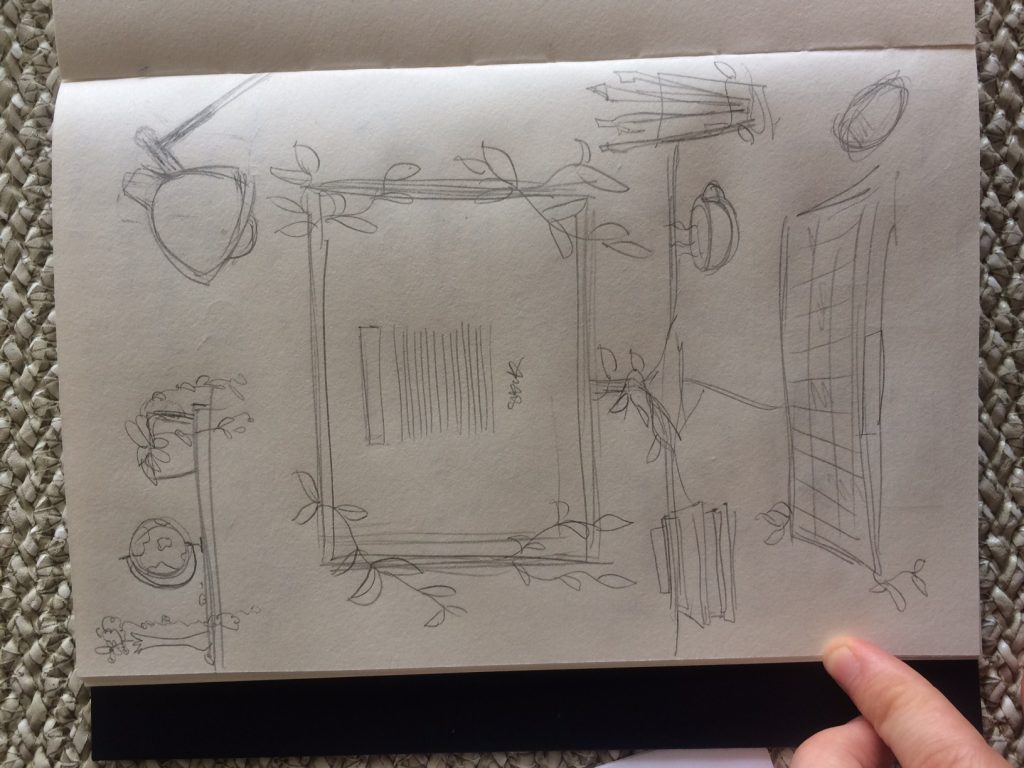
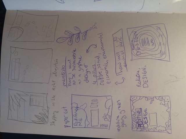
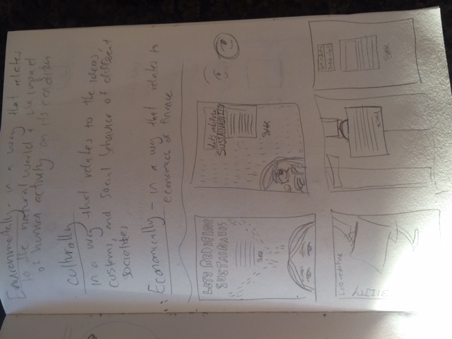
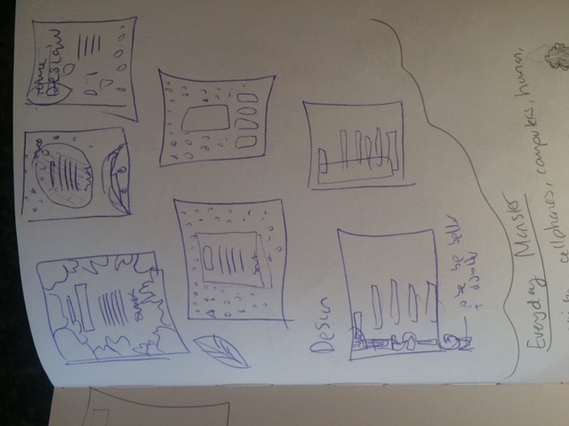
I worked a lot on the Manifesto to fit the design and did many sketches for the design/illustration.

The hardest part I think was the writing for me and what I wanted to say. Lastly, the layout was tricky for me. It would have been nice to have more time for a check-in again but I did learn a few things and overall this project was interesting and difficult.

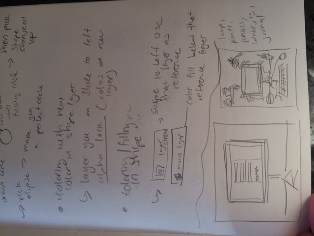
Process sketches