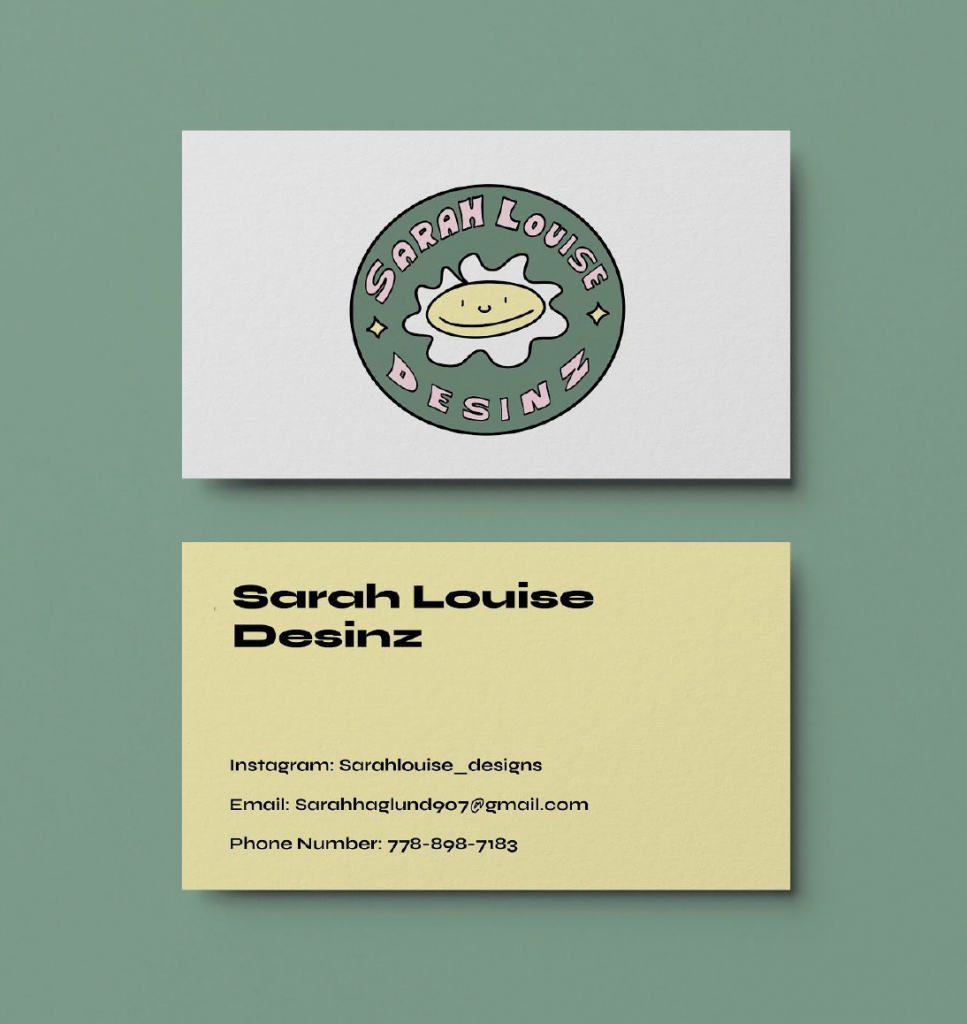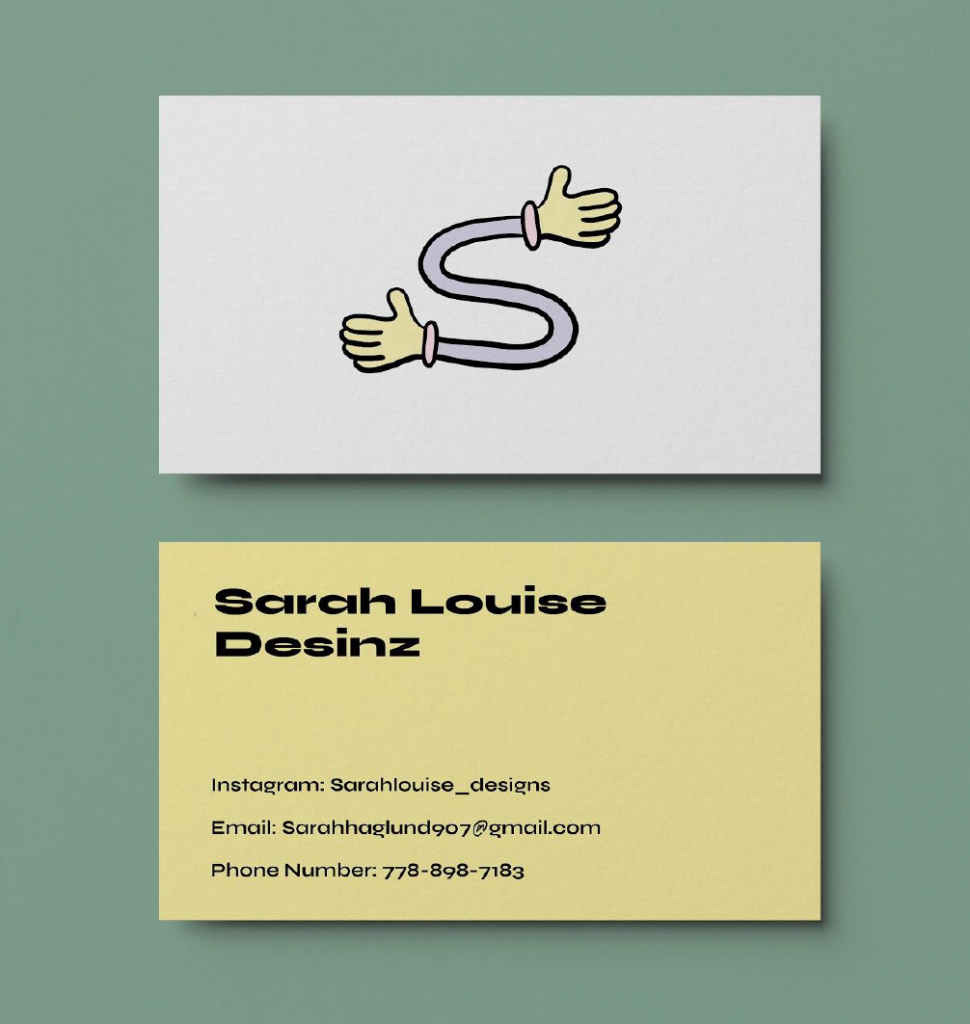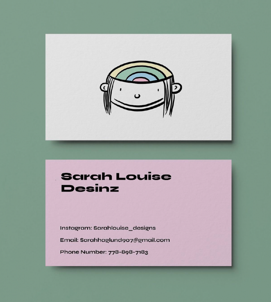
After we did the second round of 100 logo ideas we moved onto the next stage of choosing the top three best logos that have potential. I had 5 concepts that I could have gone with but narrowed it down to three. The first logo contains my name and character, which represents a typeface with personality and a playful nostalgic approach. In addition, my second concept was an “S” with two hands on either side which represents my welcoming and friendly side. Eager to meet people and can talk about business when need be. Lastly, the third concept is an illustration of my head and inside are my thoughts and ideas. This logo could be versatile with what elements can go inside my brain. All these logos have the potential for animation, the last maybe having the most. Now I am at the stage of deciding on the final. I really do like the sticker/label approach that the first one has. If I can somehow combine this feeling or theme with the second or third I think I would be satisfied with the result.
Below is the typeface I want to use for my logo.