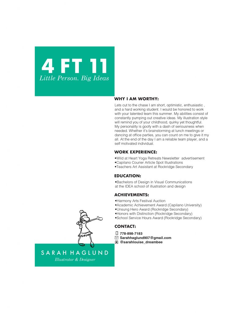
For my resume, I started by looking at references for layout and design. I also was working on pairing typefaces together. I ended up going with Futura and Century Schoolbook. I believe Futura shows confidence and a good work ethic. Century Schoolbook was chosen because I have a friendly softer side in my personality. I wanted my resume to have an interesting visual design if seen from further away and also have some colour pop to stand out.
I drew icons for the contact info to show my illustration and drawing style. I also added a small illustration of myself showing that I am fun and interested in the illustration field. Lastly, I chose my unusual title because I think the viewer would think twice or wonder what they will be reading. Overall, the way I wrote the introduction was to showcase that I am fun and approachable and would be an asset to the company. The playful writing also carries is shown throughout the resume design.
I believe I deserve an 8.5/10

