This is the final phase of this project, for these weeks I’ve been working with my mentor which I think it’s a nice chance for me to have some professional feedback from the people in the industry and I have a nice time working with my mentor. She provides me with a lot of helpful feedback and helps me think more industrially. I think the most challenge for this project is finding imaginative mockups and the timeline which is a bit short so I can’t finish all the designs I have. Also, I found that it’s easier to choose typefaces after I have done with the illustrations, as I think typefaces are based on the style I have and illustrations are determinating the personalities. For the rest of my time, I will keep working on the packaging designs and add a logo with brand guide and a website design for online store.
Phase 2
In the past few weeks, my mentor and I reviewed the Moodboards, sketches and packaging design idea for my brand-Flora and decided to do a set of packaging design that is seasonal flower flavoured (cheery blossom), including In the past few weeks, my mentor and I reviewed the Moodboards, sketches and packaging design ideas for my brand Flora and decided to do a set of packaging designs that is seasonal flower flavoured (cherry blossom), including an eyeshadow palette, lipstick and a mailbox for online purchasing. I initially was thinking of doing one more packaging design for the set which is the bb cushion foundation. However, my mentor thought we have a tight timeline and suggested I put more time on my main product which is an eyeshadow palette design and can add more or edit it during the summer. I think it’s nice to work with my mentor who provides a lot of useful websites and suggestions for me and helps me with the timeline. I think the most rewarding is thinking widely and industrially which sometimes some ideas are hard to succeed in and over budget. The most challenging thing I found is finding a suite mockup for my designs, take the bb cushion foundation as a sample, we couldn’t find one without the need to purchase it or it’s the wrong format.
Week 9, 10 and 11
Brief, research, Moodboards, sketches
During week 9, I was working on the brief and research, I shared my works with my mentor and I found that I’m not really thinking in deep and asked myself a lot of questions like, is it possible to make it? What materials I will use? What kind of price range do I want to set with, is it still possible with my original design? I’m also thanking my mentor who helps me a lot with my writing. In week 10, we start to look at Moodboards of competitors, colour palettes, logos, typefaces, illustration styles and packaging designs. My mentor gave lots of useful suggestions for my directions and got some little changes. In the next week, we started to look at some sketches of illustrations and layouts, including the final Moodboards for the products (sizes, materials, colour palettes and mockups), I have a hard time finding a mockup that looks exactly I imagined for one of my products and since our time is tight, my mentor suggested me to do the bb cushion foundation later and mainly focused on the lipstick, eyeshadow palette and mailbox design. I think it’s interesting to work with my mentor and I learned a lot from her.
Week 6
For this week, we are choosing one out of three logos we did last week and I finally choose the one with the flower element as I think it can show more my personality when people first look at it. The other two are more minimal, simple and not too special for a personal style logo.
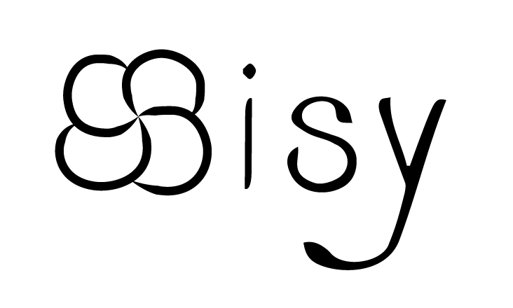
The two “S” are combined together and formed a flower shape which I replace for my first letter “S” and I found a curvy and elegant typeface to match the flower. I was thinking of using all capital letters at the very beginning but it seems like nothing surprised the reader so I use lower letters for the remaining words and I found the “s” and “y” look fun.
Here’s my final logo:
Week 3 & 4
In week 3 and 4, I’ve explored my own logo and start with a mind map of thinking about my first and initial name, included the meaning of my name, what my hobbies are, my personalities, styles, keywords form first week and workplace. After that, I came up with using whether my first name or first and last name for my logo and I decided my target audience will be packaging design, illustration and film professional people or studio. I like mind mapping as it helps me list down ideas in my head in a clean and organized way.
Then, I started to sketch my 200 possible logos. I came up with lots of styles and ideas of playing the types and I got some nice feedbacks for my first 100 sketches. After the discussion, I decided to choose whether only types or combination with flowers and types and finished with the left 100 sketches. I think it’s quite interesting to look at the processing of how my logo has been created.
Week 2
Moodboard and brief
This week I was finding all those photos online to create my moodboard and start writing my brief. It is quite interesting that I start to look back of my past designs and I found that I’ve changed a lot from the first year. I found that my style has always been changing. It is also pretty hard to find just a few photos to define myself.
I’ve finally combine all those styles together and get minimal, clean, colourful, peaceful and elegant for my style. It’s also quite interesting to write my own brief as we used to follow all the briefs provided by our professors and it is challenging to really think of what I want to do and write a clean brief.
Anyway, I am pretty exciting for the following steps and work with mentor. I was thinking about to design a cosmetic packaging or something about animate as that’s my hobby and I want to create something about me.
Week 1
Personal branding research
I found this research quite interesting, before that I’ve never think of what my career will be after 5 to 10 years. Since for the COVID, we work remotely and don’t know how long it will last for and it did affect our lifestyle.
At the very beginning of this research, it took me a few hours to really think of myself and what my strengthen and weakness are and what makes me so unique. It’s quite wired to talking about myself as it’s kind of formal introduction.
The instruction was clear and leading me to find myself and sales me as a product. The whole project took me 2 days to complete, day 1 for reknowing myself and day 2 for working on the self intro paragraph. It’s kind of a little challenge to me when phrasing the 5 keywords that should be appropriate for me. In conclusion, I’m excited for the next step of this project.
Citystudio client campaign
Sisy W, Terence Z, Marco M
“CityStudio North Vancouver is an experimentation and innovation hub for the City of North Vancouver where municipal staff and partners collaborate with Capilano University students and faculty to create projects that make North Vancouver a more vibrant, sustainable and healthy city”.
For this project, our client is VVFD North Vancouver Fire Department. We are going to design a series of ads that will change young people’s habits of causing fire, raising awareness and educating them about the dangers of leaving their doors open in the case of a fire.
After we met with our client, we decided to design a series of print posters about “Closed doors” and “Smolke alarm” that will show up on social media like Instagram, Twitter, Facebook, etc. Our audience is people between 16-25. Then we started to do research on the possible slogans for the posters and we came up with our top 4: “____ isn’t the only thing you need to worry about!”, “Close before you doze”, “It’s a lot easier for firefighters if you check the smoke alarm regularly.” and “Smoke alarms will save your life, only if it’s working.”. After that, we made some sketches and reference images for our second meeting with our client.
Finally, we decided to work on “Closed doors”. Terence did illustrations for the posters, Marco worked on the types on the posters and I was working on the mockups and moodboards for the project, we helped each other if we have problems, everyone is doing a great job and the outcome of posters are satisfying.
68 research and strategies
Sisy W, Terence Z, Marco M
“We call upon the federal government, in collaboration with Aboriginal peoples, and the Canadian Museums Association to mark the 150th anniversary of Canadian Confederation in 2017 by establishing a dedicated national funding program for commemoration projects on the theme of reconciliation.”
For this project, we were choosing one of the action 68 to work on as our title. The problem with Call to Action 68 is that the federal government has not fulfilled any of the prescribed quotas, which has weakened the importance of controlling funds in indigenous communities and has not even consulted with the people in the first place. It is very important to save this problem. Since Canada’s National Day is a time of celebration, and the relationship between the government and the Indigenous people has broken down, the people acknowledge that Canada’s National Day is not a major event worthy of real celebration and urgently needs reconciliation. Our goal is to resolve these grievances so that the future of Canada Day can be an act of respect and reconciliation.
In this project, we included history, awareness, ties and celebrations. We have considered the use of posters or advertisements, museum exhibits, street marketing, distribution of brochures, handouts, items such as souvenirs, storybooks, and even the use of food and drink to achieve our goals. We hope to build on our solid foundation and take advantage of our retrospective and explorable medium to address this particular topic. However, we must be absolutely careful about the inadvertent appropriation of aspects and ensure that the credibility and informativeness of our limited references are carefully checked.
After we made our project and design statements, we started to make our idea moodboards. After we decided which 3 poster ideas we go with, three of us were making our own three posters and decided to go with Marco’s series. All three of us did cooperate well and the outcome was turning good.
94 Calls Action
Me, Marco Mo and Terence as a group we chose the number 68 action, it’s about doing an exhibition about Aboriginal people as a reconciliation to mark the 150th anniversary of Canadian Confederation in 2017.
Below here are what we think we can do for the exhibition:
- Exhibit of what Canada 150 could’ve been
- Aboriginal peoples’ history and culture
- Exhibit of aboriginals culture to educate the mistake from the past
- Orange Shirt Day
- Graphic novel
- Board game to empathize with the suffering
- Souvenirs about Aboriginals’ culture
- Educational handouts
- Storybooks
- Brochure
- fliers
- Legends and myths
- Exhibition of items with large impact from modern indeginous people
- Books, toys, appliances, inventions
We hope this exhibition can help people recognize the history and culture of Aboriginal people and give them an identity on Canada Day which also as apologize for the pass mistake.
resources: https://newsinteractives.cbc.ca/longform-single/beyond-94?&cta=68