Throughout the mentorship project, I’ve learned so much about the animation industry and what is required to become a storyboard artist. I absolutely loved this project and my mentor Jess Pollard was just such a joy because of how enthusiastic we both were about the project. I learned a lot of terminologies and how to work as if I were in the industry, and I was also able to learn how I fared on a first-time storyboard.
I had some struggles in the research phase since I was bringing out an old story I’d written down in the past, and developing it so that I could make a “board” out of it The other toughest thing was getting through all the “roughs”. Being quick is such a huge part of storyboarding and knowing basically how to draw everything is something I’ll definitely practice. But in the end, I was rewarded with a great animatic and some new connections.
Out of 10, I’d give myself an 8.5. Some of the deadlines we both set I was unable to meet and overestimated my abilities. But it was alright as storyboards can be from a whole episode to a short sequence or scene. I really tried my best to absorb all of Jess’s knowledge like a sponge and hopefully, I’ll be able to use it in 4th year.
In the second phase of the mentorship project me and Jess met up to go over my storyboard thumbnails.
Since we already figured out which of the three ideas I pitched we should develop, it was easy to get started and finish everything early on. With the start and end of the script determined, it was about thumbnailing and getting the idea across for this week. The most interesting thing I took away from that meeting was the different camera movements and transitions, and being shown some of the loose rules to follow on storyboards.
The most rewarding thing in this phase was getting feedback for what I could add to each scene and seeing how clearly I was able to convey the thumbnails of the scenes to Jess. The challenge was getting the thumbnails done quickly since the priority for storyboards is speed, it was essential that I had the scenes planned out and playing clearly in my head for each thumbnail.
Since there wasn’t much to do this round, I’ll give myself an 8/10 since I wasn’t able to give myself extra time to finish any designs for a style guide.
Reflecting on the first phase of the mentorship project was fun. When I spoke to my mentor I found that for my specific project, that being storyboarding for an episode of a hypothetical new show, instead of a written brief to go back to, there is instead a kickoff meeting where everything is said and set down.
When I started talking to Jess Pollard, we both agreed that starting early would benefit me greatly. Therefore we began scriptwriting and getting a lot of the groundwork done by the time of our “official” start date.
What I learned was more about the industry and being a storyboard artist is basically a jack of all trades in the animation industry, combining the knowledge of cinematography/film, animation, and drafting, which makes it a job one level before that of a full director! What was really rewarding with starting early was getting to sit down and flesh out my idea with a “pro” from the industry, I also just loved the fact that jess kept giving me all these terms to learn about. I was given some homework to gather resources and storyboard to an episode of a show I’m watching, which was really challenging because I was told not to pause. Through that I got a feel for how quick-paced and loose storyboarding HAD to be.
I believe that the mark I deserve for this section would be 9/10 because of the amount of groundwork I had to make up for in comparison to storyboard artists being given a style guide and script to work with.
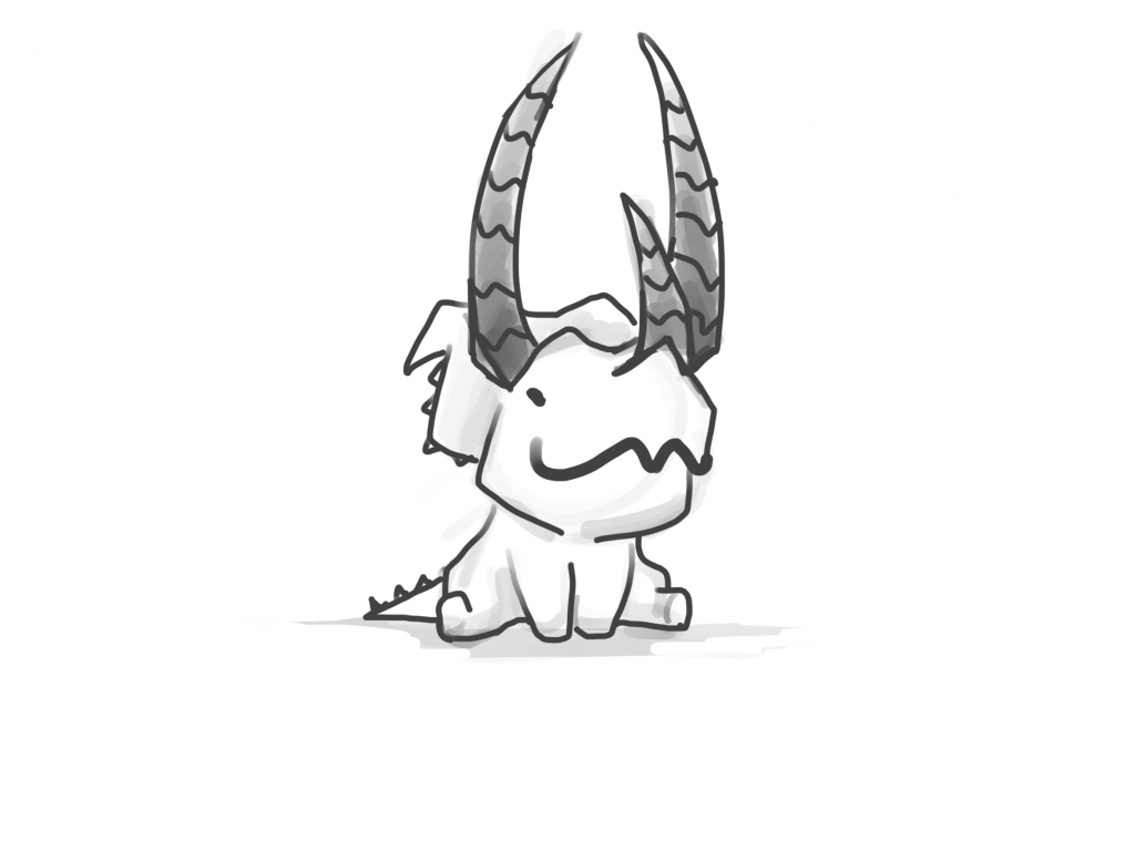
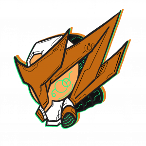
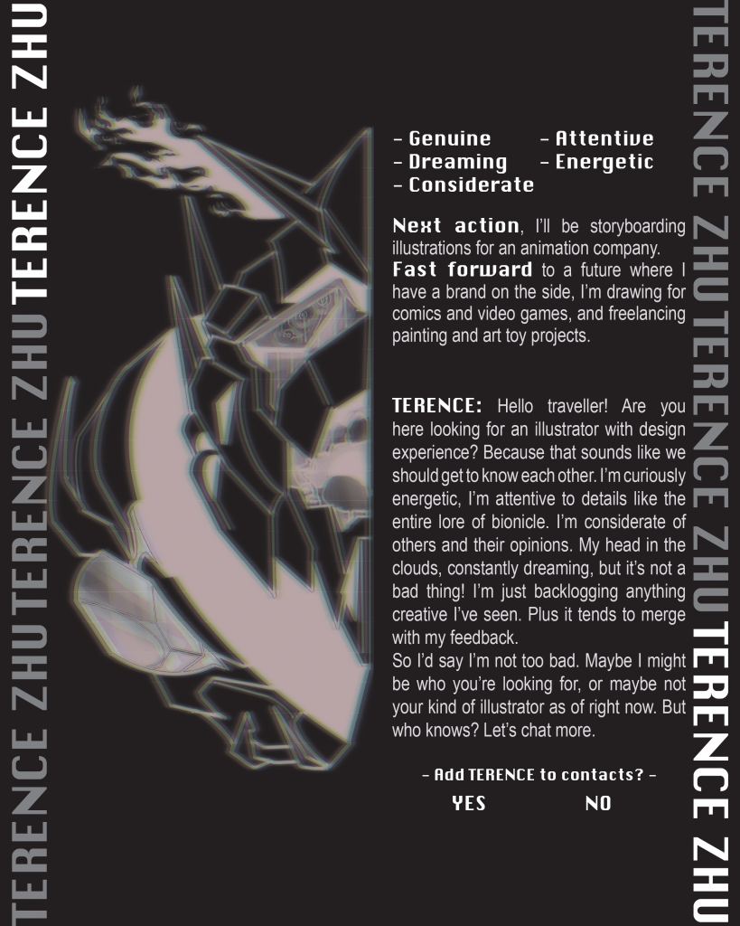
At the very end of this self-branding journey, I chose to go with the third logo, the “Mech hero”. Because it showcases my abilities through the logo itself and achieves what I wanted when I first thought about designing a logo for myself. The aesthetics of my interests are present, it shows that I can illustrate and combine things for a new solution, and I now have a mascot of which I still need to design the lower body, but a mascot character nonetheless. I also love the aesthetic it has, comparing it to logos I appreciate and enjoy.
I’d say that I’m satisfied enough with this logo because I would love to use all the logos I designed. Each one brings something different to showcase and feels like they could all be seen being used.
As a final grade, I’d give myself a 9/10 and justify this with how much thinking I put into it all. Although there were moments wherein I confused myself, I believe that trudging through it all ended up with 3 logos that are 100% authentic to me. The final redesigns of the logos took everything that everyone said and kept it secondary to how I really felt about it. So I boiled the critiques down to what I believe was meant and rebuilt the logos until I was happy with them and their applications.
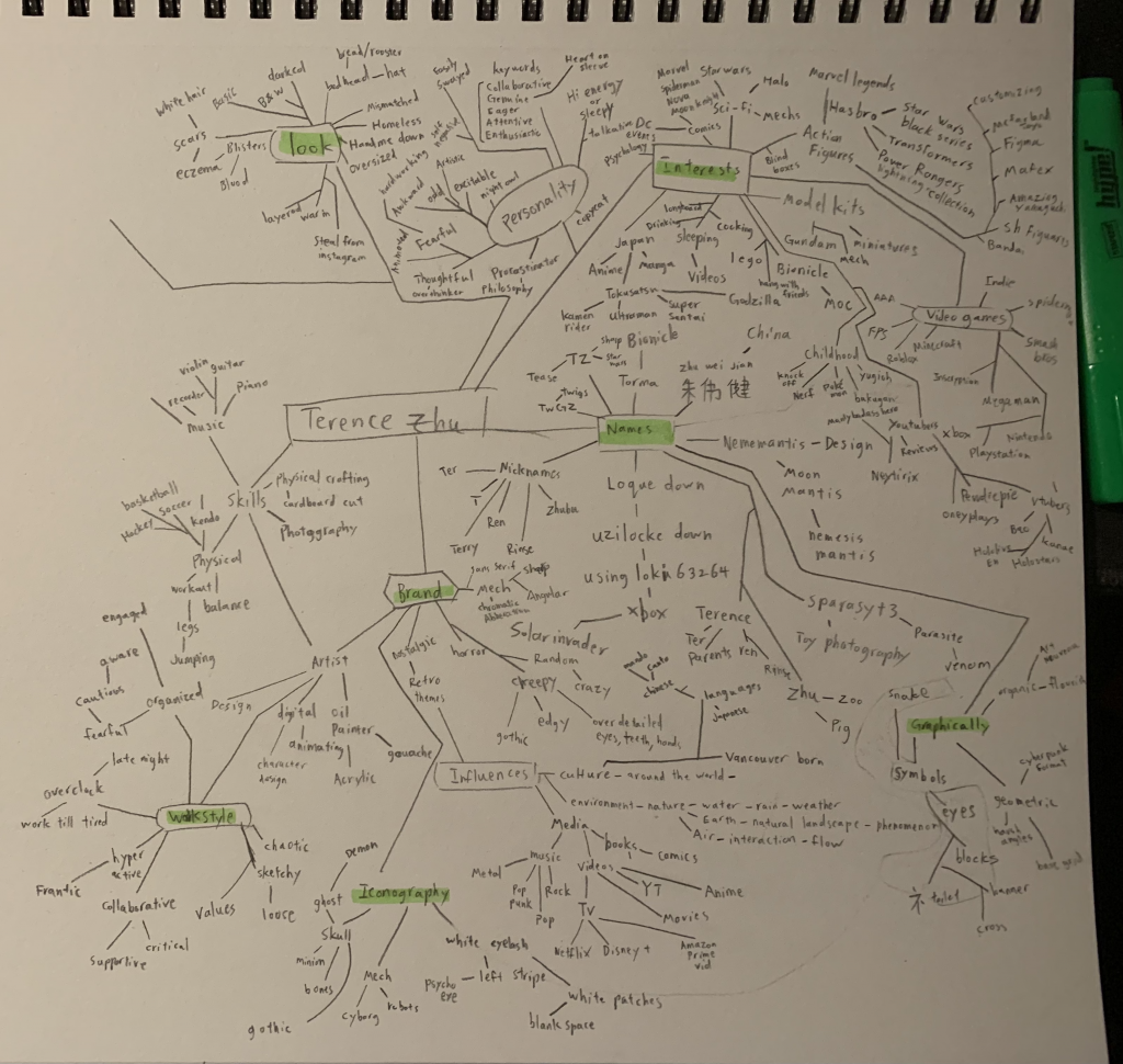
Throughout the process of building a logo for my brand, I found that taking an introspective of what I do is much easier than trying to figure out my aesthetics. For example, when I take a look at my hobbies I sometimes wondered if I did it enough to consider it a part of my brand. What really helped me along in this princess was asking friends to take a look at my web map and sketching some logos with aesthetics that they see in me. It also really helped by talking to them and just having a conversation on what kinds of impressions we all gave each other.
I found it so interesting to try to “stay true to yourself” when normally I don’t think about that.
In ideation, I would give myself a 9 out of 10, ideating for me is fairly easy. Something fun was thinking about the other names to be known because I treated it like being a superhero with another identity. One thing I’d say I lacked a bit in was trying to figure out how to incorporate 50/50 text and imagery/iconography.
Putting together a mood board about myself felt odd. The strangest thing was trying to figure out if the images I was putting in were representations of myself or if I was recalling memories where those were the strongest and clearest images that stood out.
In the end what I had placed in my moodboard was a mix of both my aesthetics that defined my style, personality, and memories that gave an insight of my childhood and how I turned out the way I did.
It turns out that, I am incredibly nostalgic about recurring senses of my childhood, very influenced by many things from culture to things I found cool once, and have an odd sense. Sometimes finding things that people would turn away from appealing, such as the smell of chinese calligraphy ink, or the taste of century egg.
I asked a childhood friend if the images matched who I was, and then I asked a family member just to be sure I was accurately and critically describing myself, and not an idealized version of myself.
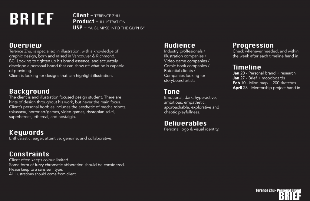
If I were to give myself a mark out of 10, I’d say that I worked hard enough that I deserve a 9.
Finding research for this project was fairly easy. Mainly asking friends to describe me in a few words, recalling things I’ve heard in the past, and looking at old projects where I’d have to describe myself. The analysis was just distilling info, nothing too difficult. However ideating and executing the actual written parts, while trying to make it full of personality was ridiculously difficult. I’m trying to say it out loud, which does help, but then adding professionalism and putting it on the actual ad to see how it looked like, really messed me up since I’d constantly reevaluate if it was something that sounded like me or if I was putting on a voice. Plus I dragged some parts out to inform what I like in terms of hobbies, like small quirks and points of curiosity. But I’m not sure it turned out that great.
Completing the project took about 8 hours altogether. Almost 2 hours were dedicated to the research, drawing that fancy art in the background with multiple variations was about 1.5 hours. Then it was 2 excruciating hours of going back and forth with the text. Ideating took about .5 hours across the 8 hours, and was quick since I was going with the flow to be as natural as possible.
I’d say that I deserve an 8/10. My text is as good as I could muster it up to be, however there are definitely much better ways of putting words together that I haven’t comprehended. Other aspects are straightforward and I tried to put it together in an interesting cohesive way.
Overall the project was a nice practice in coding in html despite having trouble remembering how to do certain things. Most of the time in the IDEA program, we worked on internal CSS and other web ux/ui building programs when we worked with code. But in general it wasn’t too different from what we learned to do in IDEA, however there were sites that I never expected using such as bootstrap. As well as working in atom and then uploading into filezilla was a hassle to deal with, since we had to constantly go back and forth, but understanding it was necessary in order to get everything working made it feel less monotonous.
The blogging service I have chosen to post through, is the website “Wix”. Why Wix? The biggest reason for choosing to create a blog post on Wix is because it is a blogging service that is advertised as easy and ready to use. While creating our website and thinking about our blogs, we thought about condensing our wants into the fewest points we could. This led us to prioritize simplicity, convenience and saving time, and we believed that Wix was the better option towards completing our goal.
S e a g u l l
We thought that simplicity is the best way to go design wise so as to not overwhelm people with information. The most convenient blog site that we could utilize was Wix, however it was a slight pain to have to create an account for it if we don’t use it again in the future. Saving time is a huge goal since the quicker we work on some things the more time we have to problem solve other things.
By AWA Creative (Terence Zhu, Marco Mo, Sisy Wong)
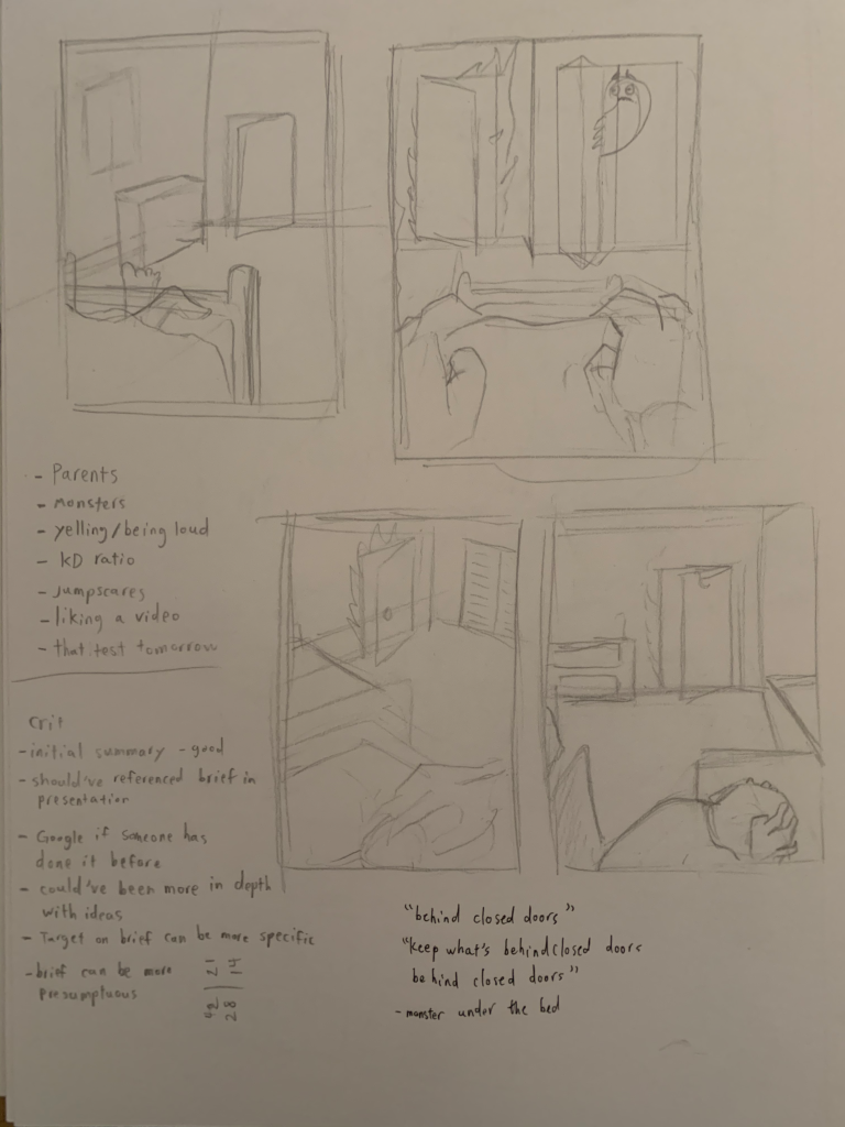
Initial Sketches – Terence Zhu
A.W.A. Creative is composed of Marco Mo, Sisy Wong, and Myself. Our team for this project was the same for the last project, and has decided on a more illustrative approach unlike our last project where we took a more typographical approach. Therefore, with more of a plan on what everyone’s roles were, I provided most of the talking and main visuals due to my concentration being illustration for third year, edits and typographic approach were done by Marco since he was comfortable with those from previous projects, and mockups of our chosen media and compiling our information were completed by Sisy as they were made and polished fairly efficiently.
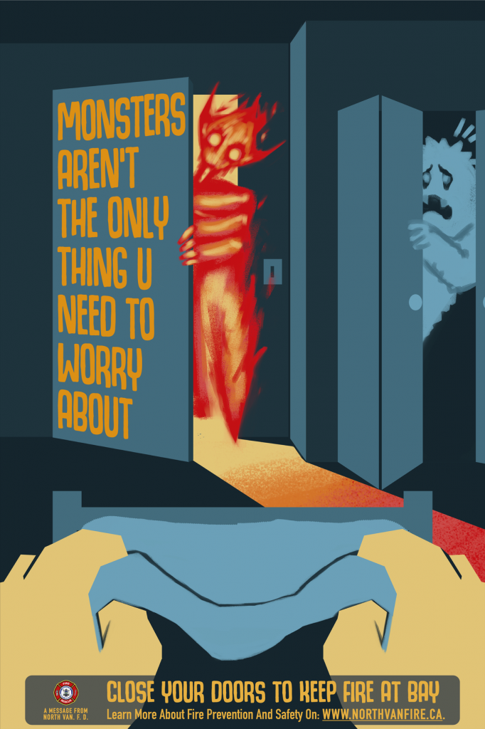
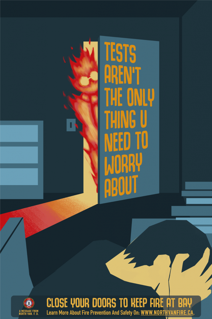
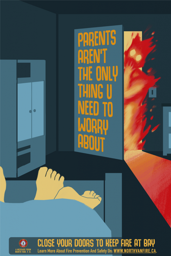
The Three Campaign Posters.
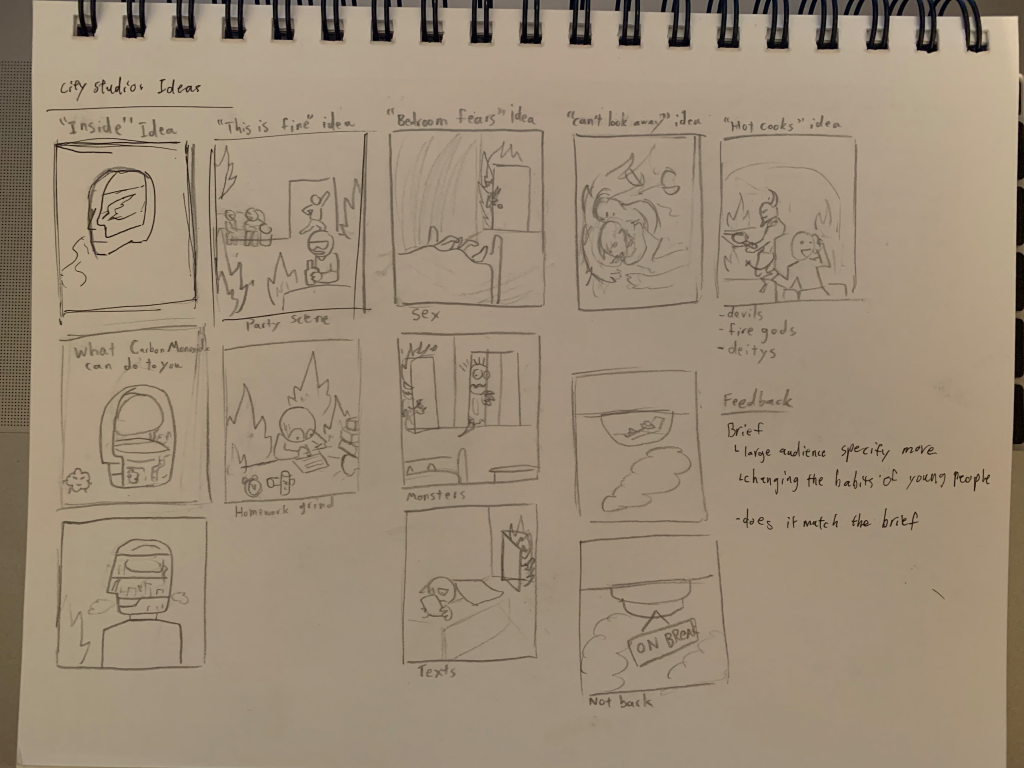
Our idea, “The Worries Campaign” was made with the intent of fulfilling the clients requirements with the most shock factor for memorability. We chose the idea of closing doors out of all the options provided due to the unique sketches that had come out of the prompt. We also decided that the approach to use fear and worries would instantly relate to the target audience. We used high contrast and a palette of two primary tones to focus on the fire of the image and to make sure that the text is what you read quickly. We chose to base the series on worries with the three of them being geared towards horny, the stressed, and the scared demographic. We did consider the gaming and late night phone user demographics, but unfortunately could not think of a solid direction and composition for them within the time frame.
The project this time kicked off with two strong ideas that were opposite of each other. Researching and sketching for the ideas was straightforward enough. Getting approved was fine and had no major hiccups thankfully. Interviews were great for clearing things up and letting us figure out how much freedom we had. The process of creating the posters took a week or two, and everyone was very quick with feedback and improvements. Lots of edits were made to the original piece, mostly placement of objects to incorporate the type. We had a few calls to sort things out which got everyone on the same page. The only times where we were completely stuck was when we couldn’t figure out a solid direction for the type and when we were frustrated with the project and had to take a break. Distributing everything onto the slides was easy enough since our group liked the clean black and white aesthetic to display information effectively.
For this self assessment I think that collectively we did much better and I could stand to benefit with a 90%, if I think critically about it.