History Book- Front and Back Cover Rationale

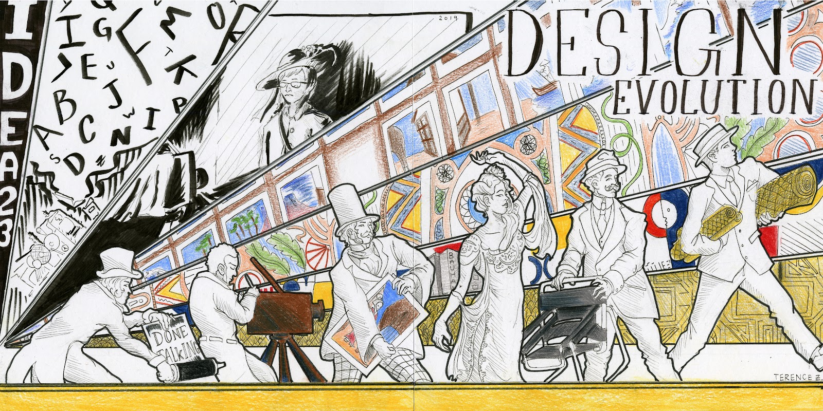
 In the final hand in for Judy’s class of the year, I picked up the assignment of front and back cover of the spread book. With this, the theme I thought would encompass our growth and development the best was the “evolution of humans”, it was also the concept that everyone seemed to be drawn towards. For the cover, I had hoped that it would give off the feeling of the evolution, the passage of time as well as how we as designers have grown in our first semester of the program.

With the front and back cover, one of the things that was difficult to troubleshoot and find a way around was deciding which six objects/ movements would relate best to our class. Through researching and referring back to our survey handouts I ended up picking the ones that had the most connection to the roots and beginning of design, as well as ones that had the largest impact and held the most memorability.

The things that could have been executed better would have to be the photography horizon part as this could have been incorporated better rather than trying to emulate a flash photography moment, the art nouveau colours could have been more pastel most likely if I had tried with a different medium, the japonism horizon part could have been less “pasty” as I most likely could have went over them again, and the pencil crayons could have been used more precisely as there is a lot of mismarks and smudges from ink.

Thing that I believe worked well for this would be the concept of the cover, the people were incorporated with an object of importance to the best of my abilities and finally the framing of the people and their respective horizon parts as you can tell which part connects to which person.

With all that said  and done, I give myself a 7/10, and I guess I am “done talking ;)”.

Survey 9- The Theory of The Big Bang Rationale

 This is the final spread I am going to do for this class. For survey 9 I was tasked with completing an infographic for science and technology. Because of this I decided to research the big bang theory, however doing research for this topic was slightly annoying as whenever I searched up anything with “Big Bang Theory” the popular television series would show up instead. Although it was annoying, I did think that this was somewhat helpful as I had to think of inventive ways of rewording the key words to get to what I was looking for. As for this spread, I wanted to keep a simple space theme. I felt that if I included objects with too much detail, then the infographic would become too busy looking, so instead I decided a good way to bypass this would be with silhouettes. The concept of this infographic came from trying to emphasize the expanding of the universe with rings or circles.

For this infographic poster, I believe that the concepts that were executed very well, were the galaxy themed background, the simplified silhouettes, and using type hierarchy to distinguish the title and the rest of the text. 

However, there are ideas and concepts that aren’t working as well as they could be. These ideas would be the empty space in the title, causing the title to not be very well noticed, the fact that the poster doesn’t give off the same energy as an infographic poster, lack of numerical and statistical information, and the formula for Planck time that could have been incorporated better as a whole.

With all of that being said, I came to the conclusion that I should receive a 6/10 for this poster due to the cons that outweigh the pros in my personal opinion.

Natalia Goncharova- A Want to Stand

Natalia Goncharova Photo (1910)

 Natalia Goncharova’s work was contradictory and mixed elements from the sacred and profane. The subject matter of Goncharova’s work are mostly around day to day tasks and lives of rural workers, this being a contrast to her wealthy family and upbringings. The early inspirations of Goncharova’s are Cezanne’s brushstrokes, Fauvism’s Matisse colours and patterns, and the world view of Gauguin.

“Self-Portrait with Yellow Lilies” (1907)

Her early work named “Self-Portrait with Yellow Lilies” (1907) gives off a very confident use of simplicity. Here, Goncharova  uses a recurring theme of flowers as well as giving herself flowers and the studio background, giving the identity of a nature lover and an artist with bohemian experiences.

“Linen” (1913)

“Linen” (1913) was a piece using a cubist and futurist style and contains a lot of cool tones. The piece was a response to a very sexist comment by Marinetti who said he despised women. Goncharova decided to divide each gender’s clothes by their suggested labor but still contained a connection between the two genders.

“The Evangelists” (1911)

“The Evangelists” (1911) was a piece entirely dedicated to representing the four evangelists. The piece was met with outrage as usually the religious icon pieces were traditionally reserved for men. Goncharova also wanted to create an icon for her age as every age had a different style and history.

“Cats” (1913)

A piece that stands out is “Cats” (1913). It demonstrates the movement of Rayonism as well as Goncharova finding a new way of seeing. It creates a new form and includes Goncharova’s past influences of Futurism, Orphism, and Cubism.

“Spanish Women” (1923-24)

With “Spanish Women” (1923-24) Goncharova uses her costume design endeavors to create her famous polyptych. The piece holds some cubist elements as seen with the faces of the women. Goncharova painted her figures with towering presence which asserts dominance in her piece.

Sources:


Lisa Yuskavage- Eroticism and Innocence

 Lisa Yuskavage photo (2016)

 Lisa Yuskavage honed an original style to figure painting. Her style is very bold, eccentric and introspective with the figure being both the subject and object of the piece. A common theme of her works would be that most of them are exhibitionists, as well as being inspired by pop culture and the dichotomy of subjects, this in turn creates her own emotional formalism in her pieces.

“The Ones That Don’t Want To: Kelly Marie” (1992)

In “The Ones That Don’t Want To: Kelly Marie” (1992), Yuskavage was beginning to find her artistic voice and is part of a series that gained very mixed reviews. The scene revolves around trying to make you feel discomfort with sexual themes and innocent and vulnerable expressions.

“Big Blonde with Hairdo” (1994)

“Big Blonde with Hairdo” (1994) was a part of her big blonde series of works which played with themes of alluring women as seen with “Penthouse” magazines, as well as that of Neo Pop artist Jeff Koons and Mike Kelly. Yuskavage took the “tasteless” subject and turned it into fine art with the figure somewhat fearful face hiding something beneath the surface.

“Half Family” (2003)

“Half Family” (2003) changed styles from an interior to landscapes. It includes the theme of “coming of age” and embracing or exploring new found sexuality. However in the background comes a storm representing that of the dangers that is to come.

“Wilderness” (2009)

“Wilderness” (2009) is similar to a surrealist piece with the open landscapes and the intense colour of the sky. The piece shows off Yuskavage’s painting style which is quite mature and worn in. another interesting thing now, is that Yuskavage is now working with her own plaster sculptures rather than models.

“Hippies in Tit Heaven” (2015)

One of the pieces that draws me the most is “Hippies in Tit Heaven” (2015) as I enjoy the moody vibe it gives off. It feels isolated and yet never lonely. The dark expressions of the figures behind the highlighted one feels creepy and very burdened.

Sources:


Research Paper- Comic Book Industry Creative Project

Terence Zhu

Cassidy Picken

Engl 100

Dec-6-2019

Comic Book Industry Research Paper

Creative comic book cover inked

 The comic book industry was the topic I wanted to indulge and educate myself in for this paper. Although, more specifically, I wanted to dive into the reasons for why the comic book industry seemed to be failing. In the research paper, I wanted to reach one conclusion if possible to why the industry seemed to be less successful than their contemporaries, manga and the film industry. However I found that there were many sources rather than one definitive answer to why the industry wasn’t as popular as it once was. Now with this research assignment, I decided that one of the more interesting ways of presenting all of the information that I have gathered, would be to make a comic book cover.

For the cover, I wanted the focus to be how heavy this is for the industry if they don’t succeed in bringing up the sales. In the foreground we have the hero representing the current industry, and inspired by atlas, trying to hold the “comic industry” or “world” up. With the hero, I wanted to show that the industry has tried moving to a more technological media by adding a robotic arm. I also wanted to make it clear it was the physical comic industry by making the head a printer. In the background are the other industries watching as comics struggle as they sit comfortably. The film industry is absorbing parts of the comic world and reusing them in adaptations coming from the book “The Comic Book Film Adaptation: Exploring Modern Hollywood’s Leading Genre” by Liam Burke in 2015, this also explains the note taking as well as the roll of film flowing all around. The Japanese clothed man represents the manga industry and is linked with two small bridges coming from the source of “Manga and Anime Go to Hollywood” by Nothrop Davis in 2015. Something I tried to do with Manga man was emulating the shape of the moon to show some sort of similarity with the comic world, however the effects of this is not as adequet as I would have liked it to be. The three industry based characters have costumes more recognizable as a stereotype to their mediums, Comic industry is more classic capes and spandex look, the film industry contains a more technological and iron man-esque suit, and the manga industry keeps a traditional kimono and chibi appearance. As mentioned in these two, the film industry profits off of the most successful stories, the nostalgic factor and the cross influences between the two. The man in the middle represents the higher ups and more industry professionals turning a more or less blind eye at the problem, with trying to make it seem like everything is fine as seen with interviews at panels during Comic-con. With the comic world, there are multiple things happening such as the declining sales arrows hitting the world and creating fractures, on the right there are ships evacuating representing people moving towards a different medium. Underneath the industry figure, we have printed comics piling on and on, the source of this imagery is from the video “Why Collecting Comics RUINED the Industry! | Comic Misconceptions.” on youtube from Scott Nisewander of the channel “Nerdsync”. Behind the comics are people who are currently observing the industry idly, this is representative of all the sources that I have gathered for this paper. The two included names above Cassidy and mine are the heads of the two biggest comic book companies as of December of 2019 with Jim Lee being the more prominent of DC while still being co president, and Kevin Feige being the head director of Marvel entertainment.

The conclusion that I was able to reach with this paper was that the comic book industry is slowly in decline due to poor sales, being very reliant on other mediums as marketing strategies,  past incidents causing some bad reputation, and other media outlets. The reasons that their contemporaries seem to be succeeding in comparison is due to the fact that they have a broader reach with advertising and due to the cheaper prices as seen with graphic novels priced between 15-35 dollars USD and manga priced at 10-15 USD. 

Work Cited