Canadian Designer: Theo Dimson

GDC, graphic design, history of canadidan graphic design
Theo Dimson (1980)

One of the canadian designers that has a unique style is Theo Dimson. Theo was born in London, Ontario, on April 8th, 1930 and died on January 18, of 2012. He was a part of the early days of the GDC, and was internationally recognized and awarded for his work.

Names

At an early age, Theo was already interested in design and ended up with a scholarship to the Ontario College of Art and Design. Afterwards, Theo went from a firm, to freelancing, then rejoining the first firm. Then in 1965, Theo became president and director of Reeson, Dimson & Smith Ltd. which was later renamed to Dimson & Smith Ltd. Finally in 1985, Theo decided to create The Dimson Design Inc. where he is the president and creative director.

Spring

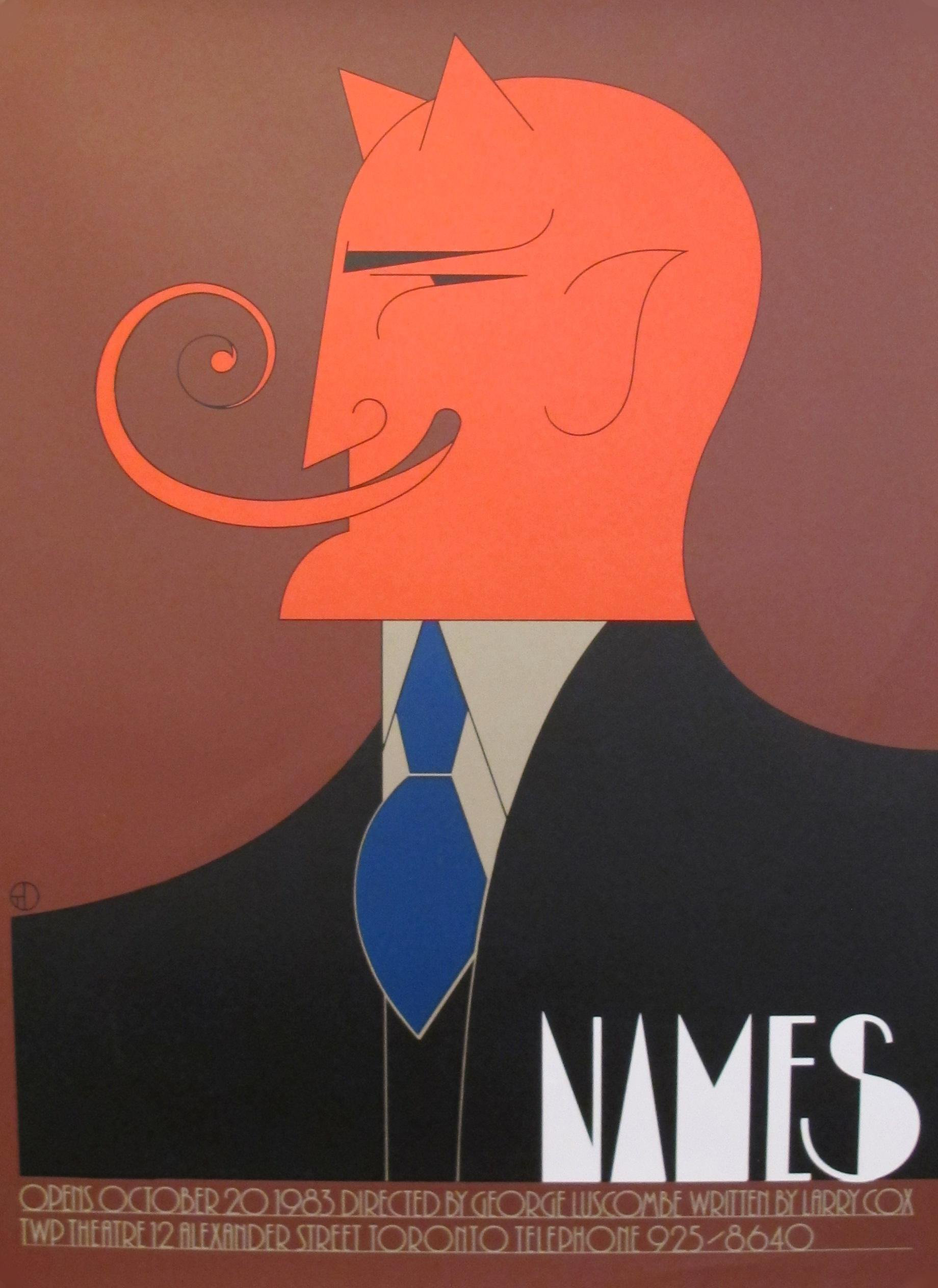
 Theo’s style was influenced by the art deco movement but with a twist. He used very thin lines in his work, fused with an intriguing and wonderful use of colour, and included a lot of serifs and deco looking sans serif. His work consists mainly of Posters, and also commissioned stamps. With these, he has been able to win awards and become members of such clubs like Royal Canadian Academy of Arts, and the GDC.

Sources:

Post-modernism: Jonathan Barnbrook

Jonathan Barnbrook (2016)

Jonathan Barnbrook is a one of a kind contemporary graphic designer, typographer, and filmmaker. Born in 1966 in Luton, UK, Jonathan’s formal art training comes from Saint Martin’s School of Art and the Royal College of Art. He is very outspoken on certain topics and uses type as his prefered way of fighting problems.

Ecocet (1991)

Jonathan always had a little knack for art and after graduating from the Royal College of Art, he became a multifaceted practitioner of graphic design, typeface design, motion graphics, activism, and industrial design. He began his typeface work through Emigre, the Californian type foundry innovator before releasing his type through his own site, Barnbrook Design and Virusfonts. The work he does began with record cover art that attracted him to graphic design.

Mason (1992)

Jonathan’s style and subject of work derives from how he feels about certain topics. Most of his fonts have a connection to their emotive and controversial titles. His more notable work comes from working on David Bowie’s 2002 album cover “Heathens”, and his types Mason and Exocet. One really interesting quote from him is that he ”set it as his goal in life to use his talent of graphic designing as a weapon for social change and justice”.

Sources:

SUPERgraphic Designer: Paula Scher

Paula Scher (2019)

Super Graphic designer Paula Scher is known as one of the most influential designers in the world. Born on October 6th, 1948, she had her childhood growing up in Virginia and Philadelphia. She is a contemporary graphic designer with over four decades worth of work, as well as being a graphic designer, she is also a painter and an art educator.

Super graphics PAVE Academy Charter School

Growing up Paula got encouraged into making hand-printed maps from her father’s device which ensured distortion free aerial photography. Paula went to Tyler School of Art in Pennsylvania for her Bachelor of Fine Arts. She began working professionally as a layout artist for Random house’s children’s book division and later ended up landing in the advertisement and promotion department at CBS Records. She briefly went over to CBS’s competitor Atlantic Records to gain experience before returning to CBS for eight years. Afterwards, she resigned and pursued graphic design, and eventually partnered up with Tyler Koppel to establish a firm named Koppel & Scher. However it did not last as the recession hit the firm and Paula went over to work for Pentagram in 1991 and worked her way up to post of principal.

Work for the Public Theatre (1994)

Paula’s style walks the line between pop culture and fine art. Her work is described as smart, iconic, and accessible. Paula’s work has caused her to gain a huge amount of awards and industry honours. Some of her most notable work includes developing brand identities for clients like The Public Theatre, Cocacola, Museum of Modern Art, and Microsoft.

Sources:

Psychedelic Designer: Wes Wilson

Wes Wilson

Robert Wesley Wilson or better known as Wes Wilson is a psychedelic artist born on July 15, 1937 in Sacramento, California, and passed away recently on January 24, 2020. He was called the father of 1960s rock concert posters. This was because of his knack for translating the sights and sounds from the culture into iconography.

Grateful Dead, Otis Rush Chicago Blues Band, The Canned Heat Blues Band at Fillmore Auditorium, SF  (1967)

In his childhood, he had a love for the natural world along with an interest in different artistic media. In post-secondary, Wes was taken in by these earlier childhood interests. For a short time he studied forestry and horticulture before moving on to philosophy. Then in the later parts of the 1960s, Wes had come to take inspiration from the avant-garde San Francisco neighbourhoods, and eventually came to creating art for people. 

Buffalo Springfield, Steve Miller Fillmore (1967)

Wes’s style is drawn from the art nouveau masters, an understanding of promotional art that let him flip it inside out, lines converging into each other, his usage of colours inspired by concerts, and letters filling every nook and cranny.  

Sources:

CCA Designer: Egbert Jacobson

“Until philosophers are kings, or the kings and princes of this world have the spirit and power of philosophy, and political greatness and wisdom meet in one, and those commoner natures who pursue either to the exclusion of the other are compelled to stand aside, cities will never have rest from their evils.”–Plato, The Republic, 4th century B.C.
Great Ideas of Western Man. (1955)

Egbert Jacobson, the mysterious man of the CCA. Nothing much is really known about him other than the fact that he published a book called “Basic Colour” as well as being one of the art directors of the CCA.

Egbert Jacobson is a man born in New York in 1980, he died in Clearwater, Florida of 1966. He began working with the CCA in 1936 as a director of design, Walter Paepcke sought him out due to his status as a leader in colour theory and typography. With Egbert as a director, he commissioned many well known artists to design the company’s national ads.

“Basic Color” (1948)

 It was said that as a director of design Egbert dealt with logos, stationary, invoices, annual reports, advertising, company office interiors, factories, and trucks. Along with this, in 1947 according to a family, Egbert designed a house at 850 Roaring Fork Drive, in Aspen.

During 1951, Egbert and Herbert Bayer got Walter Paepcke to create what would become the International Design Conference in Aspen. This became an event where designers could discuss the current situations in the world of graphic design. In the end, Egbert retired from the CCA after 30 long years of working for them in 1956.

Sources: