History Book- Front and Back Cover Rationale

 In the final hand in for Judy’s class of the year, I picked up the assignment of front and back cover of the spread book. With this, the theme I thought would encompass our growth and development the best was the “evolution of humans”, it was also the concept that everyone seemed to be drawn towards. For the cover, I had hoped that it would give off the feeling of the evolution, the passage of time as well as how we as designers have grown in our first semester of the program.

With the front and back cover, one of the things that was difficult to troubleshoot and find a way around was deciding which six objects/ movements would relate best to our class. Through researching and referring back to our survey handouts I ended up picking the ones that had the most connection to the roots and beginning of design, as well as ones that had the largest impact and held the most memorability.

The things that could have been executed better would have to be the photography horizon part as this could have been incorporated better rather than trying to emulate a flash photography moment, the art nouveau colours could have been more pastel most likely if I had tried with a different medium, the japonism horizon part could have been less “pasty” as I most likely could have went over them again, and the pencil crayons could have been used more precisely as there is a lot of mismarks and smudges from ink.

Thing that I believe worked well for this would be the concept of the cover, the people were incorporated with an object of importance to the best of my abilities and finally the framing of the people and their respective horizon parts as you can tell which part connects to which person.

With all that said  and done, I give myself a 7/10, and I guess I am “done talking ;)”.
Survey 9- The Theory of The Big Bang Rationale

 This is the final spread I am going to do for this class. For survey 9 I was tasked with completing an infographic for science and technology. Because of this I decided to research the big bang theory, however doing research for this topic was slightly annoying as whenever I searched up anything with “Big Bang Theory” the popular television series would show up instead. Although it was annoying, I did think that this was somewhat helpful as I had to think of inventive ways of rewording the key words to get to what I was looking for. As for this spread, I wanted to keep a simple space theme. I felt that if I included objects with too much detail, then the infographic would become too busy looking, so instead I decided a good way to bypass this would be with silhouettes. The concept of this infographic came from trying to emphasize the expanding of the universe with rings or circles.

For this infographic poster, I believe that the concepts that were executed very well, were the galaxy themed background, the simplified silhouettes, and using type hierarchy to distinguish the title and the rest of the text. 

However, there are ideas and concepts that aren’t working as well as they could be. These ideas would be the empty space in the title, causing the title to not be very well noticed, the fact that the poster doesn’t give off the same energy as an infographic poster, lack of numerical and statistical information, and the formula for Planck time that could have been incorporated better as a whole.

With all of that being said, I came to the conclusion that I should receive a 6/10 for this poster due to the cons that outweigh the pros in my personal opinion.

Survey 6- The Colours Rationale

Art Nouveau Artifact

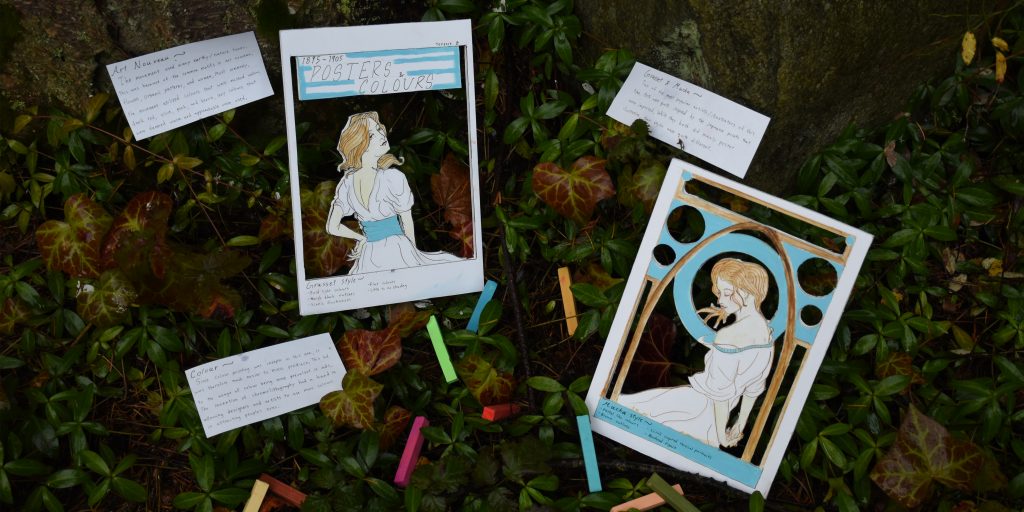
 For week 6 the topic we were assigned was a deep dive colour artifact. It was difficult to research this topic due to the fact that this was a slow time for colour. The artifact we had decided on were the posters. The focus for colour was the earth tones and the flat pastel like colours of the art nouveau movement. The secondary focus were the two influential artists of poster illustrations, Eugene Grasset and Alfons Mucha. 

A sufficient mark for this project would be around an 7or 8 for this artifact. Some things that I believe are well done would be the making of the posters distinguishable as an artifact rather than a spread, the idea, and the photograph. Some things that could have been improved on as said in the critiques are better positioning, better execution of the actual artifact, and larger letters for the written parts.

A way that I came up with to avoid the issue of distinguishing this from looking like a spread was to make everything feel tangible.

Survey 3- The witches rationale

The Days Of The Witches Of 1500’s

For survey 3, I decided a good focus for me and my team would be the daily lives of the people affected by the witch hunts of the 1500’s. We came to the agreement that this would be an interesting thing to touch upon in this era. All in all, I believe the overall design of the spread would be a 7/10. This is because during the group critiques, a common thing that people were saying was that the colours weren’t used strong enough. The colours on my spread were to lighthearted for the subject matter that I was going over in this spread.The design of the spread was split and focused on two of the ways that witches were killed during this time. These two methods being the infamous swimming test which was short lived, as well as burning which was quite the popular method for Germany. For the two sides I also tried to incorporate how gruesome the corpses would have looked, as well as how it would have looked to anyone from the other point of view. The middle of the spread is used as common ground for the whole spread. The books were the driving force of the witch hunts, so it was the centrepiece of the spread. Behind it lays the pentagram which was typically the main symbol when associating witches with Satan.

Yearbook Spread

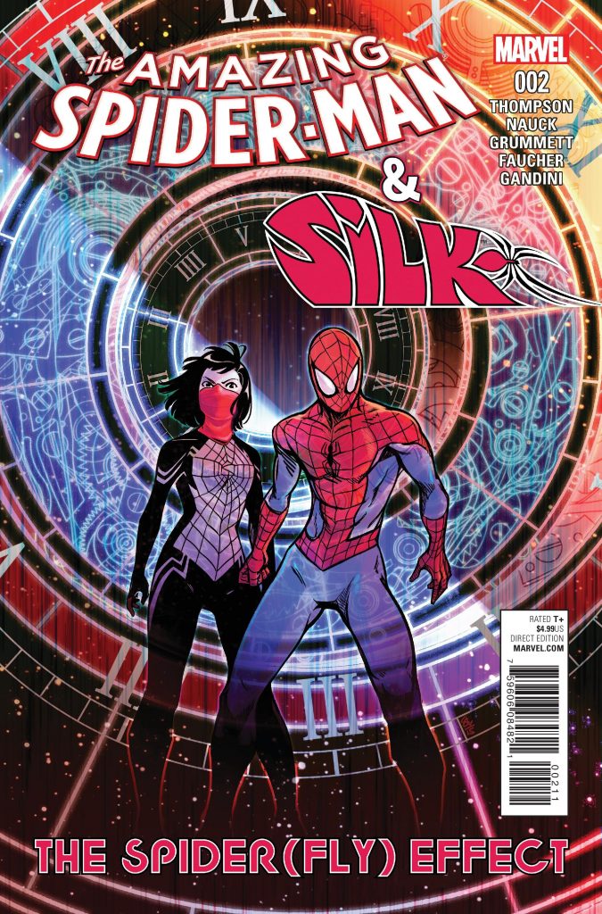
An introduction for an introduction. The kind of style that I wanted to go for with the yearbook spread was a mix of cyber/ techno and astrology/ stars. There is one reference in particular that I like to go back to often, which would be Marvel comic’s comic cover for issue #2 of “The amazing spiderman and Silk, The Spider(fly) Effect” drawn by Tom Grummett. Other things I used for the main references would be, constellation circles, a circuit board, circuits, and clocks. 

The amazing spider-man and Silk: The Spider(fly) Effect, 2016

Colouring for the spread was slightly difficult as I had the most trouble deciding the medium I wanted to go with. On the other hand I had certain colours already in mind while designing the spread, such as a strong blue for a glow effect on the circles, the circuits which I intended to be green, as well as some parts that looked better in white.

The spread includes 5 topics, which are: Life/ small bit about myself, another era/ If I were to be born in another time, different career/ If I had chosen a different path, Secret fact/ something my peers don’t know about me yet and 5 things about myself. I believe that most of these topics had a good execution, however the parts that I was most unhappy with were “life” and the 5 key words. This was due to “life” being difficult to see, and me messing up on the ink of 5 key words about me. 

 A mark that I would give myself would be about a seven out of ten. My reasoning is that there are other people who have done a better job than I have, the only unique parts of my spread would be the layout of the circles as well as the majority use of cooler colours.


Sources: