Hieronymus Bosch -the first imaginative painter-

 Hieronymus Bosch (c.1450-1516) was a notable painter of the fifteenth and sixteenth century. The main theme of his artworks were fantastical, imaginative, apocalyptic, and satirical. Bosch was quite popular as he constantly received commissions. However, Bosch never dated his paintings and had only signed some of them, therefore we have less than 25 paintings from him. 

“The Seven Deadly Sins and the Four Last Things” (c. 1500)

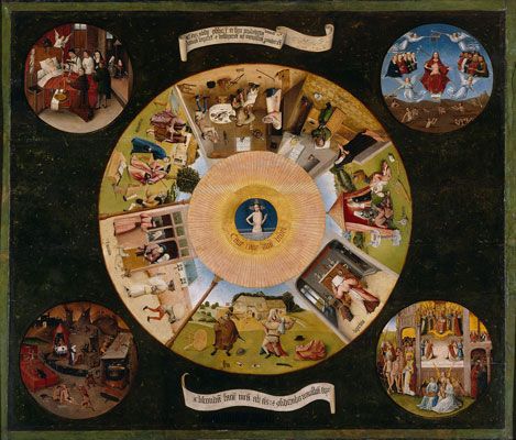
“The Seven Deadly Sins and the Four Last Things” (c. 1500) is one of Bosch’s more important works as it depicts God watching man’s downfall and the 7 deadly sins in everyday situations with different social classes. There are also references to his other works in the four corners with, the Death, the Last Judgment, Heaven, and Hell.

“The Last Judgement” (c. 1482-1505)

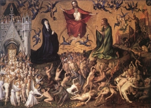
 “The Last Judgement” (c. 1482-1505) presents the fall of humanity from left to right. An interesting thing to note is that the piece only depicts heaven and hell, with no indication of a reflective purgatory or middle ground.

“Death and the Miser” (c. 1490)

 “Death and the Miser” (c. 1490) is the piece I enjoy the most and one that blends the fears of imagination with the grounds of the tangible. Quite relatable as sometimes people fear imaginary creatures around their bed.

“The Garden of Earthly Delights” (c. 1490-1510)

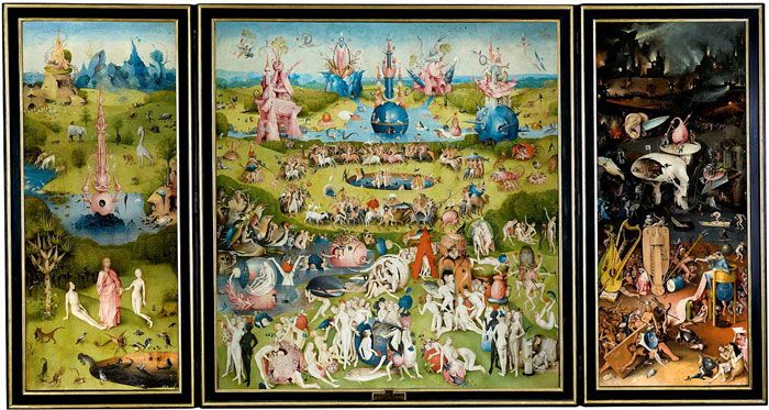
 “The Garden of Earthly Delights” (c. 1490-1510) Considered Bosch’s masterpiece, displaying the Garden of Eden, the third day of the world’s creation, and the last judgement, the key stories of mankind in the Bible.

“The Temptation of St. Anthony” (c.1501)

 A famous painting of the Triptych of “The Temptation of St. Anthony” (c.1501), one that has been recreated many times. Interestingly enough this is one of Bosch’s many interpretations and paintings of “The Temptation of St. Anthony”.

Sources:


Survey 1- The spread of Chinese writing

 On the topic of typography, I will help guide you along the ways of how the Chinese language has been spread out over the years. The Chinese typography, or writing system has been around for almost 6,000 years, and therefore has had much time to grow and refine itself.

 One such way of growing would be the transition from using traditional chinese to simplified. However the traditional language has not completely died off yet, as people still use the traditional language today. Simplified chinese was officially adopted in 1949 in an attempt to educate everyone and make sure that no one was illiterate. 

Easier life Chinese Calligraphy Small Regular Script Brush Pen Writing Painting Wolf Hair APR-12
Chinese Calligraphy

Chinese has also grown to reach other countries as well through the influence of Buddhism. Some common languages that use Chinese would be Japanese, Korean, as well as other branches of Chinese dialect. In the past Vietnamese, Dungan, Zhuang had used Chinese in their alphabets. 

The focus of this article will be Japanese Kanji, and Korean Hanja, as these two are arguably the most prevalent in modern day society. 

Image result for japanese kanji
Japanese Kanji

 In Japan, the use of Chinese characters began in the 5th century and was first introduced to them from Korea. This subsequently caused Japan to have three different alphabets to learn. In Kanji, each character has their own definition as well as their own corresponding words. Something that Kanji has similar to Chinese would be that their characters can have multiple meanings depending on how you use the characters. For an example we can use the character 日 (ni) which is the first half of Japan, as well as the meaning of “day”. 

Image result for korean hanja
Korean Hanja

 For Korea, the use of Chinese characters began with the spread of Buddhism, however the text that introduced Koreans to Hanja was not related to religion, but instead the “Cheonjamun” otherwise known as the “Thousand Character Classic”. Early on, Koreans had to learn traditional Chinese in order to properly articulate their words, later on however, they were able to develop new systems that used simplified Chinese which “phonetically transcribed to Korean”. As of 1980, however, it is more so used by the older generation as Hanja was effectively replaced by Hangul. Many words borrowed from Chinese as well have been replaced by native Korean words

Sources:

Pictures


Yearbook Spread

An introduction for an introduction. The kind of style that I wanted to go for with the yearbook spread was a mix of cyber/ techno and astrology/ stars. There is one reference in particular that I like to go back to often, which would be Marvel comic’s comic cover for issue #2 of “The amazing spiderman and Silk, The Spider(fly) Effect” drawn by Tom Grummett. Other things I used for the main references would be, constellation circles, a circuit board, circuits, and clocks. 

The amazing spider-man and Silk: The Spider(fly) Effect, 2016

Colouring for the spread was slightly difficult as I had the most trouble deciding the medium I wanted to go with. On the other hand I had certain colours already in mind while designing the spread, such as a strong blue for a glow effect on the circles, the circuits which I intended to be green, as well as some parts that looked better in white.

The spread includes 5 topics, which are: Life/ small bit about myself, another era/ If I were to be born in another time, different career/ If I had chosen a different path, Secret fact/ something my peers don’t know about me yet and 5 things about myself. I believe that most of these topics had a good execution, however the parts that I was most unhappy with were “life” and the 5 key words. This was due to “life” being difficult to see, and me messing up on the ink of 5 key words about me. 

 A mark that I would give myself would be about a seven out of ten. My reasoning is that there are other people who have done a better job than I have, the only unique parts of my spread would be the layout of the circles as well as the majority use of cooler colours.


Sources: 

Stefan Lochner


 Stefan Lochner was a ‘Late Gothic’ artist and considered one of “the last great old masters of German Gothic art”. Born in 1410 and died 1451in Germany, Stefan was regarded as one of the finest painters of the “school of Cologne”, and had a soft oil painting style based off of Jan Van Eyck, Netherlandish art, and early Cologne school works, as well as a mystical religious theme.

The Last Judgement, c. 1435

His earliest work “The Last Judgement”(1435) was mellow and dark, but still held a strong sense of a climactic drama. After meeting Jan Van Eyck, the piece showing his new learning the best would be “Altarpiece of the Patron Saints of Cologne”(1445), as the colours feel more saturated and livelier than his older works with the usage of oil.

Altarpiece of the Patron Saints of Cologne, c. 1445

One of Stefan’s more famous and well recognized pieces is”Madonna in the Rose Bower”(1448), this piece shows off Stefan’s soft and bright style the best.

Madonna in the Rose Bower, c. 1448

The last two pieces shows Stefan’s growth as an artist well, as the “Sts Anthony the Hermit, Cornelius and Mary Magdalen with a Donor”(1445) was painted in the middle of his career compared to “Saints Matthew, Catherine of Alexandria and John the Evangelist”(1445) which was one of his last works. The pieces are similar, yet different usage of mediums, colours and softer lines set them apart.

Saints Matthew, Catherine of Alexandria and John the Evangelist, c. 1450
Sts Anthony the Hermit, Cornelius and Mary Magdalen with a Donor, c. 1445


Sources: