By AWA Creative (Terence Zhu, Marco Mo, Sisy Wong)
A.W.A. Creative is composed of Marco Mo, Sisy Wong, and Myself. Our team for this project was the same for the last project, and has decided on a more illustrative approach unlike our last project where we took a more typographical approach. Therefore, with more of a plan on what everyone’s roles were, I provided most of the talking and main visuals due to my concentration being illustration for third year, edits and typographic approach were done by Marco since he was comfortable with those from previous projects, and mockups of our chosen media and compiling our information were completed by Sisy as they were made and polished fairly efficiently.
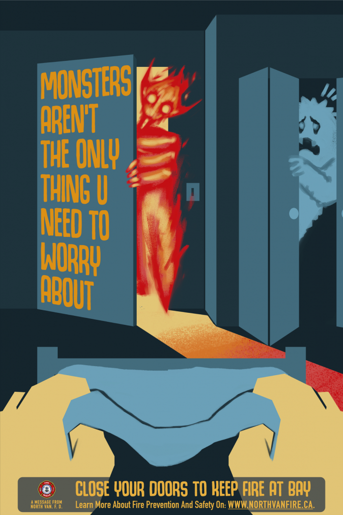
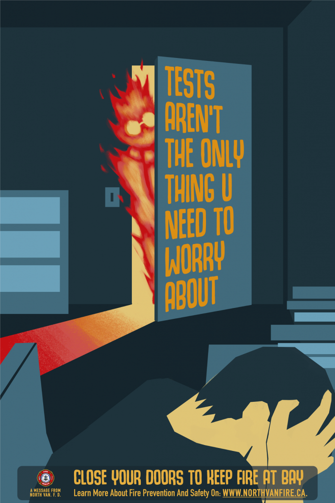
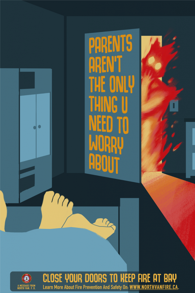
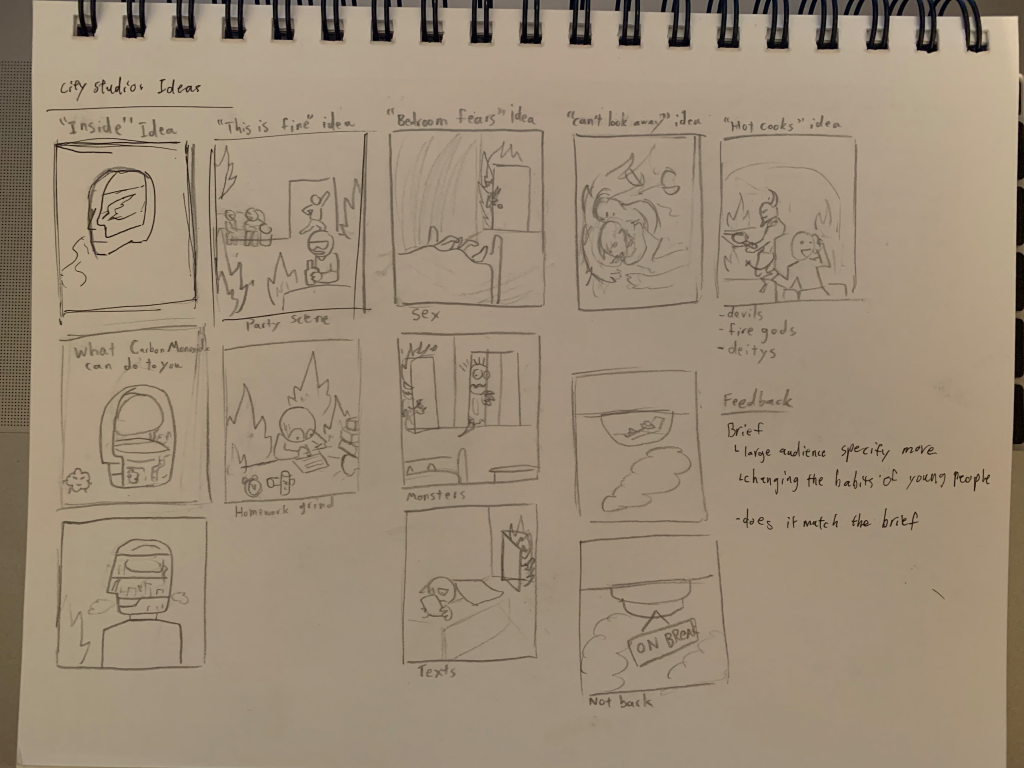
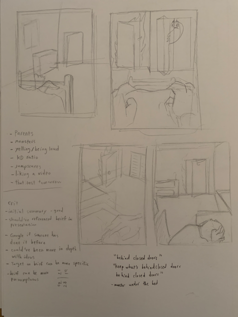
Our idea, “The Worries Campaign” was made with the intent of fulfilling the clients requirements with the most shock factor for memorability. We chose the idea of closing doors out of all the options provided due to the unique sketches that had come out of the prompt. We also decided that the approach to use fear and worries would instantly relate to the target audience. We used high contrast and a palette of two primary tones to focus on the fire of the image and to make sure that the text is what you read quickly. We chose to base the series on worries with the three of them being geared towards horny, the stressed, and the scared demographic. We did consider the gaming and late night phone user demographics, but unfortunately could not think of a solid direction and composition for them within the time frame.
The project this time kicked off with two strong ideas that were opposite of each other. Researching and sketching for the ideas was straightforward enough. Getting approved was fine and had no major hiccups thankfully. Interviews were great for clearing things up and letting us figure out how much freedom we had. The process of creating the posters took a week or two, and everyone was very quick with feedback and improvements. Lots of edits were made to the original piece, mostly placement of objects to incorporate the type. We had a few calls to sort things out which got everyone on the same page. The only times where we were completely stuck was when we couldn’t figure out a solid direction for the type and when we were frustrated with the project and had to take a break. Distributing everything onto the slides was easy enough since our group liked the clean black and white aesthetic to display information effectively.
For this self assessment I think that collectively we did much better and I could stand to benefit with a 90%, if I think critically about it.