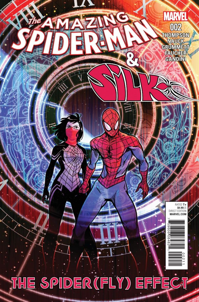
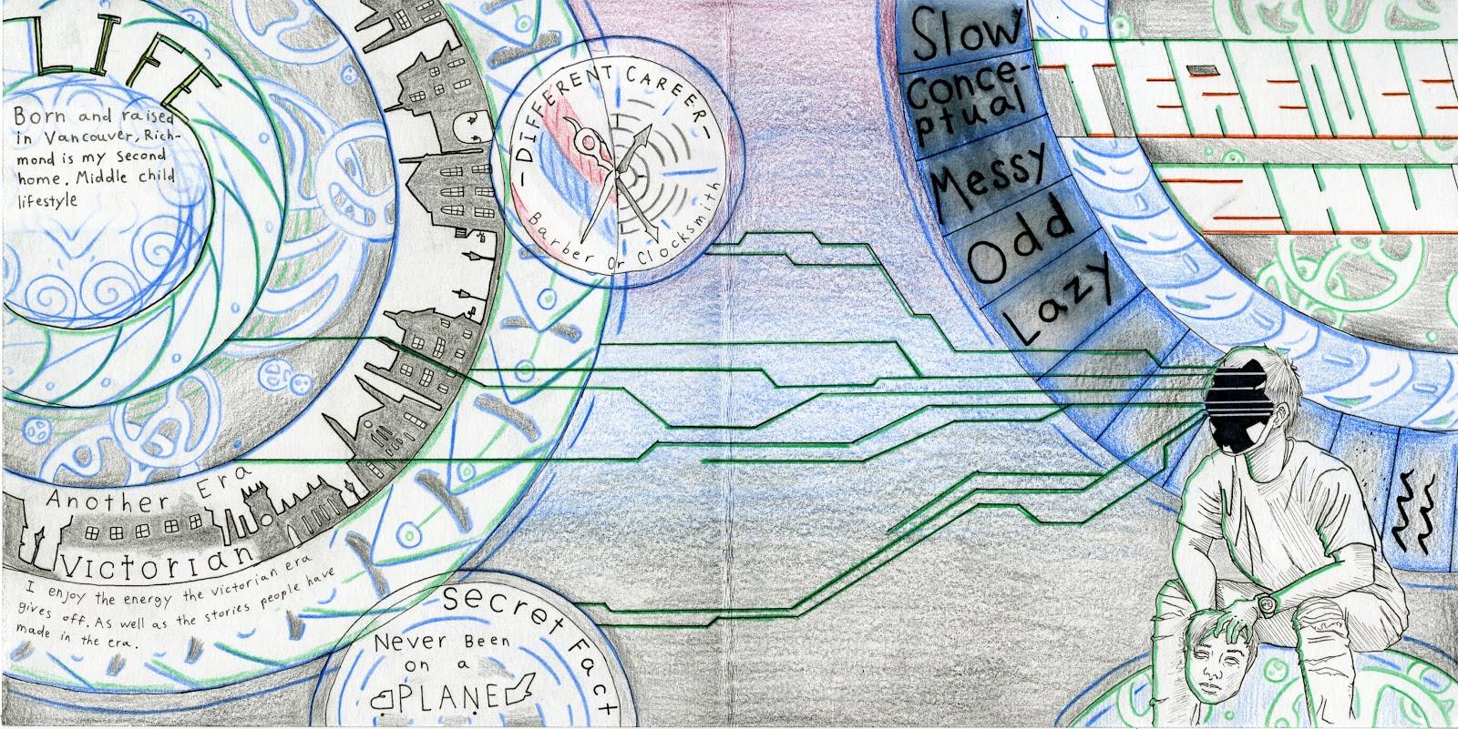
An introduction for an introduction. The kind of style that I wanted to go for with the yearbook spread was a mix of cyber/ techno and astrology/ stars. There is one reference in particular that I like to go back to often, which would be Marvel comic’s comic cover for issue #2 of “The amazing spiderman and Silk, The Spider(fly) Effect” drawn by Tom Grummett. Other things I used for the main references would be, constellation circles, a circuit board, circuits, and clocks.

Colouring for the spread was slightly difficult as I had the most trouble deciding the medium I wanted to go with. On the other hand I had certain colours already in mind while designing the spread, such as a strong blue for a glow effect on the circles, the circuits which I intended to be green, as well as some parts that looked better in white.
The spread includes 5 topics, which are: Life/ small bit about myself, another era/ If I were to be born in another time, different career/ If I had chosen a different path, Secret fact/ something my peers don’t know about me yet and 5 things about myself. I believe that most of these topics had a good execution, however the parts that I was most unhappy with were “life” and the 5 key words. This was due to “life” being difficult to see, and me messing up on the ink of 5 key words about me.
A mark that I would give myself would be about a seven out of ten. My reasoning is that there are other people who have done a better job than I have, the only unique parts of my spread would be the layout of the circles as well as the majority use of cooler colours.
Sources:
