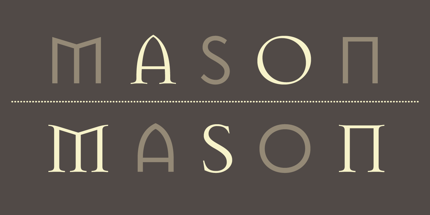
Jonathan Barnbrook is a one of a kind contemporary graphic designer, typographer, and filmmaker. Born in 1966 in Luton, UK, Jonathan’s formal art training comes from Saint Martin’s School of Art and the Royal College of Art. He is very outspoken on certain topics and uses type as his prefered way of fighting problems.
Jonathan always had a little knack for art and after graduating from the Royal College of Art, he became a multifaceted practitioner of graphic design, typeface design, motion graphics, activism, and industrial design. He began his typeface work through Emigre, the Californian type foundry innovator before releasing his type through his own site, Barnbrook Design and Virusfonts. The work he does began with record cover art that attracted him to graphic design.

Jonathan’s style and subject of work derives from how he feels about certain topics. Most of his fonts have a connection to their emotive and controversial titles. His more notable work comes from working on David Bowie’s 2002 album cover “Heathens”, and his types Mason and Exocet. One really interesting quote from him is that he ”set it as his goal in life to use his talent of graphic designing as a weapon for social change and justice”.
Sources: