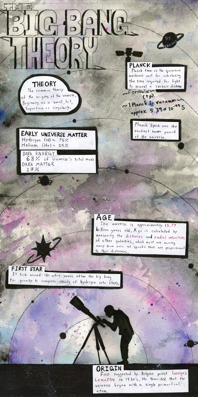
This is the final spread I am going to do for this class. For survey 9 I was tasked with completing an infographic for science and technology. Because of this I decided to research the big bang theory, however doing research for this topic was slightly annoying as whenever I searched up anything with “Big Bang Theory” the popular television series would show up instead. Although it was annoying, I did think that this was somewhat helpful as I had to think of inventive ways of rewording the key words to get to what I was looking for. As for this spread, I wanted to keep a simple space theme. I felt that if I included objects with too much detail, then the infographic would become too busy looking, so instead I decided a good way to bypass this would be with silhouettes. The concept of this infographic came from trying to emphasize the expanding of the universe with rings or circles.
For this infographic poster, I believe that the concepts that were executed very well, were the galaxy themed background, the simplified silhouettes, and using type hierarchy to distinguish the title and the rest of the text.
However, there are ideas and concepts that aren’t working as well as they could be. These ideas would be the empty space in the title, causing the title to not be very well noticed, the fact that the poster doesn’t give off the same energy as an infographic poster, lack of numerical and statistical information, and the formula for Planck time that could have been incorporated better as a whole.
With all of that being said, I came to the conclusion that I should receive a 6/10 for this poster due to the cons that outweigh the pros in my personal opinion.
