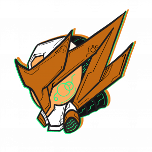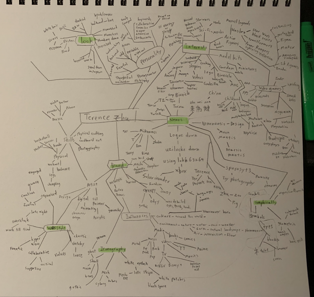
At the very end of this self-branding journey, I chose to go with the third logo, the “Mech hero”. Because it showcases my abilities through the logo itself and achieves what I wanted when I first thought about designing a logo for myself. The aesthetics of my interests are present, it shows that I can illustrate and combine things for a new solution, and I now have a mascot of which I still need to design the lower body, but a mascot character nonetheless. I also love the aesthetic it has, comparing it to logos I appreciate and enjoy.
I’d say that I’m satisfied enough with this logo because I would love to use all the logos I designed. Each one brings something different to showcase and feels like they could all be seen being used.
As a final grade, I’d give myself a 9/10 and justify this with how much thinking I put into it all. Although there were moments wherein I confused myself, I believe that trudging through it all ended up with 3 logos that are 100% authentic to me. The final redesigns of the logos took everything that everyone said and kept it secondary to how I really felt about it. So I boiled the critiques down to what I believe was meant and rebuilt the logos until I was happy with them and their applications.
