Natalia Goncharova- A Want to Stand

Natalia Goncharova Photo (1910)

 Natalia Goncharova’s work was contradictory and mixed elements from the sacred and profane. The subject matter of Goncharova’s work are mostly around day to day tasks and lives of rural workers, this being a contrast to her wealthy family and upbringings. The early inspirations of Goncharova’s are Cezanne’s brushstrokes, Fauvism’s Matisse colours and patterns, and the world view of Gauguin.

“Self-Portrait with Yellow Lilies” (1907)

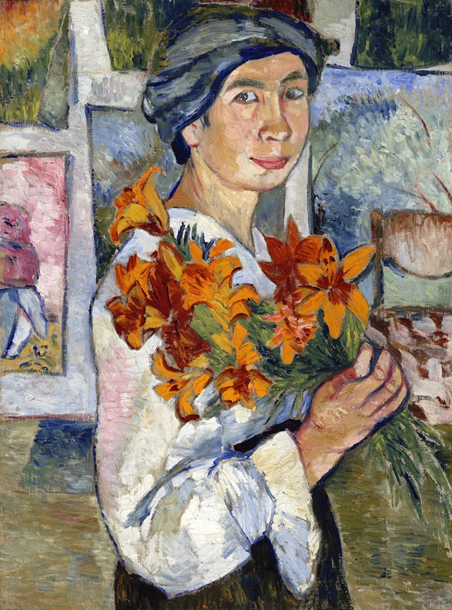
Her early work named “Self-Portrait with Yellow Lilies” (1907) gives off a very confident use of simplicity. Here, Goncharova  uses a recurring theme of flowers as well as giving herself flowers and the studio background, giving the identity of a nature lover and an artist with bohemian experiences.

“Linen” (1913)

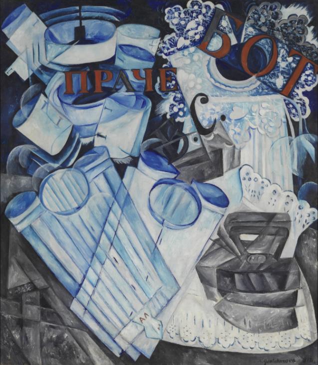
“Linen” (1913) was a piece using a cubist and futurist style and contains a lot of cool tones. The piece was a response to a very sexist comment by Marinetti who said he despised women. Goncharova decided to divide each gender’s clothes by their suggested labor but still contained a connection between the two genders.

“The Evangelists” (1911)

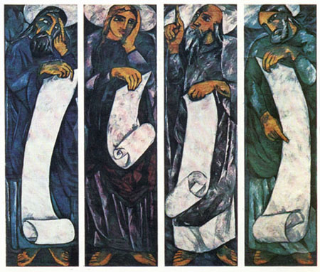
“The Evangelists” (1911) was a piece entirely dedicated to representing the four evangelists. The piece was met with outrage as usually the religious icon pieces were traditionally reserved for men. Goncharova also wanted to create an icon for her age as every age had a different style and history.

“Cats” (1913)

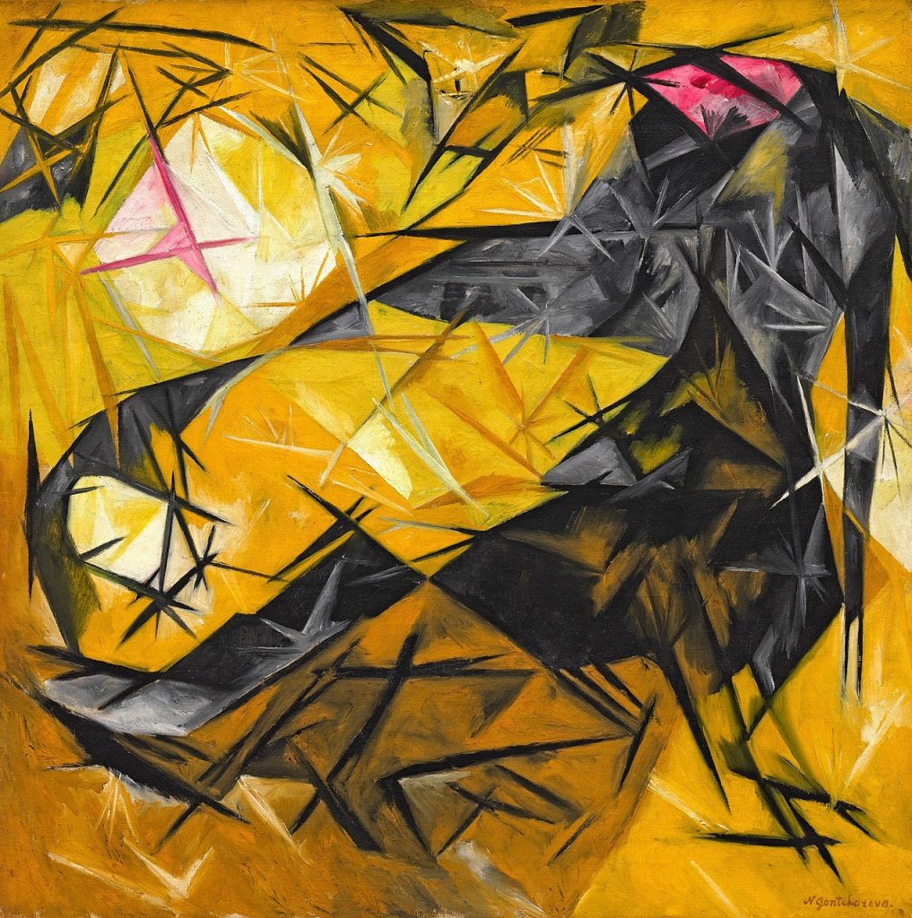
A piece that stands out is “Cats” (1913). It demonstrates the movement of Rayonism as well as Goncharova finding a new way of seeing. It creates a new form and includes Goncharova’s past influences of Futurism, Orphism, and Cubism.

“Spanish Women” (1923-24)

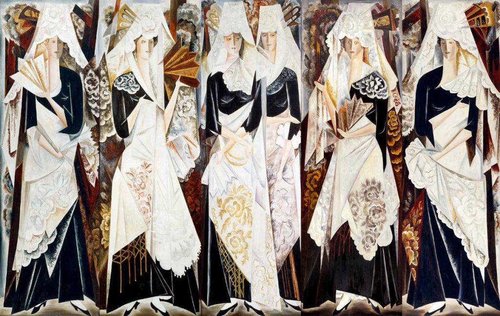
With “Spanish Women” (1923-24) Goncharova uses her costume design endeavors to create her famous polyptych. The piece holds some cubist elements as seen with the faces of the women. Goncharova painted her figures with towering presence which asserts dominance in her piece.

Sources:


Lisa Yuskavage- Eroticism and Innocence

 Lisa Yuskavage photo (2016)

 Lisa Yuskavage honed an original style to figure painting. Her style is very bold, eccentric and introspective with the figure being both the subject and object of the piece. A common theme of her works would be that most of them are exhibitionists, as well as being inspired by pop culture and the dichotomy of subjects, this in turn creates her own emotional formalism in her pieces.

“The Ones That Don’t Want To: Kelly Marie” (1992)

In “The Ones That Don’t Want To: Kelly Marie” (1992), Yuskavage was beginning to find her artistic voice and is part of a series that gained very mixed reviews. The scene revolves around trying to make you feel discomfort with sexual themes and innocent and vulnerable expressions.

“Big Blonde with Hairdo” (1994)

“Big Blonde with Hairdo” (1994) was a part of her big blonde series of works which played with themes of alluring women as seen with “Penthouse” magazines, as well as that of Neo Pop artist Jeff Koons and Mike Kelly. Yuskavage took the “tasteless” subject and turned it into fine art with the figure somewhat fearful face hiding something beneath the surface.

“Half Family” (2003)

“Half Family” (2003) changed styles from an interior to landscapes. It includes the theme of “coming of age” and embracing or exploring new found sexuality. However in the background comes a storm representing that of the dangers that is to come.

“Wilderness” (2009)

“Wilderness” (2009) is similar to a surrealist piece with the open landscapes and the intense colour of the sky. The piece shows off Yuskavage’s painting style which is quite mature and worn in. another interesting thing now, is that Yuskavage is now working with her own plaster sculptures rather than models.

“Hippies in Tit Heaven” (2015)

One of the pieces that draws me the most is “Hippies in Tit Heaven” (2015) as I enjoy the moody vibe it gives off. It feels isolated and yet never lonely. The dark expressions of the figures behind the highlighted one feels creepy and very burdened.

Sources:


Research Paper- Comic Book Industry Creative Project

Terence Zhu

Cassidy Picken

Engl 100

Dec-6-2019

Comic Book Industry Research Paper

Creative comic book cover inked

 The comic book industry was the topic I wanted to indulge and educate myself in for this paper. Although, more specifically, I wanted to dive into the reasons for why the comic book industry seemed to be failing. In the research paper, I wanted to reach one conclusion if possible to why the industry seemed to be less successful than their contemporaries, manga and the film industry. However I found that there were many sources rather than one definitive answer to why the industry wasn’t as popular as it once was. Now with this research assignment, I decided that one of the more interesting ways of presenting all of the information that I have gathered, would be to make a comic book cover.

For the cover, I wanted the focus to be how heavy this is for the industry if they don’t succeed in bringing up the sales. In the foreground we have the hero representing the current industry, and inspired by atlas, trying to hold the “comic industry” or “world” up. With the hero, I wanted to show that the industry has tried moving to a more technological media by adding a robotic arm. I also wanted to make it clear it was the physical comic industry by making the head a printer. In the background are the other industries watching as comics struggle as they sit comfortably. The film industry is absorbing parts of the comic world and reusing them in adaptations coming from the book “The Comic Book Film Adaptation: Exploring Modern Hollywood’s Leading Genre” by Liam Burke in 2015, this also explains the note taking as well as the roll of film flowing all around. The Japanese clothed man represents the manga industry and is linked with two small bridges coming from the source of “Manga and Anime Go to Hollywood” by Nothrop Davis in 2015. Something I tried to do with Manga man was emulating the shape of the moon to show some sort of similarity with the comic world, however the effects of this is not as adequet as I would have liked it to be. The three industry based characters have costumes more recognizable as a stereotype to their mediums, Comic industry is more classic capes and spandex look, the film industry contains a more technological and iron man-esque suit, and the manga industry keeps a traditional kimono and chibi appearance. As mentioned in these two, the film industry profits off of the most successful stories, the nostalgic factor and the cross influences between the two. The man in the middle represents the higher ups and more industry professionals turning a more or less blind eye at the problem, with trying to make it seem like everything is fine as seen with interviews at panels during Comic-con. With the comic world, there are multiple things happening such as the declining sales arrows hitting the world and creating fractures, on the right there are ships evacuating representing people moving towards a different medium. Underneath the industry figure, we have printed comics piling on and on, the source of this imagery is from the video “Why Collecting Comics RUINED the Industry! | Comic Misconceptions.” on youtube from Scott Nisewander of the channel “Nerdsync”. Behind the comics are people who are currently observing the industry idly, this is representative of all the sources that I have gathered for this paper. The two included names above Cassidy and mine are the heads of the two biggest comic book companies as of December of 2019 with Jim Lee being the more prominent of DC while still being co president, and Kevin Feige being the head director of Marvel entertainment.

The conclusion that I was able to reach with this paper was that the comic book industry is slowly in decline due to poor sales, being very reliant on other mediums as marketing strategies,  past incidents causing some bad reputation, and other media outlets. The reasons that their contemporaries seem to be succeeding in comparison is due to the fact that they have a broader reach with advertising and due to the cheaper prices as seen with graphic novels priced between 15-35 dollars USD and manga priced at 10-15 USD. 

Work Cited

Survey 8- The Louis of Armstrong

 The name of the game? Jazz, the name of a dude? Louis Armstrong. For this survey I will be telling you all about this prolific figure of the Jazz era named Louis Daniel Armstrong. Louis was born Aug 4, 1901 and grew up in New Orleans, Louisiana. The area he grew up in was especially poor and was nicknamed “The Battlefield” He began to gain popularity in the 1920’s with his two strongest features, his more daring trumpet style as well as his unique vocals.

Louis Armstrong Photo

Louis was encouraged to sing often by a Jewish family who often gave him a job and invited him to meals at their home. However after he was arrested for firing his stepfather’s gun he was sent to the Colored Waif’s Home for Boys. This place was coincidentally where he fell in love with music as he received musical instructions while he was there.

Louis Armstrong on a poster

It was after this experience when he had begun to earn himself a name as a fine blues player. While he was beginning he was eventually under mentorship with one of the greatest cornet players in town, Joe “King” Oliver. Soon he replaced King Oliver in Kid Ory’s band, which was back then the most popular band of New Orleans.

“Louis Armstrong The Hot Fives & Hot Sevens” Album

Things that Louis was known for was being in the first jazz big band, his band “the Hot Five, later Hot Seven, popularizing scat singing, unique covers of popular songs, the first African-American to get a featured billing role in a major movie, the first African-American musician to write an autobiography, first African-American entertainer to host a nationally sponsored radio show in 1937, Louis Armstrong House, telling the government off for not letting nine African-American children go to a public school, as well as songs like “Weather Bird”, “West End Blues”, “What a Wonderful World”, and “Hello, Dolly!”

Sources:


Survey 7- Plakatstil, Sachplakat, and Lucian Bernhard

Photograph of Lucian Bernhard

 For this week’s survey,  we are talking about colour. One of the biggest things that I want to focus on would be the Plakatstil or Sachplakat poster style of Russia. “Plakatstil” is defined as “poster style” in German. This style came about after younger artists searched beyond the current Victorian, Art Nouveau, and Arts and Craft styles.

‘Priester’ (1906) match poster

The whole movement had started with the 15 year old Lucian Bernhard and an exhibition. Bernhard went to the “Munich Glaspalast Exhibition Of Interior Decoration” once and felt the experience of, as he describes it “walking drunk with colour”. When Lucian Bernhard had made his first real poster in the style of Plakatstil, for the ‘Priester’ (1906) match company for a contest, it was a shocking difference compared to the other posters of the time. One thing to note as well was that the judges at first had discarded the poster and thought that the design was bizarre, however when the sales manager of the Berlin’s leading proto-advertising agency and poster printer saw Bernhard’s poster, he thought it was genius and named it first prize. This is because before this, simplified posters were an oddity and rarely used, the amount of text was also quite different in comparison, due to the fact that other posters tended to use way more text in their posters compared to Bernhard’s who uses barely any words in his.

‘Bosch’ Poster

The style came out of a rejection of medieval poetry and complex patterns as the new century approached. The Plakatstil style was the beginning of modern graphic design, in which they emphasized on more symbols and shapes. Some key aspects of the style would be the bold, straight fonts and simplified designs, the subject matter was also slightly more detailed while shapes and objects that aren’t the focus are simplified. The point of Plakatstil in the end was to have a standard  that presents a smooth product or image to the target audience. The simplified idea of this poster made it very advertisement friendly and therefore became standardized.

Sources:


Philip Guston- Abstraction and KKK

“Portrait of Philip Guston in Overcoat” (1982) by Jonathan Imber

 An iconic painter was Philip Guston. His earlier works were mostly abstract, and he gained success from this. However, Guston decided that abstract life wasn’t for him, so he abandoned it to the dismay of many. Gustons later works however became why he was so well remembered. Some recurring themes they included were imagery such as the hooded Klansmen, Richard Nixon, smoldering cigarettes, and huge eyeballs.

”Gladiators” (1940)

An early career piece would be ”Gladiators” (1940). The piece flaunts abstract and shows a preview to how his later pop pieces would look a little like. As well as being a piece dedicated to the Mexican mural movement showing children fighting as a political statement.

“Painter” (1979)

One of his last pieces was “Painter” (1979), and was most likely a self portrait. Guston put a confusing amount of bandages onto the figure however it remains true to his style as it includes key characteristics of his art, the cigarette, and the large eyes.

“City Limits” (1969)

One of the many KKK paintings that Guston made was “City Limits” (1969). The KKK appeared in Guston’s works as a sort of self portrait or reflection as the “idea of evil fascinated” him.

“Drawing for Conspirators” (1930)

“Drawing for Conspirators” (1930) is a haunting piece made by a 17 year old Guston. Based on early experiences with seeing the KKK and filled with the theme of oppression and symbolism. 

“Last Piece” (1958)

The “Last Piece” (1958) was a transitional piece and ironically not Guston’s last abstract impressionist piece. It was a piece to show that he had began to move away from his inspirations of nothingness and Buddhism to more recognizable motifs

Sources:


Research Project Proposal- The Failings of the Comic Book Industry

Cassidy Picken

Engl 100

Nov-15-2019

 The comic industry of current day is barely thriving as a source of entertainment. For this topic, there have been many reasons that have been speculated to be the cause of this decline. However, in my presentation, I will be attempting to answer the question of why the modern age of comics are currently in decline as well as why other similar mediums are much more successful. In particular these would be comic book movies, graphic novels, and Japanese manga. Doing research for this topic will be quite interesting due to the fact that most of the studies and research for this topic are generally not a scholarly article. As well as the fact that my other question is more of a broader and open ended question. One of the driving forces of why I want to delve into this discussion is because of the fact that I was never able to see this for myself. What I mean by this is that it was brought to my attention by youtube video essays, and people around the community. However the specifics and the cause of it all is never completely accurate from one person to another, and so I felt compelled to research this topic. Furthermore, there is also the fact that this is an industry that I love and respect, and to see its’ success dwindle is very hard for me to wrap my head around, especially because this industry has been around for so long.

Survey 6- The Colours Rationale

Art Nouveau Artifact

 For week 6 the topic we were assigned was a deep dive colour artifact. It was difficult to research this topic due to the fact that this was a slow time for colour. The artifact we had decided on were the posters. The focus for colour was the earth tones and the flat pastel like colours of the art nouveau movement. The secondary focus were the two influential artists of poster illustrations, Eugene Grasset and Alfons Mucha. 

A sufficient mark for this project would be around an 7or 8 for this artifact. Some things that I believe are well done would be the making of the posters distinguishable as an artifact rather than a spread, the idea, and the photograph. Some things that could have been improved on as said in the critiques are better positioning, better execution of the actual artifact, and larger letters for the written parts.

A way that I came up with to avoid the issue of distinguishing this from looking like a spread was to make everything feel tangible.

English Research Proposal

Terence Zhu

Cassidy Picken

Engl 100

Nov-15-2019

The Failings of the Comic Industry

 The comic industry of current day is barely thriving as a source of entertainment. For this topic, there have been many reasons that have been speculated to be the cause of this decline.

However, in my presentation, I will be attempting to answer the question of why the modern age of comics are currently in decline as well as why other similar mediums are much more successful. In particular these would be comic book movies, graphic novels, and Japanese manga. Doing research for this topic will be quite interesting due to the fact that most of the studies and research for this topic are generally not a scholarly article. As well as the fact that my other question is more of a broader and open ended question.

One of the driving forces of why I want to delve into this discussion is because of the fact that I was never able to see this for myself. What I mean by this is that it was brought to my attention by youtube video essays, and people around the community. However the specifics and the cause of it all is never completely accurate from one person to another, and so I felt compelled to research this topic. Furthermore, there is also the fact that this is an industry that I love and respect, and to see its’ success dwindle is very hard for me to wrap my head around, especially because this industry has been around for so long.

Max Ernst- Jack of All Trades, Master of None

Max Ernst Photograph

 Max Ernst was more than just a prolific artist, he was a painter, sculptor, graphic artist, and poet. Ernst was also an artist with no formal training as well as a pioneer for dada and surrealism. Furthermore, Ernst invented the techniques of Frottage and Grattage. Constant  themes of Ernst’s work includes the use of symbolic birds, The dream-scape, and painting from his subconscious.

“Here Everything is Still Floating” (1920)

The piece that demonstrates Ernst’s unique collaging style would be “Here Everything is Still Floating” (1920). The piece creates a coherent piece out of unrelated cutouts and ends up being a fun outlet for the insanity of WW1 to Ernst.

“Two Children Are Threatened by a Nightingale” (1924)

Ernst often paints with references to his own life. An example of this is “Two Children Are Threatened by a Nightingale” (1924). It seems quaint at first but becomes more terror inducing as you look more into it. 

“Europe After the Rain II” (1940-42)

“Europe After the Rain II” (1940-42), depicts a futuristic apocalypse. It was also most likely based around the Spanish war and the beginnings of WW2. Executed well is the cluttered feeling of an aftermath of destruction.

“Celebes” (1921)

The piece that I find most enjoyable is “Celebes” (1921). The piece takes a photograph of a vacuum cleaner and creates an imaginative dream-scape with it, and the headless nude that is with it.

“Barbarians Marching to the West” (1937)

Another one I enjoy would be “Barbarians Marching to the West” (1937). I enjoy the feeling of inevitability and two giant figures of the piece. The dream-scape used here is framed very constrained and the one “barbarian” leading left is very eye catching.

Sources: