Introduction
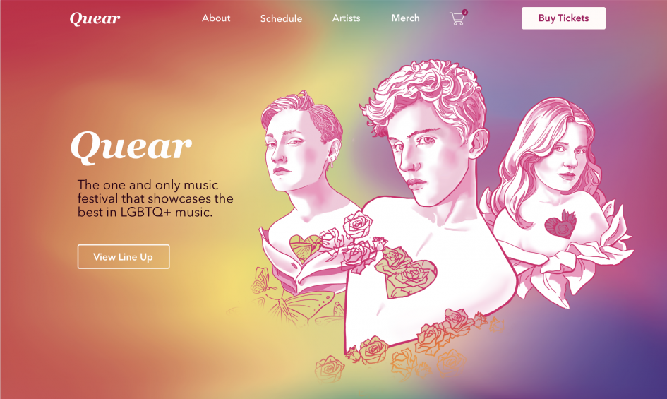
Quear is a music festival that represents the voices of the LGBTQ+ community. It is a yearly event that takes place on numerous days with many artists to explore. The purpose of the festival is to provide a place where people can relax and relate to the content that respects their sexualities and identities.
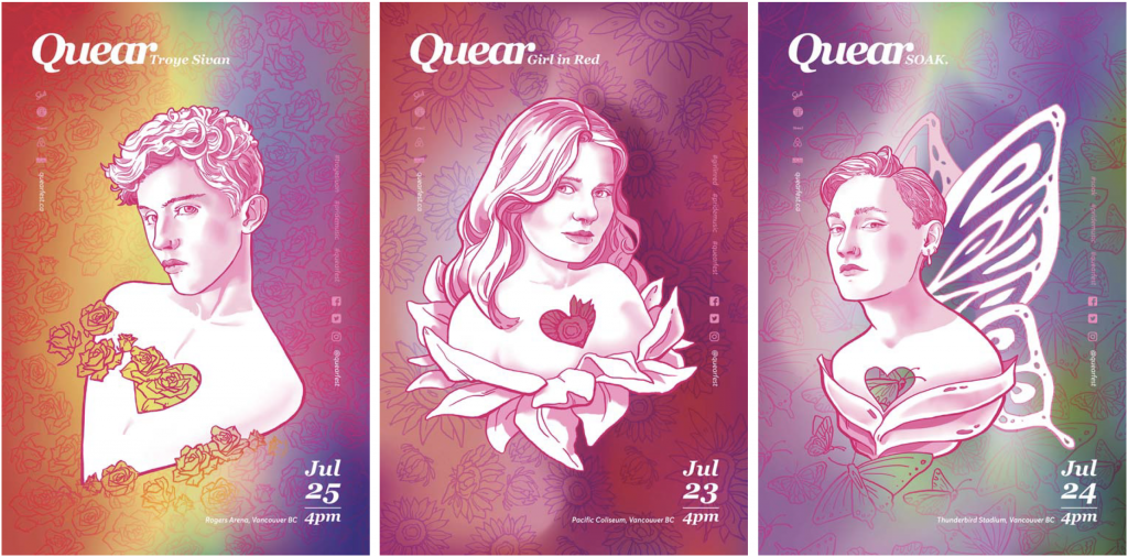
The posters feature the artist of the day and include soft gradient background that hints at either their sexuality or gender. This way its settle and is focused more on people and music but still celebrating the LGBTQ+ community.
Taking this project as my foundation, I chose to expand and create a project around Quear Festival for my mentorship at Pound and Grain that Kateland closely helped me with. I decided to do an interactive expansion of a web, serving the purpose of familiarizing the user with the festival as well as an app that would be useful to plan out the day and connect with the community at the festival.
I started with research and looking at other websites that use both web and mobile formats as well as festival webs such as VIMFF and SouthxSouthWest. I followed that step by creating project libraries for my reference.
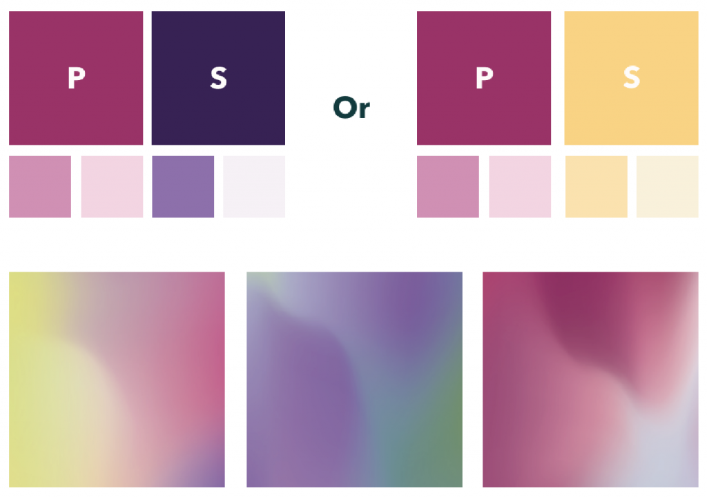
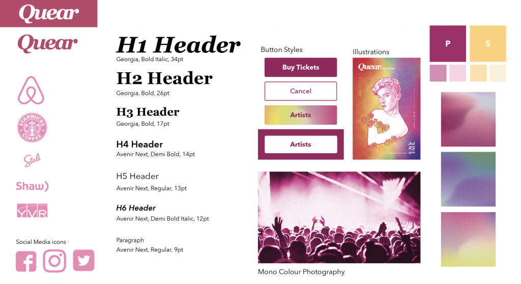
Branding
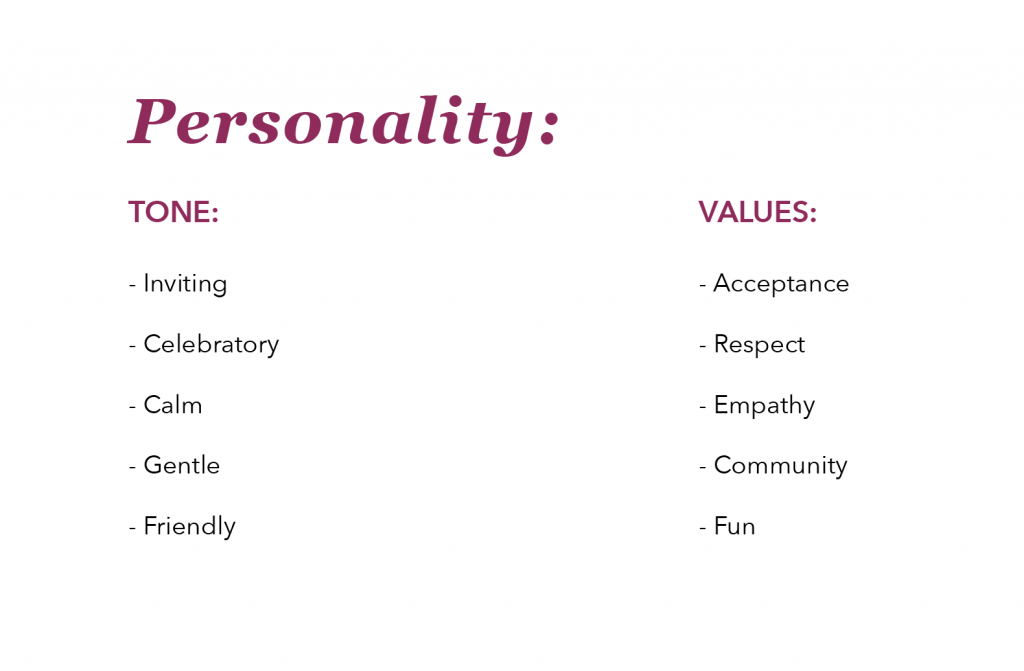
After figuring out how I want my brand to feel I went ahead and started on the art direction and stile tile to further clarify things for myself.
Information Architecture
When I figured out the look I started planing my pages with the use of Information Architecture which helps content planning before starting on the wireframes or any design thinking.
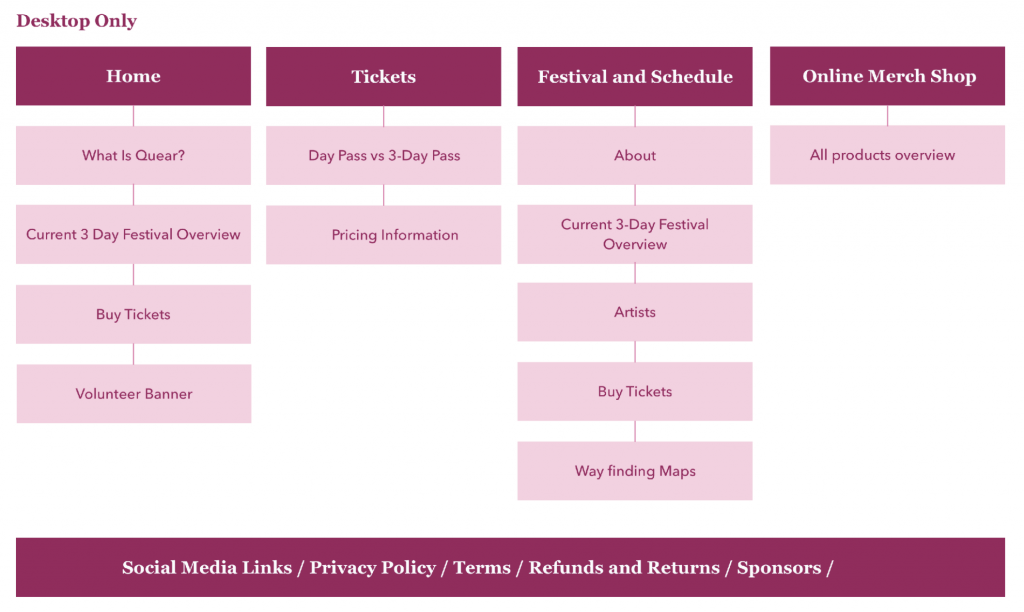
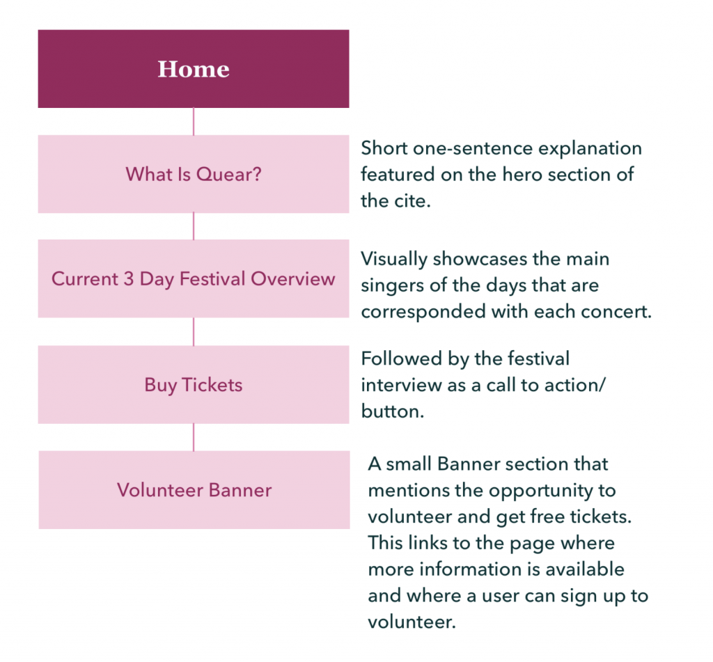
The top box representing the page and the boxes under explain for the content that needs to appear on the page. I went ahead and did detailed descriptions of each page as well as any secondary pages as shown below.
This step further enhances the understanding of the content without beginning on design. When I was happy with the foundation and planning, I moved on to my wireframes making any changes that were necessary.
Wireframes
This step helped me visualize what I wanted to create without adding colour or any particular design choices. If you look at the final design you will notice that a lot of changes have taken place since the wireframe stage but it is always a good start.
Polished Look
Thank you for your time and big thanks to Kateland who have taught me so much during my mentorship with her. I will be developing the mobile app during the summer and hope to include this project in my final portfolio next year.
Interested in more of my work or illustration commissions? check out my Instagram @whada99 and feel free to shoot me a message.
Leave a Reply