Mentorship Project – Phase 3-5

The third phase of my mentorship project consisted of me showing the logo I had created over the weekend and getting some critique on how to make it better. Thankfully, there were just some small refinements to make and not structural problems. The fourth phase was just me executing out the refinements that my mentor advised me on.

Now that I’ve reached the finish line for this mentorship project I can say while there were some bumps in the road and I still have work to do, I am happy with where I’ve gotten. Some specific things I’ve learned along the way were that research is the foundation from which you start generating ideas.

Spending less time in this part means that you’ll have less to work from later on. When I tried to spend less time in this area my ideation notably suffered, and my situation was not dire enough to make that trade-off. I still could afford the time to do the research. Additionally, I 
didn’t have to use all the research, as I moved forward I could just focus on what made sense 
for the project.

Additionally, I also learned to keep in mind the context of my project. I was making a logo, so the connection to the company had been clear, as clients weren’t going to see the rationale. Abstraction sometimes is the right solution but you have to make sure it still reads!

This project also corroborated the idea that the devil is in the details! For me, design takes a lot of time (but I have gotten faster since I started!). I’ve found that it was a good strategy to overestimate a little bit on how much time something would take me.

Aside from all the specific design help that both my mentors gave me, I think I really benefited from the opportunity to get to talk and work with other industry professionals outside of the IDEA faculty. It corroborated a lot of the things that instructors had told me about the industry, which has put my mind to ease, at least a little bit.

Overall, I think I would give myself a 7.5 or 8 out of 10. I think there are still things that could be made better, but I am happy with the progress I made.

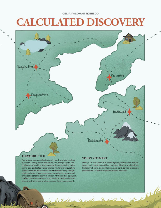
I think one of the things I found most rewarding about this project is that I focused on something that I know is a weak spot for me. I still think I struggle with logos, but this semester in particular, I’ve done a lot more logos and the help I got on this project has made me feel more comfortable with them. It was a worthwhile endeavour to push myself to do something I struggle with.

Mentor Project – Phase 3

During my previous meeting with my mentors, we had discussed typefaces and how it was next to impossible to pick a typeface in isolation to the logo. So, during the most recent meeting, I showed both my mentors a matrix I had made using combining different typefaces and placements with a quick mockup of the logo. Additionally, in our last meeting, we agreed that it would make more sense to have a pair of boots instead of a single one. So the matrix included variants of how the boots could be placed alongside each other. We decided on a typeface and I was advised to make some proportional fixes.

Moving forward I’ve started creating the shapes in illustrator. I’m finding this part difficult, even though I’ve worked with adobe illustrator before (though not as much as others). I find that I’m often frustrated with how much longer it takes me to accomplish anything in illustrator. Additionally, something always gets lost in the translation and the digital version. I’m not sure if this is due to a lack of practice or some other kind of user error on my part, but I hope I can counteract it more this time.

So far I feel like I’m at a 6/10, I feel nervous about the actual execution of the plan. Ideally, I can finish this project with a higher score.

Mentor Project – Phase 2

During the beginning part of the ideation phase, I made the mistake of trying to immediately start sketching in fear that I would get behind. I had done barely a page of sketches (roughly 30) and was already struggling to come up with more ideas, which did not bode well for my future. I had planned on having 100 sketches and here I was struggling at 30. After a much-needed talk with my instructor and other students, I went back to do more research to give myself a better foundation.

This research process consisted of me going back and creating an informal competitive analysis that compared outdoor schools in the lower mainland. For each school, I defined their tone of voice and documented their visual language (brand colours, visual elements, typography, and photography style), which helped me recognize what niches were already occupied.

I also went back to my word map, which I had created to act as a bank of visual imagery that I could use. My first pass was too thin, I had focused only on the idea of schooling and organic elements. I went back and added more categories like BC scenery, and ecological concepts which might be of use. Additionally, I also added the three brand adjectives that defined the brand (real, relevant, and revolutionary) and wrote related words as well as possible methods of visually communicating those ideas.

With this, I edited and presented to my mentors. We agreed on three potential concepts to keep refining, which were a boot print, a pine cone/Pinecone scale/badge, and lastly a three v shape. After another round of ideation, we decided that the boot print was working the best. The three v’s ended up being very anticlimactic when placed together.

The pinecone scales had become too abstract and no longer read, which is an important note moving forward that also applied to the boat concept. Some key problems we outlined were that the boot needed to be clearer as a boot, should be a little more realistic, and we considered applying texture as well.

For now, I would give myself a 7.5 or 8 out of ten: I have a sold start but I still have a ways to go.

Mentor Project – Phase 1

For this project, I knew that I wanted to focus on a branding project, as I need more emphasis on those skills for my book. I knew I wasn’t interested in packaging thus I was considering branding a company that provided a service or experience. From there I came to the idea of an outdoor school.

I pitched the idea to my mentors, initially suggesting that I would rebrand the entire school and create a logo and some other branded deliverables. I also mentioned that logos are not my strong suit, and thus my mentors offered the possibility of just focusing just on the logo. I was really happy with this development because of how important a logo is for a brand (as it’s one of the biggest touchpoints for a customer) and how much time crafting an effective logo can take.

From there I wrote my brief and send it to my mentor who wrote me a few helpful pointers for brief writing, For example, I had misinterpreted the function of the background section and lumped it in with the brand’s USP.

Another really valuable lesson learned was to take the old logo and to identify its weak points and write them out. This helped me practice analyzing logos as well as gave me concrete examples to watch out for in my own work.

Final Logo – Reflection

Final Logo

For my final logo, I ended up revisiting my third concept from the earlier round (which I felt was working the best). The problems that we identified in the critique were that it needed to tie more strongly to the idea of a pigeon coop. While I think the aerial view of a field is a lovely visual and does tie in with the story, it ultimately gets lost without an explanation. And even there, it does perhaps take too many leaps

My main reason for continuing with the third concept was that I liked the balance it struck. I think (with a lot of work, don’t get me wrong), it has the potential to be a beautiful mark, while at the same time being very utilitarian. I can see it working as a watermark with my illustration quite well, which is an important quality that was absent in the other concepts.

I’m proud of my progress through this logo because logos are still something I struggle a lot with, it’s not resolved yet. I’m much happier with the shape of the pigeon, but I feel like there is still some award negative tension in the logo I’ve arrived that I need to fix. Another worry, I have is that because it’s a dove, it might feel too soft against some of my illustrations. Additionally, I feel like it could be misinterpreted as a charity or humanitarian group logo, just because of the dove imagery. Perhaps adding some more angles into the bird’s wing could help that issue. In all, I would probably give myself a 7.5/10, I don’t think it’s a failure, but it would still really benefit from some polishing up.

Logo Concepts – Personal Reflection

Concept 1 – Initials 

The first concept revolves around my initials and the opportunity in the union of the p and the r. The leg of the r can be swapped in for different applications and ideas, and to show different aspects of my brand. My initials are fairly recognizable, partially just because of the length, so it should be able to stand on its own. 

Concept 2 – Graphic & Illustrative

The second concept is a reference to my surname and a connection to the idea of delivering the message. More specifically, my first last name Palomar means “pigeon/dove coop”, which has a connection to the idea of homing pigeons and messages/ers. Additionally, the logo is a marriage between graphic shapes (the head of the pigeon) and looser more illustrative lines which demonstrates the work I do.

Concept 3- Stamp 

The final concept is a stamp which is also a work of the idea of delivering messages and pigeons as explained in concept 2. Additionally, this concept has the additional advantage of working well with most of my work. The majority of my work is illustration, so a stamp-like icon with weight will work great as an anchor piece that won’t get lost. 

I’ve found this process very difficult, determining who I am both as a person has a demanding task. Especially as I’ve found that the work I produce doesn’t necessarily reflect the person I am, the two occasionally outright contradict each other. For example, I love neutral colors and feel like they represent the kind of person I am more, thus I designed my business cards accordingly. Unfortunately, my portfolio would suggest otherwise. The work I’m most proud of tends to have a very loud, eye-catching colour palette. I would benefit from learning from some more restraint when it comes to colors. Moving forward I need to find how to reconcile these contradictions to create cohesion instead of friction. As difficult as I’m finding the process, I’m optimistic about where I hope to end up.

Personal Ad- Reflection

The first step I took towards making my personal ad was coming up with my brand essence and how it would inform the design/layout of my personal ad. I was was expecting this part to be the most arduous, but surprisingly I figured out the concept of my brand essence and thus designing the concept relatively quickly. The swot analysis in class was a wealth of ideas for my brand essence because it identified my strengths and helped me see myself outside of my own perspective. I found figuring out my brand essence first to be good decision for my workflow as it allow me to divert more time to the illustrations in the bottom of the ad.

Overall, I found the design aspects easier than the writing, although, there were still plenty of design details that I should have paid more attention to. It was very difficult to get out of my mind and describe myself from an outside perspective, and it was also the part I completed last. It was even more difficult to inject any sense of fun or charm into it, to the point where I don’t think I was successful at this part.

In all, although this project was very simple, I found it difficult but also rewarding. I definitely left with much more of a sense of my personal brand than when I went into the project. Design-wise, I think this exercise mostly reinforced what I already knew. Namely that I really need to pay more attention to the type in general, and once again, the importance of proofreading.

———————————————————————————————–

As for the mood boards, I would give myself a 7.5 or an 8 out of ten. I believe that I have accomplished the goal of the exercise, even though there is definite room for improvement.  I definitely feel that the page of brand we wanted to emulate was the weakest. Perhaps this is in part because I feel unsure in how in/formally I’d like to present myself and my work to future clients.

Another issue I ran into was drawing the line between what I like and admire and what work I actually produce. For example, I found I was often drawn to desaturated images with lots of neutrals, which doesn’t actually reflect my illustration style. If anything, I need to use more neutrals. In the end, I had to go back and swap out some images for ones that would be more reflective of my work.

AHIS 430 – Glossary

Amplification through Simplification
The idea that simplification of an image makes its representation stronger. It is important to remember that this concept isn’t just about taking away detail. One must figure out which are the most important details that anchor an idea and keep it recognisable and cut out the other details which don’t.

This concept is actually pretty important in cartoons, as it aids in self-identification. The idea being that the more detailed and developed a character is, the more we think of them as separate from us. While a more stylised and simplified character allows the reader to project onto them.

For example, which one of this do pictures can you more easily see as representing you as an individual?

A smiley face?

Or perhaps

Leonardo da Vinci’s Mona Lisa?

Closure
Scott McCloud defines closure “phenomenon of observing the parts but perceiving the whole.” In other words, it is when readers imply what happens between the gutters of the panels. We can think of closure as the reader filling in the blanks. The example which McCloud utilises is one panel showing an axe being raised and the following panel showing a scream.

Gutter
The space that separates panels from each other. It might be helpful to think gutters akin to a cut when watching a film. Their size and placement are up to the artist. They are integral to the pacing of comics, as they can be used to slow down time by spacing it out. Likewise, events can also occur between a comics gutter’s without ever being drawn out explicitly (this is when closure comes in!)

Panels
A picture contained within some kind of border. Similarly to gutters they also contribute to the pacing of a comic, for example, the repetition of very similar panels can be used to slow down a story and focus on a specific moment. Panels come in a large variety of different shapes and are these can be use for different effects. For example, irregularly shaped panels are used to convey different states of being (for example, a dream state or a flashback) and add dynamism to action scenes or imply conflict.

Bleed
What one could be considered a panel except that the image is not contained within a border. They often have the effect of slowing down time in comics, as they give a substantial amount of space and time to one moment.

Icons
A visual representation of a person, place, thing, or idea. These are everywhere and there are too many to name them all, but we can use a smiley face as an example. I know what a smiley face is meant to represent, and almost everyone does, even though it bears very little resemblance to the face of an actual smiling face. Icons are often not not direct representations of what they are meant to invoke.

This is a common type of icon used for phones, even though this type of phone is no longer relevant to most people’s lives. Its not a direct representation of what most people see as a phone, but the idea is communicated strongly regardless!

Synaesthetics
The idea that visual elements such as lines, shapes, colours, patterns, etc. all hold a potential to express and link to senses. A lot of good examples of this being shown is in the expressive lettering of comics. Specifically, sound effects are usually lettered in a way that links them to a sense. 

Motion/Action Lines
A stylised element made up of lines meant to communicate speed and or movement. Sometimes they’ll include streaking, which is the trail which an object leaves when moving quickly. 

This this panel from Lynda Barry’s “One! Hundred! Demons!” contains a subtle example of motion lines as well as streaking, which shows the path of her arms in movement.

Mono Sensory Medium
A medium which only engages a single sense. Comics for example, are an example of this as they engage their audience solely through visuals. Another example could be radio, which only engages through audio. A film would not fit into this category because it is a medium which combines audio and visuals.

Speech Bubbles
Speech bubbles Contain the speech of a cartoon. The most recognisable version is an oval with a tail that points towards the speaking character. However, they have as much potential to be expressive as any visual element of comics. The shape generally indicates the way something is spoken. For example, a broken up speech bubble often indicates a character is whispering, while a jagged speech bubble can indicate that a character is shouting.

Here are just a few examples of the different shapes which speech bubbles can take!

AHIS 430 – Working Digitally vs Traditionally

Whether to work traditionally or digitally: its a question that we all have to ask ourselves! And its especially relevant to artists, as sometimes it feels like digital art and traditional art are two beasts which develop completely separate from each other. I tend to use a combination of both methods.

Specifically, I often find myself working traditionally when creating a solid foundation before I move forward. Paper and pencil provide the quickest vehicle for getting out all my ideas, no matter the project I’m working on.

At this stage, (perhaps ironically) I find the precision and control that working digital allows to be overly restricting. At this moment, I don’t need to have much control, because its not producing ready to go, beautiful working. My sketching process is about figuring out my plan of action and getting stuff onto paper.In my experience, the undo button or the backspace button is my worst enemy. It’s very easy to fall into a cycle where you work for hours and in the end, having nothing to do to show for it because the option to get rid of your work exists. For that reason, when sketching I find it can be helpful to avoid using erasers or even to pens or markers instead.

I find I have less of a problem using my ipad and ipad pencil than typing (if I’m writing something). It’s a feature , which by all means is supposed to mimic the process of writing. It requires the same physical actions and the “pencil strokes” even mimic that of graphites. I’m not sure that I’d consider it the same as writing on paper. It’s definitely not my first choice, I think I’ll always prefer working on paper, but it is a definite upgrade than just tying.

However, that’s not to say that digital mediums don’t have their place in sketching process. I find working digitally at a later stage of my sketching process to be immensely useful. Especially when I’m creating different colour palettes for an illustration. Digital media allows me access to whatever colour I want (which sometimes is also not a good thing) and I don’t have to worry about any kind of mess or any limitations of traditional media. Additionally the copy and paste features are very useful when I’m trying to create lots of different variations. When writing, it’s easier to edit sentences and to compare variations of possible sentences I could use. In summary, when I’m trying to create and compare variations I find digital media a better option.

When approaching the final product, I tend to find myself using digital media. Less so in art, but definitely when writing. In art, I appreciate the flexibility that is inherent in the media, although I don’t think that is necessary at all. Additionally resizing options, rotation and symmetry tools, are very convinient tools to have and significantly speed up the processs.

I think when doing illustrations digitally, it requires a less thought out of plan. The ability to undo things and change my colour palette along the way and straight up paint over what i’ve already done and still have the possibility to undone it all (thank you layers) acts as a very good safety net. Additionally, in my experience it’s usually faster (although that may be due to a  lack of experience working with traditional artwork) . So while I often do work digitally and I think its an option that works very well for me, I’m definitely interested in seeing if it’s truly the best medium for me to use.

In short, I find that there are advantages and disadvantages to each and I often change my direction in order to take advantage of each medium. I think that working traditionally has massive benefits but I wonder if those benefits outweigh the negatives for everyone.

AHIS 430 – Graphic Novel Project

For AHIS 430 class, I’ve chosen to adapt Edgar Allen Po’s “The Tell-Tale heart”. Here I’ve complied a few intial thoughts about the overall tone and direction that I want to take

The Tell-Tale heart is a classic of the gothic genre, and thus I feel lends itself to a simple black and white colour palette. That being said, black and white feels very obvious, so I could still keep the same tone but use dark, desatured tones.

As for the actual style of the writing, it very much comes across as a stream of conciouness and the narrator relays their version of events to the reader. The narration plays a huge role throughout the story, supporting the plot and tone of the story. While I don’t think a wordless adaption is impossible, I wonder if the gothic charm of the story would be lost. However, I will need to drastically shorten the script as Po can be rather long winded, and ultimately comics are a visual medium. Additionally, I want to keep the vibes of the original script as I feel that it is a huge source of charm and interest.

I’m also playing with different ideas on how to include the narration into the story. I tend not to prefer boxes with narration as they run the risk of creating a halting rythm. The story very much has a stream of conciouness feel and the only really pauses are moments of high tension such as the seconsd leading up to the old man’s murder and when the narrator is convinced they can still hear the heart beating beneath the floorboards. Additionally I think that typesetting the narration would make the story feel a little too stiff and impersonal, especially as the narrator is addressing the reader. I want the writing style to look a little frantic and fluid.

Additionally, I think this story gives a lot of oppurtunity to give the panneling unique characteristics. The panels would be an interesting avenue of relaying some of the emotions the narrator is feeling instead of soley relying on narration(especially as I’m going to have to cut down the script). One idea I’ve considered is drawing panels in where the narrator is espeically stressed with with wobbling lines. Another idea it so have use overlapping panels. I would have to use this second idea rather sparely though. While I think that the former idea communicates the idea of anxiety (and specifically how overwhelming the narrator finds it), I wonder if I’m sacrificing legiabiliy in the process. However, a chaotic page might add to the story, tonally speaking.