Born in New York City in 1923, Roy Lichtenstein is known for his contributions to Pop Art, hence being considered a founder of the art movement. His works are reminiscent of comic strips, and his style takes influences from van Gogh, Matisse and Picasso.
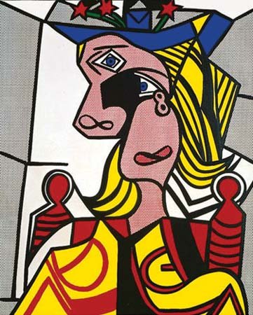
Roy Lichtenstein’s Woman with a Flowered Hat (c.1963)
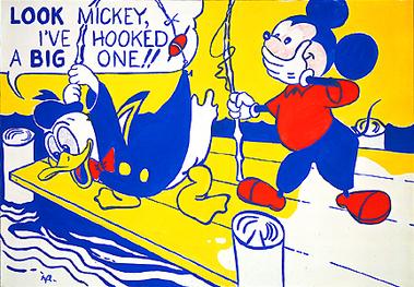
Early on in his career, Roy’s work took the form of Western-style pieces from 1951 to around 1957, depicting cowboys and Indians. He later began incorporating pop culture figures such as Mickey Mouse and Donald Duck
Roy Lichtenstein’s Look Mickey! (c.1961)
Lichtenstein eventually began to paint, advertisement illustrations, variants of other artists’ works and adaptations of paintings by older artists such as Piet Mondrian around 1961. He also began painting his famous comic style pieces the same year.
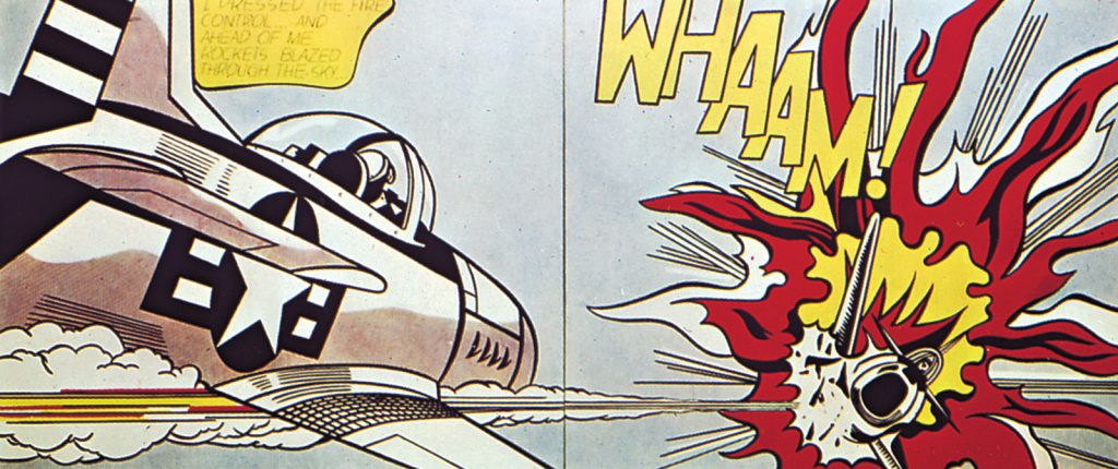
Roy’s cartoon pieces involved themes such as romance and war, while also depicting sound effects, portraying onomatopoeia in large and bold letters.
Roy Lichtenstein’s Whaam! (c.1963)
Lichenstein eventually hosted his first show in his hometown during 1962, which achieved outstanding success and global attention. Roy was also the first artist in the U.S. to exhibit their work in the London Tate Gallery in 1966.
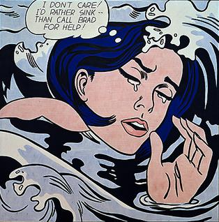
Roy Lichtenstein’s Drowning Girl (c.1963)
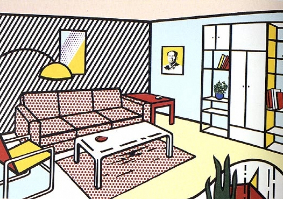
Today, Roy’s work achieves a unique identity, with his easily-distinguished comic style pieces and relatively recent work, depicting furnished interiors.
Roy Lichtenstein’s Modern Room (c.1991)
WORKS CITED
“Lichtenstein, Roy.” Gale Biographies: Popular People, edited by Gale Cengage Learning, 1st edition, 2018. Credo Reference, https://search.credoreference.com/content/entry/galegbpp/lichtenstein_roy/0. Accessed 02 Dec. 2019.
The Editors of Encyclopaedia Britannica. “Roy Lichtenstein.” Biographies, 23 Oct. 2019. Encyclopædia Britannica, inc., https://www.britannica.com/biography/Roy-Lichtenstein. Accessed 02 Dec. 2019.
“Lichtenstein, Roy (1912).” The Bloomsbury Guide to Art, edited by Shearer West, Bloomsbury, 1st edition, 1996. Credo Reference, https://search.credoreference.com/content/entry/bga/lichtenstein_roy_1912/0. Accessed 02 Dec. 2019.
Kolva, Jeanne. “Lichtenstein, Roy (b. Oct. 27, 1923; d. Sept. 30, 1997).” Encyclopedia of New Jersey, edited by Maxine N. Lurie, and Marc Mappen, Rutgers University Press, 1st edition, 2004. Credo Reference, https://search.credoreference.com/content/entry/rutgersnj/lichtenstein_roy_b_oct_27_1923_d_sept_30_1997/0. Accessed 02 Dec. 2019
Early on in his life, Joan Miró dreamt of being a painter and began to pursue his passion in Tarragona, Spain. Born on April 20,1893 in Barcelona, Miró drew influences from the likes of Paul Cezanne and the Fauvist movement, resulting in a figurative style of painting. He was also adept at lithography, and crafting sculptures or ceramics.
Mont-Roig Landscape (c.1914)
He later encountered works from the Surrealist movement in Catalonia and Paris, and Miró began to combine abstract art and surrealism in his work.
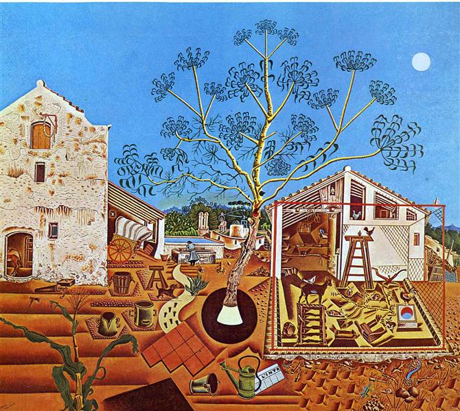
The Farm (c.1921-2)
Joan’s painted certain elements from life, such as farm animals and household items. Miró explored the painting of landscapes, discarding realism for a more abstract or suggestive focus.
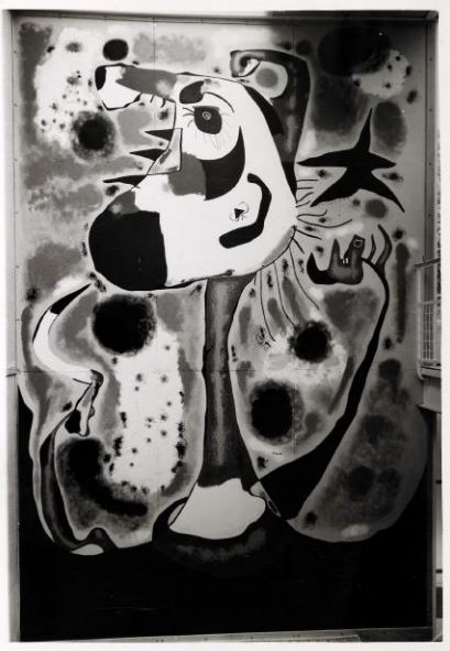
The Reaper, photograph (c.1937; destroyed 1938)
It was after WWII when he began receiving public attention, from there he worked on commissions and his work was exhibited globally. In 1930, Miró was awarded a Gold Medal of Fine Arts in Spain, while having a plaza named in his honour in Madrid. He would later die from cardiovascular disease on December 25, 1983.
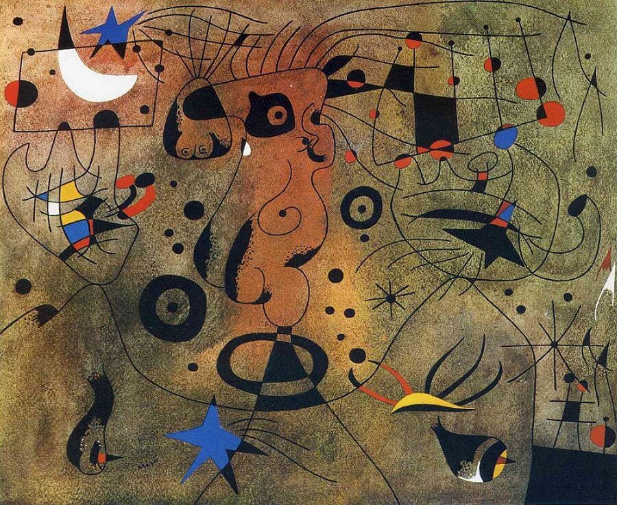
Constellations (1941)
Combining elements from abstraction and life, Miró and his work are known today for their allusions to surrealist, fancy and poetic fantasies.
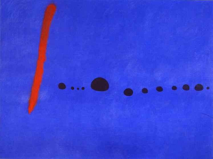
Blue II (1961)
WORKS CITED
“Miró, Joan (1893 – 1983).” The Bloomsbury Guide to Art, edited by Shearer West, Bloomsbury, 1st edition, 1996. Credo Reference, https://ezproxy.capilanou.ca/login?url=https://search.credoreference.com/content/entry/bga/mir%C3%B3_joan_1893_1983/0?institutionId=6884. Accessed 24 Nov. 2019.
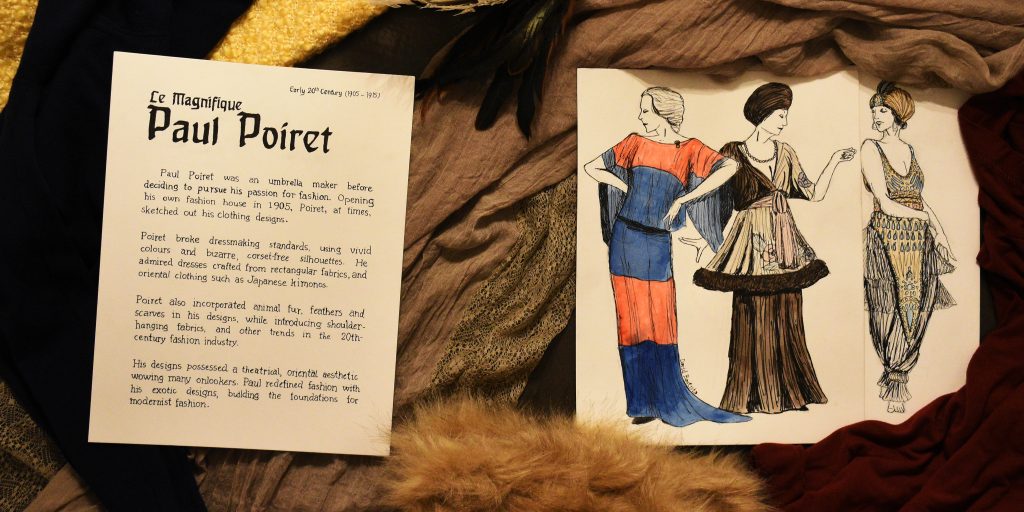
I was assigned to design a fashion artefact spread for Week 7, as such I wanted to cover fashion designer Paul Poiret, whose avant-garde designs inspired me to draw some of his apparent sketches in his style.
Many decisions were made, of course, before creating the final spread. For one, a wash of watercolour was added to the sketches, despite Poiret’s sketches not being coloured, to depict some of the vibrant colours that Poiret used in his clothing designs.
The typefaces replicated on the left side of the spread are supposed to Behrens-Schrift and Souvenir, these typefaces were chosen because they originated from the 20th century and thus matching the time period.
For the surrounding ‘objects’, the clump of feathers and fur were placed onto the spread as Poiret simply used feathers and fur trims in some of his designs. The fabrics in the back were carefully chosen depending on their likeliness to fabrics Paul himself would’ve used.
As for the orientation of the papers, the spine of the upcoming history book was considered, hence the slightly upright positioning. They were tilted slightly to make the spread more dynamic and less stiff.
Originally, 20th-century sewing objects were to be included in the spread, however finding or crafting a pin cushion, tape measure and fabric scissors was and would have been difficult for me. It would have also caused the spread to become a bit too busy. Thus it was decided to scrap the idea of including those objects.
Considering the end result, I am satisfied. However, I do recall committing some minor mistakes with the text and sketches. The execution of the body text could have been done more carefully. As such, I give myself an 8.5/10.
Total hours spent: 19h:22m
Research = 7:09
Ideation = 1:58
Execution = 8:55
Reflection = 2:00
Research – Survey 7
Le Magnifique Paul Poiret
For Week 7, we covered Cubism and Corporate Identity within the period of 1905 to 1915. It was interesting to learn about Peter Behrens and his contributions to visual identity, typography and architectural design. I was also assigned to create an artefact related to fashion during the week, and I eventually decided to research about the French fashion designer, Paul Poiret.
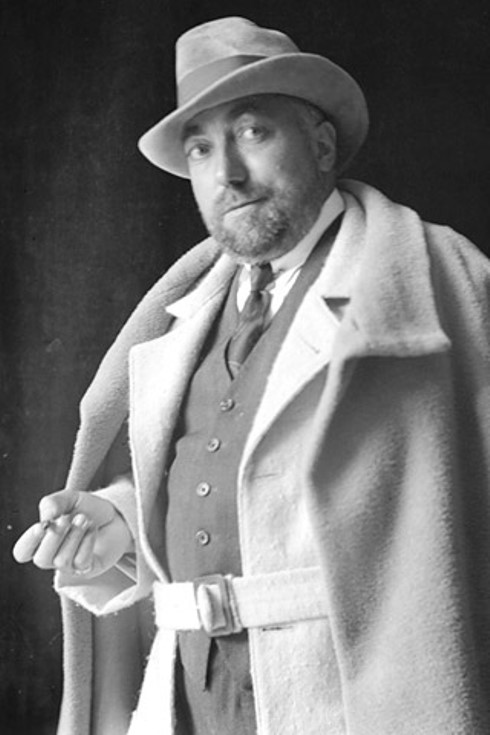
Photograph of Paul Poiret
Born on April 20, 1879, in Paris France, Paul Poiret was the son of a cloth maker and, as a teen, became an apprentice umbrella maker. However, Poiret’s interests lay in fashion and thus he began to work for fashion designers including Jaques Doucet.
In 1905, Paul established his own ‘maison de couture’, or fashion house in English, and was assisted by Jaques Doucet who managed to contact famous French actress Gabrielle Rejane to model for Poiret.
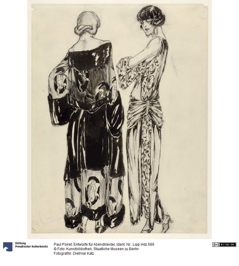
A sketch by Paul Poiret from Staatliche Museen zu Berlin Preußischer Kulturbesitz, distributed with Creative Commons BY-NC-SA
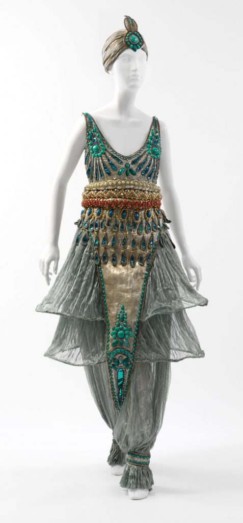
Paul was free to create his own fashion designs, influenced by oriental, eastern fashion, he introduced the Kimono shape to Europe and also made use of turbans and harem pants. Poiret’s designs took a theatrical aesthetic with fringed, draped fabrics, feathers in vibrant colours and fur trims.
He would eventually tour Europe in 1912 with a group of models, showcasing his rather avant-garde designs, and later toured the US in 1913.
One of Paul Poiret’s fashion designs, incorporating harem pants.
The following year, he joined the war efforts in WWI as a military tailor, and was forced to close his fashion business and, afterwards, couldn’t regain his position in the fashion industry, as postwar fashions were more modernist than his exotic fashions. Poiret lost his fame and later died in poverty on April 30, 1944.
However, were it not for Paul Poiret and his bizarre fashions, modern-era fashion wouldn’t have destroyed his career, for his tendency to go above and beyond built the foundations for modernist fashion.
WORKS CITED
“Poiret, Paul.” Britannica Concise Encyclopedia, Encyclopaedia Britannica, Britannica Digital Learning, 2017. Credo Reference, https://search-credoreference-com.ezproxy.capilanou.ca/content/entry/ebconcise/poiret_paul/0. Accessed 04 Nov. 2019.
“Poiret, Paul.” World of Art: The Thames & Hudson Dictionary of Fashion and Fashion Designers, Georgina O’Hara Callan, Thames & Hudson, 2nd edition, 2008. Credo Reference, https://search-credoreference-com.ezproxy.capilanou.ca/content/entry/thfashion/poiret_paul/0. Accessed 04 Nov. 2019.
Koda, Harold, and Andrew Bolton. “Paul Poiret (1879–1944).” In Heilbrunn Timeline of Art History. New York: The Metropolitan Museum of Art, 2000–. https://www.metmuseum.org/toah/hd/poir/hd_poir.htm (September 2008)
Koda, Harold, and Andrew Bolton. “Paul Poiret (1879-1944).” Metmuseum.org, The Metropolitan Museum of Art, Sept. 2008, www.metmuseum.org/toah/hd/poir/hd_poir.htm.
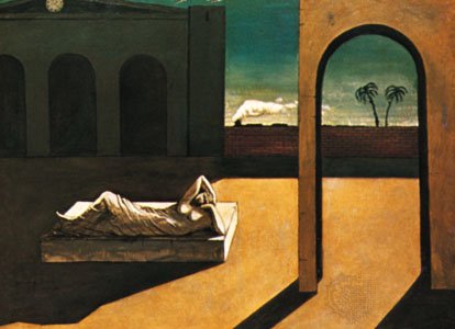
Born in Vólos, Greece on July 10, 1888, Giorgio de Chirico later moved to Germany and enrolled in the Munich Academy of Fine Arts Influenced by German painters and philosophers such as Arnold Böcklin, Giorgio rejected naturalism and instead focused on poetic and envisioned subjects.
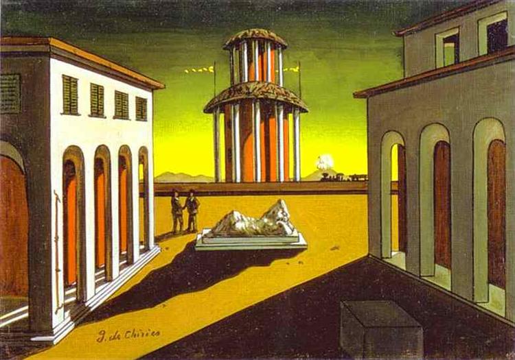
De Chirico’s Piazza d’Italia (c.1913)
The majority of de Chirico works were influenced by his surroundings and mental state (at the time), ranging from the tightly-built city of Florence to his episodes of illness and depression, often resulting in agitating pieces of art while invoking a sense of enigma.
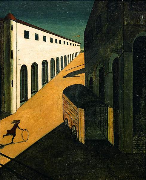
De Chirico’s Mystery and Melancholy of a Street (c.1913)
Giorgio eventually developed the Metaphysical painting style alongside Carlo Carro in 1917, which helped attract attention to his poetic artworks.
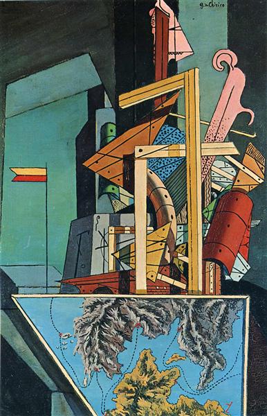
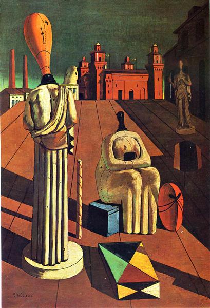
De Chirico’s The Soothsayer’s Recompense (c.1913)
De Chirico’s sense of mystery in his work began to fade in 1919 when he began painting with a more realistic, technical style. He later disassociated himself with his past works and colleagues in 1930. Giorgio eventually died on November 19, 1978, in Rome, Italy.
De Chirico’s The Disquieting Muses (c.1916-1918) was one of his Metaphysical-style masterpieces.
Most of de Chirico’s masterpieces were created during 1917. The colours of these works were bright and subjects that were not usually significant were given importance. The same works would even influence Surrealist painters such as Salvador Dali.
WORKS CITED
Chirico Giorgio de (1888 – 1978).” A Biographical Dictionary of Artists, Andromeda, edited by Lawrence Gowing, Windmill Books (Andromeda International), 2nd edition, 1995. Credo Reference, https://search-credoreference-com.ezproxy.capilanou.ca/content/entry/andbda/chirico_giorgio_de_1888_1978/0. Accessed 18 Nov. 2019.
The Editors of Encyclopaedia Britannica. “Giorgio de Chirico.” Biographies, 15 Nov. 2019. Encyclopædia Britannica, inc., https://www.britannica.com/biography/Giorgio-de-Chirico. Accessed 19 Nov. 2019.
This week we were introduced to Survey 8, covering the period of 1915-1925. What piqued my interest was that Kazimir Malevich took inspiration from the Greek philosopher Plato, who believed geometry was the best kind of beauty. Not exactly sure what Plato meant, but if it was just simple geometry- I have to disagree, for nature is more complex and beautiful than a simple square.
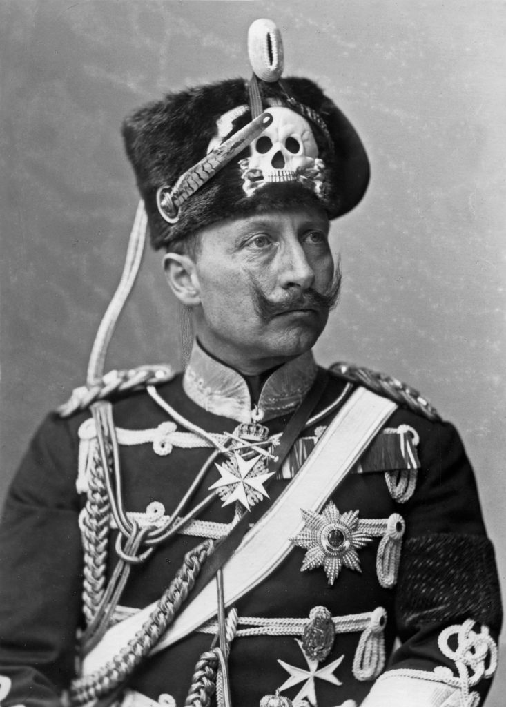
World War II was also mentioned today, and as a researcher assigned to cover a topic relating to geopolitics, I decided to cover one of the war’s significant figures: Kaiser Wilhelm II.
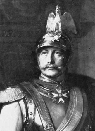
A photograph portrait of Kaiser Wilhelm II
Born in Potsdam, Germany on January 27,1859, Friedrich Wilhelm Victor Albert had a rather tough upbringing, with his left arm permanently damaged by a complicated birth. Wilhelm also had dysfunctional relationships with his parents.
Wilhelm was intelligent and extremely interested in science and technology. However, he also had a quick-tempered, impulsive, high-strung personality.
His childhood was influenced by the forming of the German Empire under Wilhelm’s father’s rule in 1871. Wilhelm was filled with enthusiasm at the time, being twelve years of age, and was determined to win a future “place in the sun” for Germany. He would later succeed his father as kaiser, or emperor of Germany on June 15, 1888.
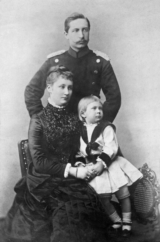
A photograph of Wilhelm with his first wife, Augusta, and son, William.
Wilhelm immediately appointed civil servant chancellors instead of statesmen. Even discharging chancellor Otto von Bismarck beforehand, who believed Wilhelm would cause Germany to collapse.
While in power, Wilhelm damaged his own political position. Meddling with foreign policies in response to his emotions, offending nations such as Britain, and being accused of having illegitimate offspring. Wilhelm was psychologically broken by the criticism following his past actions, which mostly influenced his future actions in World War I.
Wilhelm committed to creating a powerful navy to rival Great Britain’s, which he was envious of back then, but also caused financial issues for the German government. He also signed a military order due to pressure from his generals, leading to a declaration of war against Russia and France in August 1914.
He did little to manage the military, only acting as a public-relations figure by giving medals and touring German front lines. Often, he encouraged the strategies of the generals and politicians that subdued chances of a peaceful resolution to the war.
An Oil Painting of Kaiser Wilhelm II by Paul Beckert (c.1890)
Eventually, national and naval unrest in late 1918 convinced political leaders that Wilhelm should abdicate the throne. His abdication was announced long before he gave consent, but nonetheless, he agreed to step down. Moving away to the Netherlands, where he spent the rest of his life away from the troubles of war.
Living in the Netherlands prevented Wilhelm from maintaining his position in Germany, thus he lived quietly in the countryside until he died on June 4, 1941.
Wilhelm was perceived as a warlord by the British back then, however, this view has changed, viewing him more as one involved from the sidelines- criticized for encouraging the actions of German officials without regarding the consequences.
WORKS CITED
History.com Editors. “Kaiser Wilhelm II.” World War I, 14 Apr. 2010. A&E Television Networks, https://www.history.com/topics/world-war-i/kaiser-wilhelm-ii. Accessed 6 Nov. 2019.
Balfour, Michael Graham. “William II.” Biographies, 31 May, 2019. Encyclopædia Britannica, inc., https://www.britannica.com/biography/Hermann-von-Helmholtz. Accessed 6 Nov. 2019.
Born in Bordeaux, France to a peasant father and Creole mother, Odilon Redon was an agreeably-great artist and printmaker who first learned drawing in his hometown, then architecture and painting in École des Beaux-Arts.
Redon was often melancholic, caused by the eventual death of his first son and critical acclaim. This influenced Odilon to put more emphasis on light and colour in his work between 1880 and 1890. Odilon’s exploration of light and colour led to the translation of past lithograph subjects into painted pieces such as “Pegasus Triumphant” (c.1905-10)
He had an opposition towards lessons given by artist Jean-Léon Gérôme and instead was taught by engraver Rodolphe Bresdin. His time with Bresdin defined the beginning of his career, with small engravings of landscapes from childhood memories, influenced by artists like Camile Corot and Eugene Delacroix. Odilon also created oil paintings that sometimes involved figurative and religious subjects.
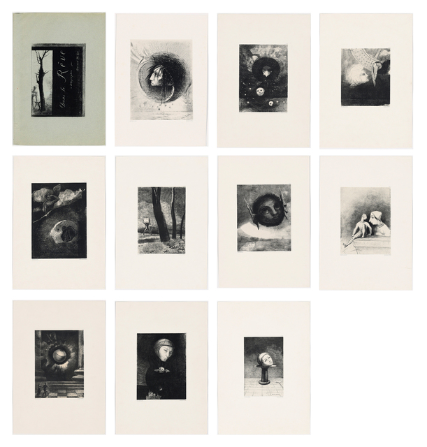
Redon also met Henri Fantin-Latour in 1874, who introduced Odilon to lithography, amidst his development in producing visual symbols in his work. He produced over 200 lithographs, with 10 being publishing in his portfolio “Dans le rêve” (c.1879)
In his autobiography, À Soimême, he mentions the main subjects in his work, those being ‘Man and Nature’ and “suggestive” art. These subjects were influenced by his friends: Armand Clavaud and Stéphane Mallarmé.
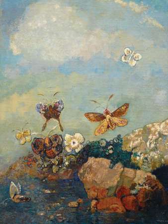
Influenced by Clavaud, Odilon produced floral pieces such as “Butterflies” (c.1910). Odilon would produce these kinds of paintings throughout his career.
“Orpheus” (c.1913-16) is proof of Odilon’s shared disinterests with Mallarmé. Odilon shared disinterest in reality, preferring dreamlike, floating, decorative and detached subjects. Odilon often described his work as “hermeticism” because of this.
Eventually, Redon became the Société des Artistes Indépendants president in 1884, even beginning to display his work in Salons around 1904. He influenced the work of his peers, including Paul Gauguin, and was admired by Symbolist writers during his time.
Odilon then died on July 6, 1916, in Paris, but not without influencing the world of 20th-century art. His disinterest in realism was one of the major influences of the Surrealist art movement.
WORKS CITED
“Redon, Odilon (1840 – 1916).” The Bloomsbury Guide to Art, edited by Shearer West, Bloomsbury, 1st edition, 1996. Credo Reference, https://ezproxy.capilanou.ca/login?url=https://search.credoreference.com/content/entry/bga/redon_odilon_1840_1916/0?institutionId=6884. Accessed 02 Nov. 2019.
“Redon Odilon (1840 – 1916).” A Biographical Dictionary of Artists, Andromeda, edited by Lawrence Gowing, Windmill Books (Andromeda International), 2nd edition, 1995. Credo Reference, https://ezproxy.capilanou.ca/login?url=https://search.credoreference.com/content/entry/andbda/redon_odilon_1840_1916/0?institutionId=6884. Accessed 02 Nov. 2019.
“Mallarmé, Stéphane.” Britannica Concise Encyclopedia, Encyclopaedia Britannica, Britannica Digital Learning, 2017. Credo Reference, https://search-credoreference-com.ezproxy.capilanou.ca/content/entry/ebconcise/mallarme_stephane/0. Accessed 02 Nov. 2019.
The Editors of Encyclopaedia Britannica. “Odilon Redon.” Biographies, 25 Aug. 2019. Encyclopædia Britannica, inc., https://www.britannica.com/biography/Odilon-Redon. Accessed 02 Nov. 2019.
Seiferle, Rebecca. “Odilon Redon Artist Overview and Analysis.” The Art Story, The Art Story Contributors, 30 Mar. 2017, www.theartstory.org/artist/redon-odilon/. Accessed 02 Nov. 2019
Before today’s lecture on Survey 7, I was assigned as a designer to cover fashion between the years 1905 and 1915, which is the period of Cubism and Corporate Identity.
I am supposed to create an artefact relating to this general topic. As such, I have decided to research the fashion designer known as Paul Poiret. Having a brief glimpse of Poiret’s work, I find him to be quite avant-garde.
I will be creating multiple fashion ‘sketches’ of his designs on separate sheets of paper. For the final ‘spread’, I intend to photograph the ‘sketches’ on a flat surface and place objects that relate to fashion in that time period for aesthetic (on one page).
Another page will have a document, written in first-person, by ‘Paul himself’, writing about his life and his own thoughts on general fashion and his own design process.
Looking forward to creating this artefact, in the meantime, I will be getting my research done!
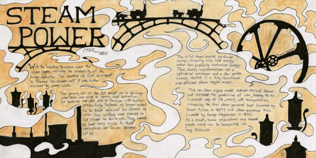
Me and my research team were given approval to dive deep into steam power through the years 1750 to 1850. Immediately, I knew that steam had to dominate my spread in some way, which is accomplished with the ‘trails’ of steam present on the spread.
Objects related to steam are depicted as black silhouettes, with the iron bridges, steam engine wheel, the steam whistles and the steam boat. They were placed in regards to the body text, to ensure there was enough space for the text. The decision to depict these objects as silhouettes was also to prevent too much attention being drawn away from the text.
Although it does look generally appealing in my opinion, I do not think very highly about this spread. I’ve come across many challenges regarding the design and execution of the final result.
A spread is supposed to reflect the style of the period, and it is a bit difficult (for me) to see any resemblances. The heading on the top left, does reflect it to a degree, being a serif font, but I’m not entirely confident that it is appropriate for the time period.
The body text prioritized placement and space, somehow I did not think of writing the body text in a typeface relevant to the time period. Looking back at the spread now, utilizing relevant typeface might make the spread more eye-catching.
The execution could have been better, the black silhouettes were blocked in using ‘Micron’ brush pens, some inked parts were smudged since the ‘Copic’ markers used to colour the background only dried seconds after being applied.
Though it was not a problem in my yearbook spread, some pencil lines were extremely hard to erase in this spread, thus one could notice some ghost lines after their first glance.
Considering what I’ve covered in this rationale, I feel that I should give myself a 7/10. Though it is appealing in my opinion, I believe I could have improved a bit with the design of the spread, as well as being more careful with some aspects of its execution.
The years 1895-1905 were covered during Week 8 of Survey Design, highlighting the art nouveau movement, which interestingly took influences such as the Renaissance and Rococo eras and Japanese ukiyo-e.
I was assigned, yet again, to another group as a researcher, for typography which I covered following our first lecture. This time, I will be briefly covering the typeface company known as the “Berthold Foundry” and its founder, whilst mainly elaborating on an extremely influential font family that shaped the sans serif typeface library.
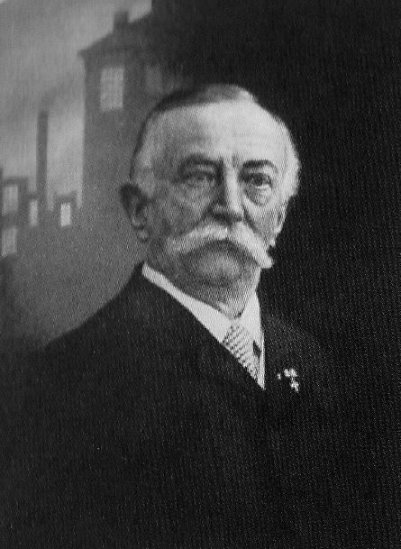
An image of Hermann Berthold, founder of the “Berthold Foundry”
In the year of 1858, a company called “Berthold Foundry” was founded in Berlin to manufacture measuring gauges. The founder, Hermann Berthold, was born in 1831 and was the head of the company for fifty-seven years until 1888.
During his time as the head, the company was asked to develop a system for measuring type in 1878, by the wish of the German typefounding industry.
With the help of a professor, a basic measurement was established for typography, where every two thousand six hundred sixty typographic points can be converted into one metre.
This eventually built the foundations of the type measurement system known as the “Didot System”, and was one of Berthold Foundry’s significant achievements.
However, a more well-known achievement of the foundry was the development of the sans-serif typeface family known as Akzidenz-Grotesk, sometime around 1898 near the end of the 19th century. It was the first sans serif font to become widely popular and is considered as the parent of Grotesque design typefaces.
Modern example of the Akzidenz-Grotesk font
This font family was made to be functional over stylistic, this is mostly due to the font being produced in response to marketing activities other than through the regular type design process. The x-height of this typeface was considerably higher, and it had shorter ascenders and descenders to save space.
Though sans serif fonts were utilized commonly as display types, the structure of Akzidenz-Grotesk made it legible enough to be used for body text. This was enough to influence the potential ways sans serif fonts were used.
Between 1893 to 1926, the “Berthold Foundry” purchased other foundries that manufactured similar typefaces to acquire them. Many of the acquired typefaces were categorized as if they originated from the Akzidenz-Grotesk family. The inclusion of more san serif fonts into Berthold Foundry’s typeface collection contributed to the success of the Akzidenz-Grotesk font.
This success opened a market for sans serif types but was partially problematic as more competing sans serif typefaces were created such as the “Venus” typeface by the “Bauer Foundry”.
The result was a drop in Akzidenz-Grotesk’s popularity, however, this was revitalized when Swiss-style typography demanded the simple, structured design of Berthold’s typeface.
Modern example of Helvetica, developed initially from Akzidenz-Grotesk
This typeface can still be obtained today, due to its enlargement and refinement in the 1950s- making it usable in a digital format. Were it not for this revitalization of popularity, this typeface would have not allowed for the development of certain sans serif designs such as Univers, and even the well-known Helvetica.
WORKS CITED
“1800-.” The Visual History of Type, by Paul McNeil, Laurence King Publishing Ltd, 2017, pp. 152–153.
Born on July 16, 1796, as Jean-Baptiste-Camille Corot in Paris, France, this prolific artist was well-known for his landscape paintings that later influenced Impressionist painters. Born to rich parents, Camille dreamed of becoming a painter.
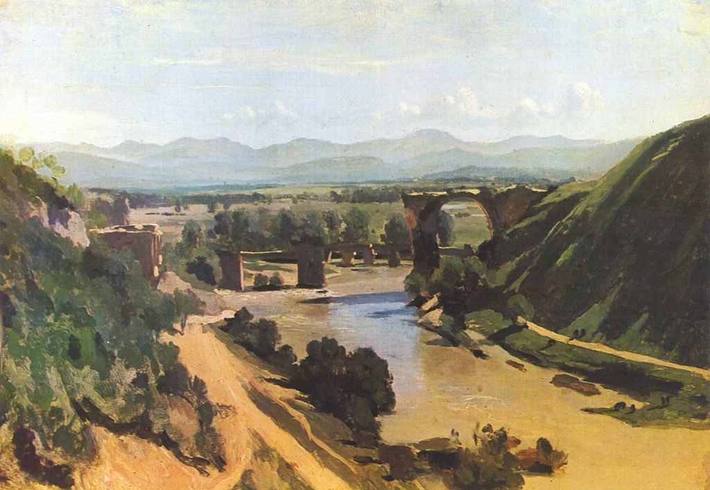
The Bridge at Narni (c.1827) shown at the 1827 Paris Salon, when he was still in Italy- was the first of his major works. Corot always spent spring and summer painting outdoors, creating small oil nature sketches and drawings, and would work on larger pieces in his studio during the winter.
Camille studied at the Louvre, with private lessons from Achille-Etna Michallon and Jean-Victor Bertin, followers of Neoclassical painter Pierre-Henri de Valenciennes.
His painting of the Forest of Fontainebleau (c.1834), was a major turning point in his career. This painting was awarded a second-class medal. It gave him the right to showcase his work in future exhibitions without approval from a jury.
Eventually, Camille would travel to Rome and upon returning, declared to his friend that he will paint landscapes and never get married, a statement that remained true for the rest of his life. He later achieved popularity through painting poetic landscapes, with sensitive tones and silvery colours.
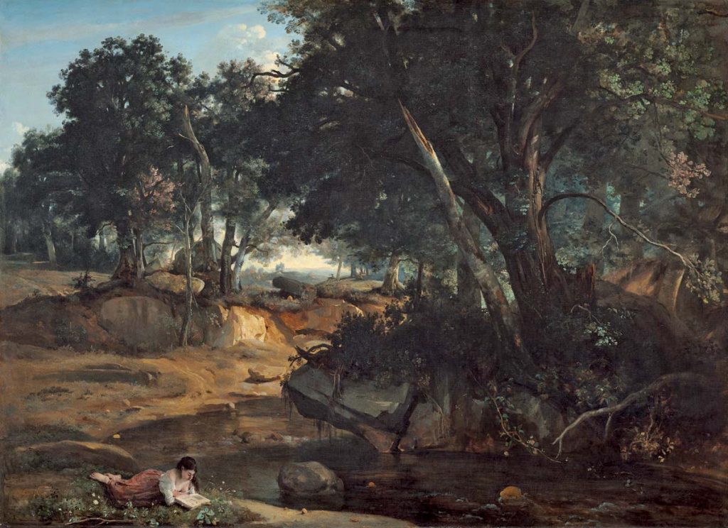
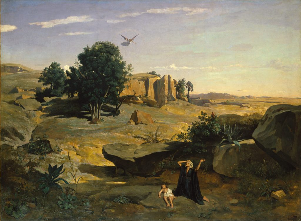
Hagar in the Wilderness (c.1835), Corot implemented classical and religious figures in his work, which also secured him fame.
Corot regularly showcased his work in the 1830s, earning him critical success. Collectors then became eager for his work in the 1850s. Corot started and gave lessons to impressionists such as Camille Pissaro and had many pupils studying under his wing, also earning the name “Papa Corot” for his kindness and generosity.
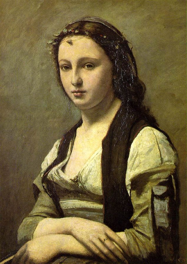
Near the end of his life, Corot actually painted portraits and figure studies, but they were almost close to never being exhibited. The Woman with the Pearl (c.1868-70) showcased his mastery of tonal values.
By the time of his death on February 22,1875, Corot established a foundation for landscape painters in the Impressionism Art Movement and became highly respected. Respect- well-deserved for an artist with a kind heart and mastered tuning towards landscapes with tones and colour.
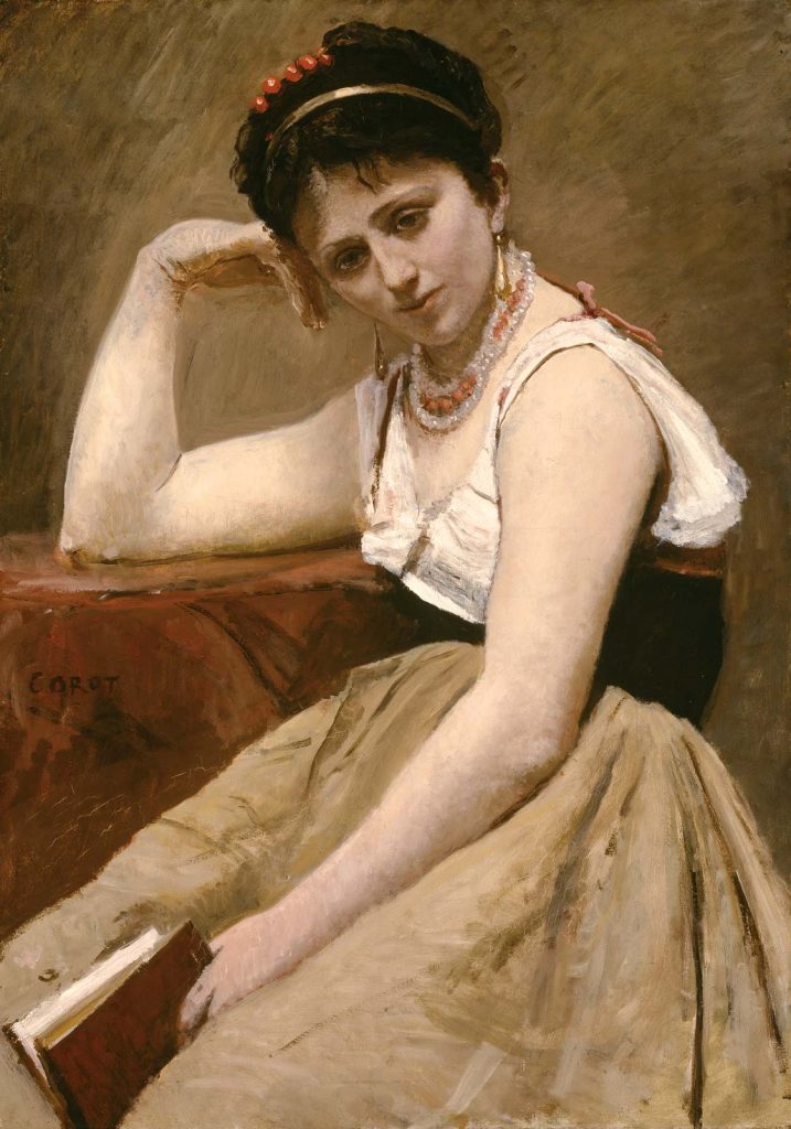
Interrupted Reading (c.1870), was another of his painted portraits created late in his career.