Survey 5

Vision with Herman von Helmholtz

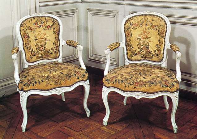
For Week 7 of Survey Design, we went over the years 1850 – 1895, while also covering The Great Exhibition. As this event happened in Vancouver in 1986, I do hope it returns in the future so I can experience it and travel the world without wandering too far from home.

I was also assigned to a group as a researcher, and in a general agreement, decided to cover optics during the 19th century, specifically anything related to vision. It was a bit difficult to research this topic during this period, but luckily I did find something interesting to cover for this post.

An actual photo of Herman von Helmholtz.

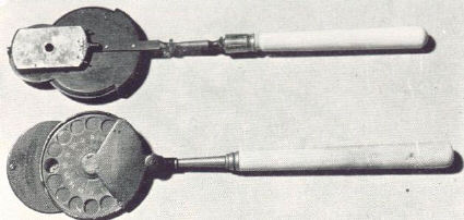
As such, I would like to introduce to you, the man responsible for boosting the development of visual optics: Hermann von Helmholtz, or Hermann Ludwig Ferdinand Helmholtz, who contributed to the study of optics, and also invented some tools that optometrists use today, with the most significant being the ophthalmoscope.

Ophthalmoscopes are used today to examine blood cells in the retina and can indicate signs of medical issues in the eye and even in the circulatory system. It also allows for the accurate prescription of eyeglasses.

Helmholtz invented the first proper ophthalmoscope in the 19th century, in the year 1851. An English inventor named Charles Babbage made a similar instrument to the ophthalmoscope earlier in 1847, but it failed to be of any use to eye doctors at the time.

Helmholtz was greatly successful due to his studies while conducting research on the eye, he found out that a clear image of eye tissue can be produced if a light is focused onto the tissue.

A front and back image of a 19th century ophthalmoscope.

Helmholtz also wrote the ‘Treatise of Physiological Optics’ (c.a. 1856), where he reports on his research regarding the behaviour and characteristics of the eye, with a dose of philosophy.

The text demonstrated the eyes’ perception of distance and developed the theory of space, while also elaborating on colour vision, in response to a theory made by Thomas Young (1802).

According to Young, three primary-colour receptors worked in unison to produce the colour range an average human witnesses.

Helmholtz expands on this, stating that three types of light receptors in the eye were colour-sensitive, reacting to blue-violet, green or red light.

Within these receptors are various chemicals with different sensitivities and reactions to light, stimulating neurons and sending signals to the brain.

Helmholtz applied this expanded theory to topics such as afterimages and blindness.

A modern, translated version of Helmholtz’s ‘Treatise of Physiological Optics’ , edited by James P.C. Southall.

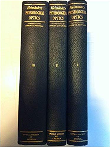
Helmholtz also delves into deep thinking with the following question: if eyes do react in a form of optical phenomena, can we be sure and trust our general senses to relay information of the outside world to our brain? This was a question that Helmholtz explored and often failed to answer.

Thanks to the efforts and materialized research of Hermann von Helmholtz, humans managed to develop the understanding of eye vision that we know and follow today.

Our optometrists may have been unable to care for the conditions of our eyes, were it not for Helmholtz’s invention.

WORKS CITED

  • Williams, L. Pearce. “Hermann von Helmholtz.” Biographies, 4 Sept. 2019. Encyclopædia Britannica, inc., https://www.britannica.com/biography/Hermann-von-Helmholtz. Accessed 22 Oct. 2019.
  • Street, Warren R, and Philip Tolin. “Helmholtz, Hermann von.” Encyclopedia of Cognitive Science, L. Nadel, Wiley, 1st edition, 2005. Credo Reference, https://search-credoreference-com.ezproxy.capilanou.ca/content/entry/wileycs/helmholtz_hermann_von/0. Accessed 22 Oct. 2019.
  • “Helmholtz, Hermann (Ludwig Ferdinand) von (1821 – 1894).” The Cambridge Dictionary of Scientists, edited by David Millar, Cambridge University Press, 2nd edition, 2002. Credo Reference, https://search-credoreference-com.ezproxy.capilanou.ca/content/entry/dicscientist/helmholtz_hermann_ludwig_ferdinand_von_1821_1894/0. Accessed 23 Oct. 2019.

IMAGES OBTAINED FROM

  • https://www.britannica.com/biography/Hermann-von-Helmholtz
  • http://www.mrcophth.com/Historyofophthalmology/ophthalmoscope.html
  • https://www.amazon.com/gp/product/B0006AJDBQ/?tag=prabook0b-20

Neoclassicism, Romanticism, & Rococo

Jean-Auguste Ingres

Born in Montauban, France on August 29, 1780. Jean-Auguste-Dominique Ingres was a French painter who was controversial due to his work and opinions on other works of art.

Self-portrait (c.1800) – After his father, Jean-Auguste was later taught by Jaques-Louis David for two years. After learning from David, Ingres began studying at Ecole des Beaux-Arts from 1799 to 1801. Ingress later had the opportunity to study at Académie de France in Rome but was unable to due to financial constraints.

His family had an artistic background, he received his first art lessons from his father. Ingres continued developing his skills in portraiture and history painting. Ingres was well-known for his portraits, but he strangely preferred to paint historical events, thinking lowly of portraiture.

He was meticulous about details in his works, and preferred precision, despising works of novelty, improvisation and sloppiness which he considered as ugly.

“Napoleon I on His Imperial Throne” (c.1806), was considered stiff and old-fashioned by critics in terms of style but was intentional on Ingres’ part. Ingres’s painted what he wanted to paint on impulse, disregarding art trends. Most critics thought negatively of his work and considered Ingres’s art style as ‘Gothic’. This piece was showcased in one of the ‘Salons’ that Ingres participated in.

Ingres’ work received publicity in ‘Salons’, which were official contemporary art exhibitions where he displayed his portraits and historical works. There, he implemented the technique of distorting figures and space.

The Vow of Louis XIII (c.1824) – Though this painting improved his reputation with critics, Ingres experienced a fall-out in the 1834 ‘Salon’, where he exhibited a religious work that made critics think lowly of Ingres. He was incredibly hypersensitive and reacted by vowing not to participate in future ‘Salons’.

Future works featured nude women, attracting negative views that were later extinguished in future ‘Salons’, with Ingres receiving critical acclaim in Paris with works such as the one above.

La Grande Odalisque (c.1814) depicted a woman in a less-appealing pose and with unnatural proportions. It was negatively considered as surreal, with one critic claiming that the woman had one too many vertebrae.

Ingres would eventually die on January 14, 1867, in Paris, but not without having ties with highly-regarded figures such as the King of France. In consensus, his explorations of distorting space and anatomy left an impression in the 20th century, influencing the likes of Picasso and Matisse.

The Source (c.1856) – Despite the controversy, Ingres’s nude paintings were his most notable works. He succeeded Jaques-Louis David as a master of Neoclassical painting, which was considered as the opposite of Romanticism. As such, Eugene Delacroix was assumed to be Ingres’s greatest rival.

WORKS CITED

  • “Ingres, Jean-Auguste-Dominique.” Britannica Concise Encyclopedia, Encyclopaedia Britannica, Britannica Digital Learning, 2017. Credo Reference, https://search-credoreference-com.ezproxy.capilanou.ca/content/entry/ebconcise/ingres_jean_auguste_dominique/0?institutionId=6884. Accessed 19 Oct. 2019.
  • Gombrich, E.H. “Permanent Revolution: The nineteenth century” The Story of Art, by Ernst Hans. GOMBIRCH, 16th ed., Phaidon, 1995
  • Shelton, Andrew C. “J.-A.-D. Ingres.” Biographies, 25 Aug. 2019. Encyclopædia Britannica, inc., https://www.britannica.com/biography/J-A-D-Ingres. Accessed 19 Oct. 2019.

IMAGES OBTAINED FROM

  • https://www.britannica.com/biography/J-A-D-Ingres/images-videos
  • https://www.napoleon.org/en/history-of-the-two-empires/paintings/napoleon-i-on-his-imperial-throne/
  • http://mini-site.louvre.fr/ingres/1.4.3.1_en.html
  • https://www.wikiart.org/en/jean-auguste-dominique-ingres/the-source-1856

Survey 4

Sound the Steam Whistles (Impacts of the Steam Engine)

Week 6 of our Survey Design class covered the years 1750-1850, as well as in-depth coverage of printmaking in Japan. In all honesty, it was a nice break from the origins of design and typography in Europe.

There was also the mention of steam power during the lecture. Having been assigned as a designer this week- I decided to cover this topic. As such, allow me to explain to you the impacts of the steam engine during the Industrial Revolution:

A photograph of a recovered Newcomen steam engine.

The invention of a steam engine through the contributions of Thomas Newcomen and James Watt signified a major turning point for life in Britain.

Thomas Newcomen invented the first known model of the steam engine in 1712, intending to improve the exploitation of coal. The resource was easier to find because of the Newcomen’s model, with the mining industry having the newfound ability to dig deeper pits to reach previously untouched coal reserves.

This method is the discharge of water from mines, now more efficient compared to slower processes existing before the steam engine. Unfortunately, this did not improve the way coal was extracted, it only reduced the time required to access the coal.

This revelation did influence the location of industrial zones, with new factories established closer to coalfields which gave access to cheaper sources of fuel.

Factories too were affected by the introduction of the steam engine. However, these engines were rather inefficient since steam would tend to escape- otherwise, more steam was being consumed to produce steam power. Cue the arrival of James Watt, who improved Newcomen’s model of the steam engine.

An illustration of a water-powered factory. Factories powered by water flow were common before the emergence of the steam engine.

Before the implementation of the steam engines, early factories had to be located on hills which contained streams of fast-running water that powered these factories. With the steam engine, factories need no longer the hillsides but a single, large steam engine reworked by Mr. Watts.

This engine was used to drive a shaft and power belt which primarily delivered power to all machines in the factory, thus reducing the required amount of manual labour.

The increased productivity also attracted bundles of settlers seeking to live in industrial zones, forced to live closer to work as many towns transformed into cities.

The use of iron was significantly improved, with the steam engine- developments in utilizing iron skyrocketed, with iron-made factories and the more accurate manufacturing of existing machines and steam engines.

The steam engine also reduced the cost of transporting goods, improving transport via land and sea, more specifically through watercraft and railroads.

A man named Robert Fulton, utilized the steam engine to invent the first steamboat, allowing more goods to be shipped through canals and waterways in 1807.

An illustration of an early steam train invented by George Stephenson.

George Stephenson invented the first steam-powered train in 1814, which transported human populations and of course goods, through long-distance spans. This opened a system of importing and exporting goods as well as raw materials.

When all these breakthroughs are considered in thought, it was no doubt that the steam engine was a major game-changer during its time.

WORKS CITED

  • “Steam Engine.” Bloomsbury Guide to Human Thought, edited by Kenneth McLeish, Bloomsbury, 1st edition, 1993. Credo Reference, https://search-credoreference-com.ezproxy.capilanou.ca/content/entry/bght/steam_engine/0. Accessed 16 Oct. 2019.
  • “Industrial Revolution.” The Hutchinson Unabridged Encyclopedia with Atlas and Weather Guide, edited by Helicon, 2018. Credo Reference, https://search-credoreference-com.ezproxy.capilanou.ca/content/entry/heliconhe/industrial_revolution/0. Accessed 16 Oct. 2019.
  • History Crunch Writers. “Invention of the Steam Engine.” History Crunch – History Articles, Summaries, Biographies, Resources and More, History Crunch, 22 Jan. 2016, www.historycrunch.com/invention-of-the-steam-engine.html#/.

IMAGES OBTAINED FROM

  • https://ethw.org/Thomas_Newcomen_and_the_Steam_Engine
  • https://www.locallocalhistory.co.uk/brit-land/power/page06.htm
  • https://diyhomeschooler.com/the-steam-locomotive-a-mini-unit/

Survey 3

A Brighter Day with Pastels

Week 3 of Survey Design involved a small case of entertaining, historical drama. What stuck out to me was the backstabbing of Johannes Gutenberg by Johann Fust. The thought of stealing a person’s work without acknowledging them to gain a full benefit- to me, is unfair and sickening.

Despite this interesting ordeal, we also covered the arrival of the printed press and of the Baroque and Rococo periods. Through research, I found that both eras seem to mention differences in using colour.

More is known of colour usage during the Baroque period, but that’s not what I want to discuss with you today. In short, we’re going to talk about the colours of its biological child, the Rococo period.

These chairs are an example of Rococo furniture, with white lacquer and light yellow cushions.

The Rococo period began when art conveying youthful vibes were requested by Louis XIV in 1699. The term ‘rococo’ originates from the French word ‘rocaille’, meaning ‘rockery’ or ‘shell incrustation’ in English.

The term is associated with a French art movement that resulted in a transition from the deep colours of the Baroque period. This change was seen in interior architecture and art.

Other than the vibrant exteriors, Rococo interiors were muted, and softer in colour compared to Baroque interiors. The wooden components of furniture were coated with white lacquer or gold, while cushioned parts were usually coloured light green or yellow.

On a side note, matching the colour of women’s clothing with Rococo furniture was a preferred practice as well.

Art had an appealing change from expressing dramatic moments in the Baroque era, to positive and happier events. To indicate this more positive vibe, artists also resorted to utilizing light pastel colours alongside Rococo interiors.

‘The Swing’ (c.1767) is considered one of the best paintings to originate from the Rococo period.

Jean-Honoré Fragonard makes use of pastels in the famous ‘The Swing’, in which a young woman sports a light pink dress as she swings to and fro. The use of pastel pink assists in depicting a moment of joy.

François Boucher’s Blond Odalisque also includes pastel colours which contrast with the golden or yellowish surroundings. Pastel blue and again- pink, were used, combined with a naked female figure to give off a more intimate vibe compared to Fragonard’s joyful piece.

An image of the ‘Blond Odelesque’ (c.1752) painting.

The artistic trend that existed in this era was a more light hearted and intimate approach to art, with artists in this period veering towards a playful manner in their works.

Pastel colours in the Rococo period were a huge leap in aesthetic value; escaping the dramatic, deep colours that once shrouded the Baroque period for the lighter spectrum of pastels.

WORKS CITED

  • Charles, Victoria, and Klaus H. Carl. Rococo. Parkstone International, 2010. EBSCOhost, search.ebscohost.com/login.aspx?direct=true&db=nlebk&AN=436229&site=eds-live&scope=site.
  • “Rococo style.” Britannica Concise Encyclopedia, Encyclopaedia Britannica, Britannica Digital Learning, 2017. Credo Reference, https://search-credoreference-com.ezproxy.capilanou.ca/content/entry/ebconcise/rococo_style/0?institutionId=6884. Accessed 09 Oct. 2019.
  • “Rococo.” The Bloomsbury Guide to Art, edited by Shearer West, Bloomsbury, 1st edition, 1996. Credo Reference, https://search-credoreference-com.ezproxy.capilanou.ca/content/entry/bga/rococo/0?institutionId=6884. Accessed 10 Oct. 2019.
  • “Rococo.” The Thames & Hudson Dictionary of British Art, edited by David Bindman, and Nigel J. Morgan, Thames & Hudson, 1st edition, 1988. Credo Reference, https://search-credoreference-com.ezproxy.capilanou.ca/content/entry/thba/rococo/0. Accessed 10 Oct. 2019.
  • Richman-Abdou, Kelly. “Celebrate the Elegance and Exuberance of French Rococo Art.” My Modern Met, 27 Apr. 2018, mymodernmet.com/rococo-art/.
  • All That’s Interesting. “The Rococo Art Movement That Dominated The Seventeenth & Eighteenth Century.” All That’s Interesting, All That’s Interesting, 7 Aug. 2019, allthatsinteresting.com/rococo-art-movement.
    Krén, Emil, and Daniel Marx. “Blond Odalisque (L’Odalisque Blonde).” Blond Odalisque (L’Odalisque Blonde) by BOUCHER, Franois, Web Gallery of Art, www.wga.hu/html_m/b/boucher/2/o_murph.html.

IMAGES OBTAINED FROM

  • https://allthatsinteresting.com/rococo-art-movement
  • https://www.britannica.com/art/Rococo

Survey 1 – Typography Zine

The original layout for the zine to allow proper folding.

For week 1, I was assigned to a group to research and design a zine for typography in the 35,000BCE-0CE. We chose to narrow down the topic to cover the origins of Chinese writing.

The zine covers in order: the mythological beginnings, the evolution of writing mediums (i.e. bone writing), until ending with the global distribution of Chinese Cangjie.

For this design, I decided to draw out 4 black and white images that span 2 pages each. I believe in doing so, compositions became more appealing. It was a bit challenging to find the right balance between images and text.

The general motif of the zine were peafowls and fans, mostly with aesthetic in mind. This also encouraged me to format the zine’s text as if it were a story, the ‘odd’ grammar is an attempt to convey information poetically.

Looking at the result, I would say I am generally satisfied- but I am certain that I can improve.

On the plus-side the use of line weight to distinguish elements such as the peafowls, is something I am proud of. I find the design to be cohesive, and the details seem to make this work.

However, I believe I could have been a bit more careful with the execution. For example, the ‘global distribution’ panel(s) has two dark circles on the right which were meant to show the red sun in Japan’s flag and the yin-yang symbol in South Korea’s flag.

It is difficult to recognize these symbols as they are quite dark in shade and it drags attention away from the rest of the drawing.

In regards to the ups and downs of the result, I would give myself a mark of 9/10. I believe I did put in the effort, and despite some minor mistakes, the overall quality seems good to me.

Baroque

Claude Lorrain

Born as Claude Gellée in Chamagne, France in 1600, Claude Lorrain is known as the greatest landscape artist of the 17th century.

Claude Lorrain’s Landscape with Dancing Figures (c.1669)

Lorrain was an employed pastry cook for Agostino Tassi before becoming his apprentice from 1618 until 1625. Tassi was a major influencer of Lorrain’s art style.

One of the 195 pages of Liber Veritatis (c.1776), depicts two individuals named Jacob and Laban, and two of Laban’s daughters. There are also three unnamed people resting beneath a tree, with herds of sheep and cattle also featured in the piece.

After his apprenticeship, Lorrain’s commissioned works were famous, causing them to be imitated by many. To prevent theft, he recorded them in a notebook- later published as the ‘Liber Veritatis’.

Lorrain usually painted seascapes and landscapes before 1640, mastering atmospheric perspective.

Lorrain’s Harbor Scene at Sunset (c.1643) shows the artist’s technique of atmospheric perspective, notably through the faded landform on the horizon. His pieces were filled with natural light and he was considered the first artist to try and accurately depict the sun and its radiating light.

Onwards, his works involved human subjects, taking studies from Domenichino and Annibale Carracci. He included biblical and mythological subjects, making his compositions more complex and lively.

Lorrain’s The View of Carthage with Dido and Aeneas (c.1675) depicts a scene from Virgil’s Aeneid, where Trojan hero Aeneas meets Queen Dido of Carthage and falls in love.

Lorrain was the first to open public eyes to the beauty of nature, with rich English men modelling their gardens after Claude’s work. His last known painting was ‘Ascanius Shooting the Stag of Silva‘ in 1682 before dying during that year.

Claude Lorrain’s Ascanius Shooting the Stag of Silva (c.1682)

Lorrain specified strictly on nature and light in landscape painting, unlike artists who painted a wider range of subjects such as Rubens and Rembrandt.

This choice made his art appeal to later generations, with his study of nature solidifying his place in art history.

WORKS CITED

  • Gombrich, E.H. “Visions and Visions: Italy, later seventeenth and eighteenth century” The Story of Art, by Ernst Hans. GOMBIRCH, 16th ed., Phaidon, 1995
  • “Claude Lorrain (1600 – 1682).” A Biographical Dictionary of Artists, Andromeda, edited by Lawrence Gowing, Windmill Books (Andromeda International), 2nd edition, 1995. Credo Reference, https://search-credoreference-com.ezproxy.capilanou.ca/content/entry/andbda/claude_lorrain_1600_1682/0. Accessed 05 Oct. 2019.
  • “Claude Lorrain.” The Columbia Encyclopedia, Paul Lagasse, and Columbia University, Columbia University Press, 8th edition, 2018. Credo Reference, https://search-credoreference-com.ezproxy.capilanou.ca/content/entry/columency/claude_lorrain/0. Accessed 06 Oct. 2019.
  • “Liber Veritatis.” British Museum, Trustees of the British Museum, 2019, https://www.britishmuseum.org/research/collection_online/collection_object_details.aspx?objectId=1525759&partId=1
    “Claude Lorrain Artworks & Famous Paintings.” The Art Story, The Art Story Foundation, 2019, www.theartstory.org/artist/lorrain-claude/artworks/.
    The Ashmolean Museum of Art and Archaeology. “Landscape with Ascanius Shooting the Stag of Sylvia.” Landscape with Ascanius Shooting the Stag of Sylvia | Art UK, Art UK, artuk.org/discover/artworks/landscape-with-ascanius-shooting-the-stag-of-sylvia-141828.

IMAGES OBTAINED FROM

  • https://www.hermitagemuseum.org/wps/portal/hermitage/digital-collection/01.%20Paintings/36956/!ut/p/z1/jZBNT8MwDIb_Cjv0SOx-pO24RUFijI1O04CQC8qmrg1qk6oNq8SvJyAuICj4Zunx68cGCQKkUSddKaetUY3vH2X6VDCWhjHHZcHpJbJiu6FbfnuFYQIPHwD-UgxB_md-ApDT8cu_FvgLon7N1xXITrn6XJujBYEhOdsobZw21QAiTuc09S7yW9r1TebTdnRRFPc84sknMO2j9y0ZDy1BQiOKYTxHzLMoS_L0XYaZfZx7mb48ln3Zk5fef7l2rhsuAgxwHEdSWVs1JTnYNsCfRmo7OBBfSejaO_G6WuAzbU4rNpu9AQBrDk8!/dz/d5/L2dBISEvZ0FBIS9nQSEh/?lng=en
  • https://www.britishmuseum.org/research/collection_online/collection_object_details.aspx?objectId=1525759&partId=1
  • https://www.theartstory.org/artist/lorrain-claude/artworks/
  • https://artuk.org/discover/artworks/landscape-with-ascanius-shooting-the-stag-of-sylvia-141828

High Renaissance & Mannerism

Hieronymus Bosch

The Garden of Earthly Delights (c.1503) is considered his best piece, again- teeming with depictions of evil. The triptych piece invokes a dreamlike aesthetic with many naked figures, gigantic birds and other surreal elements.

Hieronymus Bosch, born on 1450 as Jerome van Aken, was the Dutch son of accomplished painters. His renowned name is derived from his hometown, known as s’Hertogenbosch.

Detail from The Garden of Earthly Delights (c.1503)

A master of the unreal, he was referred to as a “creator of devils” for his depictions of evil in his paintings. Bosch tended to combine fantasy with reality, painting fictional apocalyptic scenes with supernatural and human figures.

Side panels of the Bosch’s triptych piece, Paradise and Hell (c.1510)

His works were religious, usually seen as sermons centred on sin. Bosch’s early works indicate influences from artists such as Rogier van der Weyden.

Crucifixion with a Donor (c.1485-1490)

Bosch was rather pessimistic and stern, with critics believing he was a practitioner of the occult arts, and affiliated with secret groups due to his depictions of evil. Most historians disagree with this since Hieronymus was Catholic and well respected by his neighbours and peers.

Tabletop of the Seven Deadly Sins (c.1450-1516). The corner circles represent (from left to right) Death, Judgement, Hell and Glory; The piece depicts a resurrected Christ in the center encircled by the seven deadly sins.

This piece was owned by King Philip II of Spain who admired Bosch’s work.

Hieronymus later died on August 9, 1516, ending with a successful career and (as written in official records) the title of “Insignis Pintor” or distinguished painter. A proper title for a master of imagination.

Today, Bosch is viewed as a talented artist with insight into human character. He is considered the first to artistically depict abstract concepts and is often imitated by many artists.

WORKS CITED

  • Gombrich, E.H. “The New Learning Spreads: Germany and the Netherlands, early sixteenth century.” The Story of Art, by Ernst Hans. GOMBIRCH, 16th ed., Phaidon, 1995
  • “Bosch, Hiëronymus.” Britannica Concise Encyclopedia, Encyclopaedia Britannica, Britannica Digital Learning, 2017. Credo Reference, https://search-credoreference-com.ezproxy.capilanou.ca/content/entry/ebconcise/bosch_hieronymus/0. Accessed 28 Sep. 2019.
  • “Bosch, Hieronymus (c. 1450 – 1516).” The Bloomsbury Guide to Art, edited by Shearer West, Bloomsbury, 1st edition, 1996. Credo Reference, https://search-credoreference-com.ezproxy.capilanou.ca/content/entry/bga/bosch_hieronymus_c_1450_1516/0. Accessed 28 Sep. 2019.
  • “Tabletop of the Seven Deadly Sins and the Four Last Things (oil on panel).” Bridgeman Images: The Bridgeman Art Library, edited by Bridgeman Images, 1st edition, 2014. Credo Reference, https://search-credoreference-com.ezproxy.capilanou.ca/content/entry/bridgeart/tabletop_of_the_seven_deadly_sins_and_the_four_last_things_oil_on_panel/0. Accessed 28 Sep. 2019.
  • Kuiper, Kathleen. “Hiëronymus Bosch.” Encyclopædia Britannica, Encyclopædia Britannica, Inc., 5 Aug. 2019, www.britannica.com/biography/Hieronymus-Bosch.

IMAGES OBTAINED FROM

  • www.hieronymusbosch.net/the-garden-of-earthly-delights/
  • https://www.spikeartmagazine.com/en/articles/whats-so-contemporary-about-hieronymus-boschs-apocalyptic-visions
  • https://en.wikipedia.org/wiki/Paradise_and_Hell#/media/File:Jheronimus_Bosch_115_inner_wings.jpg
  • www.hieronymusbosch.net/crucifixion-with-a-donor/.
  • https://search-credoreference-com.ezproxy.capilanou.ca/content/entry/bridgeart/tabletop_of_the_seven_deadly_sins_and_the_four_last_things_oil_on_panel/0

Survey 2

The Barbaric Squalls of the North

Following the collapse of the Roman Empire, Britain was faced with oppression from barbaric tribes. Among these tribes were the Scots and Picts, but the wild cards of this ordeal were the Vikings and the Anglo-Saxons.

A drawn depiction of Anglo-Saxon warriors.
Obtained from http://epicworldhistory.blogspot.com/2013/10/anglo-saxon-culture.html

Anglo-Saxon history dates back to the 3rd century AD, where Saxon raiders sailed across the North Sea to raid settlements on the southeast coast. Defences were strengthened to prevent raids only to fail in 367 AD during the ‘Barbarian Conspiracy’- involving a united raid of Picts, Scots, and Saxon groups. This united force temporarily shook the foundations and shattered the British army.

Early Anglo-Saxons groups to set foot in Britain soil weren’t entirely Anglo-Saxon as tribal affiliation for Germanic tribes were not too strict. Thus, groups would involve people from other Germanic groups. Some even had names influenced by Celtic origins.

The Germanic Anglo-Saxons favoured great skill and courage in combat. They originally followed pagan beliefs, with concepts such as unavoidable destiny (or fatalism) and the human ability to manipulate the supernatural. Eventually, they would be forced to convert into Christian faith, specifically because of the British Christians who looked down upon paganism.

A Viking longship, notice the shallow draft or bottom of the ship.
Obtained from https://www.khm.uio.no/english/visit-us/viking-ship-museum/

Anglo-Saxons would thrive until the rise of the Vikings, who sought the opportunity of the wealth gained by the germanic group while beginning to bring British land under their control.

Originating from Scandinavia, the Vikings (from ‘vikingr’ , Norse term for sea-rover or pirate) sailed onwards to the upper region of the British Isles. Their advances weren’t easily hindered, due to the Vikings’ use of oar-powered longships as the draft of the vessels was shallow- allowing them to land on flat beaches. This also enabled them to initiate raids without being noticed beforehand.

It is a presumption that the Vikings were motivated by sudden population blooms in Scandinavia and the fall of the Frisians, thus they were pressured and they resorted to the art of raiding. Utilizing hit-and-run tactics, they were quick on their feet and pillaged settlements before defences can retaliate.

A depiction of a Viking raid on a monastery.
Obtained from https://vikinghistorytales.blogspot.com/2013/10/802-vikings-sacked-and-burned-iona.html

Initially, they set their eye on locations along the coast, and on one instance- they raided the coastal monastery of Lindisfarne in 793AD as well as Iona in 795AD. Churches and monasteries were common targets due to the absence of defences and an abundance of loot.

The Vikings continued to raid in 840AD, but now alongside a mutual interest for settling onto Britain soil and in larger groups. Eventually settling on the isles of Scotland, the northern, eastern regions of England (as a result of the non-cooperative nature between the British and Irish nations), and as aforementioned, land occupied by the Anglo-Saxons.

WORKS CITED

  • “The Saxon Shore.” The Hutchinson Unabridged Encyclopedia with Atlas and Weather Guide, edited by Helicon, 2018. Credo Reference, https://ezproxy.capilanou.ca/login?url=https://search.credoreference.com/content/entry/heliconhe/the_saxon_shore/0?institutionId=6884. Accessed 25 Sep. 2019.
  • “Vikings.” Encyclopedia of Warrior Peoples & Fighting Groups, edited by Paul K. Davis, and Allen Lee Hamilton, Grey House Publishing, 3rd edition, 2016. Credo Reference, https://ezproxy.capilanou.ca/login?url=https://search.credoreference.com/content/entry/greywarrior/vikings/0?institutionId=6884. Accessed 25 Sep. 2019.
  • Anglo Saxon. (2018). In Helicon (Ed.), The Hutchinson unabridged encyclopedia with atlas and weather guide. Abington, UK: Helicon. Retrieved from https://ezproxy.capilanou.ca/login?url=https://search.credoreference.com/content/entry/heliconhe/anglo_saxon/0?institutionId=6884
  • Burns, William E. “Anglo-Saxons.” World History: A Comprehensive Reference Set, edited by Facts on File, Facts On File, 1st edition, 2016. Credo Reference, https://ezproxy.capilanou.ca/login?url=https://search.credoreference.com/content/entry/fofworld/anglo_saxons/0?institutionId=6884. Accessed 25 Sep. 2019.
  • “The Scourge of the North: The Vikings in Britain.” The Hutchinson Unabridged Encyclopedia with Atlas and Weather Guide, edited by Helicon, 2018. Credo Reference, https://ezproxy.capilanou.ca/login?url=https://search.credoreference.com/content/entry/heliconhe/the_scourge_of_the_north_the_vikings_in_britain/0?institutionId=6884. Accessed 25 Sep. 2019.

Survey 1

The Evolution of The Chinese Writing System

Today in our Survey Design class, we covered the history of handprints and handwriting. We briefly discussed the history of handwriting in Asia, and it was interesting to learn that inscriptions were found on bones. This drove me to further research about these inscriptions, and the history of the Chinese writing system.

Chinese writing consists of symbols or characters ,and the earliest confirmed iteration of these characters took place sometime between the Neolithic period and half of the Shang Dynasty (around 1200 to 1050 B.C.E.). First manifesting during the reign of King Wu Ding around 1200 B.C.E., they came in the form of oracle bone inscriptions. 

Oracle Bones were sold as dragon bones in the late 19th century until scholars started retrieving them in the 1920s.
Obtained from https://www.chinasage.info/oracle-bones.htm

The inscriptions on these bones are known as chiaku-wen, or bone-and-shell script, and were commonly used in divination and were inscribed on animal shoulder blades and turtle shells. They usually depicted questions from diviners regarding subjects such as weather and luck. They were then heated, and the cracks produced by the heating determined a yes or no answer from gods or ancestors. 

Samples of these oracle bones show that the characters were written in columns. The symbols themselves were more like pictograms compared to their modern-day counterparts. These are the earliest evidence of ideograms, a term referring to picture symbols often associated with the Chinese writing system.

Chiaku-wen would eventually evolve into chin-wen (or bronze script). This involved the embedding of inscriptions onto various cast-bronze objects. Similar to the writings on oracle bones, bronze inscriptions depicted messages from gods and ancestors. However, these inscriptions were permanent, making bronze script ideal for treaties, contracts and other important documents.

Bronze script was embedded onto cast-bronze objects such as weapons, and even food.
Obtained from https://alchetron.com/Chinese-bronze-inscriptions#-

Chin-wen would eventually evolve into an art form known as calligraphy. Starting sometime during the 4th century B.C.E, the practice, involving ink and brush, had very strict rules in terms of its execution. These included how much ink was used and the composition of written characters.

Individual brush strokes in ideograms are known as radicals, allowing each character to be classified. All the characters fit into an imaginary, rectangular box and are known as logograms, which are symbols representing individual words. Eventually, this formed a vast library of written characters that needed to be learnt, and those who managed to learn them were considered to be wise.

Initially, different styles of calligraphy were utilized throughout China, until the reign of Emperor Shih Huang Ti (around 259 to 210 B.C.E.), who unified all of the existing writing styles. This style remained until Li Ssu, a prime minister from 280 to 208 B.C.E., developed a new style of calligraphy called hsiao chuan or “small-seal”. The result was a more abstract and graceful style, also neatly balanced in terms of form.

A visualization of Emperor Shih Huang Ti.
Obtained from https://www.chinasage.info/qin-dynasty.htm

I will not be covering anything that occurred during the common era, since the post would be lengthened. Thus, I will be taking my leave.

Thanks, and until then!

WORKS CITED

  • “Chinese.” The Columbia Encyclopedia, Paul Lagasse, and Columbia University, Columbia University Press, 8th edition, 2018. Credo Reference, https://ezproxy.capilanou.ca/login?url=https://search.credoreference.com/content/entry/columency/chinese/0?institutionId=6884. Accessed 16 Sep. 2019.
  • Chinese writing system. (2017). In Encyclopaedia Britannica, Britannica concise encyclopedia. Chicago, IL: Britannica Digital Learning. Retrieved from https://ezproxy.capilanou.ca/login?url=https://search.credoreference.com/content/entry/ebconcise/chinese_writing_system/0?institutionId=6884
  • SAUSSY, H. “Ideogram.” The Princeton Encyclopedia of Poetry and Poetics, edited by Roland Green, et al., Princeton University Press, 4th edition, 2012. Credo Reference, https://ezproxy.capilanou.ca/login?url=https://search.credoreference.com/content/entry/prpoetry/ideogram/0?institutionId=6884. Accessed 16 Sep. 2019.
  • “calligraphy.” The Hutchinson Unabridged Encyclopedia with Atlas and Weather Guide, edited by Helicon, 2018. Credo Reference, https://ezproxy.capilanou.ca/login?url=https://search.credoreference.com/content/entry/heliconhe/calligraphy/0?institutionId=6884. Accessed 16 Sep. 2019.
  • “oracle bones.” The Columbia Encyclopedia, Paul Lagasse, and Columbia University, Columbia University Press, 8th edition, 2018. Credo Reference, https://ezproxy.capilanou.ca/login?url=https://search.credoreference.com/content/entry/columency/oracle_bones/0?institutionId=6884. Accessed 16 Sep. 2019.
  • Writing and Literacy in Early China : Studies from the Columbia Early China Seminar, edited by Feng Li, and David Prager Branner, University of Washington Press, 2011. ProQuest Ebook Central, https://ebookcentral-proquest-com.ezproxy.capilanou.ca/lib/capilano-ebooks/detail.action?docID=3444463.
  • “typography.” The Columbia Encyclopedia, Paul Lagasse, and Columbia University, Columbia University Press, 8th edition, 2018. Credo Reference, https://ezproxy.capilanou.ca/login?url=https://search.credoreference.com/content/topic/typography?institutionId=6884. Accessed 16 Sep. 2019.
  • Yee, Chiang. “Chinese Calligraphy.” Encyclopædia Britannica, Encyclopædia Britannica, Inc., 17 Jan. 2019, www.britannica.com/art/Chinese-calligraphy.
  • Asia for Educators. “Timeline of Chinese History and Dynasties: Asia for Educators: Columbia University.” Timeline of Chinese History and Dynasties | Asia for Educators | Columbia University, Columbia University, 2009, afe.easia.columbia.edu/timelines/china_timeline.htm.
  • “Chapter 3: The Asian Contribution.” Meggs’ History of Graphic Design, by Philip B. Meggs and Alston W. Purvis, 5th ed., John Wiley & Sons, 2012, pp. 34–36.

Yearbook Spread

The first assignment in the Survey Design class was to create a personal yearbook spread. I currently enjoy illustrating as a past time, which is why I decided to illustrate a composition from scratch.

The central theme of my yearbook spread is marine biology and of course, me. I wanted to stick to a colour scheme of blues (mostly) to reflect a watery atmosphere, and also because Azure is my favourite colour. Whale Sharks are also present since they are (currently) my favourite animals. Some parts of the illustration pop out to convey movement and energy, such as the bubbles, splashes of water, and the drawing of myself. The illustration is not meant to be realistic, but rather stylized to resemble vector graphics.

I arranged the text with the layout of a magazine page in mind. I was mostly going for a modern, ‘National Geographic’ feel to the composition, which is why the text is in the third person, and brighter than the black background behind it. The symbols beside some lines of text are Nautilus shells, to replace the bullet points commonly used in word documents. After finishing the panels of the text, it reminded me of the chalkboard signs some businesses use on their storefronts.

If I’m going to give myself a mark out of 10, it would be 9/10 mostly because of the text. Although I included all of the required information indicated in the assignment brief, the right panel feels a bit cramped. Some errors also occurred while adding the text with a white gel pen, so I covered the mistakes in black ink. Other than that, I’m happy with how the illustration turned out. The intricacy with the Whale Shark patterns and the texture of the coral was rather daunting, but I believe it turned out nicely.

I’m satisfied with the result, even if the process involved some trial and error. Not to mention, I’ll be mounting this spread on my deskspace as soon as I get the chance!