Need help navigating the afterlife?

Books of the dead are ancient Egyptian texts that are designed to protect and aid the deceased through the afterlife. There are multiple different versions such as Coffin texts, pyramid texts, and many more. These books were traditionally buried with the deceased and originally thought to represent their worthiness to enter paradise. The earliest found record of these texts dates back to 2400 BCE (Britannica, n.d).

Image 1: Sheet from a Book Of The Dead (Brooklyn Museum, Charles Edwin Wilbour Fund)

The Book of the Dead is a papyrus scroll that is intended to attain immortality (Gala, 0:025-0:035). These books of the dead were traditionally reserved for pharos and those of high standing called pyramid texts. The texts were thought to depict their royalty and status to prove they are worthy to enter paradise. However, it became common practice and it was thought that regular people could also make it to the afterlife if they could pay and successfully navigate the underworld. The books that non-royalty possessed were called coffin texts (Warren, n.d).

Coffin texts are spells and incantations contained in a scroll. They are a version of the book of the dead, one that was for non-royalty. These spell books were put inside their tombs and were thought to be able to assist them in navigating and passing all of the tests of the afterlife. An individual can use these tools to help persuade the gods to let them into paradise. There is a series of tests that one must pass to achieve entrance to paradise. The book of the dead is intended to aid their passing of these tests and help them pass judgment (Warren, n.d). A famous recorded example of this journey is that of Ani.

Image 2: Weighing of the soul (The Metropolitan Museum of Art, Rogers Fund, 1930)

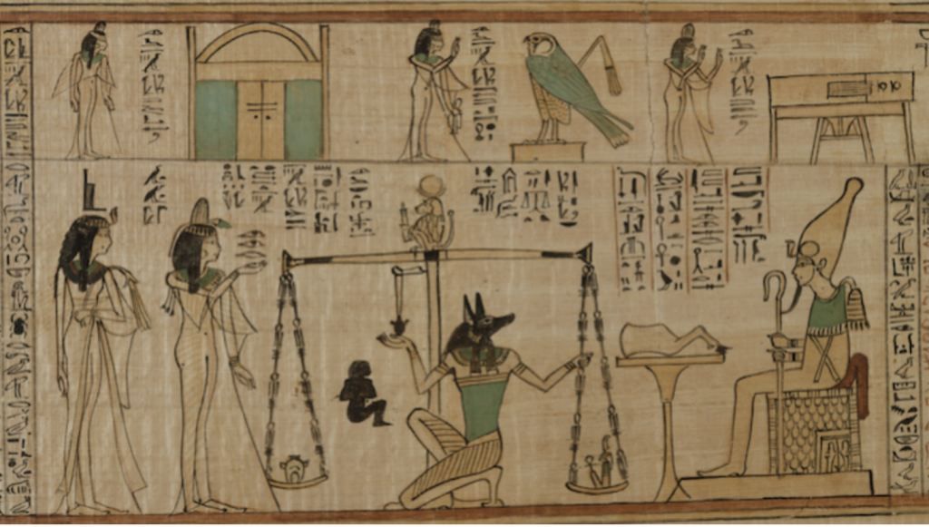
The video by Tejal Gala offered an engaging visual for the story of Ani and his book of the dead. It outlined the story of Ani and his descent into the afterlife. Ani uses his scroll of the dead to navigate the underworld and convince the gods that he is worthy to enter paradise. Equipped with the scroll he is able to pass all of the tests of the afterlife, such as proving to 42 accessor gods that he has lived a righteous life (Gala, 2:21-2:30). Ani’s path finally leads to him weighing his heart against a feather (Refer to image 2). If his heart weighs heavier than that of the feather, he would be devoured by Ammit.

Image 3: Ammit the part hippo, crocodile, and leopard (World History Encyclopedia)

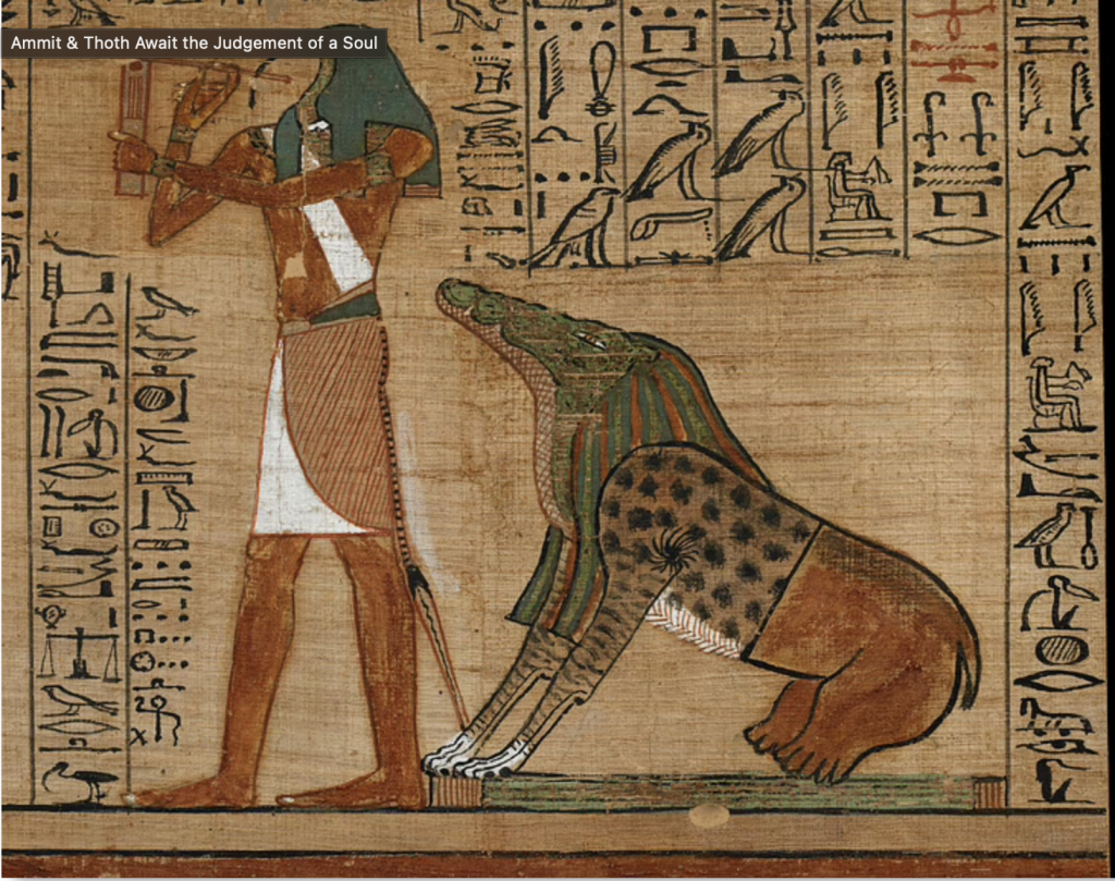
Ammit is a part hippo, part crocodile, and part leopard creature. It is a creature that devours the soul of the individual if their heart is too heavy with sins from their lifetime.  Finally, after passing this final test and avoiding being eaten by Ammit, Ani is allowed to enter paradise where he will cultivate a plot of land for the rest of his time and be reunited with his deceased family (Gala, 3:41-3:55).

Works Cited:

Image 3: “Ammit & Thoth Await the Judgement of a Soul.” World History Encyclopedia, UNESCO Archives, https://www.worldhistory.org/image/12848/ammit–thoth-await-the-judgement-of-a-soul/.

Britannica, The Editors of Encyclopaedia. “Book of the Dead”. Encyclopedia Britannica, 22 Sep. 2017, https://www.britannica.com/topic/Book-of-the-Dead-ancient-Egyptian-text. Accessed 30 September 2021.

Gala, Tejal, director. The Egyptian Book of the Dead: A Guidebook for the Underworld, Youtube, 31 Oct. 2016, https://www.youtube.com/watch?v=1yv_MXNYbAo.

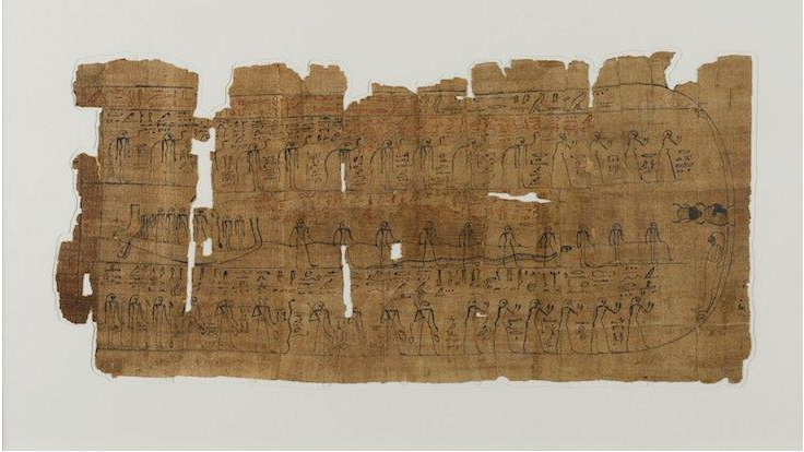
Image 1 & 2: Warren, Kellie. “Book of the Dead: A Guidebook to the Afterlife.” ARCE, American Research Center in Egypt, https://www.arce.org/resource/book-dead-guidebook-afterlife.

Visual Research II

Image 1: Author Unknown

This poster by Unknown uses the gestalt principle of Similarity. This principle refers to how we interact with objects of similar colors, shape or scale. This poster uses the similarity of the water droplet shape to guide the eye through the poster. We subconsciously connect these three items the tap, gas tap, and [bleeding] hand by association. The common element – the liquid drop creates a grouping and relation to one another that we conclude immediately by looking at the poster. 

Image 2: Massimo Vignelli (2016)

This poster by Massimo Vignelli is an example of the principle of continuation. Continuation is used to guide our eyes by using different objects and how we naturally follow lines of curves in imagery. This poster uses lines and colors to guide our eyes in this poster. Our eyes follow the line of “Knoll International” then this leads us to the dark K, our eyes are drawn to the next letter N and then through the lighter letters and back to the final dark L. This use of color and the natural reading style from left to right guides our eyes through this poster. This image creates a circle, we are drawn around this image from the large letters to the small text. 

Image 2 Link:

Image 2:

Tielman, M., 2021. A Colorful Identity | Cooper Hewitt, Smithsonian Design Museum. [online] Cooper Hewitt Smithsonian Design Museum. Available at: <https://www.cooperhewitt.org/2018/05/04/a-colorful-identity-2/> [Accessed 28 September 2021].

Visual Research I

Image 1: By Dyna Moe (2011)

Size and scale can be defined by the creation of contrast within a visual. The Mad Men poster by Dyna Moe is a strong example of this. The large red outline of the man grabs your attention but since it is contrasted with the smaller silhouette it draws your eyes down the poster. This is effective as it not only creates a bold visual but draws your eyes in and directs them throughout the poster. The contrast between the large and small silhouette creates a visual hierarchy that isn’t only visually striking but also conveys an underlying message of the strong and bold character that is being depicted.

Image 2: By Anna Minzhulina (2011)

The Monuments: City in Three Parts by Anna Minzhulina is an example of the use of space. Space can be defined as positive or negative, active or passive, and as white or empty space. She uses passive space with the indents and margins for the poetry on the right-hand side. Anne also uses whitespace between the bunches of houses (the left visual), the contrast between the full and busy bunches of houses with the whitespace helps to break up the image. It gives the viewer a break from the busy visuals and allows them to interact with the text.

Image 3: By Mirna Noaman (2019)

Mirna Noaman’s The Rules of War poster uses texture in her imagery. Textures can be created using lines and points. The collection of these lines and or points can create texture that is smooth, rough etc. In Mirna’s poster she uses points to create texture that is rough and translucent. It creates the appearance of a dusty glow emerging from the window. It does an excellent job of creating a unique texture that is emphasized by layering it on top of the dark background.

Works cited:

Minzhulina, A., 2011. Monuments: The City In Three Parts. [image] Available at: <https://magazine-awards.com/en/tag/magazine-covers/> [Accessed 15 September 2021].

Moe, D., 2011. Mad Men Poster. [image] Available at: <https://ew.com/article/2011/01/10/this-mad-men-poster-is-great/> [Accessed 15 September 2021].

Noaman, M., 2019. The Rules Of War. [image] Available at: <https://competition.adesignaward.com/design.php?ID=86925> [Accessed 15 September 2021].

Project Yearbook Spread

The first assignment that we received for IDES 141 was to create a “Yearbook Spread”. 

I chose to execute the project using my favorite medium – fineliners. I love using black and white and decided to accent it with my favorite colour which is lilac. I grew up surrounded by nature and plants which is why I gravitate towards florals so I wanted to include this in my imagery. I also added a katana for emphasis on the alternate era I would want to live in since it would be pretty cool to have one.

I tend to keep to myself which is why I choose to put my personal answers to the questions in boxes. Then have some of the contents erupt on the page represents how I can be more outgoing and expressive once I leave my inner space. The box contents and the linework are all different over the page as I wanted to show that I offer many different sides to my personality some of which don’t always harmonize with each other. I also included a lot of fluidity and movement as I have traveled and moved around a lot. I think it represents how dynamic and ever-changing my environment has been.

I would give myself a 7/10, the reasoning behind this is because I think my work does get a bit busy. There is a lot going on and I think that I would’ve preferred to have it more minimal and streamlined. I also think that my lettering can be improved, I would want to have it stylized and more consistent and clean throughout. I feel I also could’ve handled my whitespace better, it looks a little empty on the page. I spent around 4-4.5 hours creating this project.