Marian Bantjes

She is a designer, typographer illustration, and writer. She grew up in BC, and has her current office on an island off of Vancouver. She started her career as a book typesetter, she then went on to co-found a design studio called Digitopolis. Currently, she now works as a freelance designer and artist.

She published a book called I wonder and it was shortlisted for the British Design of the Year. She has since been published over 100 times in book books and magazines (Marian Bantjes,2022). 

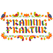
In her work, she relies on an underlying structure. She then builds off of it to create a natural flow within her work. This is shown in the image below. She establishes the text at 3/4 of the pages and uses verticals to structure the title as the main focal point. She then breaks away from this structure for a more dynamic visual.

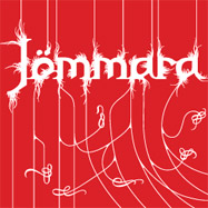
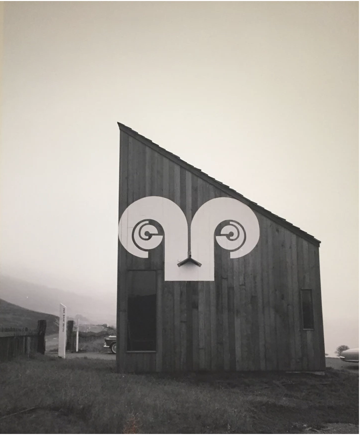
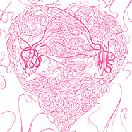
Her type often has a lot of ornamental features. She often works with patterns and repeating shapes as seen in the example below.

Her designs are versatile and her work often incorporates all of her interests. meaning that she blends her illustrative and typography skills in a lot of her work. Her illustrative work often spans into the patterned paper design and card stock. This makes use of her repetitive patterns and shapes that are often used in her work.

Works cited:

Marian Bantjes. 2022. About – Marian Bantjes. [online] Available at: <https://bantjes.com/about/> [Accessed 21 April 2022].

Images from

Peter Saville

Peter Saville was born in 1955 in Manchester, Lancashire. He began his studies at Manchester Polytechnic for graphic design until 1978. Following his education, he had a meeting with Tony Wilson. Wilson owned Factory records, which was an established record label, and helped secure Saville’s entry into the music design scene. Below is an example of his promotional work for Factory Records (Petridis, 2013).

Saville is most known for his album cover art, a majority of which he completed for artists under Factory Records. His most notable and recognizable imagery was for Joy Divisions album “Unknown Pleasures”. This imagery collected a cult following and had been re-printed and stolen countless times.

He also created notable work for New Order’s album Blue Monday and another one of Joy Divisions albums “Closer”.

Aside from album covers Saville also worked in branding and as a creative director. He created this spread for Burberry London. Saville had a unique personality that translated into his work.

Following years of album design work, he transitioned to the position of creative director for his hometown council (ArtNet,n.d).

Works Cited:

2022. Peter Saville | Biography, Designs and Facts. [online] Famous Graphic Designers. Available at: <https://www.famousgraphicdesigners.org/peter-saville> [Accessed 11 March 2022].

Artnet.com. 2022. Peter Saville. [online] Available at: <http://www.artnet.com/artists/peter-saville/biography> [Accessed 11 March 2022].

Images from

dezeen.com/2013/09/20/design-by-peter-saville/

https://www.dezeen.com/2018/08/02/peter-saville-collaborates-with-riccardo-tisci-to-design-new-logo-for-burberrys-new-graphic-identity/

Barbara Stauffacher Solomon

Barbara Stauffacher Solomon was a pioneer of the supergraphics movement and her work.

Barbara and one of her supergraphics

She has worked in the design field for over 70 years. She studied under Armin Hoffmann and this contributed to some of the Swiss elements being present in her work. One of these was her love of Helvetica which she included in her super graphics work often.

The supergraphics came out of her experimental work on a project for Sea Ranch. She applied graphics on the walls of the building and completely changed the space. One of these graphics was the rams horn logo as shown below.

These large graphics on the wall became known as supergraphics (Williamson,2021).
This won her an award from the American Institute of architects and she continued her career in design from here (Segran,2021).

She was able to blend together architecture, landscapes, and graphic design to create her unique visuals. I think that she has created a super fun and bold style. I love the look of the large graphics in interiors it adds a distinct 70’s feel and ties together the room.

Images from:

https://www.mascontext.com/issues/32-character/playing-with-paint-and-space/

https://www.lateralobjects.com/post/city-survival-bar-dress-code-guide

Lateral Objects. 2022. [online] Available at: <https://www.lateralobjects.com/post/city-survival-bar-dress-code-guide> [Accessed 3 March 2022].

Segran, E., 2022. The most influential designer you’ve never heard of is a 92-year-old artist in SF. [online] Fast Company. Available at: <https://www.fastcompany.com/90655404/the-most-influential-designer-youve-never-heard-of-is-a-92-year-old-artist-in-sf> [Accessed 3 March 2022].

Waldemar Swierzy

Waldemar Świerzy - NARAN-HO | Design Marbella | Diseño Web + Fotografía.

Waldemar Swierzy is a polish designer and professor. He was born on September 9th, 1931 in Katowice.

He studied at the academy of fine arts in Cracow and then became the head of the design studio at the higher school of fine arts in Poznan. After this he was the chairman of the international poster biennial and the head of the poster studio in Warsaw. Aside from his professional design career he also lectured at many universities (Culture.Pl,n.d).

He is most known for his poster work. He was won many awards such as the Grand Prix Toulouse-Lautrec award for his poster the Red Inn or Czerwona Oberża as shown below.

Czerwona oberża | Grafiteria.pl

Swierzy has created over 1500 posters in his career for films, records, and icons in pop culture. His poster work was extremely successful, the Mazowsze poster for example has been printed over a million times.

Waldemar Swierzy | Mazowsze (1961) | MutualArt


As his career developed so did his techniques on his posters. He developed a painting-like style. He had a fluid expression in his work that was easily identifiable. He then moved on to following art nouveau and gestural influences in his work.

His portraiture work was where he made a big name for himself. The hyperrealism combined with his personal flair developed into the style that is is most associated with. He designed over 250 portraits though his career. A lot of these pieces were for record sleeves or printed posters. He used a combination of mash-ups of different elements and colors to create his expressionistic style.

Waldemar Swierzy, poster of Jimi Hendrix, 1974 | The electri… | Flickr

Images from:https://culture.pl/en/artist/waldemar-swierzy

Culture.pl. 2022. Waldemar Świerzy. [online] Available at: <https://culture.pl/en/artist/waldemar-swierzy> [Accessed 17 February 2022].

Saul Bass

THE ART OF SAUL BASS – CFI
Image from: https://www.cafilm.org/the-art-of-saul-bass/

Saul Bass was born May 8th, 1920 in New York. He is most known for his graphic design work and his work as a filmmaker. He created new and imaginative film title sequences that were fresh expressive to audiences (Brittannica,2021). 

His career started with him drawing as a child and then at the Art Students League in New York. He then went on to Brooklyn College where he studied under George Kepes a well-known designer. After his education, he continued to work in graphic design, specifically in advertising. He slowly began to integrate his work into Hollywood by designing posters for upcoming movies. His most notable piece was the poster he designed for Carmen Jones. The director was so taken back by his work he immediately asked him to design the opening credits for the film. This was the first instance of him designing credits that would become his signature. He received his big break with The Man with the Golden Arm when he animated the opening sequence that secured his reputation and launched his career. He worked alongside many famous filmmakers notably Alfred Hichocks films, he designed almost all of the titles for those films (Brittanica,2021).

Carmen Jones (1954) — Art of the Title
image from: https://poulwebb.blogspot.com/2012/12/saul-bass-film-posters.html

His style is characterized by his use of simple geometric shapes. He utilized a lot of symbolism in his work as well. His work was often hand-rendered, there were hand-cut and drawn elements that contributed to his style (Miller, 2019). This hand-cut quality is shown in his piece Anatomy of a Murder.

This Just In: Saul Bass – Letterform Archive
Image from: https://letterformarchive.org/news/view/saul-bass

His filmmaking career was equally successful he received an academy award for best documentary (short subject) in 1969 for his film Why Man Creates. He also received around 8+ awards and nominations for his fieldwork (IMDb).  

Works cited:

Bauer, Patricia. “Saul Bass”. Encyclopedia Britannica, 4 May. 2021, https://www.britannica.com/biography/Saul-Bass. Accessed 1 February 2022.Copy Citation

IMDb. 2022. Saul Bass – IMDb. [online] Available at: <https://www.imdb.com/name/nm0000866/awards> [Accessed 1 February 2022].

Miller, E., 2022. Saul Bass: Graphic Designer Profile. [online] Lifewire. Available at: <https://www.lifewire.com/profile-of-graphic-designer-saul-bass-1697483#:~:text=Saul%20Bass’%20Style,packed%20with%20a%20sophisticated%20message.> [Accessed 1 February 2022].

Images from: