Visual Research II

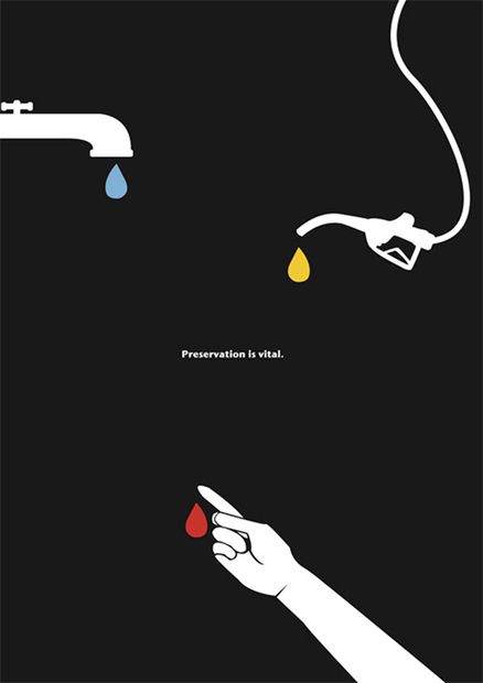
Image 1: Author Unknown

This poster by Unknown uses the gestalt principle of Similarity. This principle refers to how we interact with objects of similar colors, shape or scale. This poster uses the similarity of the water droplet shape to guide the eye through the poster. We subconsciously connect these three items the tap, gas tap, and [bleeding] hand by association. The common element – the liquid drop creates a grouping and relation to one another that we conclude immediately by looking at the poster. 
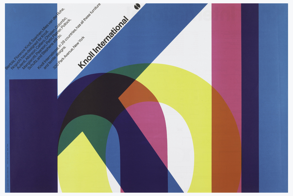
Image 2: Massimo Vignelli (2016)

This poster by Massimo Vignelli is an example of the principle of continuation. Continuation is used to guide our eyes by using different objects and how we naturally follow lines of curves in imagery. This poster uses lines and colors to guide our eyes in this poster. Our eyes follow the line of “Knoll International” then this leads us to the dark K, our eyes are drawn to the next letter N and then through the lighter letters and back to the final dark L. This use of color and the natural reading style from left to right guides our eyes through this poster. This image creates a circle, we are drawn around this image from the large letters to the small text. 

Image 2 Link:

Image 2:

Tielman, M., 2021. A Colorful Identity | Cooper Hewitt, Smithsonian Design Museum. [online] Cooper Hewitt Smithsonian Design Museum. Available at: <https://www.cooperhewitt.org/2018/05/04/a-colorful-identity-2/> [Accessed 28 September 2021].
Visual Research I

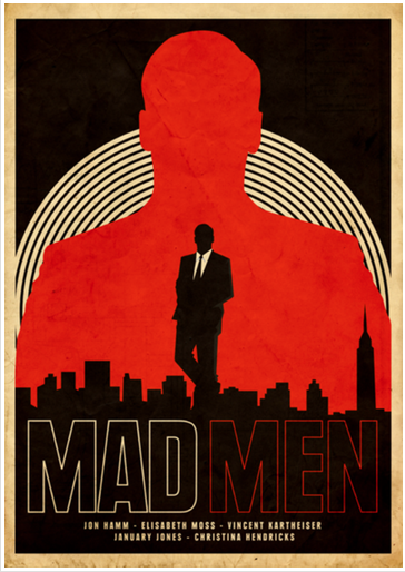
Image 1: By Dyna Moe (2011)

Size and scale can be defined by the creation of contrast within a visual. The Mad Men poster by Dyna Moe is a strong example of this. The large red outline of the man grabs your attention but since it is contrasted with the smaller silhouette it draws your eyes down the poster. This is effective as it not only creates a bold visual but draws your eyes in and directs them throughout the poster. The contrast between the large and small silhouette creates a visual hierarchy that isn’t only visually striking but also conveys an underlying message of the strong and bold character that is being depicted.

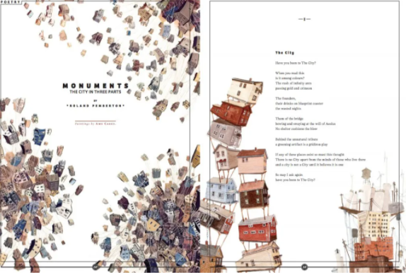
Image 2: By Anna Minzhulina (2011)

The Monuments: City in Three Parts by Anna Minzhulina is an example of the use of space. Space can be defined as positive or negative, active or passive, and as white or empty space. She uses passive space with the indents and margins for the poetry on the right-hand side. Anne also uses whitespace between the bunches of houses (the left visual), the contrast between the full and busy bunches of houses with the whitespace helps to break up the image. It gives the viewer a break from the busy visuals and allows them to interact with the text.

Image 3: By Mirna Noaman (2019)

Mirna Noaman’s The Rules of War poster uses texture in her imagery. Textures can be created using lines and points. The collection of these lines and or points can create texture that is smooth, rough etc. In Mirna’s poster she uses points to create texture that is rough and translucent. It creates the appearance of a dusty glow emerging from the window. It does an excellent job of creating a unique texture that is emphasized by layering it on top of the dark background.

Works cited:

Minzhulina, A., 2011. Monuments: The City In Three Parts. [image] Available at: <https://magazine-awards.com/en/tag/magazine-covers/> [Accessed 15 September 2021].

Moe, D., 2011. Mad Men Poster. [image] Available at: <https://ew.com/article/2011/01/10/this-mad-men-poster-is-great/> [Accessed 15 September 2021].

Noaman, M., 2019. The Rules Of War. [image] Available at: <https://competition.adesignaward.com/design.php?ID=86925> [Accessed 15 September 2021].