The Beauty of the Floating World

Japanese Ukiyo-e Prints – Origins

Image 1: Kabuki Actor Ōtani Oniji III as Yakko Edobei. This is a very popular image, it represents the ukiyo-e style well as it depicts an actor in character for a kabuki play.

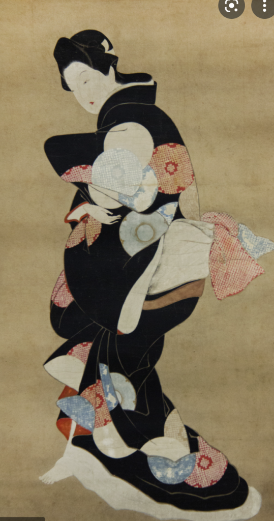
Ukiyo-e means “pictures of the floating world”. This is a style of art that was popularized with the development of woodblock printing. This style of artwork had a range of subjects but commonly depicted people of the court, prostitutes, kabuki actors and scenes, and erotica (Britannica,n.d). The subject matter then shifted to the urban everyday scenes as the style developed.

Image 2: Artwork by Hishikawa Moronobu

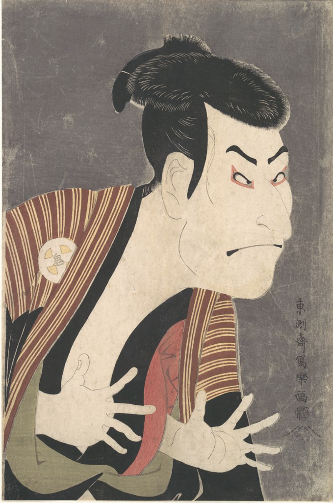
Hishikawa Moronobu – The first Ukiyo-e Artist

Hishikawa Moronbu is regarded as the father of ukiyo-e artworks. He was originally an embroiderer but became an illustrator for books. This was during the time when woodblock printing became accessible. This made mass printing of images available to all. With this new printing medium, he began to depict urban and domestic scenes of the Edo people (Britannica, n.d).

Development of Woodblock prining and Ukiyo-e Style

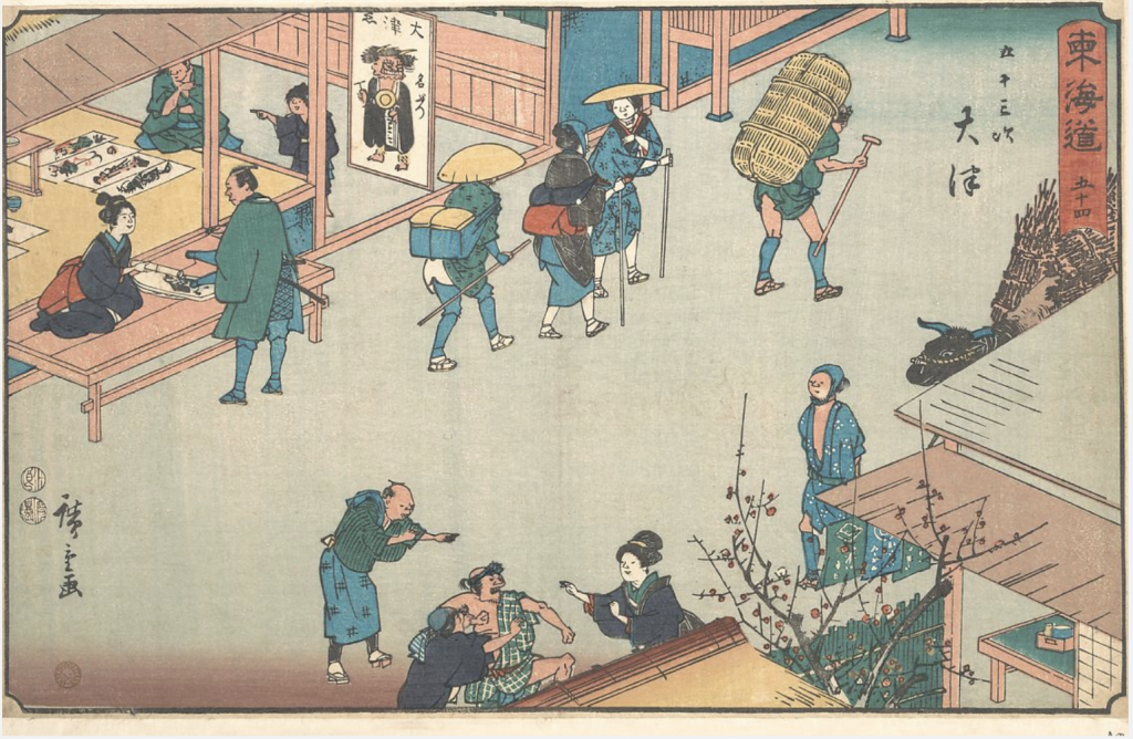
Woodblock printing and ukiyo-e prints developed hand in hand. Woodblock prints were initially used to create replicas of Buddhist and religious scripts. It was only used for text printing and not imagery in its initial conception. However, in 1765 it was discovered that they could use it to print color and imagery. The first version of full colour printed images were used for calendars or Nishiki-e (Moma, n.d). Woodcut prints became popular not only for the ease of duplication and mass production but for their content. A lot of pornographic imagery was printed this way and this was popular with the wealthy population boosting the demand.

Image 3: “OTSU” Depicts a urban scene of everyday life.

Polychrome Prints:

In contrast to regular woodblock print, this method had individual “stamps” for each part of the piece that was of a different color. This allowed them to make full-color prints called polychrome prints. This also created flat imagery which was a key element to this style of artwork.

Image 4: This depics a painting by Van Goh, his Japanese influence is strong in this piece.

Impact of Ukiyo-e on Western Art

These ukiyo-e Prints had a major impact on Western art. Since there was an influx of them in Japan and they were readily available. As trade opened up with the West the prints were used as wrapping paper for objects being sent to Western areas. As the West was exposed to this artwork it began to influence many artists of this time, one of them being Van Goh.

Works cited:

Britannica, The Editors of Encyclopaedia. “ukiyo-e”. Encyclopedia Britannica, 13 Dec. 2013, https://www.britannica.com/art/ukiyo-e. Accessed 28 October 2021.

Metmuseum.org. 2021. Woodblock Prints in the Ukiyo-e Style. [online] Available at: <https://www.metmuseum.org/toah/hd/ukiy/hd_ukiy.htm> [Accessed 28 October 2021].

Images from:

https://www.metmuseum.org/art/collection/search/37358

https://en.wikipedia.org/wiki/Hishikawa_Moronobu

El Lissitzky Zine

I choose to do my zine on El Lissitzky. He was not only a famous typographer but also a designer. I choose to create artwork inspired by his illustration and typography work in the zine. He used a minimal color palette of red, black, and white which I followed in my zine. His work is also geometric and minimal so this is why I choose to include this imagery in the zine. His typography was very free and did not adhere to a consistent or structured format. This is why I have text all over the page and facing different directions. He would ofter arrange his text like this in his own work. Finally, his typography was usually bold, this is why I choose to have thick lines on some of the main content in the zine. 

I give myself a 9/10. I think that I was able to create a zine that reflected his style and provided interesting information about his work and typography. I spend 2.75 hours on this project.

Fede Galiza

Image 1: Untitled

Fede Galiza was born in 1578 in Milan Italy. She was the daughter of an established painter, Annunzio Galiza. Annunzio was a miniature painter and was thought to have taught her how to paint. Fede is regarded as one of the earliest still-life painters in Italy (Encyclopedia, 2021).

Image 2: A glass compote with peaches, jasmine flowers, quinces, and a grasshopper
Image 3: Jacopo Menochio and Margherita Candiani Double Portrait

She received early recognition for her talents at the age of 12. By the time she was a teenager, she had gained international acknowledgment as a portraitist. Her medium for most of her work is oil. One of her works as a portraitist is the double portrait of Jacopo Menochio and Margherita Candiani (image 3). Although she was well known while she was alive, her work was “hidden” as male artists were dominating the art scene. There has been a lot of research into authenticating her paintings and very few are actually attributed to her (London Art Week, n.d). The images that I have compiled are authenticated works of hers.

Image 4: Cherries in a Silver Compote
Image 5: A still life of a porcelain basket of plums and grapes on a stone ledge with pears

In her work, she was known for her extensive attention to detail, her handling of lighting and composition. She was able to create intimate still-life scenes that draw the eye into her artwork. This is why I choose to look into her work. Specifically, Cherries in a Silver Compote (Image 4) was a work that drew me to her. I love her handling of the medium, it looks as if the cherries are real and the composition with the varying elements draws your eye around the piece. It invites you to look at it, and the detail allows you to notice something new every time. It almost creates an atmosphere of looking at something you shouldn’t be.

Works cited:

Images collected from:

http://art-now-and-then.blogspot.com/2017/05/fede-galizia.html

https://www.sothebys.com/en/artists/fede-galizia

” Women in World History: A Biographical Encyclopedia. . Encyclopedia.com. 22 Sep. 2021 .” Encyclopedia.com, Encyclopedia.com, 17 Oct. 2021, https://www.encyclopedia.com/women/encyclopedias-almanacs-transcripts-and-maps/galizia-fede-1578-1630.

“Lavinia Fontana and Fede Galizia.” Lavinia Fontana and Fede Galizia – London Art Week, https://londonartweek.co.uk/fontanaandgalizia/.

Extravagant and Ellusive: Women’s Fashion of the Rococo Period

The Rococo period style was introduced by Louis XV and Mne de Pompoudor. In France, they began to obsess over lavish things which helped develop this style. The Rococo period was said to have been the last aristocratic style of France. Rococo was not limited to fashion but architecture, art, and theatre as well (Muscato, 2019). France was extremely divided during this time, this separation was caused from the imbalance of wealth. There was an exceptionally wealthy ruling class and the extremely impoverished lower class (Muscato, 2019).

Image 1: Rococo Style Dress: Image from : https://fashion.fandom.com/wiki/Rococo

Rococo aroise from the Baroque period. The Baroque period was characterized by supreme ornamentation and emphasis on high dignity. The Rococo style left behind the dignity associated with the style but continued holding high value on wealth and decor (Muscato, 2019). Many aristocrats were no longer required in court so they spent a lot of time hosting parties and enjoying their wealthy lifestyle. Their fashion began to reflect this. For example, in women’s clothes, their robes became looser and more comfortable to reflect the life of relaxation that they possessed (Hisour, n.d). The early development of Rococo fashion was loose and more informal but as the style developed more detail and ordamentation became a part of the style.

Image 2: Ornate Details and Pastel Pallete. Image from:vhttps://zakheath.com/fashion/f/rococo-fashion-and-its-influence-on-neoclassical-style

Before Rococo the style consisted of rich dark fabrics and heavy designs. This was contrasted in the Rococo period. The Rococo fashion became characterized by ornate and intricate patterns. The fabrics were typical of light and pastel colours. The materials of silk, lace, and satin were heavily utilized during this time. The fashion was light and flowy in comparison to the period before it (Hisour, n.d). One specific element that characterized women’s dresses during this time was the Watteau pleat.

Image 3: Watteau Pleats Image from:https://funthinkers.livejournal.com/263857.html

The Watteau pleat extended the hips by utilizing a hoop worn under the skirts. This combined with the pastel colours and light fabric represented the fashion Rococo period. In conclusion, the Rococo Period had an extravagant and exuberant fashion style that was the result of the rich and lavish lifestyle of the aristocrats.

Works Cited:

Images:

https://zakheath.com/fashion/f/rococo-fashion-and-its-influence-on-neoclassical-style

https://funthinkers.livejournal.com/263857.html

https://fashion.fandom.com/wiki/Rococo

Muscato, Christopher. “Take Online Courses. Earn College Credit. Research Schools, Degrees & Careers.”

Study.com | Take Online Courses. Earn College Credit. Research Schools, Degrees & Careers, 2019, https://study.com/academy/lesson/rococo-fashion-history-period-terms.html.

Mood Board Rationale

I enjoyed the mood board project. I thought that it was really interesting to choose and learn about topics of interest across all of the timelines. I choose three topics that I was most interested in learning more about which were Playing cards, Albrecht Duer’s Apocalypse Illustrations, and Grimms Fairytales. I choose to do Print & Storytelling as the overarching topic for my project. I started my project with Albrecht Duer’s apocalypse as I was always interested in his illustrations of the four horsemen. I learned about the control the church had on the output of artists and the religious subject material for his work. I emphasized this point of religious control by including a photo of the Cologne church that is dark, menacing, and overbearing. I learned the most about playing cards from this exercise, I had no idea that the cards were different all over the world and weren’t standardized until France created suits that were made standard through mass printing. This is why I chose to include three images of different cards from different countries to showcase the different designs they each had, and the final suits that were the result of this standarization. Grimms Fairytales were initially popular in Germany but were made available to the masses through the use of the printing press. I choose to include Arthur Rackhams illustrations of Grimms fairytales as he placed high value on ornate books and illustrations which I thought linked with the demand for books and ornate objects during this time. I found that the three elements were all heavily linked to the introduction of the printing press and the demand for luxury artistic work.

I think that I would give myself an 8/10 as I think I had strong research and for the similarities that I had found between the different events. I also think I was able to link three events that don’t seem to go together in a way that was cohesive. I spend around 6 hours researching and developing this project. 

https://projects.invisionapp.com/boards/5742Y6A9FP6/

Andrea Mantegna

I was immediately drawn to Andrea Mantegna’s work after seeing Palazzo Ducale Oculus. This is what attracted me to investigate his career and contributions to art during this period. I choose 5 pieces of his work that resonated with me, not only his most famous works.

Image 1: Palazzo Ducale Oculus

The Palazzo Ducale Oculus was painted on the ceiling of the Camera Delgi Sposi in Mantua Italy (Image 1). His handling of realism and perspective in this piece was very influential during this period and many artists began replicating and studying his use of perspective (Britannica,2021).

Image 2: The Lamentation over the Dead Christ.

Mantegna was known for his execution of foreshortening in his work as well as using roman architecture and statues within his artwork (Art in Tuscany, n.d). His foreshortening is especially prominent in his piece The Lamentation over the Dead Christ (Image 2).

Image 3: Grotesque Self-portrait

This self-portrait is titled “Grotesque Self-portrait”. It is hidden on the décor on the pillars in the Camera Delgi Sposi. He was well known for his handling and technique with the use of fresco (Brittanica, 2021).

Image 4: Minerva Expelling the Vices from the Garden of Virtue

This is Minerva Expelling the Vices from the Garden of Virtue, painted in 1500-02. I loved the color and softness that he achieved in this piece.

Image 5: Madonna of the Victory

Finally, the Madonna of the Victory is a beautiful altarpiece from 1496. Mantegna’s handling of color and composition in this piece is highly regarded. His use of foreshortening and perspective in fresco was studied and used in ceiling decor for 3 centuries after his work was completed (Britannica, 2021).

Works cited:

“Andrea Mantegna, the Lamentation over the Dead Christ: Art in Tuscany: Podere Santa Pia, Holiday House in the South of Tuscany.” Andrea Mantegna, The Lamentation over the Dead Christ | Art in Tuscany | Podere Santa Pia, Holiday House in the South of Tuscany, Art In Tuscany, http://www.travelingintuscany.com/art/andreamantegna/lamentation.htm.

Sheard, Wendy Stedman. “Andrea Mantegna”. Encyclopedia Britannica, 9 Sep. 2021, https://www.britannica.com/biography/Andrea-Mantegna. Accessed 4 October 2021.

“Grotesque Self-Portrait.” Web Gallery of Art, https://www.wga.hu/html_m/m/mantegna/07/2sposi112.html.