She is a designer, typographer illustration, and writer. She grew up in BC, and has her current office on an island off of Vancouver. She started her career as a book typesetter, she then went on to co-found a design studio called Digitopolis. Currently, she now works as a freelance designer and artist.
She published a book called I wonder and it was shortlisted for the British Design of the Year. She has since been published over 100 times in book books and magazines (Marian Bantjes,2022).
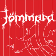
In her work, she relies on an underlying structure. She then builds off of it to create a natural flow within her work. This is shown in the image below. She establishes the text at 3/4 of the pages and uses verticals to structure the title as the main focal point. She then breaks away from this structure for a more dynamic visual.
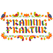
Her type often has a lot of ornamental features. She often works with patterns and repeating shapes as seen in the example below.
Her designs are versatile and her work often incorporates all of her interests. meaning that she blends her illustrative and typography skills in a lot of her work. Her illustrative work often spans into the patterned paper design and card stock. This makes use of her repetitive patterns and shapes that are often used in her work.
Works cited:
Marian Bantjes. 2022. About – Marian Bantjes. [online] Available at: <https://bantjes.com/about/> [Accessed 21 April 2022].
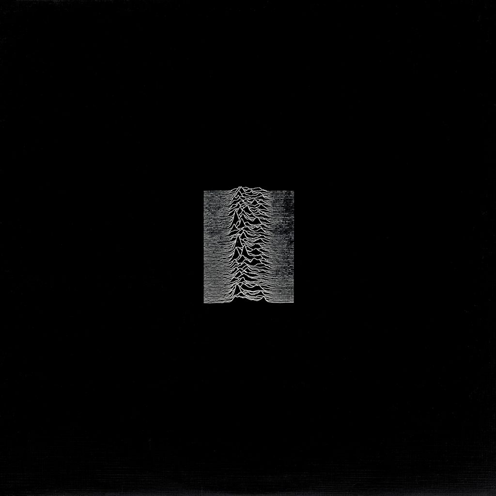
Peter Saville was born in 1955 in Manchester, Lancashire. He began his studies at Manchester Polytechnic for graphic design until 1978. Following his education, he had a meeting with Tony Wilson. Wilson owned Factory records, which was an established record label, and helped secure Saville’s entry into the music design scene. Below is an example of his promotional work for Factory Records (Petridis, 2013).
Saville is most known for his album cover art, a majority of which he completed for artists under Factory Records. His most notable and recognizable imagery was for Joy Divisions album “Unknown Pleasures”. This imagery collected a cult following and had been re-printed and stolen countless times.
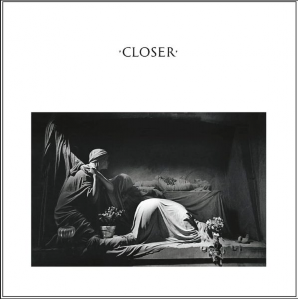
He also created notable work for New Order’s album Blue Monday and another one of Joy Divisions albums “Closer”.
Aside from album covers Saville also worked in branding and as a creative director. He created this spread for Burberry London. Saville had a unique personality that translated into his work.
Following years of album design work, he transitioned to the position of creative director for his hometown council (ArtNet,n.d).
Works Cited:
2022. Peter Saville | Biography, Designs and Facts. [online] Famous Graphic Designers. Available at: <https://www.famousgraphicdesigners.org/peter-saville> [Accessed 11 March 2022].
Artnet.com. 2022. Peter Saville. [online] Available at: <http://www.artnet.com/artists/peter-saville/biography> [Accessed 11 March 2022].
Barbara Stauffacher Solomon was a pioneer of the supergraphics movement and her work.
Barbara and one of her supergraphics
She has worked in the design field for over 70 years. She studied under Armin Hoffmann and this contributed to some of the Swiss elements being present in her work. One of these was her love of Helvetica which she included in her super graphics work often.
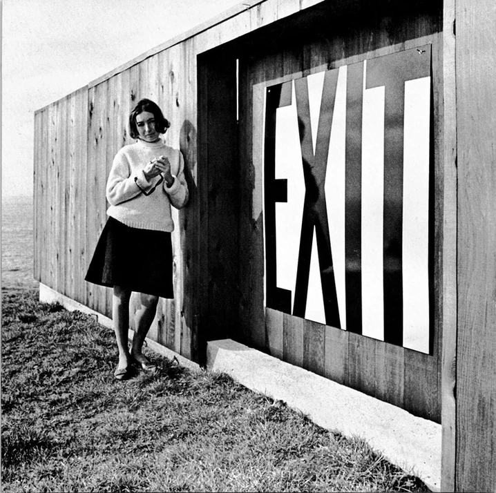
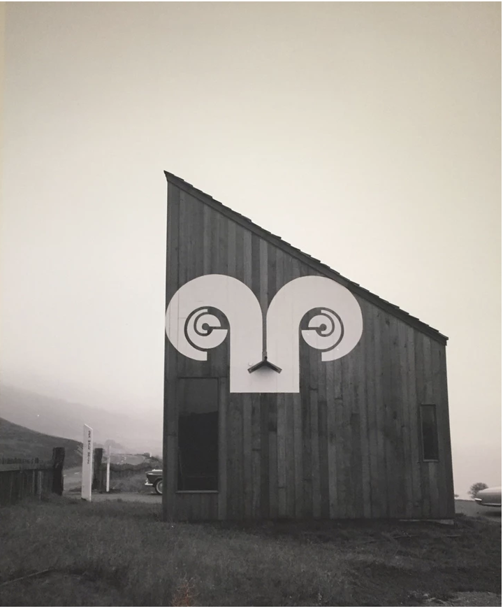
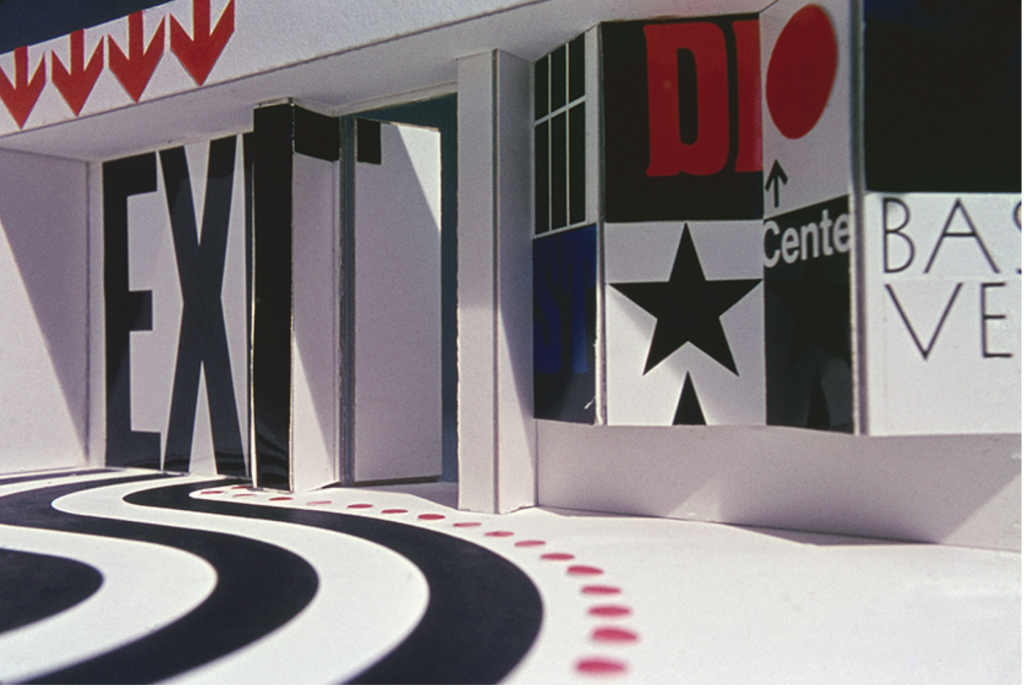
The supergraphics came out of her experimental work on a project for Sea Ranch. She applied graphics on the walls of the building and completely changed the space. One of these graphics was the rams horn logo as shown below.
These large graphics on the wall became known as supergraphics (Williamson,2021). This won her an award from the American Institute of architects and she continued her career in design from here (Segran,2021).
She was able to blend together architecture, landscapes, and graphic design to create her unique visuals. I think that she has created a super fun and bold style. I love the look of the large graphics in interiors it adds a distinct 70’s feel and ties together the room.
Lateral Objects. 2022. [online] Available at: <https://www.lateralobjects.com/post/city-survival-bar-dress-code-guide> [Accessed 3 March 2022].
Segran, E., 2022. The most influential designer you’ve never heard of is a 92-year-old artist in SF. [online] Fast Company. Available at: <https://www.fastcompany.com/90655404/the-most-influential-designer-youve-never-heard-of-is-a-92-year-old-artist-in-sf> [Accessed 3 March 2022].
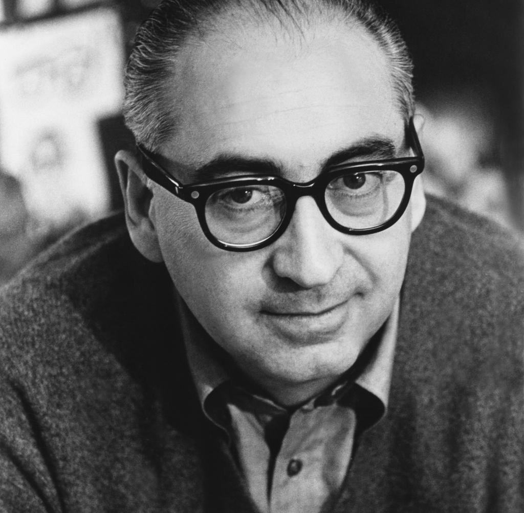
Waldemar Swierzy is a polish designer and professor. He was born on September 9th, 1931 in Katowice.
He studied at the academy of fine arts in Cracow and then became the head of the design studio at the higher school of fine arts in Poznan. After this he was the chairman of the international poster biennial and the head of the poster studio in Warsaw. Aside from his professional design career he also lectured at many universities (Culture.Pl,n.d).
He is most known for his poster work. He was won many awards such as the Grand Prix Toulouse-Lautrec award for his poster the Red Inn or Czerwona Oberża as shown below.
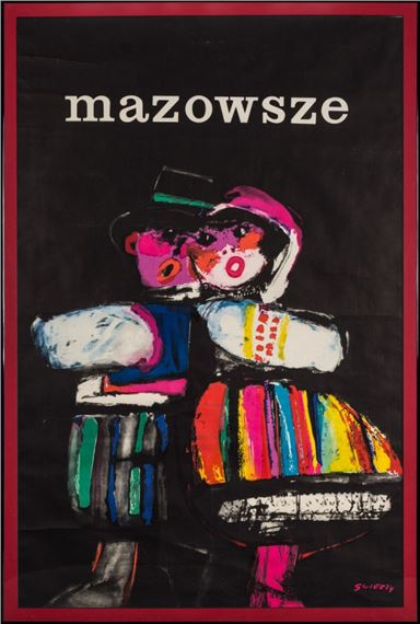
Swierzy has created over 1500 posters in his career for films, records, and icons in pop culture. His poster work was extremely successful, the Mazowsze poster for example has been printed over a million times.
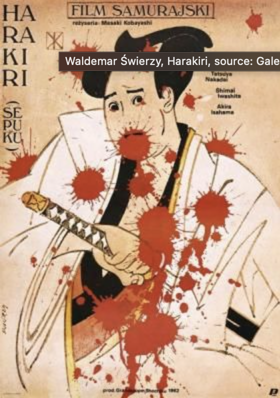
As his career developed so did his techniques on his posters. He developed a painting-like style. He had a fluid expression in his work that was easily identifiable. He then moved on to following art nouveau and gestural influences in his work.
His portraiture work was where he made a big name for himself. The hyperrealism combined with his personal flair developed into the style that is is most associated with. He designed over 250 portraits though his career. A lot of these pieces were for record sleeves or printed posters. He used a combination of mash-ups of different elements and colors to create his expressionistic style.
Saul Bass was born May 8th, 1920 in New York. He is most known for his graphic design work and his work as a filmmaker. He created new and imaginative film title sequences that were fresh expressive to audiences (Brittannica,2021).
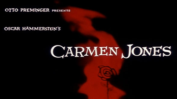
His career started with him drawing as a child and then at the Art Students League in New York. He then went on to Brooklyn College where he studied under George Kepes a well-known designer. After his education, he continued to work in graphic design, specifically in advertising. He slowly began to integrate his work into Hollywood by designing posters for upcoming movies. His most notable piece was the poster he designed for Carmen Jones. The director was so taken back by his work he immediately asked him to design the opening credits for the film. This was the first instance of him designing credits that would become his signature. He received his big break with The Man with the Golden Arm when he animated the opening sequence that secured his reputation and launched his career. He worked alongside many famous filmmakers notably Alfred Hichocks films, he designed almost all of the titles for those films (Brittanica,2021).
His style is characterized by his use of simple geometric shapes. He utilized a lot of symbolism in his work as well. His work was often hand-rendered, there were hand-cut and drawn elements that contributed to his style (Miller, 2019). This hand-cut quality is shown in his piece Anatomy of a Murder.
His filmmaking career was equally successful he received an academy award for best documentary (short subject) in 1969 for his film Why Man Creates. He also received around 8+ awards and nominations for his fieldwork (IMDb).
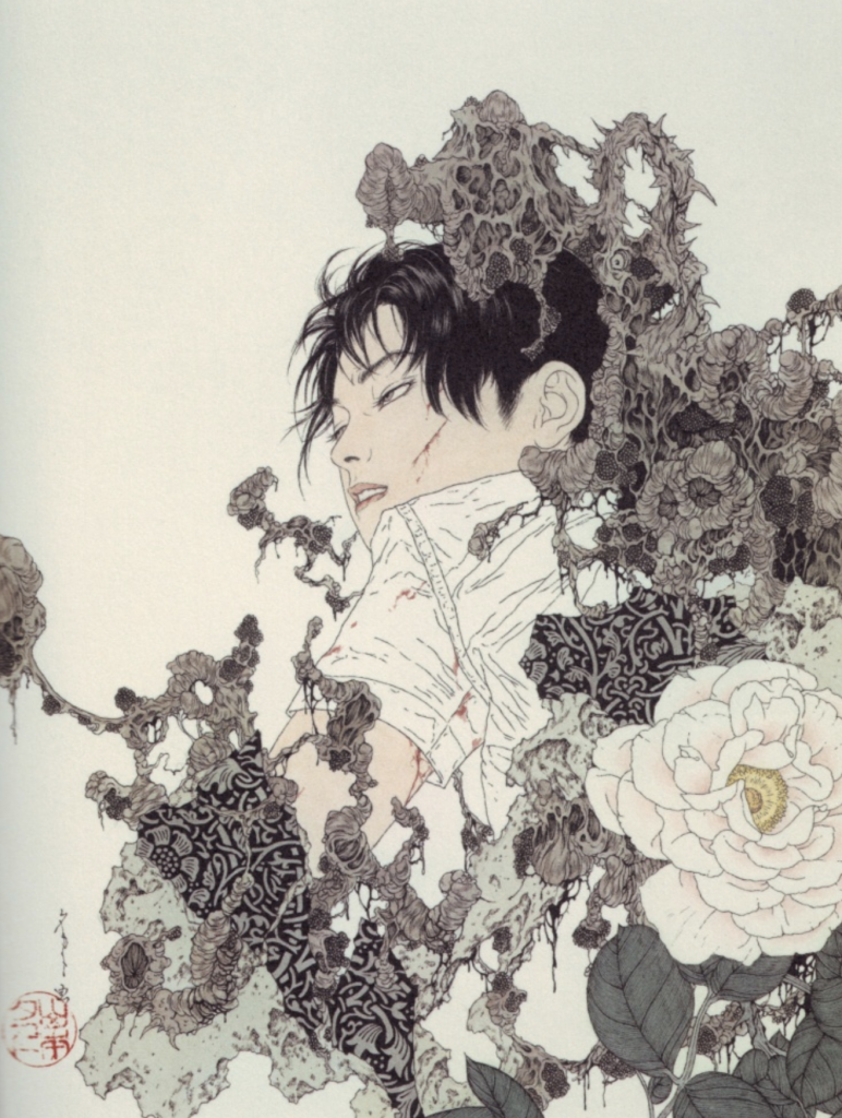
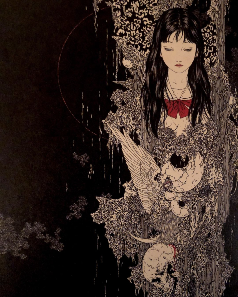
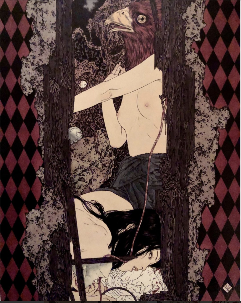
For the final blog post of this year, I decided to write on one of my favorite artists Takato Yamamoto.
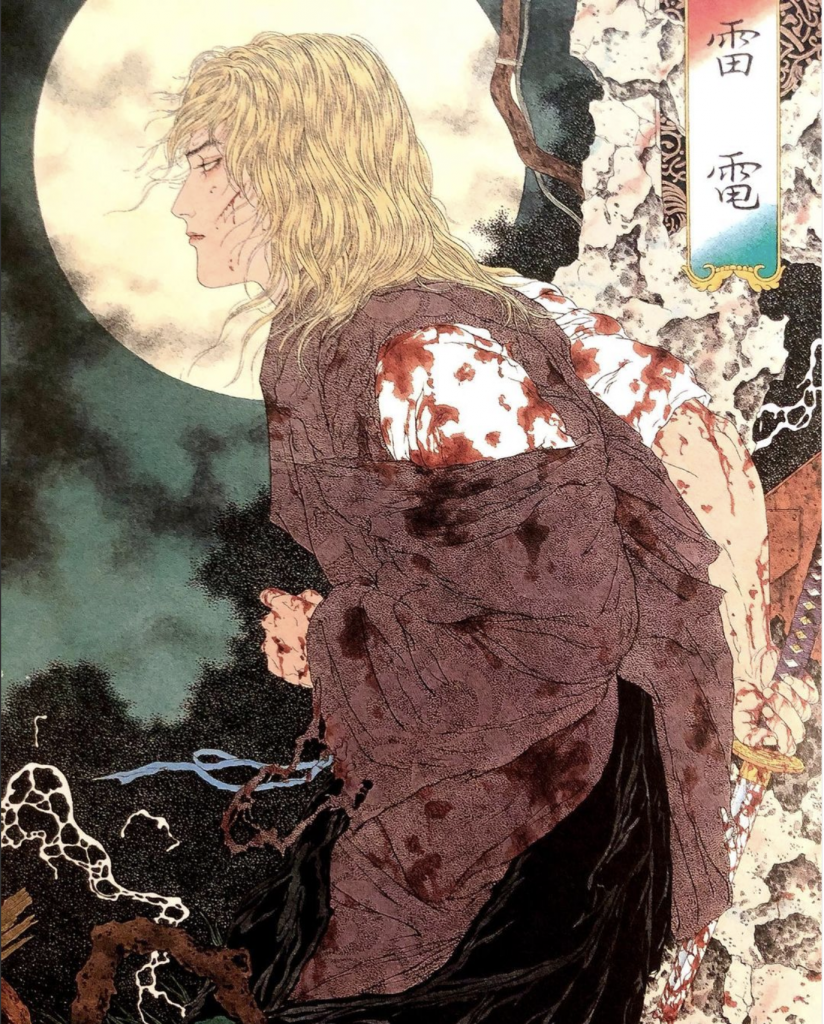
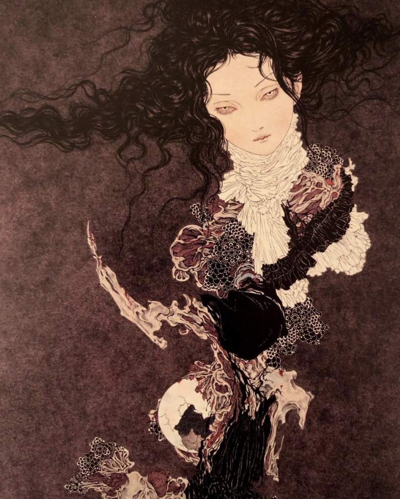
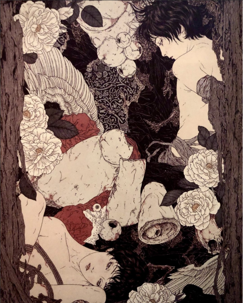
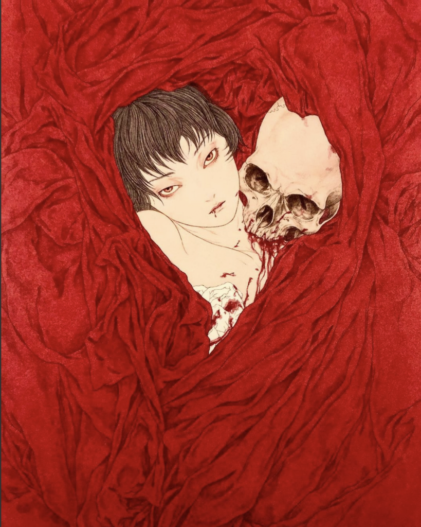
Takato Yamamoto was born on January 15th, 1960 in Japan. There is little information on his personal life online. He graduated from Tokyo Zokei University with a degree in painting (Wikiart). His work is strongly influenced by the Japanese ukiyo-e style. After working with the ukiyo-e style for some time he created “Heisei estheticism”. Heisei estheticism was a term he coined himself to describe his personal style. It blends Japanese ukiyo-e prints, Japanese pop-art, and western gothic art (Asia Contemporary art). After developing his signature style he had his first exhibition in 1998 titled “Heisei Esthetics”. His work has been used to illustrate many books and he’s had many personal shows. This is pretty much all the information on Yamamoto’s personal life but I think his work speaks for itself. It’s dark, and often has themes of rebirth, metamorphosis, brutality, death, and eroticism. His work is extremely detailed and he’s able to create intense narratives in his work. Often they reveal a scene just before a brutal event, it is almost a premonition of what’s to come. It’s seductive and makes you want to look at it even though you feel like you shouldn’t. He creates a variety of subjects in his work but it ranges from soft-brutality to complete brutality being depicted in scenes. He’s done hundreds of illustrations and I love looking through his work. Even though he’s done so many pieces his work isn’t repetitive, each piece still tells its own story. Below are a few of my favorite pieces:
Works cited:
Asia Contempoaty Art. 2021. [online] Available at: <https://www.asiacontemporaryart.com/artists/artist/Takato_Yamamoto/en/> [Accessed 15 December 2021].
Wikiart. 2021. Takato Yamamoto – 33 artworks – illustration. [online] Available at: <https://www.wikiart.org/en/takato-yamamoto> [Accessed 15 December 2021].
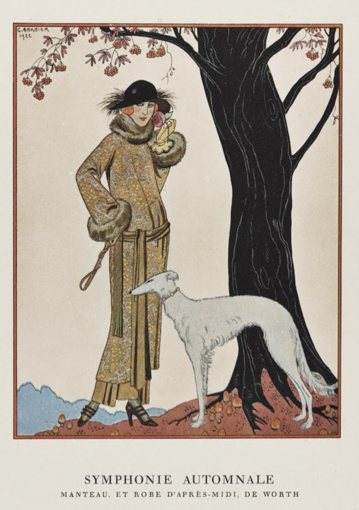
Known for their flamboyant and elegant style George Barbier is an amazing French illustrator.
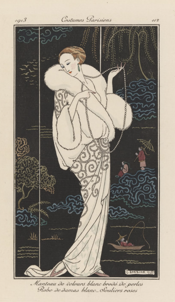
Barbier was born on October 16th, 1882 in France. He had a very successful career at an early age. He had his first show at age 29 in 1911 (Wikiart, 2021). This show offered him great exposure and his commissions began to fly in following his show. His work often depicted illustrations of costumes and fashion. He would create illustrations with posed models and clothing such as the one below:
The subject matter varied but it typically included women in fashionable attire and/or costumes. It is very embellished with details in the clothing, often showing patterns of folds in the fabric. His style reminds me a lot of Japanese ukiyo-e prints. He also uses the flat perspective and colors that are evident in the Japanese counterparts. His work usually doesn’t have an elaborate background and focuses attention on the figures or elements in the foreground. Even his posing of some women such as this one below, heavily resembles those of Ukiyo-e Prints. I think it’s very interesting to see how different artistic elements can show up in work from all around the world. Since I’ve learned about Ukiyo-e prints I can now identify similar elements in other work. I would’ve been able to see these similarities without learning about them in this course.
Barbier didn’t exclusively draw fashion but as his career developed he explored wallpaper, jewelry, and glass designing as well. He was also regularly featured in the L’Illustration which contributed to his success. He is called one of the most influential french illustrators of his time (Google Arts & Culture, 2021).
I thoroughly enjoyed his work. I love the expression that he’s able to create in his work through posing and composition. The character and personality of his subjects shine through his work.
Works cited:
Google Arts & Culture. 2021. George Barbier – Google Arts & Culture. [online] Available at: <https://artsandculture.google.com/entity/george-barbier/m0m7c4?hl=en> [Accessed 10 December 2021].
Wikiart. 2021. George Barbier – 21 artworks – illustration. [online] Available at: <https://www.wikiart.org/en/george-barbier> [Accessed 10 December 2021].
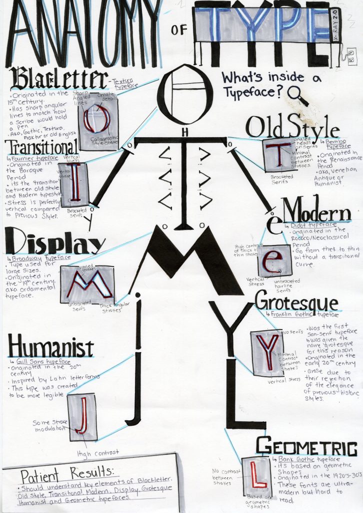
For this assignment, we had to create a type identification poster. We had to design an engaging visual that included important and informative content surrounding typefaces. I choose to theme my poster and make it about the anatomy of type. This theme dictated all of the choices for this poster. Since it was anatomy themed I choose to arrange letters from each of the typefaces I was discussing into a skeleton. This would create a visual that resembled a typical anatomical chart. I then choose to pull out each letter into an x-ray machine to dissect or ‘look’ inside each typeface. Then each letter would be dissected for key defining points of the typeface. I tried to keep the text lighter as I wanted to focus mostly on the visual elements. I created a small patient summary at the end as a fun way to wrap up the content of the poster. I kept the color palate blue to match surgical elements and to match typical x-ray scans. I also wrote the headings of each style of type in an example of that typeface. This helped differentiate each style of type and create a more dynamic visual for the viewer to engage with.
I would give myself an 8.5/10. My original idea wasn’t very creative and I feel like I was able to overcome this. I really enjoyed the process. The only reason that I think I didn’t get full marks is that some of the text isn’t straight and visually appealing, I also forgot the k in blackletter. I would’ve also wanted stronger colors but I lacked the materials to do so. I spend around 7 hours with research and drawing time.
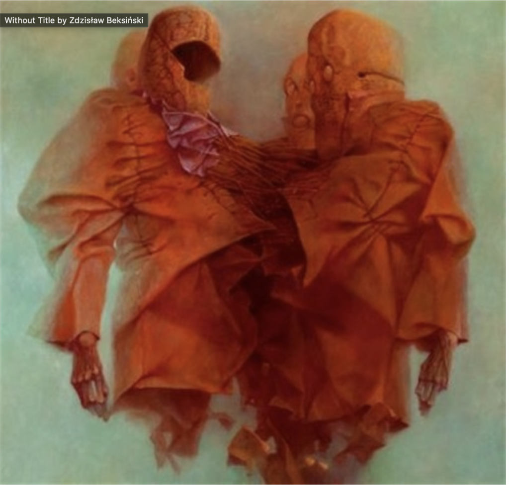
Zdzislaw Beksinski was a Polish surrealist painter. He was born in Sanok in 1929. He is most known for his surreal and dystopian imagery (Artnet,n.d).
He had no formal art training and initially studied architecture. He began his artistic career creating sculptures and working on photography. He then used his photography to venture into painting. He used his photography as a tool and base for his paintings (Culture Trip,n.d). His life and artistic career ended abruptly and tragically when he was stabbed to death by a teenager when he refused to give them money (Culture Trip,n.d).
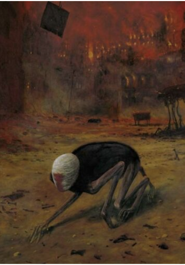
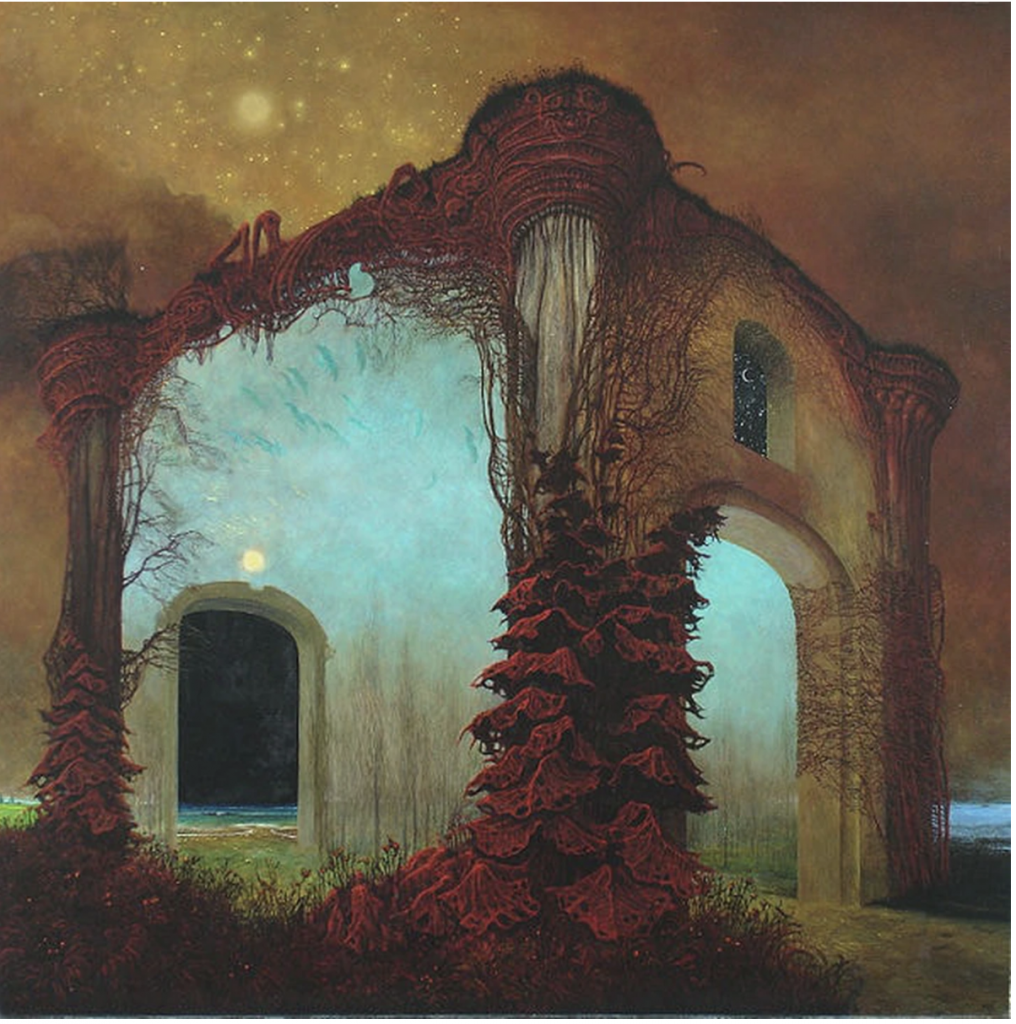
His work shows immense care for mood and tone. His work has an otherworldly nature to it. All of his pieces are painted so well that the scenes seem real. He has said that he paints as if he was photographing his dreams (Culture, n.d). This surreal and dreamlike trance he creates with paint is beautifully eerie. He is able to create an ambiance in his work, it draws the viewer in. Some of his work is able to give you the feeling that you’ve found something that you shouldn’t have. They all have a slightly unsettling undertone to them which makes them all the more intriguing.
I am very interested in surrealist paintings. I love horror, sci-fi, and fantastical elements. I like looking at something that is only available in the mind of someone else. Meaning that Beksinski is offering an insight into his mind – what he sees and imagines he’s able to share with us on canvas. The scenes and objects he creates are unique to him, no one else would be able to create the same piece. They are so unsettling that they draw you in further, you notice more and more elements in each piece. I’ve looked at the pieces I’ve chosen many times but everytime I find a new detail or shape that he’s hidden in his work.
I am very passionate and interested in psychology and understanding the human psyche. This is what drew me to write my blog on Sigmund Freud. He is well known and controversial but his work on The Interpretation of Dreams is exceptionally interesting.
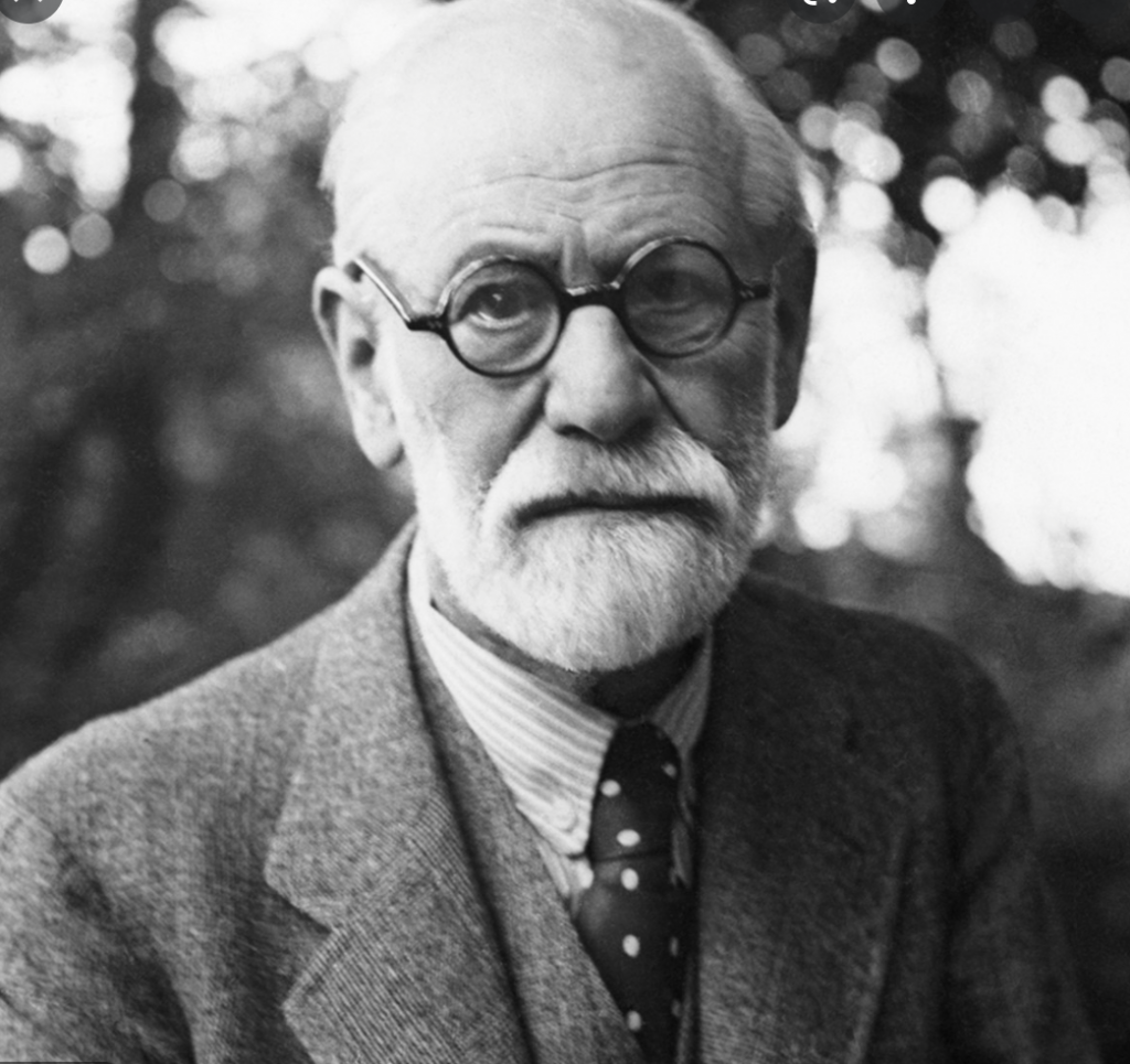
Image 1: Sigmund Freud
Freud was born in 1856, in Moravia (Britannica,n.d). He is well known for his contributions and writings on the human psyche and his interpretations and ideas on society. He was met with a lot of criticism for his work. Regardless of his criticisms, I think it’s fascinating to learn about someone else view and ideas on the world, specifically in his publishing of The interpretation of Dreams.
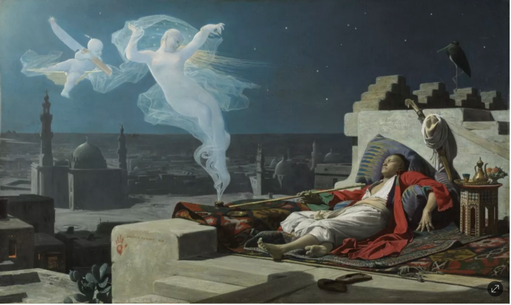
Image 2: Jean Lecomte du Nouÿ, A Eunuch’s Dream, 1874.
The Interpretation of Dreams was published in 1913. His ideas had an immense effect on 20th-century culture. I won’t delve into all of the content of his book but highlight a few interesting points that I found.
He wrote the book after his father passed away. It was thought that this event triggered him to delve into the unconscious (Encyclopedia.com,n.d). He believes that dreams have inherent meaning and that you are able to understand them using scientific methods. This has received harsh criticism, but he insists that all dreams have an underlying purpose.
Image 3: By Salvador Dali, he is an icon for surrealism and dreamscapees
Dreams draw from three sources. Firstly experiences from the day before. Second somatic sources, this would be like going to sleep hungry and having a dream about eating a meal. The third is childhood experiences being recalled (Encyclopedia.com,n.d).
Freud also delves into dreamwork, which is the process of dream formation. The first element of dreamwork is condensation. Condensation is when multiple ideas, objects, subjects, etc are combined into a single entity. One entity can have multiple meanings, it’s a mash-up of your subconscious (Encyclopedia.com,n.d). The second element is displacement. Displacement is where something is standing in for the real object, it’s a substitute for the real thing. The third element is representation. Representation is ideas that are communicated in nonverbal ways. Freud uses these elements to explain how a person’s dream is formed. Each element could be used to make sense of the seemingly random and unnatural nature of our dreams. Even though I only read a small portion I’m very interested in continuing on with his book (Encyclopedia.com,n.d).
Works Cited:
Encyclopedia.com. 2021. The Interpretation of Dreams | Encyclopedia.com. [online] Available at: <https://www.encyclopedia.com/arts/culture-magazines/interpretation-dreams> [Accessed 17 November 2021].
Jay, Martin Evan. “Sigmund Freud”. Encyclopedia Britannica, 1 Oct. 2021, https://www.britannica.com/biography/Sigmund-Freud. Accessed 16 November 2021.