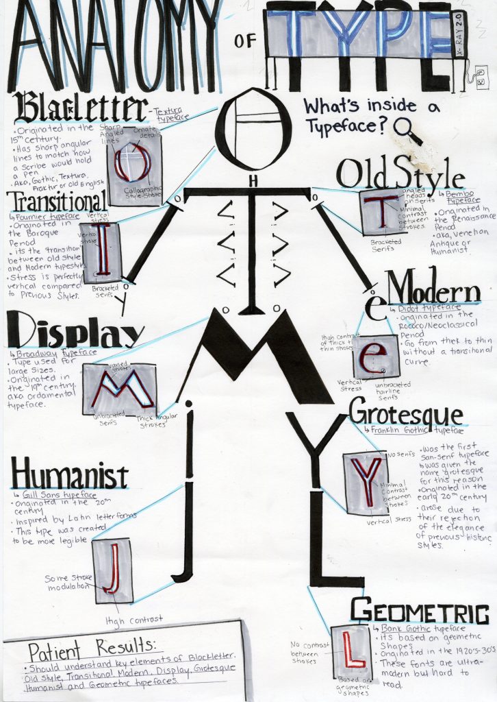
For this assignment, we had to create a type identification poster. We had to design an engaging visual that included important and informative content surrounding typefaces. I choose to theme my poster and make it about the anatomy of type. This theme dictated all of the choices for this poster. Since it was anatomy themed I choose to arrange letters from each of the typefaces I was discussing into a skeleton. This would create a visual that resembled a typical anatomical chart. I then choose to pull out each letter into an x-ray machine to dissect or ‘look’ inside each typeface. Then each letter would be dissected for key defining points of the typeface. I tried to keep the text lighter as I wanted to focus mostly on the visual elements. I created a small patient summary at the end as a fun way to wrap up the content of the poster. I kept the color palate blue to match surgical elements and to match typical x-ray scans. I also wrote the headings of each style of type in an example of that typeface. This helped differentiate each style of type and create a more dynamic visual for the viewer to engage with.
I would give myself an 8.5/10. My original idea wasn’t very creative and I feel like I was able to overcome this. I really enjoyed the process. The only reason that I think I didn’t get full marks is that some of the text isn’t straight and visually appealing, I also forgot the k in blackletter. I would’ve also wanted stronger colors but I lacked the materials to do so. I spend around 7 hours with research and drawing time.