George Barbier – Survey 9

Known for their flamboyant and elegant style George Barbier is an amazing French illustrator.
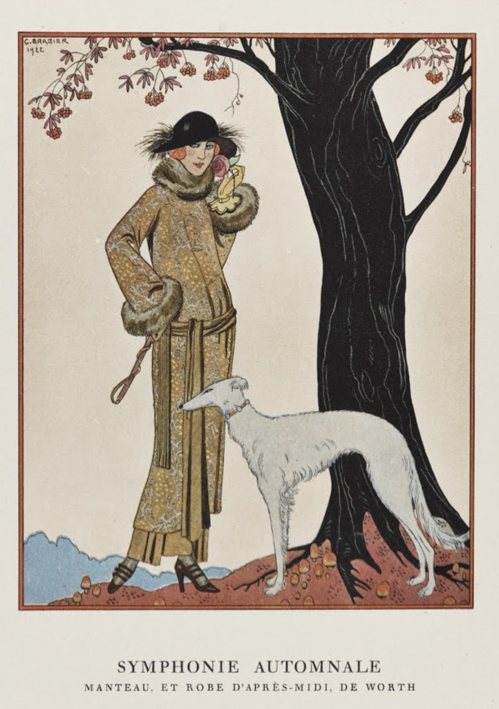

Barbier was born on October 16th, 1882 in France. He had a very successful career at an early age. He had his first show at age 29 in 1911 (Wikiart, 2021). This show offered him great exposure and his commissions began to fly in following his show. His work often depicted illustrations of costumes and fashion. He would create illustrations with posed models and clothing such as the one below:
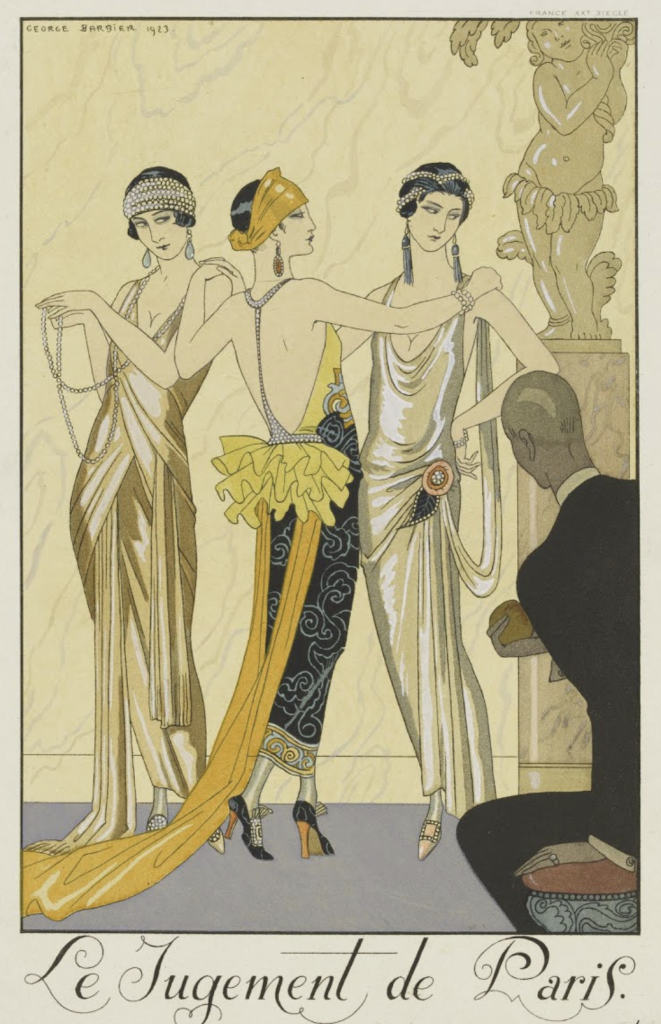

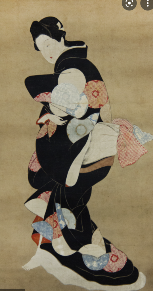
The subject matter varied but it typically included women in fashionable attire and/or costumes. It is very embellished with details in the clothing, often showing patterns of folds in the fabric. His style reminds me a lot of Japanese ukiyo-e prints. He also uses the flat perspective and colors that are evident in the Japanese counterparts. His work usually doesn’t have an elaborate background and focuses attention on the figures or elements in the foreground. Even his posing of some women such as this one below, heavily resembles those of Ukiyo-e Prints. I think it’s very interesting to see how different artistic elements can show up in work from all around the world. Since I’ve learned about Ukiyo-e prints I can now identify similar elements in other work. I would’ve been able to see these similarities without learning about them in this course.
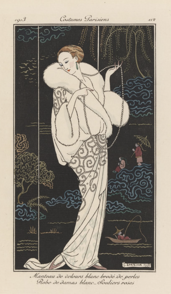
Barbier didn’t exclusively draw fashion but as his career developed he explored wallpaper, jewelry, and glass designing as well. He was also regularly featured in the L’Illustration which contributed to his success. He is called one of the most influential french illustrators of his time (Google Arts & Culture, 2021).

I thoroughly enjoyed his work. I love the expression that he’s able to create in his work through posing and composition. The character and personality of his subjects shine through his work.

Works cited:

Google Arts & Culture. 2021. George Barbier – Google Arts & Culture. [online] Available at: <https://artsandculture.google.com/entity/george-barbier/m0m7c4?hl=en> [Accessed 10 December 2021].

Wikiart. 2021. George Barbier – 21 artworks – illustration. [online] Available at: <https://www.wikiart.org/en/george-barbier> [Accessed 10 December 2021].

Images from

https://artsandculture.google.com/entity/george-barbier/m0m7c4?hl=en
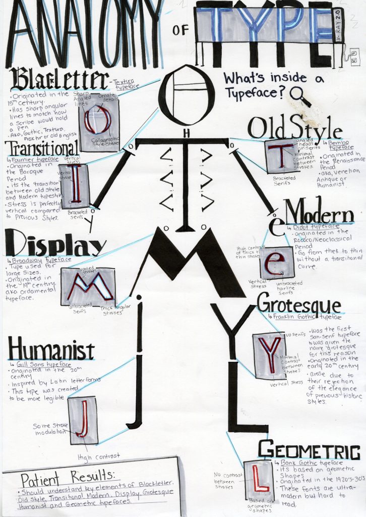
Type Identification Poster

Anatomy of Type Poster

For this assignment, we had to create a type identification poster. We had to design an engaging visual that included important and informative content surrounding typefaces. I choose to theme my poster and make it about the anatomy of type. This theme dictated all of the choices for this poster. Since it was anatomy themed I choose to arrange letters from each of the typefaces I was discussing into a skeleton. This would create a visual that resembled a typical anatomical chart. I then choose to pull out each letter into an x-ray machine to dissect or ‘look’ inside each typeface. Then each letter would be dissected for key defining points of the typeface. I tried to keep the text lighter as I wanted to focus mostly on the visual elements. I created a small patient summary at the end as a fun way to wrap up the content of the poster. I kept the color palate blue to match surgical elements and to match typical x-ray scans. I also wrote the headings of each style of type in an example of that typeface. This helped differentiate each style of type and create a more dynamic visual for the viewer to engage with.

I would give myself an 8.5/10. My original idea wasn’t very creative and I feel like I was able to overcome this. I really enjoyed the process. The only reason that I think I didn’t get full marks is that some of the text isn’t straight and visually appealing, I also forgot the k in blackletter. I would’ve also wanted stronger colors but I lacked the materials to do so. I spend around 7 hours with research and drawing time.

Sigmund Freud – The Interpretation of Dreams

I am very passionate and interested in psychology and understanding the human psyche. This is what drew me to write my blog on Sigmund Freud. He is well known and controversial but his work on The Interpretation of Dreams is exceptionally interesting.

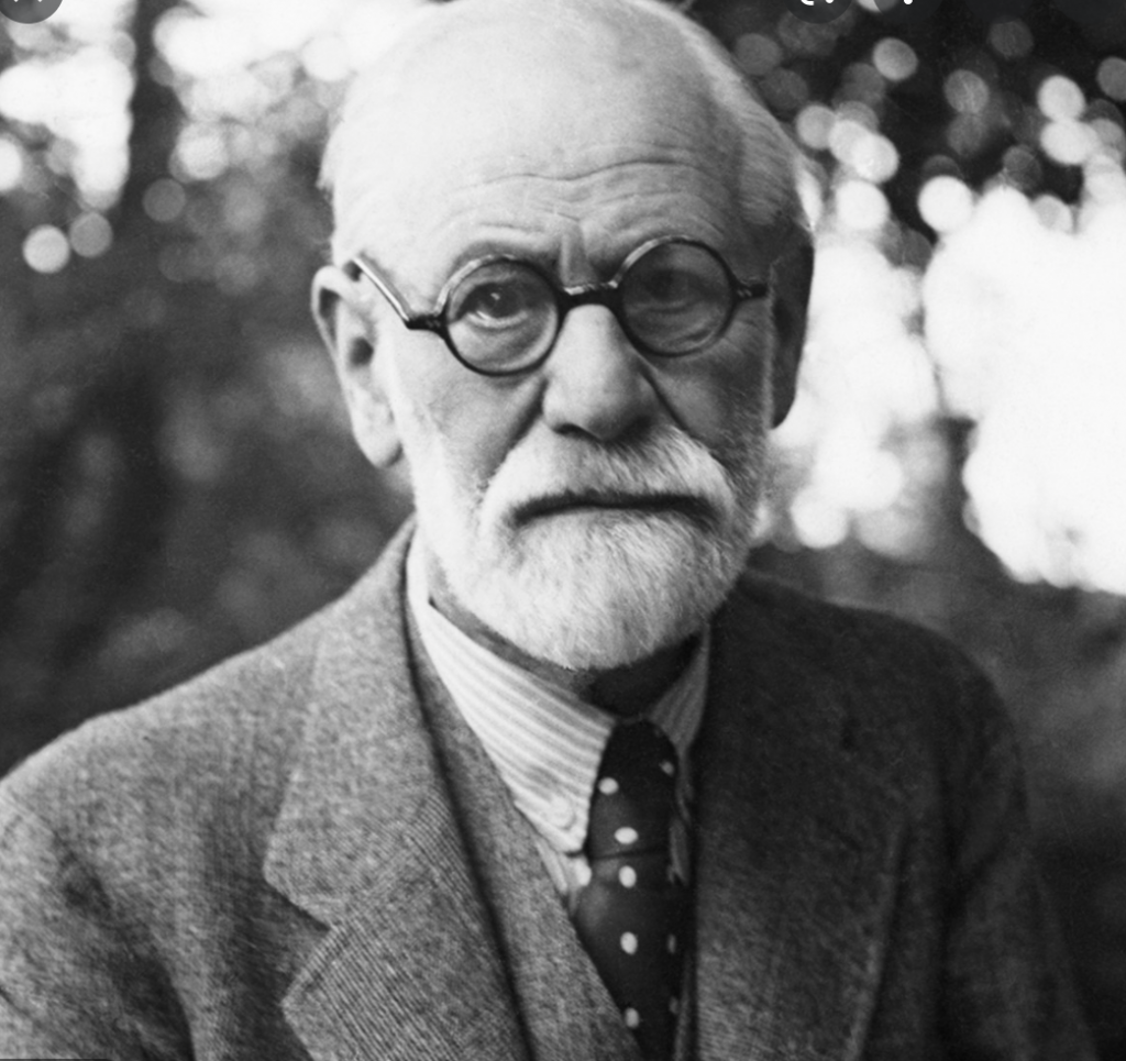
Image 1: Sigmund Freud

Freud was born in 1856, in Moravia (Britannica,n.d). He is well known for his contributions and writings on the human psyche and his interpretations and ideas on society. He was met with a lot of criticism for his work. Regardless of his criticisms, I think it’s fascinating to learn about someone else view and ideas on the world, specifically in his publishing of The interpretation of Dreams.

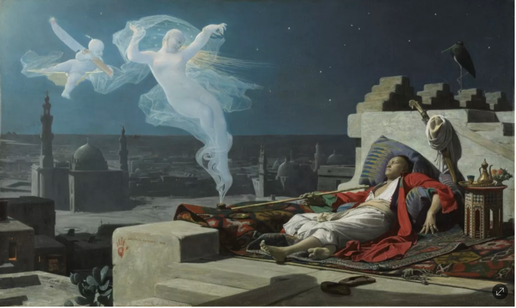
Image 2: Jean Lecomte du Nouÿ, A Eunuch’s Dream, 1874.

The Interpretation of Dreams was published in 1913. His ideas had an immense effect on 20th-century culture. I won’t delve into all of the content of his book but highlight a few interesting points that I found.

He wrote the book after his father passed away. It was thought that this event triggered him to delve into the unconscious (Encyclopedia.com,n.d). He believes that dreams have inherent meaning and that you are able to understand them using scientific methods. This has received harsh criticism, but he insists that all dreams have an underlying purpose.

Image 3: By Salvador Dali, he is an icon for surrealism and dreamscapees

Dreams draw from three sources. Firstly experiences from the day before. Second somatic sources, this would be like going to sleep hungry and having a dream about eating a meal. The third is childhood experiences being recalled (Encyclopedia.com,n.d).

Freud also delves into dreamwork, which is the process of dream formation. The first element of dreamwork is condensation. Condensation is when multiple ideas, objects, subjects, etc are combined into a single entity. One entity can have multiple meanings, it’s a mash-up of your subconscious (Encyclopedia.com,n.d). The second element is displacement. Displacement is where something is standing in for the real object, it’s a substitute for the real thing. The third element is representation. Representation is ideas that are communicated in nonverbal ways. Freud uses these elements to explain how a person’s dream is formed. Each element could be used to make sense of the seemingly random and unnatural nature of our dreams. Even though I only read a small portion I’m very interested in continuing on with his book (Encyclopedia.com,n.d).

Works Cited:

Encyclopedia.com. 2021. The Interpretation of Dreams | Encyclopedia.com. [online] Available at: <https://www.encyclopedia.com/arts/culture-magazines/interpretation-dreams> [Accessed 17 November 2021].

Jay, Martin Evan. “Sigmund Freud”. Encyclopedia Britannica, 1 Oct. 2021, https://www.britannica.com/biography/Sigmund-Freud. Accessed 16 November 2021.

Images from

https://www.biography.com/scholar/sigmund-freud

https://www.artsy.net/article/artsy-editorial-art-historys-iconic-depictions-dreams-renaissance-surrealism

Historical Artifact

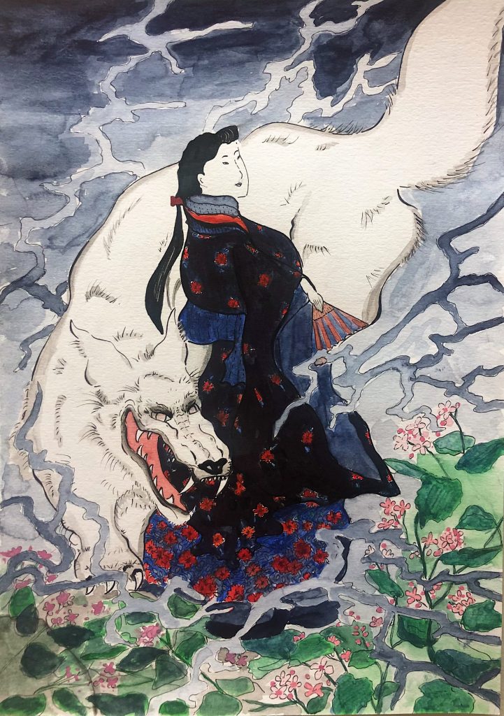
Image 1: My version of a Ukiyo-e Print (up close)

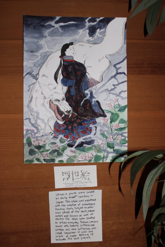
I wanted to create my own version of a ukiyo-e print for the historical artifact project. I choose to depict a wolf and a geisha in the typical Japanese style. I used fine liners and watercolors to create my image. Ukiyo-e prints are traditionally done using wood block printing by carving out each element. I choose to use a simpler method as I don’t have any of those tools available to me. I wanted to focus on replicating the art style and main components of the subject matter instead. I spend around 6.5 hours on this project. I would give myself a 9/10 as I think I was able to create my own print in the traditional style that fits with the time period. I also choose to photograph it as thought it was hanging on someones wall, including the museum tag with the Japanese kanji for “ukiyo-e print” with it. I think I could’ve improved on making the colors flatter in the piece to match it closer to the original look. I also could’ve used a sepia or yellow wash over the paper and museum label to make it look like it was from that time period.

Image 2: The historical artifact post (in museum format)

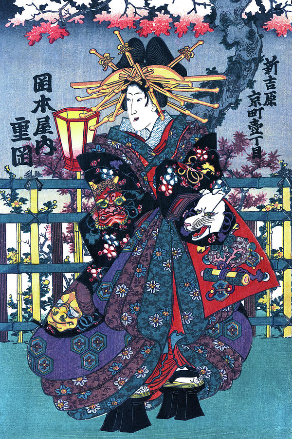
I used many different reference photos to create my image. I specifically looked into Utagawa Kuniteru, Kamada Matahachi and Utagawa Kuniyoshi’s work as inspiration for this project. Below are some of these reference photos. I drew upon the colour palate, subject matter and dynamic flow of the composition to create my piece.

Geisha, Courtesan Shigeoka, Restored Antique Ukiyo-e Color Japanese  Woodblock Print Painting by Orchard Arts
Image from https://pixels.com/featured/geisha-courtesan-shigeoka-restored-antique-ukiyo-e-color-japanese-woodblock-print-orchard-arts.html
V&A · Japanese Woodblock Prints (Ukiyo E)
Image from https://www.vam.ac.uk/articles/japanese-woodblock-prints-ukiyo-e

image By Kamada Matahachi from https://asia.si.edu/object/S2004.3.167/
image by Utagawa Kuniyoshi from https://www.allposters.com/-st/Utagawa-Kuniyoshi-Posters_c76507_.htm

Works cited:

Britannica, The Editors of Encyclopaedia. “ukiyo-e”. Encyclopedia Britannica, 13 Dec. 2013, https://www.britannica.com/art/ukiyo-e. Accessed 11 November 2021.

The Beauty of the Floating World

Japanese Ukiyo-e Prints – Origins

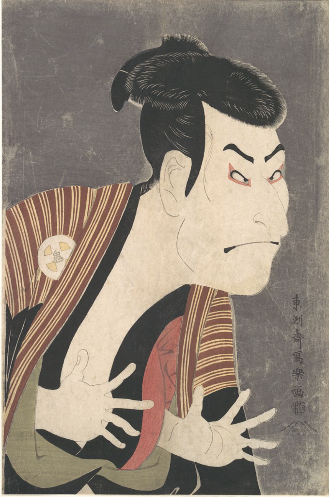
Image 1: Kabuki Actor Ōtani Oniji III as Yakko Edobei. This is a very popular image, it represents the ukiyo-e style well as it depicts an actor in character for a kabuki play.

Ukiyo-e means “pictures of the floating world”. This is a style of art that was popularized with the development of woodblock printing. This style of artwork had a range of subjects but commonly depicted people of the court, prostitutes, kabuki actors and scenes, and erotica (Britannica,n.d). The subject matter then shifted to the urban everyday scenes as the style developed.

Image 2: Artwork by Hishikawa Moronobu

Hishikawa Moronobu – The first Ukiyo-e Artist

Hishikawa Moronbu is regarded as the father of ukiyo-e artworks. He was originally an embroiderer but became an illustrator for books. This was during the time when woodblock printing became accessible. This made mass printing of images available to all. With this new printing medium, he began to depict urban and domestic scenes of the Edo people (Britannica, n.d).

Development of Woodblock prining and Ukiyo-e Style

Woodblock printing and ukiyo-e prints developed hand in hand. Woodblock prints were initially used to create replicas of Buddhist and religious scripts. It was only used for text printing and not imagery in its initial conception. However, in 1765 it was discovered that they could use it to print color and imagery. The first version of full colour printed images were used for calendars or Nishiki-e (Moma, n.d). Woodcut prints became popular not only for the ease of duplication and mass production but for their content. A lot of pornographic imagery was printed this way and this was popular with the wealthy population boosting the demand.

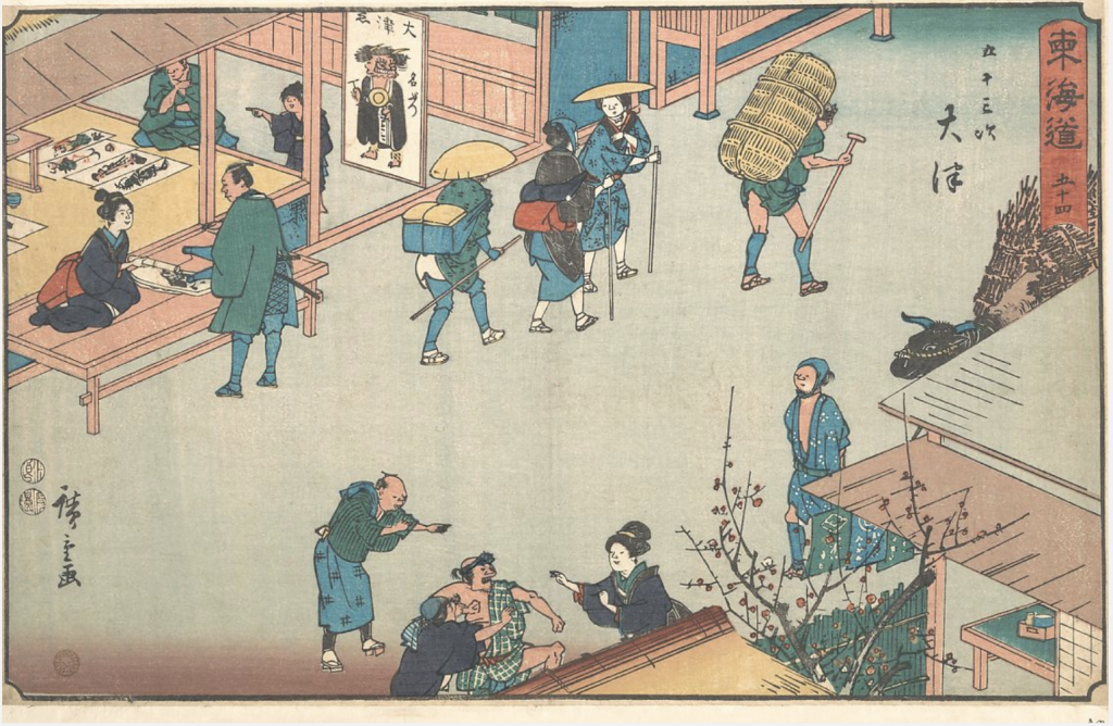
Image 3: “OTSU” Depicts a urban scene of everyday life.

Polychrome Prints:

In contrast to regular woodblock print, this method had individual “stamps” for each part of the piece that was of a different color. This allowed them to make full-color prints called polychrome prints. This also created flat imagery which was a key element to this style of artwork.

Image 4: This depics a painting by Van Goh, his Japanese influence is strong in this piece.

Impact of Ukiyo-e on Western Art

These ukiyo-e Prints had a major impact on Western art. Since there was an influx of them in Japan and they were readily available. As trade opened up with the West the prints were used as wrapping paper for objects being sent to Western areas. As the West was exposed to this artwork it began to influence many artists of this time, one of them being Van Goh.

Works cited:

Britannica, The Editors of Encyclopaedia. “ukiyo-e”. Encyclopedia Britannica, 13 Dec. 2013, https://www.britannica.com/art/ukiyo-e. Accessed 28 October 2021.

Metmuseum.org. 2021. Woodblock Prints in the Ukiyo-e Style. [online] Available at: <https://www.metmuseum.org/toah/hd/ukiy/hd_ukiy.htm> [Accessed 28 October 2021].

Images from:

https://www.metmuseum.org/art/collection/search/37358

https://en.wikipedia.org/wiki/Hishikawa_Moronobu

El Lissitzky Zine

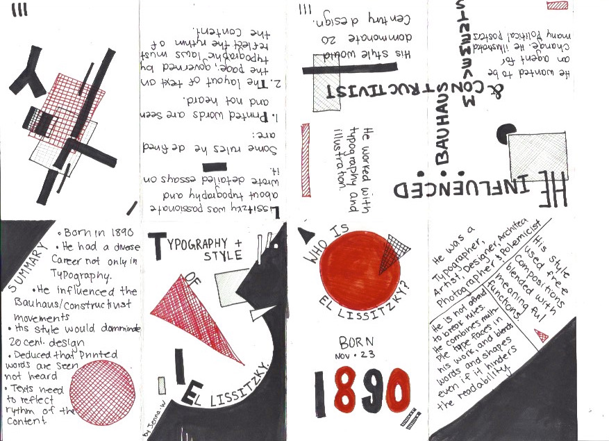
I choose to do my zine on El Lissitzky. He was not only a famous typographer but also a designer. I choose to create artwork inspired by his illustration and typography work in the zine. He used a minimal color palette of red, black, and white which I followed in my zine. His work is also geometric and minimal so this is why I choose to include this imagery in the zine. His typography was very free and did not adhere to a consistent or structured format. This is why I have text all over the page and facing different directions. He would ofter arrange his text like this in his own work. Finally, his typography was usually bold, this is why I choose to have thick lines on some of the main content in the zine. 

I give myself a 9/10. I think that I was able to create a zine that reflected his style and provided interesting information about his work and typography. I spend 2.75 hours on this project.

Extravagant and Ellusive: Women’s Fashion of the Rococo Period

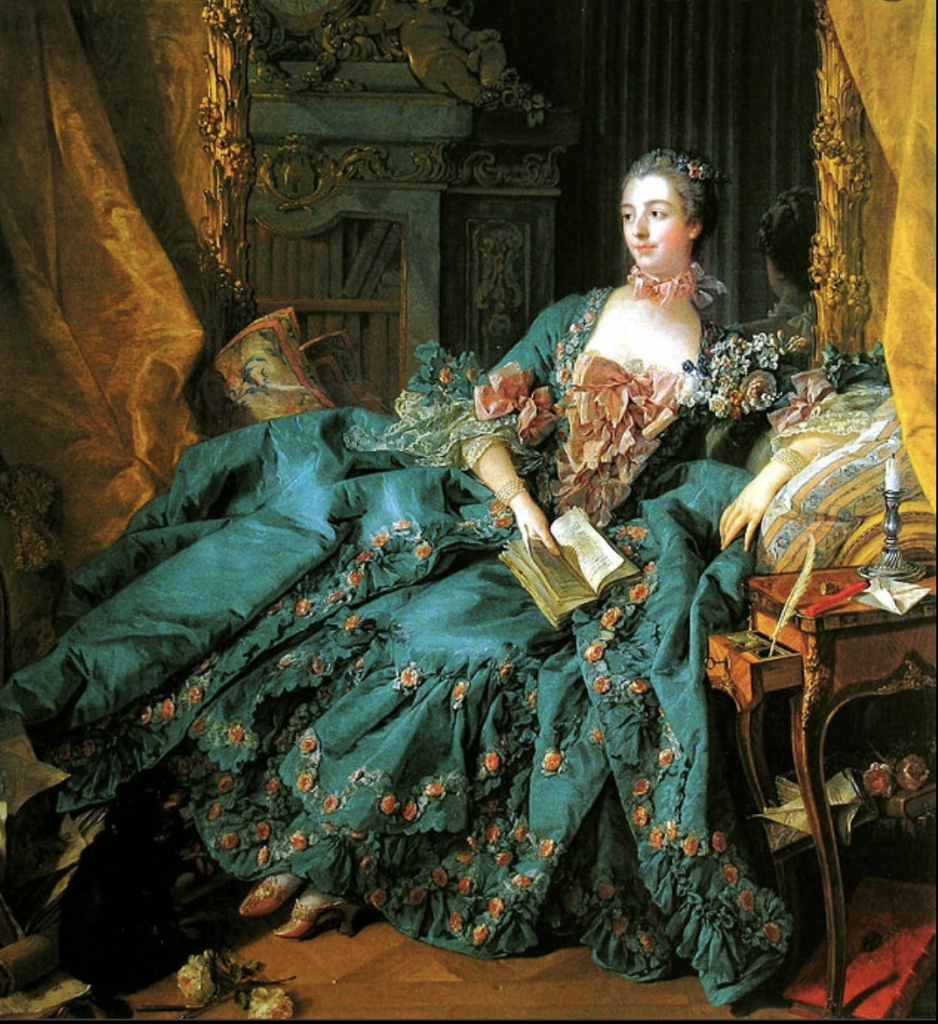
The Rococo period style was introduced by Louis XV and Mne de Pompoudor. In France, they began to obsess over lavish things which helped develop this style. The Rococo period was said to have been the last aristocratic style of France. Rococo was not limited to fashion but architecture, art, and theatre as well (Muscato, 2019). France was extremely divided during this time, this separation was caused from the imbalance of wealth. There was an exceptionally wealthy ruling class and the extremely impoverished lower class (Muscato, 2019).

Image 1: Rococo Style Dress: Image from : https://fashion.fandom.com/wiki/Rococo

Rococo aroise from the Baroque period. The Baroque period was characterized by supreme ornamentation and emphasis on high dignity. The Rococo style left behind the dignity associated with the style but continued holding high value on wealth and decor (Muscato, 2019). Many aristocrats were no longer required in court so they spent a lot of time hosting parties and enjoying their wealthy lifestyle. Their fashion began to reflect this. For example, in women’s clothes, their robes became looser and more comfortable to reflect the life of relaxation that they possessed (Hisour, n.d). The early development of Rococo fashion was loose and more informal but as the style developed more detail and ordamentation became a part of the style.

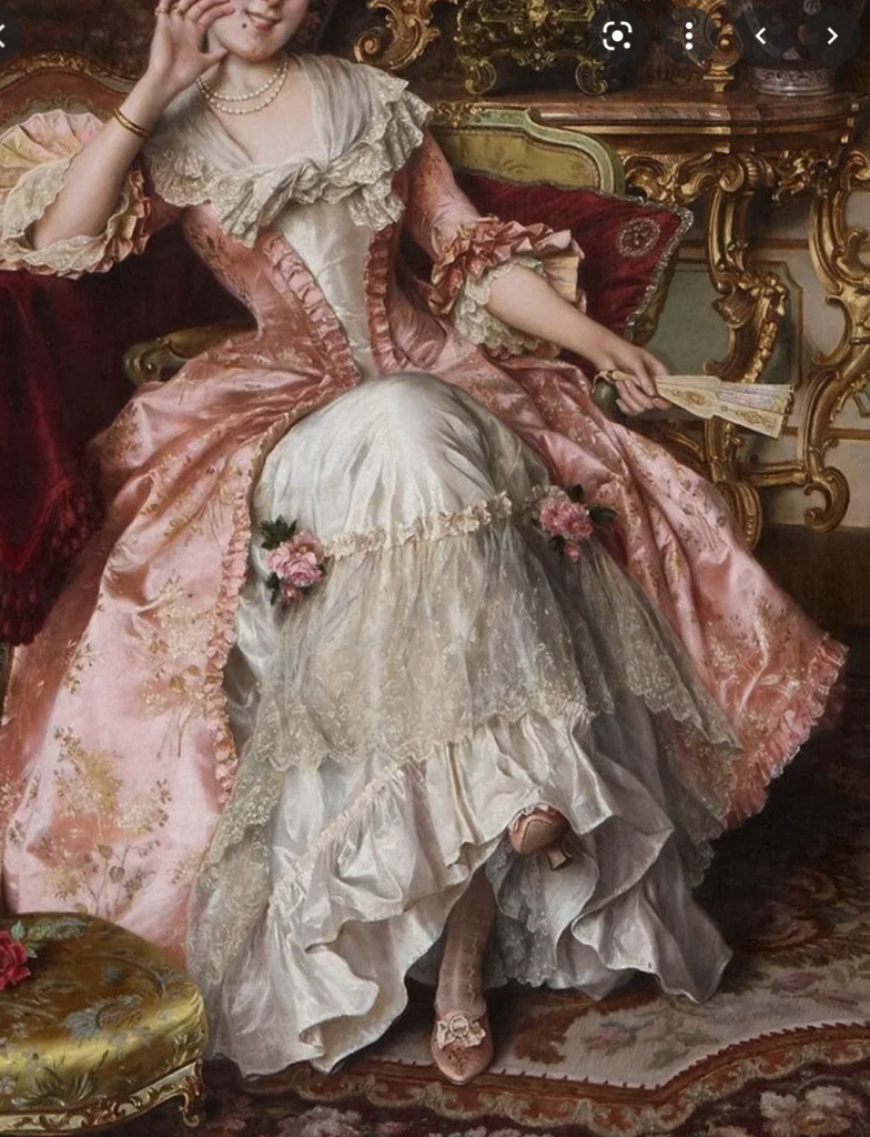
Image 2: Ornate Details and Pastel Pallete. Image from:vhttps://zakheath.com/fashion/f/rococo-fashion-and-its-influence-on-neoclassical-style

Before Rococo the style consisted of rich dark fabrics and heavy designs. This was contrasted in the Rococo period. The Rococo fashion became characterized by ornate and intricate patterns. The fabrics were typical of light and pastel colours. The materials of silk, lace, and satin were heavily utilized during this time. The fashion was light and flowy in comparison to the period before it (Hisour, n.d). One specific element that characterized women’s dresses during this time was the Watteau pleat.

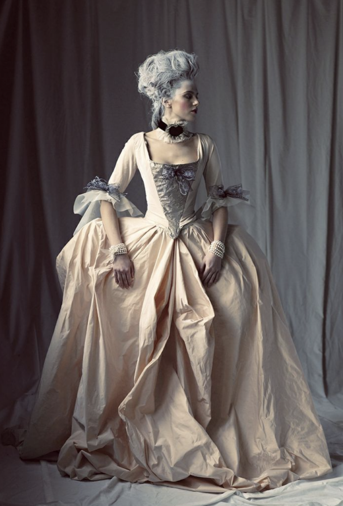
Image 3: Watteau Pleats Image from:https://funthinkers.livejournal.com/263857.html

The Watteau pleat extended the hips by utilizing a hoop worn under the skirts. This combined with the pastel colours and light fabric represented the fashion Rococo period. In conclusion, the Rococo Period had an extravagant and exuberant fashion style that was the result of the rich and lavish lifestyle of the aristocrats.

Works Cited:

Images:

https://zakheath.com/fashion/f/rococo-fashion-and-its-influence-on-neoclassical-style

https://funthinkers.livejournal.com/263857.html

https://fashion.fandom.com/wiki/Rococo

Muscato, Christopher. “Take Online Courses. Earn College Credit. Research Schools, Degrees & Careers.”

Study.com | Take Online Courses. Earn College Credit. Research Schools, Degrees & Careers, 2019, https://study.com/academy/lesson/rococo-fashion-history-period-terms.html.

Mood Board Rationale

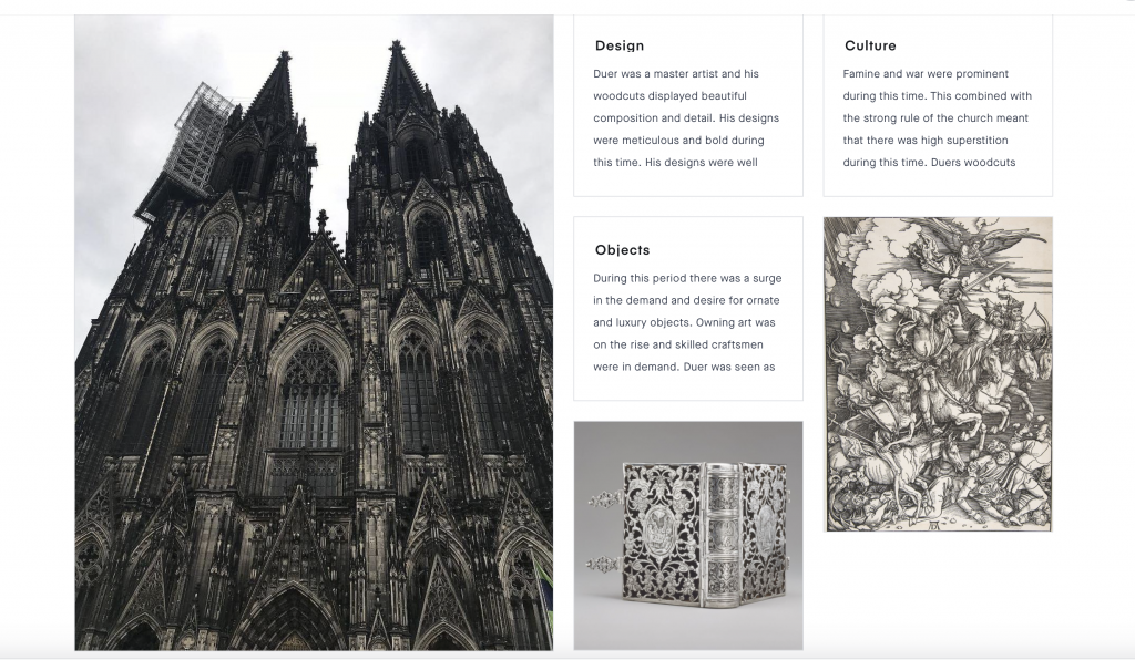
I enjoyed the mood board project. I thought that it was really interesting to choose and learn about topics of interest across all of the timelines. I choose three topics that I was most interested in learning more about which were Playing cards, Albrecht Duer’s Apocalypse Illustrations, and Grimms Fairytales. I choose to do Print & Storytelling as the overarching topic for my project. I started my project with Albrecht Duer’s apocalypse as I was always interested in his illustrations of the four horsemen. I learned about the control the church had on the output of artists and the religious subject material for his work. I emphasized this point of religious control by including a photo of the Cologne church that is dark, menacing, and overbearing. I learned the most about playing cards from this exercise, I had no idea that the cards were different all over the world and weren’t standardized until France created suits that were made standard through mass printing. This is why I chose to include three images of different cards from different countries to showcase the different designs they each had, and the final suits that were the result of this standarization. Grimms Fairytales were initially popular in Germany but were made available to the masses through the use of the printing press. I choose to include Arthur Rackhams illustrations of Grimms fairytales as he placed high value on ornate books and illustrations which I thought linked with the demand for books and ornate objects during this time. I found that the three elements were all heavily linked to the introduction of the printing press and the demand for luxury artistic work.

I think that I would give myself an 8/10 as I think I had strong research and for the similarities that I had found between the different events. I also think I was able to link three events that don’t seem to go together in a way that was cohesive. I spend around 6 hours researching and developing this project. 

https://projects.invisionapp.com/boards/5742Y6A9FP6/

Need help navigating the afterlife?

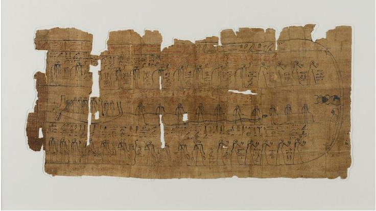
Books of the dead are ancient Egyptian texts that are designed to protect and aid the deceased through the afterlife. There are multiple different versions such as Coffin texts, pyramid texts, and many more. These books were traditionally buried with the deceased and originally thought to represent their worthiness to enter paradise. The earliest found record of these texts dates back to 2400 BCE (Britannica, n.d).

Image 1: Sheet from a Book Of The Dead (Brooklyn Museum, Charles Edwin Wilbour Fund)

The Book of the Dead is a papyrus scroll that is intended to attain immortality (Gala, 0:025-0:035). These books of the dead were traditionally reserved for pharos and those of high standing called pyramid texts. The texts were thought to depict their royalty and status to prove they are worthy to enter paradise. However, it became common practice and it was thought that regular people could also make it to the afterlife if they could pay and successfully navigate the underworld. The books that non-royalty possessed were called coffin texts (Warren, n.d).

Coffin texts are spells and incantations contained in a scroll. They are a version of the book of the dead, one that was for non-royalty. These spell books were put inside their tombs and were thought to be able to assist them in navigating and passing all of the tests of the afterlife. An individual can use these tools to help persuade the gods to let them into paradise. There is a series of tests that one must pass to achieve entrance to paradise. The book of the dead is intended to aid their passing of these tests and help them pass judgment (Warren, n.d). A famous recorded example of this journey is that of Ani.

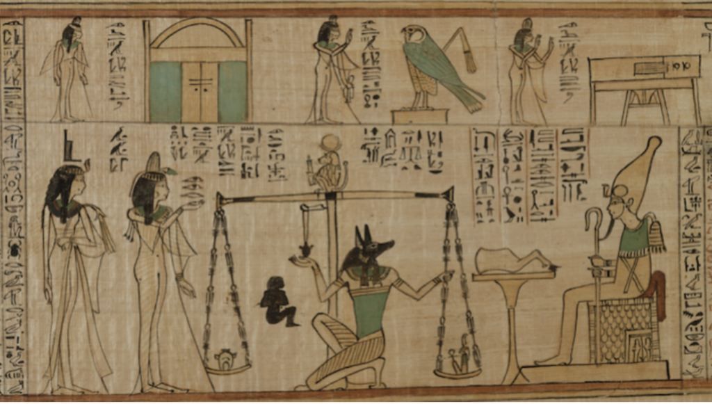
Image 2: Weighing of the soul (The Metropolitan Museum of Art, Rogers Fund, 1930)

The video by Tejal Gala offered an engaging visual for the story of Ani and his book of the dead. It outlined the story of Ani and his descent into the afterlife. Ani uses his scroll of the dead to navigate the underworld and convince the gods that he is worthy to enter paradise. Equipped with the scroll he is able to pass all of the tests of the afterlife, such as proving to 42 accessor gods that he has lived a righteous life (Gala, 2:21-2:30). Ani’s path finally leads to him weighing his heart against a feather (Refer to image 2). If his heart weighs heavier than that of the feather, he would be devoured by Ammit.

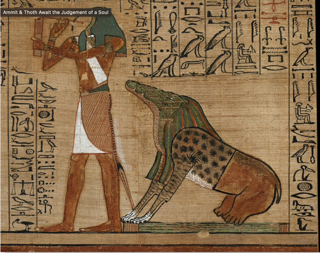
Image 3: Ammit the part hippo, crocodile, and leopard (World History Encyclopedia)

Ammit is a part hippo, part crocodile, and part leopard creature. It is a creature that devours the soul of the individual if their heart is too heavy with sins from their lifetime.  Finally, after passing this final test and avoiding being eaten by Ammit, Ani is allowed to enter paradise where he will cultivate a plot of land for the rest of his time and be reunited with his deceased family (Gala, 3:41-3:55).

Works Cited:

Image 3: “Ammit & Thoth Await the Judgement of a Soul.” World History Encyclopedia, UNESCO Archives, https://www.worldhistory.org/image/12848/ammit–thoth-await-the-judgement-of-a-soul/.

Britannica, The Editors of Encyclopaedia. “Book of the Dead”. Encyclopedia Britannica, 22 Sep. 2017, https://www.britannica.com/topic/Book-of-the-Dead-ancient-Egyptian-text. Accessed 30 September 2021.

Gala, Tejal, director. The Egyptian Book of the Dead: A Guidebook for the Underworld, Youtube, 31 Oct. 2016, https://www.youtube.com/watch?v=1yv_MXNYbAo.

Image 1 & 2: Warren, Kellie. “Book of the Dead: A Guidebook to the Afterlife.” ARCE, American Research Center in Egypt, https://www.arce.org/resource/book-dead-guidebook-afterlife.

Project Yearbook Spread

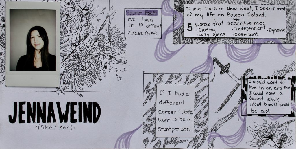
The first assignment that we received for IDES 141 was to create a “Yearbook Spread”. 

I chose to execute the project using my favorite medium – fineliners. I love using black and white and decided to accent it with my favorite colour which is lilac. I grew up surrounded by nature and plants which is why I gravitate towards florals so I wanted to include this in my imagery. I also added a katana for emphasis on the alternate era I would want to live in since it would be pretty cool to have one.

I tend to keep to myself which is why I choose to put my personal answers to the questions in boxes. Then have some of the contents erupt on the page represents how I can be more outgoing and expressive once I leave my inner space. The box contents and the linework are all different over the page as I wanted to show that I offer many different sides to my personality some of which don’t always harmonize with each other. I also included a lot of fluidity and movement as I have traveled and moved around a lot. I think it represents how dynamic and ever-changing my environment has been.

I would give myself a 7/10, the reasoning behind this is because I think my work does get a bit busy. There is a lot going on and I think that I would’ve preferred to have it more minimal and streamlined. I also think that my lettering can be improved, I would want to have it stylized and more consistent and clean throughout. I feel I also could’ve handled my whitespace better, it looks a little empty on the page. I spent around 4-4.5 hours creating this project.