Takato Yamamoto

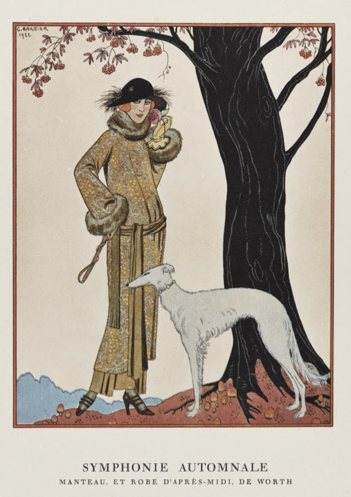
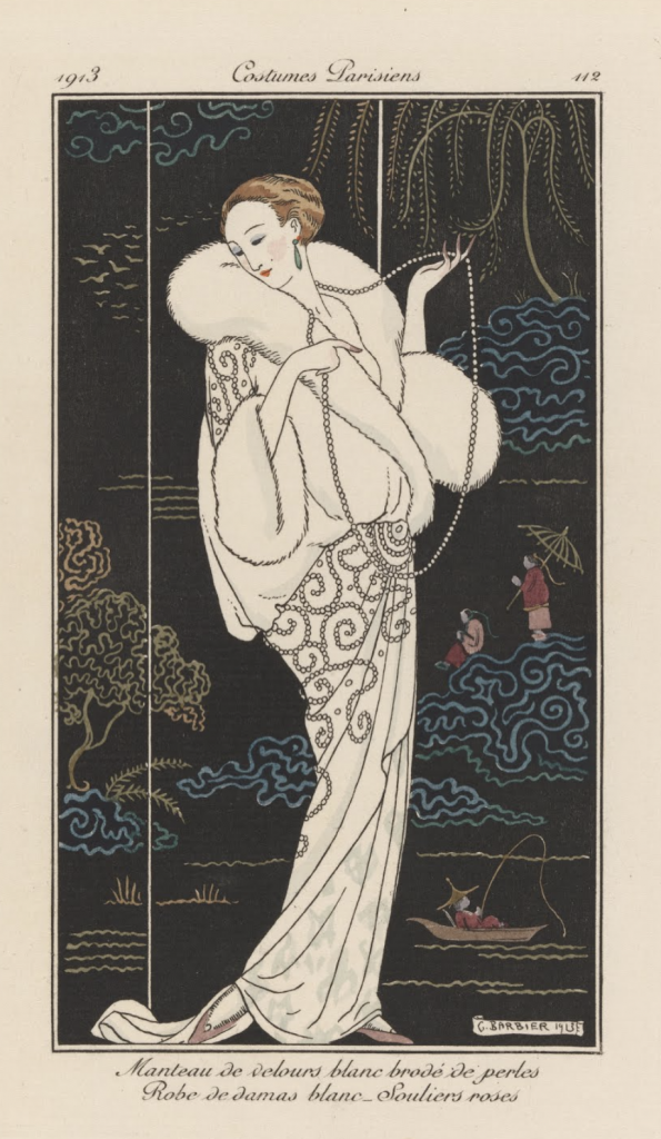
For the final blog post of this year, I decided to write on one of my favorite artists Takato Yamamoto.

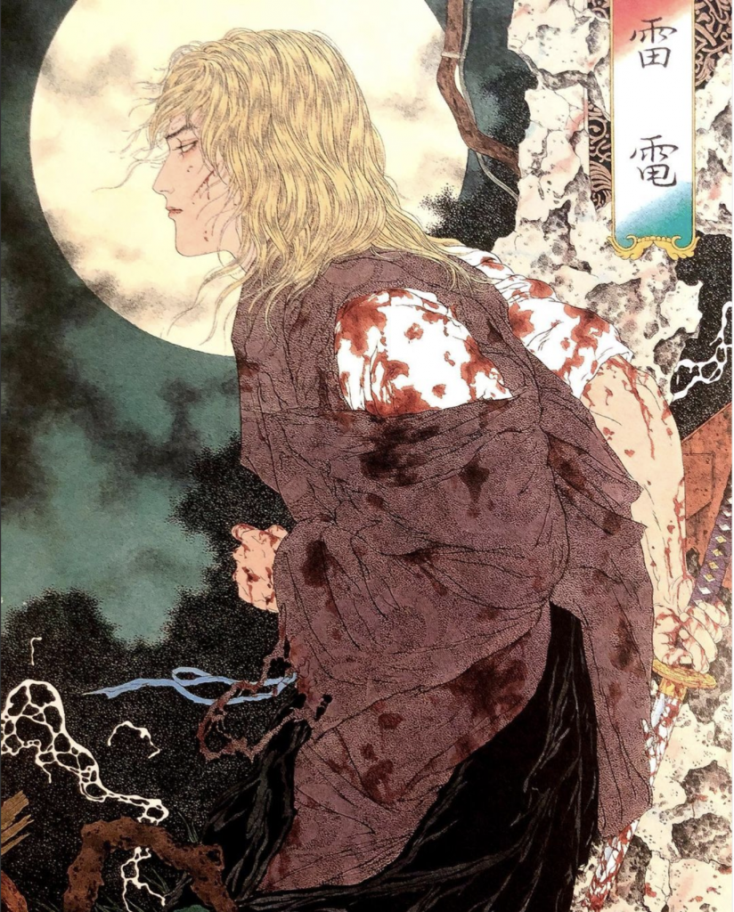
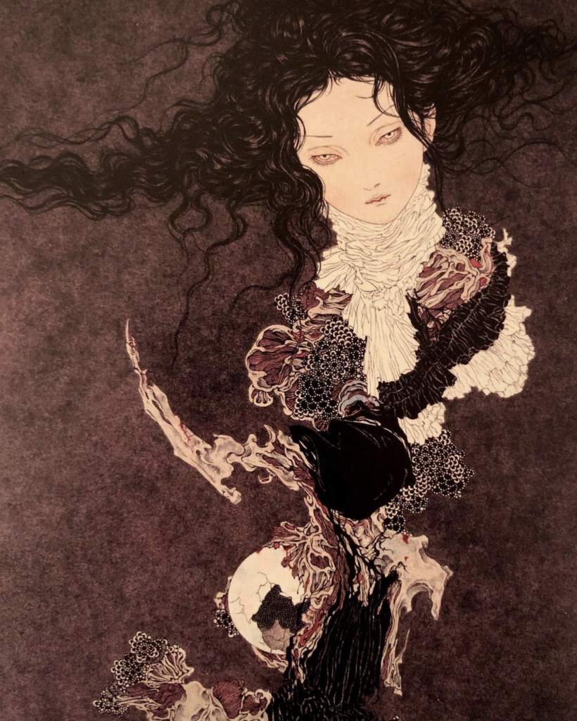
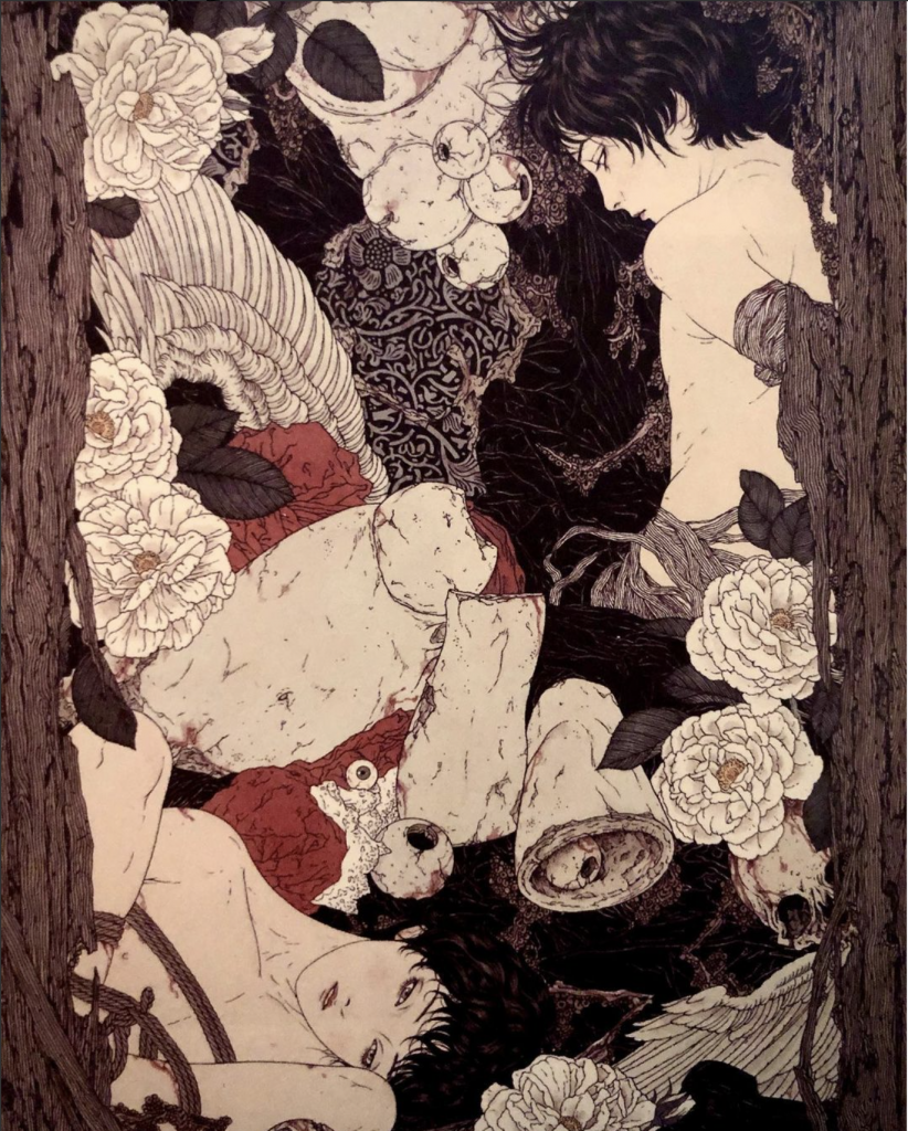
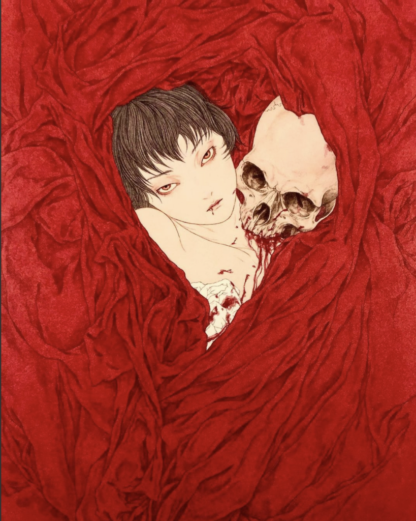
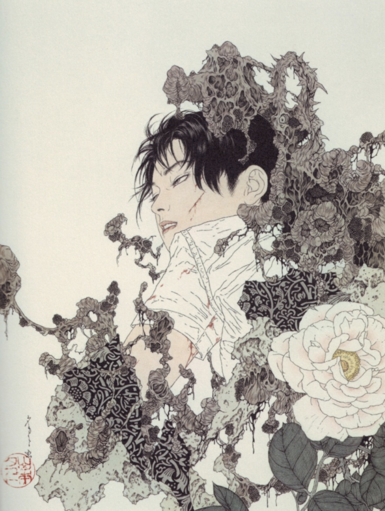
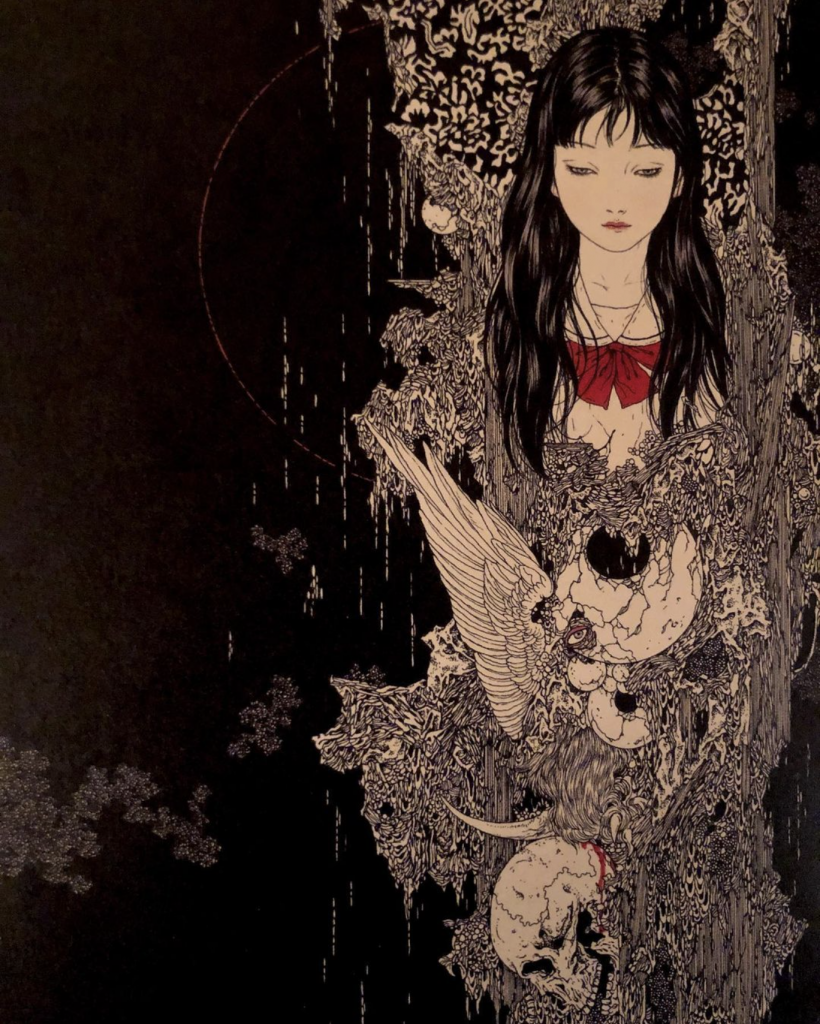
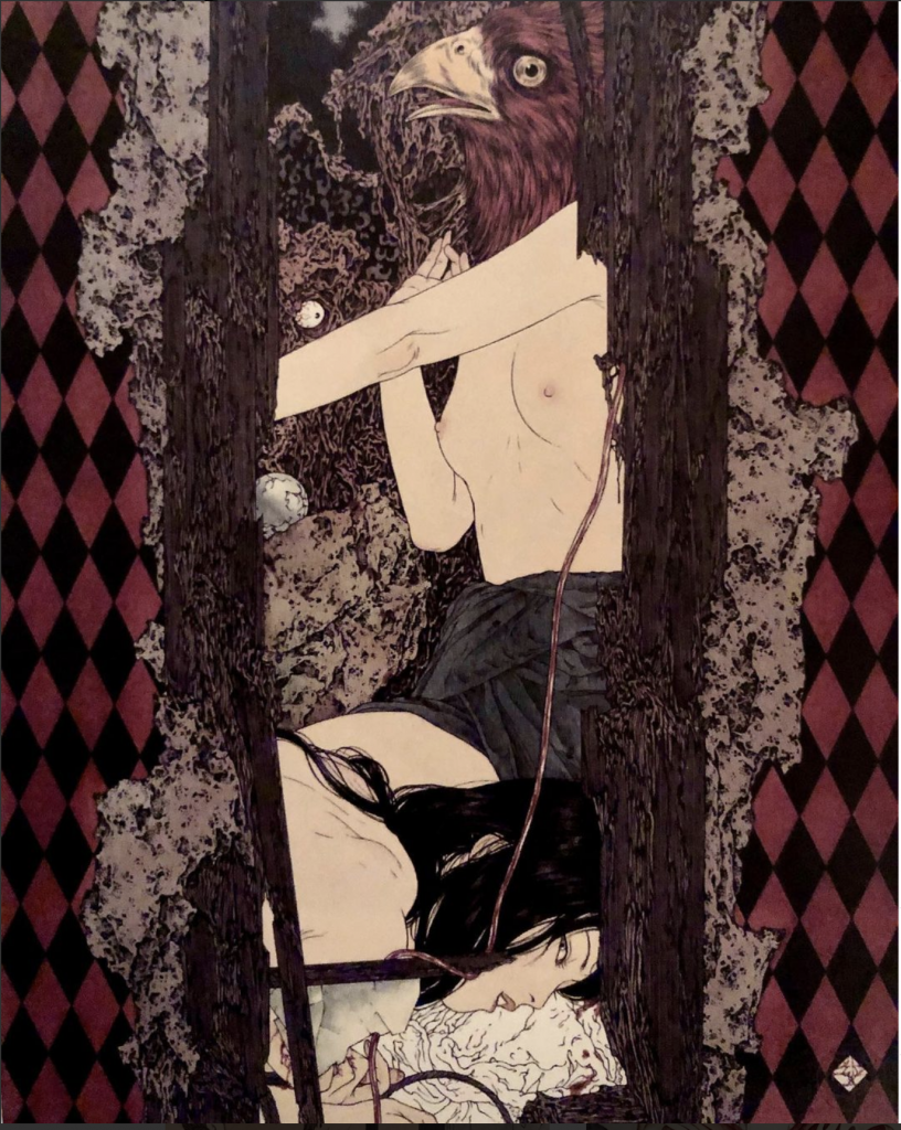
Takato Yamamoto was born on January 15th, 1960 in Japan. There is little information on his personal life online. He graduated from Tokyo Zokei University with a degree in painting (Wikiart). His work is strongly influenced by the Japanese ukiyo-e style. After working with the ukiyo-e style for some time he created “Heisei estheticism”. Heisei estheticism was a term he coined himself to describe his personal style. It blends Japanese ukiyo-e prints, Japanese pop-art, and western gothic art (Asia Contemporary art). After developing his signature style he had his first exhibition in 1998 titled “Heisei Esthetics”. His work has been used to illustrate many books and he’s had many personal shows. This is pretty much all the information on Yamamoto’s personal life but I think his work speaks for itself. It’s dark, and often has themes of rebirth, metamorphosis, brutality, death, and eroticism. His work is extremely detailed and he’s able to create intense narratives in his work. Often they reveal a scene just before a brutal event, it is almost a premonition of what’s to come. It’s seductive and makes you want to look at it even though you feel like you shouldn’t. He creates a variety of subjects in his work but it ranges from soft-brutality to complete brutality being depicted in scenes. He’s done hundreds of illustrations and I love looking through his work. Even though he’s done so many pieces his work isn’t repetitive, each piece still tells its own story. Below are a few of my favorite pieces:

Works cited:

Asia Contempoaty Art. 2021. [online] Available at: <https://www.asiacontemporaryart.com/artists/artist/Takato_Yamamoto/en/> [Accessed 15 December 2021].

Wikiart. 2021. Takato Yamamoto – 33 artworks – illustration. [online] Available at: <https://www.wikiart.org/en/takato-yamamoto> [Accessed 15 December 2021].

Images from:

Takato Yamamoto, The Heisei Esthiticism style

https://www.instagram.com/p/CN5KqZMlqbz/

George Barbier – Survey 9

Known for their flamboyant and elegant style George Barbier is an amazing French illustrator.


Barbier was born on October 16th, 1882 in France. He had a very successful career at an early age. He had his first show at age 29 in 1911 (Wikiart, 2021). This show offered him great exposure and his commissions began to fly in following his show. His work often depicted illustrations of costumes and fashion. He would create illustrations with posed models and clothing such as the one below:


The subject matter varied but it typically included women in fashionable attire and/or costumes. It is very embellished with details in the clothing, often showing patterns of folds in the fabric. His style reminds me a lot of Japanese ukiyo-e prints. He also uses the flat perspective and colors that are evident in the Japanese counterparts. His work usually doesn’t have an elaborate background and focuses attention on the figures or elements in the foreground. Even his posing of some women such as this one below, heavily resembles those of Ukiyo-e Prints. I think it’s very interesting to see how different artistic elements can show up in work from all around the world. Since I’ve learned about Ukiyo-e prints I can now identify similar elements in other work. I would’ve been able to see these similarities without learning about them in this course.

Barbier didn’t exclusively draw fashion but as his career developed he explored wallpaper, jewelry, and glass designing as well. He was also regularly featured in the L’Illustration which contributed to his success. He is called one of the most influential french illustrators of his time (Google Arts & Culture, 2021).

I thoroughly enjoyed his work. I love the expression that he’s able to create in his work through posing and composition. The character and personality of his subjects shine through his work.

Works cited:

Google Arts & Culture. 2021. George Barbier – Google Arts & Culture. [online] Available at: <https://artsandculture.google.com/entity/george-barbier/m0m7c4?hl=en> [Accessed 10 December 2021].

Wikiart. 2021. George Barbier – 21 artworks – illustration. [online] Available at: <https://www.wikiart.org/en/george-barbier> [Accessed 10 December 2021].

Images from

https://artsandculture.google.com/entity/george-barbier/m0m7c4?hl=en

Type Identification Poster

Anatomy of Type Poster

For this assignment, we had to create a type identification poster. We had to design an engaging visual that included important and informative content surrounding typefaces. I choose to theme my poster and make it about the anatomy of type. This theme dictated all of the choices for this poster. Since it was anatomy themed I choose to arrange letters from each of the typefaces I was discussing into a skeleton. This would create a visual that resembled a typical anatomical chart. I then choose to pull out each letter into an x-ray machine to dissect or ‘look’ inside each typeface. Then each letter would be dissected for key defining points of the typeface. I tried to keep the text lighter as I wanted to focus mostly on the visual elements. I created a small patient summary at the end as a fun way to wrap up the content of the poster. I kept the color palate blue to match surgical elements and to match typical x-ray scans. I also wrote the headings of each style of type in an example of that typeface. This helped differentiate each style of type and create a more dynamic visual for the viewer to engage with.

I would give myself an 8.5/10. My original idea wasn’t very creative and I feel like I was able to overcome this. I really enjoyed the process. The only reason that I think I didn’t get full marks is that some of the text isn’t straight and visually appealing, I also forgot the k in blackletter. I would’ve also wanted stronger colors but I lacked the materials to do so. I spend around 7 hours with research and drawing time.