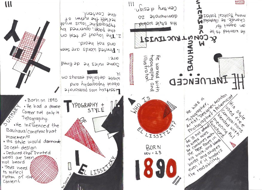
I choose to do my zine on El Lissitzky. He was not only a famous typographer but also a designer. I choose to create artwork inspired by his illustration and typography work in the zine. He used a minimal color palette of red, black, and white which I followed in my zine. His work is also geometric and minimal so this is why I choose to include this imagery in the zine. His typography was very free and did not adhere to a consistent or structured format. This is why I have text all over the page and facing different directions. He would ofter arrange his text like this in his own work. Finally, his typography was usually bold, this is why I choose to have thick lines on some of the main content in the zine.
I give myself a 9/10. I think that I was able to create a zine that reflected his style and provided interesting information about his work and typography. I spend 2.75 hours on this project.