Blogpost#4 The Golden Age Part II – Gil Elvgren

Kết quả hình ảnh cho gil elvgren portrait
Gil Elvgren portrait

Gil Elvgren was born in St. Paul, Minnesota. He went to the Minneapolis Institute of Arts for the short period of time and then changed to the American Academy of Art. After graduating, he joined the stable of artists at Stevens and Gross, Chicago’s most prestigious advertising agency. During this time he got the chance to learn from the famous illustrator Haddon Sundblom, who gained his popularity from his Coca Cola Santas. Working in Sundblom’s shop, Elvgren contributed to various Coca-Cola ads himself.

Station WOW

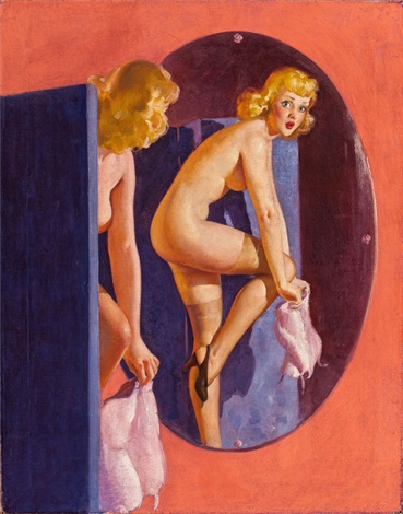
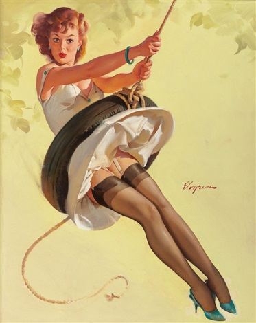
In 1937, Gil began painting calendar pinups girl for Louis F. Dow, one of America’s leading publishing companies, during which time he created about 60 works. These pinups girls illustrations art easily to recognize because they are printed version with Elvgren’s signature. In 1944, he was approached by Brown and & Bigelow to work for them as a staff artist which meant his work would be in more or less direct competition with other big names in the field. The firm offered him $1,000 per piece, which was more than what Dow was paying him. Elvegren signed a contrast with Brown & Bigelow in which he has to produce twenty calendar girls each year, ranging from cowgirls of the golden west to sultry sirens of the Riviera.

Image result for Louis F. Dow Gil Elvgren
Louis f. dow calendar illustration by Gil Elvgren
Related image

Swingin Sweetie, Brown & Bigelow calendar illustration by Gil Evgren

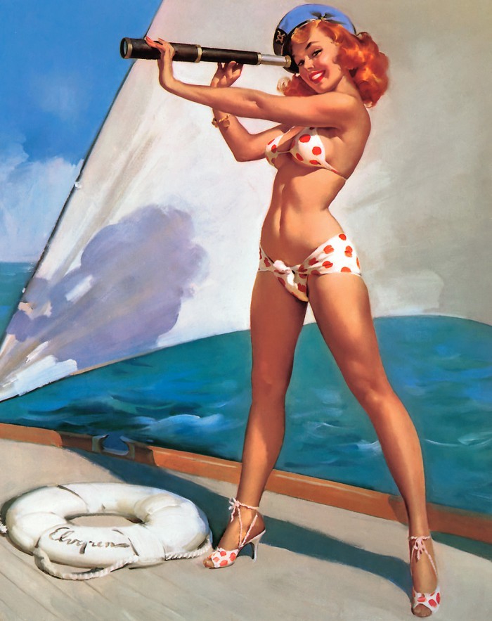
In 1951, Evgren salary arrangements with Brown & Bigelow changed, instead of $ 1,000 per piece, they paid him $ 2,500 per piece. With the amount of money he got from his magazine illustration and numerous national advertising accounts, he and his family moved from Chicago to the suburb of Winnetka. He started to hire a full-time assistant to help with photographing the models, forming sets with various props to portray different subjects and preparing his art tools. Having his own studio at home help Evgren work more efficiently. Eventually, after 30 years working with Brown & Bigelow Evgren retired and moved to Florida.

Image result for Gil Elvgren
Splendid View

In order to create these pin-up girl pieces, Elvgren had to plan each of them carefully. Beginning with an idea, he would develop the visual situation and then select a suitable model for the specific setting. Then he would choose the outfit, the background, the props and the liting and finally, he would take some pictures as the reference for his piece.

My opinion :

To be honest, in my opinion, pin-up girl illustrators kind of have really similar styles. He did have a successful career and he had a really solid skill set to make these girls look as lively as possible. His colour palette is always warm, vibrant to look at but other than that his art doesn’t leave a strong impression for me.

Blog post#3 The Golden Age Part I – Neysa McMein

Neysa McMein.jpg
Neysa Moran McMein photograph

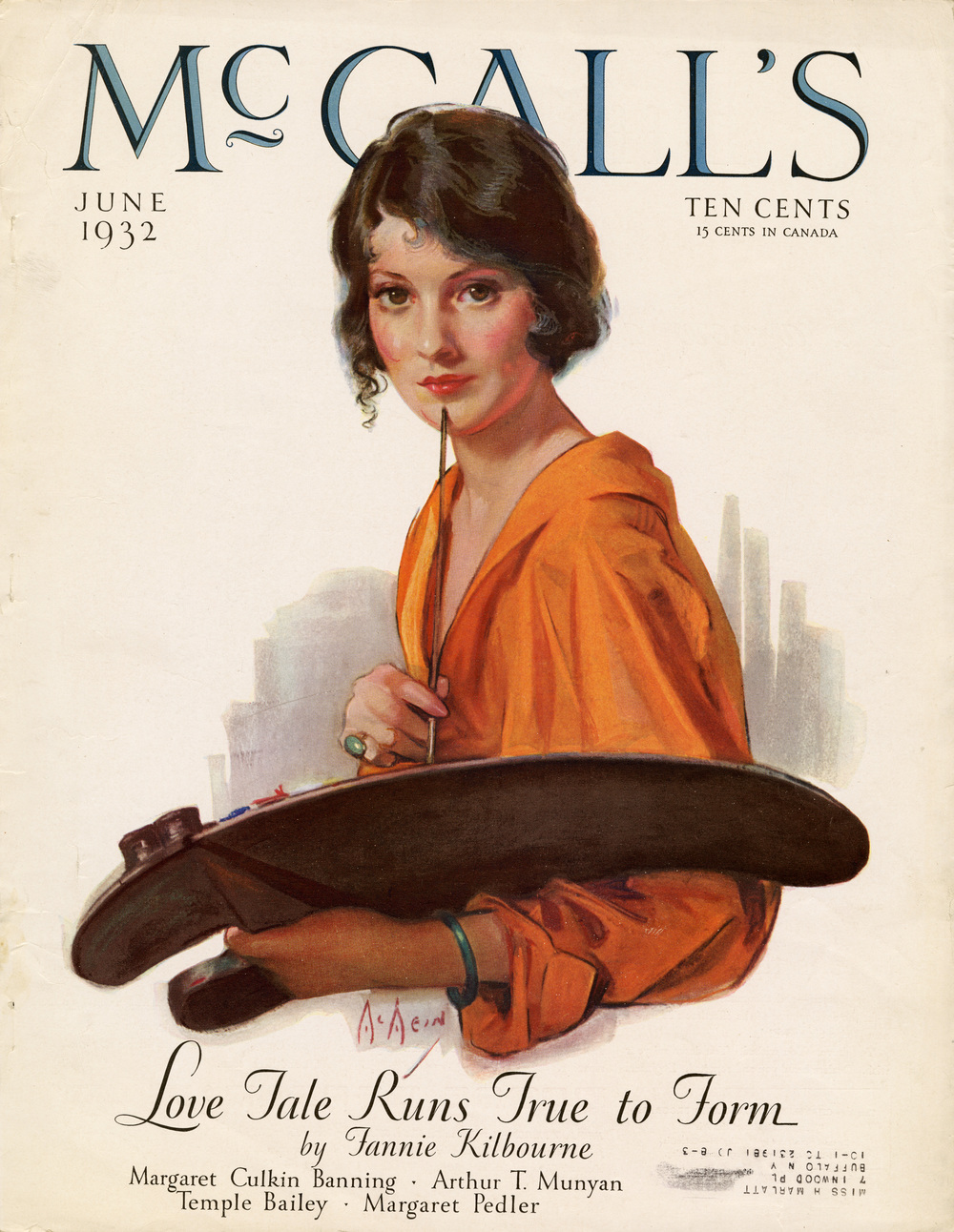
Neysa Moran McMein was an American Illustrator and portrait painter who studied at The School of The Art Institute of Chicago and Art Students League of New York. She started her career as an illustrator, during World War I, she travelled across France entertaining military troops and made posters to support the war effort. Through McMein entire career she was a successful illustrator, she would work for great publication such as McCall’s, The Saturday Evening Post, and Collier’s. Moreover, she was also a successful portrait painter, she would often take commission from famous celebrities and writers.

Kết quả hình ảnh cho Neysa McMein
Cover illustration for Mc Call’s

McMein was born in Quincy, Illinois on January 24, 1888. She was the daughter of Harry Moran and Isabelle Parker McMein. McMein had many talents, she knew how to sing, to act and to draw. After graduating from Quincy High School, she attended The School of the Art Institute in Chicago. In 1913 she went to New York City and attended the Art Students League for a few months. After one year she sold her first artwork to the Boston Star and she also did the cover for the Saturday Evening Post.

Kết quả hình ảnh cho Neysa McMein the Saturday Evening Post. 1915
McMein illustration for 1917 The Saturday Evening Post cover

Her warm pastel drawing for strong American female was highly popular and brought her many commissions. During World War I she drew posters for the U.S and French governments, McMein spent six months in France as a lecturer and entertainer. From 1923 through 1937 she provided all the artwork for McCall’s covers. She also supplied work to McClure’s, Liberty, Woman’s Home Companion, Collier’s, Photoplay, and other magazines and she also produced advertising graphics for products such as Palmolive soap and Lucky Strike cigarette. General Mills commissioned her to create the image of Betty Crocker.

Kết quả hình ảnh cho Neysa McMein Lucky Strike cigarettes
Lucky Strike Illustration

Kết quả hình ảnh cho Neysa McMein betty cocker
Betty Crocker Illustration

In addition to her highly successful career as an illustrator and designer McMein also had a great social life, she was a regular member of the Algonquin Round Table set. In 1923 she married John C.Baragwanath and they had a satisfy open relationship. Unfortunately, the popularity of her style decided during the late 1930s so McMein started to focusing more on portraiture using pastel and oil paint.

More of McMain works:

Hình ảnh có liên quan
Kết quả hình ảnh cho Neysa McMein work

My personal thought about the illustrator:

McMain was a strong independent woman since she was so talented she got the chance to have way more interesting experiences than other women during that period. She had a successful career, producing numerous illustration for popular magazines and she was able to stand out among other male illustrators. Artistic wise I think she had an excellent set of skill but she is limited to portraiture only since I can not find any full body scale illustration from McMein.

Source:

 http://www.americanartarchives.com/mcmein.htm

Blog post#2: Illustration’s Early Masters – Virginia Frances Sterrett

Hình ảnh có liên quan
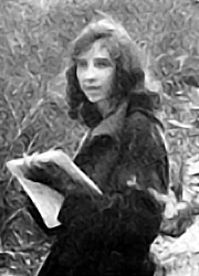
Virginia portrait

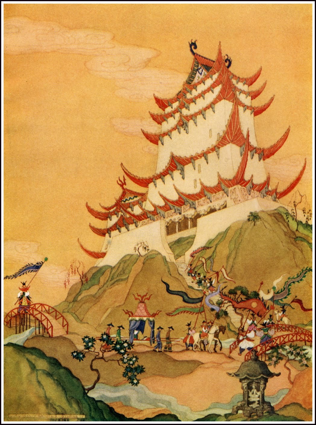
Virginia Frances Sterrett was born in Chicago, Illinois, in 1900. She is known to be an introverted child which means she would rather be in her own world of imagination and drawing than interaction with other children in school. When her father passed away, she and her family moved to Missouri where their relatives were. Later on, when she was 13, she won several awards at Kansas State Fair that event had encouraged Virginia to focus even more on Drawing. Two years later, her family moved back to Chicago where she went to high school with the goal to study art but she soon attended the Art Institute of Chicago and she also received a full scholarship. Unfortunately, Virginia mom became ill one year later which forced her to quit studying to get a job and support her family.

old french fairytales virginia frances sterrett
One page of Virginia’s illustration in the Old French Fairytales

It was not long before her own health began to fail; she was diagnosed with tuberculosis. Her first commission came in 1919. She was commissioned by Penn Publishing Company to illustrate the Comptesse de Ségur’s Old French Fairy Tales. She was 19 and received $500 for the eight watercolors and 16 pen and ink drawings, with a supplemental $250 for a colored drawing for the cover and ink drawings for the end papers and boards. This was quickly followed by another commission for Tanglewood Tales from the same publisher, Penn Publishing Company.

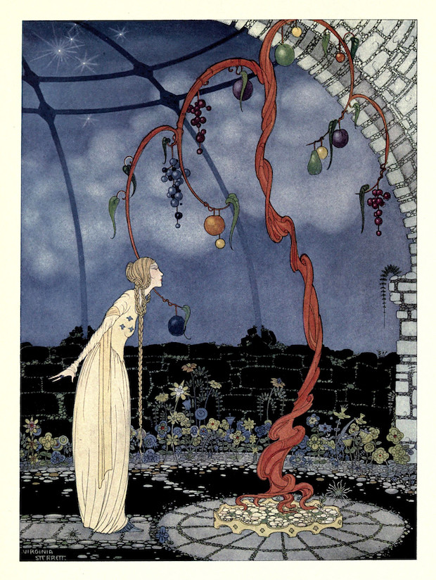
Illustration from Tanglewood Tales by Virginia Frances Sterrett (1920)
Illustration from Tanglewood Tales by Virginia Frances Sterrett


Illustration from Tanglewood Tales by Virginia Frances Sterrett (1920)
Illustration from Tanglewood Tales by Virginia Frances Sterrett 

In 1923, the family moved to the warmer climate of southern California, making their home in Altadena, nestled at the foot of the San Gabriel mountains just north of Pasadena. There was a slight improvement in her health, but it didn’t last, and she entered Compton Sanitorium. Her health was now curtailing her work, and she could only draw for a short time each day. She started a new series of illustrations for Arabian Nights but the declining state of her health, it took three years to complete. The Arabian Nights, her last published works, are considered her masterpiece. 

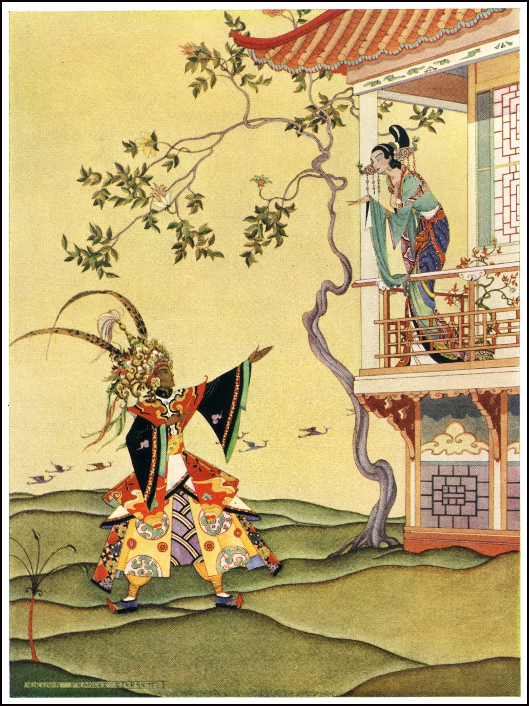
Aladdin Greeted the Princess with Joy by Virginia
Aladdin Made His Way to the Sultan’s Palace by Virginia

In 1930, Virginia began work on her last commission, a series of illustration for Myths and Legends. This commission was never completed; her health took a turn for the worse and she died on June 8, 1931. She was 31 years old. 

Kết quả hình ảnh cho Virginia Frances Sterrett
Illustration from Old French Fairy Tales by Virginia Frances Sterrett 

  My personal opinion:

I can see that Virginia artworks somewhat reflect her personality, the mood in her artwork is always calm and mystery. Everything she drew is style like from human figure to natural elements such as the ocean wave, trees. She has a unique way of seeing a world and to see that in her art is incredible. I love the way she used cool tone for the background warm tone in her illustration series for the Old French Fairy Tales. Moreover, most details in the background often rendered with one specific curve which made the figure stand out more. In addition, I admired the fact that Virginia has gone through so may hardship but she still able to produce such amazing work until the end of her life.


Source: http://artpassions.net/sterrett/virginia_sterrett.html

Blog post# 1 Beginning to the Golden Age – Alphonse Mucha

  Alphonse Maria Mucha was born in the town of Ivancice, Moravia. During his early age, Mucha developed his passion for art which leaded him to pursue illustration later on. At first, he worked as a decorative painter in Moravia, mostly painting theatrical scenery and then he became the leader in a Viennese theatrical design company while continuing to perfect his art skills.

Alphonse Mucha portrait

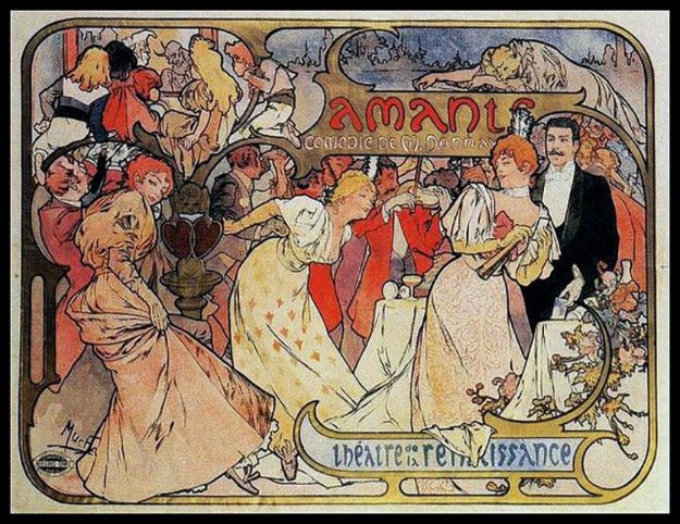
In 1881, Mucha came back to Moravia and he got hired by Count Karl Khuen of Mikulov to finish several murals for the Hrusovany Emmahof Castle. Noticing how talented Mucha was Count Karl Khen offer to sponsor Mucha’s training at the Munchin Academy of Fine Arts. After that, he moved to Paris in 1887 and continued his studies at Julian Academy and Colarossi Academy while also producing magazines and illustrations. Mucha volunteer to produce a lithographed for the play Gismonda by Victorien Sardou and it happen to turn into an overnight sensation which formed the new artistic style and its creator to the public. The actor for the play was so satisfied with the success of Mucha’s poster that she signed a six years contrast with Mucha.

View of Mucha’s murals


Amants - Theatre De La Renaissance 1895
Amants – Theatre De La Renaissance 1895

Mucha was known for his flurry painting, poster, advertisement, and book illustrations. Moreover, his designs for jewellery, carpets, wallpaper, and theatre were also quite popular. He produced works focusing in illustrate beautiful woman wear flowing Neoclassical outfit, these girls often surrounded by flowers and delicate decorations. His use of pastel colours helps him stand out from others illustrators who produce contemporary posters. Even though Mucha was famous for his commercial art, he aims to produce art with the purpose of communicating spiritual messages. Mucha wanted to concentrate on projects what would honour art and his birthplace.

 More example of Mucha’s works:

Image result for Alphonse mucha
Weather illustration by Mucha
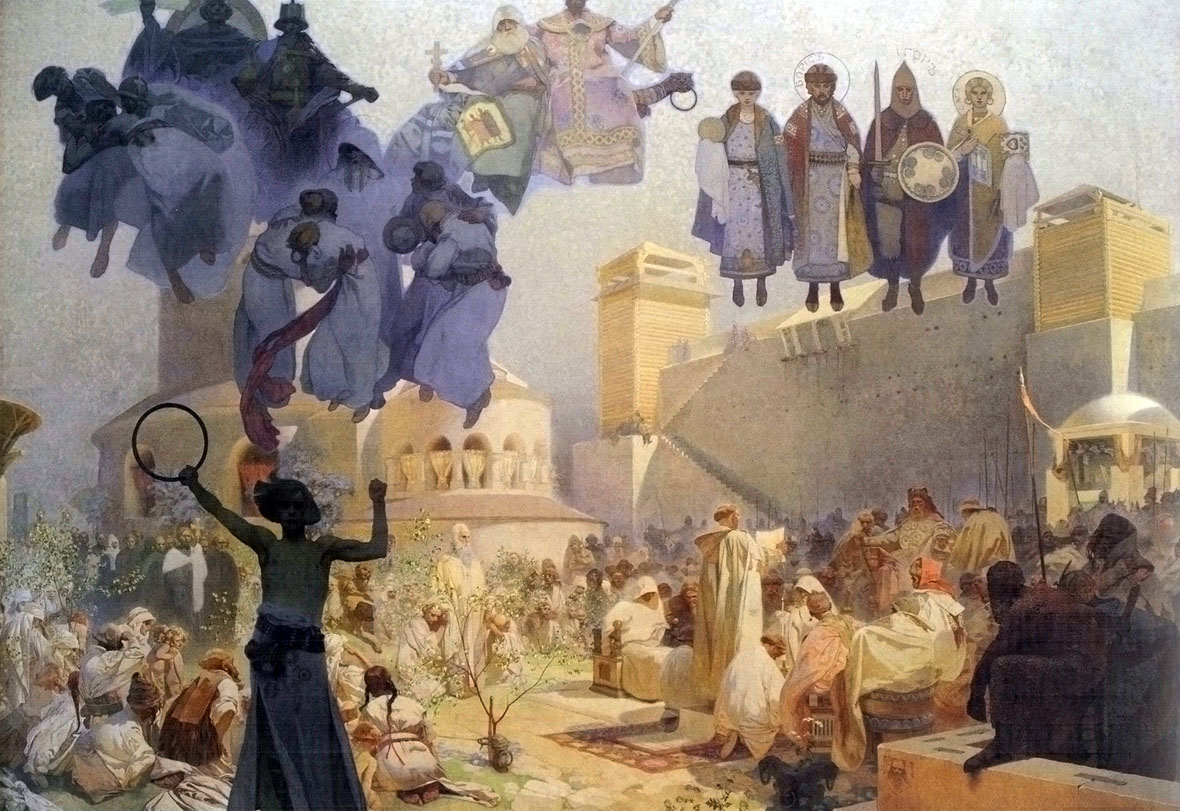
Alfons Mucha 1860 - 1939, 'Slav Epic' 1910 - 1928:
3 'The Introduction of the Slavonic Liturgy' - 'Praise the Lord in Your Native Tongue' 1912.
Egg tempera and oil on canvas, 610 x 810 cm, unsigned.
National Gallery Prague, Jklamo 2011 commons.wikimedia
The Introduction of the Slavonic Liturgy
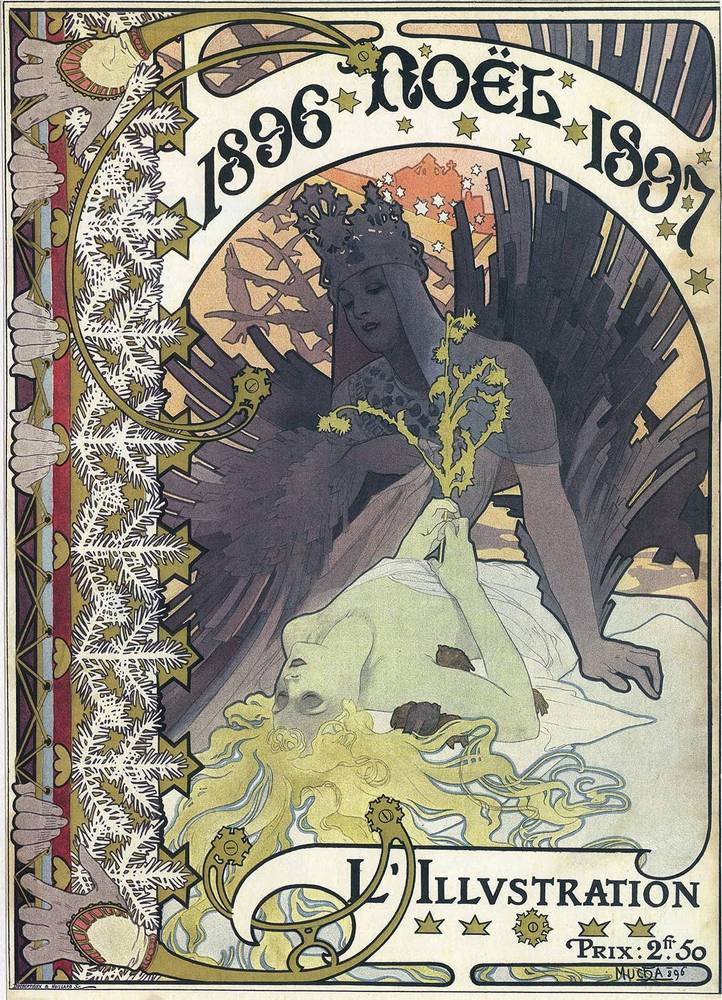
Image result for Couverture Pour L'Illustration mucha
Couverture Pour L’Illustration

My opinion about Mucha:

I love Mucha art styles, he did many woman illustration, but each of them has different personalities, and all the poses just fit perfectly in every piece. Moreover, he did a fantastic job of texture rendering. His four weathers piece the flowers and the flowy dress look incredibly natural.

He was a successful commercial artist but I think he also struggled a lot with that title since he wants to focus more on bigger and more meaningful projects. I am really interested in his life story because it is what I expected from an illustrator life, you might love to draw certain topics but since it is your job, you possibly work a lot with projects you not really fond of.

Source:

https://en.wikipedia.org/wiki/Alphonse_Mucha

The cover rationale


     After looking through other people spread for the book me and my group deiced that we want to make a more dynamic and interesting design rather than an an academic cover. We deiced that we want to add bit and pieces of information on our cover some how to attract the reader and we finally came up with  a design of a tea cup with spread from the back to the front cover. More over, we also felt that history is kind of a mess so we go with a more messy approach with an explosion of object we think is important in history such as the pyramid, the first camera, printing press and the teddy bear which is more like a funny factor that we just want to throw in. Since we want to emphasize this is a tea cup we went with a dark brown color which I think should be lighter but overall I happy with the final product. I would mark myself 8.5

.


History spread #3 rationale

Rationale:

          I chose to make a spread comparing the style between Bauhaus and Art Decor. When I did my research, I found that Bauhaus and Art have two completely different style and beside producing furniture they also make art and others object so I corporate them to my spread to emphasize the differences between the two movement. I also attempted to suggest the differences by using two type of typography, while ” Bauhaus” is bold lettering with heavy outline, ” Art Deco” is more decorative. Also, the two-chair image which I used are two great examples of Bauhaus and Art decor product. While the Wassily chair is quite modern looking, the Dragon chair is more complicate with dragon heads carve to the chair handle and the one common point about the two chair is their design are both influenced by something else. Finally, I highlight key works to compare and contrast between the two movement.

             I quite satisfy with the final product since I think that I had convey all the important information so I would give myself 8.5.


Blogpost#10 Contemporary & Post Modernism

Related image
Ivan portrait

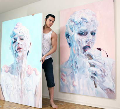
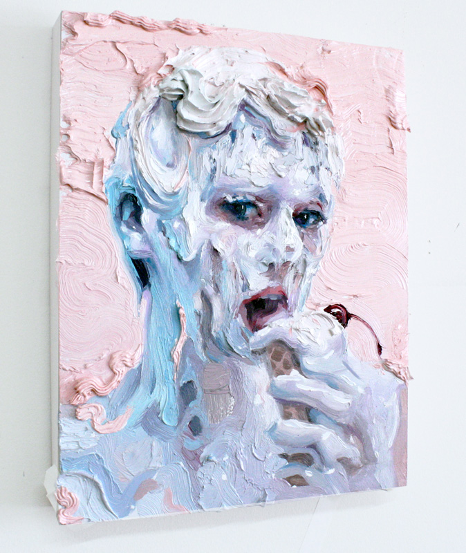
               Ivan Alifan Jdanov was born in 1989 in Russia. He graduated from the OCAD University in Toronto, Canada with a Bachelor in Fine Arts in Drawing and Painting. Recently he participates in the LA International art pair. He is famous for his process of hardening paint with wax and using cake icing tools to pipe paint onto his canvas.

Image result for ivan alifan
Ice cream sketch – I love his technique with the cake pipping tools and in some of his painting he made paint flower with the tools and sticked it to the canvas.

                 Ivan Alifan’s work often depicts human body to portrait the meanings of consumption about sexual taboos. He uses shocks tactics and provocative topic, where the erotic subtext is used to stroke the viewer and force them to examine their relationship to sexuality, questioning their prejudices about sex.  To be more specific, he would paint male of female heads, busts or bodies which are covered with dripping white- pastel liquid. He intentionally forms an exotic, explicit and even strange composition. Ivan’s palette consists of mostly turquoise and picks which resemble the baroque lavishness and decadent delight.

Meringue
Meringue

            Ivan said that:

             ” Art is beyond an image of perception and creativity. Art is part of the past present, future, where one can interpret their own view. Painting allows me as an artist to express my strengths or my vulnerability. Each brushstroke builds up a story, a life and, a passion.” 

            Ivan had always fascinated with the glossy surface of porcelain figures and marble statues. His current art style form during one time when he asked his friend to participate in a photo shoot where he would pour a bucket full of gesso over her. Ivan does not want to stick with the traditional brown painting method; he wants to represent the human flesh realistically to create images filled with sexual ambiguity.  Later on, he started to experiment with slime, milk-based creams and non-toxic paint.

Related image
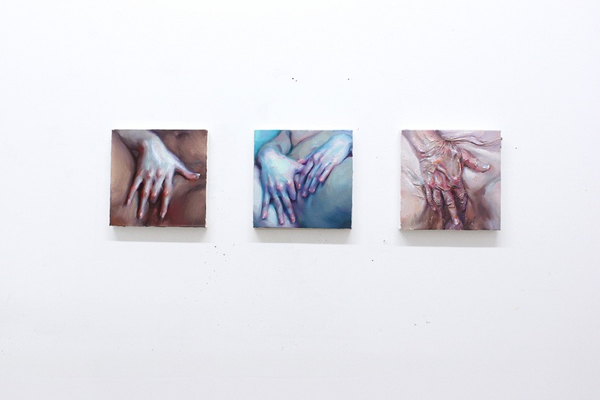
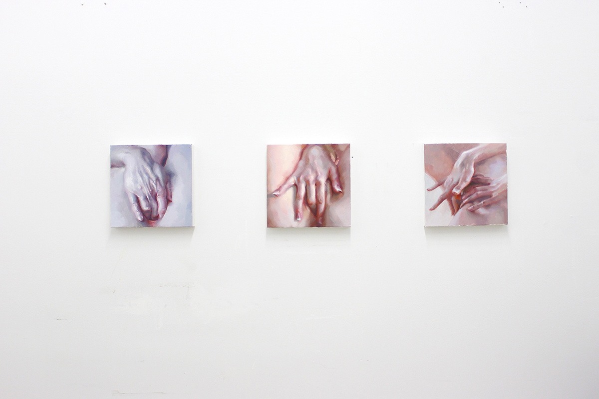
The hand studyImage result for ivan alifan a study of hand

                  One of Ivan famous series is ”  The hand study” series which he aimed to portrait female intimacy. He did not portrait it as a sexual act but more like a moment of enlightenment, a pure bliss. Ivan wanted to accentuate the profundity of the female pleasure and self-awareness regardless of the omnipresent male gaze. This series of beautiful art hit you when you see it with fantastic work of illustrating delicate woman hand realistically. It might be the best hand paintings I have ever seen.

Image result for ivan alifan 2d love
2D Love – I think this painting is an accurate depiction of people with anime obsession, having an unhealthy life style . The way he handling paint looks phenomenal.

Source : I believe art is sex and sex is art’: Step into the dripping pastel world of Ivan Alifan.

                                    A study of Hands Like No Other, By Ivan Alifan.


Blogpost#9 Abtract Expressionism & Pop Art


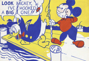
                     Roy Lichtenstein pulled off his idea of irony comic illustration with one of his first popular art piece of Mickey Mouse and Donald Duck on a wooden jetty. Donald Duck raises his fishing rod and shouts out: ” Look Mickey, I’ve hooked a big one”. This painting somehow challenged  the Abstract Expressionism artists which was dominated American art during that time.

Look Mickey, I’ve hooked a big one

                    Lichtenstein was born in New York City, he showed his artistic really early. Lichtenstein drew, painted and sculpted as a teenager, and he also spent lots of his time in the American Museum of Natural History and the Museum of Modern Art. Later on, he spent sometimes in Europe but then returned home due to his father illness.

Wonder Woman Comic Art

                   Lichtenstein was identified with Pop art, he interested in industrial processes and mass consumerism. He form his career on creating simple works that appropriated from comic books, advertisements and pulp fiction, isolating, cropping and enlarging selected elements to form power-full composition. More over, he also imitate the crude printing processes of newspaper reproduction as you can see with the dots on his art works. Lichtenstein creates about more than 5000 painting, prints, drawings, sculptures, murals and other objects.

Drowning Girl (1963). On display at the Museum of Modern Art, New York

                 To be more specific, Lichtenstein’s works based on enlarged panels from comic books. Lichtenstein himself said ” I am nominally copying, but I am really restating the copied thing in other term. In doing that, the original acquires a totally different texture. It isn’t thick or thin brushstrokes, it’s dots and flat colours and unyielding lines”. He would took a tiny picture, smaller than the palm of the hand, printed in four colour inks on newsprint and blew it up to the conventional size and finished it by painting on canvas. He elevated comic art to something you would see in a gallery.

Ohhh…Alright…

                    His popularity reached it peak during the 1960s with Pop painting, he gravitated toward what he would refer as ” dumbest” or ” worst” visual item he could fins and then he would attempt to improve it. Paraphrasing, particularly the paraphrasing of despised images had become a unique trait ofLichtenstein art. People love his convention or permeated art, they called his works ” a purely American mythological subject matter”.

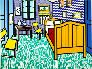
File:Bedroom at Arles.jpg
Lichtenstein’s Bedroom at Arles (1992)

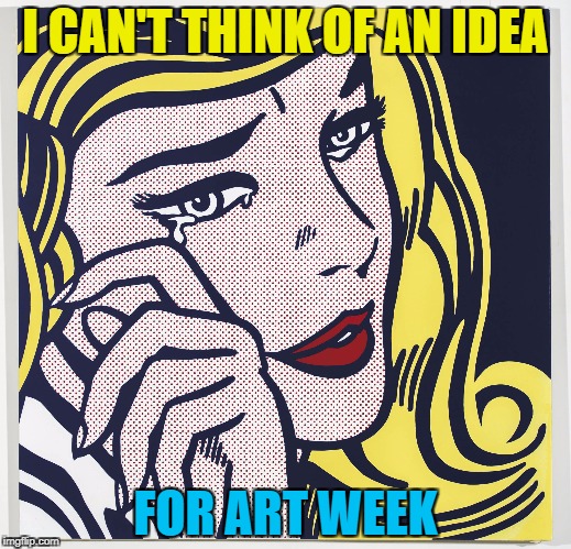
          My comment on Liechtenstein’s art: His art really catch my eyes with the vibrant palette and interesting texture. Unlike the other, his creativity is about seeing a poetical image and elevate it. When I first look at his art, I immediately think about all those meme picture since his art tend to be zoom in to a girl face with emotional face expression.

Image result for Roy Lichtenstein meme

Source : https://lichtensteinfoundation.org/biography/

English 100 revised argument essay


                      For my English 100 class in Capilano, I was given an assignment to write an argument essay to give my opinion whereas we should consider Dharavi as the model for future city structure.

                      I do think that Dharavi makes some good point that we can adapt, but the city also has its limit of being a homegrown city without being looked after by the government.

                     Question: Echanove and Srivastava’s article “This is Not a Slum” suggests that Dharavi’s density, efficiency, and community integration should be viewed as a legitimate model of a “homegrown neighborhood” that cities worldwide would be wise to make space for. Based on what you read in the article, do you agree?

Revised essay 

                    The article ” This is Not a Slum: What the World Can Learn from Dharavi’’ by Echanove Matias and Rahul Srivastava discusses how Dharavi, a poor area in Mumbai, was able to develop rapidly in a short amount of time. They also clarify what makes the city an excellent example of a housing system for us to learn from. Throughout the entire article, the two writers emphasize some critical points about taking the maximum advantage of our living space and designing it according to our needs would create some significant impacts. I agree that Dharavi is an excellent example of Indian people being creative in overcoming their disadvantage when it comes to their living environment and we can adopt some of their idea. However, I also see there are several problems with this housing system that we cannot consider it as a model for other places.

                       Dharavi,or would I say a ‘’slum’’ or a ‘’ homegrown neighbourhood’’, is a shabby- looking community that emerged without state guidance. This area is known for being one of the most famous locations in India which attracts thousands of tourists every year. Moreover, Dharavi also has a huge impact on Mumbai’s economy, making around $500 million a year. In other words, even though this area is considered to be an under an underdeveloped area of the city which needs to be removed, it still shows some significant value. The citizens can be creative in designing their own living space to serve their needs. They can build small-scaled, shape-shifting structures which are changeable for constructing in the future, therefore allowing them to live and work in the same place or divide their home into several parts for renting. This system gives the inhabitant the opportunity to create a community network base, providing shops, workshops and warehouse right on the street, which also become helpful when it comes to travelling since everything is united in the same place. Therefore, inhabitants can enjoy the short commute between their home and workplaces .As a result, space can serve a various purpose. Particularly, with the freedom that Dharavi’s citizen has, they create an environment which works best for them, so they can improve their income and their living standard at the same time. Also, thanks to Dharavi’s housing approach, people always feel safe to live here, they can even walk during the night time without feeling uncomfortable, which is usually not the case on Mumbai streets. Unfortunately, the authorities see Dharavi as a shameful obstacle because Dharavi is not under their control. With the intention of rebuild the place to sell for the higher class, the improvement for Dharavi’s infrastructure had not been competently carried out by the government which leads to the hygiene shortage in this area, with no toilets and sewage disposal. Overall, even though sanitation is a drawback in Dharavi, the advantage we can gain by learning from them is undeniable. Dharavi was able to become a community that developed as a whole, and there is a strong sense of communication between them. As we come to realize, the connection is the real key to success. Citizen can perform better at work especially when it requires them to work with others because they are comfortable with communication.

                       On the other hand, while I agree that Dharavi is an excellent example of Indian people being creative to live their life during difficult times, several reasons prevent the place from becoming a kind of model that the world can learn from. The first, and also the most crucial point, is an environmental concern. By living and working at the same place, and at the same time, Dharavi residents have to exchange their own lives for financial prosperity. As we know, all kinds of manufacturing have their waste material, which must be purified before being sent to the environment. Dharavi’s most popular industries, including pottery, leather, and textiles, are no exception. Not much could be found out about those workshop’s law-abiding status in waste-treatment, but their disapproving (and ignoring) of the zoning law, which the purpose is to separate human life away from the toxic industrial environments in the first place. Moreover,  waste recycling is growing uncontrollably. As Victoria Moore said in her article, eighty percent of Mumbai’s solid waste is now being transported to Dharavi, the “recycling marvel’’(Moore). It’s great being green and sustainable. However, living and processing garbage at the very same place is unimaginable. As a result, the environment around Dharavi is in fatal alarm, and that is not an exaggeration speech. In the last pollution study of Dharavi by the National Environmental Engineering Research Institute (NEERI) in November 2010, 551.7 microgram/ meter cube (ug/m3) of average suspended particulate matter (SPM) was found, that is more than five times of the permissible limit (M Ghaneka ) . Dharavi residents’ disregarding of zoning and waste disposal laws defying of building code, and hyper-dense population all played significant roles in this tragedy. Even though it is somewhat beneficial for Dharavi citizens to have all the freedom to control their environment, Dharavi also leaves them with substantial health risks since they come into contact so closely with all these toxic industrial materials and substances.

                       The second issue in order, but equal in importance, is the health issue, or rather the life issue itself. Of course, most of stable subjects are directly related to the living environment, which is already terrible. Also, the denser the population is, the easier epidemic breakouts came to happen ( Tarwater). Dharavi has suffered from some plagues from year to year: in 2012, drug-resistant tuberculosis was discovered (Loewenberg S). About safety aspect:  being used as homes and workshops are improper constructions made by builders that defy building codes, which leading to higher accident rates, home and work alike as they are in same house. The firefighter will struggle to find their way through narrow alleys their trucks cannot come in, while the fire will spread faster from the massive amount of combustible material. In other word, while Dharavi claims to allow the citizens to feel safe, there still many hazards dangers around the area which can make a significant effect on the citizen’s life.

                    All things considered, Dharavi is a model of what people could do to “find opportunity” in the urban areas of a developing country like India, and we can learn from its experiences to some extent. However, such an economic and residential model could not be applied anywhere else where environment and human health are more valuable than financial gain.


Survey#10 The second case of sex reassignment surgery


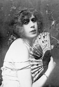
         Lili Ilse Elvenes ( 1882-1931) or Lili Elbe, was a Danish transgender woman and one of the first identifiable recipient of sex reassignment. Elbe originally named Einar Magnus and was a successful painter under that name.

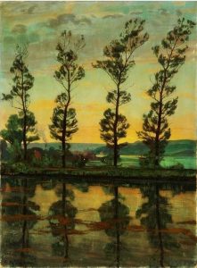
Image result for Einar Magnus Andreas Wegener
photograph of Einar Magnus an

Einar Magnus Andreas Wegener ‘s painting

Elbe went to Germany for sex reassignment surgery which was quite risky at the time since she was the second transgender woman to undergo Gohrbandt’s vaginoplasty technique. A series of four operations were carried out four operations over a two year period. The first surgery was to remove the testicles which were under the supervision of sexologist Magnus Hirchfeld in Berlin and the rest of it were carried out by doctor Kurt Warnekros. The Second operation was to implant an ovary onto Lili’s abdominal musculature and the third was to remove the penis and the scrotum. The last surgery was to transplant a uterus and construct a vaginal canal.

At the time of Elbe last operation, her story was all over the newspapers in Denmark and Germany. Unfortunately, her immune system rejected the transplanted uterus and she developed an infection. She died on September 13, 1931, three months after the surgery.
Source:https://en.wikipedia.org/wiki/Lili_Elbe

              Lecture summary: 

                   For this week lecture, we learn more what happened during the Second World War . Since Nazi came to power in German, bringing an end to the democracy established after WWI, many designer do not agree with Nazi idea so they came to America to continue their work. Designer like Jan Tschichold deisgnes paperbacks for Penguin books. Walter Paepcke founed the Container Corporation of America in Chicago. The U.S Works Progress Ad- ministration created jobs for artist produce approximately 2000 poster between 1936 and 1943. Also we were introduce to the Baby Brownie camera and Polaroid which I think is two great inventions.