Iron Buildings and Mustard Yellows– Art Nouveau Architecture and Colours

A continuation of the Arts and Crafts branch, Art Nouveau brought the beauty and asymmetrical rhythm of nature into buildings all over the world. Architects were very creative during this era as ironwork, glass, ceramic, and brickwork were combined to create curvy and colourful structures. From art museums, whole blocks of buildings, skyscrapers to iconic landmarks, art nouveau inspired a global beautification of previously ordinary cities.
Examples of this work include Barcelona’s famous Casa Batlló, designed by Antoni Gaudí. This building gained its international fame for the colourful broken ceramics that adorn the exterior, paired with the bubbling effect created using iron and wood. Today it is a popular tourist attraction in Barcelona and also serves as an art museum, therefore, featuring stunning artwork both inside and out.

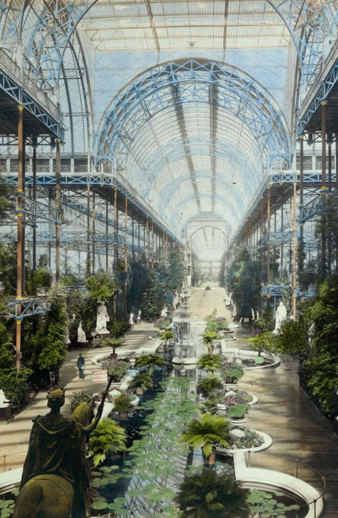
The use of ironwork truly led the way for the creation of many Art Nouveau buildings. From the Crystal Palace in London to the Eiffel tower, iron made it possible for architects to create durable skeletons while shaping it to whatever their minds pleased. Iron also was used as decorations on buildings, shown in the Secession Building found in Vienna, with its striking golden dome covered with gilt wrought-iron laurel leaves. (Below is a picture of the Crystal Palace before it was burned down in a fire in 1936)
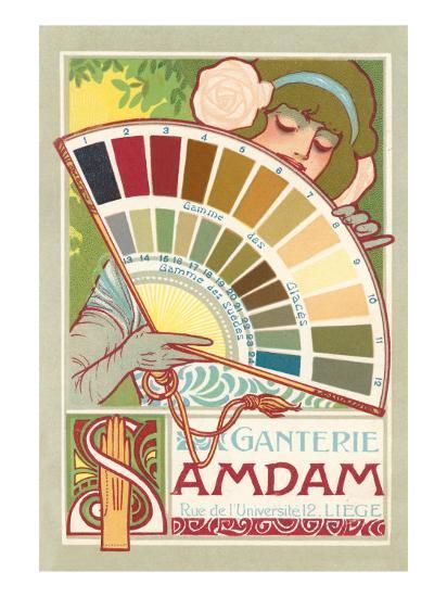
Asides from the colourful and natural buildings, Art Nouveau artwork developed a specific colour scheme that included many muted and pastel colours. Continuing with the all-natural theme, earthy tones like mustard, brown, and olive green were commonly paired with bright and floral colours such as lilac, violets, and peacock blues. These colours were prominent in posters, artwork, and even interior decorations, all featuring greenery and flora. (Below is an example of a common Art Nouveau colour palette. Soft peaches and yellows were also common in skin tone depictions. Link for the photo is found at the bottom.)
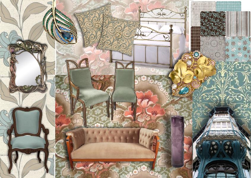
Ornate gold and metalwork also made up for a good part of the Art Nouveau colour palette. In jewelry, furniture, gates, and frames, the dark colour of metals and iron contrasted the lively colours and mimicked the style of line work popular in art nouveau posters. Iron buildings previously mentioned of also used a great deal of dark greys but were often contrasted with blue glass and very colourful ceramics as part of their facades.
Cites Used:
https://weheartit.com/entry/3445093
https://www.britannica.com/art/Art-Nouveau
https://www.theartstory.org/movement/art-nouveau/history-and-concepts/